• Home
  • Tools dropdown img
    • Spreadsheet Charts

      • ChartExpo for Google Sheets
      • ChartExpo for Microsoft Excel
    • Power BI Charts

      • Power BI Custom Visuals by ChartExpo
    • Word Cloud

  • Charts dropdown img
    • Chart Category

      • Bar Charts
      • Circle Graphs
      • Column Charts
      • Combo Charts
      • Comparison Charts
      • Line Graphs
      • PPC Charts
      • Sentiment Analysis Charts
      • Survey Charts
    • Chart Type

      • Box and Whisker Plot
      • Clustered Bar Chart
      • Clustered Column Chart
      • Comparison Bar Chart
      • Control Chart
      • CSAT Survey Bar Chart
      • CSAT Survey Chart
      • Dot Plot Chart
      • Double Bar Graph
      • Funnel Chart
      • Gauge Chart
      • Likert Scale Chart
      • Matrix Chart
      • Multi Axis Line Chart
      • Overlapping Bar Chart
      • Pareto Chart
      • Radar Chart
      • Radial Bar Chart
      • Sankey Diagram
      • Scatter Plot Chart
      • Slope Chart
      • Sunburst Chart
      • Tornado Chart
      • Waterfall Chart
      • Word Cloud
    • Google Sheets
      Microsoft Excel
  • Services
  • Pricing
  • Contact us
  • Blog
  • Support dropdown img
      • Gallery
      • Videos
      • Contact us
      • FAQs
      • Resources
    • Please feel free to contact us

      atsupport@chartexpo.com

Categories
All Data Visualizations Data Analytics Surveys
Add-ons/
  • Google Sheets
  • Microsoft Excel
  • Power BI
All Data Visualizations Data Analytics Surveys
Add-ons
  • Google Sheets
  • Microsoft Excel
  • Power BI

We use cookies

This website uses cookies to provide better user experience and user's session management.
By continuing visiting this website you consent the use of these cookies.

Ok

ChartExpo Survey


Home > Blog > Data Visualization

Chart Presentation: Data Made Simple with Insights

Data alone doesn’t win attention. But a clean chart can.

A chart presentation gives your numbers a voice. It lets your insights speak clearly. In meetings, reports, or pitches, it’s the chart that carries the message home.

Chart Presentation

Why does this matter? Because people don’t remember spreadsheets. They remember stories. A good chart connects dots. It simplifies big ideas. It makes decisions faster and easier. The goal of data presentation is to convey meaning from numbers.

In this guide, you’ll learn how to pick the right graph, when to use it, and how to build one in Excel using ChartExpo. From slope charts to scatter plots, we’ll cover the tools that make your chart presentation stand out. Whether it’s a quick sales update or a detailed client report, the right chart can do the heavy lifting.

Table of Contents:

  1. What is a Chart Presentation?
  2. Which Graphs are Used in Presentations?
  3. Examples of Graphs for Presentations
  4. How to Select a Presentation Graph?
  5. How to Make a Presentation Graph in Excel?
  6. How To Download and Use Best Charts for Presentations?
  7. How to Present Graphs in PowerPoint?
  8. Benefits of PowerPoint Presentation Graphs
  9. FAQs
  10. Wrap-up

What is a Chart Presentation?

Definition: A chart presentation is a clean, visual way to display data. Instead of showing long tables or dense spreadsheets, it turns raw numbers into graphs that make sense at a glance.

That’s what tools like Google Charts or Excel pivot charts do best. They take your data and shape it into visuals. You can then use these visuals in slide decks, dashboards, or reports.

A chart maker helps turn complex data into readable visuals. When done right, it saves your audience time. They don’t have to hunt for trends. The chart spells it out.
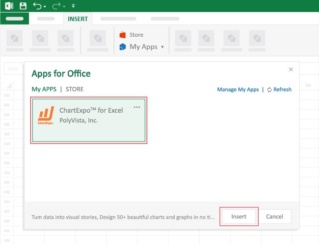
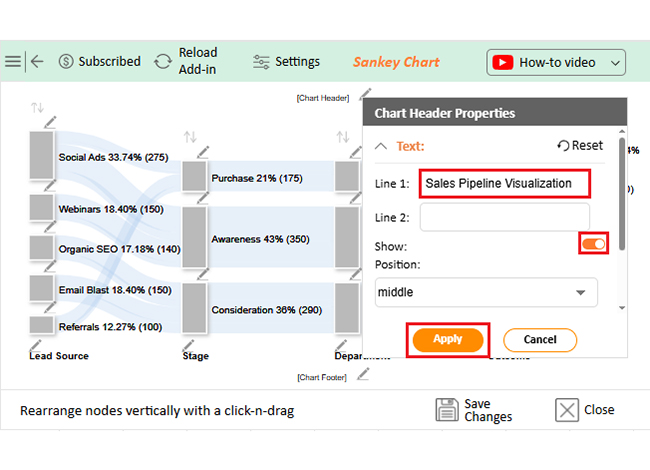
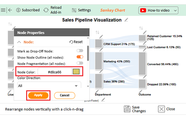
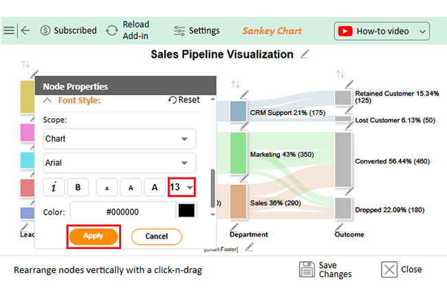
Which Graphs are Used in Presentations?

Charts vary. And so should your choice. Each chart presentation needs to match the goal of the message.

Here’s a quick breakdown:

  • Bar chart: Ideal for comparing categories. Think sales by region.
  • Stacked bar diagram: Use this to show parts of a whole. Great for survey breakdowns.
  • Funnel chart: Perfect for showing steps in a sales or marketing process.
  • Pie chart: Good for proportion, but not for comparing multiple groups.
  • Radar chart: Helps plot performance across different metrics.
  • Box and whisker plot: Highlights distribution and outliers in a dataset.
  • Slope chart: Shows the change between two points clearly.
  • Pareto chart: Combines bars and lines to show frequency and importance.
  • Likert scale: Useful for survey answers on agreement levels.

Graphs for presentations must balance clarity and depth. Overload the chart, and your message gets lost.

A bar graph works well to compare values across categories. But if your message is about variation, go with a slope chart.

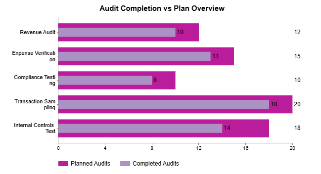
Use a stacked bar diagram to show parts of a whole across groups. Every data set tells a different story. Let the graph match the story.

Examples of Graphs for Presentations

Let’s look at real examples where chart presentation made the difference.

  • A funnel chart tracks drop-offs across sales steps. It helps spot where interest fades.
  • A Likert scale chart maps customer opinions. “Strongly agree” to “Strongly disagree,” laid out in color.
  • A radar chart compares marketing metrics. You can track engagement, leads, and ROI — all in one view.
  • A slope chart shows revenue growth between years. One glance tells you if the business has improved.
  • A box and whisker plot highlights performance spread. HR can spot top performers instantly.

A slope chart compares changes between two points in time. You don’t need a paragraph of numbers. One visual does the job.

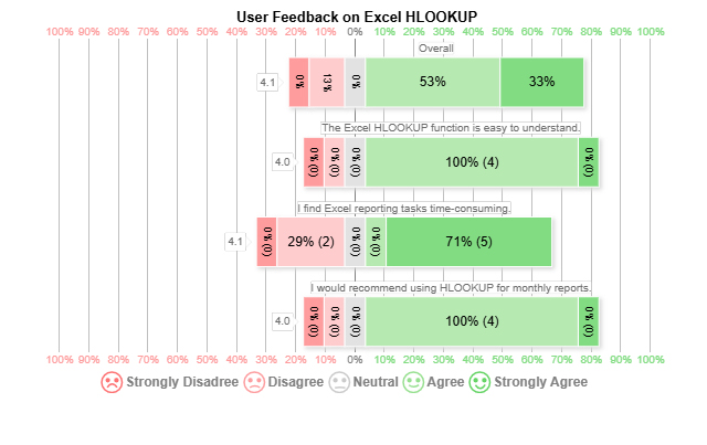
A Likert scale chart maps agreement levels in surveys. It’s clear. No confusion.

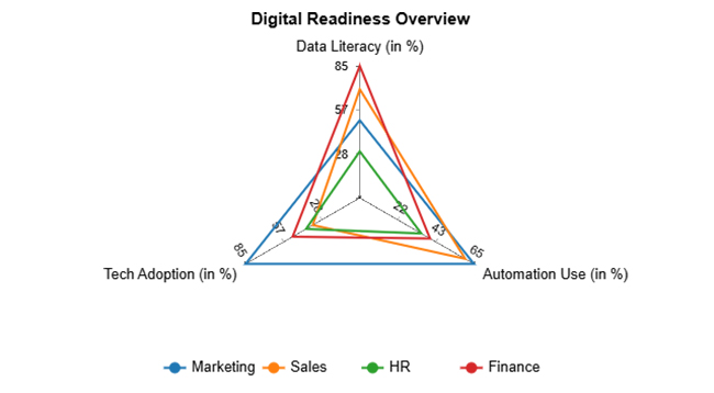
A radar chart maps metrics on multiple axes for performance review. Each example builds clarity through visuals. That’s the power of a smart chart presentation.

How to Select a Presentation Graph?

Choosing the right presentation graph starts with knowing your data.

First, ask what type of data you have. Is it time-based? Categorical? Continuous? Your choice depends on that.

Second, figure out your goal. Are you comparing values or showing a trend? If it’s about time, try a line or slope chart. For group comparisons, go with a bar or Pareto chart.

Third, consider the audience. Keep it simple. Your chart presentation should reflect your audience’s needs.

Fourth, check your format. Are you presenting on slides or dashboards? For slides, go for bold fonts and simple layouts. Use one chart per slide.

Lastly, consider interactivity. Google Charts lets you build interactive visuals for live dashboards. If that’s your need, skip static charts.

The right presentation graph depends on what you want to show. Keep it focused. Don’t force your data to fit a fancy chart.

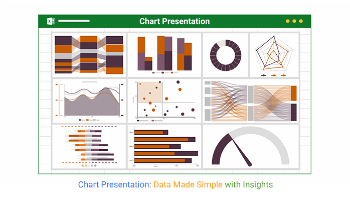
Top 10 ChartExpo Visuals in Excel

Each chart presentation below serves a different role. ChartExpo adds these visuals to Excel with zero code.

  1. Multi-axis line Chart: Shows trends in multiple variables on separate axes.
    Chart Presentation
  2. Sankey Chart: Displays flow and volume from one stage to another.
    Chart Presentation
  3. Comparison Bar Chart: Compares performance over time or between groups.
    Chart Presentation
  4. Likert Scale Chart: Maps survey responses from agree to disagree.
    Chart Presentation
  5. Overlapping Bar Chart: Great for comparing targets vs actuals.
    Chart Presentation
  6. Multi Axis Spider Chart: Tracks multiple performance areas.
    Chart Presentation
  7. Progress Circle Chart: Shows completion status of goals or KPIs.
    Chart Presentation
  8. Mosaic Plot Chart: Visualizes proportions in categorical data.
    Chart Presentation
  9. Scatter Plot Chart: Maps relationships between two variables.
    Chart Presentation
  10. Gauge Chart: A dial showing progress toward a goal.
    Chart Presentation

How to Make a Presentation Graph in Excel?

Building a chart presentation in Excel starts with clean data.

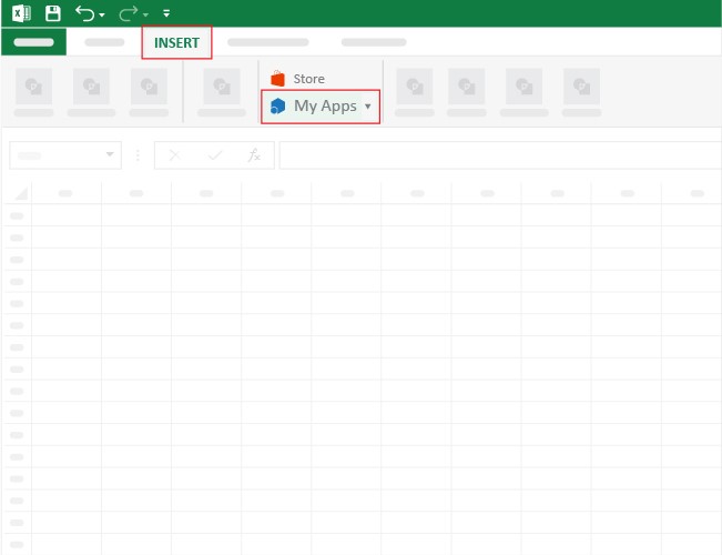
First, create a table. Sort your columns. Highlight your range. Go to the Insert tab. Select your chart: Bar, Line, or Pivot.

To level up, add ChartExpo. This tool offers charts that Excel doesn’t. You get visuals built for presentations. Faster. Cleaner.

Using a graph maker in Excel reduces the time spent formatting.

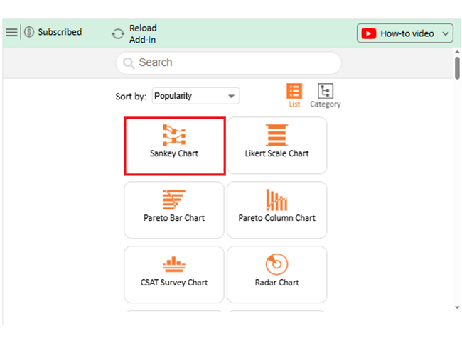
ChartExpo adds smart visuals like Sankey charts, Likert, and Spider charts — no formulas needed.

Step-by-Step Setup With ChartExpo

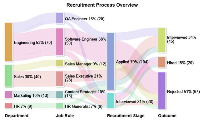
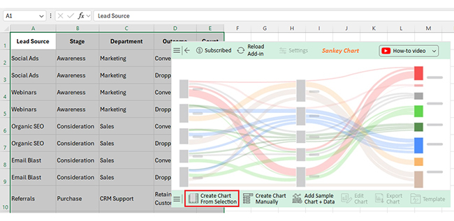
Let’s work through a Sankey Chart example.

We’ll use the following data: lead source, stage, department, outcome, and count. This structure highlights flow, conversion, and drop-off points.

Lead Source  Stage  Department  Outcome  Count 
Social Ads  Awareness  Marketing  Converted  150 
Social Ads  Awareness  Marketing  Dropped  50 
Webinars  Awareness  Marketing  Converted  120 
Webinars  Awareness  Marketing  Dropped  30 
Organic SEO  Consideration  Sales  Converted  100 
  • Open Excel. Click the Insert menu.
Chart Presentation
  • Choose “My Apps.” That opens the add-ins window.
Chart Presentation
  • Search for ChartExpo. Click Add.
  • Once installed, find it in your sheet. Search for “Sankey Chart.”
Chart Presentation
  • Select your data range. Click “Create Chart from Selection.”
Chart Presentation
  • To edit, click “Edit Chart.” Adjust layout, spacing, and labels.
Chart Presentation
  • To rename your chart, click the pencil icon.
Chart Presentation
  • To change the bar color, select the node and choose a color.
Chart Presentation
  • To increase font size, open the font menu and scale up.
Chart Presentation
  • Click “Save” once done.
Chart Presentation
  • You now have a clean, ready-to-use visual.
Chart Presentation

Insights

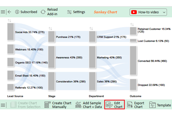
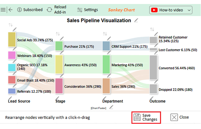
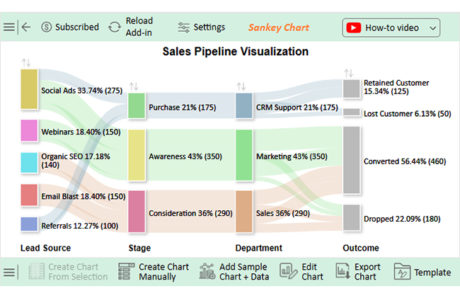
This Sankey chart tells a story worth pausing for.

  • Social Ads dominate lead source share.
    Social Ads account for 33.74% of leads. That’s higher than Webinars and Email Blasts. It suggests paid channels are converting more than expected.
  • Big drop in the middle of the funnel.
    43% of all leads enter the Awareness stage. But only 21% reach Purchase. Mid-funnel needs fixing.
  • Marketing leads the load.
    Marketing handles 43% of the total leads. Sales follow at 36%. CRM Support trails at 21%. Resource allocation may need a second look.
  • Too many leads are lost before purchase.
    Over 22% drop before buying. Another 6% churn after purchase. That’s lost revenue you can’t ignore.

How To Download and Use Best Charts for Presentations?

Excel comes packed with charts. If you have 2016 or newer, you already have Funnel, Waterfall, Radar, and more.

No need to install anything. Just open Excel and pick the chart.

For older versions, upgrade through Microsoft 365 to access the full set. After you make the chart, right-click and “Save as Picture” to use in slides.

These are the best charts for presentations with clean layouts. Keep them simple. Highlight one message per chart.

A Pareto chart helps prioritize issues based on frequency.

How to Present Graphs in PowerPoint?

A great chart falls flat without the right delivery.

Here’s how to nail it:

  • Title for insight: Don’t write “Bar Chart.” Write “Sales Fell After Q2.”
  • One chart per slide: No clutter. Focus wins attention.
  • Call out insights: Use arrows or labels to guide eyes.
  • Use color smartly: High contrast helps with visibility.
  • Embed pivot charts: Let your slides stay dynamic.

Embedding a pivot chart gives you filtering options within your slide. It keeps the content flexible.

Benefits of PowerPoint Presentation Graphs

A PowerPoint presentation graph helps retain audience attention.

People forget numbers. They remember images. Good visuals boost retention.

Charts help break down hard ideas. They make data easier to explain.

Clear graphs also show you’re prepared. It builds trust. You don’t look messy. You look sharp.

A chart gives insights quickly than a table vs a chart view. One glance and people get the point. That’s what matters in meetings.

FAQs

How to Make a Chart Presentation?

Find your key data. Pick the right chart. Build it in Excel or ChartExpo. Paste into PowerPoint. Add clear labels.

How to Present a Chart Effectively?

Tell a story. Highlight one message. Use color and labels to guide focus. Keep your format consistent.

Wrap-up

Your chart presentation can shape how people understand data. It’s not just about drawing graphs. It’s about telling the right story with them.

Whether you’re building in Excel or using ChartExpo visuals, always choose what fits your audience. Let the chart explain the message. Don’t make them work for it.

Build every chart presentation to support your message. Strip away fluff. Point to insight.

Your next chart could be the reason someone finally gets it. Keep it simple. Make it speak.

How much did you enjoy this article?

ExcelAd1
Start Free Trial!
153187

Related articles

next previous
Data Analytics9 min read

How to Create Analytical Report Template in Excel?

Discover ready-to-use Analytical Report Templates that simplify data analysis, highlight trends, and provide actionable business insights.

Data Analytics8 min read

Real Estate Financial Planning Explained Through Charts

Real Estate Financial Models help you project income, expenses, and returns to make better property investment decisions in Google Sheets.

Data Analytics7 min read

Quality KPIs: A Practical Approach to Tracking Success

Quality KPIs help you measure, track, and improve product and service performance for consistent results and higher customer satisfaction.

Data Analytics8 min read

How to Prioritize Tasks for Better Productivity and Insights

How to Prioritize Tasks in Google Sheets with practical steps, charts, and examples to organize work, reduce stress, and achieve better results.

Data Analytics13 min read

Monthly Finance Report with Charts for Better Insights

Learn what a monthly finance report is, why it matters, and how to create one to track business performance and make informed financial decisions.

ChartExpo logo

Turn Data into Visual
Stories

CHARTEXPO

  • Home
  • Gallery
  • Videos
  • Services
  • Pricing
  • Contact us
  • FAQs
  • Privacy policy
  • Terms of Service
  • Sitemap

TOOLS

  • ChartExpo for Google Sheets
  • ChartExpo for Microsoft Excel
  • Power BI Custom Visuals by ChartExpo
  • Word Cloud

CATEGORIES

  • Bar Charts
  • Circle Graphs
  • Column Charts
  • Combo Charts
  • Comparison Charts
  • Line Graphs
  • PPC Charts
  • Sentiment Analysis Charts
  • Survey Charts

TOP CHARTS

  • Sankey Diagram
  • Likert Scale Chart
  • Comparison Bar Chart
  • Pareto Chart
  • Funnel Chart
  • Gauge Chart
  • Radar Chart
  • Radial Bar Chart
  • Sunburst Chart
  • see more
  • Scatter Plot Chart
  • CSAT Survey Bar Chart
  • CSAT Survey Chart
  • Dot Plot Chart
  • Double Bar Graph
  • Matrix Chart
  • Multi Axis Line Chart
  • Overlapping Bar Chart
  • Control Chart
  • Slope Chart
  • Clustered Bar Chart
  • Clustered Column Chart
  • Box and Whisker Plot
  • Tornado Chart
  • Waterfall Chart
  • Word Cloud
  • see less

RESOURCES

  • Blog
  • Resources
  • YouTube
SIGN UP FOR UPDATES

We wouldn't dream of spamming you or selling your info.

© 2025 ChartExpo, all rights reserved.