• Home
  • Tools dropdown img
    • Spreadsheet Charts

      • ChartExpo for Google Sheets
      • ChartExpo for Microsoft Excel
    • Power BI Charts

      • Power BI Custom Visuals by ChartExpo
    • Word Cloud

  • Charts dropdown img
    • Chart Category

      • Bar Charts
      • Circle Graphs
      • Column Charts
      • Combo Charts
      • Comparison Charts
      • Line Graphs
      • PPC Charts
      • Sentiment Analysis Charts
      • Survey Charts
    • Chart Type

      • Box and Whisker Plot
      • Clustered Bar Chart
      • Clustered Column Chart
      • Comparison Bar Chart
      • Control Chart
      • CSAT Survey Bar Chart
      • CSAT Survey Chart
      • Dot Plot Chart
      • Double Bar Graph
      • Funnel Chart
      • Gauge Chart
      • Likert Scale Chart
      • Matrix Chart
      • Multi Axis Line Chart
      • Overlapping Bar Chart
      • Pareto Chart
      • Radar Chart
      • Radial Bar Chart
      • Sankey Diagram
      • Scatter Plot Chart
      • Slope Chart
      • Sunburst Chart
      • Tornado Chart
      • Waterfall Chart
      • Word Cloud
    • Google Sheets
      Microsoft Excel
  • Services
  • Pricing
  • Contact us
  • Blog
  • Support dropdown img
      • Gallery
      • Videos
      • Contact us
      • FAQs
      • Resources
    • Please feel free to contact us

      atsupport@chartexpo.com

Categories
All Data Visualizations Data Analytics Surveys
Add-ons/
  • Google Sheets
  • Microsoft Excel
  • Power BI
All Data Visualizations Data Analytics Surveys
Add-ons
  • Google Sheets
  • Microsoft Excel
  • Power BI

We use cookies

This website uses cookies to provide better user experience and user's session management.
By continuing visiting this website you consent the use of these cookies.

Ok

ChartExpo Survey


Home > Blog > Power BI

How to Create Calendar Table in Power BI?

A calendar table in Power BI plays a pivotal role in enabling effective data-based analysis. This table organizes temporal data, facilitating seamless tracking, visualization, and interpretation of time-related metrics within reports.

Calendar Table in Power BI

In this article, we will define a calendar table in Power BI. We’ll then look at why calendar tables are important in Power BI. We’ll also learn the benefits of using a calendar table. Eventually, delve into how to create a Power BI calendar table using a comparison bar chart.

Table of Contents:

  1. What is a Calendar Table in Power BI?
  2. Why is Using Calendar Tables Important in Power BI?
  3. The Use of Calendar Table in Power BI
  4. How to Create a Calendar Table in Power BI?
  5. Benefits of Using a Calendar Table
  6. Wrap Up

First…

What is a Calendar Table in Power BI?

A calendar table in Power BI is a specialized data table. It’s also known as a date table or date dimension table.

It is designed to organize and manage date-related information.

It includes columns with various date attributes, such as day, month, quarter, and year. A Power BI calendar table serves as a cornerstone for time-based analysis within Power BI reports. It enables users to create dynamic visualizations, filter data, and perform calculations based on dates.

The calendar table provides a structured approach to handling temporal data. This facilitates the creation of insightful and interactive reports.

Why is Using Calendar Tables Important in Power BI?

By setting up a properly configured Power BI calendar table, you unlock several powerful features. This can take your data analysis to new heights. The following are reasons why using a calendar table in Power BI is important:

·        Quickly Drill Down or Roll Up Your Data Analysis Across Different Periods

Calendar tables provide a structured way to represent date hierarchies, such as years, quarters, months, and days. The hierarchical structure allows for efficient data analysis across various periods.

  • Ensure that your analysis accurately reflects your organization’s unique fiscal periods

Many organizations operate on custom financial calendars, for example, September to September. With a calendar table, you can define and implement custom fiscal calendars. This ensures that your analysis accurately reflects your organization’s unique financial periods.

  • Holiday and Event Marking

Identifying and accounting for holidays, events, or special dates is crucial in industries like retail, hospitality, and finance.

Calendar tables enable the inclusion of special dates in analysis. This allows companies to provide valuable insights that may be difficult to detect otherwise.

  • Derive Deep Insights Into Time-Based Data

Power BI’s DAX language offers a suite of time intelligence functions that work seamlessly with calendar tables. These functions empower you to perform sophisticated calculations, for example:

    • such as year-over-year comparisons,
    • running totals,
    • and period-over-period changes.

This helps provide deep insights into your time-based data.

  • Consistent Date Formatting

Centralizing date information in a calendar table ensures consistent date formatting across all reports and dashboards.

This consistency not only enhances the user experience but also streamlines your data governance processes.

The Use of Calendar Table in Power BI

The calendar table stands as a foundational element in Power BI. It serves as a cornerstone for time intelligence functions, facilitating robust analysis and visualization of temporal data.

Let’s delve into how a calendar table enhances the efficacy of Power BI reports and dashboards.

  • Enabling Time-Based Analysis

A calendar table empowers users to perform time-based analysis effortlessly. Analysts can gain valuable insights across various time dimensions. This is because you can incorporate a wide range of dates, from the past to the future.

You can work with daily, weekly, monthly, or yearly data. The calendar table serves as a fundamental framework for organizing temporal data, thereby facilitating meaningful analysis.

  • Seamless Integration with Time Intelligence Functions

Power BI offers an array of powerful time intelligence functions that leverage the calendar table to perform sophisticated calculations.

These include TOTALYTD, SAMEPERIODLASTYEAR, and DATEADD. These functions rely on the calendar table’s structure to accurately compute metrics such as year-to-date sales, comparative performance, and moving averages.

This seamless integration streamlines the analytical process, enabling users to derive actionable insights with precision and efficiency.

  • Supporting Customized Reporting Periods

Power BI users often require flexibility in defining reporting periods based on business requirements.

The calendar table allows users to define custom fiscal calendars, fiscal years, or specific reporting periods.

This flexibility empowers users to adapt analytical frameworks according to unique business scenarios. This enhances the relevance and applicability of insights derived from Power BI reports.

  • Enhancing Visualization Capabilities

Effective visualization is pivotal in conveying insights derived from data analysis. The calendar table enriches Power BI visualizations by providing a structured timeline for plotting temporal data.

Calendar tables allow for the creation of various visualizations, strengthening visual storytelling. You can create trend analysis charts, time series plots, and date-based aggregations.

How to Create a Calendar Table in Power BI?

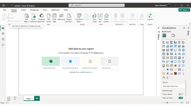
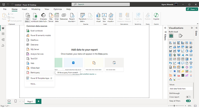
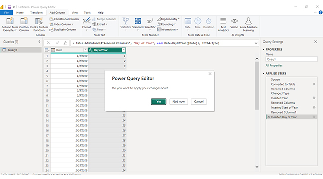
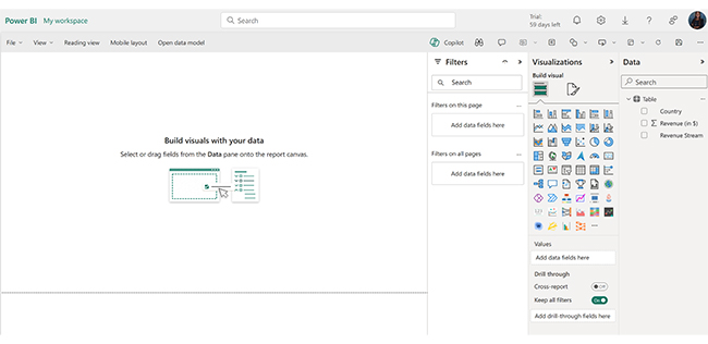
In this section, we learn more about how to create a calendar table in Power BI.

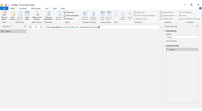
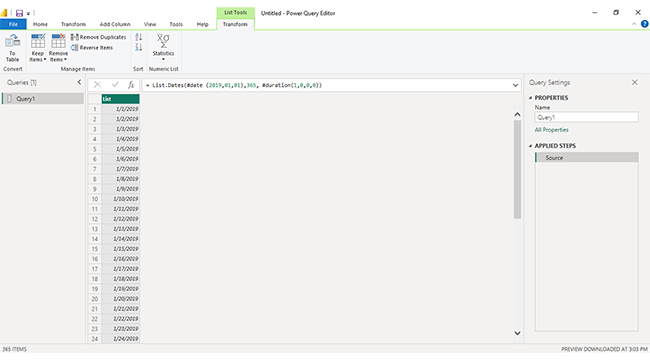
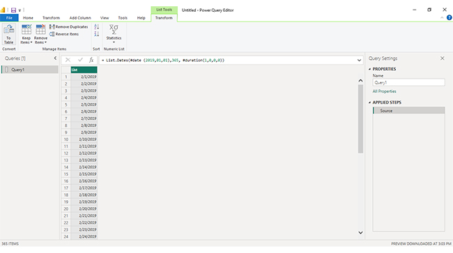
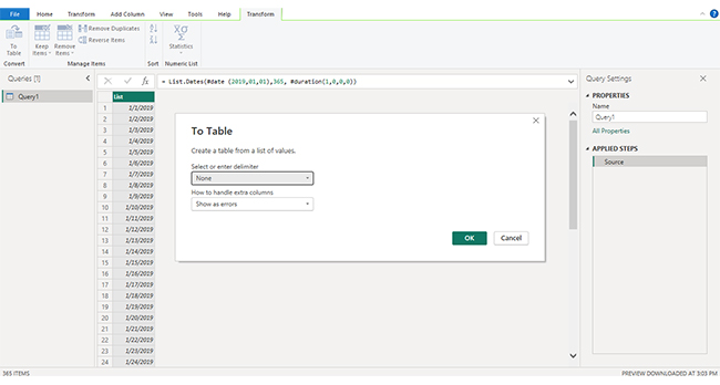
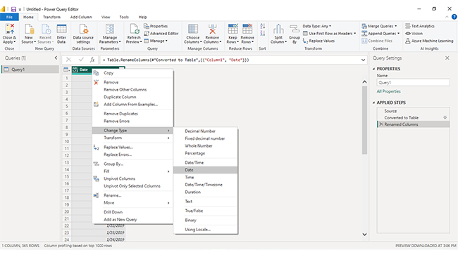
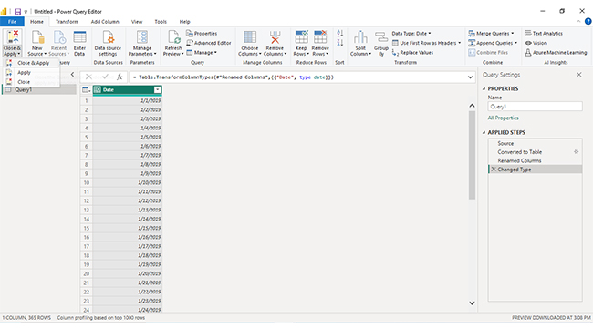
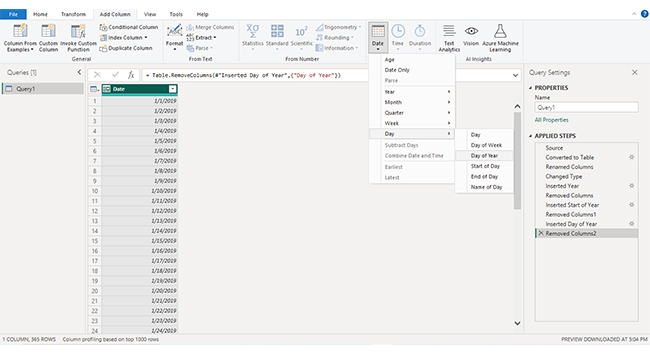
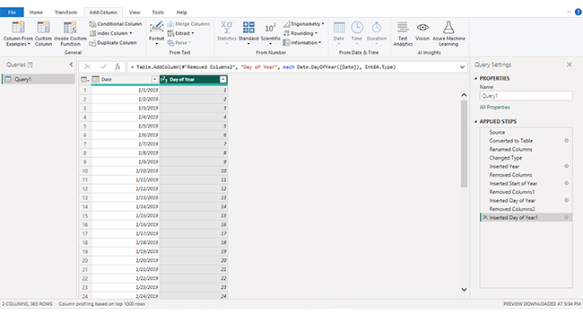
There are two ways to create a calendar table in Power BI. You can use Power Query or DAX.

Let’s look at how to create a calendar table.

Stage 1: Access Power BI Desktop

  • You can find an updated version of Power BI Desktop in the Microsoft Store.
  • Once you update, you should see Power BI Desktop.
Open Power BI Desktop for Adding Calendar Table in Power BI
  • Click “Open.”
  • Power BI Desktop should automatically sign you in.
Power BI Desktop Sign In Page for Adding Calendar Table in Power BI
  • Click “New” and then “Report.”
  • The Power BI Desktop window opens.

Stage 2: Create a Calendar Table

  • Click “Get Data.”
Get Data for Adding Calendar Table in Power BI
  • Click “Blank query.”
Click Blank Query for Adding Calendar Table in Power BI
  • You should access the Power Query editor.
Power BI Query Editor for Adding Calendar Table in Power BI
  • Type the query:
    • = List.Dates(#date (2019,01,01),365, #duration(1,0,0,0))
  • This should create one column with 2019 dates (January to December).
  • Click “Enter.”
Add Calendar Table in Power BI
  • Click “To Table” under “Convert.”
To Table for Adding Calendar Table in Power BI
  • Click “OK” since we are not choosing any delimiter.
Choose Delimiter for Adding Calendar Table in Power BI
  • Double-click on the column name, “Column1,” to change the name of the column to “Date.”
  • Click “Enter.”
  • Right-click on the “Date” column.
Name Date for Adding Calendar Table in Power BI
  • Scroll down to “Change Type.”
  • Choose “Date.”
  • This ensures that the column data has the date type.
  • Choose “Close and Apply” under “Close.”
Apply Changes for Adding Calendar Table in Power BI
  • Choose “Close & Apply.”
  • This saves the changes to your report view.
  • You should see your Calendar Table data under “Data.”
  • You can add columns in your calendar table to help with your data visualization.
  • To add a day of the year column, for example, go to “Transform Data.”
Transform Data for Adding Calendar Table in Power BI
  • Then “Add Column”.
  • Choose “Day” and then “Day of Year”.
Select Day of Year for Adding Calendar Table in Power BI
  • A column with the day of the year is added.
Day of Year is Added for Adding Calendar Table in Power BI
  • Save changes.
Save Changes for Adding Calendar Table in Power BI
  • You should see your Calendar Table data under “Data.”
Calendar Table Data for Adding Calendar Table in Power BI
  • The date column in your calendar table must have unique values. This will ensure that your date table works properly with time intelligence functions in Power BI.

Stage 3: Drawing a Comparison Bar Chart With ChartExpo’s Power BI Extension

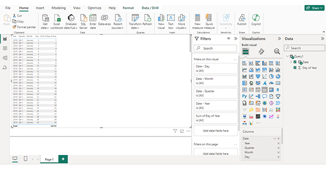
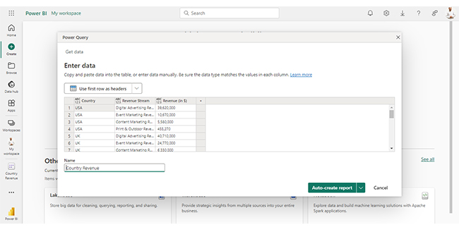
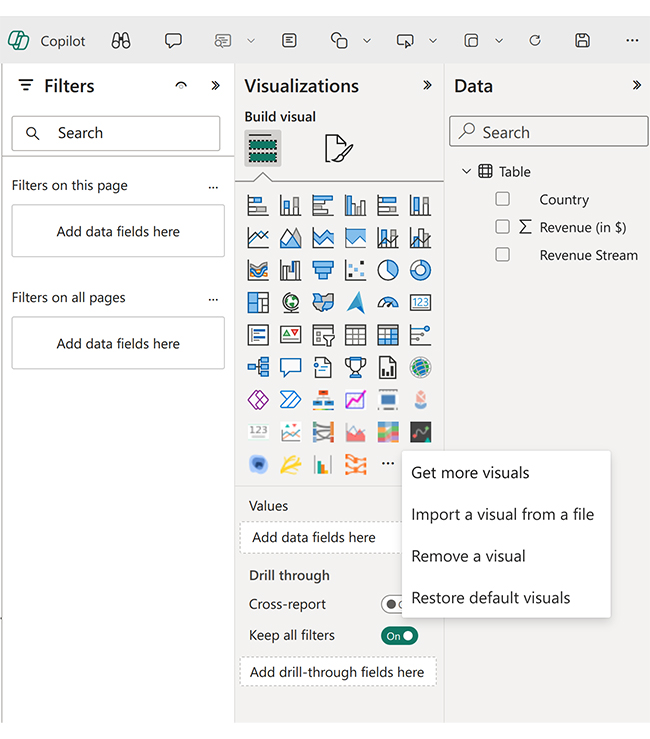
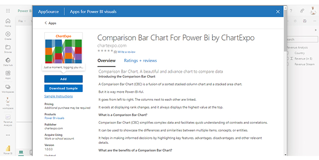
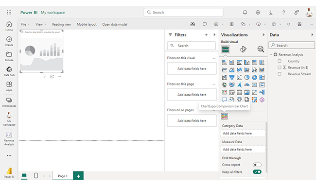
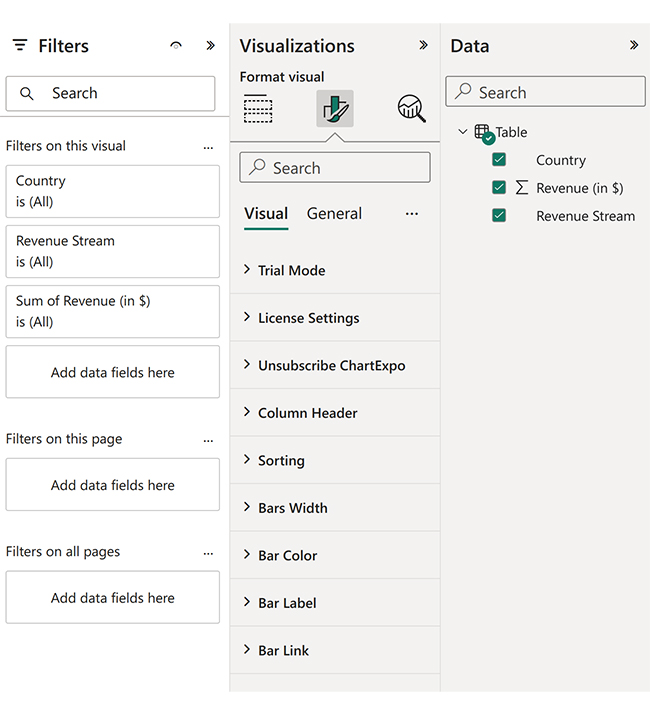
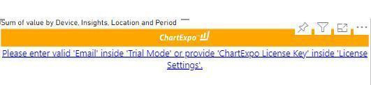
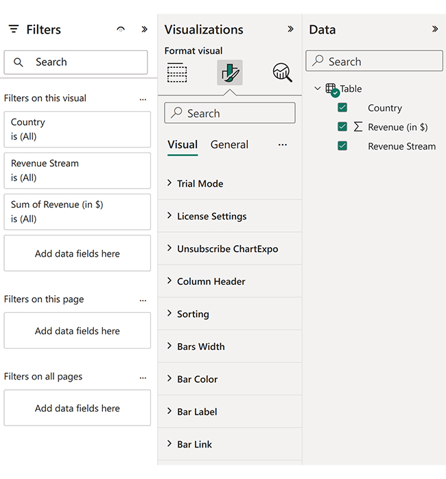
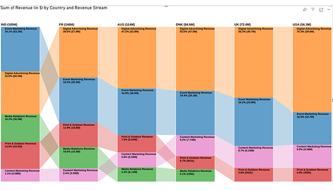
You can use a calendar table in Power BI within other visualizations, for example, the Comparison Bar Chart.

Create the Data to Use in Your Comparison Bar Chart

  • Click on the “Create” option on the left-side menu.
  • Select “Paste or manually enter data.”
select Paste or manually enter data in Power BI ce487
  • We’ll use the following sample data for this example:
Country Revenue Stream Revenue  (in $)
USA Digital Advertising Revenue           39,620,000
USA Event Marketing Revenue           10,670,000
USA Content Marketing Revenue             5,580,000
USA Print & Outdoor Revenue                 455,270
UK Digital Advertising Revenue           40,710,000
UK Event Marketing Revenue           24,770,000
UK Content Marketing Revenue             6,330,000
UK Print & Outdoor Revenue                 552,190
DNK Digital Advertising Revenue           47,040,000
DNK Event Marketing Revenue           29,070,000
DNK Content Marketing Revenue             7,740,000
DNK Print & Outdoor Revenue                 600,690
DNK Media Relations Revenue                 106,430
AUS Digital Advertising Revenue           53,790,000
AUS Event Marketing Revenue           38,530,000
AUS Content Marketing Revenue             6,590,000
AUS Print & Outdoor Revenue             9,040,000
AUS Media Relations Revenue             6,130,000
FR Digital Advertising Revenue           57,860,000
FR Event Marketing Revenue           50,450,000
FR Content Marketing Revenue             3,560,000
FR Print & Outdoor Revenue           18,790,000
FR Media Relations Revenue           15,460,000
IND Digital Advertising Revenue           60,470,000
IND Event Marketing Revenue           63,200,000
IND Content Marketing Revenue             2,080,000
IND Print & Outdoor Revenue           29,500,000
IND Media Relations Revenue           30,020,000
  • Paste the above data table into the “Power Query” window.
  • Select the “Create a dataset only” option.
Create a Dataset Only After Adding Calendar Table in Power BI
  • Click on the “Data Hub” option on the left-side menu.
  • Power BI populates the data set list. (If you have not created a data set, refer to the Error! Reference source not found section.)
  • You can click on “Create Report.”
Create Report After Adding Calendar Table in Power BI
  • The report window opens.
Report Window After Adding Calendar Table in Power BI
  • You’ll select the columns to use in your visualization from the “Data” pane.
  • Click on “Get more visuals”.
Click Get More Visuals After Adding Calendar Table in Power BI
  • The Power BI visuals pane opens.
Power BI Visuals Pane After Adding Calendar Table in Power BI
  • Search for ChartExpo and choose “Comparison Bar Chart”.
Choose Comparison Bar Chart After Adding Calendar Table in Power BI
  • Click on “Add.”
Click Add Button After Adding Calendar Table in Power BI
  • You can now see the Comparison Bar Chart in the visuals list.
Comparison Bar Chart Visual List After Adding Calendar Table in Power BI
  • Select the “ChartExpo Comparison Chart” icon in the visualization panel.
  • The following window opens in the report section of your dashboard:
Select ChartExpo Comparison Bar Chart icon After Adding Calendar Table in Power BI
  • You can resize the visual as needed.
  • Navigate to the right side of your Power BI dashboard. You should see “Fields” next to “Visualizations.”
  • You’ll select the fields to use in your Comparison Bar Chart here.
Select Fields in Comparison Bar Chart After Adding Calendar Table in Power BI
  • Select the fields in the following sequence:
    • Country
    • Revenue
    • Revenue Stream
  • You’ll be asked for a ChartExpo license key or email address.
Asked License Key After Adding Calendar Table in Power BI
  • Select the middle icon, “Format visual.”
Format Visual After Adding Calendar Table in Power BI
  • The visual properties will be populated as shown below.
Visual Properites After Adding Calendar Table in Power BI
  • If you are a new user,
    • Type in your email under the section titled “Trial ”
    • This should be the email address that you used to subscribe to the ChartExpo add-in. It is where your ChartExpo license key will be sent.
    • Ensure that your email address is valid.
    • Click “Enable Trial.” You’ll get a 7-day trial.
Enable Trial After Adding Calendar Table in Power BI
  • You should receive a welcome email from ChartExpo.
  • If you have obtained a license key:
    • Enter your license key in the “ChartExpo License Key” textbox in the “License Settings” section (see below).
    • Slide the toggle switch next to “Enable License” to “On.”
Enable License After Adding Calendar Table in Power BI
  • You should now have a final comparison bar chart.
Final Calendar Table in Power BI

Insights

  • India has the highest total revenue, closely followed by France, Australia, and then Denmark.
  • In most countries, “Digital Advertising” tends to be a significant revenue contributor, but in India, “Event Marketing” is leading.
  • The US and UK do not have any revenue from “Media Relations”.
  • France has a lower contribution from content marketing compared to other revenue streams. India has the lowest revenue from content marketing despite its overall high revenue.

Benefits of Using a Calendar Table

In this section, we explore the benefits that using a calendar table in Power BI brings to your Power BI projects:

  • Effortlessly Slice and Dice Your Data Based on Specific Periods

Calendar tables streamline the use of time intelligence functions in Power BI. Functions like TOTALYTD, SAMEPERIODLASTYEAR, and many others become much more manageable with a dedicated calendar table.

A calendar table simplifies data analysis by allowing easy data slicing and dilution by day, month, quarter, or year. This eliminates the need for complex DAX formulas.

  • Ensuring Uniformity and Accuracy in Your Analyses

One of the challenges in analyzing time-based data is maintaining consistency across different levels of date hierarchies.

With a calendar table, you can establish a standardized hierarchy that aligns with your reporting needs. This ensures uniformity and accuracy in analyses.

  • Enhancing Forecasting Capabilities

Forecasting future trends is a crucial aspect of data analysis. It’s also useful in business decision-making.

Incorporating a calendar table into your Power BI model paves the way for sophisticated forecasting techniques.

  • Facilitating Date-Based Filtering and Slicing

Efficient data exploration often involves filtering and slicing data based on specific date ranges. A calendar table allows for easy data filtering by day, month, quarter, or year.

This capability is invaluable when conducting comparative analysis, identifying trends, or investigating anomalies within distinct periods.

FAQs

What is the Function of Calendar Table in DAX?

A calendar table plays a crucial role in enabling time intelligence calculations and analysis using DAX.

It is a separate date dimension table that contains a continuous range of dates. They often span several years. Its primary function is to serve as a central date dimension that other tables can reference for date-related calculations and filtering.

The calendar table typically includes columns for different date parts. For example year, quarter, month, day, and any additional date attributes you might need for your analysis.

This structured date dimension allows you to perform time-based calculations and create relationships between your fact tables and the calendar table.

What is the Difference Between CALENDAR and CALENDARAUTO  in DAX?

CALENDAR and CALENDARAUTO are both used to generate date tables. They, however, differ in terms of their approach and flexibility.

The CALENDAR function in DAX allows you to create a date table by specifying the start and end dates. You can also specify additional columns or attributes.

Here’s the syntax:

CALENDAR(START_DATE, END_DATE, [COLUMNS])

The CALENDARAUTO function, on the other hand, is a more automated approach to creating a date table. It automatically generates a date table based on the date range found in your data model.

The syntax is simpler:

CALENDARAUTO()

Do I Need a Date Table in Power BI?

You almost always need a dedicated date table when working with time-based data in Power BI.

It’s possible to perform basic date filtering and grouping without a date table.

However, you’ll quickly run into limitations when attempting more advanced date-based calculations or handling complex date scenarios.

Wrap Up

Throughout this article, we defined a calendar table in Power BI. We explored its significance in unlocking advanced analytical capabilities.

We learned how to create a Power BI calendar table. We familiarize ourselves with the steps involved in setting up this essential component.

Leveraging a calendar table in Power BI offers numerous benefits. It empowers users to quickly drill down or roll up data analysis across different periods. It also ensures an accurate representation of an organization’s unique fiscal calendars.

Additionally, calendar tables facilitate holiday and event marking. You can also derive deep insights into time-based data and ensure consistent date formatting.

By incorporating a calendar table into your Power BI data model, you gain the ability to perform sophisticated time intelligence calculations.

This seamless integration streamlines the analytical process, enabling you to derive actionable insights with precision and efficiency.

By leveraging this powerful tool, you can create insightful and visually compelling reports that drive informed decision-making.

How much did you enjoy this article?

PBIAd2
Start Free Trial!
135365

Related articles

next previous
Power BI12 min read

Power BI Group By Guide for Effective Data Insights

Learn how Power BI Group By helps you aggregate data, clarify trends, and create reports by grouping values to make large datasets manageable & insightful.

Power BI12 min read

How to Create Sankey Diagram in Microsoft Power BI?

Learn How to Create Sankey Diagram in Microsoft Power BI using Desktop & Web Service. What they are and how to use them effectively.

Power BI8 min read

Power BI Artificial Intelligence: Insights Using Visuals

Discover all there is to know about the Power BI artificial intelligence. You'll also discover how AI is used in Power BI, and how to use it for analysis and more.

Power BI9 min read

Budgeting in Healthcare: Use Visuals to Spot Budget Gaps

This guide helps you discover what budgeting in healthcare is. You'll also discover the factors that affect hospital budgets and types of budgeting in healthcare.

Power BI9 min read

Predictive Analytics in Power BI for Making Insightful Visuals

This guide shows you everything you need to know about Predictive Analytics in Power BI. It also shows you how it works, and how to interpret the results.

ChartExpo logo

Turn Data into Visual
Stories

CHARTEXPO

  • Home
  • Gallery
  • Videos
  • Services
  • Pricing
  • Contact us
  • FAQs
  • Privacy policy
  • Terms of Service
  • Sitemap

TOOLS

  • ChartExpo for Google Sheets
  • ChartExpo for Microsoft Excel
  • Power BI Custom Visuals by ChartExpo
  • Word Cloud

CATEGORIES

  • Bar Charts
  • Circle Graphs
  • Column Charts
  • Combo Charts
  • Comparison Charts
  • Line Graphs
  • PPC Charts
  • Sentiment Analysis Charts
  • Survey Charts

TOP CHARTS

  • Sankey Diagram
  • Likert Scale Chart
  • Comparison Bar Chart
  • Pareto Chart
  • Funnel Chart
  • Gauge Chart
  • Radar Chart
  • Radial Bar Chart
  • Sunburst Chart
  • see more
  • Scatter Plot Chart
  • CSAT Survey Bar Chart
  • CSAT Survey Chart
  • Dot Plot Chart
  • Double Bar Graph
  • Matrix Chart
  • Multi Axis Line Chart
  • Overlapping Bar Chart
  • Control Chart
  • Slope Chart
  • Clustered Bar Chart
  • Clustered Column Chart
  • Box and Whisker Plot
  • Tornado Chart
  • Waterfall Chart
  • Word Cloud
  • see less

RESOURCES

  • Blog
  • Resources
  • YouTube
SIGN UP FOR UPDATES

We wouldn't dream of spamming you or selling your info.

© 2025 ChartExpo, all rights reserved.