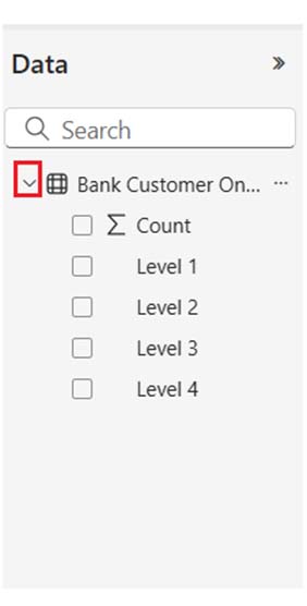
• Home
  • Tools dropdown img
    • Spreadsheet Charts

      • ChartExpo for Google Sheets
      • ChartExpo for Microsoft Excel
    • Power BI Charts

      • Power BI Custom Visuals by ChartExpo
    • Word Cloud

  • Charts dropdown img
    • Chart Category

      • Bar Charts
      • Circle Graphs
      • Column Charts
      • Combo Charts
      • Comparison Charts
      • Line Graphs
      • PPC Charts
      • Sentiment Analysis Charts
      • Survey Charts
    • Chart Type

      • Box and Whisker Plot
      • Clustered Bar Chart
      • Clustered Column Chart
      • Comparison Bar Chart
      • Control Chart
      • CSAT Survey Bar Chart
      • CSAT Survey Chart
      • Dot Plot Chart
      • Double Bar Graph
      • Funnel Chart
      • Gauge Chart
      • Likert Scale Chart
      • Matrix Chart
      • Multi Axis Line Chart
      • Overlapping Bar Chart
      • Pareto Chart
      • Radar Chart
      • Radial Bar Chart
      • Sankey Diagram
      • Scatter Plot Chart
      • Slope Chart
      • Sunburst Chart
      • Tornado Chart
      • Waterfall Chart
      • Word Cloud
    • Google Sheets
      Microsoft Excel
  • Services
  • Pricing
  • Contact us
  • Blog
  • Support dropdown img
      • Gallery
      • Videos
      • Contact us
      • FAQs
      • Resources
    • Please feel free to contact us

      atsupport@chartexpo.com

Categories
All Data Visualizations Data Analytics Surveys
Add-ons/
  • Google Sheets
  • Microsoft Excel
  • Power BI
All Data Visualizations Data Analytics Surveys
Add-ons
  • Google Sheets
  • Microsoft Excel
  • Power BI

We use cookies

This website uses cookies to provide better user experience and user's session management.
By continuing visiting this website you consent the use of these cookies.

Ok

ChartExpo Survey


Home > Blog > Data Analytics

Bank Dashboard: Enhancing Insights Through Data

Bank dashboards provide real-time visual insights into customer behavior, financial performance, and operational metrics. All these help support strategic decision-making.

Bank Dashboard

This guide shows you what a bank dashboard is, why you should use it, and the key features of an effective bank dashboard. You’ll discover how to create a dashboard in Power BI and see executive dashboard examples.

The guide dives deep into the digital dashboard, Power BI KPI dashboard, finance dashboard in Power BI, and business intelligence dashboard. You’ll also discover how the customer relationship management dashboard works, how to create a Power BI dashboard design, and the nitty-gritty that goes into a dashboard user interface design.

Table of Content:

  1. What is a Bank Dashboard?
  2. Why Use an Online Banking Dashboard?
  3. What are the Key Features of an Effective Bank Dashboard?
  4. How many Types of Internet Banking Dashboards?
  5. How to Design a User-Friendly Bank Dashboard?
  6. How to Use a Banker’s Dashboard?
  7. What are the Common Challenges in Building Bank Dashboards?
  8. What are the Best Practices for Implementing Bank Dashboards?
  9. How to Analyze a Banking Dashboard in Power BI?
  10. FAQs
  11. Wrap Up

What is a Bank Dashboard?

A bank dashboard is a visual tool that shows key financial and operational metrics in real time.

Top 4 Essential Charts to Display on a Bank Dashboard

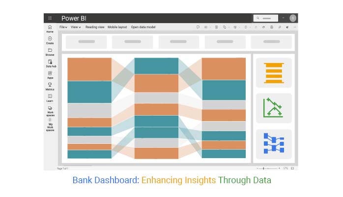
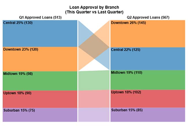
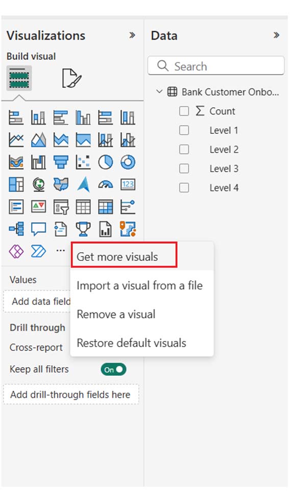
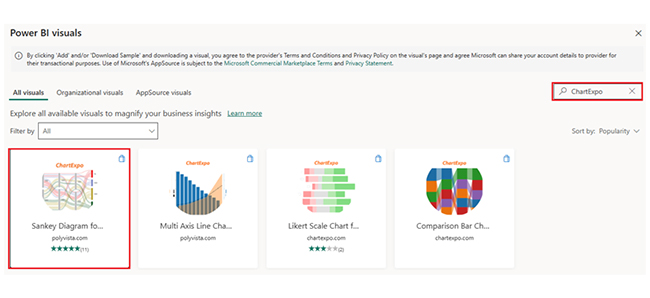
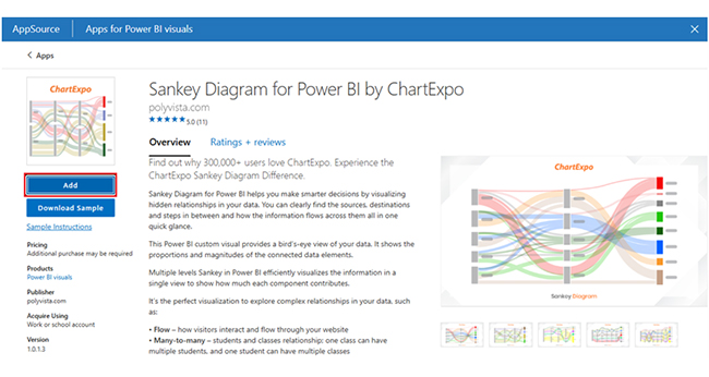
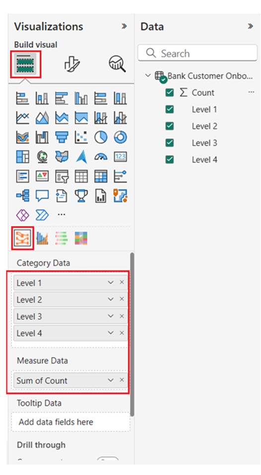
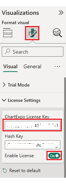
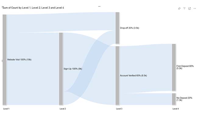
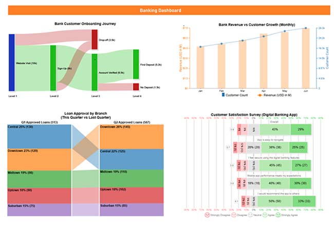
Here are some bank dashboards that can be created using ChartExpo.
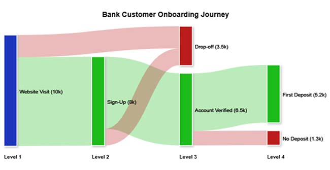
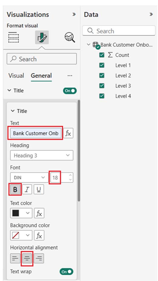
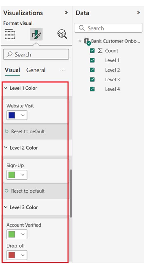
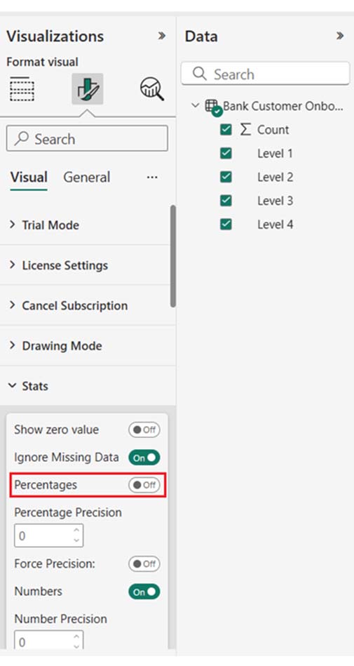
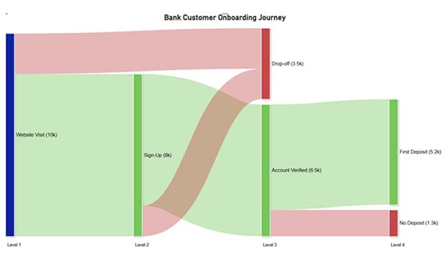
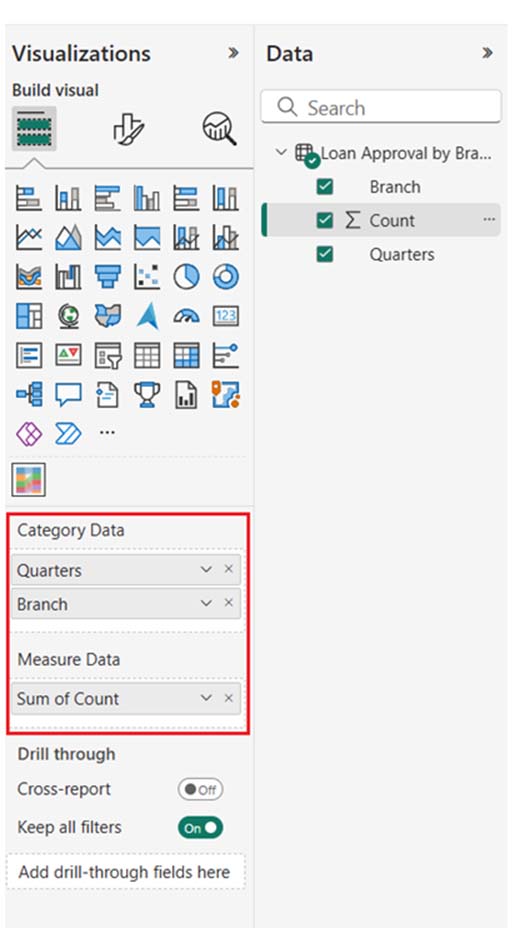
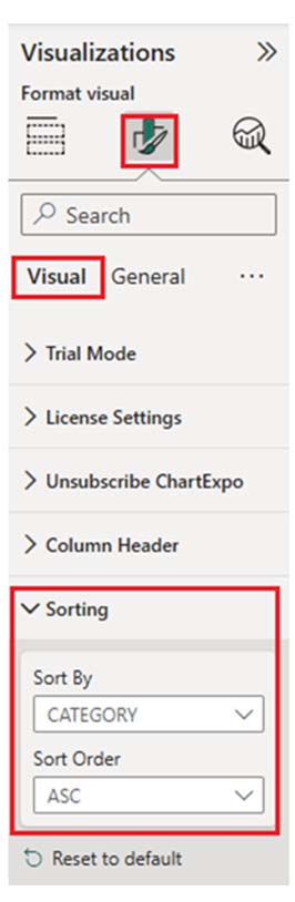
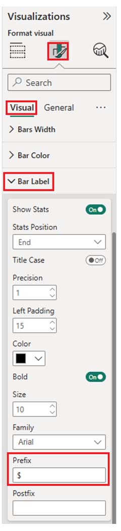
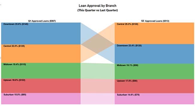
Sankey Chart:

Bank Dashboard 1

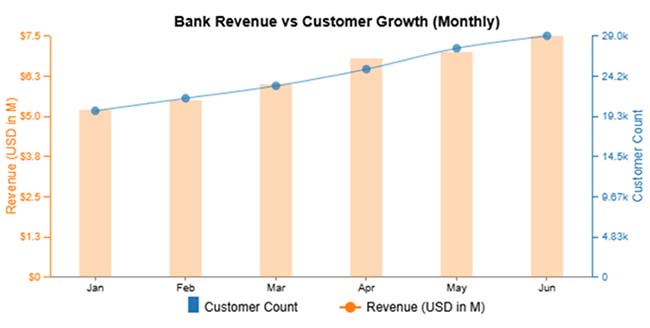
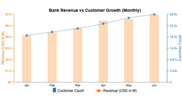
Multi-Axis Line Chart:
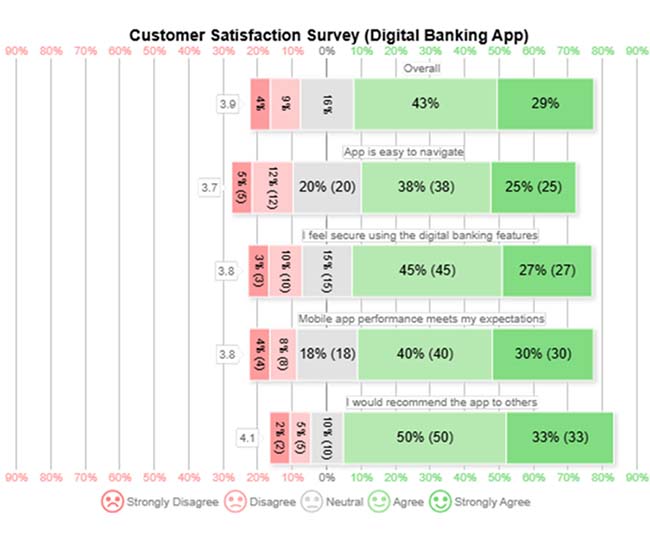
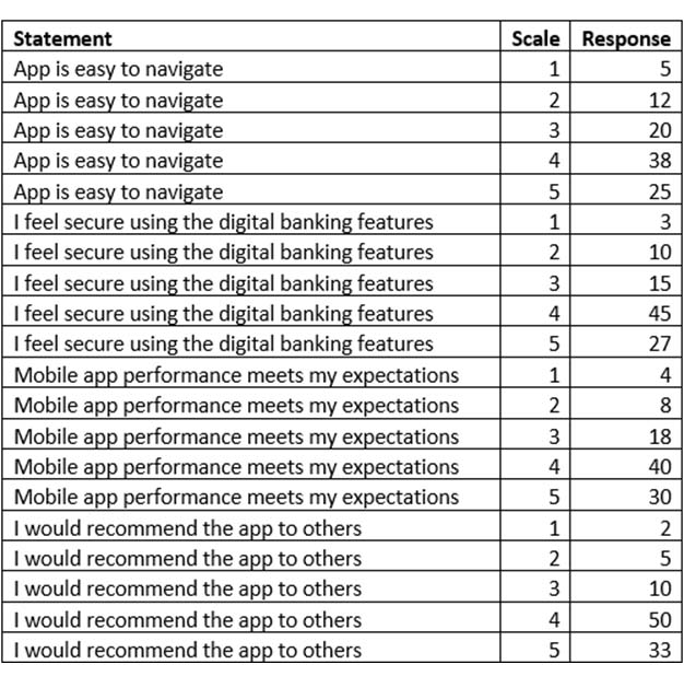
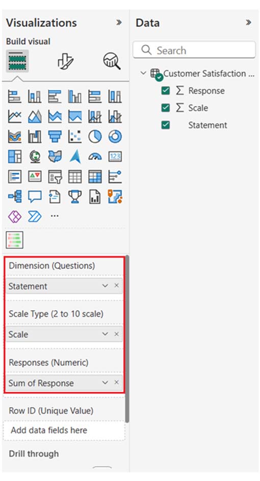
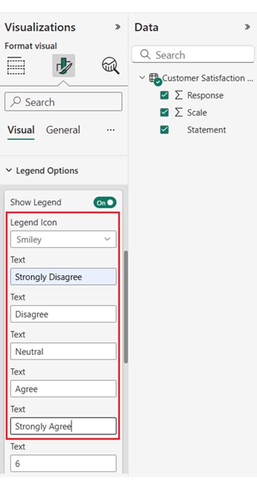
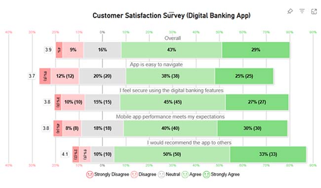
Bank Dashboard 2

Likert Scale Chart:

Bank Dashboard 3

Comparison Bar Chart:

Bank Dashboard 4

Why Use an Online Banking Dashboard?

  • Improved Decision-Making: Executives and managers use data from the banking dashboard to guide strategic budgeting, forecasting, and planning.
  • Operational Efficiency: The Banking dashboard allows banks to reduce costs, optimize workflows, and improve service delivery.
  • Enhanced Customer Insights: Insights obtained from the banking dashboard help banks provide personalized services, customer retention strategies, and cross-selling opportunities.
  • Real-Time Financial Monitoring: Real-time monitoring helps banks track profitability, identify discrepancies, and respond to financial risks.

What are the Key Features of an Effective Bank Dashboard?

  • Customizable KPIs: It allows users to track relevant metrics based on goals and roles.
  • Interactive Visuals: Graphs, charts, and filters to explore data dynamically.
  • Performance Tracking: It monitors branch, employee, or product-level performance.
  • Mobile Accessibility: It enables monitoring from any device.

How many Types of Internet Banking Dashboards?

  • Executive Dashboard: These dashboards help executives make strategic decisions based on real-time trends and data. It displays KPIs like expenses, revenue, growth metrics, and profit margins.
  • Operational Dashboard: These dashboards track operational metrics like account activity, transaction volumes, customer service performance, and loan disbursement. It helps managers improve efficiency and optimize workflows.
  • Customer Analytics Dashboard: These dashboards monitor metrics like loan applications, account usage, customer feedback, and transaction patterns. Banks use them to improve customer retention and personalize services.
  • Financial Performance Dashboard: It focuses on financial data like income statements, balance sheets, and cash flow. It helps decision-makers optimize profitability and manage finances.
  • Risk and Compliance Dashboard: This dashboard monitors compliance with regulations, tracks financial risks, and ensures that the bank adheres to internal controls. Key metrics include fraud detection, loan defaults, and adherence to regulatory standards.

How to Design a User-Friendly Bank Dashboard?

Here are four major steps to help you design a user-friendly bank dashboard.

  • Identify the Target Audience: You need to know who will use the dashboard. Come up with different views for managers, executives, analysts, and customer service teams.
  • Define Key Performance Indicators (KPIs): Select the most relevant KPIs based on your target audience’s needs. These could be loan balances, revenue, customer satisfaction, or transaction volume.
  • Use Simple and Intuitive Visuals: Choose easy-to-understand graphs, charts, and tables that display data. Stick to simplicity for seamless communication.
  • Ensure Mobile Accessibility: Design a mobile-responsive dashboard. This way, users will be able to monitor financial data on the go.

How to Use a Banker’s Dashboard?

  • Log in to the Dashboard: You can access the dashboard through a secure login process.
  • Review Key Metrics: Always review vital KPIs like customer transactions, account balances, loan performance, and revenue.
  • Monitor Financial Health: Check financial reports like expenses, profit margins, and cash flow. This will help you get a good grasp of the bank’s current performance.
  • Track Customer Activity: Analyze data on loan requests, customer accounts, engagement, and transaction volumes to identify trends or opportunities for improvement.
  • Customize Views: You have to tailor the dashboard layout to your role, and focus on the data that’s most relevant to the work.

What are the Common Challenges in Building Bank Dashboards?

Here are the common challenges in building bank dashboards:

  • Data Accuracy: Ensuring data is up-to-date, accurate, and clean is essential for reliable insights.
  • Real-Time Data Processing: Ensuring real-time updates for vital metrics can strain the system’s infrastructure and resources.

Security Concerns: Protecting sensitive financial data and ensuring compliance with regulations like HIPAA and GDPR requires robust security measures.

What are the Best Practices for Implementing Bank Dashboards?

  • Define Clear Objectives: What are the specific goals of the dashboard? Is it for performance tracking, financial monitoring, or customer insights? This ensures that the right metrics are prioritized.
  • Keep It Simple: Always use clean, intuitive designs with easy-to-understand visuals to avoid information overload.
  • Customize for Users: Always give room for customization. And that is based on different user preferences and roles.
  • Focus on Key Metrics: To avoid clutter, you should limit the number of KPIs. Focus on the most important data that drives decision-making.

How to Analyze a Banking Dashboard in Power BI?

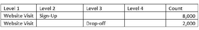
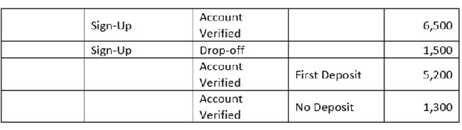
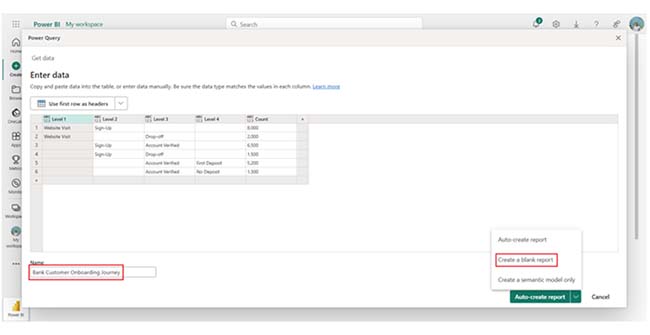
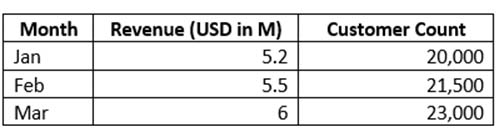
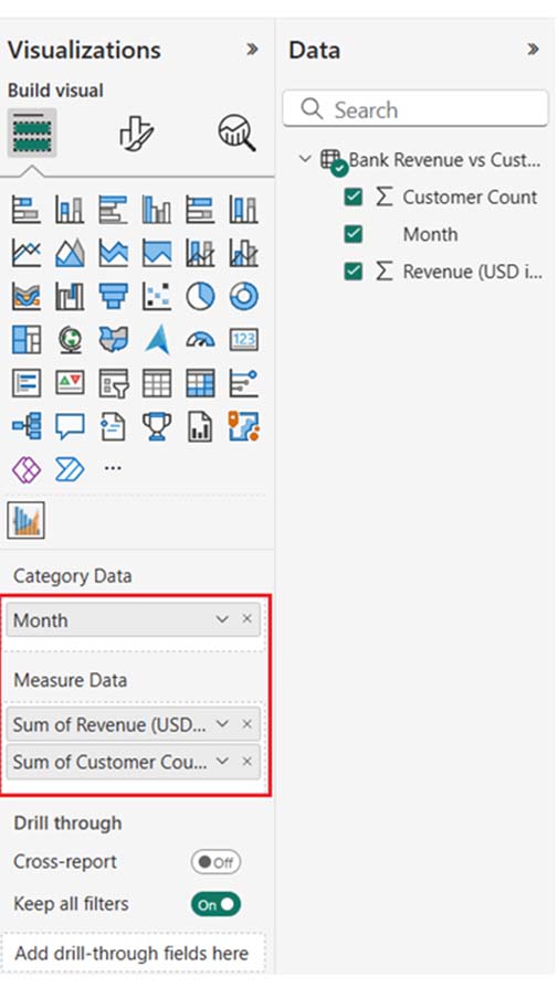
In this section, you’ll see how to create a banking dashboard to provide a comprehensive overview of key financial metrics and operational metrics within the banking sector.

The dashboard consolidates multiple data insights:

  • Bank Customer Onboarding Journey Report (Sankey Diagram)
  • Customer Satisfaction Survey Dashboard (Likert Scale Chart)
  • Bank Revenue vs Customer Group (Multi-Axis Line Chart)
  • Loan Approval by Branch (Comparison Bar Chart)
  • Log in to Power BI, enter your email, and click the “Submit” button.
Social Media Dashboard
  • You’ll be redirected to a Microsoft account. Enter your password, and click “Sign in.”
Social Media Dashboard
  • You can opt to stay signed in.
Social Media Dashboard
  • Create a dataset and select the Data to use in the Required Chart
  • The data table below will be used for the Sankey Diagram in the dashboard.
Data Table 1
Data Table 2
  • To add data to your report, click on the “Paste data into a blank report.”
Social Media Dashboard
  • Paste the data table above into a blank table, name it, and click on the “Create a blank report” button.
Create a blank report
  • Click on “Expand All” to see the chart metrics. After that, check the dimensions and metrics.
Expand All
  • Click on “Get more visuals.”
Get more visuals ce932
  • Search “ChartExpo” and select the Sankey plot. You’ll have to add all the charts to your visuals. After all, you’ll use these charts in your business dashboard for different business insights.
Social Media Dashboard
  • Click on the “Add” button.
Social Media Dashboard
  • After adding all four charts to the visuals, you’ll see the chart icons in your visuals list.
  • From left to right, Sankey Diagram, Multi Axis Line Chart, and Comparison Bar Chart by ChartExpo.
choose dimension ce932
  • To add the Sankey Diagram visual (first one from left), click on the chart icon, and choose the dimension and measures as shown below.
Choose Dimensions ce932
  • In Visualization’s properties, click on License Settings and add the key.
Social Media Dashboard
  • After adding the key, you’ll see the Sankey Diagram.
Sankey Diagram ce932
  • You’ll have to set the properties to customize the look and feel of the chart. First, you’ll change the title of the chart.
set properties ce932
  • You can set the node color for each level.
set node colors ce932
  • You can disable the (%) sign as follows.
off percentage sign ce932
  • Here is the look and feel of the chart.
Final Chart 1 ce932
  • You can add a second chart (Likert Scale Chart) to your dashboard/report.
Bank Dashboard 5
  • The following customer satisfaction survey for digital banking app data will be used for the Likert Scale Chart.
Bank Dashboard 6
  • Once the data is manually posted in Power BI or exported from Excel, choose the dimension and measures as shown below.
Bank Dashboard 7
  • To remove the watermark, enter the key. You can set the properties to customize the look and feel of the Likert chart. You can change the title of the chart by following similar steps as shown in the first chart. After that, you’ll have to change the text in the legend for smiley icons.
Bank Dashboard 8
  • Here’s the final look and feel of the Likert Scale Chart.
Bank Dashboard 9
  • You can add the third chart (Comparison Bar Chart) to your report/dashboard.
Bank Dashboard 10
  • The following approved loan data will be used for the Comparison Bar Chart.
Bank Dashboard 11
Bank Dashboard 12
  • After the data has been manually pasted in Power BI or exported from Excel, choose the dimension and measures as shown below.
Bank Dashboard 13
  • Just like the Sankey Diagram, to remove the watermark, enter the key. You can set the properties to customize the look and feel of the Likert chart. You can change the title of the chart. You can also sort the data columns.
Bank Dashboard 14
  • You can prepend the ‘$’ sign with numbers as a prefix.
Bank Dashboard 15
  • Here’s the final look and feel of the Comparison Bar Chart.
Bank Dashboard 16
  • You can add the final chart (Multi Axis Line Chart) to the report/dashboard.
Bank Dashboard 17
  • The following monthly revenue data will be used for a multi-axis line chart.
Bank Dashboard 18
Bank Dashboard 19
  • Once the data is manually pasted in Power BI or exported from Excel, choose the dimension and measures as shown below.
Bank Dashboard 20
  • To remove the watermark, you’ll have to enter the key. You can set the properties to customize the look and feel of the Likert chart. Just like in the first chart, you can change the title of the chart. After that, sort the data columns.
Bank Dashboard 21
  • Next, you can change the data representation to Bar, Line, and Area.
Bank Dashboard 22
  • You can change legend properties to set the shape type, Column, Line and Circle, and Area.
Bank Dashboard 23
  • Here’s the final look and feel of the Comparison Bar Chart.
Bank Dashboard 24
  • Place the charts in a good way on the dashboard area. After placing the chart’s business dashboard, here’s what the chart will look like.
Bank Dashboard 25

Insights:

  • Loan Approval: There was a higher loan approval (567) in Q2 than in Q1 (513), with the Downtown branch leading in Q2.
  • Revenue vs Customer Growth: Revenue and customer count increased from January to June.
  • Customer Onboarding: The majority rated the app positively; 50% would recommend it, and 45% feel secure using it.
  • Customer Satisfaction: The Majority rated positively, and 50% would recommend the app, and 45% feel secure using it.

FAQs

What is a dashboard in banking?

A dashboard in banking is a visual tool that displays key operational and financial metrics. This enables banks to monitor performance, analyze customer behavior, track KPIs, and make data-driven decisions in real time.

What are the three types of dashboards?

The three types of dashboards are Tactical Dashboards (for operational decision-making), Strategic Dashboards (for high-level insights), and Operational Dashboards (for real-time monitoring of daily activities and processes).

Wrap Up

A bank dashboard offers real-time insights into customer behavior, financial metrics, and operations. Online banking dashboards help improve customer service, streamline decision-making, track KPIs, and boost operational efficiency with real-time data.

To properly implement bank dashboards, you’ll have to keep them simple, prioritize security, and customize them for users. Always use clean, intuitive designs with easy-to-understand visuals to avoid information overload.

To protect sensitive banking data, you should consider using encryption, access controls, and user authentication. You should also allow for customization based on different user preferences and roles.

Now you know how banking dashboards work, what type of banking dashboard fits your needs?

How much did you enjoy this article?

GSAd1
Start Free Trial!
155154

Related articles

next previous
Data Analytics8 min read

Metrics vs. Measures: Understanding the Key Differences

Metrics vs. measures track the right data and explain performance. This blog shows how to use both effectively with examples and visualization tips.

Data Analytics10 min read

DevOps Performance Metrics for Chart-Based Insights

DevOps performance metrics track efficiency in software delivery. This blog shows you how to use them to boost performance and streamline workflows.

Data Analytics8 min read

Social Media Dashboard to Improve Marketing Insights

This guide delves into what a social media dashboard is and how to create one. You'll also discover how to use a social media dashboard and more.

Data Analytics10 min read

Consulting Report Template for Better Decision Insights

A consulting report template organizes insights and data for clients. Click here to learn how to write, analyze, and enhance reports with charts and examples.

Data Analytics10 min read

Data Export in Salesforce: Insights Made Simple

Salesforce data export helps you download and use your CRM data. Click here to learn how to export, analyze, and track sales with easy steps and visuals.

ChartExpo logo

Turn Data into Visual
Stories

CHARTEXPO

  • Home
  • Gallery
  • Videos
  • Services
  • Pricing
  • Contact us
  • FAQs
  • Privacy policy
  • Terms of Service
  • Sitemap

TOOLS

  • ChartExpo for Google Sheets
  • ChartExpo for Microsoft Excel
  • Power BI Custom Visuals by ChartExpo
  • Word Cloud

CATEGORIES

  • Bar Charts
  • Circle Graphs
  • Column Charts
  • Combo Charts
  • Comparison Charts
  • Line Graphs
  • PPC Charts
  • Sentiment Analysis Charts
  • Survey Charts

TOP CHARTS

  • Sankey Diagram
  • Likert Scale Chart
  • Comparison Bar Chart
  • Pareto Chart
  • Funnel Chart
  • Gauge Chart
  • Radar Chart
  • Radial Bar Chart
  • Sunburst Chart
  • see more
  • Scatter Plot Chart
  • CSAT Survey Bar Chart
  • CSAT Survey Chart
  • Dot Plot Chart
  • Double Bar Graph
  • Matrix Chart
  • Multi Axis Line Chart
  • Overlapping Bar Chart
  • Control Chart
  • Slope Chart
  • Clustered Bar Chart
  • Clustered Column Chart
  • Box and Whisker Plot
  • Tornado Chart
  • Waterfall Chart
  • Word Cloud
  • see less

RESOURCES

  • Blog
  • Resources
  • YouTube
SIGN UP FOR UPDATES

We wouldn't dream of spamming you or selling your info.

© 2025 ChartExpo, all rights reserved.