Categories
Reliable information is the foundation of every decision worth making. Data collection methods and techniques give researchers, businesses, and analysts the structured frameworks they need to gather information that actually reflects reality.
When the wrong approach is chosen, even sophisticated analysis tools produce misleading conclusions that can cost time, money, and organizational credibility.
This guide covers the major methods, core techniques, and practical steps involved in gathering high-quality data at scale. You will also find ten real-world examples and a step-by-step walkthrough for organizing and analyzing your results in Google Sheets, moving you from raw inputs to clear, actionable findings.
Definition: Data collection methods and techniques are the systematic frameworks organizations use to gather, record, and measure information from targeted sources. They provide the structure that keeps gathered data accurate, relevant, and ready for analysis.
Put simply, a method determines the overall approach, such as conducting a survey, while a technique describes the specific tool used within that approach, such as a questionnaire. Both work together across research, business intelligence, and data analytics to produce structured, meaningful results.
Choosing the right data collection methods and techniques is what separates trustworthy findings from misleading ones. Flawed approaches at the collection stage create problems that no amount of downstream analysis can fix.
Key reasons why they matter:
For instance, teams applying quantitative market research are better positioned to pinpoint customer needs and sharpen product strategy.
Different data collection methods serve different goals. Knowing the range of available options lets you match your approach to your objectives, available resources, and the kind of market research methods best suited to your situation.
Common types include:
If methods represent the strategy, data collection techniques are the specific execution tools. Selecting the right technique for each situation keeps the collection efficient and the resulting data consistent.
Popular techniques include:
Mastering these techniques matters whether you work with quantitative and qualitative data, because the right execution method shapes the overall value of every dataset you produce.
No single approach fits every scenario. The right data collection methods and techniques for your project depend on what you need to learn, how you plan to use the findings, and what constraints exist on time and budget.
Consider the following factors:
A quantitative research design works best when you need measurable, statistically comparable data, while qualitative approaches are better suited to exploring motivations and context.
A repeatable process prevents gaps and inconsistencies. Applying structured data collection methods and techniques throughout these six steps helps you analyze and interpret results with confidence, from initial planning through final validation.
Clearly identify what you want to achieve to guide the entire data collection process.
Choose whether to collect data from primary sources, secondary sources, or both.
Decide on the most suitable method, such as surveys, interviews, or observations.
Create questionnaires, forms, or templates to ensure structured and consistent data gathering.
Systematically gather and store data in an organized format for easy access and analysis.
Check the collected data for accuracy, completeness, and reliability before analysis.
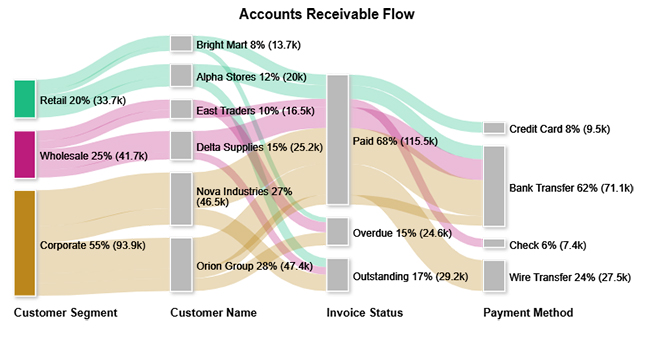
This Sankey Chart tracks how income from retail, wholesale, and corporate segments flows across clients and payment statuses, mapping the full distribution picture.
Example Insight: Uncovers payment bottlenecks and collection patterns so teams can improve cash flow and focus on high-value clients.
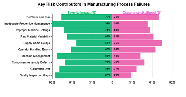
This Tornado Chart plots failure factors against two dimensions: how severe their impact would be and how often they are likely to occur, revealing where risk concentrates.
Example Insight: Identifies which risks combine high impact with high probability, allowing preventive resources to target the right failure points.
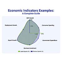
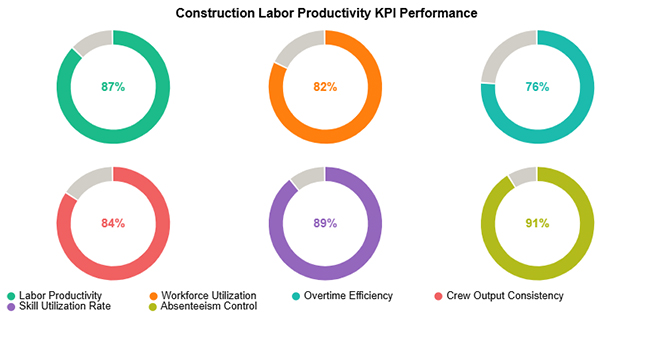
This Progress Circle Chart maps workforce metrics such as productivity, utilization, efficiency, and absenteeism into a single visual snapshot of operational health.
Example Insight: Pinpoints strong performance areas while surfacing workforce efficiency gaps that hold back project timelines.
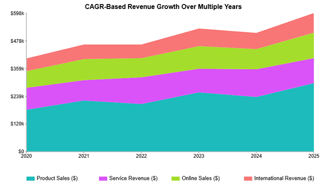
This Stacked Area Chart plots how individual revenue streams compound over multiple years, showing their cumulative contribution to total business growth.
Example Insight: Reveals consistent growth trends and identifies which streams drive long-term expansion.
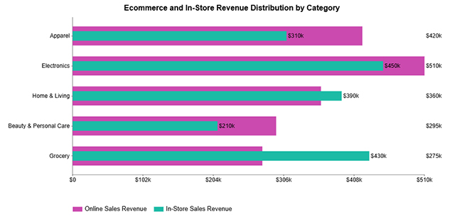
This Overlapping Bar Chart measures channel performance side by side across product categories, contrasting digital and physical sales contribution within each segment.
Example Insight: Shows which categories perform better online versus in-store, informing channel investment and sales strategy.
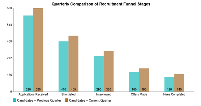
This Clustered Column Chart tracks candidate progression through each hiring stage, comparing last quarter’s figures against the current quarter to assess process improvement.
Example Insight: Reveals where applicants drop off and where conversion improved, giving recruiters a clear lens for process optimization.
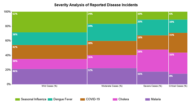
This Mosaic Plot distributes illnesses across severity levels, from mild through critical, showing how each disease contributes to each tier of patient impact.
Example Insight: Highlights which diseases drive severe and critical case volumes, helping healthcare teams prioritize resource allocation.
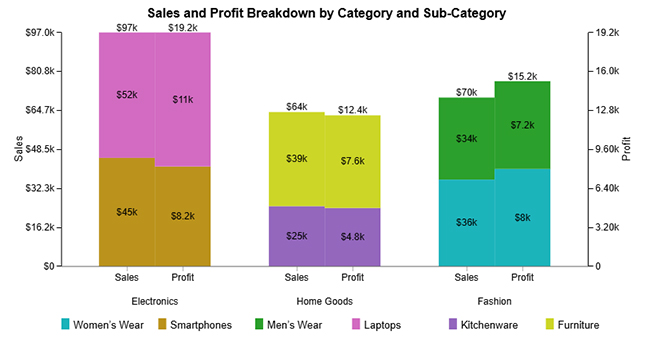
This Clustered Stacked Bar Chart places revenue and profit side by side across product categories and sub-categories, revealing where margin gaps exist within revenue.
Example Insight: Identifies both high-performing segments and low-margin categories to sharpen pricing and product mix decisions.
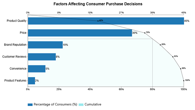
This Pareto Bar Chart ranks the factors that drive buying behavior by relative weight, making it easy to see which drivers dominate and which play a secondary role.
Example Insight: Shows that product utility and price lead purchase decisions, while other factors carry considerably less influence.
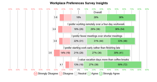
This Likert Scale Chart converts employee survey responses on work styles and benefits into a layered view of satisfaction distribution across the workforce.
Example Insight: Surveys majority preferences alongside areas of disagreement, giving HR clear signals for culture and policy refinement.
Google Sheets provides an accessible starting point for applying data collection methods and techniques to raw information. The steps below show how to move from a messy dataset to a clear, visual output using built-in formulas and charts.
Start by arranging your collected data with clear headings, consistent formats, and well-defined categories.
Ensure all entries are standardized to make further analysis easier and more accurate.
Tip: Remove duplicates and fix errors before moving forward.
Determine which variables and metrics are most relevant to your research objectives.
Focus on selecting data points that align with your goals for better clarity and direction.
Tip: Avoid unnecessary data to keep your analysis focused.
Use basic formulas like SUM, AVERAGE, and COUNT to calculate important values from your dataset.
These functions help in summarizing and simplifying large volumes of collected data.
Tip: Always verify formulas to ensure correct results.
Use pivot tables to group and organize data into meaningful summaries.
This helps in comparing different categories and identifying patterns efficiently.
Tip: Pivot tables are useful for handling large datasets quickly.
Create charts such as bar graphs, pie charts, or line charts to represent your data visually.
You can also use tools like ChartExpo to enhance your visual analysis with advanced charts.
Tip: Choose visuals that clearly highlight trends and comparisons.

A well-designed data collection approach pays dividends throughout the entire research or business cycle. When paired with careful data interpretation, the advantages reach far beyond simply having more numbers on hand.
Key benefits include:
Even well-planned data collection methods and techniques have real-world limits. Understanding these constraints matters especially when working with types of qualitative research design, where the researcher’s interpretation can affect results.
Common limitations include:
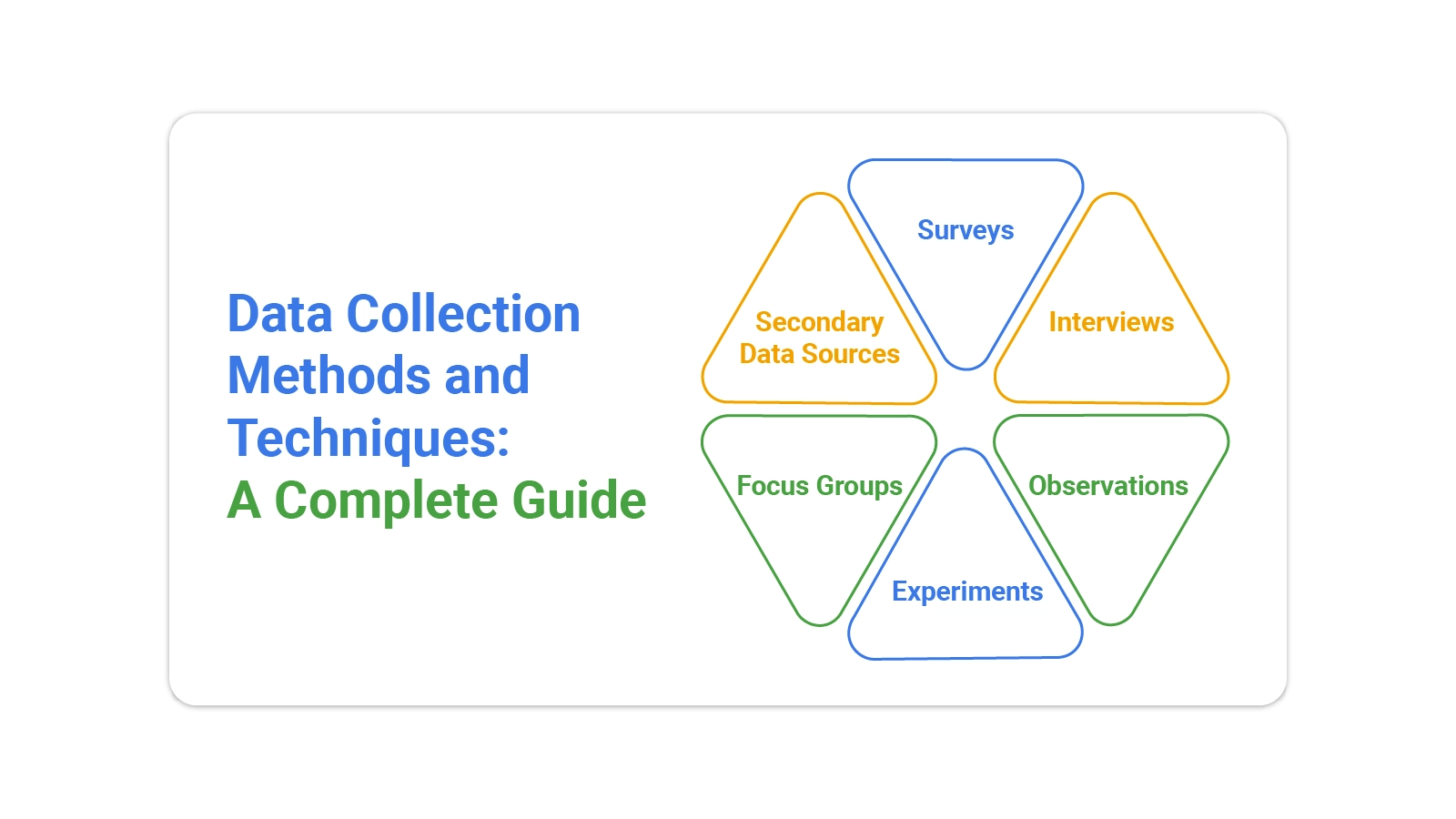
The five primary methods are surveys, interviews, observations, experiments, and secondary data sources. Each one suits different goals within the broader framework of data collection methods and techniques for gathering reliable information.
Core techniques include questionnaires, online forms, structured interviews, field observations, and document analysis. Supporting tools range from basic spreadsheet software to dedicated data management and analysis platforms.
The four guiding principles are accuracy, reliability, validity, and consistency. Together, they ensure that whatever data collection methods are applied, the resulting dataset is trustworthy enough to inform sound decisions.
The quality of any analysis rests on the quality of the data feeding it. That is why data collection methods and techniques deserve serious attention at every stage, from defining what you need to validating what you gathered. Choosing the right approach reduces noise, cuts wasted effort, and makes findings far easier to act on.
Whether you are a researcher designing a study or a business team tracking performance, structured collection practices produce results you can rely on. The frameworks covered in this guide, combined with tools like Google Sheets, give you a practical path from raw information to real insight.
How much did you enjoy this article?


Calculate accounts receivable turnover ratio to measure credit collection speed, improve cash flow, and strengthen your financial strategy. Read on!

Change Management KPIs are the key to tracking adoption, performance, and ROI during transitions. Find out which metrics matter. Read on!

Measuring Workforce Productivity helps businesses track performance and boost efficiency. Explore key methods, formulas, and metrics. Read on!