• Home
  • Tools dropdown img
    • Spreadsheet Charts

      • ChartExpo for Google Sheets
      • ChartExpo for Microsoft Excel
    • Power BI Charts

      • Power BI Custom Visuals by ChartExpo
    • Word Cloud

  • Charts dropdown img
    • Chart Category

      • Bar Charts
      • Circle Graphs
      • Column Charts
      • Combo Charts
      • Comparison Charts
      • Line Graphs
      • PPC Charts
      • Sentiment Analysis Charts
      • Survey Charts
    • Chart Type

      • Box and Whisker Plot
      • Clustered Bar Chart
      • Clustered Column Chart
      • Comparison Bar Chart
      • Control Chart
      • CSAT Survey Bar Chart
      • CSAT Survey Chart
      • Dot Plot Chart
      • Double Bar Graph
      • Funnel Chart
      • Gauge Chart
      • Likert Scale Chart
      • Matrix Chart
      • Multi Axis Line Chart
      • Overlapping Bar Chart
      • Pareto Chart
      • Radar Chart
      • Radial Bar Chart
      • Sankey Diagram
      • Scatter Plot Chart
      • Slope Chart
      • Sunburst Chart
      • Tornado Chart
      • Waterfall Chart
      • Word Cloud
    • Google Sheets
      Microsoft Excel
  • Services
  • Pricing
  • Contact us
  • Blog
  • Support dropdown img
      • Gallery
      • Videos
      • Contact us
      • FAQs
      • Resources
    • Please feel free to contact us

      atsupport@chartexpo.com

Categories
All Data Visualizations Data Analytics Surveys
Add-ons/
  • Google Sheets
  • Microsoft Excel
  • Power BI
All Data Visualizations Data Analytics Surveys
Add-ons
  • Google Sheets
  • Microsoft Excel
  • Power BI

We use cookies

This website uses cookies to provide better user experience and user's session management.
By continuing visiting this website you consent the use of these cookies.

Ok

ChartExpo Survey


Home > Blog > Data Analytics

Healthcare Datasets: Step-by-Step Guide for Insights

Some hospitals consistently deliver strong patient care, while others struggle to achieve the same result. It’s all about the data. Specifically, it’s how well they use Datasets for Healthcare to turn messy information into something that actually matters.

Healthcare Datasets

These days, healthcare organizations can’t wing it anymore. They need healthcare datasets that don’t just sit in a server somewhere but actively drive better outcomes, smoother operations, and smarter choices.

From frontline clinical care to big-picture policy shifts, mastering health datasets isn’t optional. It’s the difference between guessing and knowing.

Table of Contents:

  1. What are Datasets for Healthcare?
  2. Why are Medical Datasets Important?
  3. Types of Health-Related Datasets
  4. What are Healthcare Datasets Examples?
  5. How to Analyze Health Datasets Using Power BI?
  6. Datasets for Healthcare: Power BI vs ChartExpo Comparison
  7. Benefits of Using Structured Healthcare Datasets
  8. Best Practices for Managing and Analyzing Datasets for Healthcare
  9. Limitations of Health-Related Datasets
  10. FAQs
  11. Wrap Up

What are Datasets for Healthcare?

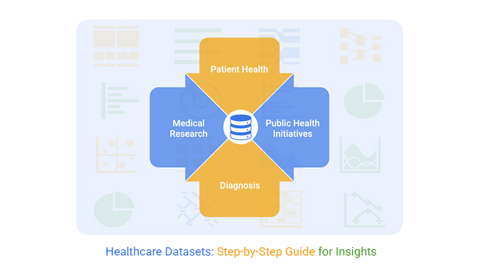
Definition: Datasets for Healthcare are organized bundles of health information that teams can actually use. They’re structured (sometimes semi-structured) collections covering everything from patient records to financial metrics.

Clinical data, operational workflows, and billing details. All rolled into formats built for analysis, reporting, and planning. Medical datasets zero in on clinical stuff. Broader health datasets? They power analytics, research, and keep operations humming. Both are essential.

Healthcare Datasets

Why are Medical Datasets Important?

Medical datasets and healthcare datasets aren’t just nice-to-have. They’re the backbone of evidence-based decisions and tangible performance gains.

  • They enable data-driven decision-making for clinicians, administrators, and researchers who can’t afford to guess.
  • They reveal patterns and measure outcomes, which directly translates to better care quality.
  • They cut down on errors and make operations run more tightly, saving time and money.
  • They unlock predictive modeling and population health analysis, giving teams a clearer view of what’s coming.
  • They fuel healthcare industry market research and sharpen insights within the business intelligence in the healthcare industry.

Types of Health-Related Datasets

Clinical and Patient Data

These health-related datasets pull together electronic health records, lab results, imaging files, prescriptions, and clinical notes. They’re what clinicians lean on for diagnosis, treatment planning, and tracking how patients respond over time.

Operational and Financial Data

Operational data tracks staffing levels, workflows, and how resources get used. Financial data keeps an eye on costs and supports budgeting in healthcare. Together, these datasets help organizations boost efficiency and stay financially viable.

Public Health and Research Data

Public and research-focused health datasets typically come from national or global sources. They’re aggregated to support epidemiological studies, disease surveillance, and academic research that shapes policy and public health strategy.

What are Healthcare Datasets Examples?

Here’s what real-world healthcare datasets look like:

  • Electronic Health Records (EHRs): Patient demographics, diagnoses, medications, and lab results all in one system.
  • Medical imaging data: X-rays, MRIs, and CT scans that clinicians use for diagnostic analysis.
  • Insurance claims data: Billing details, procedure codes, and service usage that reveal utilization patterns.
  • Genomic datasets: Genetic information driving disease research and precision medicine breakthroughs.
  • Public health data: Mortality records, disease registries, and surveys like NHANES that track population health.

These datasets get consolidated into Power BI datasets and displayed on a healthcare dashboard for real-time, informed decision-making.

How to Analyze Health Datasets Using Power BI?

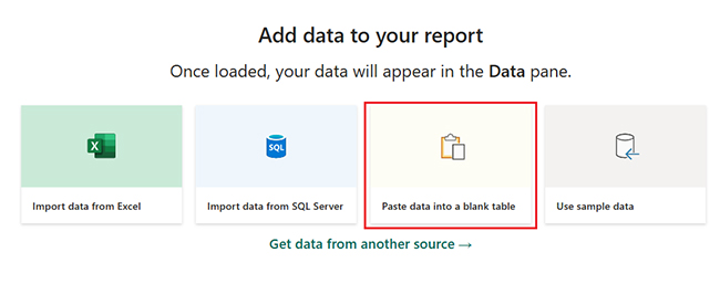
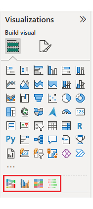
Analyzing healthcare datasets in Power BI begins with data cleansing and modeling to guarantee accurate analysis. ChartExpo takes Power BI up a notch by adding advanced visuals that simplify complicated data and spotlight key trends and insights.
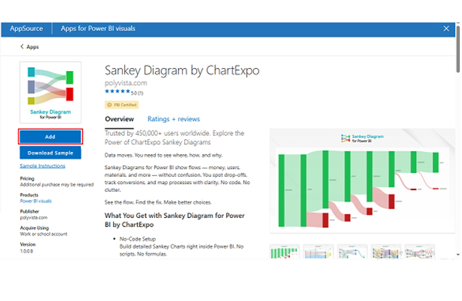
Why Use ChartExpo?

  • It boosts clarity and storytelling when you’re dealing with dense medical data that would otherwise overwhelm viewers.
  • It makes interpreting trends, spotting inefficiencies, and communicating findings across teams way easier.
  • It offers a 7-day free trial and costs just $10/month after that.

Example:

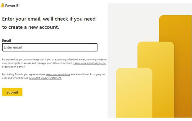
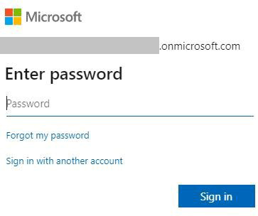
Let’s walk through logging into Power BI first.

  • Log in to Power BI.
  • Enter your email. Click the “Submit” button.
Healthcare Datasets
  • You’re redirected to your Microsoft account.
  • Enter your password and click “Sign in.”
Healthcare Datasets
  • Choose whether to stay signed in.
Healthcare Datasets
  • Once you’re in, the Power BI home screen appears.

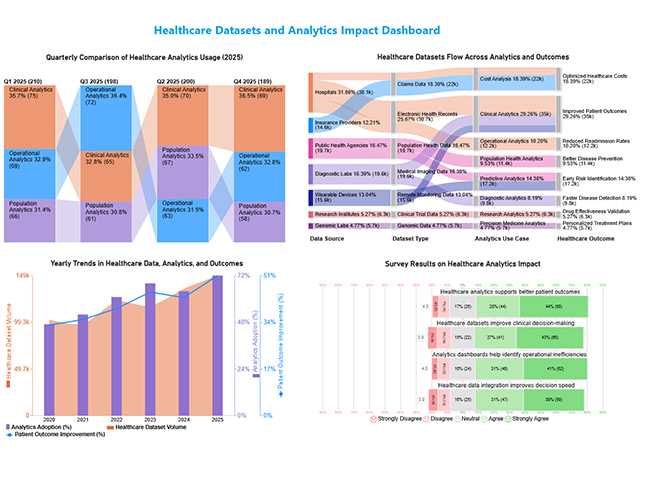
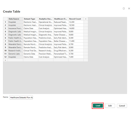
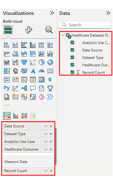
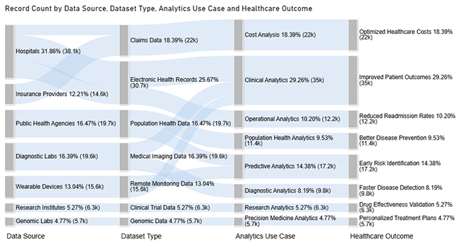
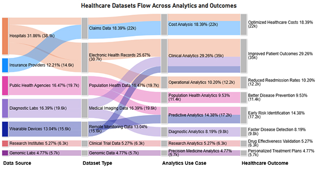
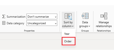
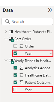
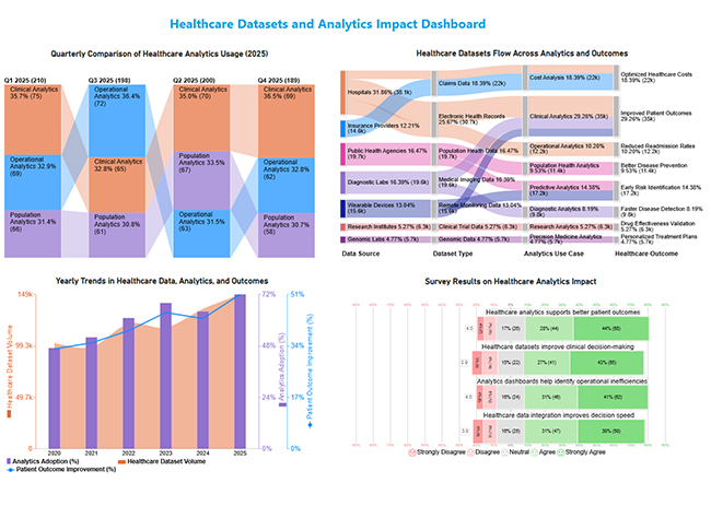
Now, let’s say we’ve got this data for a Sankey Chart.

Data Source

Dataset Type Analytics Use Case Healthcare Outcome

Record Count

Hospitals Electronic Health Records Clinical Analytics Improved Patient Outcomes 18,500
Hospitals Electronic Health Records Operational Analytics Reduced Readmission Rates 12,200
Diagnostic Labs Medical Imaging Data Diagnostic Analytics Faster Disease Detection 9,800
Insurance Providers Claims Data Cost Analysis Optimized Healthcare Costs 14,600
Research Institutes Clinical Trial Data Research Analytics Drug Effectiveness Validation 6,300
Public Health Agencies Population Health Data Population Health Analytics Better Disease Prevention 11,400
Wearable Devices Remote Monitoring Data Predictive Analytics Early Risk Identification 8,900
Genomic Labs Genomic Data Precision Medicine Analytics Personalized Treatment Plans 5,700
  • First, you’ll need to add data to your report. Click on “Paste data into a blank report.”
Healthcare Datasets
  • Paste the data into a blank table, name it, then click Load.
Healthcare Datasets
  • To build a Sankey Chart, import the visual from App Source by opening the Visualizations panel in Power BI.
  • Select “Get more Visuals.”
Healthcare Datasets
  • In the search bar, type “ChartExpo” and select “Sankey Diagram.”
Healthcare Datasets
  • Click on the “Add” button.
Healthcare Datasets
  • Select the Sankey chart icon from the visuals list.
Healthcare Datasets
  • Once the Sankey chart is pasted into the report, choose the dimension and measures.
Healthcare Datasets
  • Enter the ChartExpo license key to remove the watermark.
Healthcare Datasets
  • After removing the watermark, your Sankey Chart appears clean and professional.
Healthcare Datasets
  • You can customize the chart’s title to match your reporting needs.
Healthcare Datasets
  • You can also change bar colors to align with your organization’s branding.
Healthcare Datasets
  • The final look of your Sankey Chart should resemble this.
Healthcare Datasets

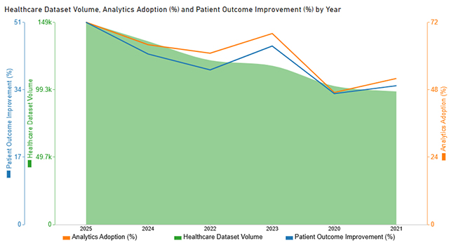
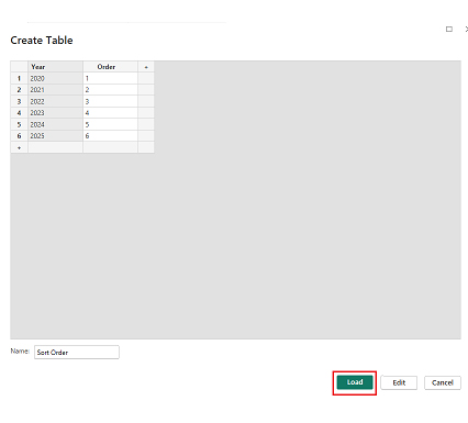
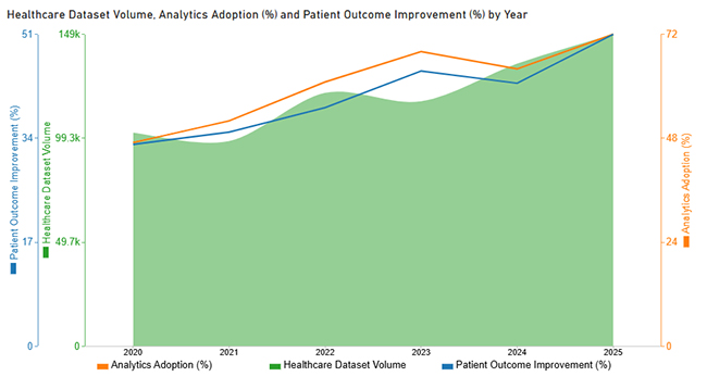
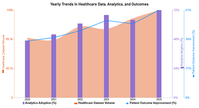
Now let’s tackle the second chart. Consider we have the following data for a Multi Axis Line Chart.

Year Healthcare Dataset Volume Analytics Adoption (%) Patient Outcome Improvement (%)
2020 102000 47 33
2021 98000 52 35
2022 121000 61 39
2023 117000 68 45
2024 135000 64 43
2025 149000 72 51
  • Once you manually paste the data into Power BI or export from Excel, choose the dimension and measures.
Healthcare Datasets
  • Enter the license key to remove the watermark from the Multi Axis Line Chart.
Healthcare Datasets
  • To apply custom sorting on the X-axis, create a new table named “Sort Order” with month names and their corresponding numeric order. Click the Load button.
Healthcare Datasets
  • After loading the “Sort Order” table, select the Year column from your original dataset.
Healthcare Datasets
  • In the ribbon, choose “Sort by Column” and select “Sort by Order.”
Healthcare Datasets
  • Next, select the month column from the “Sort Order” table.
Healthcare Datasets
  • With custom X-axis sorting applied, your chart now displays months in the correct chronological sequence.
Healthcare Datasets
  • You can tweak how the data’s represented to emphasize specific metrics.
Healthcare Datasets
  • Adjust legend colors and shape types to improve visual clarity.
Healthcare Datasets
  • You can add postfix signs (like % or $) to make your data units crystal clear.
Healthcare Datasets
  • The final appearance of your Multi Axis Line Chart is shown below.
Healthcare Datasets

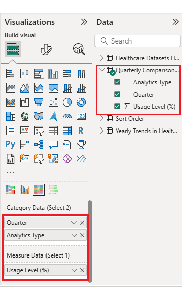
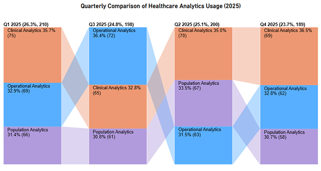
Now let’s discuss the third chart. Consider we have the following data for a Comparison Bar Chart.

Quarter Analytics Type Usage Level (%)
Q1 2025 Clinical Analytics 75
Q1 2025 Operational Analytics 69
Q1 2025 Population Analytics 66
Q2 2025 Clinical Analytics 70
Q2 2025 Operational Analytics 63
Q2 2025 Population Analytics 67
Q3 2025 Clinical Analytics 65
Q3 2025 Operational Analytics 72
Q3 2025 Population Analytics 61
Q4 2025 Clinical Analytics 69
Q4 2025 Operational Analytics 62
Q4 2025 Population Analytics 58
  • Once the data is manually pasted in Power BI or exported from Excel, choose the dimension and measures.
Healthcare Datasets
  • Enter the key to remove the watermark, update the title, and tweak bar colors.
Healthcare Datasets
  • The final look of the Comparison Bar Chart appears below.
Healthcare Datasets

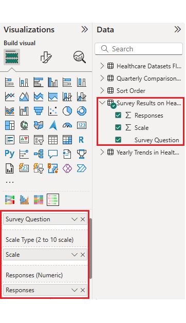
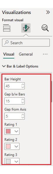
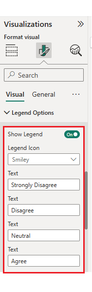
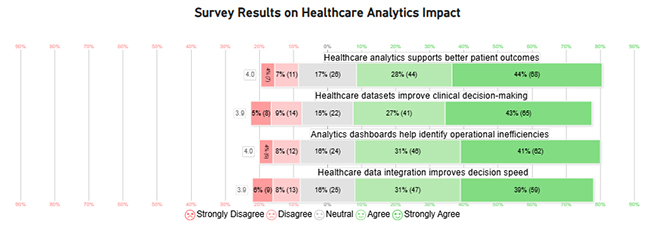
Now let’s discuss the fourth chart. Consider we have the following data for a Likert Chart.

Survey Question Scale Responses
Healthcare datasets improve clinical decision-making 1 8
Healthcare datasets improve clinical decision-making 2 14
Healthcare datasets improve clinical decision-making 3 22
Healthcare datasets improve clinical decision-making 4 41
Healthcare datasets improve clinical decision-making 5 65
Analytics dashboards help identify operational inefficiencies 1 6
Analytics dashboards help identify operational inefficiencies 2 12
Analytics dashboards help identify operational inefficiencies 3 24
Analytics dashboards help identify operational inefficiencies 4 46
Analytics dashboards help identify operational inefficiencies 5 62
Healthcare analytics supports better patient outcomes 1 7
Healthcare analytics supports better patient outcomes 2 11
Healthcare analytics supports better patient outcomes 3 26
Healthcare analytics supports better patient outcomes 4 44
Healthcare analytics supports better patient outcomes 5 68
Healthcare data integration improves decision speed 1 9
Healthcare data integration improves decision speed 2 13
Healthcare data integration improves decision speed 3 25
Healthcare data integration improves decision speed 4 47
Healthcare data integration improves decision speed 5 59
  • Once the data is manually pasted in Power BI or exported from Excel, choose the dimension and measures.
Healthcare Datasets
  • Enter the key to remove the watermark, update the title, and adjust rating colors and labels.
Healthcare Datasets
  • You can also change the legend text as well.
Healthcare Datasets
  • The final look of the Likert Chart is shown below.
Healthcare Datasets

Arrange the charts efficiently and add interactivity to create a clear, engaging dashboard. After placement, the dashboard should appear as shown below.

Healthcare Datasets

Key Insights

  • In the Sankey chart, healthcare data flows mainly from hospitals and insurers into clinical and cost analytics, driving better outcomes overall.
  • In the Comparison Bar Chart, clinical analytics consistently lead usage across all quarters in 2025.
  • In the Multi Axis Line chart, patient outcomes trend upward despite occasional fluctuations in data and adoption.
  • In the Likert Chart, stakeholders strongly agree that healthcare analytics improves decisions and boosts efficiency.

Datasets for Healthcare: Power BI vs ChartExpo Comparison

Aspect Power BI ChartExpo (Power BI Add-in)
Focus Data modeling and dashboard creation Advanced visualization and insight discovery
Chart Standard native visuals Specialized charts for complex healthcare datasets
Ease of use Requires setup and configuration No-code, intuitive chart creation
Best use Building enterprise healthcare dashboards Insight-driven health datasets visualization

Benefits of Using Structured Healthcare Datasets

Using structured healthcare datasets delivers multiple organizational benefits that can’t be ignored:

  • Faster and more accurate decision-making, which is what everyone wants but few actually achieve.
  • Improved cost control by leveraging big data analytics to reduce healthcare costs systematically.
  • Enhanced patient outcomes through data-driven care pathways that actually work.
  • Stronger compliance, reporting, and audit readiness when regulators come knocking.

Best Practices for Managing and Analyzing Datasets for Healthcare

Effective management of Datasets for Healthcare requires a structured and secure approach. These are the key best practices:

  • Establish strong data governance protocols for accuracy and compliance from day one.
  • Implement robust security and privacy controls to protect sensitive healthcare data, no matter what.
  • Standardize data formats across systems for consistency and to avoid integration headaches later.
  • Validate and update datasets regularly to maintain quality and keep them relevant.
  • Use centralized analytics platforms to improve collaboration and prevent data silos.
  • Align data strategies with organizational goals to support healthcare transformation that actually sticks.

Limitations of Health-Related Datasets

While valuable, health-related datasets face real challenges that affect analysis and decision-making:

  • Data quality issues like errors or incomplete records that mess up your analysis.
  • Missing or fragmented data that limits full analysis and leaves gaps in your conclusions.
  • Interoperability issues across different healthcare systems prevent smooth data exchange.
  • Privacy and regulatory restrictions on data access that block what you need to do.
  • Bias in data collection that leads to skewed insights and poor decisions down the line.

FAQs

What makes a good healthcare dataset?

A good healthcare dataset is accurate, complete, secure, easy to integrate, and well-documented for reliable analysis. Without these qualities, you’re just guessing.

What is a medical dataset?

A medical dataset is a structured collection of healthcare data used for analytics, research, reporting, and evidence-based decision-making. It’s what separates modern medicine from guesswork.

How are healthcare datasets used in analytics?

Healthcare datasets help identify trends, measure outcomes, predict risks, and support data-driven decisions that improve care quality, efficiency, and population health. They’re the foundation of smart healthcare analytics.

Wrap Up

Bottom line? Datasets for Healthcare drive data-informed decisions that improve outcomes and efficiency. Effective management and analysis transform complex data into actionable insights.

Tools like ChartExpo enhance the visualization and understanding of healthcare analytics. Strong data strategies remain essential for sustainable healthcare innovation. Don’t overthink it. Just get started.

How much did you enjoy this article?

PBIAd1
Start Free Trial!
158535

Related articles

next previous
Data Analytics7 min read

Customer Retention Metrics: Key KPIs Explained Visually

Customer Retention Metrics help track churn, loyalty, engagement, and revenue trends so teams can spot risks early and improve long-term customer value.

Data Analytics8 min read

Cost Breakdown Template for Better Budget Visibility

Understand how a cost breakdown template improves budget clarity, controls spending, and supports smarter planning with Excel examples and visuals.

Data Analytics12 min read

Agile Performance Metrics: From Activity to Real Outcomes

Agile performance metrics track team progress, quality, and delivery. Discover the key KPIs, examples, and best practices to boost results.

Data Analytics13 min read

Cash Flow Forecasting Template: A Complete Guide

Cash flow forecasting template designed to help businesses monitor liquidity, plan expenses, and prepare for financial changes.

Data Analytics13 min read

Social Media Marketing Plan Template for SMM Success

A template for a social media marketing plan organizes goals and tracking. This blog shows you how to plan, analyze, and report smarter for better results.

ChartExpo logo

Turn Data into Visual
Stories

CHARTEXPO

  • Home
  • Gallery
  • Videos
  • Services
  • Pricing
  • Contact us
  • FAQs
  • Privacy policy
  • Terms of Service
  • Sitemap

TOOLS

  • ChartExpo for Google Sheets
  • ChartExpo for Microsoft Excel
  • Power BI Custom Visuals by ChartExpo
  • Word Cloud

CATEGORIES

  • Bar Charts
  • Circle Graphs
  • Column Charts
  • Combo Charts
  • Comparison Charts
  • Line Graphs
  • PPC Charts
  • Sentiment Analysis Charts
  • Survey Charts

TOP CHARTS

  • Sankey Diagram
  • Likert Scale Chart
  • Comparison Bar Chart
  • Pareto Chart
  • Funnel Chart
  • Gauge Chart
  • Radar Chart
  • Radial Bar Chart
  • Sunburst Chart
  • see more
  • Scatter Plot Chart
  • CSAT Survey Bar Chart
  • CSAT Survey Chart
  • Dot Plot Chart
  • Double Bar Graph
  • Matrix Chart
  • Multi Axis Line Chart
  • Overlapping Bar Chart
  • Control Chart
  • Slope Chart
  • Clustered Bar Chart
  • Clustered Column Chart
  • Box and Whisker Plot
  • Tornado Chart
  • Waterfall Chart
  • Word Cloud
  • see less

RESOURCES

  • Blog
  • Resources
  • YouTube
SIGN UP FOR UPDATES

We wouldn't dream of spamming you or selling your info.

© 2026 ChartExpo, all rights reserved.