Categories
Viz of the Day: could a simple chart change how we understand the forces shaping our lives? Sure, it can. Imagine a single number deciding who gets a life-saving organ transplant first.


Now pause. What story does that number hold?
Numbers surround us. On average, people generate 1.7 megabytes of data every second. By 2026, experts estimate that global data creation will exceed 221 zettabytes. That is so vast, it is nearly impossible to picture. Yet buried inside are truths that affect health, money, climate, and opportunity.
But raw numbers alone rarely move people. A million data points can vanish into information overload. What cuts through the noise? A map showing air quality. A bar chart of school graduation rates. Or a timeline of rising costs. These visuals tell a story faster than paragraphs ever could. And that’s the magic of data storytelling. It turns statistics into narratives that the human brain is wired to remember.
Viz of the Day does more than display figures. It demonstrates how a single image can shift perspective. It also reminds us of the best tools for data visualization available to anyone curious enough to explore. Whether you’re a policymaker or a student, the right visual can change how you see the ordinary.
So the next time you scroll past a chart, pause. Ask what the picture is saying beyond the numbers. Because sometimes the smallest data point, shown the right way, holds extraordinary power.
This topic is vast. Continue reading to gain a better understanding.
First…
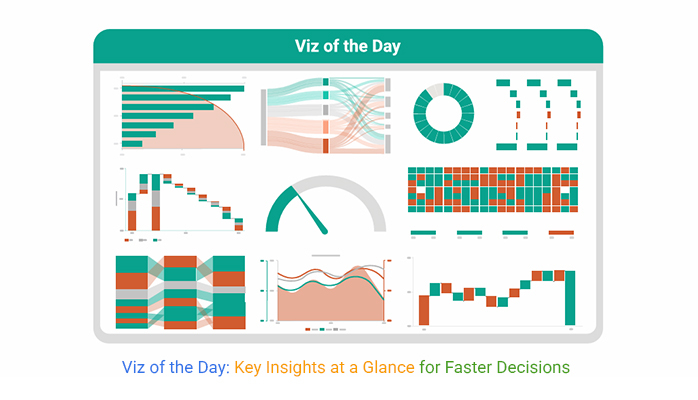
Definition: Viz of the Day is a daily spotlight on how numbers transform into meaning. It highlights one visual that makes complex data easy to grasp. Each feature shows how information can be shaped into insight.
The aim is to inspire fresh ways of thinking. It proves that a single chart can tell a bigger story. Viz of the Day also encourages people to practice data visualization in their own work. From public health to sports, the themes are diverse. But the focus remains simple: Show the story, share the impact, and help people see more through the power of visuals.
Have you noticed how a simple chart can sometimes stop you mid-scroll? Numbers on a spreadsheet rarely do that. But when data is turned into a striking image, it can shift how we see issues around us. Viz of the Day matters because it proves that visuals are more than decoration. They are powerful tools for clarity, influence, and change.
How?
Viz of the Day is not random. Each selection is made with care so the visual speaks louder than numbers alone. It is chosen to inspire, to teach, and to show how data can become a story worth remembering. Here is how the process works:
Every day, people face choices shaped by numbers. Yet rows of figures rarely move us to act. That is why Viz of the Day highlights visuals that transform raw data into meaning. With the help of a chart maker or a digital dashboard, these charts tell stories that connect instantly.
Here are ten chart types that often rise to the spotlight, each with a lesson in clarity and impact:
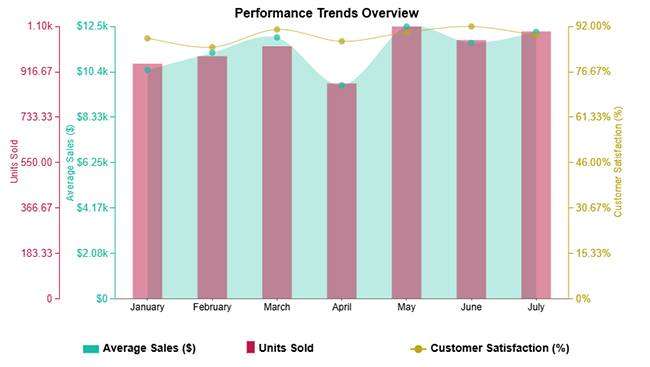
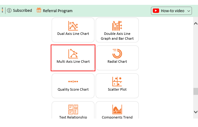
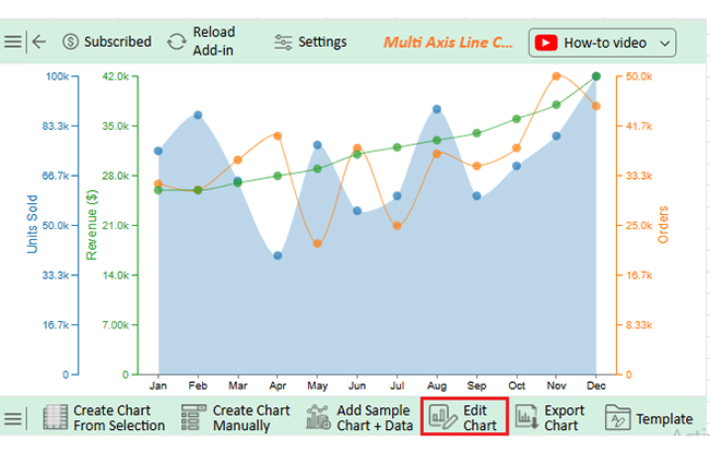
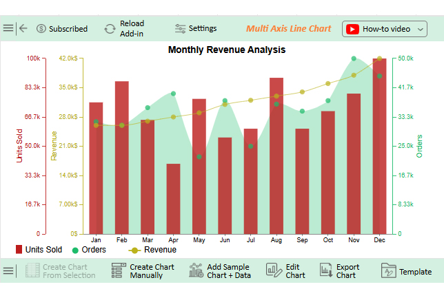
Hospitals often track multiple vitals at once, from heart rate to blood pressure to oxygen levels. A Multi Axis Line Chart lets doctors see these different measures on a single screen. This helps connections that save time and sometimes even lives. Trends that might hide in a table suddenly stand out with clarity.
Schools and universities rely heavily on survey results to understand student and parent satisfaction. A Comparison Bar Chart places feedback side by side so differences in opinions are clear at a glance. It helps educators act faster because they know exactly where improvements are needed.
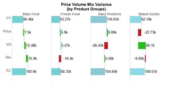
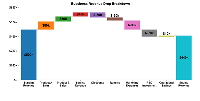
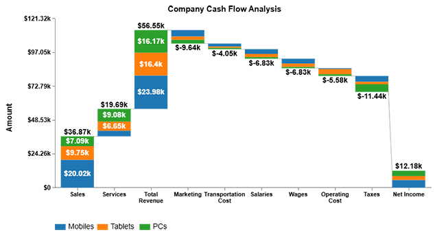
Businesses live and breathe performance numbers. A Horizontal Waterfall Chart is powerful for data analysis. It shows how each factor contributes to the final profit or loss. Marketing spend, staffing costs, or unexpected revenue streams all become visible parts of the story.
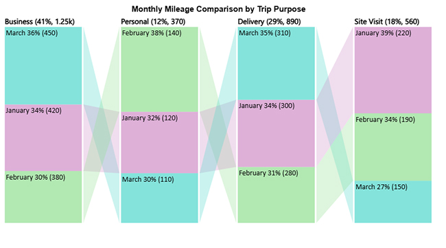
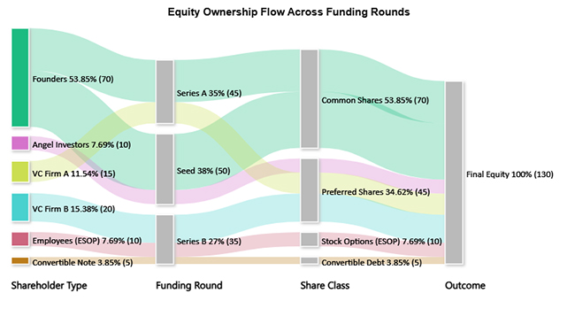
Resource allocation is often messy. A Sankey Chart clears the confusion by showing where resources come from and where they go. Governments use it to illustrate how budgets flow across departments. Nonprofits use it to demonstrate how donations reach specific projects.
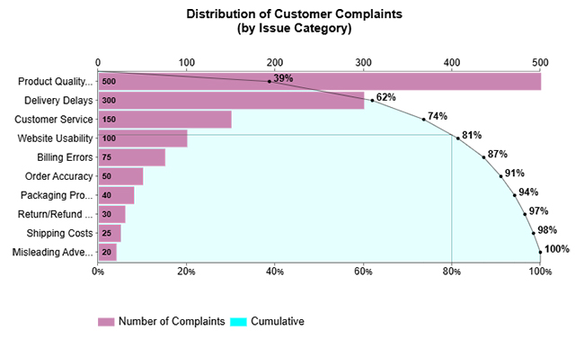
Every organization has a long list of problems, but not all problems matter equally. A Pareto Bar chart, or Pareto chart, applies the 80/20 principle, highlighting the few factors that drive most of the results. An airline might see that a handful of delays cause the majority of complaints. It points leaders to the issues that matter most.
For finance teams, the Waterfall Chart is a favorite in data analysis in Excel. It breaks down revenues, expenses, and adjustments in a step-by-step manner. Retailers use it to explain how sales promotions, returns, and seasonal peaks affect the final revenue. The path from start to finish becomes easy to follow, making it an essential tool for financial charts.
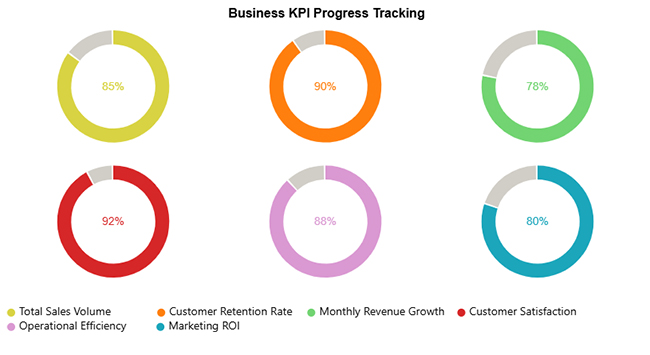
Motivation often comes from seeing progress. A nonprofit fundraising campaign can use a Progress Circle Chart to show how close it is to reaching a goal. Donors see a ring filling up in real time, creating urgency and excitement to give more.
When issues are complex, a Stacked Waterfall Chart adds more detail. A government agency explaining how different programs affect a budget can use this type of chart. Citizens see both the overall outcome and the smaller contributions that make it up, building trust through transparency.
Sports analysts rely on Heatmaps to track player movements or scoring zones. A Heatmap makes strengths and weaknesses visible at a glance with color. Coaches and fans alike can spot patterns that would be buried in match statistics.
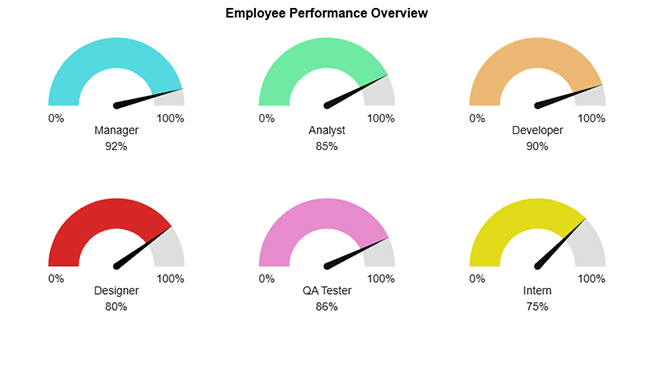
In any modern digital dashboard, the Gauge Chart is a favorite for quick checks. Managers use it to monitor sales goals or employee performance. One glance at the dial shows whether targets are being met or whether urgent action is needed.
Creating a Viz of the Day goes beyond just dropping numbers into a chart. The right tool can turn raw data into visuals that tell a story instantly. A well-crafted visual grabs attention, guides the eye, and makes complex information understandable.
The most common tools for these creations include:
A spreadsheet full of figures rarely sparks curiosity. Viz of the Day changes that. It transforms everyday data into visuals, making patterns and insights instantly obvious. All Excel charts tell a story, reveal a trend, or highlight a surprising fact you might have missed otherwise.
Follow these steps to create an impactful Viz of the Day
ChartExpo allows you to create visuals quickly and beautifully. Unlike traditional tools, it offers ready-made advanced charts inside familiar platforms like Excel and Google Sheets. This enables data to work more smoothly and efficiently.
Here are some reasons why you should use ChartExpo:
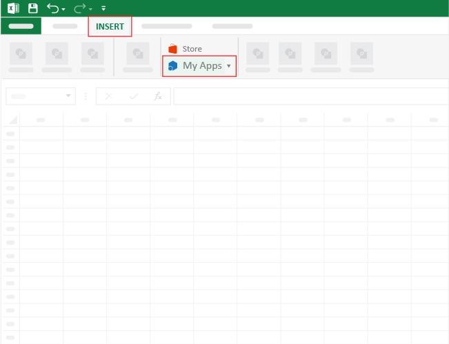
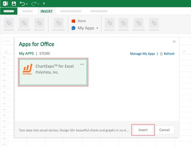
How to Install ChartExpo in Excel?
ChartExpo charts are available both in Google Sheets and Microsoft Excel. Please use the following CTAs to install the tool of your choice and create beautiful visualizations with a few clicks in your favorite tool.
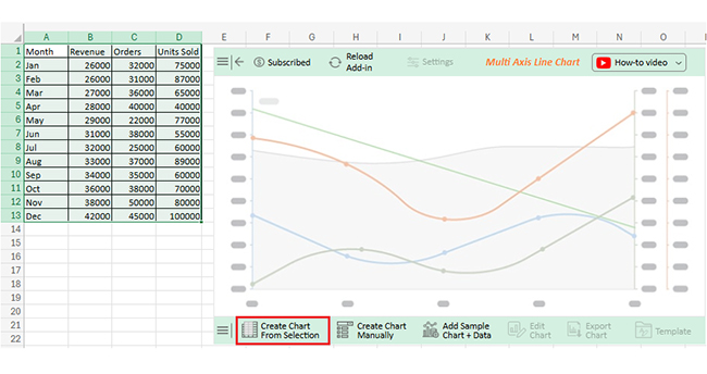
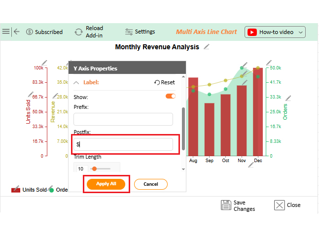
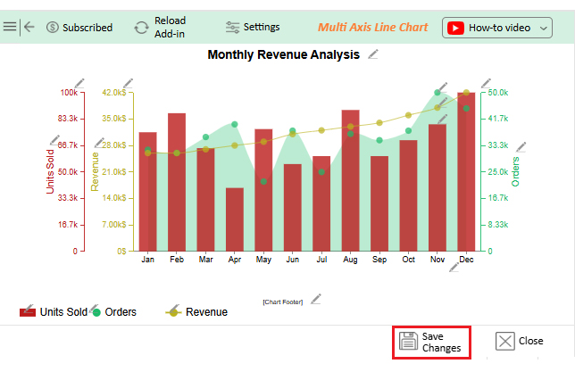
Let’s use the data below to create a Viz of the day in Excel using ChartExpo.
|
Month |
Revenue | Orders |
Units Sold |
| Jan | 26000 | 32000 | 75000 |
| Feb | 26000 | 31000 | 87000 |
| Mar | 27000 | 36000 | 65000 |
| Apr | 28000 | 40000 | 40000 |
| May | 29000 | 22000 | 77000 |
| Jun | 31000 | 38000 | 55000 |
| Jul | 32000 | 25000 | 60000 |
| Aug | 33000 | 37000 | 89000 |
| Sep | 34000 | 35000 | 60000 |
| Oct | 36000 | 38000 | 70000 |
| Nov | 38000 | 50000 | 80000 |
| Dec | 42000 | 45000 | 100000 |
Numbers are everywhere, but they often get ignored. Visuals of the Day turn raw data into snapshots that are easy to understand. They make insights clear, spark conversations, and help teams act faster.
How?
Creating a Viz of the Day goes beyond just making a chart. It’s about telling a story with data that anyone can understand at a glance. A well-designed visual captures attention, conveys insights quickly, and inspires action.
So, how do you achieve all this? Follow these best practices:
No doubt…Viz of the Day can transform data into insights. But it comes with trade-offs. Understanding some of these challenges will help you create more effective visuals and avoid misinterpretation:
Viz in data means turning numbers into visuals. Charts, graphs, and dashboards help show patterns and trends. They make complex data easier to understand. Insights become clear at a glance, and you can make decisions faster and smarter.
Text to Viz is the process of turning written data or descriptions into visuals. It converts text-based information into charts, graphs, or dashboards. This makes patterns and trends easier to see, where insights become clear and quick to understand.
Numbers surround us every day. They appear in reports, spreadsheets, and dashboards. Most of them go unnoticed, but Viz of the Day changes that. It turns ordinary numbers into visuals that reveal patterns and insights instantly.
The real power lies in data storytelling. A well-designed visual can explain trends, highlight key metrics, and make complex information understandable. Readers can grasp ideas in seconds rather than hours. Each Viz of the Day is a story waiting to be explored.
Daily exposure to charts also combats information overload. Instead of drowning in rows of numbers, viewers focus on one clear insight at a time. This enables faster and more confident decision-making. It also helps teams stay aligned and informed.
Choosing the right tool is essential. The best tools for data visualization simplify chart creation and ensure visuals are accurate and engaging. They help anyone turn raw data into meaningful stories.
ChartExpo is an excellent choice. It works inside familiar platforms like Excel and Google Sheets, where users can create advanced visuals without complex formatting. Even beginners can make charts that communicate clearly.
So, do not hesitate. Start using ChartExpo today. Install it, explore your data, and create your first Viz of the Day. This will transform your everyday numbers into extraordinary insights. Then, you can share them, learn from them, and let your data tell the story it deserves.
How much did you enjoy this article?


Calculate accounts receivable turnover ratio to measure credit collection speed, improve cash flow, and strengthen your financial strategy. Read on!

Change Management KPIs are the key to tracking adoption, performance, and ROI during transitions. Find out which metrics matter. Read on!

Data collection methods and techniques determine the quality of every insight you act on. Explore key approaches for gathering reliable data. Read on!


