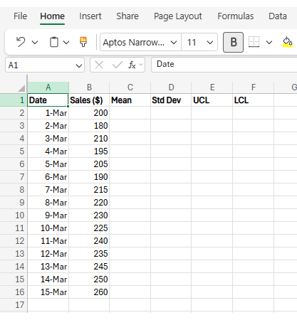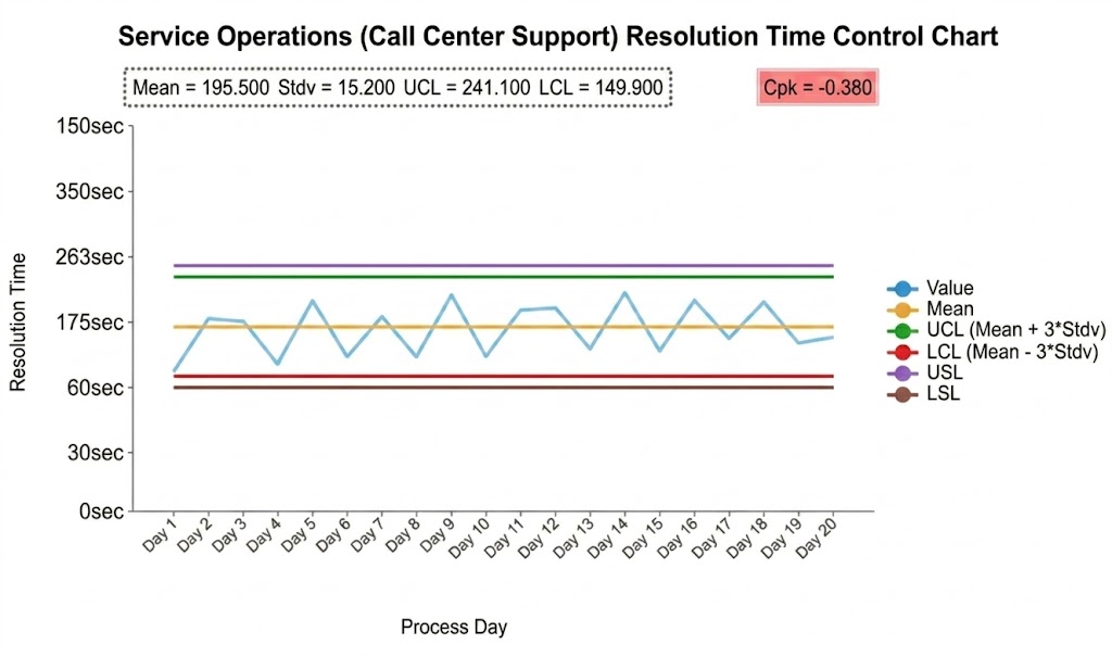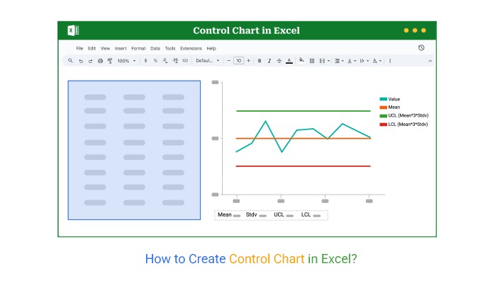
Key Components of a Control Chart in Excel
Data Points
- Individual measurements collected in sequence, such as daily output, defects, or response times. These points show how the process performs at each moment.
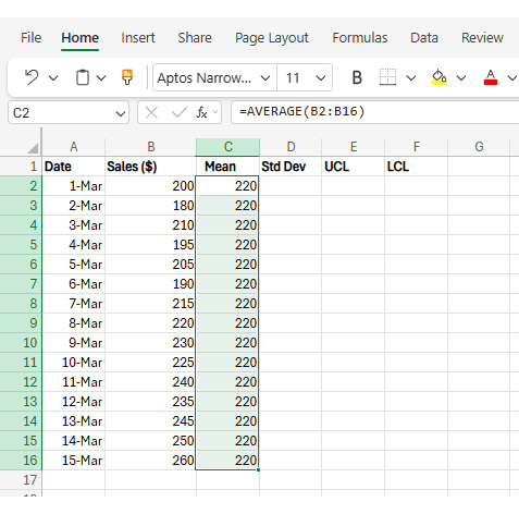
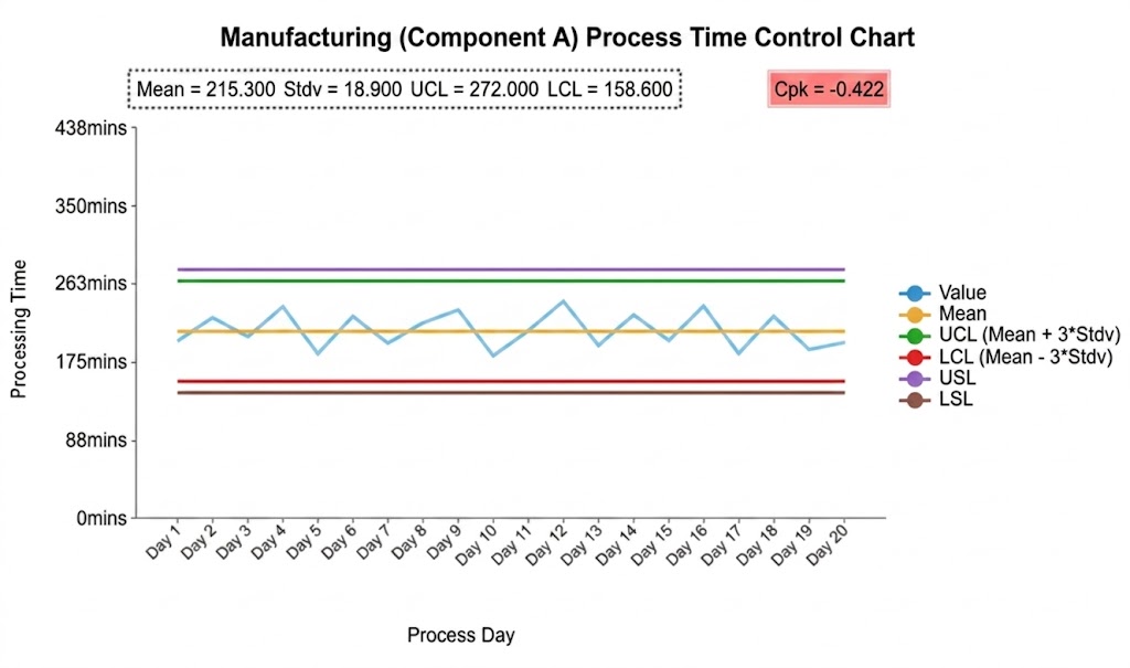
Center Line
- The average of all data points represents the typical process performance. It acts as a reference to identify shifts or consistent changes over time.
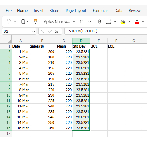
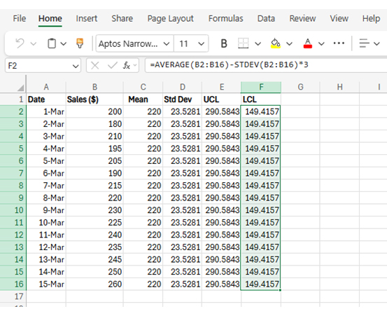
Control Limits (UCL & LCL)
- Statistical boundaries, usually set at ±3 standard deviations from the mean, that define the expected range of normal variation. Points outside these limits indicate that the process may be experiencing unusual changes.
Common Types of Control Charts in Excel
Control charts in Excel are not one-size-fits-all. Each type is designed for a specific kind of data structure. Choosing the right one depends on how your data is collected and what you want to monitor.
-
I-MR Chart (Individual and Moving Range)
Best for tracking single data points collected over time.
It is commonly used when data is not grouped into batches, such as daily sales, response times, or machine readings.
The I chart shows individual values, while the MR chart tracks how much variation occurs between consecutive points.
-
X-bar and R Chart
Used when data is collected in small subgroups, such as multiple samples from the same batch.
The X-bar chart tracks the average of each subgroup, while the R chart measures the variation within those subgroups.
This type is useful for monitoring consistency within production or repeated sampling processes.
-
P Chart (Proportion Chart)
Used to track the percentage of defective items in a process.
It is based on proportions rather than raw counts, making it useful for quality control situations where results are classified as pass or fail.
It works best when sample sizes are relatively consistent over time.
-
C Chart (Count of Defects)
Used when you are counting the number of defects in a fixed sample size.
For example, tracking the number of errors in reports or defects per inspection unit.
This chart assumes the sample size remains constant across all measurements.
-
U Chart (Defects per Unit)
Used when the number of defects is tracked, but sample sizes vary.
It standardizes defects per unit, making it suitable for processes where volume is not consistent, such as service requests or transaction-based systems.