• Home
  • Tools dropdown img
    • Spreadsheet Charts

      • ChartExpo for Google Sheets
      • ChartExpo for Microsoft Excel
    • Power BI Charts

      • Power BI Custom Visuals by ChartExpo
    • Word Cloud

  • Charts dropdown img
    • Chart Category

      • Bar Charts
      • Circle Graphs
      • Column Charts
      • Combo Charts
      • Comparison Charts
      • Line Graphs
      • PPC Charts
      • Sentiment Analysis Charts
      • Survey Charts
    • Chart Type

      • Box and Whisker Plot
      • Clustered Bar Chart
      • Clustered Column Chart
      • Comparison Bar Chart
      • Control Chart
      • CSAT Survey Bar Chart
      • CSAT Survey Chart
      • Dot Plot Chart
      • Double Bar Graph
      • Funnel Chart
      • Gauge Chart
      • Likert Scale Chart
      • Matrix Chart
      • Multi Axis Line Chart
      • Overlapping Bar Chart
      • Pareto Chart
      • Radar Chart
      • Radial Bar Chart
      • Sankey Diagram
      • Scatter Plot Chart
      • Slope Chart
      • Sunburst Chart
      • Tornado Chart
      • Waterfall Chart
      • Word Cloud
    • Google Sheets
      Microsoft Excel
  • Services
  • Pricing
  • Contact us
  • Blog
  • Support dropdown img
      • Gallery
      • Videos
      • Contact us
      • FAQs
      • Resources
    • Please feel free to contact us

      atsupport@chartexpo.com

Categories
All Data Visualizations Data Analytics Surveys
Add-ons/
  • Google Sheets
  • Microsoft Excel
  • Power BI
All Data Visualizations Data Analytics Surveys
Add-ons
  • Google Sheets
  • Microsoft Excel
  • Power BI

We use cookies

This website uses cookies to provide better user experience and user's session management.
By continuing visiting this website you consent the use of these cookies.

Ok

ChartExpo Survey


Home > Blog > Data Analytics

Visual Encoding: The Rules That Improve Insights

Visual encoding is shaping the way we understand numbers and patterns more than we realize.

Visual Encoding

How?

Think about how much data is produced every single day. Colors, shapes, sizes, and positions all play a role in guiding attention. They help us see trends faster than we could ever read from rows of raw numbers.

Picture a hospital tracking patient outcomes with healthcare data visualization. Charts showing recovery rates across treatments can instantly highlight what works best. No long reports. No confusion. Just clarity.

Companies using visual analytics have seen measurable benefits. A Forbes report revealed that data-driven organizations are 23 times more likely to gain customers. And that is the power of presenting information in a form our brains are wired to process. Numbers alone struggle to tell stories, but pictures and structured visuals speak louder.

At its core, visual encoding is about trust. It gives meaning to raw data and facilitates faster data-driven decision-making. Whether you’re analyzing sales or studying travel trends through Airbnb data visualization, the goal is the same. Clear visuals lead to better choices.

So, before you scroll past another confusing table, pause and ask yourself: “Could this have been understood faster through a better visual?”

Let me take you through visual encoding.

Table of Contents:

  1. What is Visual Encoding?
  2. Importance of Visual Encoding in Data Understanding
  3. Types of Visual Encoding?
  4. Key Aspects of a Visual Encoding
  5. Explaining the Visual Encoding Examples
  6. Which of the Following is a Good Example of Visual Encoding?
  7. How Does Visual Encoding Work?
  8. How to Use Visual Encoding in Excel to Better Understand Data?
  9. Benefits of Visual Encoding
  10. Limitations of Visual Encoding
  11. Applications of Visual Encodings
  12. Strategies to Improve Visual Encoding
  13. FAQs
  14. Wrap Up

What is Visual Encoding?

Definition: Visual encoding is the method of turning data into shapes, colors, and sizes that people can quickly read. It is the reason a bar chart feels easier to understand than a spreadsheet full of numbers. Effective encoding establishes a clear visual hierarchy, directing the eye to what matters most first. Without it, patterns hide in plain sight.

Think of it as giving numbers a voice. It makes data speak clearly and directly. When paired with information design, visual encoding helps simplify complex findings. It ensures that decisions are based on understanding, not confusion. It is the bridge between numbers and meaning.

Importance of Visual Encoding in Data Understanding

Have you ever wondered why a chart can tell a clearer story than a report filled with numbers? That is the magic of visual encoding. It turns raw information into visuals that guide the eye, spark understanding, and build trust.

Here is why it matters so much for data understanding:

  • Clarity over confusion: Numbers alone often overwhelm. Encoding transforms them into visuals that simplify and clarify the information.
  • Spotting patterns fast: Time is critical in data analysis. Encoding highlights trends instantly without lengthy explanations.
  • Building trust through design: Pairing encoding with information design ensures accuracy and reliability. It removes clutter and directs focus to what matters.
  • Supporting better choices: When visuals are clear, decisions follow naturally. Encoding enhances decision-making confidence and reliability.

Types of Visual Encoding?

Visual encoding transforms raw information into signals our eyes can quickly read, and our minds can interpret. In data visualization, these signals are the difference between confusion and clarity. Every design choice influences how fast someone grasps the story.

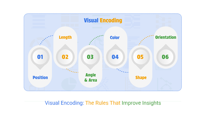
Here are the key types of visual encoding:

  • Position: Placing data on a common axis makes comparisons effortless. Our eyes naturally align points and notice differences instantly.
  • Length: Using bar heights or line lengths conveys value with precision. The longer the mark, the greater the meaning.
  • Angle and area: Pie slices rely on angle, while bubble charts depend on area. Both create impact but must be scaled carefully to avoid misleading impressions.
  • Color: Color highlights categories and intensities. In visual analytics, the right palette can reveal trends that raw numbers hide.
  • Shape: Shapes assign identity to data points. They allow multiple groups to coexist in a single view without confusion.
  • Orientation: The direction of elements signals relationships. In information design, even a slight tilt can shift how patterns are perceived.

Key Aspects of a Visual Encoding

A chart can either clear the fog or create more confusion. The difference lies in how Visual encoding is handled. Small choices, such as scale, color, or shape, can completely alter interpretation. These aspects determine whether the story is accurate, precise, and meaningful:

  • Accuracy: Every visual must reflect the actual value of the data. Distorted scales or uneven sizing break trust and weaken insights.
  • Clarity: Good visuals remove noise and highlight meaning. Explicit encoding helps people grasp insights without second-guessing.
  • Consistency: Keeping the same colors, shapes, and positions across visuals reduces confusion. In data analytics, consistency ensures smooth comparisons across multiple reports.
  • Accessibility: Visuals should work for everyone. Even in Airbnb, data design choices must consider color blindness and readability for all users.

Explaining the Visual Encoding Examples

Numbers on their own can feel flat. But turn them into visuals and the story starts to breathe. Visual encoding gives data form, texture, and meaning. The choice of chart affects how quickly people understand trends or outliers in data analytics.

Here are three common visuals and their reasons for effectiveness.

  • Bar Chart: Bars use length and position to show comparisons. They make ranking and size differences easy to see at a glance.
  • A Heatmap: Colors encode intensity or frequency. In the best tools for data visualization, heatmaps highlight patterns that text or tables might hide.
  • Scatter Plot: Scatter Plots use position to show relationships between variables. They are instrumental in data visualization for spotting clusters, gaps, or correlations.

Which of the Following is a Good Example of Visual Encoding?

Some visuals do the heavy lifting for you. They make data feel simple, approachable, and straightforward. That is the strength of visual encoding. The right choice saves time and reduces errors. Here are examples that show how encoding brings numbers to life:

  • Bar chart: Bars use position and length to compare values. This makes the differences between categories instantly visible and easy to process.
  • Heatmap: Color intensity reveals patterns that raw numbers hide. In data analytics, heatmaps expose trends or problem areas in seconds.
  • Scatter Plot: Points show the relationship between two variables with precision. This chart is praised for revealing clusters, gaps, and correlations in data.

How Does Visual Encoding Work?

Think about the last time a chart made sense in seconds. That spark of clarity came from visual encoding. It transforms raw figures into signals that our brains naturally understand.

Here is how it actually works.

  • Position: Placing data points along an axis allows for precise comparisons. The eye can quickly detect even slight differences in placement.
  • Color: Colors separate categories or show intensity. In data analytics, this helps highlight trends or outliers immediately.
  • Size: Larger or smaller marks represent magnitude. Viewers instantly sense which values carry more weight.
  • Shape: Different shapes distinguish groups without words. They add clarity when multiple variables share the same space.

Top 10 ChartExpo Visuals in Excel to Show Visual Encoding

Excel handles numbers well, but numbers alone rarely tell a story. ChartExpo fills that gap with visuals that turn raw figures into insights. Through visual encoding, these charts help ensure a more precise analysis. Here are ten strong examples:

  • Sankey Chart: The width of flows, colors, and positions shows how values move between categories. Sankey Chart simplifies complex relationships into an easy-to-read flow.
Visual Encoding
  • Comparison Bar Chart: Bars represent data using their length and position to compare values between groups. This makes shifts and differences instantly clear.
Visual Encoding
  • Waterfall Chart: Bars step through how values add up to a total. It is excellent for explaining financial or performance changes in data analysis.
Visual Encoding
  • Multi-Axis Spider Chart: Variables spread across multiple axes for side-by-side comparison. It highlights differences and patterns across groups.
Visual Encoding
  • Horizontal Waterfall Chart: Positive and negative values build toward a final balance horizontally. It is ideal for budgets, financials, and year-to-year trends.
Visual Encoding
  • Stacked Waterfall Chart: Costs or values break down into subcategories with color and position. It illustrates how individual parts contribute to the overall total in data visualization.
Visual Encoding
  • Clustered Stacked Bar Chart: Clustering and stacking display both category and subcategory values together. It gives a detailed breakdown while allowing group comparisons.
Visual Encoding
  • Progress Circle Chart: Angle and color show progress toward a target. It makes KPIs and goals simple to read at a glance.
Visual Encoding
  • Multi-Axis Line and Bar Chart: This chart combines bars and lines on separate axes to display multiple measures in a single view. This provides teams with a comprehensive view of productivity.
Visual Encoding
  • Heatmap: The color intensity represents the value size or frequency. It quickly reveals patterns, trends, and anomalies in data analysis.
Visual Encoding

How to Use Visual Encoding in Excel to Better Understand Data?

Spreadsheets are loyal, but they are not storytellers. Rows of numbers in Excel can bury meaning instead of revealing it. The real spark comes from data visualization, not endless scrolling.

That is where visual encoding takes the stage, turning dull data into patterns you can see and act on. Excel alone falls short here. Its charts often lack depth and clarity.

Enter ChartExpo, a tool that fills this gap with more brilliant visuals and strategies. It helps transform raw numbers into insights, making data understanding faster, sharper, and far more engaging.

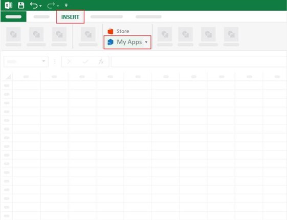
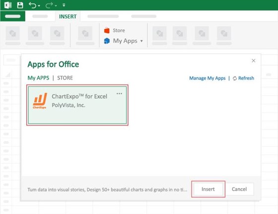
How to Install ChartExpo in Excel?

  1. Open your Excel application.
  2. Open the worksheet and click the “Insert” menu.
  3. You’ll see the “My Apps” option.
  4. In the Office Add-ins window, click “Store” and search for ChartExpo on my Apps Store.
  5. Click the “Add” button to install ChartExpo in your Excel.

ChartExpo charts are available both in Google Sheets and Microsoft Excel. Please use the following CTAs to install the tool of your choice and create beautiful visualizations with a few clicks in your favorite tool.

Example

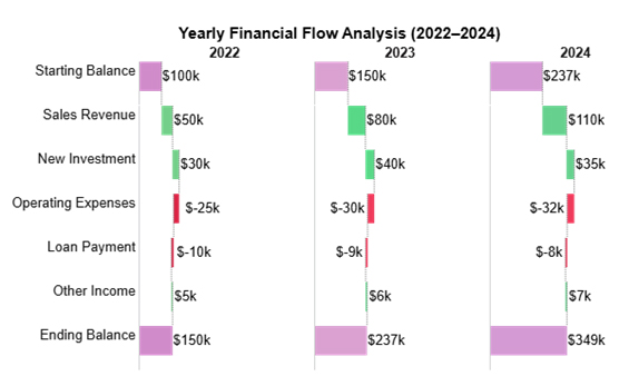
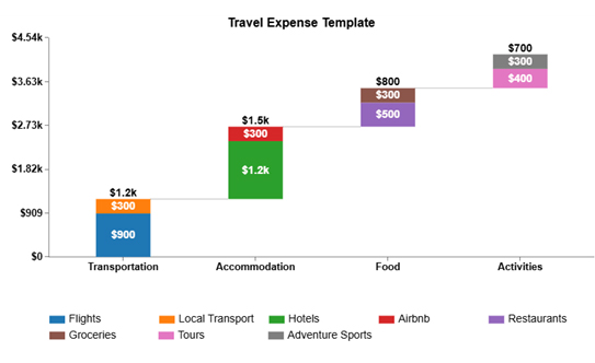
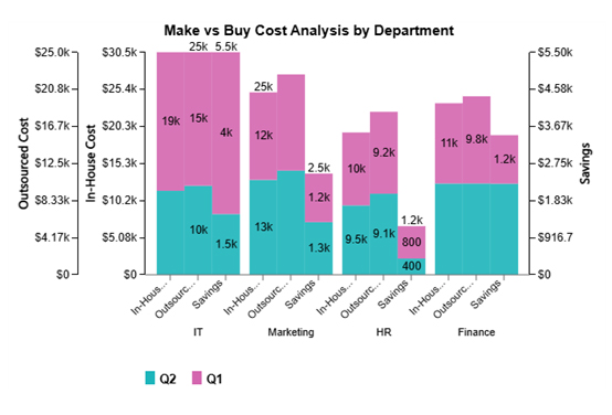
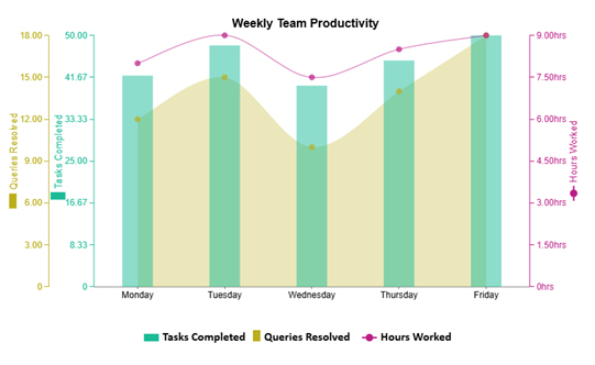
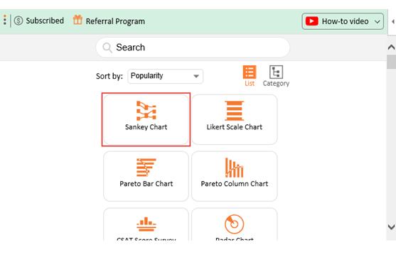
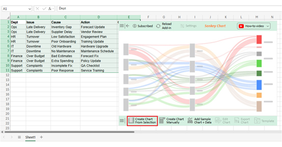
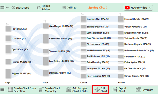
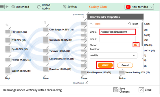
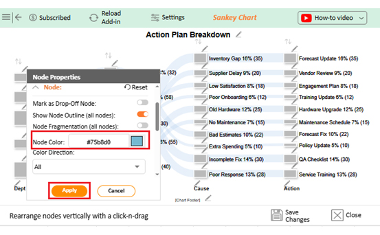
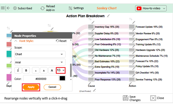
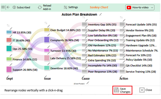
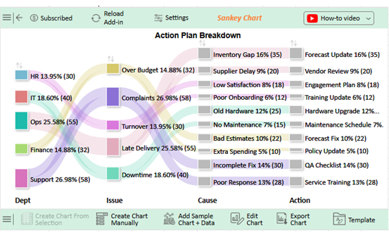
Let’s do visual encoding with the sample data in Excel using ChartExpo and analyze it.

Dept Issue Cause Action Count
Ops Late Delivery Inventory Gap Forecast Update 35
Ops Late Delivery Supplier Delay Vendor Review 20
HR Turnover Low Satisfaction Engagement Plan 18
HR Turnover Poor Onboarding Training Update 12
IT Downtime Old Hardware Hardware Upgrade 25
IT Downtime No Maintenance Maintenance Schedule 15
Finance Over Budget Bad Estimates Forecast Fix 22
Finance Over Budget Extra Spending Policy Update 10
Support Complaints Incomplete Fix QA Checklist 30
Support Complaints Poor Response Service Training 28
  • To get started with ChartExpo, install ChartExpo in Excel.
  • Now, click on My Apps from the INSERT menu.
Visual Encoding
  • Choose ChartExpo from My Apps, then click Insert.
Visual Encoding
  • Once it loads, choose the “Sankey Chart” from the charts list.
Visual Encoding
  • Click the “Create Chart From Selection” button after selecting the data from the sheet, as shown.
Visual Encoding
  • ChartExpo will generate the visualization below for you.
Visual Encoding
  • If you want to have the chart’s title, click Edit Chart, as shown in the above image.
  • Click the pencil icon next to the Chart Header to change the title.
  • It will open the properties dialog. Under the Text section, you can add a heading in Line 1 and enable Show.
  • Give the appropriate title of your chart and click the Apply button.
Visual Encoding
  • You can add color in Nodes and set the direction as follows:
Visual Encoding
  • You can increase font size for better readability as follows:
Visual Encoding
  • Click the “Save Changes” button to persist the changes.
Visual Encoding
  • Your final chart will appear as follows.
Visual Encoding

Insights

  • Support and Operations handle the largest share of issues, each exceeding 25%.
  • Top issue types: Complaints (27%) and late delivery (25.6%).
  • Common root causes: Inventory gap, incomplete fix, and poor response.
  • Key actions taken: Forecast update and service training.
  • Department-specific patterns appear, such as inventory issues in Operations and downtime in IT.

Benefits of Visual Encoding

Data speaks, but not everyone speaks data. That is why visual encoding matters. It translates numbers into visuals that our brains process in seconds. Instead of staring at rows of figures, you see trends, patterns, and insights with ease. In data visualization, encoding is the difference between confusion and clarity.

Why?

  • Faster understanding: Visuals cut through noise and highlight meaning quickly. Thus, you can make decisions without heavy mental effort.
  • Revealing patterns: Encoding makes hidden trends visible. In data analysis, this brings context that raw numbers cannot provide.
  • Clear comparisons: Position, size, and color make differences stand out. Comparing groups or categories becomes simple.
  • Better communication: Charts tell stories that words cannot. This makes sharing insights across teams far more effective.
  • Smarter decisions: When visuals are clear, confidence grows. In data-driven decision-making, encoding ensures choices are based on fundamental understanding.

Limitations of Visual Encoding

A chart can be powerful, but it is not perfect. Visual encoding gives clarity, yet it also has limits. Poor choices in color, scale, or shape can twist the story. So, keep these key limitations in mind:

  • Risk of misinterpretation: Bad scales or distorted visuals confuse viewers. What looks bigger may not actually be more.
  • Too much complexity: Crowded visuals overwhelm. In data analysis, too many variables in one chart bury the insight.
  • Color dependency: Relying heavily on color creates barriers. Viewers with vision challenges may miss critical differences.
  • Context loss: A chart shows patterns but sometimes hides details. Without context, decisions can lean on incomplete information.
  • Tool limitations: Not every chart maker or platform supports advanced visuals. This can limit the clarity of insights presented.

Applications of Visual Encodings

Data becomes meaningful only when people can see its story. Visual encoding is what makes that possible. It takes raw numbers and transforms them into shapes, colors, and positions that speak instantly. Its application stretches across industries and use cases.

  • Business dashboards: Executives track sales, revenue, and customer trends in real time. Encoding makes performance visible at a glance.
  • Healthcare data visualization: Hospitals use charts to monitor patient outcomes and treatment efficiency. Visuals make complex medical data easier to act on.
  • Airbnb data visualization: Travel trends, bookings, and reviews turn into patterns that inform growth. Encoding helps spot demand shifts and customer behaviors.
  • Education reporting: Teachers and administrators use visuals to track performance. Visuals reveal patterns in student progress at a glance.
  • Operations monitoring: Teams track downtime, defects, or bottlenecks. Encoding highlights what needs fixing without long reports.

Strategies to Improve Visual Encoding

A chart can tell a story or create confusion. The difference lies in how encoding is handled. Strong strategies in information design sharpen clarity and avoid missteps. Here is how to improve visual communication.

  • Choose the correct chart: Use the best tools for data visualization to match the data type with the correct chart. A poor match hides the story.
  • Simplify visuals: Remove clutter and focus on what matters. Clean designs strengthen data-driven decision-making.
  • Use color wisely: Colors should guide attention, not overwhelm it. In visual hierarchy, contrast is key for spotting what matters first.
  • Stay consistent: Apply the same shapes, scales, and colors across visuals. Consistency builds trust and reduces confusion.
  • Test for accessibility: Check that visuals work for everyone, including those with color blindness. Explicit encoding ensures insights are universal.

FAQs

What is visual coding in psychology?

Visual coding in psychology is the process of storing images in the brain. It helps us remember shapes, colors, and patterns. This type of encoding allows people to recall visual details even without words.

What is the difference between semantic and visual encoding?

Semantic encoding stores meaning, such as understanding words or concepts. Visual encoding stores images, shapes, and colors. Semantic relies on comprehension, while visual depends on mental imagery. Both work together to strengthen memory and recall.

Wrap Up

Data does not speak until it is shown in the proper form. That is why visual encoding is so essential. It turns abstract numbers into shapes, colors, and patterns that the mind can understand instantly. Without it, even the most thoughtful analysis loses impact.

Examples such as bar charts, scatter plots, and heat maps demonstrate how visuals can reveal what tables conceal. They show relationships, highlight patterns, and guide smarter decisions. In data analytics, this clarity is the difference between acting fast and missing opportunities.

Strategies improve this power further. Choosing the correct chart, simplifying visuals, and applying a clear visual hierarchy all matter. Consistency and accessibility ensure that every reader, no matter their background, understands the insight with ease.

Practical use cases make the value clear. Businesses track performance with dashboards, while hospitals use healthcare data visualization to monitor patient outcomes. Even travel companies gain insights through Airbnb data visualization to improve guest experiences. Encoding connects numbers to real actions.

Excel alone often falls short in this area. That is why a more innovative chart maker is essential. ChartExpo stands out among the best tools for data visualization. It offers clarity, flexibility, and visuals that go beyond Excel’s limits.

The conclusion is simple. Better visuals mean better decisions, and visual encoding is no longer optional; it is essential for growth. So, install ChartExpo today, and start transforming your data into insights you can act on. The sooner you begin, the faster your data starts working for you.

How much did you enjoy this article?

ExcelAd1
Start Free Trial!
157959

Related articles

next previous
Data Analytics15 min read

Operational Reporting for Data-Driven Operations

Operational Reporting tracks daily performance with real-time data. Discover its benefits, examples, and Power BI tips to make smarter business decisions.

Data Analytics12 min read

Startup Financial Model: A Visual Approach

A startup financial model helps founders plan revenue, expenses, and cash flow. This guide shows how to create, analyze, and visualize your model.

Data Analytics12 min read

Restaurant Profit and Loss Template for Data Insights

A Restaurant Profit and Loss Template shows income and costs. Learn how to create, use, and analyze it in Excel to make smarter decisions and boost profits.

Data Analytics10 min read

Restaurant Key Performance Indicators: A Complete Guide

Restaurant KPIs track sales, costs, and customer satisfaction. Click here to see the examples, benefits, and best practices to boost performance.

Data Analytics10 min read

SLA vs KPI: Key Differences Explained with Visuals

SLA vs. KPI defines performance standards and measures results in business operations. Learn the key differences, similarities, and practical examples.

ChartExpo logo

Turn Data into Visual
Stories

CHARTEXPO

  • Home
  • Gallery
  • Videos
  • Services
  • Pricing
  • Contact us
  • FAQs
  • Privacy policy
  • Terms of Service
  • Sitemap

TOOLS

  • ChartExpo for Google Sheets
  • ChartExpo for Microsoft Excel
  • Power BI Custom Visuals by ChartExpo
  • Word Cloud

CATEGORIES

  • Bar Charts
  • Circle Graphs
  • Column Charts
  • Combo Charts
  • Comparison Charts
  • Line Graphs
  • PPC Charts
  • Sentiment Analysis Charts
  • Survey Charts

TOP CHARTS

  • Sankey Diagram
  • Likert Scale Chart
  • Comparison Bar Chart
  • Pareto Chart
  • Funnel Chart
  • Gauge Chart
  • Radar Chart
  • Radial Bar Chart
  • Sunburst Chart
  • see more
  • Scatter Plot Chart
  • CSAT Survey Bar Chart
  • CSAT Survey Chart
  • Dot Plot Chart
  • Double Bar Graph
  • Matrix Chart
  • Multi Axis Line Chart
  • Overlapping Bar Chart
  • Control Chart
  • Slope Chart
  • Clustered Bar Chart
  • Clustered Column Chart
  • Box and Whisker Plot
  • Tornado Chart
  • Waterfall Chart
  • Word Cloud
  • see less

RESOURCES

  • Blog
  • Resources
  • YouTube
SIGN UP FOR UPDATES

We wouldn't dream of spamming you or selling your info.

© 2026 ChartExpo, all rights reserved.