• Home
  • Tools dropdown img
    • Spreadsheet Charts

      • ChartExpo for Google Sheets
      • ChartExpo for Microsoft Excel
    • Power BI Charts

      • Power BI Custom Visuals by ChartExpo
    • Word Cloud

  • Charts dropdown img
    • Chart Category

      • Bar Charts
      • Circle Graphs
      • Column Charts
      • Combo Charts
      • Comparison Charts
      • Line Graphs
      • PPC Charts
      • Sentiment Analysis Charts
      • Survey Charts
    • Chart Type

      • Box and Whisker Plot
      • Clustered Bar Chart
      • Clustered Column Chart
      • Comparison Bar Chart
      • Control Chart
      • CSAT Survey Bar Chart
      • CSAT Survey Chart
      • Dot Plot Chart
      • Double Bar Graph
      • Funnel Chart
      • Gauge Chart
      • Likert Scale Chart
      • Matrix Chart
      • Multi Axis Line Chart
      • Overlapping Bar Chart
      • Pareto Chart
      • Radar Chart
      • Radial Bar Chart
      • Sankey Diagram
      • Scatter Plot Chart
      • Slope Chart
      • Sunburst Chart
      • Tornado Chart
      • Waterfall Chart
      • Word Cloud
    • Google Sheets
      Microsoft Excel
  • Services
  • Pricing
  • Contact us
  • Blog
  • Support dropdown img
      • Gallery
      • Videos
      • Contact us
      • FAQs
      • Resources
    • Please feel free to contact us

      atsupport@chartexpo.com

Categories
All Data Visualizations Data Analytics Surveys
Add-ons/
  • Google Sheets
  • Microsoft Excel
  • Power BI
All Data Visualizations Data Analytics Surveys
Add-ons
  • Google Sheets
  • Microsoft Excel
  • Power BI

We use cookies

This website uses cookies to provide better user experience and user's session management.
By continuing visiting this website you consent the use of these cookies.

Ok

ChartExpo Survey


Home > Blog > Data Analytics

Operational Reporting for Data-Driven Operations

Operational reporting: What does it really mean for a business trying to stay ahead each day? At its core, it’s about giving decision-makers the information they need, in real time, to act fast and smart.

Operational Reporting

A recent survey by Deloitte found that 67% of executives rely heavily on data dashboards for daily decision-making. Without clear reports, many companies face delays, missed opportunities, or costly mistakes. Numbers may be everywhere, but without structure, they don’t tell a story.

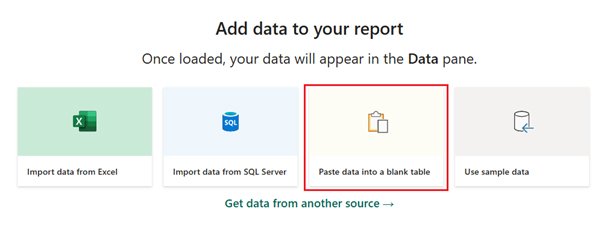
This is where tools such as Power BI and ChartExpo change the game. They transform raw data into clear, visual representations that anyone can understand.

Think of a plant manager monitoring machine downtime or a finance officer reviewing expenses. Operational reporting makes such tasks faster, sharper, and more reliable. In fact, Gartner reported that businesses using advanced BI reporting tools are 30% more likely to achieve their performance targets.

The beauty of reporting lies in flexibility. You can generate management reporting dashboards for day-to-day tracking or drill deeper into patterns with pivot reporting. Instead of drowning in spreadsheets, leaders see trends, spot risks early, and guide teams with clarity. This isn’t about replacing human judgment. It’s about strengthening it with evidence that speaks plainly.

Operational reporting is no longer optional. It’s the difference between reacting slowly and leading with confidence. With Power BI and ChartExpo, the gap between raw data and smart decisions disappears.

This guide will walk you through how to make that shift a reality. Let’s get started…

Table of Contents:

  1. What is Operational Reporting?
  2. Why is Ops Reporting Important?
  3. Key Characteristics of Operational Reporting
  4. Types of Operational Reporting
  5. What are Operational Reporting Tools?
  6. Examples of Operational Reporting
  7. How to Analyze Operational Reporting in Power BI?
  8. Benefits of Sales Operations Reports
  9. Best Practices for Implementing Business Operations Report
  10. FAQs
  11. Wrap Up

What is Operational Reporting?

Definition: Operational reporting is the process of turning raw data into clear, actionable insights. It focuses on day-to-day activities, helping teams track performance and spot issues quickly.

Unlike strategic reports, operational reporting highlights immediate actions rather than long-term planning. Businesses use it to monitor sales, expenses, and productivity in real-time. Modern operational reporting tools make this faster and easier.

Reports can be simple summaries or detailed dashboards. A data reporting approach ensures accuracy and consistency across departments. From tracking sales operations reports to managing costs, operational reporting keeps businesses informed and responsive. This, in turn, drives smarter decisions every single day.

Why is Ops Reporting Important?

Every business runs on decisions. Some are small, while others change the direction of the company. Ops reporting makes those choices faster and smarter. Without it, leaders rely on guesswork. With it, they act with confidence. Whether through executive reporting or an analytical report, the difference is clear: facts replace assumptions.

How?

  • Increased efficiency: With ops reporting, teams spend less time searching for data. This frees them to focus on the tasks that truly matter.
  • Enhanced accountability: Reports clearly show who is responsible for each outcome. This makes performance visible and transparent.
  • Proactive decision-making: Early trend detection highlights potential issues. This allows you to act before small problems escalate.
  • Compliance support: Accurate reports ensure adherence to industry rules. This reduces the risk of costly penalties.
  • Increased profitability: Efficiency and accountability create a stronger foundation for success. Proactive insights then drive steady profit growth.

Key Characteristics of Operational Reporting

Operational reporting is most effective when it provides clear, timely, and actionable information. Whether reviewing a business operations report or comparing trends through a Power BI report, the goal remains the same: Better decisions backed by facts.

Take note of these points to make this a reality:

  • Timeliness: Reports must provide up-to-date insights. Delayed data often means missed opportunities.
  • Granularity: Break information into detailed layers. Teams can then see not only the outcomes but also the causes behind them.
  • Relevance: Focus only on what matters. Irrelevant data distracts and slows decision-making.
  • Clarity: Reports should be simple, direct, and free of jargon. Clear visuals always beat cluttered spreadsheets.
  • Automation: Automated reporting saves time and reduces errors. It ensures ops reporting remains consistent and reliable.

Types of Operational Reporting

Operations run on data, and reports are the heartbeat that keeps everything in check. Operational reporting takes raw numbers and turns them into insights you can act on right away. Whether it’s tracking money, stock, or customer issues, the right reports keep businesses moving forward with clarity:

  1. Daily Transaction Reports: These capture sales, purchases, and other day-to-day activities. They help managers spot unusual patterns, verify accuracy, and ensure no transaction goes unmonitored.
  2. Production and Inventory Reports: These track stock availability, production levels, and supply gaps. They prevent costly delays, reduce waste, and keep operations running smoothly.
  3. Financial Operations Reports: These highlight expenses, revenues, and cost centers. Much like spending reports, they show where money is going and where you can make savings.
  4. Customer Service Reports: These measure response times, complaint resolution, and satisfaction rates. Businesses use them to improve service quality, retain clients, and strengthen brand trust.

What are Operational Reporting Tools?

Operational reporting tools turn complex data into clear insights. They help teams track daily performance and act quickly.

Tools like Power BI, ChartExpo, Tableau, and Looker are popular choices. Each provides dashboards, charts, and visuals that make data easy to read. A market intelligence report built in these tools can reveal trends competitors might miss. Moreover, a market research report can provide detailed insights into customer behaviors.

These tools eliminate guesswork and enable faster, more informed decision-making. They also support automation, saving time and cutting errors. With the right tool, operational reporting becomes less about numbers and more about action.

Examples of Operational Reporting

Every industry runs on numbers, but raw data alone doesn’t drive results. That’s where operational reporting steps in. It turns complex information into clear insights that help teams act fast. Whether through management reporting or a detailed Power BI report, businesses can track performance and make sharper decisions.

Here are some examples to help you get started:

  • Retail: Stores use daily sales and inventory reports to track product movement. This prevents stockouts, highlights bestsellers, and improves supply chain planning.
  • Manufacturing: Reports monitor production rates, equipment downtime, and material usage. This reduces waste and boosts efficiency on the shop floor.
  • Finance: Operational reporting provides insights into expenses, revenues, and cash flow trends. Combined with spend reporting, it helps spot unnecessary costs and improve profitability.
  • Marketing: Campaign performance reports highlight engagement, conversions, and ROI. Teams use these insights to refine strategies and target audiences more effectively.
  • Market research: A market research report example may track consumer behavior or competitor activity. Such reports inform product development and enable companies to stay competitive.

How to Analyze Operational Reporting in Power BI?

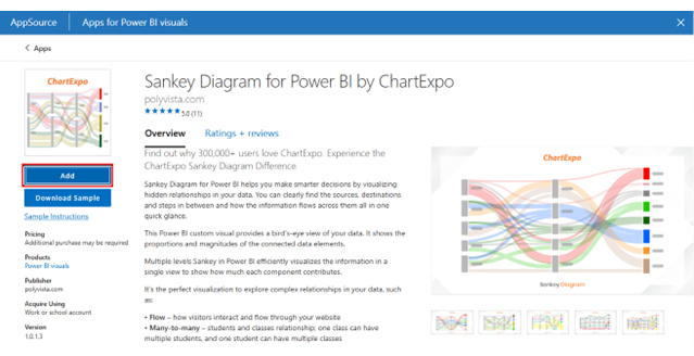
Operational reports are like the heartbeat of any business. They tell you what’s working, what’s lagging, and where action is needed. Power BI makes these reports look sharp, but sometimes its visuals feel limited.

Data without the right story can be overwhelming, and that’s where ChartExpo steps in. It transforms raw data into clear, meaningful visuals that drive action, not confusion.

Why use ChartExpo to analyze Operational Reporting?

  • Delivers easy-to-read charts.
  • Highlights trends faster.
  • Simplifies complex data.
  • Enhances decision-making.
  • Saves time with ready-made visuals.

Example

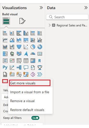
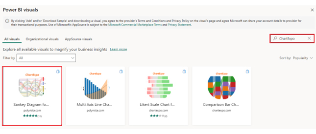
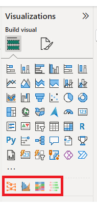
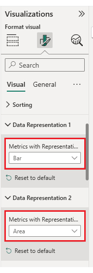
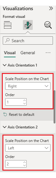
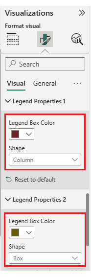
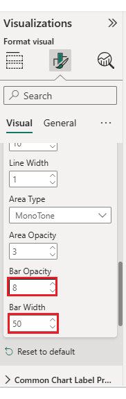
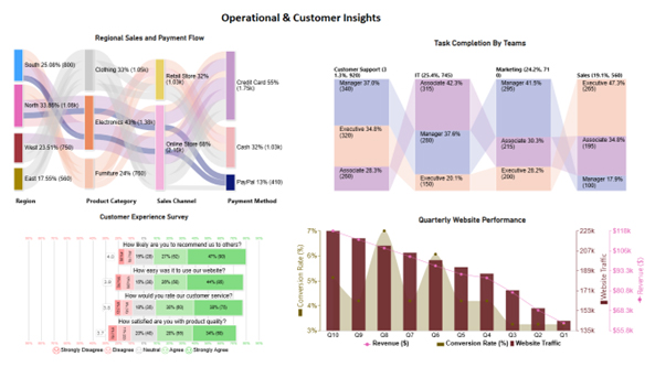
In this guide, I’ll walk through how to build and customize four impactful custom visuals in Power BI: Sankey Chart, Comparison Bar Chart, Multi-Axis Line Chart, and Likert Chart. Each one will come with simple, step-by-step instructions so you can explore your data more clearly and interactively:

Stage 1: Logging in to Power BI

  • Log in to Power BI.
  • Enter your email address and click the “Submit” button.
Operational Reporting
  • You are redirected to your Microsoft account.
  • Enter your password and click “Sign in.”
Operational Reporting
  • You can choose whether to stay signed in.
Operational Reporting
  • Once done, the Power BI home screen will open.

Stage 2: Creating a Data Set and Selecting the Data Set to Use in Your Chart

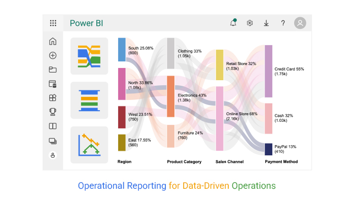
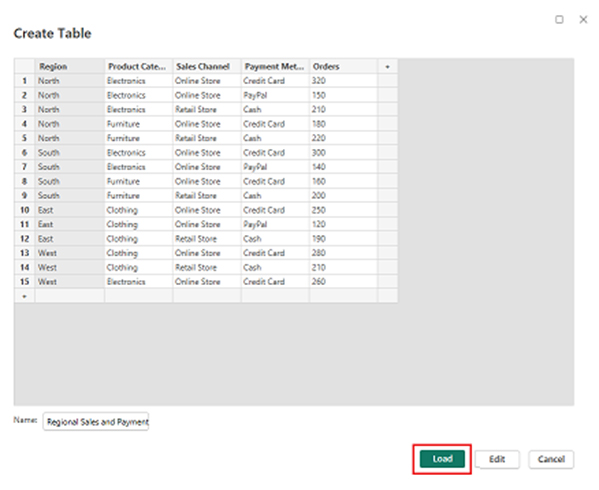
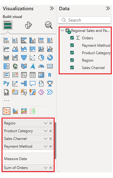
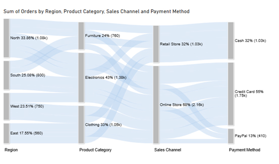
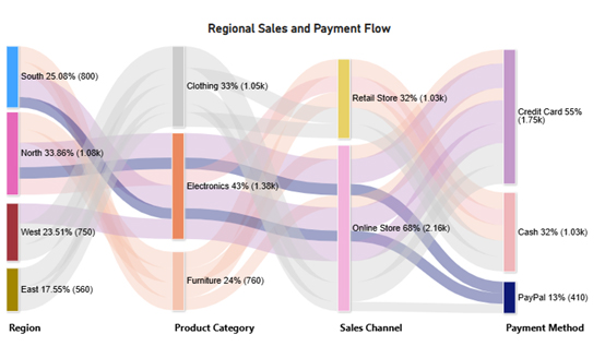
Now, assume we have the following data for a Sankey Chart:

Region Product Category Sales Channel Payment Method Orders
North Electronics Online Store Credit Card 320
North Electronics Online Store PayPal 150
North Electronics Retail Store Cash 210
North Furniture Online Store Credit Card 180
North Furniture Retail Store Cash 220
South Electronics Online Store Credit Card 300
South Electronics Online Store PayPal 140
South Furniture Online Store Credit Card 160
South Furniture Retail Store Cash 200
East Clothing Online Store Credit Card 250
East Clothing Online Store PayPal 120
East Clothing Retail Store Cash 190
West Clothing Online Store Credit Card 280
West Clothing Retail Store Cash 210
West Electronics Online Store Credit Card 260
  • First, you need to add data to your report and click on the “Paste data into a blank report”.
Operational Reporting
  • Paste the data table above into a blank table, name it, and click on the “Load” button.
Operational Reporting
  • To build a Sankey Chart, you will initially have to import an add-in or Power BI visual through App Source. You will find the Visualizations panel on the right side of your Power BI dashboard.
  • Select “Get more Visuals”:
Operational Reporting
  • Search ‘ChartExpo’ and select the Sankey Diagram. Here, you should add Multi Axis Line Chart, Comparison Bar Chart, and Likert Chart in your visuals. We will use these charts for different insights.
Operational Reporting
  • Click on the “ADD” button:
Operational Reporting
  • Once you have added all four charts to your visuals, you’ll see the chart icons in your visuals list. From left to right, Sankey Diagram, Multi Axis Line Chart, Comparison Bar Chart, and Likert Chart by ChartExpo.
  • Now, we will use these charts one by one.
Operational Reporting
  • To add the Sankey Chart visual (first one from left), click on the chart icon, and choose the dimension and measures:
Operational Reporting
  • In the visualization’s properties, click on License Settings and add the key. So that you’ll see the Sankey Chart without a watermark:
Operational Reporting
  • Now, after applying the key, the watermark is removed from the chart:
Operational Reporting
  • Now, we will enhance the chart’s appearance. To do so, we can modify the title to better align with the visualized data.
Operational Reporting
  • You can set the bar colors from “Visual”:
Operational Reporting
  • You can change font size and node width for better visualization from “Nodes Font Size”:
Operational Reporting
  • The final look of the Sankey Chart is as shown below:
Operational Reporting

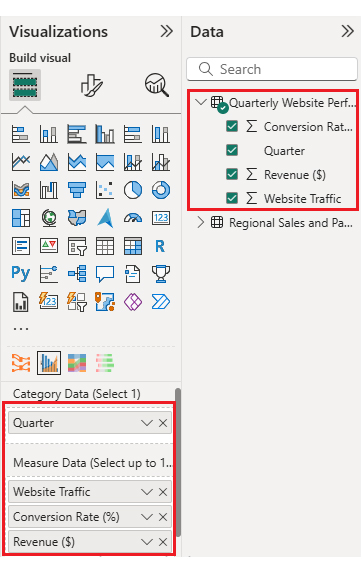
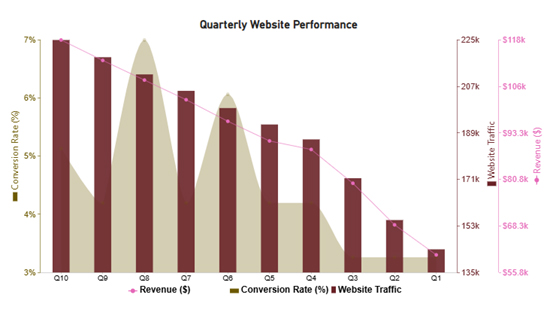
Now, we will discuss the second chart (Multi Axis Line Chart) in our report:

Operational Reporting

Let’s say we have the following data for a Multi Axis Line Chart:

Quarter Website Traffic Conversion Rate (%) Revenue ($)
Q1 143,700 3 60,500
Q2 155,100 3 68,600
Q3 171,400 3 79,800
Q4 186,500 4 88,900
Q5 192,300 4 91,200
Q6 198,700 6 96,500
Q7 205,400 4 102,300
Q8 211,800 7 107,600
Q9 218,500 4 112,900
Q10 225,200 5 118,400
  • Once data is manually pasted in Power BI or exported from Excel, choose the dimension and measures:
Operational Reporting
  • Before creating the chart, you must enter the key to remove the watermark, as we did for the Sankey Chart.
  • Now, we will enhance the chart’s appearance. First, we will change the title of the chart, just as we did for the first chart. Then we will sort the data columns:
Operational Reporting
  • You can change the data representation as well:
Operational Reporting
  • You can change the Axis Orientation as well:
Operational Reporting
  • Next, we will change legend properties to set the shape type Column, Box, Line, and Circle:
Operational Reporting
  • You can adjust bar width and opacity from “Common Chart Properties”:
Operational Reporting
  • Add prefix and postfix signs with metrics by expanding “Y Axis Properties”:
Operational Reporting
  • The final look of the Multi Axis Line Chart is as shown below:
Operational Reporting

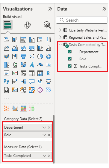
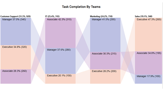
Now, we will add the third chart (Comparison Bar Chart) to our report:

Operational Reporting

Consider we have the following data for a Comparison Bar Chart:

Department Role Tasks Completed
Sales Manager 100
Sales Executive 265
Sales Associate 195
Marketing Manager 295
Marketing Executive 200
Marketing Associate 215
IT Manager 280
IT Executive 150
IT Associate 315
Customer Support Manager 340
Customer Support Executive 320
Customer Support Associate 260
  • Once data is manually pasted in Power BI or exported from Excel, choose the dimension and measures:
Operational Reporting
  • Before creating the chart, you must enter the key to remove the watermark, as we did for the Sankey Chart.
  • Now, we will set the properties to customize the look and feel of the Comparison Bar Chart. First, we will change the title of the chart, as we changed the first chart. You can adjust bar width as well:
Operational Reporting
  • If you want to change the bar color of the chart so that it looks more presentable, you can also do it from “Bar Color”:
Operational Reporting
  • The final look of our Comparison Bar Chart is as shown below:
Operational Reporting

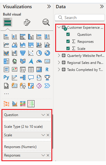
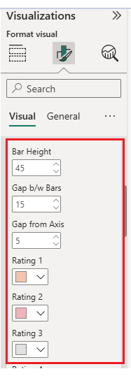
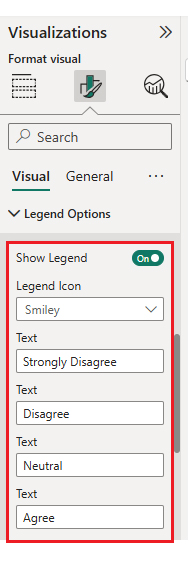
Now, we will add the fourth chart (Likert Scale Chart) to our report.

Operational Reporting

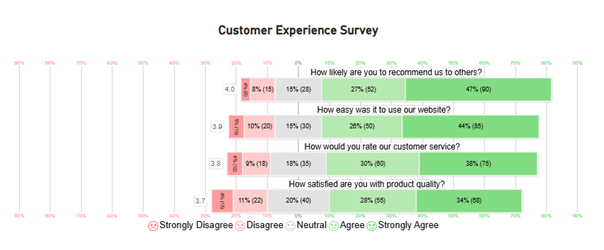
Consider we have the following data for the Likert Chart:

Question Scale Responses
How satisfied are you with product quality? 1 15
How satisfied are you with product quality? 2 22
How satisfied are you with product quality? 3 40
How satisfied are you with product quality? 4 55
How satisfied are you with product quality? 5 68
How would you rate our customer service? 1 12
How would you rate our customer service? 2 18
How would you rate our customer service? 3 35
How would you rate our customer service? 4 60
How would you rate our customer service? 5 75
How easy was it to use our website? 1 10
How easy was it to use our website? 2 20
How easy was it to use our website? 3 30
How easy was it to use our website? 4 50
How easy was it to use our website? 5 85
How likely are you to recommend us to others? 1 8
How likely are you to recommend us to others? 2 15
How likely are you to recommend us to others? 3 28
How likely are you to recommend us to others? 4 52
How likely are you to recommend us to others? 5 90
  • Once you manually paste the data into Power BI or export from Excel, choose the dimension and measures:
Operational Reporting
  • Before creating the chart, you must enter the key to remove the watermark, as we did for the Sankey Chart.
  • Now, we will set the properties to customize the look and feel of the Likert Chart. First, we will change the title of the chart, just as we did for the first chart. You can change rating colors and other properties from “Bar and Label Option”:
Operational Reporting
  • You can change the legend text from “Legend Options” as well:
Operational Reporting
  • Final Look of the Likert Chart is as shown below:
Operational Reporting

You can also bring these charts together into a dashboard. This allows you to arrange them in a clear and structured way, making your insights more impactful. By using space wisely and adding interactivity, you create an engaging experience for viewers. A well-designed layout not only captures attention but also turns raw data into a compelling visual story.

Once the charts are placed, your dashboard should look something like this.

Operational Reporting

Key Insights

  • North leads sales (33.86%), with Electronics as the top category (43%) and online credit card purchases driving volume.
  • Customer Support Managers and IT Associates complete the most tasks, while Sales Executives lead their team.
  • Ratings are positive, highest in likelihood to recommend (4.0) and lowest in product quality (3.7).
  • Traffic, conversions, and revenue peak in Q6 and Q10, with steady growth overall.

Benefits of Sales Operations Reports

Sales don’t happen by chance. They happen by design. Sales operations reports give teams a clear view of pipelines, quotas, and performance. They turn scattered numbers into insights that drive more intelligent decisions. With tools like BI reporting, you can spot trends, fix issues, and push growth. These reports aren’t just charts. They’re a roadmap to hitting targets faster and smarter:

  • Monitor sales pipeline health and conversion rates: Spot bottlenecks, track progress, and understand why deals close, or don’t.
  • Optimize territory and quota assignments: These reports will help you ensure fairness and balance, so no team is overloaded while others sit idle.
  • Enhance the accuracy of forecasting: These reports give insights to help you base predictions on real trends rather than intuition. This will reduce costly surprises.
  • Reveal performance gaps: Identify underperforming reps or regions quickly and take action before revenue suffers.

Best Practices for Implementing Business Operations Report

A business operations report is only useful if implemented thoughtfully. Done right, it guides smarter decisions and improves workflows. Using tools like management reporting or analytical reports helps teams track performance and act quickly.

Follow these best practices to make your reports dance with insights:

  • Ensure data accuracy: Accurate data is the foundation of every report. Mistakes in numbers lead to wrong decisions. So, clean and validate your data before building reports to maintain reliability.
  • Define clear objectives: Every report should have a purpose. Know what questions it answers and who will use it. Clear goals ensure the report delivers actionable insights rather than noise.
  • Use visualization wisely: Charts, graphs, and dashboards make data easy to digest. Avoid clutter and focus on visuals that clearly highlight trends and patterns. Good visuals turn numbers into stories.
  • Automate reporting: Automation keeps reports up-to-date and reduces manual errors. Scheduled refreshes and formula-driven dashboards save time and ensure consistent reporting.
  • Review and iterate regularly: Business priorities change, and reports should evolve. Regular reviews help adjust metrics, formats, and focus areas to ensure relevance and continued usefulness.

FAQs

What are the four types of operational reports?

Operational reports come in several types, each serving a specific purpose:

  • Daily transaction reports track routine activities.
  • Production and inventory reports monitor stock and output.
  • Financial operations reports show expenses and revenue.
  • Customer service reports measure satisfaction and response times.

What data is present in an operational report?

An operational report contains key business data. It includes sales figures, production metrics, inventory levels, and financial summaries. Customer interactions and service metrics are also tracked. The report may highlight trends, performance gaps, and actionable insights for daily decision-making.

Wrap Up

Operational reporting transforms raw data into clear insights. It helps businesses track performance and make informed decisions more quickly. Using tools like Power BI, teams can visualize trends and spot issues early.

ChartExpo enhances Power BI by offering ready-to-use charts. It makes complicated data easy to understand. With management reporting dashboards, even non-technical users can quickly interpret results.

Reports, such as daily transactions, financial operations, and customer service, provide a comprehensive view of a business’s health. They highlight gaps and opportunities. With consistent reporting, teams stay aligned and focused on priorities.

Advanced features such as pivot reporting allow users to slice and dice data. This helps uncover hidden patterns and enhances forecasting accuracy. Decision-makers gain clarity and confidence in their actions.

Automation saves time and reduces errors. Scheduled updates keep reports fresh and reliable. Combined with ChartExpo, the process becomes seamless. Teams can focus on analysis, not formatting.

Operational reporting is no longer optional. It drives efficiency, accountability, and profitability. Install ChartExpo today and start turning your data into actionable insights. Build dashboards, visualize trends, and make smarter decisions. Your business will start benefiting immediately.

How much did you enjoy this article?

ExcelAd1
Start Free Trial!
157746

Related articles

next previous
Data Analytics12 min read

Startup Financial Model: A Visual Approach

A startup financial model helps founders plan revenue, expenses, and cash flow. This guide shows how to create, analyze, and visualize your model.

Data Analytics12 min read

Restaurant Profit and Loss Template for Data Insights

A Restaurant Profit and Loss Template shows income and costs. Learn how to create, use, and analyze it in Excel to make smarter decisions and boost profits.

Data Analytics10 min read

Restaurant Key Performance Indicators: A Complete Guide

Restaurant KPIs track sales, costs, and customer satisfaction. Click here to see the examples, benefits, and best practices to boost performance.

Data Analytics10 min read

SLA vs KPI: Key Differences Explained with Visuals

SLA vs. KPI defines performance standards and measures results in business operations. Learn the key differences, similarities, and practical examples.

Data Analytics12 min read

B2B Marketing KPIs: Key Metrics for B2B Growth

B2B marketing KPIs track lead quality, engagement, and revenue. Click here to learn how to choose, analyze, and visualize KPIs for better marketing results.

ChartExpo logo

Turn Data into Visual
Stories

CHARTEXPO

  • Home
  • Gallery
  • Videos
  • Services
  • Pricing
  • Contact us
  • FAQs
  • Privacy policy
  • Terms of Service
  • Sitemap

TOOLS

  • ChartExpo for Google Sheets
  • ChartExpo for Microsoft Excel
  • Power BI Custom Visuals by ChartExpo
  • Word Cloud

CATEGORIES

  • Bar Charts
  • Circle Graphs
  • Column Charts
  • Combo Charts
  • Comparison Charts
  • Line Graphs
  • PPC Charts
  • Sentiment Analysis Charts
  • Survey Charts

TOP CHARTS

  • Sankey Diagram
  • Likert Scale Chart
  • Comparison Bar Chart
  • Pareto Chart
  • Funnel Chart
  • Gauge Chart
  • Radar Chart
  • Radial Bar Chart
  • Sunburst Chart
  • see more
  • Scatter Plot Chart
  • CSAT Survey Bar Chart
  • CSAT Survey Chart
  • Dot Plot Chart
  • Double Bar Graph
  • Matrix Chart
  • Multi Axis Line Chart
  • Overlapping Bar Chart
  • Control Chart
  • Slope Chart
  • Clustered Bar Chart
  • Clustered Column Chart
  • Box and Whisker Plot
  • Tornado Chart
  • Waterfall Chart
  • Word Cloud
  • see less

RESOURCES

  • Blog
  • Resources
  • YouTube
SIGN UP FOR UPDATES

We wouldn't dream of spamming you or selling your info.

© 2026 ChartExpo, all rights reserved.