• Home
  • Tools dropdown img
    • Spreadsheet Charts

      • ChartExpo for Google Sheets
      • ChartExpo for Microsoft Excel
    • Power BI Charts

      • Power BI Custom Visuals by ChartExpo
    • Word Cloud

  • Charts dropdown img
    • Chart Category

      • Bar Charts
      • Circle Graphs
      • Column Charts
      • Combo Charts
      • Comparison Charts
      • Line Graphs
      • PPC Charts
      • Sentiment Analysis Charts
      • Survey Charts
    • Chart Type

      • Box and Whisker Plot
      • Clustered Bar Chart
      • Clustered Column Chart
      • Comparison Bar Chart
      • Control Chart
      • CSAT Survey Bar Chart
      • CSAT Survey Chart
      • Dot Plot Chart
      • Double Bar Graph
      • Funnel Chart
      • Gauge Chart
      • Likert Scale Chart
      • Matrix Chart
      • Multi Axis Line Chart
      • Overlapping Bar Chart
      • Pareto Chart
      • Radar Chart
      • Radial Bar Chart
      • Sankey Diagram
      • Scatter Plot Chart
      • Slope Chart
      • Sunburst Chart
      • Tornado Chart
      • Waterfall Chart
      • Word Cloud
    • Google Sheets
      Microsoft Excel
  • Services
  • Pricing
  • Contact us
  • Blog
  • Support dropdown img
      • Gallery
      • Videos
      • Contact us
      • FAQs
      • Resources
    • Please feel free to contact us

      atsupport@chartexpo.com

Categories
All Data Visualizations Data Analytics Surveys
Add-ons/
  • Google Sheets
  • Microsoft Excel
  • Power BI
All Data Visualizations Data Analytics Surveys
Add-ons
  • Google Sheets
  • Microsoft Excel
  • Power BI

We use cookies

This website uses cookies to provide better user experience and user's session management.
By continuing visiting this website you consent the use of these cookies.

Ok

ChartExpo Survey


Home > Blog > Microsoft Excel

Tableau vs Excel: How to Pick the Right Tool for You

Tableau vs. Excel—which one should you choose? The answer depends on what you’re trying to accomplish. Both tools are powerful, but they serve different purposes. Understanding those differences could save your team hours and improve your decisions.

Tableau vs Excel

Tableau focuses on turning numbers into clear visuals. With Tableau, a sales manager can spot trends at a glance. Moreover, a marketer can track campaign performance without crunching formulas.

Still, Excel holds the ground. It gives more control over calculations. If you need to dive into formulas or functions, Excel wins. Many professionals rely on Excel functions for data Analysis to quickly sort, filter, and evaluate large datasets.

Yet, the question isn’t about replacing Excel. It’s about understanding how the two fit into your workflow. You might not need to choose one over the other. You might need both. Comparing Google Spreadsheet vs. Excel also helps when weighing cost, access, and simplicity.

Businesses are pushing for more intelligent reporting, and teams want faster insights. The tools you pick will shape how you work with data. This blog will help you decide which fits your needs—and why.

Let’s get started…

Table of Contents:

  1. What is the Tableau Versus Excel?
  2. Why is Excel Important Compared to Tableau?
  3. What are the Key Differences Between Excel and Tableau?
  4. What are the Key Similarities Between Excel and Tableau?
  5. When to Use Excel and Tableau?
  6. How is Excel Better for Analysis than Tableau?
  7. What are the Excel vs. Tableau Pros and Cons?
  8. FAQs
  9. Wrap Up

What is the Tableau Versus Excel?

Both tools help you understand data, but they do it in different ways. Excel feels familiar. Tableau feels powerful. If you’re deciding which one to use, this side-by-side look will help:

Feature Excel Tableau
Purpose Spreadsheet software for calculations and reports Data visualization and business intelligence.
Ease of Use Easy for beginners. Steeper learning curve.
Data Handling Handles small to medium datasets well. Handles large, complex datasets smoothly.
Visualization Basic charts and graphs. Interactive, dynamic dashboards.
Automation Uses formulas, macros, and VBA. Drag-and-drop with filters and parameters.
Collaboration Share via files or OneDrive. Publish to Tableau Server or Tableau Cloud.
Integration Strong with Microsoft tools. It connects to many data sources (cloud, SQL, etc.).
Price One-time or subscription (Microsoft 365). Subscription-based (can be expensive).
Customization Flexible with formulas and formatting. Advanced with calculated fields and filters.
Best For Quick reports, finance, small-scale analysis In-depth analysis, storytelling with data

Top Charts can be Created in Excel

Progress Circle Chart:

Tableau vs Excel

Mosaic Plot (a.k.a. Mekko):

Tableau vs Excel

Sankey Chart:

Tableau vs Excel

Multi Axis Line Chart:

Tableau vs Excel

Multi Axis Spider Chart:

Tableau vs Excel

Horizontal Waterfall Chart:

Tableau vs Excel

Likert Scale Chart:

Tableau vs Excel

Progress Chart:

Tableau vs Excel

Stacked Waterfall Chart:

Tableau vs Excel

Clustered Stacked Bar Chart:

Tableau vs Excel

Why is Excel Important Compared to Tableau?

Spreadsheets remain the first stop for actionable insight, even as dazzling BI dashboards gain headlines. Before numbers turn into colorful charts, they need structure, scrutiny, and context—and that’s where Excel shines.

Here’s why many still choose Excel over Tableau.

  • Universality and accessibility: Excel is used on over 80% of business computers; add-ins for Excel Mac give Apple users equal power as PC users. That reach makes opening, editing, and sending spreadsheets friction-free across departments and devices.
  • Versatility for everyday tasks: Excel works for budgets, inventories, schedules—you name it. Moreover, data analysis in Excel supports everything, from simple charts to pivot tables.
  • Ease of use and learning curve: The ribbon groups features in plain language, so beginners can build formulas within minutes. And that’s not all. Thousands of tutorials shorten the learning curve, while advanced users level up through VBA and Power Query.
  • Better for raw data manipulation: Rows and columns provide a flexible staging area for efficiently sorting, filtering, and combining millions of records. Power Pivot, Flash Fill, and structured references help analysts reshape data effectively before using any visualization platform.
  • Integration with other tools: Excel links with Outlook, Teams, and databases. Learning how to share an Excel workbook makes team edits smooth and fast.

What are the Key Differences Between Excel and Tableau?

Excel or Tableau? People often ask this when trying to level up how they use data. Both tools are helpful, but weren’t built for the same job. One focuses on doing the math, while the other focuses on telling the story.

Here’s how they compare:

Feature Excel Tableau
Purpose and focus Built for calculations, models, and MS Excel use in business, like budgets and reports. Built to visualize trends and patterns fast. Ideal for storytelling with data.
Data visualization capabilities Charts are there, but basic. You need time to format and customize. Drag and drop. Dashboards are clean, interactive, and sharp.
Handling of large datasets It slows down with very large files. Excel can crash past a million rows. Handles millions of rows with ease. It’s built to process big data fast.
Data connectivity and automation Excel connects to databases but often needs manual refreshes. Automation tools exist, but can be clunky. Tableau connects live to multiple sources and provides real-time updates with fewer steps.
Ease of use Easy to learn; most people know how to create a Report in Excel quickly. Steeper curve. Tableau is more visual but requires training to master it.

What are the Key Similarities Between Excel and Tableau?

Excel and Tableau might seem worlds apart, but they share more than you think. Both tools help people make more intelligent decisions from data. One might use formulas, and the other might use visuals. But at the core, they both support insight, speed, and better business choices.

Let’s break down where they align.

Feature Excel Tableau
Data Analysis and Decision Support Helps analyze trends using formulas, pivots, and Excel functions for data analysis. Helps spot insights quickly through visuals and dashboards.
Visualization Capabilities Offers charts, graphs, and sparklines. Customization is manual. Offers drag-and-drop visuals. Great for interactive dashboards.
Data Filtering and Sorting Filters and sorts using headers, slicers, or formulas. Filters are visual and dynamic—easy to apply across charts.
Integration with Other Tools Connects with Outlook, Teams, Power BI, and CRMs. Mastering how to share an Excel workbook also boosts team access. Connects to cloud data, CRMs, SQL, Google Sheets, and more. Live sync options are strong.
Widely Used in Business Environments A staple for finance, HR, marketing, and operations. Found in nearly every industry. Tableau is gaining speed in analytics, sales, and BI teams. It is common in mid to large enterprises.

When to Use Excel and Tableau?

Choosing between Excel and Tableau doesn’t have to be a battle. Think of it more as picking the right tool for the job. Both are powerful and have strengths. The real trick is knowing when to use which.

Here’s a quick guide to help you decide.

Use Excel when:

  • You’re working with calculations, formulas, or raw data cleanup.
  • You need to build budgets, reports, or financial models.
  • You want complete control over cells, sheets, and formulas.
  • You’re preparing structured datasets for visual tools later.

Use Tableau when:

  • You want to create visuals that help people spot insights quickly.
  • You’re working with large or live datasets from multiple sources.
  • You need interactive dashboards that update in real-time.
  • You want to impress stakeholders with sleek, shareable visuals.
  • You’re comparing platforms like Google spreadsheets vs Excel, but you want better visuals.

How is Excel Better for Analysis than Tableau?

Data is everywhere, but making sense of it? That’s the real challenge. Regarding data visualization, Excel often feels like trying to paint a masterpiece with just a crayon. It gets the job done, but the results can be… well, basic.

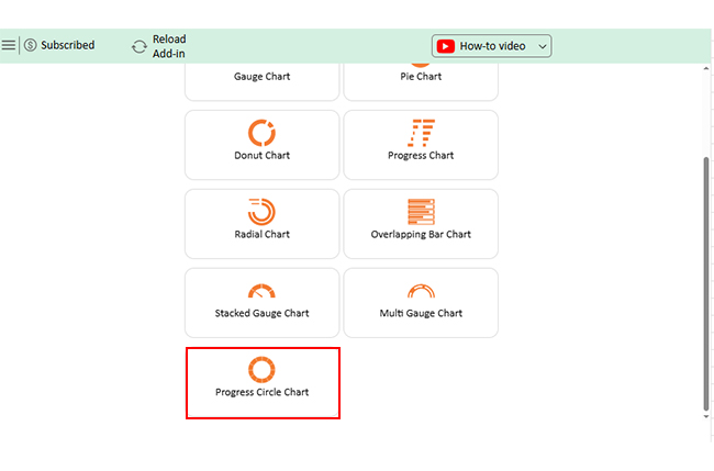
Enter Tableau, the superstar for turning data into eye-catching stories. But what if you love Excel and don’t want to switch? That’s where ChartExpo steps in—a clever tool that boosts Excel’s visuals from “meh” to “wow” without the hassle.

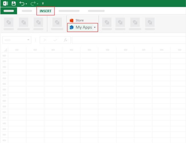
How to Install ChartExpo in Excel?

  1. Open your Excel application.
  2. Open the worksheet and click the “Insert” menu.
  3. You’ll see the “My Apps” option.
  4. In the Office Add-ins window, click “Store” and search for ChartExpo on my Apps Store.
  5. Click the “Add” button to install ChartExpo in your Excel.

ChartExpo charts are available both in Google Sheets and Microsoft Excel. Please use the following CTAs to install the tool of your choice and create beautiful visualizations with a few clicks in your favorite tool.

Example

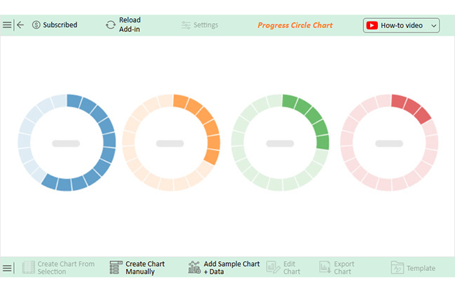
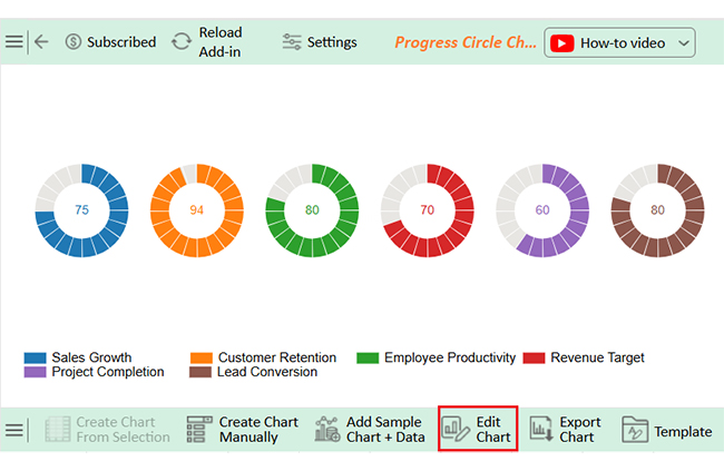
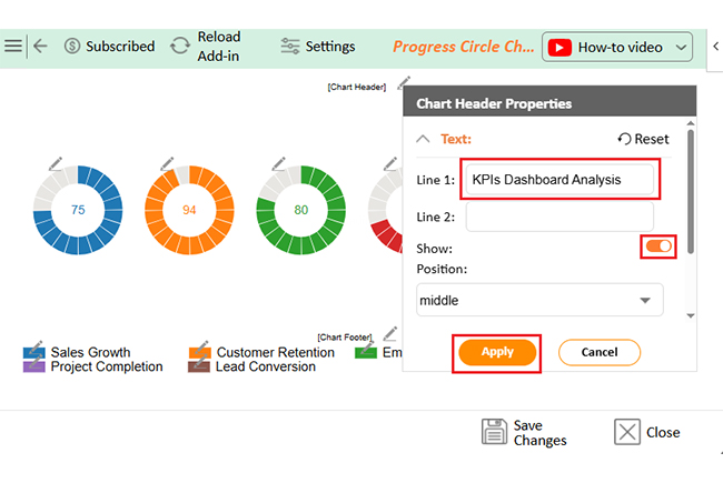
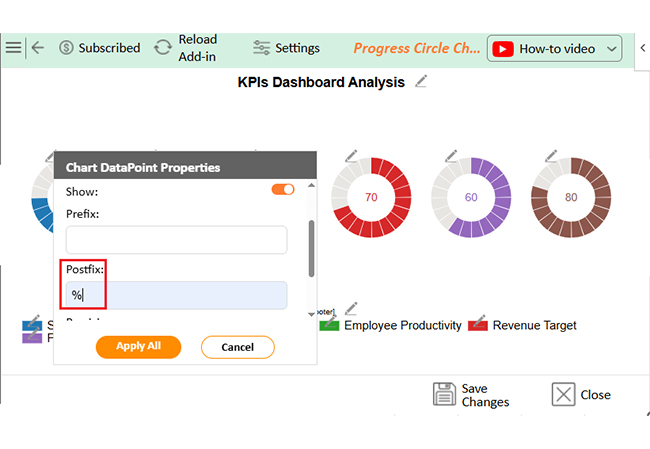
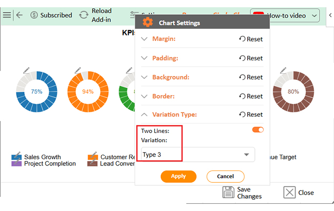
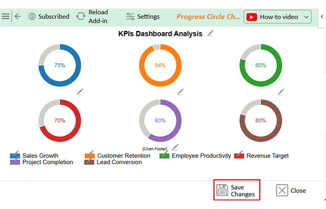
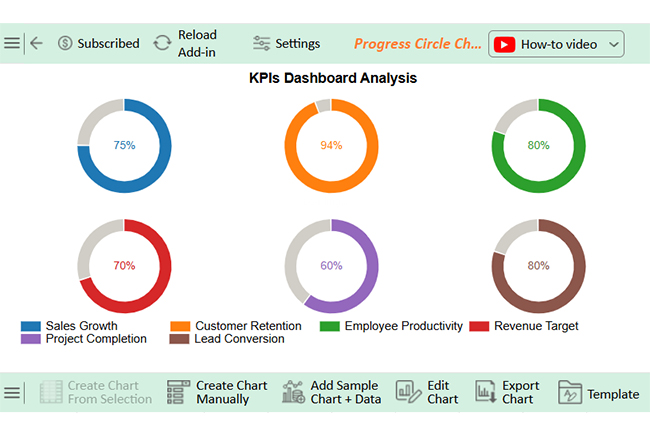
Let’s learn how to create a report and glean valuable insights in Excel using ChartExpo.

KPI Name Progress (%)
Sales Growth 75
Customer Retention 94
Employee Productivity 80
Revenue Target 70
Project Completion 60
Lead Conversion 80
  • To get started with ChartExpo, install ChartExpo in Excel.
  • Now, click on My Apps from the INSERT menu.
Tableau vs Excel
  • Choose ChartExpo from My Apps, then click Insert.
Tableau vs Excel
  • Once it loads, scroll through the charts list to locate and choose the “Progress Circle Chart”.
Tableau vs Excel
  • The Progress Circle Chart will appear as below.
Tableau vs Excel
  • Click the “Create Chart From Selection” button after selecting the data from the sheet, as shown.
Tableau vs Excel
  • ChartExpo will generate the visualization below for you.
Tableau vs Excel
  • If you want to add anything to the chart, click the Edit Chart button:
  • Click the pencil icon next to the Chart Header to change the title.
  • It will open the properties dialog. Under the Text section, you can add a heading in Line 1 and enable Show.
  • Give the appropriate title of your chart and click the Apply button.
Tableau vs Excel
  • You can add the (%) with all values:
Tableau vs Excel
  • You can change the data type by clicking on the settings button as follows:
Tableau vs Excel
  • Click the “Save Changes” button to persist the changes made to the chart.
Tableau vs Excel
  • Your final Progress Circle Chart will look like the one below.
Tableau vs Excel

Insights

  • Customer Retention is strong at 94%.
  • Lead Conversion is performing well at 80%.
  • Sales Growth is progressing steadily at 75%.
  • Employee Productivity is solid at 80%.
  • Revenue Target achievement is lagging at 70%.
  • The project Completion rate is low at 60% and needs improvement.

What are the Excel vs. Tableau Pros and Cons?

Excel or Tableau—it’s the kind of debate that pops up in team meetings, budget talks, and data strategy sessions. Each tool brings something special to the table, but none is perfect. Knowing the pros and cons can help you use both wisely, depending on your goals, team, and data. Here’s a quick breakdown:

Excel

Pros:

  • Super flexible for data entry and quick calculations.
  • Everyone knows it well (or has come across it).
  • Great for financial modeling and what-if analysis.
  • Tons of built-in formulas and functions.
  • Easy to export, share, and print.

Cons:

  • It gets sluggish with large datasets.
  • Not built for interactive visualizations.
  • Harder to maintain version control.
  • Error-prone (one wrong cell = disaster).
  • It can look dull and outdated for presentations.

Tableau

Pros:

  • Stunning, interactive dashboards—no code needed.
  • Connects easily to significant data sources.
  • Fast insights with drag-and-drop visuals.
  • Excellent for spotting trends and outliers.
  • Real-time updates and live dashboards.

Cons:

  • Tableau has a steeper learning curve for beginners.
  • It can’t do complex calculations like Excel.
  • Limited data manipulation—needs prep beforehand.
  • Costly, especially for small teams.
  • Not ideal for detailed tabular reports.

FAQs

Do I need to learn Excel before Tableau?

Yes, learning Excel first helps. It builds a strong data foundation. Excel teaches you basic calculations and data cleaning, and these skills make Tableau easier to use. Understanding Excel improves your overall data analysis ability.

Will Tableau replace Excel?

No, Tableau won’t replace Excel. They serve different purposes. Excel handles detailed calculations and raw data, while Tableau focuses on visual storytelling. Many use both tools together for the best results, as each complements the other’s strengths.

Wrap Up

Excel and Tableau are both powerful tools, but they serve different needs. Excel is mainly used for data calculation and organization, while Tableau shines in creating visual stories from data.

What is Excel software used for? It’s a powerful tool for managing raw data and performing detailed analysis. Its familiar grid system of rows and columns makes organizing information easy. To use it effectively, it’s important to understand the difference between an Excel workbook and a worksheet. A workbook contains multiple worksheets, helping you manage related data in one place.

For Mac users, Excel add-ins for Mac enhance functionality. They bring features that improve analysis and automation and help close the gap between Mac and Windows versions.

Tableau, on the other hand, focuses on data visualization. It creates interactive charts and dashboards fast. Tableau handles large datasets better than Excel.

The choice depends on your goals. Use Excel for calculations and data prep, and Tableau to visualize insights and trends.

Don’t hesitate to install ChartExpo for visualizing insights and trends in Excel. ChartExpo simplifies Excel data visualization with advanced, easy-to-use charts that enhance faster insights and decisions.

How much did you enjoy this article?

ExcelAd1
Start Free Trial!
155822

Related articles

next previous
Microsoft Excel10 min read

How to Create a Stacked Waterfall Chart in Excel?

Discover how to build and customize a stacked waterfall chart in Excel. Ideal for showing positive and negative values across categories or time.

Microsoft Excel12 min read

What is the Best Spreadsheet Application? A Quick Guide

The best spreadsheet application simplifies data tasks and boosts productivity. Click here to learn how to pick the right one and create smarter charts.

Microsoft Excel11 min read

Excel for Accounting and Finance: A Complete Walkthrough

Learn how Excel in accounting and finance simplifies data management. You’ll discover tips and tools to boost your skills and improve financial analysis.

Microsoft Excel12 min read

How to Create Sankey Diagram in Excel? Easy Steps

Create your own Sankey Diagram in Excel with simple steps. This guide shows you how to build, format, and customize a professional flow chart without coding.

Microsoft Excel12 min read

Excel Online Worksheet: A Complete Walkthrough

An Excel online worksheet is a browser-based spreadsheet you can access anywhere. Click here to learn how to edit, chart, share, and manage data online.

ChartExpo logo

Turn Data into Visual
Stories

CHARTEXPO

  • Home
  • Gallery
  • Videos
  • Services
  • Pricing
  • Contact us
  • FAQs
  • Privacy policy
  • Terms of Service
  • Sitemap

TOOLS

  • ChartExpo for Google Sheets
  • ChartExpo for Microsoft Excel
  • Power BI Custom Visuals by ChartExpo
  • Word Cloud

CATEGORIES

  • Bar Charts
  • Circle Graphs
  • Column Charts
  • Combo Charts
  • Comparison Charts
  • Line Graphs
  • PPC Charts
  • Sentiment Analysis Charts
  • Survey Charts

TOP CHARTS

  • Sankey Diagram
  • Likert Scale Chart
  • Comparison Bar Chart
  • Pareto Chart
  • Funnel Chart
  • Gauge Chart
  • Radar Chart
  • Radial Bar Chart
  • Sunburst Chart
  • see more
  • Scatter Plot Chart
  • CSAT Survey Bar Chart
  • CSAT Survey Chart
  • Dot Plot Chart
  • Double Bar Graph
  • Matrix Chart
  • Multi Axis Line Chart
  • Overlapping Bar Chart
  • Control Chart
  • Slope Chart
  • Clustered Bar Chart
  • Clustered Column Chart
  • Box and Whisker Plot
  • Tornado Chart
  • Waterfall Chart
  • Word Cloud
  • see less

RESOURCES

  • Blog
  • Resources
  • YouTube
SIGN UP FOR UPDATES

We wouldn't dream of spamming you or selling your info.

© 2025 ChartExpo, all rights reserved.