• Home
  • Tools dropdown img
    • Spreadsheet Charts

      • ChartExpo for Google Sheets
      • ChartExpo for Microsoft Excel
    • Power BI Charts

      • Power BI Custom Visuals by ChartExpo
    • Word Cloud

  • Charts dropdown img
    • Chart Category

      • Bar Charts
      • Circle Graphs
      • Column Charts
      • Combo Charts
      • Comparison Charts
      • Line Graphs
      • PPC Charts
      • Sentiment Analysis Charts
      • Survey Charts
    • Chart Type

      • Box and Whisker Plot
      • Clustered Bar Chart
      • Clustered Column Chart
      • Comparison Bar Chart
      • Control Chart
      • CSAT Survey Bar Chart
      • CSAT Survey Chart
      • Dot Plot Chart
      • Double Bar Graph
      • Funnel Chart
      • Gauge Chart
      • Likert Scale Chart
      • Matrix Chart
      • Multi Axis Line Chart
      • Overlapping Bar Chart
      • Pareto Chart
      • Radar Chart
      • Radial Bar Chart
      • Sankey Diagram
      • Scatter Plot Chart
      • Slope Chart
      • Sunburst Chart
      • Tornado Chart
      • Waterfall Chart
      • Word Cloud
    • Google Sheets
      Microsoft Excel
  • Services
  • Pricing
  • Contact us
  • Blog
  • Support dropdown img
      • Gallery
      • Videos
      • Contact us
      • FAQs
      • Resources
    • Please feel free to contact us

      atsupport@chartexpo.com

Categories
All Data Visualizations Data Analytics Surveys
Add-ons/
  • Google Sheets
  • Microsoft Excel
  • Power BI
All Data Visualizations Data Analytics Surveys
Add-ons
  • Google Sheets
  • Microsoft Excel
  • Power BI

We use cookies

This website uses cookies to provide better user experience and user's session management.
By continuing visiting this website you consent the use of these cookies.

Ok

ChartExpo Survey


Home > Blog > Microsoft Excel

How to Use Excel Power Query for Smarter Visual Insights

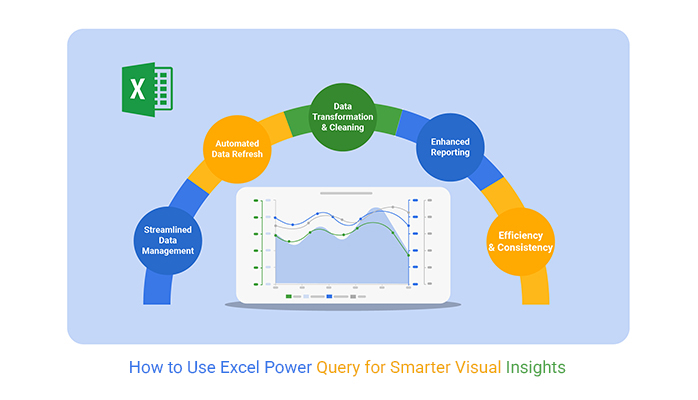
How do you use Excel Power Query to simplify data work?

Power Query is a game-changer for managing large datasets. It makes tasks efficient and straightforward, from cleaning messy spreadsheets to combining datasets.

With data growing fast, tools like Power Query are essential. It automates repetitive steps, saving hours of manual effort. While many use it for calculations, fewer explore its potential for tasks like creating data for Excel charts or improving information design.

How to Use Excel Power Query

Have you spent hours cleaning messy data? Power Query eliminates that frustration. Filter, sort, and format data consistently with just a few clicks. It ensures accuracy and reduces human error, opening doors to graph design ideas and impactful insights.

Businesses need quick, actionable insights. Power Query helps professionals work smarter, not harder. It’s perfect for anyone seeking results without extra complications.

By mastering Power Query, you unlock a tool that enhances productivity. Whether for careers or businesses, it’s invaluable.

Are you ready to simplify your workflows and improve your data analytics? Let’s dive in.

Table of Contents:

  1. What is Power Query in Excel?
  2. What are the Phases of Power Query in Excel?
  3. What Can You Do With Excel Power Query?
  4. How to Import Data with Power Query in Excel?
  5. What are the Benefits of Adding Power Query to Excel?
  6. What are the Limitations of Microsoft Power Query for Excel?
  7. How to Analyze Data Using Power Query in Excel?
  8. FAQs
  9. Wrap Up

First…

What is Power Query in Excel?

Definition: Power Query in Excel is a powerful tool for transforming data. It connects, cleans, and shapes data from various sources. Its visual analytics capabilities make data interpretation faster and more accurate.

The tool automates repetitive tasks like filtering and merging data. It supports connections to databases, files, and online sources. Its user-friendly interface lets you refine queries or dive deeper with M code.

Power Query is ideal for managing large or complex datasets. It tackles information overload, simplifying workflows for better decision-making.

Key features of Power Query include:

  • Data extraction: Power Query connects to various data sources. It easily pulls data from files, databases, or online platforms, eliminating the need for manual imports.
  • Data transformation: Power Query cleans and shapes data; you can remove duplicates, split columns, and apply filters.
  • Automated refresh: Power Query refreshes source data instantly, eliminating the need to redo work. Then, you can use an Excel charts add-in to create impactful visuals from your updated data.
  • User-friendly interface: No coding is required. Power Query’s interface is intuitive. You can drag, drop, and customize steps to fit your needs.
  • Integration with Excel: Power Query seamlessly integrates with Excel. You can load transformed data directly into your worksheets or pivot tables, keeping everything streamlined.

What are the Phases of Power Query in Excel?

Power Query in Excel is your assistant for working with messy data. It streamlines the process of preparing information for analysis. The process is simple but powerful, involving four main phases.

  • Connect (Extract): Start by connecting Power Query to your data source. It could be a file, database, or an online feed. You can pull in raw data to get started.
  • Transform (Clean and Shape): You can clean messy data, remove duplicates, and format columns. You can also rearrange, split, or combine data until it’s exactly how you need it. Power Query does the hard work, so you don’t have to.
  • Load (Load Data into Excel): Load your prepared data into Excel. It’s seamless, organized, and perfect for data storytelling.
  • Refresh (Update Data): Data constantly changes, and Power Query makes updates easy. With one click, refresh your queries to pull in new or updated information. It saves time and keeps your reports accurate.

What Can You Do With Excel Power Query?

Power Query is like having a data superhero in Excel. It simplifies tasks, saves time, and makes managing data fun.

Let’s explore the use of PowerQuery in Excel.

  • Import data: Power Query simplifies data integration for business analytics. It effortlessly connects to Excel files, databases, web pages, and cloud services.
  • Clean and transform data: Power Query is your tidy-up tool. In seconds, you can remove duplicates, split columns, format data, or replace errors.
  • Combine data: Merge tables or append files with ease. Whether joining sales data from multiple regions or combining monthly reports, Power Query handles it like a pro.
  • Automate processes: Why repeat tasks when you can automate them? Set it up once, and Power Query will remember. Refresh your data anytime, and it updates everything for you.
  • Load data: When your data is polished, load it where you need it—Excel tables, pivot tables, or straight into Power BI for advanced analysis.
  • Custom calculations: Create custom columns, apply logic, and craft formulas tailored to your needs. It even helps prepare data for custom Excel charts, making analysis seamless.

How to Import Data with Power Query in Excel?

Power Query makes importing data a breeze. Whether from a file, a database, or the web, it’s all about a few clicks and some magic behind the scenes:

  1. Open Power Query: First, fire up Excel. Head to the Data tab and click Get Data. You’ll see a menu with many options—it’s your gateway to importing data.
  2. Select data source: Where’s your data? Is it an Excel file? A CSV? Maybe a database? Pick the proper source from the menu. Power Query can connect to just about anything!
  3. Browse and select file: If your data is in a file, browse your folders and select it. It’s as easy as picking a photo for your profile picture.
  4. Preview data: Power Query shows you a sneak peek of your data. This preview helps you spot any issues or see if you picked the correct file.
  5. Load or transform: If your data looks good, hit Load to send it to Excel. Choose Transform Data and unleash Power Query’s editing tools if cleanup is needed.
  6. Finish: Once you’re happy, click Close & Load. Your data is ready to shine in Excel, perfectly imported, and ready to use.

What are the Benefits of Adding Power Query to Excel?

Power Query isn’t just an add-on—it’s a game changer for Excel users. Whether you deal with small datasets or complex reports, it simplifies and supercharges your workflow. Here’s why you’ll love adding PowerQuery to Excel:

  • Streamlined data management: Power Query lets you connect, organize, and manage data from multiple sources in one place. It’s like having a central control hub for your data.
  • Automated data refresh: Are you tired of manual updates? Power Query automates the process. Once set up, it refreshes your data with a single click—no re-importing or re-cleaning required.
  • Data transformation and cleaning: Power Query is a cleaning wizard. It can fix formatting, remove duplicates, split columns, or even filter out unwanted rows. In minutes, it can transform raw data into something usable.
  • Enhanced reporting: Clean data means better reports. Combine Power Query with Excel’s PivotTables or charts for dynamic reporting tools. When deciding between table vs. charts consider your audience—tables excel at detailed data, while charts highlight trends and insights.
  • Efficiency and consistency: Say goodbye to repetitive tasks. Power Query standardizes your data processes, ensuring accuracy and saving you hours. Focus on analysis, not tedious data prep.

What are the Limitations of Microsoft Power Query for Excel?

Microsoft Power Query for Excel is a fantastic tool, but it’s not perfect. Like any superhero, it has its kryptonite. Let’s explore some of its limitations so you know what to expect.

  • Complexity for advanced users: While it’s easy for beginners, advanced tasks can get tricky. Writing complex M-code or handling intricate data models might feel overwhelming without extra learning.
  • Memory usage: Working with massive datasets? Power Query relies on your computer’s memory, which can cause slowdowns or crashes if the data gets too large.
  • Limited support for real-time data: Power Query works well with static data sources but struggles with real-time updates. If you need live-streaming data, this might not be your best option.
  • Limited data sources: Although it supports many data types, some niche or proprietary systems aren’t compatible. You might need workarounds to access less familiar sources.
  • No In-place editing: Power Query doesn’t let you edit data directly in the source. You’ll need to make changes within the tool, which can feel restrictive for some workflows.

How to Analyze Data Using Power Query in Excel?

Data analysis is visual storytelling—all about making numbers speak. Excel’s Power Query is a powerful tool for wrangling data, but when it comes to visuals, Excel can be a disaster.

What’s the fuss about visuals? Data visualizations are the key to unlocking insights, yet Excel’s charts often feel limited and uninspiring.

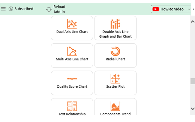
That’s where ChartExpo steps in. It’s your secret weapon for transforming raw Excel data to graph. ChartExpo’s advanced Excel charts are stunning, actionable, and insightful.

Let’s dive into how to create a graph from a table and elevate your game with better visuals!

Let’s learn how to install ChartExpo in Excel.

  1. Open your Excel application.
  2. Open the worksheet and click the “Insert” menu.
  3. You’ll see the “My Apps” option.
  4. In the Office Add-ins window, click “Store” and search for ChartExpo on my Apps Store.
  5. Click the “Add” button to install ChartExpo in your Excel.

ChartExpo charts are available both in Google Sheets and Microsoft Excel. Please use the following CTAs to install the tool of your choice and create beautiful visualizations with a few clicks in your favorite tool.

Example

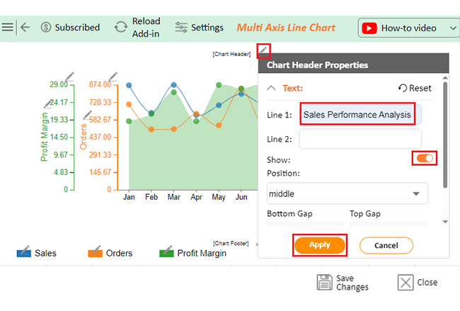
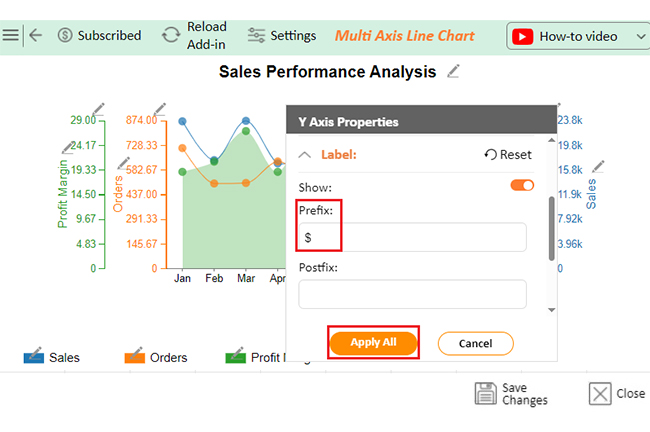
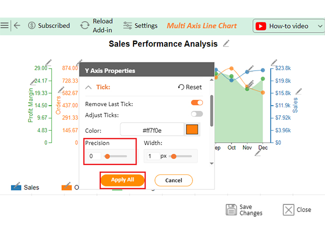
Are you wondering how to create a dashboard using Excel? Let’s use this sample data and ChartExpo to make it a breeze.

Months Orders Sales Profit Margin
Jan 713 23695 19
Feb 504 17457 21
Mar 507 23771 27
Apr 634 16936 19
May 538 19181 29
Jun 842 21755 28
Jul 497 19406 29
Aug 562 21689 21
Sep 769 23370 27
Oct 874 20006 26
Nov 661 22677 21
Dec 591 23229 25
  • To get started with ChartExpo, install ChartExpo in Excel.
  • Now Click on My Apps from the INSERT menu.
insert chartexpo in excel
  • Choose ChartExpo from My Apps, then click Insert.
open chartexpo in excel
  • Once it loads, scroll through the charts list to locate and choose the “Multi Axis Line Chart”.
search multi axis line chart in excel
  • You will see a Multi Axis Line Chart on the screen.
See Multi Axis Line Chart Page for Learning How to Use Excel Power Query
  • Click the “Create Chart From Selection” button after selecting the data from the sheet, as shown.
Click Create Chart From Selection for Learning How to Use Excel Power Query
  • If you want to add anything to the chart, click the Edit Chart button:
Click Edit Chart for Learning How to Use Excel Power Query
  • Click the pencil icon next to the Chart Header to change the title.
  • It will open the properties dialog. Under the Text section, you can add a heading in Line 1 and enable Show.
  • Give the appropriate title of your chart and click the Apply button.
Add Chart Header for Learning How to Use Excel Power Query
  • You can add the dollar sign with discounted cash flow value as follows:
Add Prefix with Discounted Cash Flow Value for Learning How to Use Excel Power Query
  • You can change the precision value to zero of “Orders” as follows:
Change Precision Value to Zero of Orders for Learning How to Use Excel Power Query
  • You can add the percentage sign with “Profit Margin” and change the precision value to zero as follows:
Add Postfix with Profit Margin for Learning How to Use Excel Power Query
  • You can change the Data Representation by clicking on Settings as follows:
Chnage Data Representation for Learning How to Use Excel Power Query
  • Change the Legend shape of “Sales” into a Line and Circle.
Change Legend Shape of Sales for Learning How to Use Excel Power Query
  • Change the shape of “Orders” into a Column as follows:
Change Legend Shape of Orders for Learning How to Use Excel Power Query
  • Click the “Save Changes” button to persist the changes made to the chart.
Click Save Changes for Learning How to Use Excel Power Query
  • Your final Multi Axis Line Chart will look like the one below.
Final How to Use Excel Power Query

Insights

  • October: Highest orders (874).
  • March: Highest sales ($23,771).
  • May & July: Peak profit margins (29%).
  • Overall: Stable demand with consistent sales and profits.
  • Key Insight: High margins in select months show effective cost management despite order fluctuations.

Enhancing Chart Accuracy with Microsoft Excel Power Query:

  1. Open your Excel Application.
  2. Install ChartExpo Add-in for Excel from Microsoft AppSource to create interactive visualizations.
  3. Select the Multi-Axis Line Chart from the list of charts.
  4. Select your data
  5. Click on the “Create Chart from Selection” button.
  6. Customize your chart properties to add header, axis, legends, and other required information.

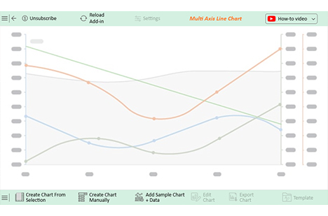
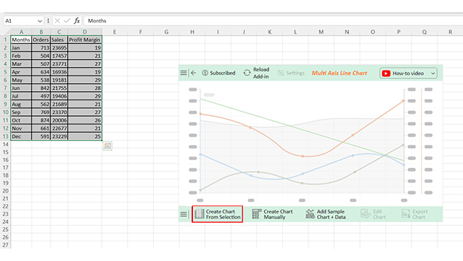
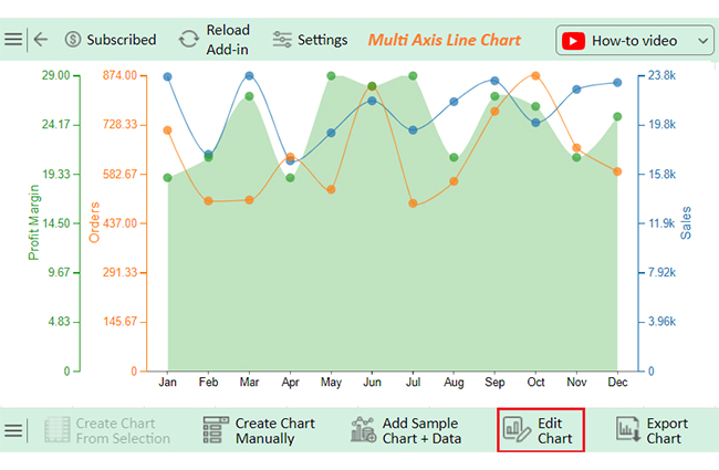
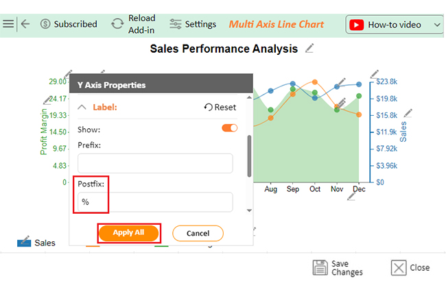
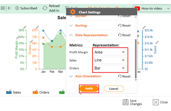
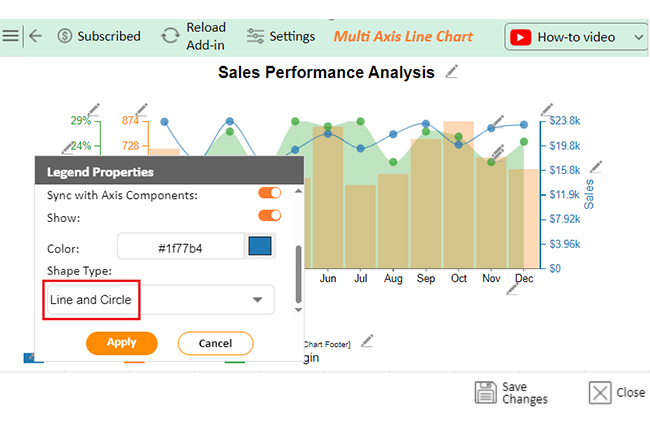
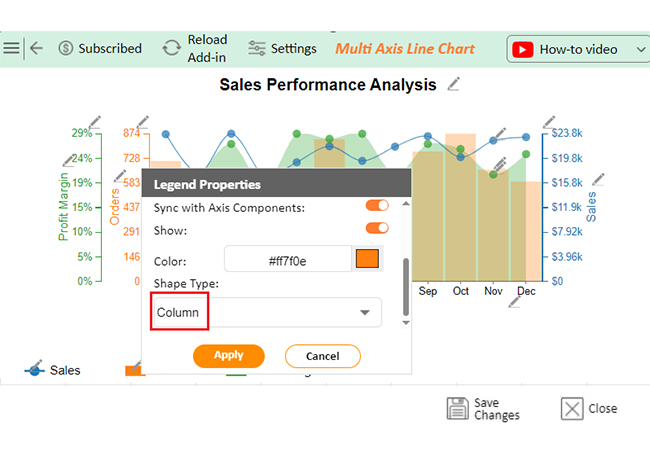
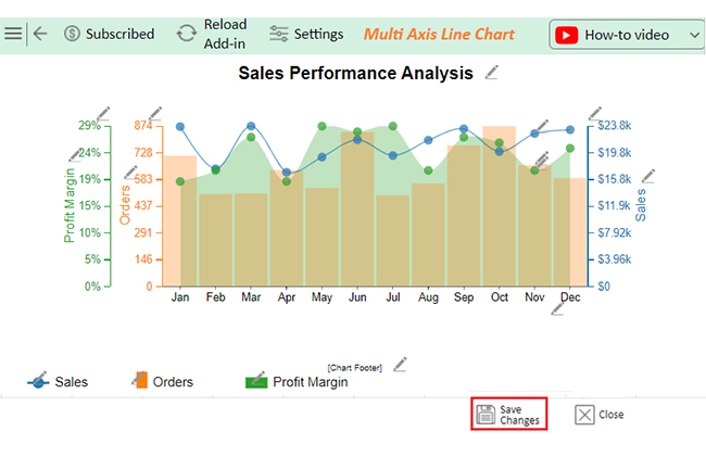
The following video will help you to create a Multi-Axis Line Chart in Microsoft Excel.

FAQs

How do I use the Power Query tool in Excel?

To use Power Query in Excel:

  1. Go to the “Data” tab.
  2. Click “Get Data” to import data.
  3. Transform data using its editor.
  4. Apply filters, merge tables, or reshape data.
  5. Load the results.

Where do I put Power Query in Excel?

Power Query is in Excel’s “Data” tab under the “Get & Transform Data” section. Use it to import, clean, and transform data. You’ll find options like “Get Data,” “Queries & Connections,” and “Edit Queries” there.

Wrap Up

Excel Power Query is a must-have for managing data. It simplifies cleaning, shaping, and Transforming information. Moreover, it saves time and effort, making it a game-changer for handling large datasets or combining files.

Power Query for Excel connects to multiple sources, from databases to online feeds. This flexibility ensures you can effectively manage any data challenge. Its intuitive features simplify tasks like removing duplicates, splitting columns, and applying custom formatting.

Power Query streamlines workflows, empowering data-driven decision-making. It ensures your data is clean, organized, and ready for actionable insights, no matter the size or complexity.

A standout feature is automated refresh. It updates data, reduces manual steps, and ensures reports reflect the latest information. This reliability enhances the analyzing and interpreting of data seamlessly.

Power Query’s integration with Excel boosts productivity. You can effortlessly load prepared data into sheets, pivot tables, or dashboards. Pair it with data visualization tools like ChartExpo to create stunning charts and graphs for impactful insights.

Mastering Power Query and installing add-ins for Excel Mac, like ChartExpo, unlock powerful solutions. Together, they simplify data preparation and visualization, empowering you to handle data with confidence and clarity.

How much did you enjoy this article?

ExcelAd1
Start Free Trial!
147666

Related articles

next previous
Microsoft Excel10 min read

Compound Interest in Excel for Smarter Reporting

Discover compound interest in Excel and how it works. Learn its formulas, calculation tips, and common errors to avoid for more accurate financial analysis.

Microsoft Excel9 min read

KPI Dashboard in Excel: A Complete Guide

A KPI dashboard in Excel helps track key metrics and streamline data visualization. Discover how to create, analyze, and use it with clear guides and examples.

Microsoft Excel11 min read

How to Plot a Speedometer Chart in Excel?

Create a Speedometer Chart in Excel to track KPIs, goals, and performance metrics visually. Explore templates, examples, and step-by-step instructions for better dashboards.

Microsoft Excel13 min read

Excel for Teachers for Insightful Preparation

Excel for teachers simplifies grading, tracks attendance, and organizes data. Find its key features, expert tips, and how ChartExpo enhances data visualization.

Microsoft Excel14 min read

How to Make a Cash Flow Diagram in Excel?

Learn how to make a Cash Flow Diagram in Excel. It will help you learn to visualize and analyze inflows and outflows of your business cash flow.

ChartExpo logo

Turn Data into Visual
Stories

CHARTEXPO

  • Home
  • Gallery
  • Videos
  • Services
  • Pricing
  • Contact us
  • FAQs
  • Privacy policy
  • Terms of Service
  • Sitemap

TOOLS

  • ChartExpo for Google Sheets
  • ChartExpo for Microsoft Excel
  • Power BI Custom Visuals by ChartExpo
  • Word Cloud

CATEGORIES

  • Bar Charts
  • Circle Graphs
  • Column Charts
  • Combo Charts
  • Comparison Charts
  • Line Graphs
  • PPC Charts
  • Sentiment Analysis Charts
  • Survey Charts

TOP CHARTS

  • Sankey Diagram
  • Likert Scale Chart
  • Comparison Bar Chart
  • Pareto Chart
  • Funnel Chart
  • Gauge Chart
  • Radar Chart
  • Radial Bar Chart
  • Sunburst Chart
  • see more
  • Scatter Plot Chart
  • CSAT Survey Bar Chart
  • CSAT Survey Chart
  • Dot Plot Chart
  • Double Bar Graph
  • Matrix Chart
  • Multi Axis Line Chart
  • Overlapping Bar Chart
  • Control Chart
  • Slope Chart
  • Clustered Bar Chart
  • Clustered Column Chart
  • Box and Whisker Plot
  • Tornado Chart
  • Waterfall Chart
  • Word Cloud
  • see less

RESOURCES

  • Blog
  • Resources
  • YouTube
SIGN UP FOR UPDATES

We wouldn't dream of spamming you or selling your info.

© 2025 ChartExpo, all rights reserved.