Categories
What is a project management dashboard in Excel? You’ve probably asked yourself this question if you’re leading multiple projects or tracking several moving parts.


Excel isn’t new. But it’s still powerful. Over 1 billion people use Microsoft Office, and Excel remains one of the most-used tools. Why? It’s accessible, flexible, and already on your computer. With a project management dashboard in Excel, you bring your team’s priorities, deadlines, and progress into one central view.
Imagine this: You open a file and see every project status at a glance. You know what’s overdue and who’s behind. You know what needs attention now—no need to scroll through endless task lists or ping team members for updates. The data tells the story.
Leaders need visibility, and teams need clarity. Excel dashboards help with both. They’re handy for growing teams juggling multiple deliverables. Whether you’re tracking marketing campaigns, product launches, or client work, these dashboards simplify everything.
But not all dashboards are useful. A cluttered sheet doesn’t help. The layout, visuals, and structure matter. That’s why more managers now learn how to create a dashboard using Excel. Not to become designers but to stay in control.
Efficiency isn’t luck. It’s visibility. With the right dashboard, your entire project flow becomes easier to manage, present, and improve.
Definition: A project management dashboard in Excel is a visual tool for tracking project data in real-time. It displays key metrics like timelines, tasks, and deadlines. Teams can organize information using dashboard templates in Excel.
This enables managers to monitor progress and identify issues promptly. The dashboard pulls data from multiple sheets or inputs. Charts and graphs make updates easy to understand. A well-built project tracker template in Excel supports decision-making and keeps everyone aligned.
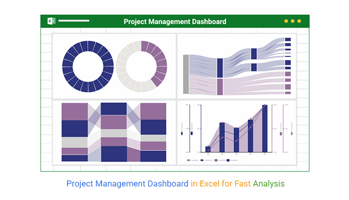
Check out the top charts used to analyze the Project Management Dashboard, including a Stacked waterfall chart. These visuals were created using ChartExpo for clear and effective data insights.


Have you ever felt project updates are everywhere—except where you need them? Emails, chats, sticky notes, spreadsheets, and still, no clear picture. That’s why using a finance dashboard in Excel isn’t only for budgets. It can change how you manage projects, too. A good dashboard clears the noise and gives you what matters—fast.
Here are some of the reasons why you need this template:
Creating a dashboard shouldn’t feel overwhelming. You don’t need to be an Excel wizard—you need a plan. A well-made project tracker template in Excel starts with structure, not style, and helps you create clear and actionable Excel charts. Think of it as building something useful first, then making it look good.
Here’s how to do it right.
Have you ever tried making sense of a chaotic Excel sheet with 12 tabs, 57 formulas, and zero colors? That’s project management without a dashboard. A project management dashboard in Excel brings order to the madness, turning raw data into real-time decisions.
But let’s be honest—Excel’s chart options can feel like choosing between dull and duller. When it comes to data visualization, Excel often falls short. It lacks the wow factor and clarity needed for deep insights. That’s where ChartExpo steps in. It transforms boring data into stunning visuals with zero coding.
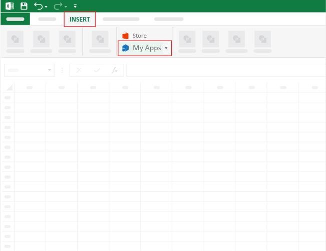
How to Install ChartExpo in Excel?
ChartExpo charts are available both in Google Sheets and Microsoft Excel. Please use the following CTAs to install the tool of your choice and create beautiful visualizations with a few clicks in your favorite tool.
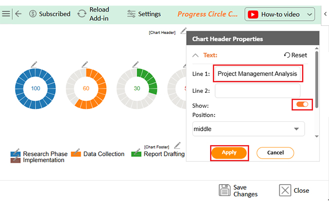
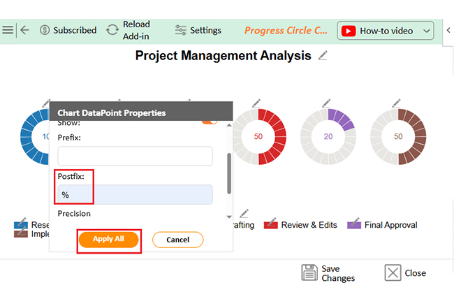
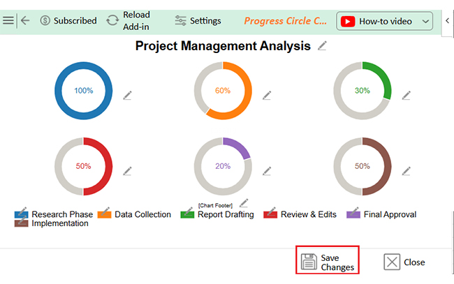
Let’s learn how to create a dashboard in Excel using ChartExpo and glean valuable insights from the visuals.
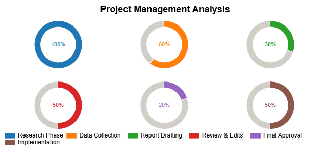
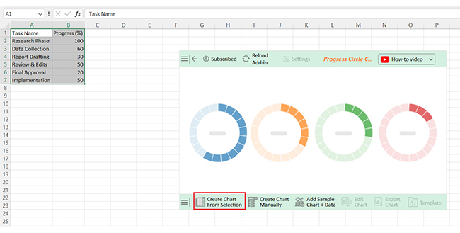
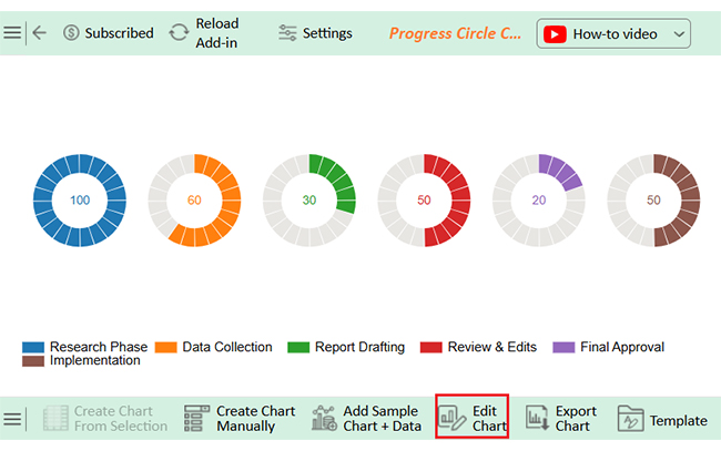
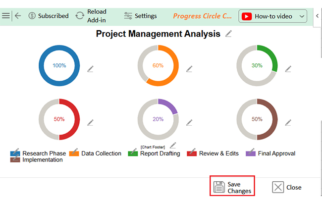
| Task Name | Progress (%) |
| Research Phase | 100 |
| Data Collection | 60 |
| Report Drafting | 30 |
| Review & Edits | 50 |
| Final Approval | 20 |
| Implementation | 50 |


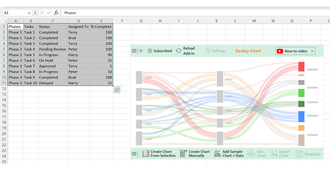
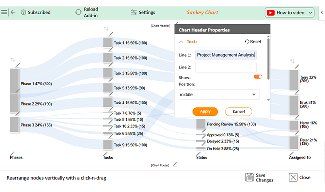
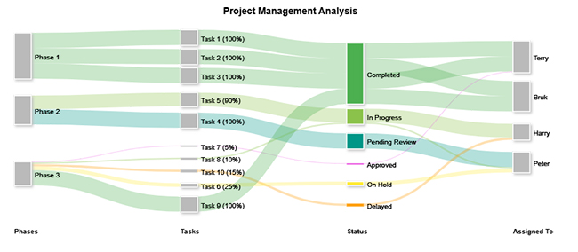
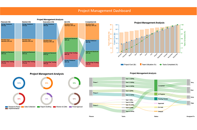
Now, we will create a new chart, the Sankey Chart, to show the information inflow using the data below.
| Phases | Tasks | Status | Assigned To | % Complete |
| Phase 1 | Task 1 | Completed | Terry | 100 |
| Phase 1 | Task 2 | Completed | Bruk | 100 |
| Phase 1 | Task 3 | Completed | Terry | 100 |
| Phase 2 | Task 4 | Pending Review | Peter | 100 |
| Phase 2 | Task 5 | In Progress | Harry | 90 |
| Phase 3 | Task 6 | On Hold | Peter | 25 |
| Phase 3 | Task 7 | Approved | Terry | 5 |
| Phase 3 | Task 8 | In Progress | Peter | 10 |
| Phase 3 | Task 9 | Completed | Bruk | 100 |
| Phase 3 | Task 10 | Delayed | Harry | 15 |
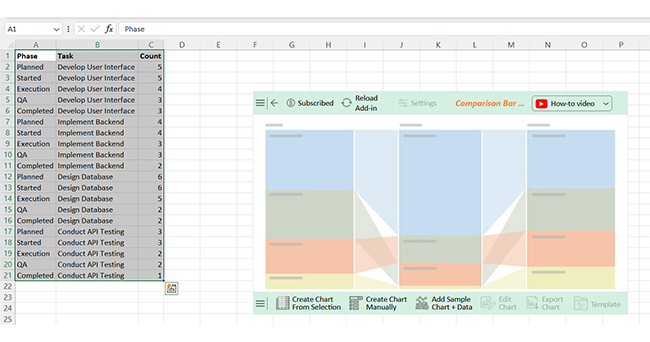
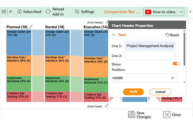
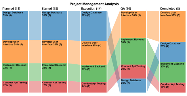
Now, we will create a Comparison Bar Chart from the data below. This chart will help us trace the completion status of each task in each phase.
| Phase | Task | Count |
| Planned | Develop User Interface | 5 |
| Started | Develop User Interface | 5 |
| Execution | Develop User Interface | 4 |
| QA | Develop User Interface | 3 |
| Completed | Develop User Interface | 3 |
| Planned | Implement Backend | 4 |
| Started | Implement Backend | 4 |
| Execution | Implement Backend | 3 |
| QA | Implement Backend | 3 |
| Completed | Implement Backend | 2 |
| Planned | Design Database | 6 |
| Started | Design Database | 6 |
| Execution | Design Database | 5 |
| QA | Design Database | 2 |
| Completed | Design Database | 2 |
| Planned | Conduct API Testing | 3 |
| Started | Conduct API Testing | 3 |
| Execution | Conduct API Testing | 2 |
| QA | Conduct API Testing | 2 |
| Completed | Conduct API Testing | 1 |
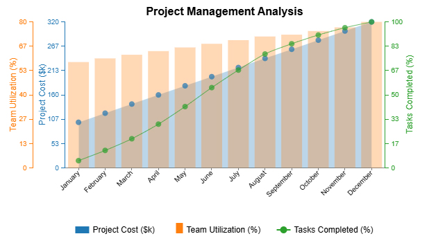
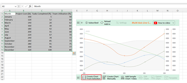
Now, let’s create the final chart for our dashboard, the Multi Axis Line Chart. Use the following data to make this chart.
| Month | Project Cost ($) | Tasks Completed (#) | Team Utilization (%) |
| January | 100 | 5 | 58 |
| February | 120 | 12 | 60 |
| March | 140 | 20 | 62 |
| April | 160 | 30 | 64 |
| May | 180 | 42 | 66 |
| June | 200 | 55 | 68 |
| July | 220 | 67 | 70 |
| August | 240 | 78 | 72 |
| September | 260 | 85 | 73 |
| October | 280 | 91 | 75 |
| November | 300 | 96 | 77 |
| December | 320 | 100 | 80 |
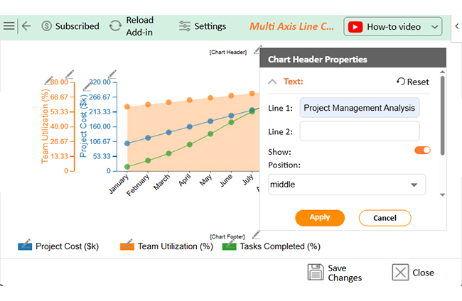
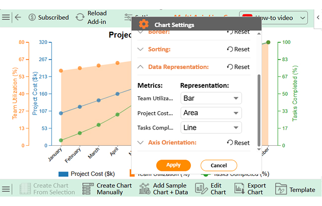
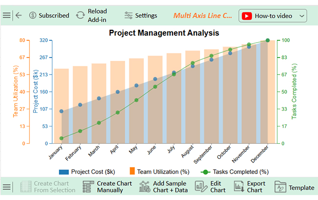
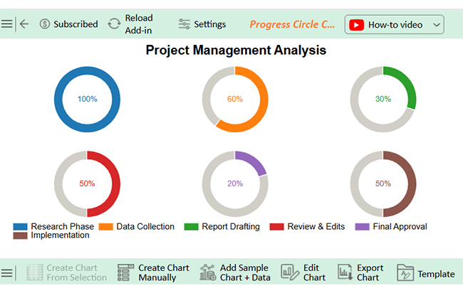
Now, it’s time to place the charts in a good way. After placing the charts, the project Management dashboard should look like below:
A project management dashboard in Excel is more than a report—it’s your project’s control panel. However, a dashboard only works if you know how to use it. You don’t need complex steps – you need smart habits.
Here’s how to make the most of it:
Excel is everywhere. Most teams already use it, and it’s often the first stop for project tracking. But is using an Excel project management dashboard template always the best move? Let’s break it down with a quick, honest look at the pros and cons.
Building an Excel project tracker dashboard? Don’t rush into charts and colors. The best dashboards aren’t the flashiest—they’re the clearest. Start smart, keep it clean, and think long-term.
Here are the best practices that work:
Yes, Excel works well for basic project management. It’s accessible, flexible, and easy to customize. You can build timelines, trackers, and dashboards. It’s ideal for solo or small team projects, but lacks live collaboration and built-in automation.
A project management dashboard in Excel keeps your projects on track. It turns complex data into clear visuals. You can see what’s done, what’s late, and what needs attention. This saves time and reduces confusion.
Using a project status report template helps you centralize updates. No more checking emails or scattered notes. You get one view of all your project insights. That means fewer surprises during meetings.
A well-built dashboard makes decisions easier. With a finance dashboard in Excel, you can track budgets, costs, and timelines side by side. It keeps both your tasks and spending aligned. That’s a win for managers and stakeholders.
The key is knowing how to create a dashboard using Excel. Planning, clean data, and simple visuals matter most. Focus on what helps your team act faster. Avoid clutter and complex formulas.
Dashboards also help teams communicate better. Clear visuals make updates easier to share, and everyone stays on the same page—even when the pressure is on.
Excel isn’t perfect, but it’s powerful. Use it wisely, and your dashboard can turn chaos into clarity. Install ChartExpo to unlock advanced data visualization.
How much did you enjoy this article?


Learn how to use sparklines in Excel to quickly visualize trends inside cells. Discover types, creation steps, customization, use cases, benefits, and best practices.

Learn what a confidence interval graph is, how to create it in Excel, and how to interpret results to make more reliable, data-driven decisions.

A correlation matrix in Excel helps identify relationships between variables. Learn how to create, read, and use it for effective data analysis.


