Categories
Spreadsheets can quickly get messy. One minute, you’re writing a simple formula. Next, you’re lost in a swamp of cell references like A2:B100, wondering what they meant in the first place.
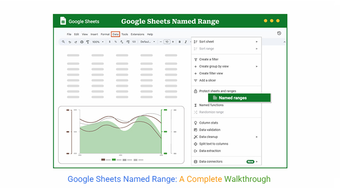


That’s where Google Sheets’ named range comes in. It turns cell blocks into labeled, reusable references that make your work simpler, faster, and way more readable.
If you’re working with a team or building a dashboard, clarity is everything. Naming a range Sales_Q1 instead of remembering A2:D30? That’s a no-brainer.
Whether you’re building reports, running calculations, or linking data across tabs, using a Google Sheets named range gives your spreadsheet structure without the clutter.
Plus, if you’re using tools like ChartExpo, it takes named ranges and turns them into visual gold—no formulas or code needed.
This guide covers everything you need to know about using a Google Sheets named range. We’ll start by explaining what it is and how to use it.
Then we’ll walk through editing, applying it in data validation, and even visualizing named ranges with ChartExpo.
Along the way, you’ll pick up tips for using them across multiple sheets, connecting to dynamic dashboards, and building smarter workflows.
Definition: A named range in Google Sheets replaces cryptic coordinates with a clear, reusable label. Instead of using A2:B10, you create a name like SalesData. This makes formulas easier to follow and reduces errors. You can apply it to a single cell or an entire block of cells.
A named range in Google Sheets works well when you reuse a range in multiple formulas. It’s like giving directions to someone using landmarks instead of latitude and longitude.
Using a Google Sheets named range is not about aesthetics. It solves real spreadsheet problems.
Named ranges reduce formula complexity. When collaborating, you don’t waste time explaining what A2:D14 means. You simply say, “Check the RevenueData range.” It’s also easier to update. If your data moves, you change the range once—formulas update automatically.
You also future-proof your files. Even if you add tools using Google Sheets’ artificial intelligence or link to external data, your formulas stay clear.
Named ranges support integration across sheets, too. They pair well with IMPORTRANGE in Google Sheets, which lets you pull data from one file into another. That makes your workflows faster and cleaner.
Named ranges increase efficiency without adding new tools. They work across sheets and with all major functions.
If you use lookup formulas, a named range turns messy syntax into something readable. Use it with VLOOKUP for Google Sheets to create clear mappings.
They also work in dropdowns. A named range can power a dropdown menu for selecting products, categories, or departments. That’s a Google Sheets data validation named range in action.
They work across sheets, too. Define a named range in one tab, use it in another. Whether you’re building a dashboard or summarizing a report, this keeps your references consistent.
Open your spreadsheet. Select the cell or block of cells you want to name. It could be anything—sales data, customer lists, or monthly expenses.
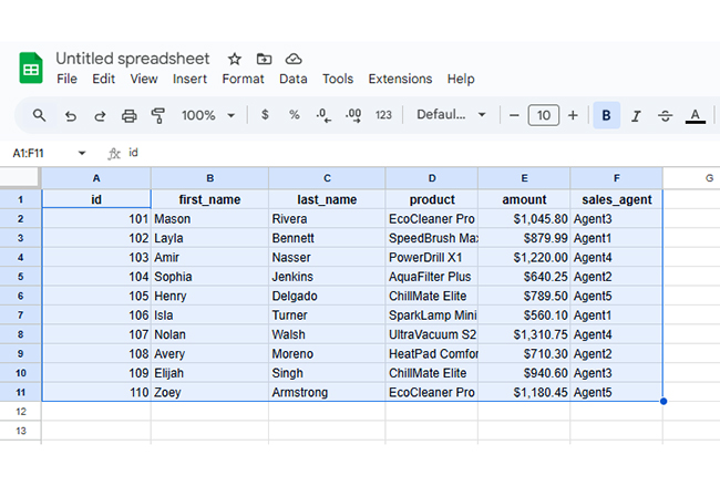
Image 01: Open the Google Sheets file and select a range for applying named ranges
Click the Data menu. From the dropdown, choose Named ranges. A panel opens on the right.
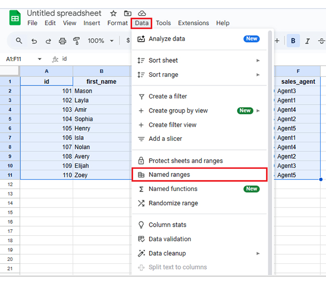
Image 02: From the “Data” select “Named ranges”
Click Add a range in the panel. This brings up a form to assign a name.
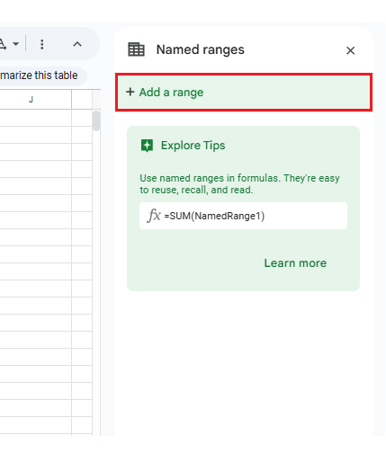
Image 03: Click on the “Add a range” button
Give your range a name. It must start with a letter, use no spaces, and include only letters, numbers, or underscores. Hit Done.
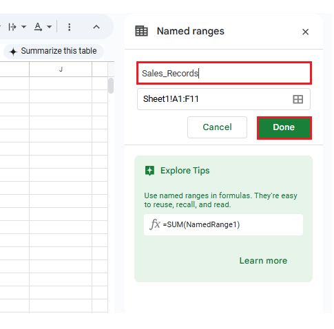
Image 04: Give a name to your range and click “Done.”
Your named range now appears in the side panel. You can select or update it anytime.
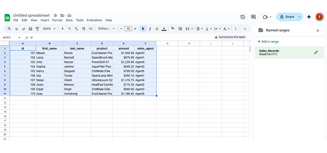
Image 05: The sidebar panel will now have your newly formed named range.
Named ranges simplify analysis. But visuals make insights stick. That’s where ChartExpo helps. It turns a Google Sheets named range into clean visuals—without code or settings menus.
ChartExpo adds a new layer to your spreadsheet. You click, choose a chart, and map your named range. You see patterns that formulas don’t show.
It supports many advanced charts—Sankey, Pareto chart, radar, and multi-axis. The best part? It’s intuitive. You don’t need to study chart logic or write scripts.
Why Use ChartExpo?
ChartExpo shows trends without editing formulas. It makes your named ranges tell stories, and even lets you include a progress bar in Google Sheets to visualize growth or track key metrics. Want to see where revenue is growing, or churn is dropping?
Feed your Google Sheets named range to ChartExpo, and it builds charts from the data, including a Scatter plot in Google Sheets. It even highlights metrics that shift over time.
You can also try it for free for 7 days. After that, it’s $10/month.
How to Install ChartExpo in Google Sheets?
Click Extensions > Add-ons > Get add-ons
Search for ChartExpo in the Marketplace.
Click Install, allow access, and it’s ready to use.
You can now launch ChartExpo, select a Google Sheets named range, and start charting, including a Waterfall chart in Google Sheets.
We’ll use a Google Sheets named range that tracks monthly growth.
| Month | Revenue ($) | New Leads | Conversion Rate (%) | Customer Churn (%) |
| Jan | 25,000 | 1,200 | 3.8 | 5.2 |
| Feb | 27,500 | 1,450 | 4.1 | 4.9 |
| Mar | 29,200 | 1,700 | 4.3 | 4.6 |
| Apr | 31,000 | 1,850 | 4.5 | 4.4 |
| May | 33,400 | 2,100 | 4.8 | 4 |
| Jun | 35,000 | 2,250 | 5 | 3.7 |
| Jul | 37,800 | 2,400 | 5.2 | 3.5 |
Dataset Table
Includes revenue, new leads, conversion rate, and churn (January–July).
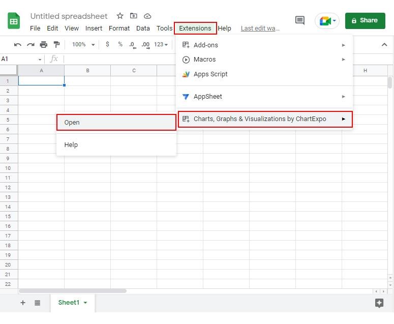
Image 06: Open ChartExpo from Extensions
To create your chart, click Add new chart from the ChartExpo panel.
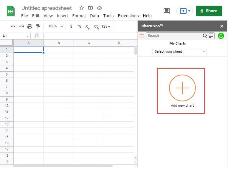
Image 07: Once ChartExpo is opened, click on the “Add new Chart” button
Choose Multi Axis Line Chart from the chart options.
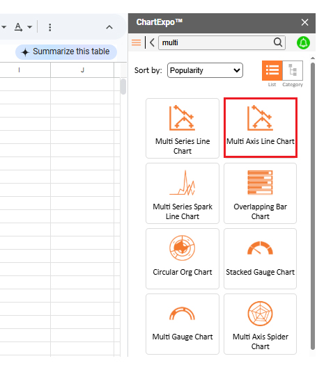
Image 08: Select Multi Axis Line Chart
Select your sheet, define metrics (e.g., Revenue, Leads), pick dimensions (Month), and click Create Chart.
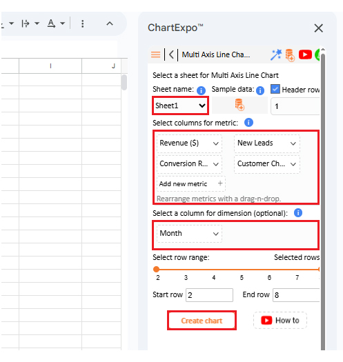
Image 09: Select sheet, metrics, and dimensions, and click the “Create Chart” button
To customize, click Edit Chart.
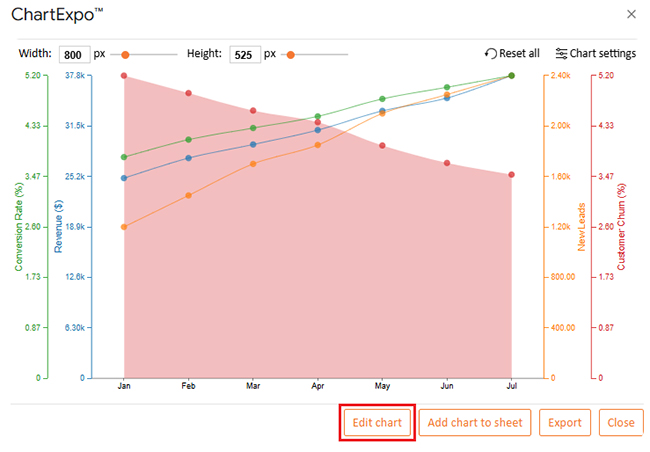
Image 10: Click the “Edit Chart” button
Update the chart title using the pencil icon at the top.
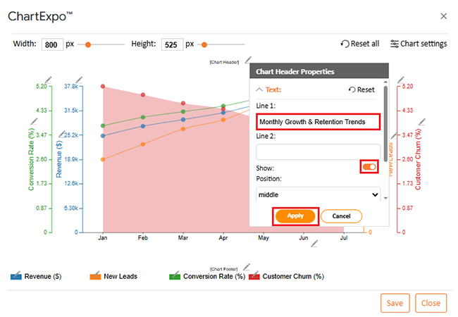
Image 11: Change the chart’s title
You can change how your data appears—bars, lines, color scales.
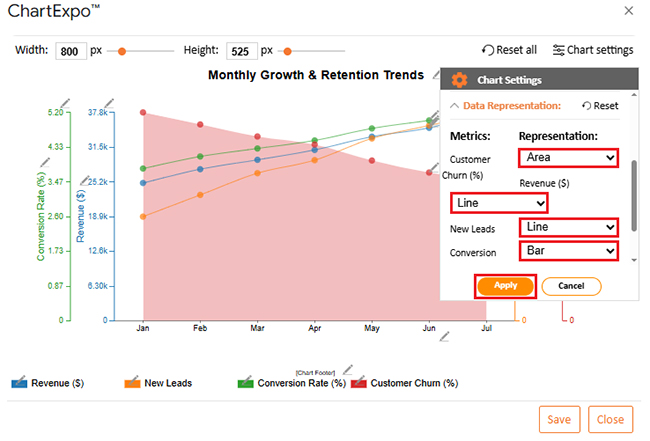
Image 12: You can change the data representation
Control opacity and bar width for clarity.
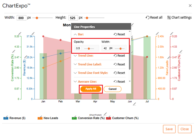
Image 13: You can change bars’ Opacity and width,
To adjust the legend’s look, use the footer pencil icon.
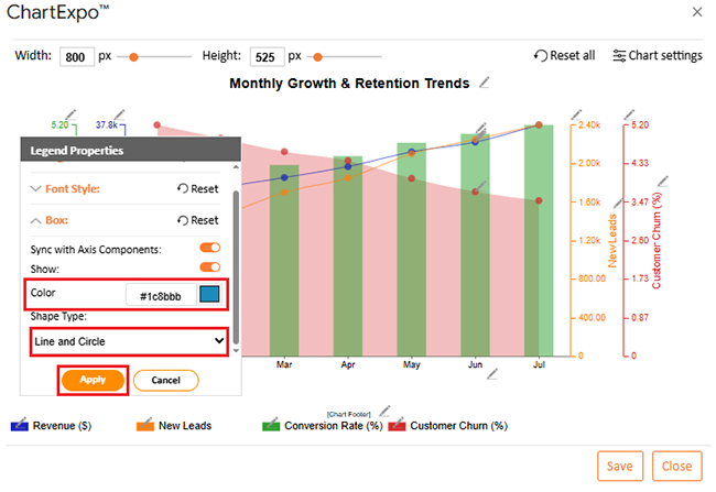
Image 14: You can change the Legend shape type and color
Add prefix signs to show currency or percentage.
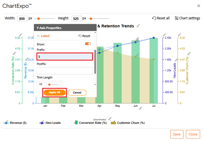
Image 15: You can add a prefix sign
Increase font size for better readability.
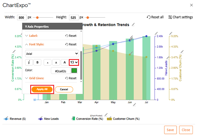
Image 16: You can change the font size for better readability
You can align the legend left, right, or center.
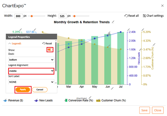
Image 17: You can change legend alignment
Click Save to store your changes.
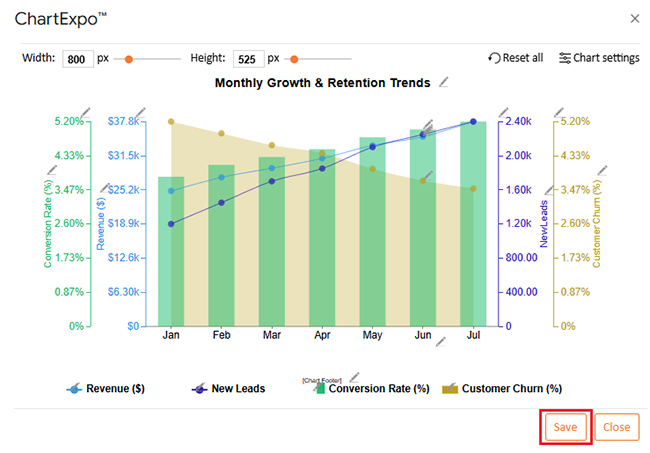
Image 18: Click the Save button to save the changes
Here’s the final chart.
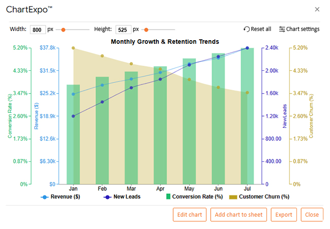
Image 19: Final look of Multi Axis Line Chart
The chart shows a steady increase in revenue. Each month builds on the last, which means consistent growth.
Open the Google Sheet. Click Data > Named ranges to access the sidebar.
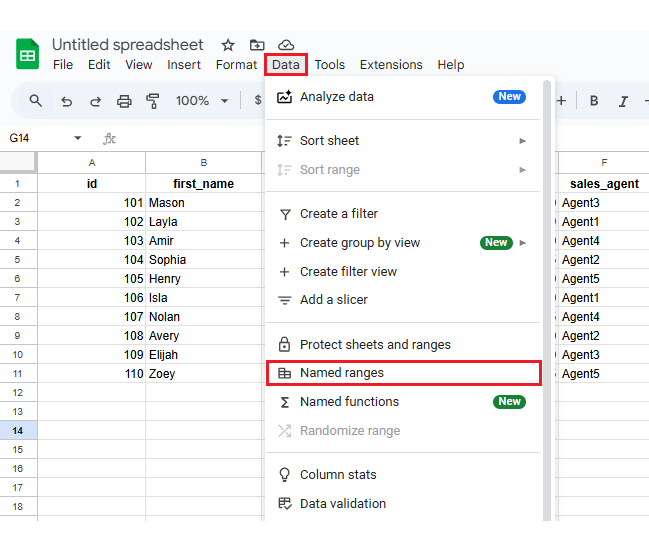
Image 20: From “Data” select “Named ranges”
Click the pencil icon next to your named range.
Image 21: You can edit named ranges by clicking on the pencil icon
Now, change the range or rename it. Click Done when finished.
Image 22: You can change the name and ranges of cells and click “Done.”
Create a named range with your list items. Don’t include headers.
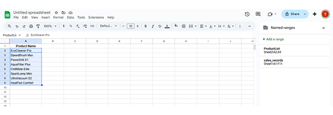
Image 23: Create a named range for your list items and select the input cells
Click the cell where you want the dropdown. Then go to Data > Data validation.
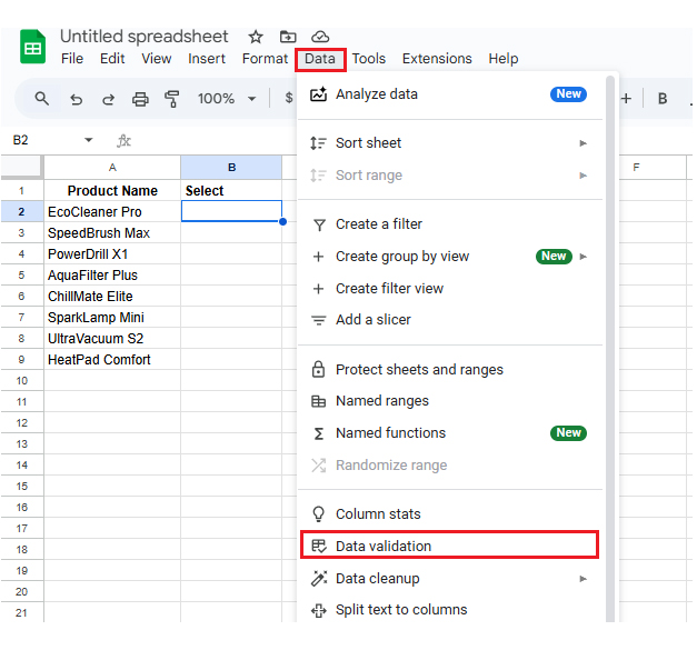
Image 24: Select the cell where you want the drop-down list, then from Data select “Data validation”
Click Add rule in the validation menu.
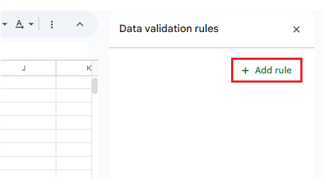
Image 25: Click on the “Add rule” button
Choose Dropdown (from a range) and enter your named range. Press Enter.
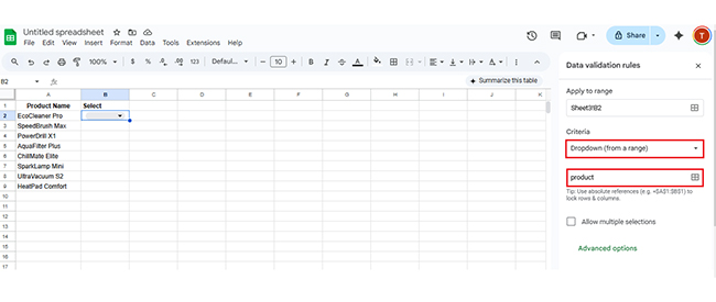
Image 26: Apply “Dropdown (from a range)”, type the name of the range, and press ‘Enter’
A Google Sheets indirect named range updates automatically when inputs change. Use it for interactive reports or flexible dashboards.
It lets you switch views, values, or filters without rewriting formulas. This feature supports what-if analysis in Google Sheets by making responses instant.
You can scale reports, reduce manual edits, and build smarter workflows with less maintenance.
Use named ranges to keep multi-tab workbooks clean.
Not unless used excessively in huge datasets. For normal usage, they improve performance.
It makes formulas easier to read, reduces errors, and allows structured data handling using a Google Sheets named range.
If you’re juggling sheets, formulas, or dashboards, using a Google Sheets named range can bring order to the chaos. You no longer have to remember cell locations. You work with names that make sense. Your data becomes readable, reliable, and reusable.
Pairing a Google Sheets named range with tools like ChartExpo takes things further. You stop writing formulas and start reading visuals. Whether you’re building dashboards, forecasting sales, or managing data across teams, named ranges keep things sharp.
Start small. Label your sales data. Add one to your lookup. Build a dropdown. Then scale. With each use, your spreadsheet becomes cleaner and easier to manage.
Ready to take control? Use a Google Sheets named range in your next project.
How much did you enjoy this article?


SUMPRODUCT in Google Sheets handles multi-condition calculations without extra columns. Master its syntax, uses, and errors. Read on!

An annual budget template in Google Sheets organizes your yearly finances, tracks every dollar, and reveals spending patterns. Read on!

Learn the best graph to show profit and loss with practical examples and use cases. Discover how to visualize your business data, track trends, and make smarter financial decisions.


