• Home
  • Tools dropdown img
    • Spreadsheet Charts

      • ChartExpo for Google Sheets
      • ChartExpo for Microsoft Excel
    • Power BI Charts

      • Power BI Custom Visuals by ChartExpo
    • Word Cloud

  • Charts dropdown img
    • Chart Category

      • Bar Charts
      • Circle Graphs
      • Column Charts
      • Combo Charts
      • Comparison Charts
      • Line Graphs
      • PPC Charts
      • Sentiment Analysis Charts
      • Survey Charts
    • Chart Type

      • Box and Whisker Plot
      • Clustered Bar Chart
      • Clustered Column Chart
      • Comparison Bar Chart
      • Control Chart
      • CSAT Survey Bar Chart
      • CSAT Survey Chart
      • Dot Plot Chart
      • Double Bar Graph
      • Funnel Chart
      • Gauge Chart
      • Likert Scale Chart
      • Matrix Chart
      • Multi Axis Line Chart
      • Overlapping Bar Chart
      • Pareto Chart
      • Radar Chart
      • Radial Bar Chart
      • Sankey Diagram
      • Scatter Plot Chart
      • Slope Chart
      • Sunburst Chart
      • Tornado Chart
      • Waterfall Chart
      • Word Cloud
    • Google Sheets
      Microsoft Excel
  • Services
  • Pricing
  • Contact us
  • Blog
  • Support dropdown img
      • Gallery
      • Videos
      • Contact us
      • FAQs
      • Resources
    • Please feel free to contact us

      atsupport@chartexpo.com

Categories
All Data Visualizations Data Analytics Surveys
Add-ons/
  • Google Sheets
  • Microsoft Excel
  • Power BI
All Data Visualizations Data Analytics Surveys
Add-ons
  • Google Sheets
  • Microsoft Excel
  • Power BI

We use cookies

This website uses cookies to provide better user experience and user's session management.
By continuing visiting this website you consent the use of these cookies.

Ok

ChartExpo Survey


Home > Blog > Data Analytics

Customer Experience Dashboard for Quick Insights

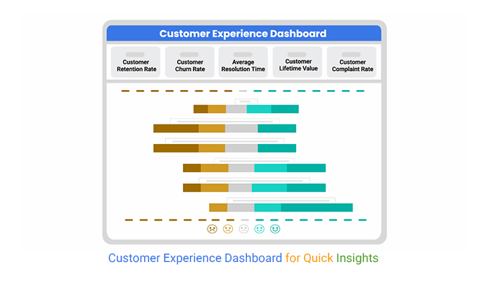
The customer experience dashboard tracks key metrics like retention, feedback, and satisfaction. It helps businesses improve customer engagement and service quality.

Customer Experience Dashboards

This guide dives deep into what the Customer Experience (CX) dashboard is, the importance of a Customer Experience Dashboard, and Customer Experience Dashboard Examples.

Business owners (or analysts) who are looking to figure out customer lifetime value, CRM analytics, customer segmentation, and customer effort score can benefit by reading through this guide.

You’ll also see some customer feedback examples and how the voice of the customer surveys work.

Table of Contents:

  1. What is a Customer Experience (CX) Dashboard?
  2. What is the Importance of a Customer Experience Dashboard?
  3. Features of an Effective Customer Insight Dashboard
  4. What are Essential Customer Experience Dashboard Metrics?
  5. How to build a Customer Experience Dashboard in Power BI?
  6. How to use the CX Dashboard?
  7. Benefits of a Customer Experience Dashboard
  8. FAQs
  9. Wrap Up

What is a Customer Experience (CX) Dashboard?

Definition: A Customer Experience (CX) dashboard is a visual tool that tracks key customer metrics like retention, satisfaction, support efficiency, and feedback. It helps business owners analyze trends, improve service quality, and boost overall customer engagement.

What is the Importance of a Customer Experience Dashboard?

  • Real-Time Customer Insights

A CX dashboard consolidates data from multiple sources like surveys, support tickets, social media, and website interactions. This helps business owners monitor customer sentiment, respond proactively, and identify pain points.

  • Enhanced Decision-Making

Data-driven decisions are essential for business growth. A CX dashboard provides clear visual reports on customer trends. This helps managers make strategic improvements in service quality, product offerings, and support processes.

  • Increased Revenue and Brand Loyalty

Satisfied customers are more likely to make repeat purchases and recommend the brand. A CX dashboard helps businesses improve engagement strategies. This will, in turn, yield higher sales and stronger customer relationships.

  • Faster Issue Resolution

Businesses that want to optimize their customer service operations should monitor support ticket volume, resolution rates, and response times. Quick issue resolution leads to increased brand trust and better experiences.

Features of an Effective Customer Insight Dashboard

  • Key Performance Indicator (KPI) Monitoring

The dashboard tracks essential customer KPIs like:

    • Net Promoter Score (NPS): It measures customer loyalty.
    • Churn Rate: It identifies customer retention trends.
    • Customer Effort Score (CES): It evaluates the ease of interaction.
    • Customer Satisfaction Score (CSAT): It tracks overall satisfaction.
  • Real-Time Data Tracking

A good dashboard provides real-time insights into support tickets, customer interactions, and feedback. This will help businesses address issues proactively and improve the customer experience.

  • Customizable and User-Friendly Interface

A customizable layout gives businesses the room to focus on the most relevant metrics. Users can explore data efficiently by using interactive charts, filters, and drill-down options.

  • Automated Alerts and Notifications

Real-time alerts for increasing complaints, negative feedback, or declining NPS scores help business owners take immediate corrective actions.

What are Essential Customer Experience Dashboard Metrics?

Here are some essential customer experience dashboard metrics you should know.

  • Net Promoter Score (NPS)

It measures customer loyalty by asking how likely they are to recommend the brand. A higher NPS shows strong customer advocacy.

  • Customer Satisfaction Score (CSAT)

It tracks customer satisfaction based on surveys after purchases or interactions. Higher scores show a positive experience.

  • Customer Effort Score (CES)

It measures how easy it is for customers to complete tasks (like resolving issues). Lower effort leads to higher satisfaction.

  • Churn Rate

It calculates the percentage of customers who stop using a product (or service). It helps businesses identify retention issues.

  • Customer Lifetime Value (CLV)

It estimates the total revenue a customer will generate over their relationship with the company. A higher CLV shows strong retention.

How to build a Customer Experience Dashboard in Power BI?

This section shows you how to come up with a customer service questionnaire, and also shows you the right customer success metric and the customer satisfaction KPI to look out for.

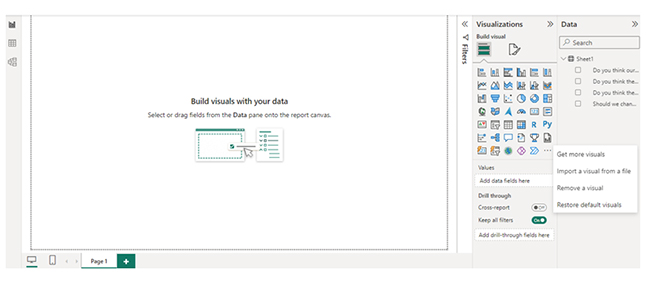
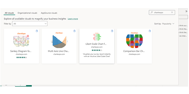
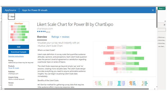
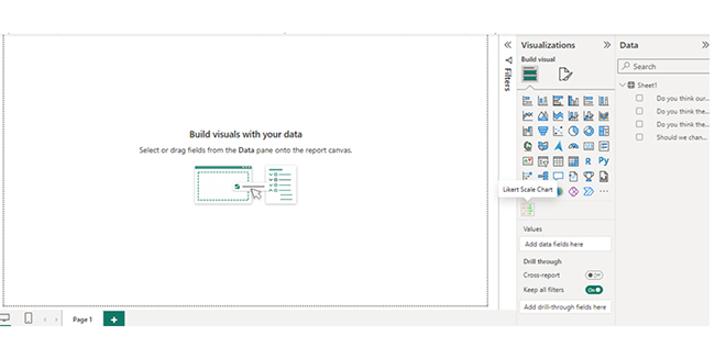
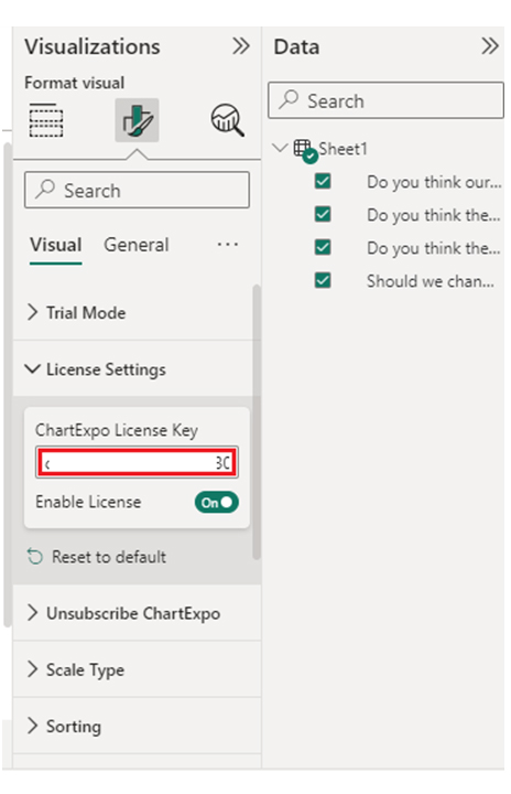
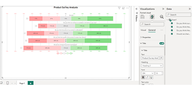
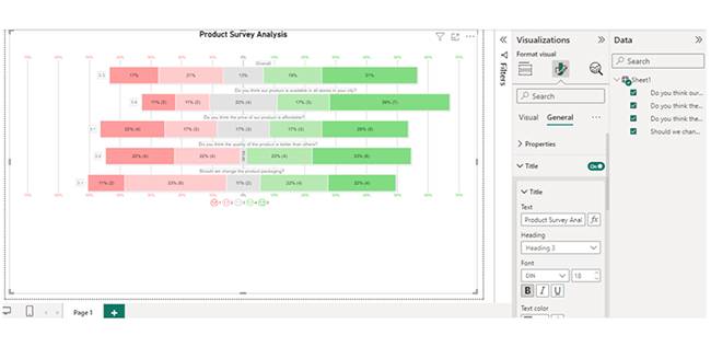
Here are the stages to help you build a customer experience dashboard in Power BI.

  • Stage 1: Log in to Power BI, enter your email, and click the “Submit” button.
Customer Experience Dashboards
  • Enter your password, and click “Sign in.”
Customer Experience Dashboards
  • You can opt to stay signed in.
Customer Experience Dashboards
  • Stage 2: Create a Data Set and Select the Data Set to Use in the Sankey Chart
  • Navigate to the left-side menu, and click on the “Create” option. You’ll have to select “Paste or manually enter data.”
Customer Experience Dashboards
  • The data below will be used for this illustration.
Customer Experience Dashboards
  • Paste the data table above into the “Power Query” window. After that, select the “Create a dataset only” option.
Customer Experience Dashboards
  • Navigate to the left-side menu, and click on the “Data Hub” option. Power BI will populate the data set list. If no data set has been created, you’ll get an error message. At this point, click on “Create report.
  • To see your chart metrics, click on “Expand All.” You can check the dimensions and metrics. Click on “Get more visuals.”
Customer Experience Dashboards
  • Search ChartExpo and select the Likert Scale Chart.
Customer Experience Dashboards
  • You can click on “Add.”
Customer Experience Dashboards
  • After that, you’ll see the Likert Scale Chart in the visuals list.
Customer Experience Dashboards
  • In Visual, click on License Settings and add the key. After adding the key, you’ll see the Likert Scale Chart.
Customer Experience Dashboards
  • After that, you can set the scale of the chart.
Customer Experience Dashboards
  • You can add the header text on top of the chart.
Customer Experience Dashboards
  • Here’s the final look at the Likert Scale Chart in Power BI.
Customer Experience Dashboards

Insights

  • Price Affordability: Strongly Agree: Mixed opinions suggest varying perceptions of affordability.
  • Product Quality: Strongly Agree: Customers believe the quality surpasses competitors.
  • Packaging Change: Disagree: There’s no clear consensus on the need for a packaging overhaul.
  • Availability in Stores: Mixed: There’s uncertainty if the product is universally accessible in the city’s stores.

How to use the CX Dashboard?

  • Integrate Data Sources

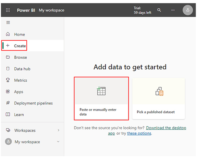
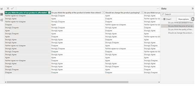
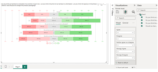
To gather comprehensive insights, you’ll have to connect the dashboard with CRM systems, social media, surveys, customer support platforms, and website analytics.

  • Monitor Key Metrics

You can track essential metrics like:

    • Net Promoter Score (NPS): It measures customer loyalty.
    • Customer Satisfaction Score (CSAT): It evaluates the overall experience.
    • Customer Effort Score (CES): It identifies ease of service.
    • Churn Rate: It helps detect customer retention issues.
    • Support Ticket Volume and Resolution Time: It tracks service efficiency.
  • Analyze Trends and Patterns

Use historical trends and real-time data to measure customer sentiment, identify pain points, and improve services.

  • Customize Reports for Decision-Making

You can generate custom reports for leadership teams, customer service, and sales managers to align strategies with customer needs.

  • Take Action and Optimize Strategies

You can use dashboard insights to boost customer interactions, enhance product offerings, streamline support, and personalize experiences for better engagement.

Benefits of a Customer Experience Dashboard

  • Reduced Customer Churn

Thorough analyses of churn trends help businesses implement proactive engagement strategies to retain valuable customers.

  • Improved Customer Satisfaction and Retention

Businesses that monitor Customer Satisfaction Score (CSAT), Customer Effort Score (CES), and Net Promoter Score (NPS) can quickly identify and address issues to improve customer retention.

  • Data-Driven Decision Making

CX dashboards offer visual reports and analytics that help businesses make strategic improvements in customer service, marketing strategies, and product offerings.

  • Increased Revenue and Brand Loyalty

Satisfied customers are more likely to refer others and make repeat purchases. This will, in turn, impact business profitability and growth.

FAQs

What are CX insights?

CX insights are data-driven analyses of customer behaviors, feedback, and interactions. Creating customer experience survey questions and performing customer care surveys are some of the major ways of gaining these insights.

They help businesses understand customer needs, enhance satisfaction, improve experiences, and optimize strategies for better engagement, brand loyalty, and retention.

What does CX stand for?

CX is the Customer Experience. It refers to a customer’s overall perception of a brand based on interactions across touchpoints like sales, websites, support, and services. It influences satisfaction, business success, and loyalty. There are cases where the CX is showcased using the customer journey visualization.

How to create a customer dashboard?

To create a customer relationship management dashboard, you’ll have to integrate data sources, define key metrics (CSAT, churn rate, NPS), and use data visualization tools (Tableau, Power BI). You will have to enable real-time tracking, customize reports, and set automated alerts for insights.

Wrap Up

A Customer Experience (CX) Dashboard tracks key metrics like churn rate, CSAT, and NPS. This helps in analyzing customer interactions.

Businesses can use the insights gathered from this analysis to improve retention, enhance satisfaction, resolve issues, and make data-driven decisions. This will, in turn, help breed long-term customer loyalty and growth.

The customer experience dashboard offers real-time customer insights. With the customer experience dashboard, data is consolidated from multiple sources, which allows businesses to track customer sentiment, behavior, and feedback instantly.

CX dashboard plays a role in quick issue resolution. Since it helps track response times, support ticket volume, and resolution rates, it becomes easy to improve service efficiency. This will, in turn, lead to quicker resolutions and higher customer satisfaction.

Now you know how to create a customer experience (CX) dashboard in Power BI, what features (or metrics) will you include when designing yours?

How much did you enjoy this article?

PBIAd1
Start Free Trial!
152438

Related articles

next previous
Data Analytics7 min read

Manufacturing Dashboard: Insights Made Easy

This guide shows you what a manufacturing dashboard is, and how to choose the right production dashboard. It also shows you how the dashboard works.

Data Analytics7 min read

Operations Dashboard for Executive Level Insights

This guide explains everything you need to know about operation dashboards, including what they include and how to create one.

Data Analytics12 min read

How to Analyze Financial Statements in Excel?

Learn how to analyze financial statements step-by-step. Master balance sheets, income statements, and cash flow for smarter business decisions.

Data Analytics14 min read

Direct vs. Indirect Cash Flow: Examples & Insights

Enhance your financial acumen with our guide of direct vs. indirect cash flow. Uncover definitions, examples, & key insights for effective financial management.

Data Analytics10 min read

Logistics KPIs: See the Big Picture and Win

Logistic KPIs help measure supply chain delivery, cost, and efficiency. Learn their benefits, top examples, and how to track them with Excel and ChartExpo.

ChartExpo logo

Turn Data into Visual
Stories

CHARTEXPO

  • Home
  • Gallery
  • Videos
  • Services
  • Pricing
  • Contact us
  • FAQs
  • Privacy policy
  • Terms of Service
  • Sitemap

TOOLS

  • ChartExpo for Google Sheets
  • ChartExpo for Microsoft Excel
  • Power BI Custom Visuals by ChartExpo
  • Word Cloud

CATEGORIES

  • Bar Charts
  • Circle Graphs
  • Column Charts
  • Combo Charts
  • Comparison Charts
  • Line Graphs
  • PPC Charts
  • Sentiment Analysis Charts
  • Survey Charts

TOP CHARTS

  • Sankey Diagram
  • Likert Scale Chart
  • Comparison Bar Chart
  • Pareto Chart
  • Funnel Chart
  • Gauge Chart
  • Radar Chart
  • Radial Bar Chart
  • Sunburst Chart
  • see more
  • Scatter Plot Chart
  • CSAT Survey Bar Chart
  • CSAT Survey Chart
  • Dot Plot Chart
  • Double Bar Graph
  • Matrix Chart
  • Multi Axis Line Chart
  • Overlapping Bar Chart
  • Control Chart
  • Slope Chart
  • Clustered Bar Chart
  • Clustered Column Chart
  • Box and Whisker Plot
  • Tornado Chart
  • Waterfall Chart
  • Word Cloud
  • see less

RESOURCES

  • Blog
  • Resources
  • YouTube
SIGN UP FOR UPDATES

We wouldn't dream of spamming you or selling your info.

© 2025 ChartExpo, all rights reserved.