• Home
  • Tools dropdown img
    • Spreadsheet Charts

      • ChartExpo for Google Sheets
      • ChartExpo for Microsoft Excel
    • Power BI Charts

      • Power BI Custom Visuals by ChartExpo
    • Word Cloud

  • Charts dropdown img
    • Chart Category

      • Bar Charts
      • Circle Graphs
      • Column Charts
      • Combo Charts
      • Comparison Charts
      • Line Graphs
      • PPC Charts
      • Sentiment Analysis Charts
      • Survey Charts
    • Chart Type

      • Box and Whisker Plot
      • Clustered Bar Chart
      • Clustered Column Chart
      • Comparison Bar Chart
      • Control Chart
      • CSAT Survey Bar Chart
      • CSAT Survey Chart
      • Dot Plot Chart
      • Double Bar Graph
      • Funnel Chart
      • Gauge Chart
      • Likert Scale Chart
      • Matrix Chart
      • Multi Axis Line Chart
      • Overlapping Bar Chart
      • Pareto Chart
      • Radar Chart
      • Radial Bar Chart
      • Sankey Diagram
      • Scatter Plot Chart
      • Slope Chart
      • Sunburst Chart
      • Tornado Chart
      • Waterfall Chart
      • Word Cloud
    • Google Sheets
      Microsoft Excel
  • Services
  • Pricing
  • Contact us
  • Blog
  • Support dropdown img
      • Gallery
      • Videos
      • Contact us
      • FAQs
      • Resources
    • Please feel free to contact us

      atsupport@chartexpo.com

Categories
All Data Visualizations Data Analytics Surveys
Add-ons/
  • Google Sheets
  • Microsoft Excel
  • Power BI
All Data Visualizations Data Analytics Surveys
Add-ons
  • Google Sheets
  • Microsoft Excel
  • Power BI

We use cookies

This website uses cookies to provide better user experience and user's session management.
By continuing visiting this website you consent the use of these cookies.

Ok

ChartExpo Survey


Home > Blog > Microsoft Excel

What is Excel Software Used for: A Complete Guide

Spreadsheets might seem old-school, but Microsoft Excel remains a powerhouse in business, finance, and everyday tasks. Business Excel helps organizations track sales, predict trends, and control costs.

What is Excel Software Used for

Accountants employ it to analyze numbers, and marketers review customer trends. Teachers and students even use it to organize research and plan lessons. Cross-tabulation in Excel helps compare data across multiple categories, making insights clearer and more actionable.

Anyone can use it to create to-do lists, plan travel budgets, or track fitness goals. The software’s built-in formulas automate calculations, reducing human error. With charts and graphs, raw numbers turn into clear visuals. Trend analysis in Excel helps businesses identify patterns and make data-driven decisions.

Data analysts and financial experts depend on Excel’s advanced tools. PivotTables summarize large datasets in seconds and conditional formatting highlights trends. Excel even handles complex financial modeling and risk analysis. Moreover, you can track data over time and make accurate forecasts with time series analysis.

What is Excel software used for? It is used for almost anything that involves numbers, organization, or planning. Whether handling personal budgets or managing millions in revenue, Excel is a powerful tool for turning data into decisions.

Let’s dive deeper.

Table of Contents:

  1. What Is Excel Software Used For?
  2. What Is Microsoft Excel Used for in the Workplace?
  3. Why Excel Software Use Is Important?
  4. How Does MS Excel Software Work?
  5. How to Use Excel Software for Charting?
  6. Tips for Using Excel Software
  7. Benefits of Excel Software for Mac
  8. FAQs
  9. Wrap Up

What Is Excel Software Used For?

Definition: Excel software helps organize, calculate, and analyze data. Businesses track sales, budgets, and inventory. Accountants manage finances with formulas and reports. Marketers analyze trends and customer behavior for better data interpretation and decision-making.

Students and teachers plan lessons and projects, and data analysts create charts and PivotTables. Engineers and healthcare workers use it for records and calculations while teams collaborate with cloud sharing.

In summary, Excel simplifies complex tasks. It makes data discovery easier, helping you uncover hidden patterns in large datasets. From personal budgets to business forecasts, it turns raw data into clear insights.

What Is Microsoft Excel Used for in the Workplace?

Excel keeps businesses organized, saves time, and improves decision-making. From finance to project management, companies rely on it daily for calculations and analysis. Here’s how it makes work easier:

  • Data management & organization: Excel stores, sorts, and organizes large amounts of data. Businesses track customer details, employee records, and important metrics—all in one place.
  • Financial planning & budgeting: Companies manage expenses, forecast revenue, and analyze cash flow. Built-in formulas simplify financial calculations and reduce errors.
  • Reporting & performance tracking: Data presentation with dashboards and charts turn numbers into clear insights. Managers monitor progress, identify trends, and make informed decisions.
  • Project & workflow management: Teams use Excel to set deadlines, assign tasks, and track progress. It keeps projects on schedule and boosts productivity.
  • Sales, inventory & payroll automation: Businesses track sales, manage inventory, and process payroll. Automation reduces manual work, saving time and increasing accuracy.

Why Excel Software Use Is Important?

Excel is a tool that keeps businesses running smoothly. From organizing data to making big decisions, it helps professionals work more intelligently. Its features support information design, turning complex data into clear, structured insights.

Here’s why Excel is essential in today’s workplace:

  • Efficient data management: Excel allows storing, organizing, and sorting large amounts of data. Businesses have utilized it to efficiently monitor customer records, schedules, and key metrics.
  • Powerful data analysis & decision-making: Excel makes it easy to analyze trends and patterns with its built-in formulas and PivotTables. Businesses use Excel to handle data processing and decision data.
  • Automation and productivity: Excel can automate repetitive tasks, saving time and avoiding manual errors. This increases productivity and frees up time for the big tasks.
  • Financial & budget management: Companies employ Excel for budgeting, expense tracking, and revenue forecasting. Keeping track of your finances prevents overspending and makes for better financial health.
  • Data visualization & reporting: Raw digits are visualized as graphs and dashboards. This helps teams visualize data, identify trends, and track performance.
  • Versatility & industry applications: Excel is for everyone and everything, from the healthcare sector and retail to finance. Highly flexible, it is essential for organizing, analyzing, and managing data across industries.

How Does MS Excel Software Work?

MS Excel helps organize, analyze, and simplify data. It makes work easier for business, finance, or personal tasks. With the right tools, you can use it as a digital dashboard for tracking key metrics and trends.

Here’s how it works:

  • Spreadsheet structure: Excel is built on grids of rows and columns; each cell stores text, numbers, or formulas for calculations.
  • Data entry & formulas: You manually input or import data from other sources. Built-in formulas perform quick calculations, from simple math to complex financial analysis.
  • Data analysis & visualization: Tools like PivotTables, charts, and conditional formatting highlight patterns and trends. These features turn raw numbers into clear, actionable insights.
  • Automation & productivity tools: Macros and functions automate repetitive tasks, saving time and reducing errors. Excel’s collaboration features allow teams to edit and share data in real-time.

How to Use Excel Software for Charting?

Microsoft Excel software is used for data management, number crunching, and organization. It’s suitable for calculations and fundamental analysis but has significant limitations for data visualizations.

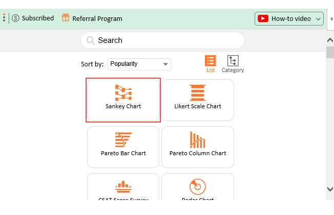
Standard charts can be clunky, rudimentary, and time-consuming to customize. Good data visualization is critical for practical data analysis, but Excel makes it more difficult than it should be.

This is where ChartExpo can help you. This add-on turns your raw data into beautiful, simple visuals. A good chart will lead you to comprehend quicker and cast a more significant impression.

Top 5 Charts

Sankey Chart

What is Excel Software Used for

Likert Scale Chart

What is Excel Software Used for

Comparison Bar Chart

What is Excel Software Used for

Stacked Waterfall Chart

What is Excel Software Used for

Multi Axis Line Chart

What is Excel Software Used for

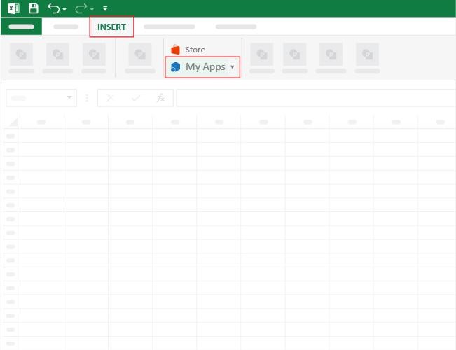
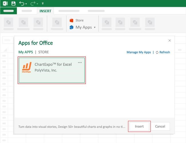
How to Install ChartExpo in Excel?

  1. Open your Excel application.
  2. Open the worksheet and click the “Insert” menu.
  3. You’ll see the “My Apps” option.
  4. In the Office Add-ins window, click “Store” and search for ChartExpo on my Apps Store.
  5. Click the “Add” button to install ChartExpo in your Excel.

ChartExpo charts are available both in Google Sheets and Microsoft Excel. Please use the following CTAs to install the tool of your choice and create beautiful visualizations with a few clicks in your favorite tool.

Example

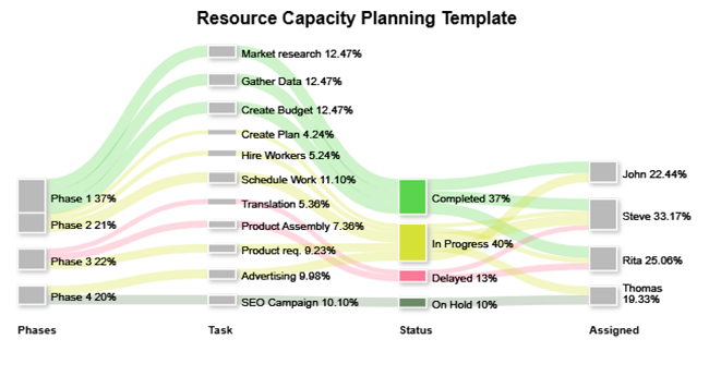
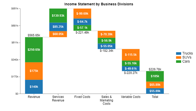
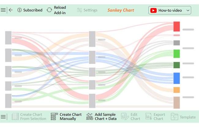
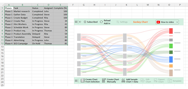
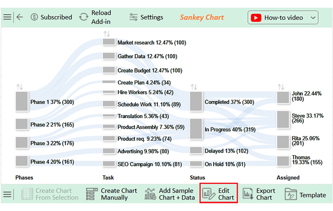
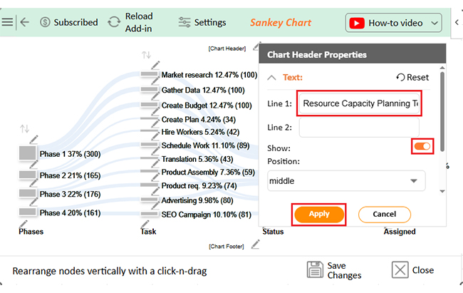
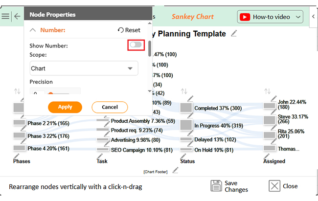
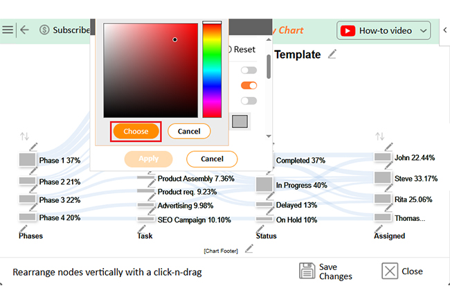
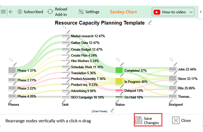
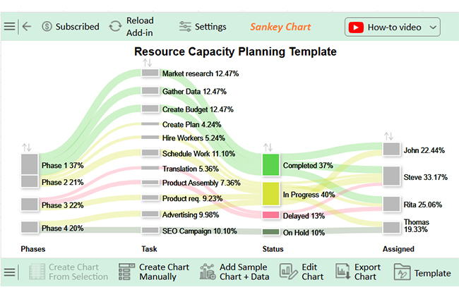
Let’s learn how to create a report in Excel using the sample data below and analyze the data using ChartExpo:

Phases Task Status Assigned Complete (%)
Phase 1 Market research Completed John 100
Phase 1 Gather Data Completed Steve 100
Phase 1 Create Budget Completed Rita 100
Phase 2 Create Plan In Progress Steve 34
Phase 2 Hire Workers In Progress Rita 42
Phase 2 Schedule Work In Progress Steve 89
Phase 3 Product req. In Progress Thomas 74
Phase 3 Product Assembly Delayed Rita 59
Phase 3 Translation Delayed Steve 43
Phase 4 Advertising In Progress John 80
Phase 4 SEO Campaign On Hold Thomas 81
  • To get started with ChartExpo, install ChartExpo in Excel.
  • Now Click on My Apps from the INSERT menu.
What is Excel Software Used for
  • Choose ChartExpo from My Apps, then click Insert.
What is Excel Software Used for
  • Once it loads, choose the “Sankey Chart” from the charts list.
What is Excel Software Used for
  • After clicking on the chart, you will see the Sankey Chart on the screen.
What is Excel Software Used for
  • Click the “Create Chart From Selection” button after selecting the data from the sheet, as shown.
What is Excel Software Used for
  • ChartExpo will generate the visualization below for you.
What is Excel Software Used for
  • If you want to have the chart’s title, click Edit Chart, as shown in the above image.
  • Click the pencil icon next to the Chart Header to change the title.
  • It will open the properties dialog. Under the Text section, you can add a heading in Line 1 and enable Show.
  • Give the appropriate title of your chart and click the Apply button.
What is Excel Software Used for
  • You can disable the Numbers as follows:
What is Excel Software Used for
  • You can add the colors of Nodes of Status as follows:
What is Excel Software Used for
  • Click the “Save Changes” button to persist the changes.
What is Excel Software Used for
  • Your final chart will appear as below.
What is Excel Software Used for

Insights

  • Phase 1: Fully completed.
  • Phase 2: Progressing, with scheduling near completion.
  • Phase 3: Delays in assembly and translation.
  • Phase 4: Advertising is 80% done, with the SEO campaign on hold despite 81% progress.

Tips for Using Excel Software

Excel is a powerhouse for organizing and analyzing data, but using it efficiently can take your skills to the next level. Whether creating reports or analyzing trends, these tips can save time and make your work smoother:

  • Use keyboard shortcuts: Leverage keyboard shortcuts, such as Ctrl + C (copy), Ctrl + V (paste), and Ctrl + Z (undo). They speed up your workflow so you can work more efficiently.
  • Apply conditional formatting: Conditional formatting automatically modifies the appearance of your cells, making trends, outliers, or specific values easy to identify.
  • Master Excel functions: SUM, IF, and VLOOKUP are your best friends. With  these mastered, you can speedily resolve complex calculations and automate tasks.
  • Use PivotTables for data analysis: If you are analyzing a large data set, you can use PivotTables to pull all the information together. They let you slice and dice data to summarize and uncover insights you might have missed.
  • Automate tasks with macros: How often have you gone through the same steps more than once? Macros log actions you take in Excel and allow you to play them back automatically, saving time on repetitive actions.
  • Protect and secure data:Excel lets you protect sheets or specific cells with passwords. This ensures data security and grants access only to authorized users.

Benefits of Excel Software for Mac

Excel for Mac is powerful, fast, and built for efficiency. It helps you manage data, analyze trends, and automate tasks. Whether for business or personal use, it makes work easier. Its advanced tools support data mining, helping you uncover patterns and valuable insights.

Here’s why it stands out:

  • Seamless compatibility: Excel for Mac works smoothly with Windows versions. Files can be opened, edited, and saved without issues.
  • Advanced data analysis: Built-in formulas and PivotTables simplify calculations. You can quickly process and interpret large datasets.
  • Data visualization: Charts, graphs, and conditional formatting make complex data easy to understand. Reports become more engaging and insightful.
  • Automation with macros: Macros eliminate repetitive tasks, save time, and reduce manual effort. Workflows run faster and smoother.
  • Cloud integration: Excel syncs with OneDrive and iCloud for easy access. Users can work from anywhere, on any device.
  • User-friendly interface: The Mac version offers a clean, intuitive design. Navigation is smooth, making tasks quicker to complete.

FAQs

What is the purpose of Excel software?

Excel helps organize, analyze, and manage data efficiently. Businesses use it for budgeting, reporting, and forecasting. It simplifies calculations with formulas and automates repetitive tasks. Charts and graphs turn data into clear insights. Excel improves decision-making across industries and professions.

What does Excel software cost?

Excel is part of the Microsoft 365 subscription. The personal plan costs around $69.99 per year. For businesses, pricing starts at $5 per user per month. There’s also a one-time purchase option for around $149.99.

Wrap Up

Excel is a powerful tool for managing and analyzing data. It helps businesses, students, and professionals organize information efficiently. From simple lists to creating financial models in Excel, it efficiently handles complex calculations.

Companies rely on it for budgeting, reporting, and forecasting. It simplifies financial planning with built-in formulas, and teams track expenses, revenue, and performance in one place. Business process mapping becomes easier with Excel, helping organizations visualize workflows and improve efficiency.

Data analysis becomes easier with Excel’s functions. PivotTables summarize large datasets in seconds. Charts and graphs turn numbers into visual insights for better decisions. Learning how to add trend lines in Excel will help you identify patterns and predict future trends.

Automation boosts productivity by reducing manual work. With macros, repetitive tasks are completed in seconds, saving time and minimizing errors.

Despite its strengths, Excel has limitations in data visualization. Standard charts lack flexibility and clarity. Add-ons like ChartExpo enhance Excel’s ability to create impactful visuals.

What is Excel software used for? Nearly everything that involves data. It remains essential for businesses and individuals worldwide. With the right tools, Excel becomes even more powerful.

Do not hesitate.

Install ChartExpo to create advanced charts and transform raw data into clear insights.

How much did you enjoy this article?

ExcelAd1
Start Free Trial!
150278

Related articles

next previous
Microsoft Excel12 min read

Artificial Intelligence in Excel for Clear Insights

Discover how AI elevates Excel, from automation to advanced data analysis. This blog covers benefits, limitations, and examples to enhance your productivity.

Microsoft Excel8 min read

Excel Task Tracker Template for Smarter Task Insights

Task tracker template in Excel organizes tasks, tracks deadlines, and boosts efficiency. Learn its benefits, and explore expert tips to simplify task management.

Microsoft Excel10 min read

Invoice Tracker Template in Excel for Better Insights

An invoice tracker Excel template helps track invoices, due dates, and payments. Learn how to use this template for better financial management.

Microsoft Excel12 min read

Key Performance Indicators in Healthcare for Better Insights

Key Performance Indicators in healthcare track patient care and efficiency. Learn about these KPIs, top examples, and how to use them to improve outcomes.

Microsoft Excel10 min read

BMI Calculation Formula in Excel for Better Fitness Insights

The BMI calculation formula in Excel helps track and analyze body mass index. Explore step-by-step instructions and tips to simplify BMI tracking in Excel.

ChartExpo logo

Turn Data into Visual
Stories

CHARTEXPO

  • Home
  • Gallery
  • Videos
  • Services
  • Pricing
  • Contact us
  • FAQs
  • Privacy policy
  • Terms of Service
  • Sitemap

TOOLS

  • ChartExpo for Google Sheets
  • ChartExpo for Microsoft Excel
  • Power BI Custom Visuals by ChartExpo
  • Word Cloud

CATEGORIES

  • Bar Charts
  • Circle Graphs
  • Column Charts
  • Combo Charts
  • Comparison Charts
  • Line Graphs
  • PPC Charts
  • Sentiment Analysis Charts
  • Survey Charts

TOP CHARTS

  • Sankey Diagram
  • Likert Scale Chart
  • Comparison Bar Chart
  • Pareto Chart
  • Funnel Chart
  • Gauge Chart
  • Radar Chart
  • Radial Bar Chart
  • Sunburst Chart
  • see more
  • Scatter Plot Chart
  • CSAT Survey Bar Chart
  • CSAT Survey Chart
  • Dot Plot Chart
  • Double Bar Graph
  • Matrix Chart
  • Multi Axis Line Chart
  • Overlapping Bar Chart
  • Control Chart
  • Slope Chart
  • Clustered Bar Chart
  • Clustered Column Chart
  • Box and Whisker Plot
  • Tornado Chart
  • Waterfall Chart
  • Word Cloud
  • see less

RESOURCES

  • Blog
  • Resources
  • YouTube
SIGN UP FOR UPDATES

We wouldn't dream of spamming you or selling your info.

© 2025 ChartExpo, all rights reserved.