Categories
Dashboard templates in Excel—what are they? They turn cluttered spreadsheets into clear visuals, like a month-to-month comparison Excel chart for tracking trends.
I know you’ve been overwhelmed by rows of raw data before. You’re not alone. The dashboard templates in Excel provide a solution. Think of them as your data’s storyteller, turning numbers into actionable insights.
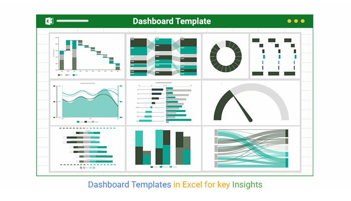


Excel remains one of the most widely used tools for data analysis globally. Despite its popularity, many struggle to present data effectively. Excel dashboard templates solve this by offering pre-designed layouts that save time and improve clarity. For example, a 3-axis graph in Excel makes it easy to compare multiple data sets simultaneously.
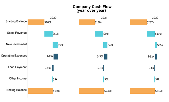
Why does this matter? Visual data is processed 60,000 times faster than text. A well-designed dashboard can highlight critical information at a glance, helping teams make faster, smarter decisions. A Cash Flow Diagram in Excel simplifies financial planning by clearly showing inflows and outflows.
Are you ready to turn your data chaos into clarity? This blog post explores how dashboard templates in Excel can simplify your data analysis process and boost productivity.
Let’s dive in.
Definition: Excel dashboard templates are pre-designed layouts that help visualize data effectively. They turn raw numbers into clear, interactive charts and graphs. These templates save time by providing ready-to-use formats for tracking metrics like sales, budgets, or performance.
Excel’s flexibility allows customization to fit specific needs. These dashboard templates simplify complex data, making it easier to spot trends and make informed decisions quickly. Whether managing finances or analyzing business performance, using tools like Excel’s profit and Loss template ensures clarity and efficiency.
Are you drowning in your monthly budget data? Or is it your sales data? Data tracking and analysis are more straightforward with dashboard samples in Excel. They turn chaos into clarity with actionable insights. Here are the main reasons why you need them.
Are you struggling to make sense of your data? Excel dashboards turn chaos into clarity. They help convert Excel data to graphs for better insights. They’re your key to more thoughtful, faster decisions. Here’s why they matter.
Have you ever opened a dashboard and thought, “What am I looking at?” An excellent Excel dashboard should be clear and insightful. Let’s explore six key features of an effective dashboard.
Have you ever stared at an Excel sheet and felt lost in a sea of numbers? You’re not alone. Data visualization makes analysis more manageable, but Excel’s built-in charts often fall short.
That’s where dashboard templates in Excel help turn raw data into insights.
And what about Excel’s data visualization limits? Use ChartExpo, a chart add-in for Excel that fills the gaps. With tools like a Sankey diagram generator, creating clear, insightful visuals becomes effortless.
The charts below were created in Excel using ChartExpo:
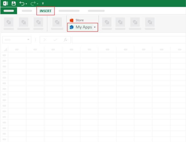
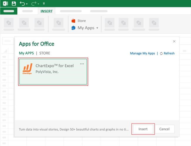
How to Install ChartExpo in Excel?
ChartExpo charts are available both in Google Sheets and Microsoft Excel. Please use the following CTAs to install the tool of your choice and create beautiful visualizations, including a finance dashboard in Excel, with just a few clicks in your favorite tool.
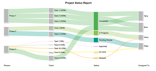
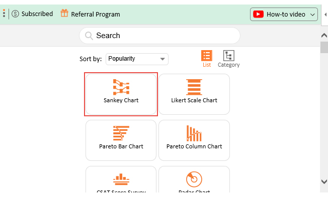
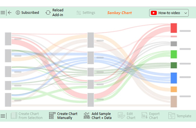
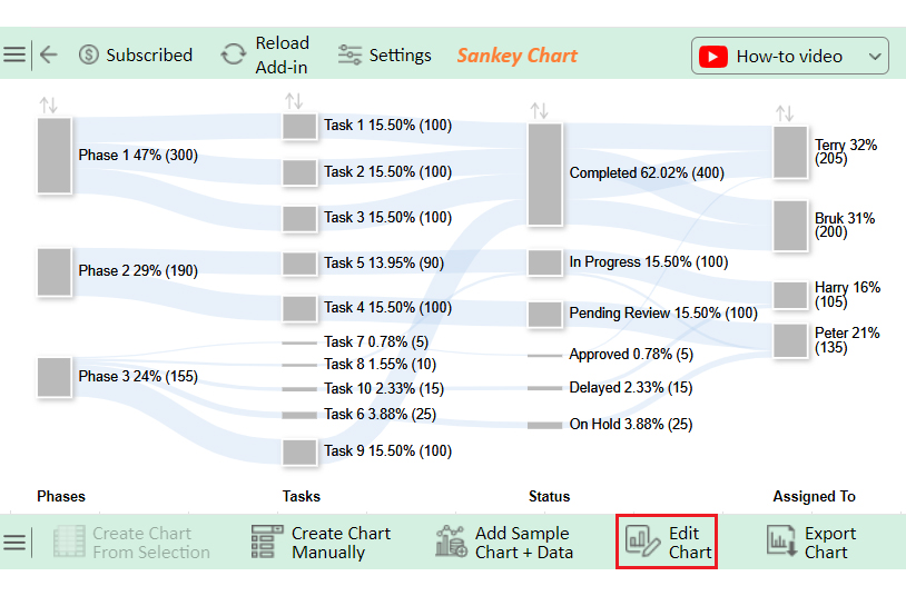
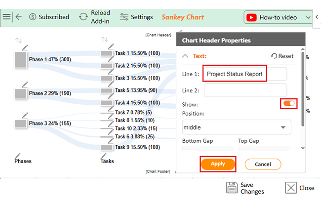
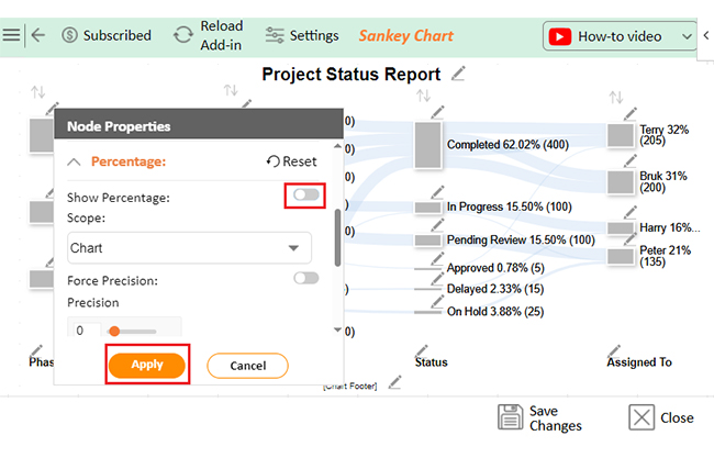
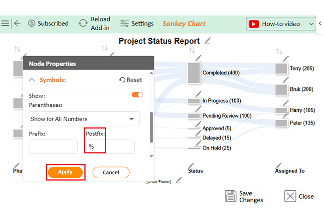
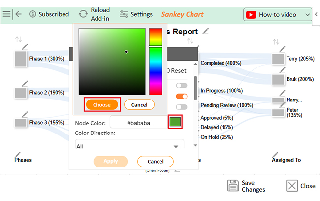
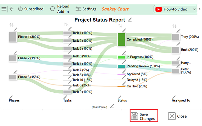
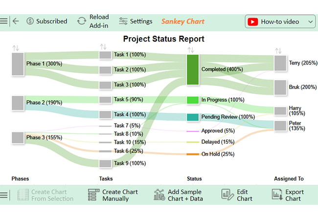
Let’s learn how to analyze data in Excel using ChartExpo and explore how a Sankey chart Excel visualization can help you clearly understand data flows and insights.
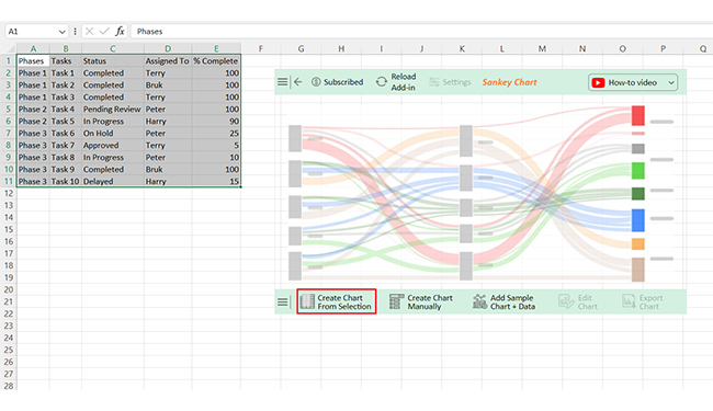
| Phases | Tasks | Status | Assigned To | % Complete |
| Phase 1 | Task 1 | Completed | Terry | 100 |
| Phase 1 | Task 2 | Completed | Bruk | 100 |
| Phase 1 | Task 3 | Completed | Terry | 100 |
| Phase 2 | Task 4 | Pending Review | Peter | 100 |
| Phase 2 | Task 5 | In Progress | Harry | 90 |
| Phase 3 | Task 6 | On Hold | Peter | 25 |
| Phase 3 | Task 7 | Approved | Terry | 5 |
| Phase 3 | Task 8 | In Progress | Peter | 10 |
| Phase 3 | Task 9 | Completed | Bruk | 100 |
| Phase 3 | Task 10 | Delayed | Harry | 15 |
Excel dashboards are powerful but have limits. Knowing their boundaries helps you decide when to use them or switch tools. While they offer insightful business graphs for data visualization, customization, and scalability can be challenging. Let’s explore their limitations.
An effective Excel dashboard should simplify data, not complicate it. This requires clarity, simplicity, and relevance. Focus on key metrics, use consistent formatting, incorporate visuals, and ensure data accuracy for impactful insights:
Yes, you can create dynamic dashboards in Excel. Use features like pivot tables, slicers, and formulas. These tools let you filter, update, and visualize data interactively. With some setup, Excel dashboards can adapt to changing data, making them robust for real-time insights.
Excel dashboards can include bar charts, line charts, pie charts, and scatter plots. You can also create stacked bars, area charts, and combo charts. Advanced options like pivot charts and sparklines add depth. These visuals help simplify complex data for better understanding.
Dashboard templates in Excel are powerful tools for transforming raw data into clear, actionable insights. They simplify complex information, making it easier to understand and act on. By using pre-designed layouts, you save time and focus on analyzing and interpreting data rather than designing.
These templates turn numbers into visuals like charts and graphs. Visual data is processed faster, helping teams make quicker decisions. Whether tracking sales, budgets, or performance, dashboards highlight key metrics at a glance. A Sankey diagram in Excel is handy for visualizing data flow and identifying inefficiencies.
Excel’s flexibility allows customization to fit specific needs. You can tweak colors, labels, and layouts without advanced skills. This adaptability ensures your dashboard meets unique business requirements. Need to compare multiple trends? Overlay graphs in Excel make it easy to layer different datasets for better analysis.
However, Excel has limitations. Large datasets can slow performance, and advanced features may require expertise. Manual updates can also be time-consuming and prone to errors.
Despite these challenges, dashboard templates in Excel remain a popular choice. They balance simplicity and functionality, making them accessible to all skill levels.
In conclusion, dashboard templates in Excel are invaluable for data visualization and decision-making. They streamline workflows, improve clarity, and empower you to turn data into meaningful stories.
Ready to elevate your data game? Start by learning how to analyze Likert scale data in Excel. Then, install ChartExpo to unlock advanced charting capabilities and take your Excel dashboards to the next level.
How much did you enjoy this article?


Learn how to use sparklines in Excel to quickly visualize trends inside cells. Discover types, creation steps, customization, use cases, benefits, and best practices.

Learn what a confidence interval graph is, how to create it in Excel, and how to interpret results to make more reliable, data-driven decisions.

A correlation matrix in Excel helps identify relationships between variables. Learn how to create, read, and use it for effective data analysis.


