• Home
  • Tools dropdown img
    • Spreadsheet Charts

      • ChartExpo for Google Sheets
      • ChartExpo for Microsoft Excel
    • Power BI Charts

      • Power BI Custom Visuals by ChartExpo
    • Word Cloud

  • Charts dropdown img
    • Chart Category

      • Bar Charts
      • Circle Graphs
      • Column Charts
      • Combo Charts
      • Comparison Charts
      • Line Graphs
      • PPC Charts
      • Sentiment Analysis Charts
      • Survey Charts
    • Chart Type

      • Box and Whisker Plot
      • Clustered Bar Chart
      • Clustered Column Chart
      • Comparison Bar Chart
      • Control Chart
      • CSAT Survey Bar Chart
      • CSAT Survey Chart
      • Dot Plot Chart
      • Double Bar Graph
      • Funnel Chart
      • Gauge Chart
      • Likert Scale Chart
      • Matrix Chart
      • Multi Axis Line Chart
      • Overlapping Bar Chart
      • Pareto Chart
      • Radar Chart
      • Radial Bar Chart
      • Sankey Diagram
      • Scatter Plot Chart
      • Slope Chart
      • Sunburst Chart
      • Tornado Chart
      • Waterfall Chart
      • Word Cloud
    • Google Sheets
      Microsoft Excel
  • Services
  • Pricing
  • Contact us
  • Blog
  • Support dropdown img
      • Gallery
      • Videos
      • Contact us
      • FAQs
      • Resources
    • Please feel free to contact us

      atsupport@chartexpo.com

Categories
All Data Visualizations Data Analytics Surveys
Add-ons/
  • Google Sheets
  • Microsoft Excel
  • Power BI
All Data Visualizations Data Analytics Surveys
Add-ons
  • Google Sheets
  • Microsoft Excel
  • Power BI

We use cookies

This website uses cookies to provide better user experience and user's session management.
By continuing visiting this website you consent the use of these cookies.

Ok

ChartExpo Survey


Home > Blog > Microsoft Excel

Data Merging in Excel: Explained Step by Step

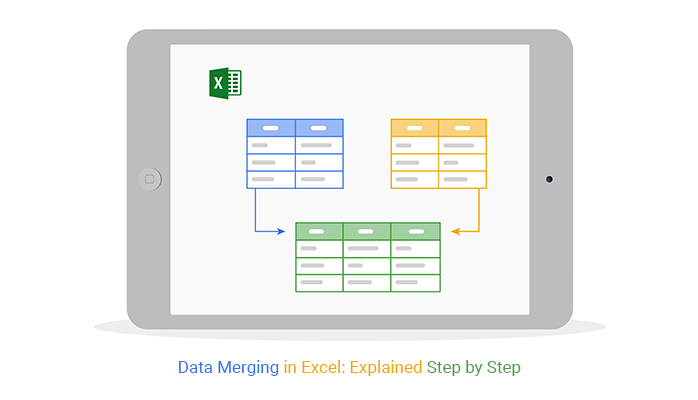
What is data merging in Excel?

Imagine having hundreds of customer records stored in different sheets or files. Trying to compile them into one place sounds overwhelming. Yet, data merging in Excel does precisely that.

With Excel, bringing together data doesn’t have to be complicated—it can be easy. Data merging in Excel allows you to bring everything together in a way that’s simple, powerful, and accessible. You can match, combine, and manage data efficiently without specialized software.

Data Merging in Excel

Think of it as pulling together valuable pieces of information to create a complete picture. With Excel’s merging tools, this process becomes seamless. Whether using the “VLOOKUP” function or Power Query, Excel offers flexibility to suit different data needs.

In today’s fast-paced environment, organizing and merging data correctly can save countless hours. Businesses want precise insights – Excel’s data merging helps cut through information silos, turning scattered data into something useful. This means faster access to insights, easier reporting, and more reliable data.

Data merging in Excel is practical for both beginners and professionals. After mastering it, your workflow will feel smoother, and your reports will be more cohesive.

Table of Contents:

  1. What is Data Merging in Excel?
  2. Key Methods for Data Merging in Excel
  3. How to Merge Excel Files Into One File?
  4. How to Merge Two Excel Columns?
  5. How to Combine Data from Multiple Sheets in Excel?
  6. How to Merge Two Tables in Excel with Formulas?
  7. How to Join Multiple Tables Into One with Excel Power Query?
  8. How to Combine Tables in Excel by Column Headers?
  9. How to Visualize Merged Data in Excel?
  10. What are the Advantages of Merging Data in Excel?
  11. What are the Tips for Merging Sheets in Excel?
  12. Wrap Up

First…

What is Data Merging in Excel?

Definition: Data merging in Excel is the process of combining information from multiple sources into a single, unified view. It’s especially helpful when data is spread across different sheets or files.

Excel provides tools like VLOOKUP, INDEX-MATCH, and Power Query to make data merging easy. It saves time, improves organization, and makes data analysis simpler. From customer lists to sales figures, merging ensures all information is in one place, ready for clear and accurate insights.

Key Methods for Data Merging in Excel

Data merging in Excel offers several methods designed to bring scattered information into a cohesive view. Here are some of the key ways to do it:

  • LOOKUP, HLOOKUP, or INDEX-MATCH: VLOOKUP and HLOOKUP allow you to search for matching data across sheets. INDEX-MATCH is a flexible alternative that can find values in any direction within a range.
  • Power Query: Power Query lets you connect and merge data from various sources into one table. This tool allows you to filter, clean, and transform data quickly.
  • Appending Tables: If you have similar tables, appending allows you to stack them into one continuous list. This method is helpful when combining data from different sheets or workbooks.
  • Pivot Tables: Pivot tables help you organize and summarize large datasets in seconds. They allow you to group, count, and total data, making merged information easy to analyze.

How to Merge Excel Files Into One File?

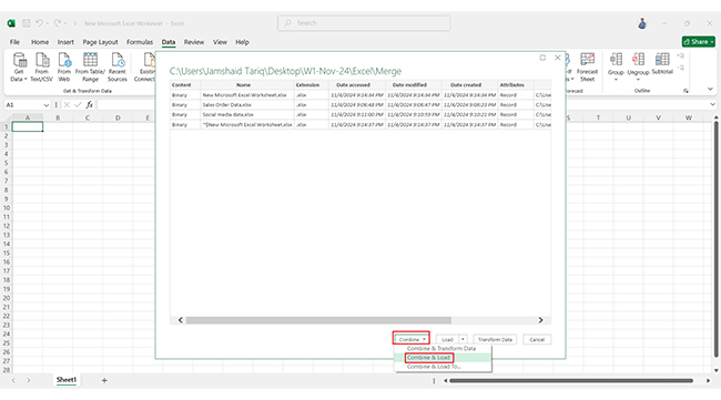
Here’s a quick guide to merging multiple Excel files into one:

  1. Place all files you want to merge in the same folder. This makes importing them easier.
  2. Go to the Data tab in Excel and select Get Data > From File > From Folder. Choose the folder with your files.
Go to Data Tab in Excel for Data Merging in Excel
Select Folder with Files for Data Merging in Excel
  1. Power Query will show all files in that folder. Click Combine & Load to import them.
Click Combine and Load for Data Merging in Excel
Select Sheet and Click Ok for Data Merging in Excel
Processing Queries for Data Merging in Excel
  1. Select Append Queries in Power Query to stack data from each file into a single table.
Select Append Queries in Power Query for Data Merging in Excel

How to Merge Two Excel Columns?

  1. Choose a blank column where you want the merged data to appear.
Choose a Blank Column for Data Merging in Excel
  1. Use the CONCATENATE Formula
  2. Type =CONCAT(A2, ” “, B2) if A2 and B2 are your columns. The ” ” adds a space between values.
Use CONCATENATE Formula for Data Merging in Excel
Adds a Space Between Values for Data Merging in Excel
  1. Drag the formula down the column.
Darg Formula Down Column for Data Merging in Excel

How to Combine Data from Multiple Sheets in Excel?

  1. Go to Data > Get Data > From File > From Workbook. Choose the Excel file with the sheets you want to combine.
Choose Excel File with Sheets for Data Merging in Excel
  1. Click Import.
Click Import for Data Merging in Excel
  1. When prompted, click Transform Data instead of Load. This opens your data in Power Query.
Click Transform Data instead of Load for Data Merging in Excel
  1. Click Close & Load to pull the combined data into a new Excel worksheet.
Click Close and Load for Data Merging in Excel

How to Merge Two Tables in Excel with Formulas?

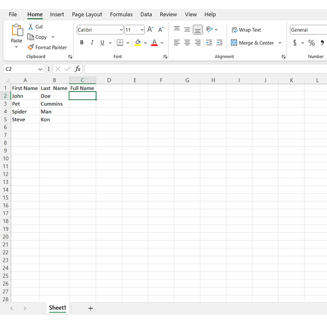
Merging tables with formulas in Excel is like connecting dots—each data piece joins to create a bigger picture. Here’s how you can do it with two powerful formulas:

Merging with VLOOKUP

VLOOKUP is perfect when you need to pull data from one table into another based on a common key (like an ID number).

How to do it:

Use the formula:

= VLOOKUP(lookup_value, table_array, col_index_num, [range_lookup])

  • lookup_value: The value you’re looking for in the first table.
  • table_array: The table from which to retrieve data.
  • col_index_num: The column number in the table where the result is located.
  • [range_lookup]: Use FALSE for an exact match.

Example: =VLOOKUP(A2, Table2!A:B, 2, FALSE)

It’s quick and easy! If your tables are structured well, this formula will seamlessly pull data from one to the other.

Merging with INDEX and MATCH

INDEX and MATCH together give you more flexibility than VLOOKUP. You can look up data in any column, not just the first one.

How to do it:

Use the formula:

= INDEX(return_range, MATCH(lookup_value, lookup_range, 0))

  • return_range: The column where you want the result.
  • lookup_value: The value to search for.
  • lookup_range: The column where the lookup_value is located.
  • The 0 ensures an exact match.

Example: =INDEX(Table2!B:B, MATCH(A2, Table2!A:A, 0))

This combo works even if the lookup column isn’t the first one. Plus, it’s more efficient for larger datasets.

How to Join Multiple Tables Into One with Excel Power Query?

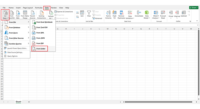
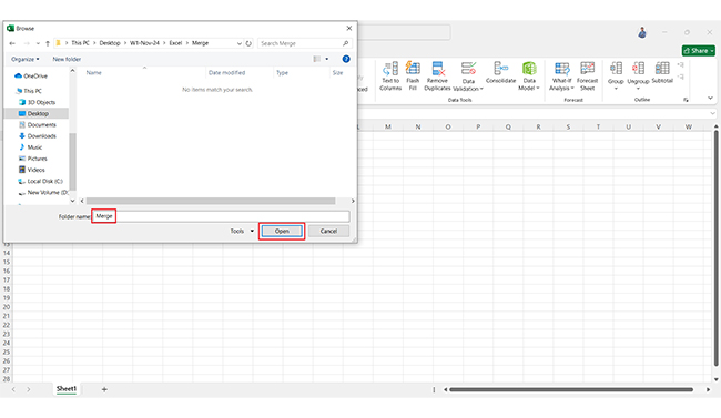
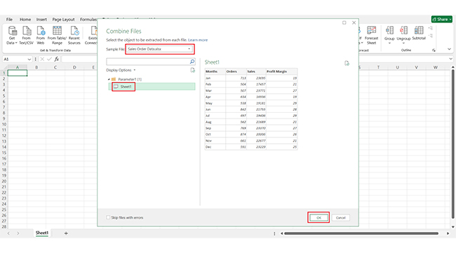
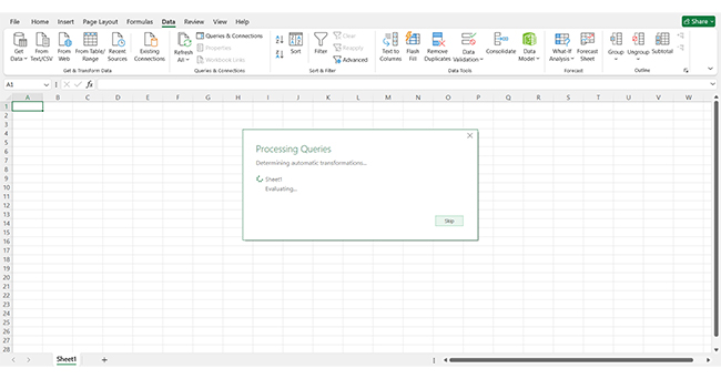
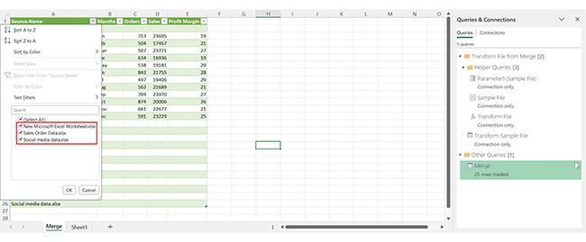
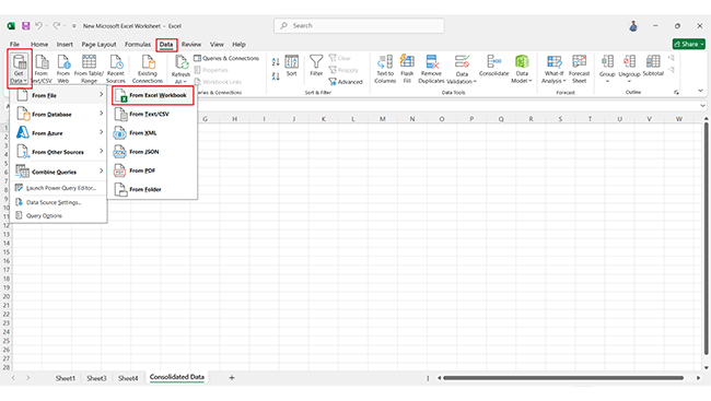
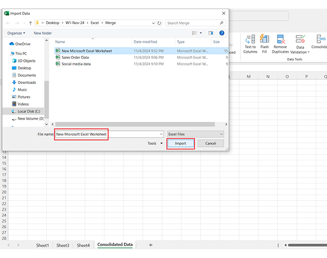
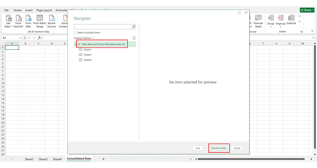
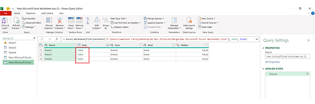
Joining multiple tables in Excel with Power Query makes data consolidation in Excel easy. Follow these steps to create one unified table:

  1. Load tables: Start by loading each table into Excel, making sure they’re formatted as tables.
  2. Open Power Query: Go to the “Data” tab and select “Get Data” to launch Power Query.
  3. Merge queries: In Power Query, select “Merge Queries” and choose the tables you want to combine. Match them by a common column.
  4. Expand columns: After merging, click on the new columns to expand and display the data you need.
  5. Repeat for additional tables: If you have more tables to add, repeat the merge and expand steps until all are combined.
  6. Load to Excel: Load the final, joined table back into Excel for easy access and analysis.

How to Combine Tables in Excel by Column Headers?

Combining tables by column headers in Excel is quick with the right steps. Here’s how to bring it all together seamlessly:

  1. Ensure consistent headers: First, ensure each table has the same column headers for smooth merging.
  2. Use Power Query: Go to the “Data” tab, select “Get Data,” and load each table into Power Query.
  3. Load and transform: In Power Query, select “Append Queries” to stack tables based on their shared headers. Transform data as needed to align everything.
  4. Close & load: Once the tables are combined, click “Close & Load” to bring the final merged table back into Excel.

How to Visualize Merged Data in Excel?

Merging data in Excel is one thing; making sense of it is another.

Data visualization turns numbers into stories, bringing hidden insights to life. Yet, Excel’s basic charts often fall short of complex analysis. They’re limited, static, and sometimes just plain uninspiring.

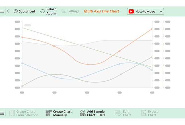
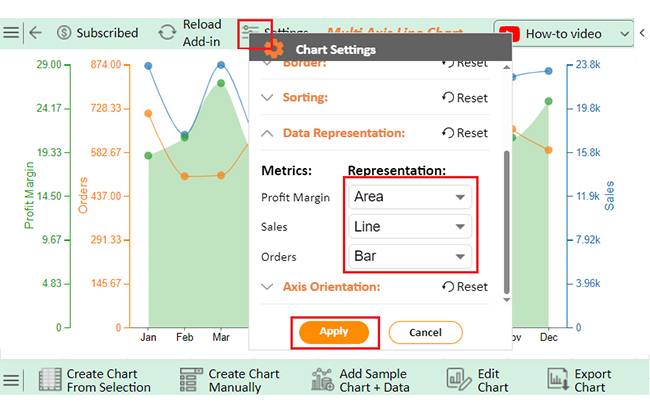
This is where ChartExpo comes in. As an advanced add-in for Excel, ChartExpo offers interactive, dynamic visualizations that transform raw data into engaging, clear graphics. With ChartExpo, visualizing merged data in Excel goes from a challenge to a breeze.

Let’s learn how to install ChartExpo in Excel.

  1. Open your Excel application.
  2. Open the worksheet and click the “Insert” menu.
  3. You’ll see the “My Apps” option.
  4. In the Office Add-ins window, click “Store” and search for ChartExpo on my Apps Store.
  5. Click the “Add” button to install ChartExpo in your Excel.

ChartExpo charts are available both in Google Sheets and Microsoft Excel. Please use the following CTAs to install the tool of your choice and create beautiful visualizations with a few clicks in your favorite tool.

Example

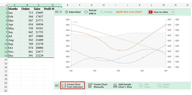
Let’s analyze the merged data below in Excel using ChartExpo.

Months Orders Sales Profit Margin
Jan 713 23695 19
Feb 504 17457 21
Mar 507 23771 27
Apr 634 16936 19
May 538 19181 29
Jun 842 21755 28
Jul 497 19406 29
Aug 562 21689 21
Sep 769 23370 27
Oct 874 20006 26
Nov 661 22677 21
Dec 591 23229 25
  • To get started with ChartExpo, install ChartExpo in Excel.
  • Now Click on My Apps from the INSERT menu.
insert chartexpo in excel
  • Choose ChartExpo from My Apps, then click Insert.
open chartexpo in excel
  • Once it loads, scroll through the charts list to locate and choose the “Multi Axis Line Chart”.
search multi axis line chart in excel
  • You will see a Multi Axis Line Chart on the screen.
See Multi Axis Line Chart on Screen After Data Merging in Excel
  • Click the “Create Chart From Selection” button after selecting the data from the sheet, as shown.
Click Ceate Chart From Selection After Data Merging in Excel
  • ChartExpo will generate the visualization below for you.
Initial Visual After Data Merging in Excel
  • Click on Settings and change the “Data Representation” as follows.
Change Data Representation After Data Merging in Excel
  • If you want to add anything to the chart, click the Edit Chart button:
Click Edit Chart After Data Merging in Excel
  • Click the pencil icon next to the Chart Header to change the title.
  • It will open the properties dialog. Under the Text section, you can add a heading in Line 1 and enable Show.
  • Give the appropriate title of your chart and click the Apply button.
Add Chart Header After Data Merging in Excel
  • You can add the dollar sign with (Sales) value as follows:
Add Prefix with Sales After Data Merging in Excel
  • You can change the precision value of Orders to zero as follows:
Change Precision Value of Orders to Zero After Data Merging in Excel
  • You can change the precision value of the Profit Margin to zero as follows:
Change Precision Value of Profit Margin to Zero After Data Merging in Excel
  • You can add the percentage sign with Profit Margin as follows:
Add Precentage Sign with Profit Margin After Data Merging in Excel
  • Enable the show button. Then, change the Legend shape of “Sales” into a Line and Circle and click the “Apply” button.
Change Legend Shape of Sales After Data Merging in Excel
  • Change the Legend shape of “Orders” to Column and click the “Apply” button.
Change Legend Shape of Orders After Data Merging in Excel
  • Click the “Save Changes” button to persist the changes made to the chart.
Click Save Changes After Data Merging in Excel
  • Your final Multi Axis Line Chart will look like the one below.
Final Data Merging in Excel

Insights

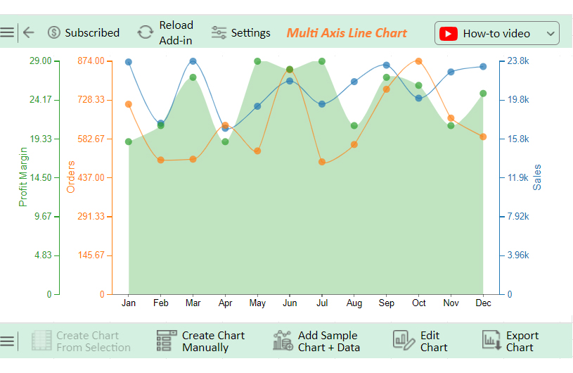
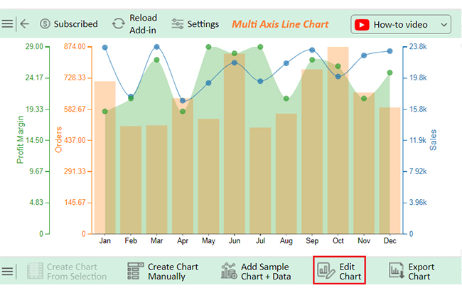
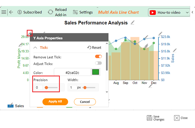
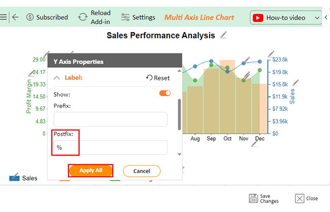
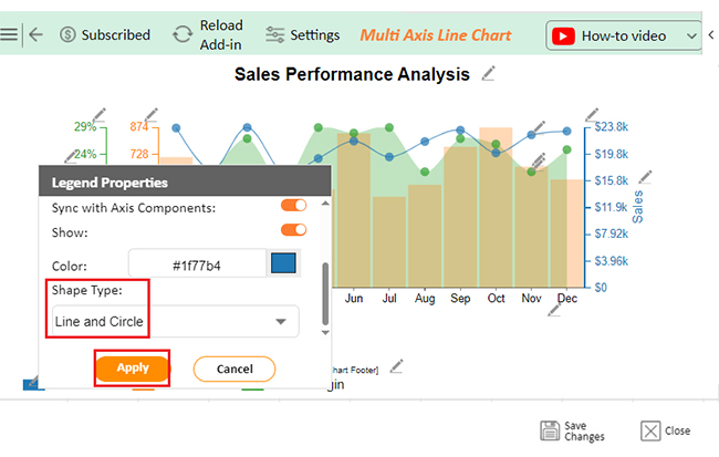
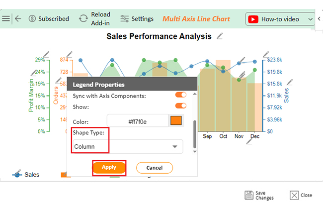
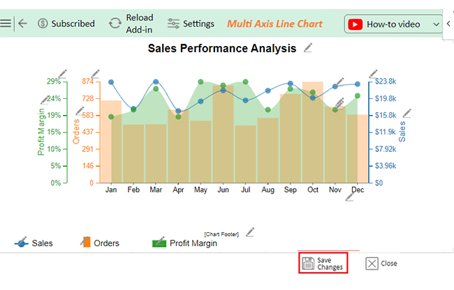
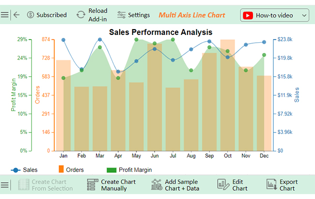
Monthly sales and orders fluctuate throughout the year as follows:

  • Highest sales: January with $23,695.
  • Most orders: October with 874 orders.
  • Peak profit margins: 29% in both May and July.
  • Notable month: June, with a strong balance of high orders (842) and solid sales ($21,755).

Unlock Analytical Potential After Data Merging in Excel:

  1. Open your Excel Application.
  2. Install ChartExpo Add-in for Excel from Microsoft AppSource to create interactive visualizations.
  3. Select the Multi-Axis Line Chart from the list of charts.
  4. Select your data.
  5. Click on the “Create Chart from Selection” button.
  6. Customize your chart properties to add header, axis, legends, and other required information.

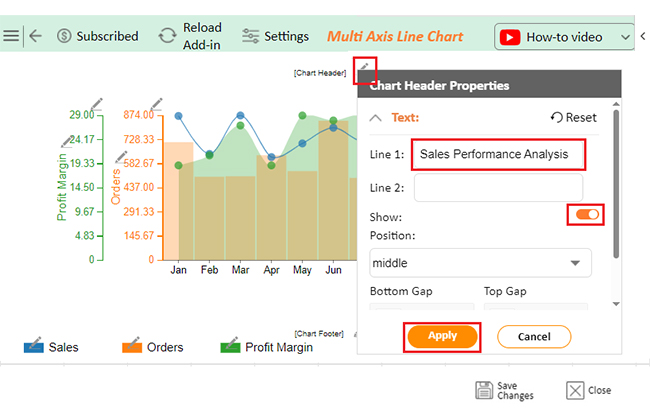
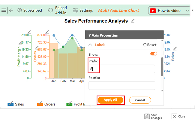
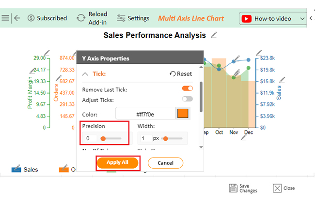
The following video will help you create a Multi-Axis Line Chart in Microsoft Excel.

What are the Advantages of Merging Data in Excel?

Merging data in Excel has big benefits for anyone working with lots of information. Here are the main advantages:

  • Consolidated view: Merging gives a complete view of all your data in one place, making it easy to understand.
  • Improved accuracy: Combining data reduces errors from managing multiple files and keeps everything aligned.
  • Time efficiency: With merging, you save time on manual updates and can work faster.
  • Streamlined analysis and reporting: Merged data makes analysis easier and reporting clearer, helping you find insights quickly.

What are the Tips for Merging Sheets in Excel?

Merging sheets in Excel doesn’t have to be complicated. With a few smart tips, you can make the process smooth and accurate:

  • Standardize headers: Ensure all sheets use the same headers for easy merging and better data alignment.
  • Remove duplicates: Remove duplicates in Excel before merging to keep data clean and manageable.
  • Use named ranges: Named ranges simplify formulas and make it easier to find data across sheets.
  • Leverage Power Query: Power Query can quickly combine and transform data, saving you manual work.
  • Use VLOOKUP/XLOOKUP: These functions help pull matching data from different sheets efficiently.
  • Align data types: Match data types across sheets to avoid errors during merging.
  • Backup data: Always create a backup copy in case you need to restore your original data.

FAQs

Can you merge two cells in Excel and keep both data?

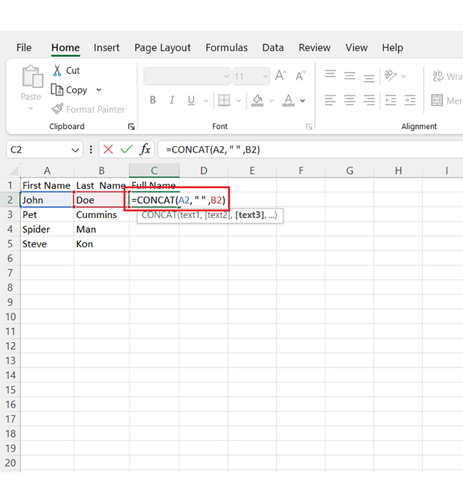
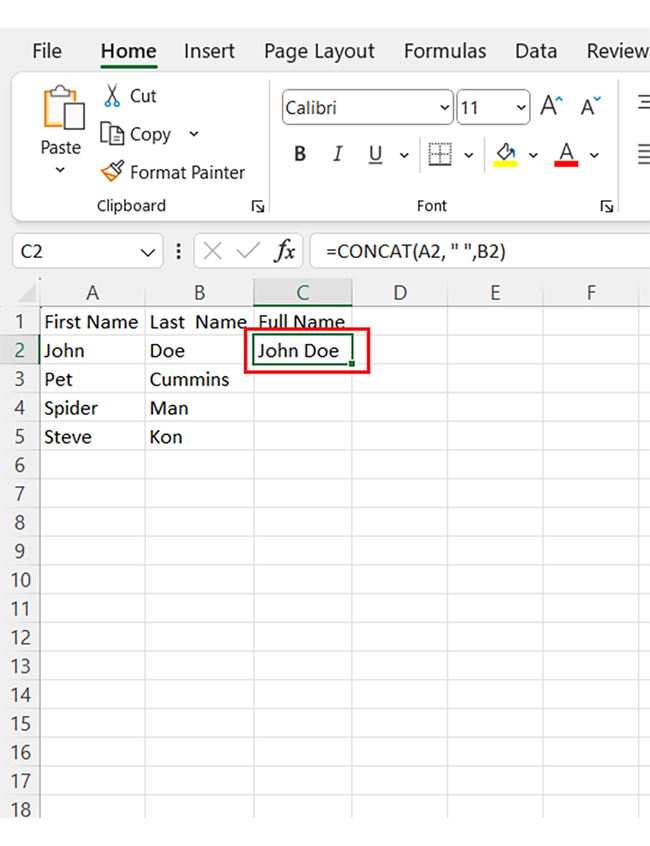
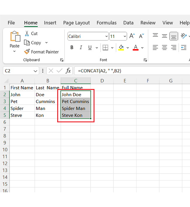
Yes, you can merge two cells and keep both data using a formula. In a new cell, use =A1 & ” ” & B1 to combine the contents of cells A1 and B1, with a space between.

How do I merge two Excel entries?

To merge two Excel entries, use the CONCATENATE function or =A1 & ” ” & B1. This combines the contents of cells A1 and B1 and preserves both entries without losing data.

How to merge two lists in Excel?

To merge two lists in Excel:

  • Copy one list below the other in the same column.
  • Use Remove Duplicates under the Data tab to clean up any repeats.
  • This combines both lists into a single, unique list.

Wrap Up

Data merging in Excel is a powerful skill. It brings scattered information together in one place, allowing you to see the full picture without flipping through multiple sheets.

Merging data saves time and reduces errors. With everything in one table, you can spot patterns and insights faster. Excel functions like VLOOKUP and Power Query make merging data accessible for all users.

When data is merged, analysis becomes simpler. You can easily filter, sort, and summarize. It’s a straightforward way to keep information organized and efficient.

However, while merging data is essential, visualization is just as important. Excel’s basic charts may not always capture the depth of your data. Complex insights need advanced, interactive visuals.

This is where tools like ChartExpo can help. ChartExpo turns data into engaging, clear visuals. It’s perfect for anyone looking to go beyond Excel’s standard charts.

Ready to elevate your data analysis? Install ChartExpo in Excel today to unlock advanced visualization and make your data easy to understand and impactful.

How much did you enjoy this article?

ExcelAd2
Start Free Trial!
144006

Related articles

next previous
Microsoft Excel9 min read

KPI Dashboard in Excel: A Complete Guide

A KPI dashboard in Excel helps track key metrics and streamline data visualization. Discover how to create, analyze, and use it with clear guides and examples.

Microsoft Excel11 min read

How to Plot a Speedometer Chart in Excel?

Create a Speedometer Chart in Excel to track KPIs, goals, and performance metrics visually. Explore templates, examples, and step-by-step instructions for better dashboards.

Microsoft Excel13 min read

Excel for Teachers for Insightful Preparation

Excel for teachers simplifies grading, tracks attendance, and organizes data. Find its key features, expert tips, and how ChartExpo enhances data visualization.

Microsoft Excel14 min read

How to Make a Cash Flow Diagram in Excel?

Learn how to make a Cash Flow Diagram in Excel. It will help you learn to visualize and analyze inflows and outflows of your business cash flow.

Microsoft Excel11 min read

Succession Planning Template for Long-Term Success

Succession Planning Templates help businesses prepare for leadership changes. Learn to create, analyze, and use them for seamless transitions and growth.

ChartExpo logo

Turn Data into Visual
Stories

CHARTEXPO

  • Home
  • Gallery
  • Videos
  • Services
  • Pricing
  • Contact us
  • FAQs
  • Privacy policy
  • Terms of Service
  • Sitemap

TOOLS

  • ChartExpo for Google Sheets
  • ChartExpo for Microsoft Excel
  • Power BI Custom Visuals by ChartExpo
  • Word Cloud

CATEGORIES

  • Bar Charts
  • Circle Graphs
  • Column Charts
  • Combo Charts
  • Comparison Charts
  • Line Graphs
  • PPC Charts
  • Sentiment Analysis Charts
  • Survey Charts

TOP CHARTS

  • Sankey Diagram
  • Likert Scale Chart
  • Comparison Bar Chart
  • Pareto Chart
  • Funnel Chart
  • Gauge Chart
  • Radar Chart
  • Radial Bar Chart
  • Sunburst Chart
  • see more
  • Scatter Plot Chart
  • CSAT Survey Bar Chart
  • CSAT Survey Chart
  • Dot Plot Chart
  • Double Bar Graph
  • Matrix Chart
  • Multi Axis Line Chart
  • Overlapping Bar Chart
  • Control Chart
  • Slope Chart
  • Clustered Bar Chart
  • Clustered Column Chart
  • Box and Whisker Plot
  • Tornado Chart
  • Waterfall Chart
  • Word Cloud
  • see less

RESOURCES

  • Blog
  • Resources
  • YouTube
SIGN UP FOR UPDATES

We wouldn't dream of spamming you or selling your info.

© 2025 ChartExpo, all rights reserved.