Categories
Power BI is a tool used to shape raw data into informative visuals and reports. It comes with a user-friendly interface and formidable functionalities, which makes it an invaluable platform for individuals to refine their skills through hands-on projects.
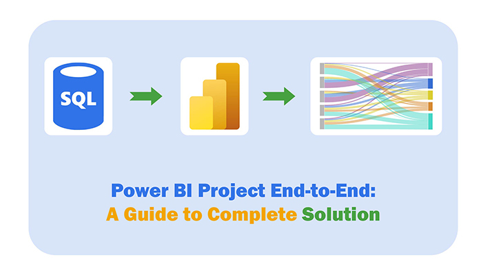


Whether you’re a beginner or an expert, the Power BI practice project can help you grow your skills. In this guide, you’ll discover what the Power BI project is, how to create a Power BI project end-to-end, and the best practices for creating Power BI projects.
First…
A Power BI project involves using Microsoft Power BI to transform raw data into meaningful insights through interactive reports and visualizations. It involves:
You need to determine the purpose of the project and what insights you want to gain from the data. To do that, you’ll have to engage stakeholders to understand their requirements.
Identify and connect to various data sources. These data sources could be databases (like Oracle, SQL Server), Web APIs, cloud services (like Azure, Google Analytics), or Excel files.
Use Power Query in Power BI Desktop to clean, transform, and prepare the data. These include:
You should define relationships between different tables in the data model. This will help you perform complex calculations and create meaningful visualizations. Also, use DAX (Data Analysis Expressions) and apply conditional formatting in Power BI to create calculated columns and measures for advanced analysis.
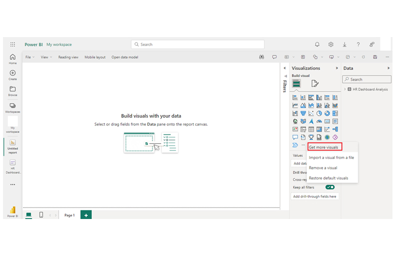
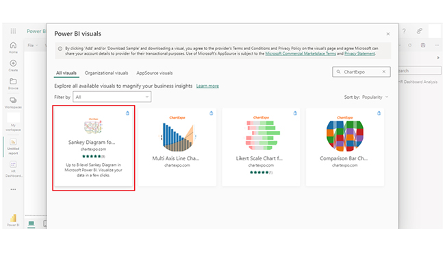
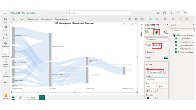
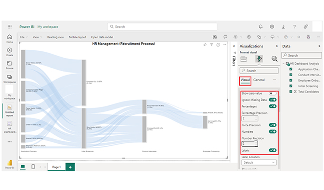
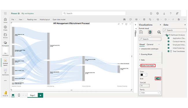
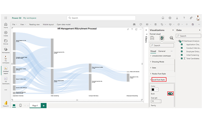
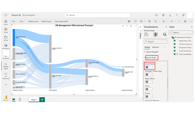
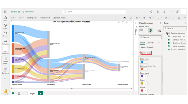
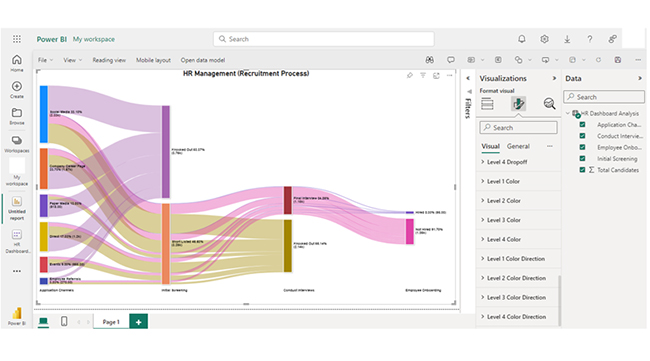
Use the report view in Power BI Desktop to create interactive visualizations like tables, charts, slicers, maps, and even advanced visuals such as the Sankey Diagram in Power BI. These visuals should clearly and effectively convey the insights. Furthermore, organize visuals in a logical layout for ease of understanding. If you’re looking to enhance visual appeal, use themes and formatting.
Filters and slicers should be incorporated. This will enable users to interact with the data and explore different dimensions. The drill-through functionality should be enabled for deeper analysis of specific data points.
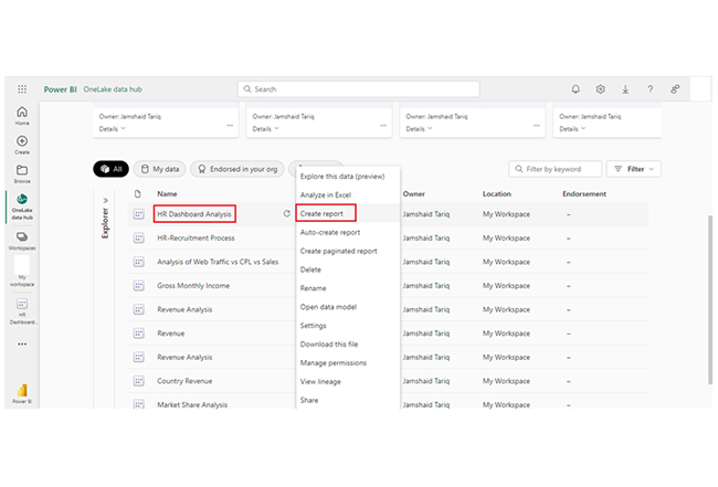
After finalizing the report, you’ll have to publish it to the Power BI service (app.powerbi.com) and share it with stakeholders. You can control who can view (or edit) the report with the user permissions.
To create dashboards, pin key visuals from the reports. Dashboards provide a high-level overview of performance metrics.
Configure data refresh settings to keep your reports up to date with the latest data. It could be setting refresh daily, weekly, or as needed.
Gather feedback from users to understand how well the project meets their needs. You also need to make adjustments to the reports and dashboards based on new data sources, user insights, or changing business requirements.
Create documentation outlining the data sources, visualizations, transformation processes, and user guides to facilitate future updates and knowledge transfer.
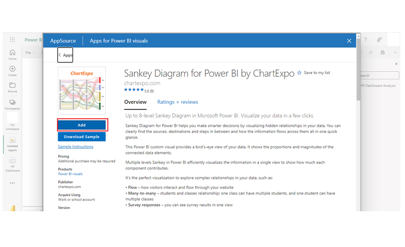
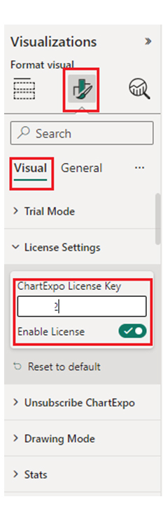
Take a quick tour of the Sankey Diagram for Power BI app demo:
Stage 1: Logging in to Power BI


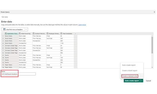
| Channels | Initial Screening | Conduct Interviews | Employee Onboarding |
Total Candidates
|
| Social Media | Short Listed | Final Interview | Hired | 32 |
| Social Media | Short Listed | Final Interview | Not Hired | 400 |
| Social Media | Short Listed | Knocked Out | 800 | |
| Social Media | Knocked Out | 1100 | ||
| Company Career Page | Short Listed | Final Interview | Hired | 20 |
| Company Career Page | Short Listed | Final Interview | Not Hired | 250 |
| Company Career Page | Short Listed | Knocked Out | 500 | |
| Company Career Page | Knocked Out | 900 | ||
| Events | Short Listed | Final Interview | Hired | 5 |
| Events | Short Listed | Final Interview | Not Hired | 100 |
| Events | Short Listed | Knocked Out | 200 | |
| Events | Knocked Out | 350 | ||
| Paper Media | Short Listed | Final Interview | Hired | 3 |
| Paper Media | Short Listed | Final Interview | Not Hired | 80 |
| Paper Media | Short Listed | Knocked Out | 135 | |
| Paper Media | Knocked Out | 700 | ||
| Employee Referrals | Short Listed | Final Interview | Hired | 10 |
| Employee Referrals | Short Listed | Final Interview | Not Hired | 70 |
| Employee Referrals | Short Listed | Knocked Out | 80 | |
| Employee Referrals | Knocked Out | 110 | ||
| Direct | Short Listed | Final Interview | Hired | 25 |
| Direct | Short Listed | Final Interview | Not Hired | 150 |
| Direct | Short Listed | Knocked Out | 425 | |
| Direct | Knocked Out | 600 |
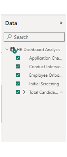

Insights:
Take a comprehensive journey through a Power BI project end-to-end in this detailed tutorial. Learn how to seamlessly move from data collection to visualization, using dynamic charts and graphs to deliver clear and actionable insights. Starting with data acquisition, transformation, and modeling, you’ll gain the skills to structure your data effectively using Power BI’s powerful tools. Once your data is prepared, explore how to create interactive reports and dashboards that provide a visual representation of key metrics and performance indicators. Mastering the entire Power BI process enables you to deliver robust, data-driven solutions, improve decision-making, and effectively communicate insights across your organization. With engaging visuals, your Power BI project will turn complex data into easily digestible stories that drive business success.
To create a Power BI project, you’ll have to gather and prepare data, model relationships, design interactive reports and dashboards, publish to Power BI Service, and regularly update and monitor performance.
To deploy a Power BI project, publish the report to the Power BI Service, share with stakeholders, set data refresh schedules, and manage user permissions for access control.
A Power BI project involves transforming data into insights. Interactive reports are used during these transformation processes. To create one, you’ll have to gather data, model it, design visuals, and publish.
To get the most out of the Power BI project, you should organize data into a star schema for easier modeling and improved performance. You can do this by using fact tables linked to dimension tables. Also keep detailed documentation of data sources, transformations, and report designs for future reference.
Finally, gather feedback from stakeholders to make necessary adjustments and improvements.
Now you know what the Power BI project end-to-end is, and its benefits, what kind of data will you analyze with it?
How much did you enjoy this article?


Discover diverse and high-quality Power BI report examples for inspiration and insights. Elevate your reporting with strategic visualization techniques.

A Customer Relationship Management Dashboard centralizes data, tracks key metrics, and drives smarter business decisions. Discover now!

Explore Healthcare Dashboard Examples and learn how to turn complex healthcare data into clear, actionable insights for better decision-making.


