Categories
First, why create a frequency chart in Excel?
When working with data, raw numbers can be difficult to interpret on their own. For example, if you track monthly sales in a business, it is hard to understand performance patterns just by scanning values.
A frequency chart in Excel helps solve this by organizing data into ranges and showing how often values occur.
A frequency chart in Excel provides a clear view of data distribution, making it easier to identify trends, clusters, and variations in your dataset.
This turns complex data into a simple visual format that supports faster analysis and better decisions.
Excel is one of the most commonly used tools for this purpose because it is widely available, easy to use, and integrates well with different data sources.
It is used in daily operations by a large number of businesses, making it a practical choice for data analysis tasks like frequency distribution.
One of the key advantages of using Excel is automation.
Instead of manually calculating frequencies, Excel can quickly generate results and visual charts, saving time and reducing errors. This allows more focus on interpreting data rather than processing it.
Overall, frequency charts in Excel help transform raw data into meaningful insights that are easier to understand, share, and act upon.
Definition: A frequency distribution in Excel is a method used to organize and summarize data by showing how often values occur within a dataset.
In this approach, data is grouped into categories called bins, where each bin represents a specific range of values.
The frequency indicates how many data points fall within each range, making it easier to understand the structure of the dataset.
Frequency distributions are often visualized using charts such as histograms and frequency polygons.
A histogram uses bars to display the frequency of each bin, while a frequency polygon connects data points with lines to show the overall pattern.
To create a frequency distribution, you first organize your data, then define appropriate bin ranges, and finally count how many values fall into each bin.
This method helps identify patterns, understand data spread, and analyze distribution more effectively, making it a valuable tool for data analysis in Excel.
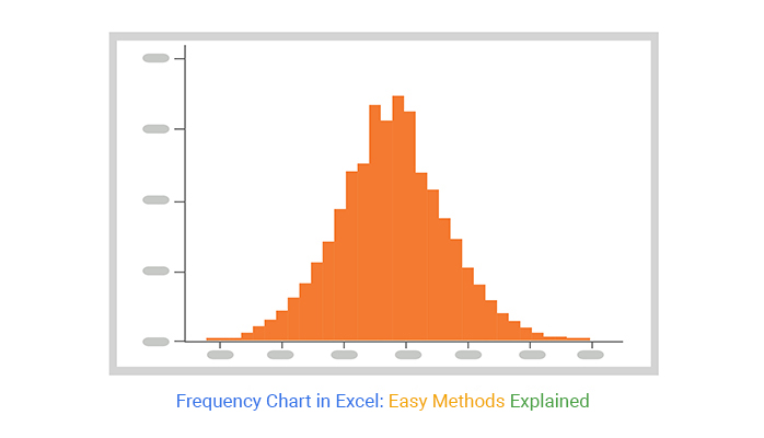
A frequency chart in Excel is a visual tool that shows how often different values or ranges of values appear in a dataset.
It organizes data into intervals called bins or classes and displays the number of observations in each group.
This chart simplifies large datasets by structuring data into clear categories, making it easier to identify patterns, trends, and the overall distribution.
It helps you quickly see where most values are concentrated, how spread out the data is, and whether the distribution is balanced or skewed.
Frequency charts in Excel are widely used in data analysis to summarize information, compare datasets, and support more accurate and informed decision-making.
A frequency chart in Excel is an essential tool for simplifying and analyzing data. It transforms complex numerical datasets into clear visual formats, making it easier to understand patterns, trends, and insights at a glance.
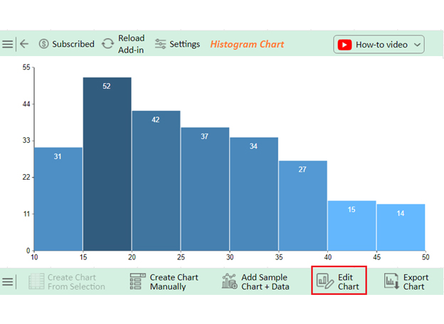
There are several ways to create a frequency chart in Excel, depending on your data structure and level of analysis. Each method offers a different level of control and flexibility.
To show frequencies in Excel:
To make a frequency response graph in Excel:
Creating a frequency chart in Excel is a useful skill for turning raw data into a clear visual summary.
It helps you understand how values are distributed and makes it easier to identify patterns, trends, and variations in your dataset.
These charts simplify data analysis by grouping values into ranges and showing how often each range occurs.
This makes complex datasets easier to interpret and supports better decision-making based on real insights.
Excel provides simple tools to build charts, but the accuracy of your results depends on how well you organize your data.
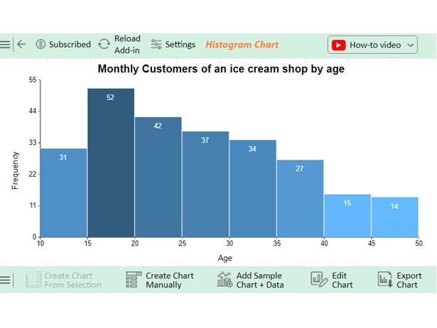
Choosing appropriate bins is especially important because it directly affects how clearly your data distribution is represented.
Clear labeling of axes and chart titles is also essential. It ensures your chart is easy to understand and provides proper context for anyone reviewing the data.
Before finalizing, always review your chart to ensure it accurately reflects your dataset.
A well-structured chart not only improves understanding but also helps communicate insights more effectively for reporting and analysis.
How much did you enjoy this article?


Learn how to use sparklines in Excel to quickly visualize trends inside cells. Discover types, creation steps, customization, use cases, benefits, and best practices.

Learn what a confidence interval graph is, how to create it in Excel, and how to interpret results to make more reliable, data-driven decisions.

A correlation matrix in Excel helps identify relationships between variables. Learn how to create, read, and use it for effective data analysis.


