Categories
Sort by Column in Power BI is not merely a function; it revolutionizes data analysis.
Picture this situation: You possess an extensive dataset comprising sales data, customer characteristics, and product details. You need to pinpoint the top-performing and low-performing products or regions rapidly. Lacking the capability to sort by column could make this task difficult and time-consuming.


The Power BI Sort by Column feature allows you to organize the data easily to display the best-selling products. Or identify the specific areas that need to be focused on. This function simplifies your presentation and lets your team quickly understand critical information.
Businesses must prioritize in-depth data visualization and analysis to maintain a competitive edge. Microsoft’s Power BI, a powerful tool for business analytics, has garnered significant attention in the industry. Microsoft has reported more than 5 million Power BI subscriptions globally.
According to Gartner, data analysis tools such as Power BI can boost organizational efficiency by 20%. This highlights the importance of using Power BI Sort by Column to improve data-driven decision-making processes.
This blog post delves deeper into the significance of Power BI Sort by Column. We’ll explore practical examples of how it can revolutionize your approach to data analysis.
Buckle up’ let’s embark on this insightful journey into data visualization and business intelligence.
First…
Definition: Custom sorting in Power BI allows you to define a specific order for sorting data. This is particularly useful when the default sorting options (alphabetical or numerical) are not suitable. For instance, you might want to sort months chronologically instead of alphabetically.
To create a custom sort, you must add a new column representing the desired order. This can be done using a numeric value or a custom list. Once the column is added, you can set it as the sorting column for the target field. This ensures the data is displayed in the defined sequence.
The process involves:
Custom sorting enhances data visualization, making reports more intuitive and aligned with business needs.
In Power BI, the “Sort by Column” feature is crucial for presenting data meaningfully and coherently. It allows you to sort data fields based on a specified column, enhancing data visualization clarity and accuracy.
Here are reasons why Power BI Sort by Column is important:
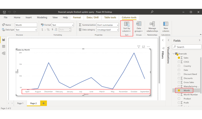
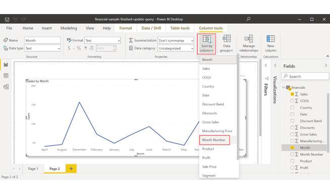
To set a different column to sort by in Power BI Desktop, both columns must have the same level of granularity. For instance, you will need a corresponding number for each month to correctly organize a column of month names. The sorting rule will be used for all visuals in the report, including the column being sorted.
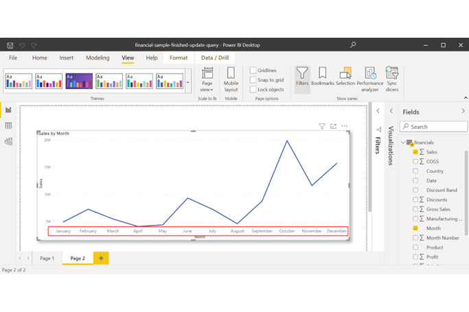
In this example, for performing Power BI sort by column, the months are currently arranged alphabetically. However, they need to be arranged in chronological order.
Use Power BI charts to visualize sorted columns clearly, so trends, rankings, and patterns stand out instantly and make analysis faster and more accurate.


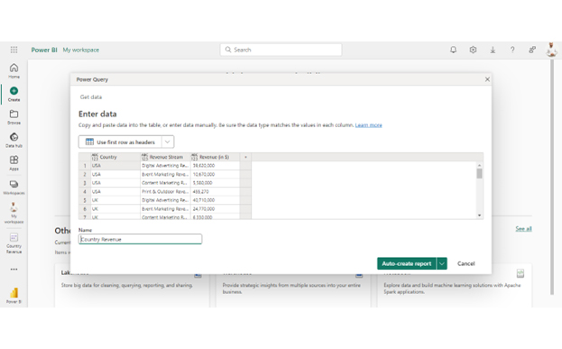
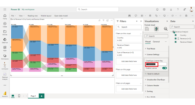
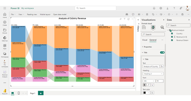
| Country | Revenue Stream | Revenue (in $) |
| USA | Digital Advertising Revenue | 39,620,000 |
| USA | Event Marketing Revenue | 10,670,000 |
| USA | Content Marketing Revenue | 5,580,000 |
| USA | Print & Outdoor Revenue | 455,270 |
| UK | Digital Advertising Revenue | 40,710,000 |
| UK | Event Marketing Revenue | 24,770,000 |
| UK | Content Marketing Revenue | 6,330,000 |
| UK | Print & Outdoor Revenue | 552,190 |
| DNK | Digital Advertising Revenue | 47,040,000 |
| DNK | Event Marketing Revenue | 29,070,000 |
| DNK | Content Marketing Revenue | 7,740,000 |
| DNK | Print & Outdoor Revenue | 600,690 |
| DNK | Media Relations Revenue | 106,430 |
| AUS | Digital Advertising Revenue | 53,790,000 |
| AUS | Event Marketing Revenue | 38,530,000 |
| AUS | Content Marketing Revenue | 6,590,000 |
| AUS | Print & Outdoor Revenue | 9,040,000 |
| AUS | Media Relations Revenue | 6,130,000 |
| FR | Digital Advertising Revenue | 57,860,000 |
| FR | Event Marketing Revenue | 50,450,000 |
| FR | Content Marketing Revenue | 3,560,000 |
| FR | Print & Outdoor Revenue | 18,790,000 |
| FR | Media Relations Revenue | 15,460,000 |
| IND | Digital Advertising Revenue | 60,470,000 |
| IND | Event Marketing Revenue | 63,200,000 |
| IND | Content Marketing Revenue | 2,080,000 |
| IND | Print & Outdoor Revenue | 29,500,000 |
| IND | Media Relations Revenue | 30,020,000 |
Power BI’s Sort by Column enhances data presentation and analysis. This feature offers several benefits that improve data clarity, insights, reporting, and overall data management.
Here are the benefits of using Power BI Sort by Column:
Understanding the limitations involved is crucial while employing customized sorting in Power BI. Some of these limitations include:
These restrictions may affect how data is organized in Power BI. Therefore, it is crucial to consider these limitations when using custom sorting.
Sorting by multiple columns in Power BI can significantly enhance the clarity and utility of your reports. Following these best practices will help ensure your data is presented as logically and insightfully as possible:
To sort by a specific column in Power BI:
This sets the custom sort order.
To set a sort order in Power BI:
To sort a column numerically in Power BI, select the column header in your table or visual. Click the “Sort ascending” or “Sort descending” button in the toolbar. This will sort the column in numerical order.
Power BI’s “Sort by Column” feature is essential for effective data visualization. It allows you to display data in a meaningful order, enhancing clarity and understanding.
This feature improves data interpretation. By sorting data logically, you can uncover patterns and trends more easily. It ensures that important data points stand out, making analysis more intuitive. This leads to better decision-making and more accurate insights.
Another key benefit is consistency in data presentation. “Sort by Column” ensures that reports and dashboards maintain a uniform appearance. This consistency helps users quickly grasp the information presented and adds a professional touch to business reports.
The feature also supports business-specific needs. You can sort data according to your organization’s unique requirements. This flexibility allows for customized analysis that fits specific operational contexts. It ensures reports are relevant and aligned with business goals.
Lastly, “Sort by Column” enhances the overall user experience. It facilitates smoother data interaction and exploration. Users can dynamically adjust views to analyze specific data points better. This dynamic interaction makes data analysis more engaging and efficient.
In summary, Power BI’s “Sort by Column” is a powerful tool for improving data clarity and insight. It ensures consistent and professional data presentation, vital for effective data management and visualization in Power BI.
How much did you enjoy this article?


Discover diverse and high-quality Power BI report examples for inspiration and insights. Elevate your reporting with strategic visualization techniques.

A Customer Relationship Management Dashboard centralizes data, tracks key metrics, and drives smarter business decisions. Discover now!

Explore Healthcare Dashboard Examples and learn how to turn complex healthcare data into clear, actionable insights for better decision-making.


