• Home
  • Tools dropdown img
    • Spreadsheet Charts

      • ChartExpo for Google Sheets
      • ChartExpo for Microsoft Excel
    • Power BI Charts

      • Power BI Custom Visuals by ChartExpo
    • Word Cloud

  • Charts dropdown img
    • Chart Category

      • Bar Charts
      • Circle Graphs
      • Column Charts
      • Combo Charts
      • Comparison Charts
      • Line Graphs
      • PPC Charts
      • Sentiment Analysis Charts
      • Survey Charts
    • Chart Type

      • Box and Whisker Plot
      • Clustered Bar Chart
      • Clustered Column Chart
      • Comparison Bar Chart
      • Control Chart
      • CSAT Survey Bar Chart
      • CSAT Survey Chart
      • Dot Plot Chart
      • Double Bar Graph
      • Funnel Chart
      • Gauge Chart
      • Likert Scale Chart
      • Matrix Chart
      • Multi Axis Line Chart
      • Overlapping Bar Chart
      • Pareto Chart
      • Radar Chart
      • Radial Bar Chart
      • Sankey Diagram
      • Scatter Plot Chart
      • Slope Chart
      • Sunburst Chart
      • Tornado Chart
      • Waterfall Chart
      • Word Cloud
    • Google Sheets
      Microsoft Excel
  • Services
  • Pricing
  • Contact us
  • Blog
  • Support dropdown img
      • Gallery
      • Videos
      • Contact us
      • FAQs
      • Resources
    • Please feel free to contact us

      atsupport@chartexpo.com

Categories
All Data Visualizations Data Analytics Surveys
Add-ons/
  • Google Sheets
  • Microsoft Excel
  • Power BI
All Data Visualizations Data Analytics Surveys
Add-ons
  • Google Sheets
  • Microsoft Excel
  • Power BI

We use cookies

This website uses cookies to provide better user experience and user's session management.
By continuing visiting this website you consent the use of these cookies.

Ok

ChartExpo Survey


Home > Blog > Microsoft Excel

How to Make Line Graph in Excel?

Ever wondered how to wrangle multiple data sets into a harmonious visual masterpiece?

Say goodbye to confusion and hello to clarity”“Excel is here to save the day.

Excel allows you to create multiple line graphs, each telling its unique story. You can compare trends, analyze patterns, and uncover hidden insights.

Line Graphs In Excel

However, making a multiple-line graph in Excel can be a bit of a challenge.

Don’t worry; I’m here to rescue you from the clutches of confusion. I’ll take you through creating multiple line graphs in Excel. Step by step.

Don’t let the idea of multiple lines intimidate you. We’re not playing a game of connect-the-dots with spaghetti. We’re weaving a tapestry of insights. With just a few clicks, you’ll master the art of distinguishing one line from the other.

Buckle up”“let’s Excel in style.

Your numbers are waiting to be heard, and Excel is your symphony conductor.

Table of Contents:

  1. What is a Line Graph in Excel?
  2. What are Line Graphs Used For?
  3. Types of Line Charts in Excel
  4. How to Make a Line Graph in Excel?
    1. Step 1: Open Excel And Add Charting Tool
    2. Step 2: Search Line Chart & Click on It
    3. Step 3: Arrange & Select Your Data For Line Chart
    4. Step 4: Line Chart in Excel Look Like
    5. Step 5: Add a title for Line Graph in Excel
    6. Step 6: Add Label For Line Graph in Excel
    7. Step 7: Save All Changes in a Line Graph in Excel
    8. Step 8: Final Line Graph in Excel Look Below
  5. When to Use Line Chart in Excel?
  6. When not to use a line graph?
  7. Tips for Making a Line Chart in Excel
  8. Pros and Cons of Line Graphs
  9. Wrap Up

Video Tutorial: Line Graph in Excel

What is a Line Graph in Excel?

Definition: A Line Graph in Excel visually represents data points connected by lines. It’s an effective way to display trends, changes, and relationships over time or between variables.

The horizontal axis represents the independent variable, while the vertical axis displays the dependent variable. Line graphs are useful for showing continuous data and comparing different data sets.

What are Line Graphs Used For?

  1. Tracking Changes Over Time: Ideal for visualizing how data points change over a continuous time period.
  2. Comparing Trends: Useful for comparing the trends of multiple variables over the same period.
  3. Identifying Patterns: Helps in spotting trends, patterns, and fluctuations in the data.
  4. Demonstrating Relationships: Shows the relationship between two or more continuous variables.
  5. Forecasting: Often used to project future data based on trends observed in past data.

Types of Line Charts in Excel

Here are some of the different types of line charts that Excel offers.

  • Line Chart

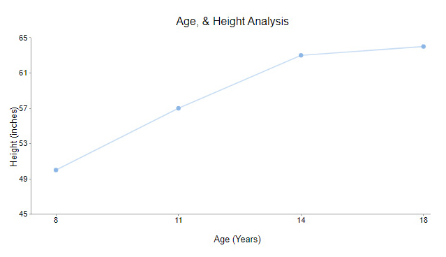
The standard line chart is the foundation of all Line Chart variations. It displays data points as markers connected by lines. This chart type is applicable when you have a single data series and want to visualize its trend. Line charts are excellent for showing trends, fluctuations, and changes in data.

For example, the chart below illustrates the height of humans of different ages.

Line Chart ce414
  • Dual Axis Line Chart

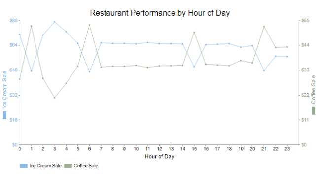
This chart allows you to display two data series with distinct units on a single chart. Each data has its vertical axis. This is useful when the two data series have different scales, making direct comparisons difficult.

Using Dual Axis charts requires caution since they can sometimes mislead if not used properly. The differing scales on each axis can influence the viewer’s perception of the data. Therefore, you should label the axes clearly and use this chart judiciously.

Dual Axis Line Chart ce414
  • Multi-Axis Line Chart

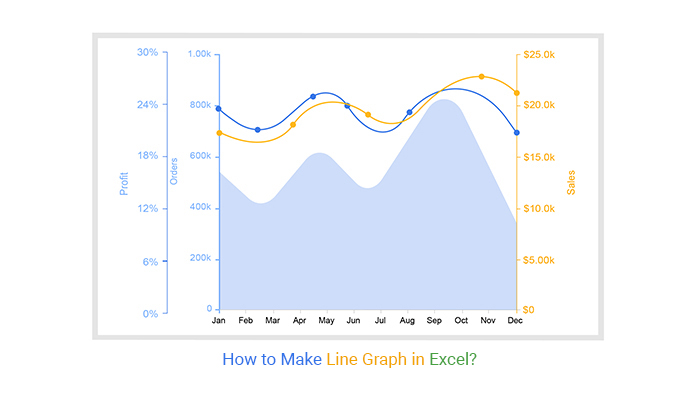
Multi-Axis Line charts take the concept of the Dual Axis Chart further. They allow you to include more than two data series with individual scales. This is useful for diverse data sets that require separate axes to prevent obscuring valuable insights.

Nevertheless, Multi-axis charts are complex and can become overwhelming if poorly designed. Therefore, proper labeling, clear color coding, and thoughtful arrangement of the axes are crucial to prevent confusion.

Multi Axis Line Chart ce414

How to Make a Line Graph in Excel?

In the majestic realm of Excel, where numbers dance and charts groan under the weight of your ambitions, the Multi-Axis Chart in Excel stands out as a versatile tool. But let’s face it; even with this powerful feature, Excel has its limits””like a cupcake shop with only vanilla frosting.

But don’t worry; the solution lies in ChartExpo.

ChartExpo turns Excel into a data visualization powerhouse. It offers a variety of Line Graph variants to bring your data to life.

This isn’t your everyday Excel trick; it’s a slick solution that takes your line graphs to new dimensions.

How to Install ChartExpo in Excel?

  1. Open your Excel application.
  2. Open the worksheet and click the “Insert” menu.
  3. You’ll see the “My Apps” option.
  4. In the office Add-ins window, click “Store” and search for ChartExpo on my Apps Store.
  5. Click the “Add” button to install ChartExpo in your Excel.

ChartExpo charts are available both in Google Sheets and Microsoft Excel. Please use the following CTA’s to install the tool of your choice and create a beautiful chart maker in a few clicks in your favorite tool.

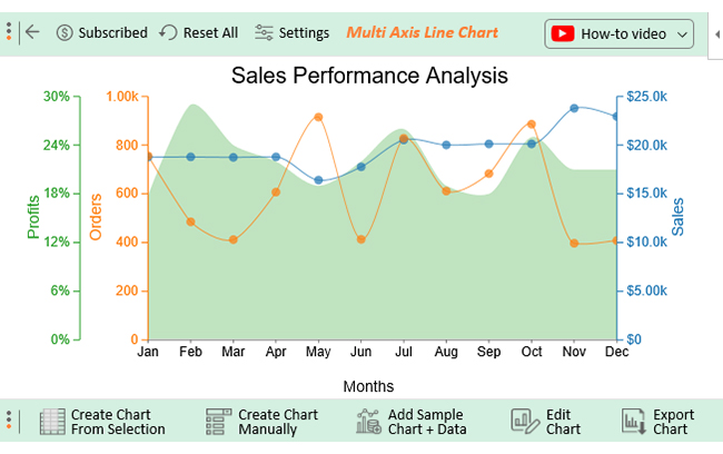
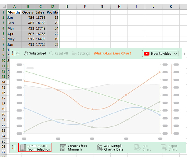
Let’s say you want to analyze company orders, sales, & profits data below.

Months Orders Sales Profits
Jan 756 18766 18
Feb 485 18788 29
Mar 412 18743 24
Apr 607 18788 22
May 915 16406 19
Jun 413 17765 22
Jul 828 20532 26
Aug 611 20016 19
Sep 683 20122 18
Oct 886 20125 25
Nov 397 23783 21
Dec 408 22942 21

The best-suited chart for this is the Multi-Axis Line Chart since it has multiple axes. Follow the steps below to learn how to create a Multi-Axis Line Chart in Excel with ChartExpo.

Step 1: Open Excel And Add Charting Tool

insert chartexpo in excel
  • Choose ChartExpo from My Apps, then click Insert.
open chartexpo in excel

Step 2: Search Line Chart & Click on It

search multi axis line chart in excel

Step 3: Arrange & Select Your Data For Line Chart

Create Chart From Selection ce414

Step 4: Line Chart in Excel Look Like

Line Graphs In Excel Design Template

Step 5: Add a title for Line Graph in Excel

Apply Title on Chart ce414

Step 6: Add Label For Line Graph in Excel

Apply Label on Chart ce414

Step 7: Save All Changes in a Line Graph in Excel

Apply Label Postfix Value On Chart ce414

Step 8: Final Line Graph in Excel Look Below

Final Line Graphs In Excel

Insights

  • The profits peaked in February, with January recording the lowest profit figures.
  • November witnessed the highest sales, while May had the lowest sales numbers.
  • May had the highest number of orders, whereas June and November had the fewest orders.
  • Since July, there has been a downward trend in sales, orders, and profits. Notably, the decline in sales has been consistently manageable.

When to Use Line Chart in Excel?

Knowing when to use a Line Chart can greatly enhance data presentation and communication. Here are some of the instances when to use a line chart in Excel:

  1. Displaying trends: Line charts are tailor-made for showcasing trends over time. They effectively illustrate the direction and magnitude of change. For instance, you can track company revenue over quarters, analyze website traffic by month, or monitor population growth.
  2. Comparing multiple data series: When you have multiple data series that you want to compare, a Line Chart comes to the rescue. For example, when visualizing sales data for different product categories. Assigning each data series to a different line helps you easily spot patterns, differences, and correlations.
  3. Highlighting rate of change: Line charts, including slop charts in Excel, are adept at highlighting the rate of change. Steeper slopes indicate rapid changes, while gentler slopes indicate gradual shifts. This makes them perfect for displaying growth rates, inflation rates, or any data that involves velocity.
  4. Visualizing continuity: Line charts are applicable when visualizing continuous data, like temperature measurements, stock prices, or air quality indices. They provide seamless visual representations of data’s progression, helping your audience grasp the continuous nature of the information. If you’re wondering how to make a graph from a table, line charts offer an excellent way to transform your data into a clear and insightful visual format.
  5. Showing fluctuations: Line charts excel in showing fluctuations and variations in data, like daily temperature variations and stock price volatility. They effectively highlight the ups and downs, making the absorption of information easy.
  6. Tracking performance: Line charts are a reliable way to track performance over time. For instance, employee productivity, customer satisfaction scores, and project completion rates. They enable you to monitor progress and identify areas that need attention.

When not to use a line graph?

  1. Data is categorical: Line graphs are best for continuous data. For purely categorical data, bar charts or pie charts are more appropriate.
  2. Too many variables: If there are too many lines, the graph can become cluttered and difficult to read, making trends unclear.
  3. Discrete data points: If your data points are distinct and do not imply a continuous trend, a scatter plot may be more suitable.
  4. Small data sets: With very few data points, a line graph may not effectively convey trends or patterns.
  5. Inconsistent time intervals: Line graphs assume uniform intervals; irregular time intervals may lead to misleading representations.

Tips for Making a Line Chart in Excel

  1. Organize Data-Clearly: Arrange data in columns or rows with proper labels.
  2. Select the Right Chart Type: Use the “Insert” tab to choose a line chart that fits your data.
  3. Label Axes and Title: Add a clear chart title and axis labels.
  4. Differentiate Lines: Use distinct colors or styles for each line.
  5. Simplify with Minimal Gridlines: Keep gridlines light and minimal to avoid clutter.

Pros and Cons of Line Graphs

are some key pros and cons of line graphs:

Pros:

  1. Trend Visualization: Line graphs are excellent for showing trends over time or continuous data.
  2. Comparison: They allow easy comparison of multiple datasets.
  3. Clarity: Simple and clear for showing data with a consistent time or measurement interval.
  4. Data Interpretation: Facilitates understanding of increases, decreases, and fluctuations in data.

Cons:

  1. Cluttered with Too Many Variables: Multiple lines can make the graph difficult to read and interpret.
  2. Inappropriate for Categorical Data: Line graphs are not suitable for non-continuous data or categorical variables.
  3. Misleading with Uneven Intervals: Can misrepresent data if time intervals are inconsistent.
  4. Not Ideal for Small Data Sets: Fewer data points might not effectively convey the intended trend or pattern.

FAQs

What is a Line Graph maker in Excel?

A Line Graph maker is a tool that creates visual representations of data points connected by lines. It simplifies the process of transforming numerical data into informative trends. Consequently, it makes data analysis and communication more accessible.

How do you make a Line Graph with multiple lines in Excel?

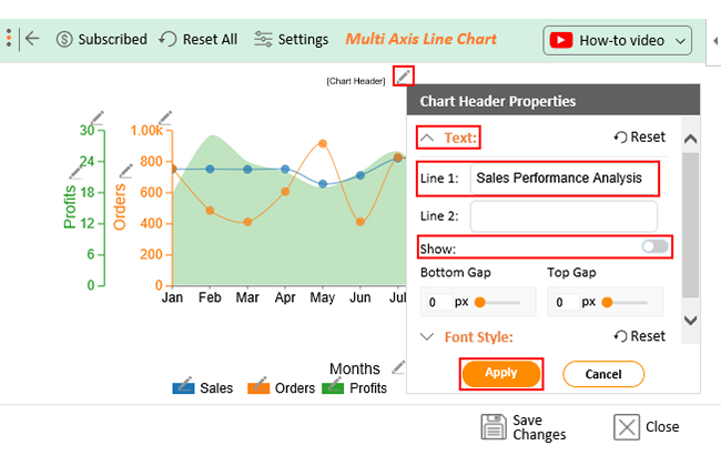
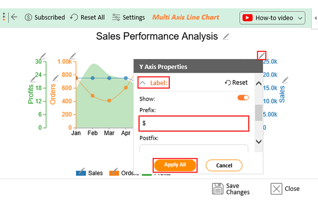
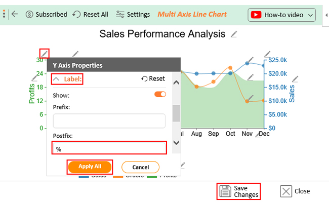
To craft a Line Graph with multiple lines in Excel, embrace the magic of ChartExpo. ChartExpo’s intuitive interface does the heavy lifting, ensuring your lines dance harmoniously to depict insightful trends.

Wrap Up

Line graphs offer a clear depiction of data evolution over time or categories. These graphs also help with comparing multiple data series simultaneously. Consequently, they aid decision-making and convey insights to diverse audiences.

Mastering the art of creating multiple line graphs in Excel significantly enhances data visualization and analysis. We have highlighted the step-by-step process, making it accessible even for beginners.

Excel’s user-friendly interface and customization options make crafting these graphs seamless. Moreover, choosing appropriate axes labels and customizing colors help enhance graph clarity.

Remember to maintain consistency in design and labeling for improved comprehension.

The introduction of ChartExpo adds a layer of finesse, transforming the mundane into the mesmerizing. Its user-friendly interface removes the daunting coding curtain, welcoming creativity and insight effortlessly. The power to mold and personalize visuals amplifies with every click. As a result, it enables your data’s voice to echo through distinct colors, fonts, and styles.

Do not hesitate.

Embrace this skill, experiment with various datasets, and elevate your communication of valuable information.

How much did you enjoy this article?

ExcelAd2
Start Free Trial!
128909

Related articles

next previous
Microsoft Excel9 min read

KPI Dashboard in Excel: A Complete Guide

A KPI dashboard in Excel helps track key metrics and streamline data visualization. Discover how to create, analyze, and use it with clear guides and examples.

Microsoft Excel11 min read

How to Plot a Speedometer Chart in Excel?

Create a Speedometer Chart in Excel to track KPIs, goals, and performance metrics visually. Explore templates, examples, and step-by-step instructions for better dashboards.

Microsoft Excel13 min read

Excel for Teachers for Insightful Preparation

Excel for teachers simplifies grading, tracks attendance, and organizes data. Find its key features, expert tips, and how ChartExpo enhances data visualization.

Microsoft Excel14 min read

How to Make a Cash Flow Diagram in Excel?

Learn how to make a Cash Flow Diagram in Excel. It will help you learn to visualize and analyze inflows and outflows of your business cash flow.

Microsoft Excel11 min read

Succession Planning Template for Long-Term Success

Succession Planning Templates help businesses prepare for leadership changes. Learn to create, analyze, and use them for seamless transitions and growth.

ChartExpo logo

Turn Data into Visual
Stories

CHARTEXPO

  • Home
  • Gallery
  • Videos
  • Services
  • Pricing
  • Contact us
  • FAQs
  • Privacy policy
  • Terms of Service
  • Sitemap

TOOLS

  • ChartExpo for Google Sheets
  • ChartExpo for Microsoft Excel
  • Power BI Custom Visuals by ChartExpo
  • Word Cloud

CATEGORIES

  • Bar Charts
  • Circle Graphs
  • Column Charts
  • Combo Charts
  • Comparison Charts
  • Line Graphs
  • PPC Charts
  • Sentiment Analysis Charts
  • Survey Charts

TOP CHARTS

  • Sankey Diagram
  • Likert Scale Chart
  • Comparison Bar Chart
  • Pareto Chart
  • Funnel Chart
  • Gauge Chart
  • Radar Chart
  • Radial Bar Chart
  • Sunburst Chart
  • see more
  • Scatter Plot Chart
  • CSAT Survey Bar Chart
  • CSAT Survey Chart
  • Dot Plot Chart
  • Double Bar Graph
  • Matrix Chart
  • Multi Axis Line Chart
  • Overlapping Bar Chart
  • Control Chart
  • Slope Chart
  • Clustered Bar Chart
  • Clustered Column Chart
  • Box and Whisker Plot
  • Tornado Chart
  • Waterfall Chart
  • Word Cloud
  • see less

RESOURCES

  • Blog
  • Resources
  • YouTube
SIGN UP FOR UPDATES

We wouldn't dream of spamming you or selling your info.

© 2025 ChartExpo, all rights reserved.