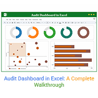
Categories
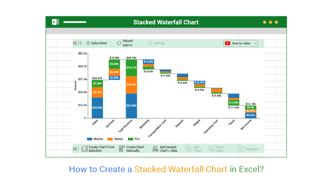
A Stacked waterfall chart in Excel helps visualize how individual components contribute to changes in a total value across categories or over time.


In this blog, you will learn:
A Stacked waterfall chart in Excel shows changes in values over time or between multiple data sets. It can show the cumulative effect of a data series or compare multiple data series.
In this chart, we use a combination of stacked bars and columns to show the data points. The bars and columns are placed side by side to build the chart.
The chart also includes a total bar, which shows the sum of all the data points in a category or series. Also known as a Waterfall chart, it displays the bridge that connects the starting point to the endpoint.
It’s a great way to illustrate the contributions of different values to a total sum. Data analysis gets easier by displaying the individual items as bars and the total sum as a total bar.
Here’s a quick video showing how to make this chart in Excel from scratch. The video discusses the following details:
A Stacked bridge chart in Excel is used to visualize how sequential positive and negative values contribute to a final total. It helps in understanding the impact of individual factors or categories on the overall outcome, making it easier to track changes and see how various elements accumulate over time.
These types of charts are particularly useful for illustrating financial performance, project progress, or any situation where cumulative effects need to be presented.
You can manually build a cascade chart in Excel to visualize sequential changes across multiple categories. Follow these steps:
Add-ins like ChartExpo make it much easier to generate cascade charts in Excel:
First, you will need to organize your data into columns and rows. Each row should have a different series of data. Once you organize the data, you can create the chart. Upon creating the chart, you can customize it by adding labels, changing the colors and font sizes, or adding a legend.
How to Install ChartExpo on Excel?
ChartExpo charts are available in Microsoft Excel. Please use the following CTA’s to install the tool of your choice and make creative data visualizations in Excel in a few clicks in your favorite tool.


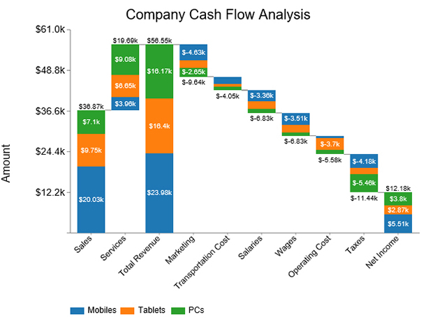
Here is the cash flow data for a certain business. Let’s create a Chart of this data:
| Stacks | Bridges | Amount |
| Sales | Mobiles | 20025 |
| Sales | Tablets | 9746 |
| Sales | PCs | 7095 |
| Services | Mobiles | 3959 |
| Services | Tablets | 6650 |
| Services | PCs | 9077 |
| Total Revenue | Mobiles | 23984 |
| Total Revenue | Tablets | 16396 |
| Total Revenue | PCs | 16172 |
| Marketing | Mobiles | -4630 |
| Marketing | Tablets | -2360 |
| Marketing | PCs | -2650 |
| Transportation Cost | Mobiles | -2150 |
| Transportation Cost | Tablets | -935 |
| Transportation Cost | PCs | -965 |
| Salaries | Mobiles | -3360 |
| Salaries | Tablets | -2340 |
| Salaries | PCs | -1130 |
| Wages | Mobiles | -3510 |
| Wages | Tablets | -2390 |
| Wages | PCs | -930 |
| Operating Cost | Mobiles | -640 |
| Operating Cost | Tablets | -3700 |
| Operating Cost | PCs | -1240 |
| Taxes | Mobiles | -4180 |
| Taxes | Tablets | -1800 |
| Taxes | PCs | -5460 |
| Net Income | Mobiles | 5514 |
| Net Income | Tablets | 2871 |
| Net Income | PCs | 3797 |


It is commonly used to visualize and analyze financial data, such as profit, revenue, expenses, and cash flow. This is also useful for visualizing and analyzing datasets with multiple categories. For example, expenditures by department or revenue by product category.
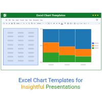
To use this chart Excel template, first open it and enter your data into the predefined categories and subcategories. The template automatically builds the chart based on your inputs.
Customize colors and labels as needed to highlight positive and negative values. This template makes it easy to visualize complex data and track how different components contribute to overall changes.
Now, you have learned how to create this chart in Excel. It’s a great way to compare the contributions of different values to a total sum.
ChartExpo is a great resource for creating a Stacked waterfall chart in Excel. It offers a variety of charts and diagrams to choose from and provides step-by-step instructions for creating the chart.
These charts help you to visualize the cumulative effect of positive and negative values. Creating a Chart is a great way to visualize data intuitively.
In addition, it’s also a great way to identify areas of improvement quickly. For efficiency, ensure the data is in columns and rows, and the chart is easy to interpret.
How much did you enjoy this article?


Sparkline in Excel helps visualize trends fast. Learn to create, customize, and analyze sparklines with ChartExpo for clearer, actionable insights.
Learn how chart templates save time and boost consistency in Excel. This guide covers benefits and top chart examples to improve your data visuals.

Excel automations help you save time, reduce errors, and streamline your tasks. Learn simple methods to automate reports and work smarter in Excel.