Categories
Whenever you visualize your data, your primary objective is to establish a relationship with your KPIs. Sometimes this task can be tedious.


However, a powerful solution to streamline this process is leveraging the capabilities of an Excel three-axis graph.
This feature empowers users to navigate through complex datasets, presenting KPI relationships in a more visually intuitive and efficient manner.
To create a 3-axis chart in Excel elevates the visual representation of data to a three-dimensional realm, transforming conventional spreadsheets into dynamic tools for in-depth analysis.
Do you want to learn how to plot a 3-axis graph in Excel? If yes, buckle up as we get this show on the road.
In this blog, you’ll discover:
But first, we must learn what a 3-axis graph is.
Definition: A 3-axis Graph is a visualization type where one can plot points along two or more vertical axes. You can establish a relationship in your metrics from such a graph and gain meaningful insights.
You can create a 3-axis chart in Excel to plot 3 axes. Each of the axes will have different values and data points.
One of the advantages of a 3-axis chart, such as an X and Y Axis Chart, is that you can display a wealth of insights in a limited space. You can enhance your visualization strategy if you want to track the relationships among multiple metrics.
That’s not all.
Are you curious to know how to make a 3-axis graph in Excel, including the utilization of the Excel third axis?
Let’s get this journey started.
We create a graph with three axis in Excel to visualize complex data with multiple variables on different scales. Ttype of chart, such as the 3-axis graph template in Excel, helps compare and analyze trends more effectively when two vertical axes and one horizontal axis are needed.
It’s especially useful for combining different data types, like revenue, temperature, and percentages, in a single, easy-to-read visual, making it perfect for comprehensive data analysis.
The 3-axis chart in Excel displays essential insights into your data points, and you can also learn how to create a chart from a table using this method. As noted from the examples above, this graph allows us to view relationships and trends between various metrics and track them over time. Such metrics include population growth, living standards, and other relevant factors.
Let’s show you some of the scenarios where you can use a 3-axis chart in Excel:
Lastly,
Before we get down to business, let us educate you on some essential facts.
If you carefully examine your Excel workbook, you will discover that you can create a 3-axis graph in Excel. However, it requires a lot of customizations that not everyone can easily manage without a 3-axis graph generator or a dedicated chart maker in Excel.
It doesn’t mean that we do away with Excel. We have a solution.
A unique and affordable add-in exists, which you can install in your Excel. It will help you access stunning charts like a Radar Chart, as well as 3-axis charts in Excel.
Are you curious to know about this add-in?
This tool is called ChartExpo. With this affordable tool, you can learn how to plot three-axis graphs in Excel using 3-Axis Graph maker and other insightful and customized Excel charts. Install it and see a significant difference in your data visualization.
The following are simple steps to use ChartExpo to create a 3-variable chart in Excel. ChartExpo will help you significantly to know how to add a third axis in Excel.
After you have installed ChartExpo in your Excel, the following easy steps can guide you in adding a Multi-Axis Chart in Excel, including an Excel three-axis graph.
You don’t need coding skills, just follow our lead with these few clicks. It’s as easy as that.
For better understanding, let us use several practical examples.
Let us use a practical example that will help us learn how to make a graph with a 3-axis in Excel.
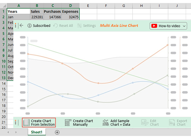
Let’s assume you own a mobile phone shop. You want to track some metrics and establish a relationship among them. You also want to obtain insights that will help your business grow.
Up to this point, you are wondering what chart you will use. In such a scenario, you can use a Multi-Axis Line Chart as a three-axis chart in Excel. Let us show you the capabilities of this chart and how you can add two or more 3-y axes in Excel in a chart in Microsoft Excel.
| Months | Sales | Purchases | Expenses |
| Jan | 229281 | 147366 | 32475 |
| Feb | 174611 | 139606 | 16965 |
| Mar | 165264 | 127633 | 19157 |
| Apr | 160742 | 101648 | 18927 |
| May | 223204 | 122676 | 19368 |
| Jun | 230360 | 191301 | 16794 |
| Jul | 156034 | 105019 | 27036 |
| Aug | 156370 | 91181 | 21978 |
| Sep | 238345 | 187063 | 32063 |
| Oct | 169488 | 92264 | 33393 |
| Nov | 160571 | 77871 | 25406 |
| Dec | 214305 | 172144 | 20861 |
The following are the steps you can take to create a Multi-Axis Line Chart in Excel:


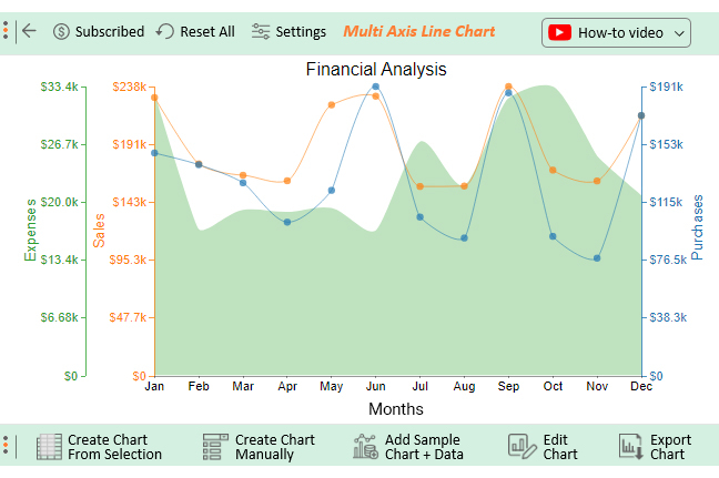
You can learn how to add a third axis in an Excel chart from the above examples. You can visualize sales, purchases, and expenses in one view.
Let’s try adding another essential metric to our data to create 4-axis line graph.
You will also learn how to have 3 axes in Excel.
Let’s add Profit data to our table below, as shown.
| Months | Sales | Purchases | Expenses | Profit |
| Jan | 229281 | 147366 | 32475 | 49440 |
| Feb | 174611 | 139606 | 16965 | 18040 |
| Mar | 165264 | 127633 | 19157 | 18474 |
| Apr | 160742 | 101648 | 18927 | 40167 |
| May | 223204 | 122676 | 19368 | 81160 |
| Jun | 230360 | 191301 | 16794 | 22265 |
| Jul | 156034 | 105019 | 27036 | 23979 |
| Aug | 156370 | 91181 | 21978 | 43211 |
| Sep | 238345 | 187063 | 32063 | 19219 |
| Oct | 169488 | 92264 | 33393 | 43831 |
| Nov | 160571 | 77871 | 25406 | 57294 |
| Dec | 214305 | 172144 | 20861 | 21300 |

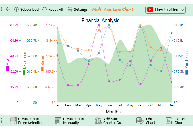
It’s as easy as that. Now you can view how your metrics progress in different years.
That is how to plot a 3-axis graph in Excel.
To add a third axis in Excel, you typically use a workaround since Excel doesn’t support a true third axis by default. Here’s how:
A 3-axis chart allows you to visualize three different variables, even if they use different units or scales. This makes it ideal for showing complex relationships and making multi-variable data more understandable at a glance.
Instead of creating multiple separate charts, you can combine them into one cohesive visual using a 3-axis Excel chart template. This approach not only reduces clutter in your reports or dashboards but also enhances the efficiency and clarity of your data presentation.
With three data series displayed together, it becomes easier to identify correlations, patterns, or inconsistencies. This side-by-side comparison enhances analytical clarity and supports better decision-making.
A 3-axis chart adds more depth to your data visualization, allowing you to present a richer, more compelling story. It helps communicate insights effectively, especially when sharing results with teams or stakeholders.
Use a third axis in a 3-variable chart in Excel only when it’s necessary to compare multiple data sets with different units or scales. Overcomplicating the chart can make it hard to read and distract from the main insights.
Clearly label each axis, including units of measurement, and make sure every data series is easy to identify. Use contrasting colors, custom markers, or line styles to differentiate them and include a well-placed legend for quick reference.
Check that the scales of all three axes are balanced and logical. Avoid extreme values that could skew the visual representation and lead to inaccurate conclusions.
Combo charts (like column + line + area) are best for displaying diverse data sets on one chart. Choose chart types that suit your data’s nature to maintain readability and visual balance.
After building the chart, review it carefully. Ask a colleague or viewer unfamiliar with the data if they understand it. If they struggle, simplify the chart by adjusting axes, reducing data points, or breaking it into smaller visuals.
In Excel, a Tertiary Axis refers to a third Y-axis in a chart, allowing the simultaneous representation of three datasets with distinct scales. This feature aids in visualizing complex data relationships, enabling users to communicate nuanced insights effectively. The Tertiary Axis enhances the depth and clarity of Excel charts.
Yes, in Excel, you can add a third axis, known as a Tertiary Axis, to a chart. This feature facilitates the simultaneous representation of three sets of data with different scales, offering a more comprehensive visualization of complex relationships in your datasets.
You can use the Multi-Axis Line Chart to graph the 3 variables in Excel. The best way to create a Multi-Axis Line Chart is to use the ChartExpo add-in for Excel. You can use this add-on to create a Multi-Axis Line Chart in a few clicks without coding.
In a nutshell, we have learned that you can visualize more than two metrics in one graph. It is impossible in a dual-axis chart because it only supports two axes.
As we have covered in this blog, you will need a visualization chart that is unique from the rest.
And that is why we need the 3-axis graph in Excel.
With the help of ChartExpo, you too can visualize your data with a 3-axis chart in Excel.
So take the next step in your data visualization skills with ChartExpo. Sign up today and get a 7-day free trial to access other amazing charts.
How much did you enjoy this article?


A business budget template in Excel tracks income and expenses. Click here to learn how to create and optimize your template for better financial control.
Discover step-by-step methods on how to analyze survey data in Excel. Explore how to organize, compute, examine, and interpret survey results effectively.
Excel has a wide range of advanced charts and graphs to present your data comprehensively. Learn about top advanced Excel charts and how to create them.