Categories
By ChartExpo Content Team
Everything looks equal until you compare it side by side.
Raw numbers can be hard to read. Spreadsheets make it worse. That’s where a Radar Chart helps. It gives shape to your data. You can see strengths, gaps, and patterns all in one view.
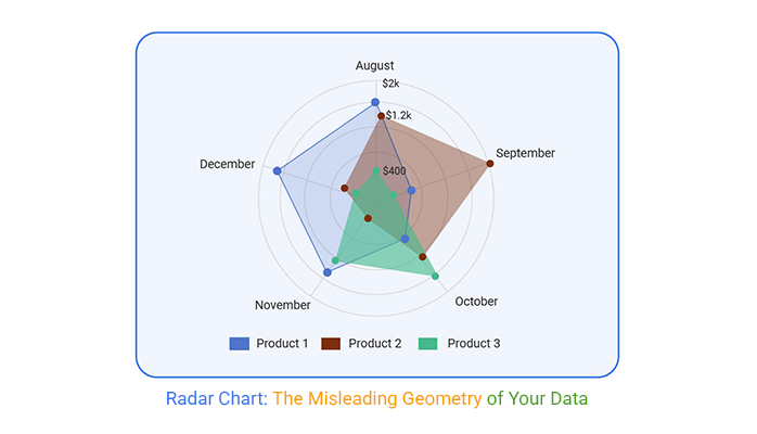
A Radar Chart maps values across several categories. Each axis shows one category. Lines connect the values, creating a web-like shape. That shape tells a story at a glance.
Use a Radar Chart to compare performance, skills, features, or anything spread across multiple areas. Want to show how a team stacks up across different metrics? Want to highlight which product leads in which area? The Radar Chart handles it. Fast. Clear. Effective.
The Radar Chart isn’t flashy. It’s simple. That’s the point. It gives you a way to say more with less.
Symmetry in charts can feel like a warm blanket, reassuring and neat. But here’s the catch: it often masks what’s happening. Imagine a report where every department looks equally productive. Sounds good, right? Until you dig deeper and find out some teams are coasting while others are pulling double duty. The balance of shapes can trick the eye into seeing fairness where there isn’t any, leading to skewed decisions.
What makes this even more dangerous is how easily shape perception overrides actual data. The brain loves patterns, and a symmetrical chart feeds this craving. Before you know it, you’re making calls based on visual appeal rather than hard facts. This isn’t just misleading; it’s a fast track to misplaced trust and wasted time. People think they’ve got a handle on things when, in reality, they’re in the dark.
Not all data types play nice with visual representations. Take non-normalized data, for example. Throwing it into a visual without tweaking is like tossing building blocks into a blender. You get a mess, not clarity. Binary or categorical data can also throw off the visual structure, making it hard to see the nuances that matter. The story gets lost in translation, leaving decision-makers scratching their heads.
And let’s not forget misclassification. A subtle shift in data categorization can distort the whole picture, leading to conclusions that miss the mark. It’s like trying to paint a masterpiece with the wrong brushes. At the data level, these silent saboteurs can cause a ripple effect, breaking trust and leading to bad calls. The output might look neat, but it’s built on shaky ground.
Ever notice how big numbers tend to steal the show? In visuals, high values grab attention, overshadowing the smaller, yet crucial details. This can flatten the narrative, painting an incomplete picture. It’s like watching a movie trailer that shows all the explosions but skips the plot twists. Viewers get dazzled by the surface, missing the depth that really matters.
In practice, this backfires when critical insights get buried under flashy figures. You might end up focusing on what’s loudest, not what’s most important. This is particularly risky in high-stakes scenarios, where missing a detail can lead to costly misjudgments. The visual might say “look here,” but the real story hides in the shadows.
Leaders often trust their gut, and visuals are no exception. The problem? They can read charts emotionally, jumping to conclusions before asking the right questions. It’s like calling a book good based solely on its cover. You might think you’ve got it figured out, but the real story tells otherwise. This knee-jerk reaction can lead to decisions that seem sound but are actually based on flawed interpretations.
The reputational risk here is real. If stakeholders catch wind of manipulative or confused messages, trust erodes fast. No one wants to be seen as the person who can’t read a visual properly. The risk isn’t just about making wrong calls; it’s about losing credibility. Visuals should clarify, not complicate. But when they don’t, the fallout is swift and unforgiving.
Picture this: you’re in a meeting, and someone says, “This chart looks complicated for no reason.” It happens. The key? Shift the focus. Explain how this type of chart provides a clear view of multiple dimensions at once. It’s like seeing the whole board instead of individual pieces. Not just data; it’s a strategy view.
Stakeholders often need a little nudge to see the benefits. Point out how it allows comparison across categories, making complex data easier to digest. Tell them it’s not about making things pretty, it’s about making them clear. In our experience, once people get it, they see how the chart simplifies the chaos.
“Too pretty, not trustworthy.” Heard that one before? Some folks think visuals sacrifice function for form. But that’s where you step in. Ground your visuals in solid rationale. Explain that the design isn’t just for show, it’s crafted to highlight essential insights.
When you preempt this skepticism, you build trust. You show that the intention is clarity, not decoration. Mention how the design serves the audience’s needs by making the critical data points stand out. It’s about saying, “We respect your time and intelligence; here’s what you need to know.”
Ah, the bar chart fans. They always show up early, don’t they? They ask, “Why not just use a bar chart?” Keep your response sharp but not defensive. Bar charts have their place, but they can miss the bigger picture when it comes to multi-dimensional data.
Explain that your choice wasn’t random. It was about finding the best tool for the job. This chart shows relationships and patterns that a bar chart can’t. It’s about the insight, not the format. Protect your choice by reasserting its credibility. Show them it’s not about being different; it’s about being effective.
Misuse of visuals can look like hiding something. Let’s be honest, stakeholders will think it if they see it. Defuse these claims with transparency. Design your chart with clear labels and straightforward data representation. It’s all about trust.
Include transparency cues in your design. Explain each part of the chart, so nothing feels hidden. When you do this, you show that you’re not trying to obscure the message. You’re making it clearer. The goal is to avoid any perception of manipulation and keep the focus on the data’s truth.
The following video will help you create a Radar Chart in Microsoft Excel.
The following video will help you create a Radar Chart in Google Sheets.
When you’re using a radar chart to show just one thing, it’s like trying to have a conversation with yourself. Without something to compare against, you’re left with a shape that says little. It’s like shouting into a void – no echo, no feedback, just empty noise. Why? Radar charts thrive on comparison. They need a point of reference to highlight differences or similarities.
Consider alternative tools for single data sets. Bar charts or line graphs might do the trick, providing clarity without confusion. A single-entity radar chart often leaves viewers guessing or worse, misinterpreting. Comparisons are the radar chart’s bread and butter; without them, they just fall flat.
Imagine baking a cake with ingredients measured in different units. Chaos, right? That’s what happens if you don’t normalize your data before throwing it into a radar chart. It’s easy to get swept up in the visuals, but if the numbers aren’t on the same playing field, the chart’s a mess.
Set a simple rule: normalize or walk away. If your data’s not ready, neither is your chart. This isn’t a step you can skip. Without normalization, you’re setting yourself up for a misleading visual. Make sure every data point speaks the same language before you even think about shapes and lines.
Shoving monthly, quarterly, and annual data into one radar chart is like cramming mismatched puzzle pieces together. It just doesn’t fit. You end up with a visual that’s more like a kaleidoscope than a clear picture. This mismatch in time frames leads to misalignment and confusion.
Keep your time data consistent. Each period should stand alone or be properly segmented. Otherwise, your audience might see patterns that aren’t there, leading to misguided decisions. Radar charts need uniformity in time to maintain their structure and integrity.
Radar charts don’t just show data; they send messages. The order of the axes is like the playlist of a concert – it sets the tone and tells a story. But be warned: even accidental sequencing can skew perception. A misplaced axis might make a strong performance look weak or vice versa.
Think carefully about the order of your axes. This isn’t about aesthetics; it’s about clarity and honesty. Misreading the order can lead to misunderstandings and misjudgments. Align them thoughtfully to ensure your chart communicates the intended message clearly and accurately.
Overlaying entities on radar visuals is like putting glasses on a blurry world. You suddenly see details you missed. It helps you compare different entities on the same chart without losing the big picture. When you have multiple charts side by side, the meaning often gets lost in translation. Ghosted overlays keep everything in a single frame, letting you see where one entity stands out or falls short against another.
Overlaying lets you catch patterns and outliers you’d miss otherwise. Imagine trying to track multiple runners on separate tracks. Hard, right? But put them on the same track, and you can tell at a glance who’s leading and who’s lagging. That’s the power of ghosted overlays. You focus on differences and similarities rather than trying to guess what each separate chart is saying. It turns confusion into clarity.
Four lines on a radar visual are like a well-rehearsed quartet, harmonious and clear. But add a fifth, and it’s like too many cooks in the kitchen. The clarity disappears, replaced by a tangled mess of lines that leave you scratching your head. Trying to process more than four entities at once dilutes the message and muddies the meaning. The chart turns into a soup of colors and shapes where nothing stands out.
Instead of overwhelming your audience with too much at once, break it down. Use segmentation techniques to group related entities and compare them in smaller batches. It’s like having a group chat versus a one-on-one conversation; the latter always feels more personal and easier to follow. Keep it simple, and your audience will thank you with understanding rather than confusion.
Labels on a radar visual are powerful storytellers. The way you phrase them can sway interpretations without anyone noticing. A subtle tweak here, a careful choice of words there, and suddenly, you’re guiding the viewer’s mind. It’s like being a director who controls the narrative arc, leading your audience down the path you want them to take.
Be intentional, but ethical, with your label choices. Avoid manipulation, but don’t shy away from steering attention where it’s needed most. It’s about highlighting the story your data tells, not creating a new one. Just like a movie script, the flow and emphasis of your labels can change how the story is understood. Lead with clarity, not confusion, and your radar visual will speak volumes.
Relying solely on what your chart tool produces is like trusting a first draft as a final product. Raw exports often come out flat, missing the polish needed to truly convey your message. They lack the finesse that turns basic data into something insightful and engaging. This is where post-processing becomes your secret weapon.
Refining your visuals after export is essential. Adjust color schemes, line thickness, and label fonts to make your data pop. Think of it like editing a photo; the raw shot might be good, but a few tweaks can make it great. These adjustments ensure your chart isn’t just a data dump but a compelling narrative that holds attention and drives understanding.
Visuals are tricky. They tell stories without words, creating narratives with shapes and patterns. That’s their power. In the world of radar charts, the shape speaks louder than any headline. It’s the first thing your audience sees, and often, it’s the only thing they remember. So, let the shape work for you. Align it with your message. If the pattern suggests strength, make sure the data reflects it. If the lines form a starburst, it better be a stellar story.
But here’s the flip side. Shapes can mislead. A lopsided figure might scream imbalance, even if the numbers are sound. This is where intent comes in. Control the visual narrative by being deliberate with your choices. If something’s off, either fix it or highlight it. The shape should serve your purpose, not sabotage it. When done right, your chart becomes more than just a picture; it becomes the message itself.
Outliers. Those pesky data points that stick out like a sore thumb. They can dominate a radar chart, drawing eyes to where you don’t want them. And let’s face it, one dip can overshadow an entire presentation. That’s just how our brains work. We see that one flaw and forget the rest. It’s psychological dominance in action.
So, what do you do? Mask it, soften it, or anchor it. Masking involves making that outlier less prominent. You don’t hide it, but you don’t highlight it either. Softening is about reducing its impact, maybe through color or line thickness. Anchoring is different. It’s about tethering that dip to something significant, giving it context. These tricks shift focus, ensuring your audience sees the whole picture, not just the weak spot.
Labels aren’t just names on a chart. Their decisions. Decisions that carry weight. They guide interpretation, influence perception, and can even sway opinions. Think about it. A simple label change can turn “Sales” into “Revenue Growth,” shifting the entire conversation. It’s strategic, and it matters.
But it’s not just about tone. Order and emphasis play roles, too. Where you place a label impacts how it’s perceived. Put the most critical data point first, and it sets the stage. Highlight a label, and it becomes the focal point. These choices have political and strategic implications. A misstep here can lead to misinterpretation, or worse, mistrust. So, every label needs thought. Because in this game, labels are more than words; they’re power.
Radar charts thrive on contrast. They need peaks and valleys to tell their tales. Flat data? It kills the spark. When everything’s balanced, your chart turns into a circle, and circles are boring. They scream monotony. They lack the drama that makes a radar chart pop.
So, if your data’s stable and even, ditch the radar. Use a format that suits the content. But if there’s contrast, even subtle, that’s where a radar chart shines. It visualizes differences and highlights strengths and weaknesses in a way other charts can’t. It’s the highs and lows that make it compelling. Use it to show off those contrasts, not to mask an uneventful dataset.
Sometimes, the best charts are the ones that leave the room speechless. If your audience is staring in silence, you nailed it. There’s no need for a lengthy explanation or a desperate pitch. The chart said it all. A clean, focused radar chart does the talking, leaving no room for follow-up questions. It’s a win.
Visual tightness is key here. It’s not about cramming in every data point. It’s about saying more with less. The right balance of detail and clarity ensures your message lands without a hitch. And when it does, enjoy the silence; it means you did your job well.
Ever been fooled by a chart that looks perfect but tells a different story? Yeah, been there. Bad inputs? They’re sneaky. They make charts look trustworthy when they’re anything but. Like a magician’s trick, they hide the truth behind visual flair. You think you’re seeing one thing, but the reality is? Completely different. It’s like putting on makeup to hide a blemish. Sure, you look great, but the problem’s still there.
Imagine presenting data that seems airtight. The audience is nodding, and you’re feeling confident. But underneath, the data is a mess. Maybe it’s missing values, maybe it’s wrongly categorized. Whatever the case, the chart is lying. It’s like building a house on sand. Looks nice, but one wave and it’s gone. Clean your data. Scrutinize every input like it’s a suspect in a crime. Only then can you trust that your chart is telling the truth.
Axis order in a chart? It’s not just decoration. The sequence can twist perceptions, like adding a filter to a photo. Change the order, and suddenly, the narrative shifts. It’s a subtle power play that can make or break your presentation. Don’t let randomness decide the story your data tells. Be the director, not just an observer.
Think of axis order like the cast in a play. If the lead is in the background, does the story hit the same? No way. Arrange your axes with intention. Highlight what needs to shine. Downplay what’s less crucial. Done right, it’s like directing a spotlight onto what truly matters. Done wrong, it’s chaos. So, take control. Decide what your audience sees first, second, and last. Every position matters. Choose wisely.
Incomplete data is like serving a half-baked cake. Not only unappetizing but potentially embarrassing. You wouldn’t serve a cake missing ingredients, so why show a chart missing data? Gaps in data create voids in understanding. They leave your audience guessing. And not in a good way. It’s like a mystery novel with missing pages. Frustrating, right?
If gaps must exist, mask them with finesse. Use safe tricks to fill them or gracefully mute their presence. Think of it as adding a subtle background to an unfinished painting. It won’t complete it, but it lessens the impact. The goal is to present something cohesive, not fragmented. Remember, a chart should illuminate, not confuse. If it’s not ready, don’t rush it. Better to wait than to show something half-done.
Aggregation can be a double-edged sword. It’s like compressing a file; convenient, but you lose detail. Sure, it simplifies things, but the cost? Lost insights. Important nuances vanish, swallowed by averages and totals. It’s like judging a book by its cover. Quick, but you miss the story inside.
Holding complexity a bit longer can reveal hidden truths. It’s like savoring a meal instead of gulping it down. You catch flavors you’d otherwise miss. Take time to explore data before summarizing. You’ll see patterns and insights that aggregation would bury. So, before you hit ‘summarize,’ pause. Consider what you might lose. Complexity isn’t the enemy. It’s the key to deeper understanding.
It’s wild, but shapes can fool even the sharpest minds. Executives, the ones you’d think are all about numbers, often fall for the symmetry of visuals. They see a perfectly balanced chart and assume all is well. But that symmetry can mask issues. It’s not about the numbers anymore; it’s about the shape. It’s like they’re hypnotized. You show them a chart, and they see what they want to see, not what’s there.
The funny thing? This isn’t just an executive thing. We all do it. That shape bias is sneaky. It makes us trust what we see over what we know. The brain loves patterns. When things look neat, we relax. Maybe too much. It’s like when someone smooth-talks you, and you believe them before realizing they’re all charm and no substance. Don’t let your visuals be that smooth talker.
Color: It’s not just for making things pretty. Bold lines and bright hues can draw attention to the wrong spots. It’s like putting a spotlight on the wrong actor in a play. Suddenly, they’re the star, even if they’re way off script. That’s what happens when color takes over logic. It can make one area seem more important than it is.
But guess what? You can use this to your advantage. Direct attention where it matters. Maybe you’ve got a standout performer who deserves the spotlight. Use color to guide eyes there. Just be careful. Too much drama, and you’ve got chaos instead of clarity. It’s all about balance. Use the colors wisely, like a director with a vision, not just a palette.
You know those empty spots on a chart? They’re like magnets for suspicion. Stakeholders see a gap and instantly wonder, “What’s missing?” It’s a knee-jerk reaction, and it can derail your whole presentation. They start questioning the data, your motives, everything. Those empty zones scream uncertainty.
The trick? Reframe the story without hiding the gaps. Make the emptiness part of the narrative. Maybe it’s a chance to point out areas for growth or to highlight where the competition isn’t doing so hot. Turn that doubt into an opportunity. Fill the gaps with context, not data. Give them something to think about, not something to worry about.
Ever seen a chart so cluttered it makes your head spin? Stakeholders have. And it’s not pretty. When there’s too much going on, trust goes out the window. It’s like walking into a room full of noise; you can’t focus on a single conversation. The same goes for visuals. Clutter breeds confusion, and confusion breeds skepticism.
So, how do you keep it clean? Strip it down. Make every element earn its place. If something doesn’t add to the story, cut it. Think of it as tidying up before guests arrive. You want them to see the room, not the mess. Design with intention, not decoration. Keep it sharp, keep it simple. That way, your audience sees the message, not the noise.
Messy data is the enemy. If your data isn’t consistent, automated charting might as well be a pipe dream. You need to hammer down on input discipline from the start. Think of data sorting as setting the stage for a play, where every actor knows their mark. If each piece of data doesn’t align, your output will be chaos.
Ever tried to format a report only to find out each column is a different unit? It’s a nightmare. Commit to structured data input. Everything should be in its rightful place, or you risk the whole thing crumbling. Spend time on this now, or waste it later when your charts don’t make sense.
Get your logic in order before you start on the polish. Styling is the icing, not the cake. If your script isn’t clean, your fancy designs won’t make up for it. Focus on creating a strong foundation. Write scripts that are clear, concise, and can be easily read by others.
Picture this: you’re in a meeting and your chart falls apart because you spent more time on looks than substance. Embarrassing, right? Prioritize a strong core. Style can always be added, but a flawed logic structure will always be a problem.
Manual exports are a relic of the past. There’s no reason to waste your time copy-pasting today. Efficient export strategies and static pipelines are a must. It’s like refusing to use email and insisting on sending letters by post. You’re just slowing yourself down.
Automate your exports, and thank yourself later. Once you’ve set it up, it’s like having a personal assistant for your data. No more late nights fixing charts when you could be doing something more impactful.
Picture this: a room full of executives, their eyes glued to a single chart. The data? Crystal clear. No one needs to ask for clarification because the message is undeniable. That’s the beauty of a well-crafted radar chart. It presents complex data in a way that speaks for itself, eliminating the noise and putting the focus where it belongs, on the insight.
When a chart is this clean and focused, it does more than just inform; it commands respect. It’s not just about the data points; it’s about the confidence it instills. You’ve distilled chaos into clarity, leaving no room for doubt. This is when you know you’ve nailed it, when the only sound in the room is the quiet hum of understanding.
We’ve all faced messy data. Numbers that seem to fight against clarity. But with the right visual strategy, chaos becomes a powerful story. The arrangement of data points in a radar chart can shift perception, turning what once seemed complex into a digestible narrative. It’s not about hiding the mess; it’s about making sense of it.
The moment you see those scattered numbers align into a cohesive shape, you’ve controlled the narrative. It’s an art form, taking the tangled web of data and shaping it into something that communicates judgment and insight. The story isn’t just told; it’s experienced. And that’s when you’ve not only won the battle but the trust of those who matter.
When someone requests your chart after a meeting, it’s the ultimate compliment. It means your chart did more than just fill space on a screen; it struck a chord. It’s a testament to the power of a well-executed visual. They’ve seen the value, and now they want to keep it close.
Reusability is the name of the game. If your chart is making the rounds, you’ve done something right. It’s not just about showing data; it’s about providing something that others can use to bolster their own arguments. That’s the signal you’ve created something that resonates, something they’ll return to again and again.
Ever been in a meeting where your words felt like they were falling flat? Then you show a chart, and suddenly, the room is abuzz with understanding. That’s the power of a visual that speaks for itself. It doesn’t just support your argument; it becomes the argument.
When a chart is this effective, it transcends the need for explanation. It cuts through the clutter of conversation, delivering a message with precision and impact. It’s a silent advocate, amplifying your insights without uttering a word. This is when you know the visual has done its job; it’s not just heard, it’s felt.
The radar chart isn’t about showing everything. It’s about showing what matters fast. Used right, it gives clear comparisons, shows balance, and gets decisions made.
You’ve seen how it works in presentations, budget meetings, and strategy sessions. You’ve seen where it fails too, cluttered labels, broken scales, and misleading symmetry. These aren’t minor issues. They break trust and lose attention.
The radar chart needs a purpose. It needs clean labels, honest scales, and clear framing. That’s how it tells the right story, to the right people, in the time you have.
It won’t win every chart contest. That’s not the point. It’s for fast clarity, shared focus, and action without debate.
Use the radar chart to show the whole picture. And make sure everyone sees it the same way.
How much did you enjoy this article?


A stakeholder analysis matrix helps teams rank project participants by influence and interest. Learn to build matrices and map relationships.
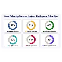
Track response speed, outreach frequency, and conversions with sales follow up statistics. Learn what these metrics reveal. Read on!
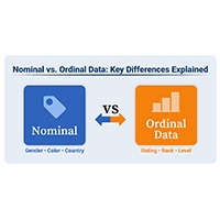
Explore the differences between nominal vs. ordinal data types and learn when to use each for accurate analysis. Discover now!