• Home
  • Tools dropdown img
    • Spreadsheet Charts

      • ChartExpo for Google Sheets
      • ChartExpo for Microsoft Excel
    • Power BI Charts

      • Power BI Custom Visuals by ChartExpo
    • Word Cloud

  • Charts dropdown img
    • Chart Category

      • Bar Charts
      • Circle Graphs
      • Column Charts
      • Combo Charts
      • Comparison Charts
      • Line Graphs
      • PPC Charts
      • Sentiment Analysis Charts
      • Survey Charts
    • Chart Type

      • Box and Whisker Plot
      • Clustered Bar Chart
      • Clustered Column Chart
      • Comparison Bar Chart
      • Control Chart
      • CSAT Survey Bar Chart
      • CSAT Survey Chart
      • Dot Plot Chart
      • Double Bar Graph
      • Funnel Chart
      • Gauge Chart
      • Likert Scale Chart
      • Matrix Chart
      • Multi Axis Line Chart
      • Overlapping Bar Chart
      • Pareto Chart
      • Radar Chart
      • Radial Bar Chart
      • Sankey Diagram
      • Scatter Plot Chart
      • Slope Chart
      • Sunburst Chart
      • Tornado Chart
      • Waterfall Chart
      • Word Cloud
    • Google Sheets
      Microsoft Excel
  • Services
  • Pricing
  • Contact us
  • Blog
  • Support dropdown img
      • Gallery
      • Videos
      • Contact us
      • FAQs
      • Resources
    • Please feel free to contact us

      atsupport@chartexpo.com

Categories
All Data Visualizations Data Analytics Surveys
Add-ons/
  • Google Sheets
  • Microsoft Excel
  • Power BI
All Data Visualizations Data Analytics Surveys
Add-ons
  • Google Sheets
  • Microsoft Excel
  • Power BI

We use cookies

This website uses cookies to provide better user experience and user's session management.
By continuing visiting this website you consent the use of these cookies.

Ok

ChartExpo Survey


Home > Blog > Microsoft Excel

Top 6 Survey Best Practices for Interpreting Survey Data

Ladies and gentlemen, step up and witness the greatest show on earth. That’s right; we’re talking surveys.

survey best practices

You might be thinking, “What’s so great about surveys?”

Well, let me tell you, my friend. Surveys are the key to unlocking the secrets of the universe. Perhaps not the entire cosmos, but certainly the group of people you are trying to reach.

To do that, you need good survey questions and transparent results. Otherwise, you’re just asking strangers what they had for breakfast. And let’s be real, nobody cares about that (unless it was something exciting, like unicorn pancakes).

To help you navigate this tricky terrain, we’ve rounded up the top 6 surveys best practices. But before we dive in, let’s get one thing straight. A bad survey is like a bad joke – no one wants to be a part of it.

Table of Contents:

  1. What is a Survey?
  2. Importance of Surveys
  3. Survey Best Practices
  4. Conducting Surveys Using Best Practices
  5. Plotting & Interpreting Results
  6. Wrap Up

What is a Survey?

A survey is a systematic method of collecting information or data from a group of individuals. It aims to gather their opinions, experiences, or preferences on a particular topic or issue. Typically, a survey involves asking a series of structured or semi-structured questions to a representative sample of participants.

You can conduct surveys through various means, including online questionnaires, telephone interviews, face-to-face interactions, or paper-based forms. The data collected from surveys is then analyzed and used to derive insights. Or understand trends and patterns within a specific population. Then used for decision-making purposes.

Importance of Surveys

Surveys are like pickles. They might not be everyone’s favorite, but they’re crucial in understanding what people want. Here are five reasons why surveys are important:

  • Data collection: Surveys provide a structured method to collect data from a representative group. They facilitate the gathering of quantitative and qualitative data on various topics. Such topics include; customer satisfaction, market trends, public opinions, employee feedback, and demographic information.
  • Decision making: Surveys gather data that aid in informed decision-making by understanding the target audience’s preferences, needs, and opinions. This information allows for customization of products, services, or policies, resulting in more effective decision-making.
  • Research and analysis: Surveys are essential research instruments. They facilitate extensive data collection that allows statistical analysis, hypothesis testing, and the exploration of variable relationships.
  • Identifying trends and patterns: Surveys help identify emerging trends, patterns, or shifts in public opinions, consumer behavior, or market preferences. This information assists in adapting strategies, developing new products, and staying ahead of the competition.
  • Policy development: Surveys are instrumental in shaping policies and initiatives at local, national, and international levels. They help gather public opinions and gauge support for various options. Consequently, ensure policies align with the needs and aspirations of the population.

Best Survey Best Practices

Executing a survey requires careful planning, attention to detail, and a deep understanding of the subject matter. Let’s explore the best practices for surveys that will help you create a masterpiece of insights.

  1. Define your objectives: Defining your objectives is essential for survey. It helps you stay focused and ensures your questions align with the research goals.
  2. Target the right audience: Ensure that your survey reaches individuals with the knowledge or experience required to provide accurate responses. Tailor your questions and language to match the characteristics and preferences of your target audience.
  3. Keep it concise: Long surveys can lead to abandonment or rushed answers, potentially compromising data quality. Focus on questions that directly contribute to your objectives, and eliminate any unnecessary or redundant items.
  4. Use clear and unbiased language: Ambiguous or confusing wording can lead to misunderstandings and inaccurate responses. Use simple, jargon-free language that your target audience understands. Furthermore, avoid leading or biased language that may influence respondents’ answers.
  5. Utilize a mix of question types: Using a variety of question types can help capture different types of information and enhance the survey experience. Consider including multiple-choice questions, Likert scales, ranking or rating questions, and open-ended survey questions. The choice of question type should align with the information you want to gather and the depth of insights you seek.
  6. Test your survey: Conduct a pilot test with a small group of participants who match your target audience. This allows you to refine and improve your survey based on feedback. Consequently, ensure it is well-crafted and user-friendly.

Conducting Surveys Using Best Practices

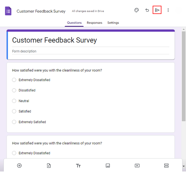
Let’s say you want to conduct an online customer feedback survey with the following questions.

  • How satisfied were you with the cleanliness of your room?
  • How satisfied were you with the comfort of your bed?
  • How satisfied were you with the level of noise in your room?
  • How satisfied were you with the quality of the food at the hotel restaurant?

You want to map the response scale below to each question.

  1. Extremely Dissatisfied
  2. Dissatisfied
  3. Neutral
  4. Satisfied
  5. Extremely Satisfied

How do you go about this?

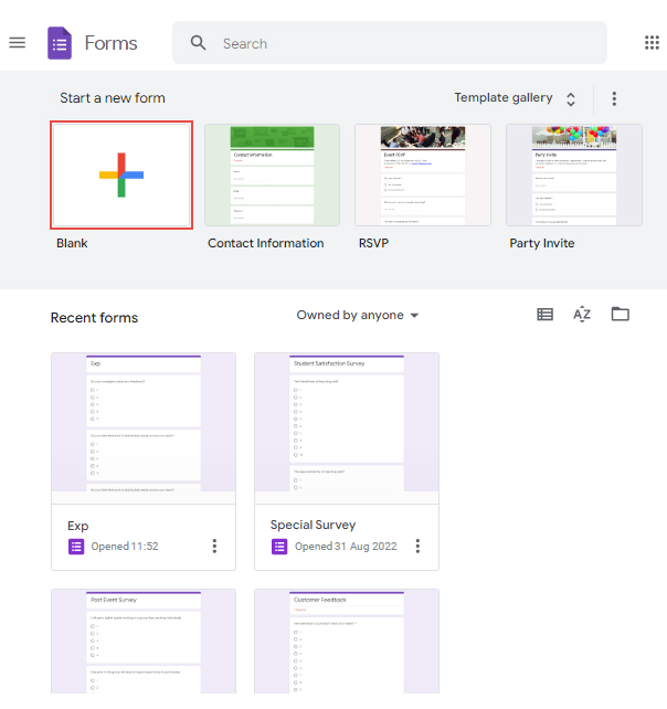
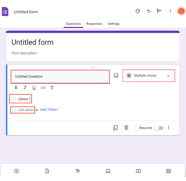
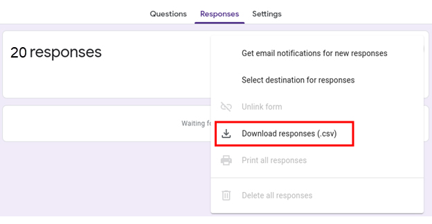
Use Google Forms to create your survey.

How?

Follow these steps:

  • Log in to Google Forms using your Google account.
  • Click the “Blank” button to open a new form.
open a new form
  • Select the type of question you want to use, such as multiple-choice, checkbox, or short answer.
  • Type your Questions in the “Untitled Question” section. Write “Option 1” and choose “Add option” for more options.
untitled form
  • Click the “Send” button to share the form with the target audience.
Click the Send button
  • When you have collected sufficient responses, click the three vertical dots next to “Link to Sheets.”
Link to Sheets
  • Select the option to download the responses as a.csv file.
download the responses

Plotting & Interpreting Results

Survey data can be confusing, but you can easily uncover insights with the right charts and graphs.

Transforming raw survey data into insightful visualizations is made effortless with ChartExpo for Excel.

ChartExpo enables you to weave an intricate tapestry of information like a skilled artist wielding a brush. Transforming mere numbers into captivating visuals that paint a vivid picture of your survey findings. You can unravel hidden patterns and trends with a few clicks, breathing life into every data point.

Benefits of Using ChartExpo

  • ChartExpo’s wide range of visualizations allows you to select the most suitable one for your data. This streamlines data analysis and presentation for optimal effectiveness.
  • Effortlessly create insightful visualizations with ChartExpo’s intuitive user interface, even without coding experience.
  • ChartExpo’s customization options allow you to add a personal touch to your visuals. You can tweak colors, fonts, and styles to your liking.
  • ChartExpo offers exceptional value for money, with a free 7-day trial and a $10 monthly plan.

How to Install ChartExpo in Excel?
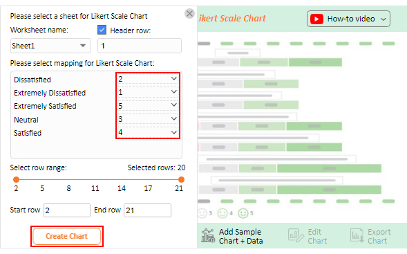
  1. Open your Excel application.
  2. Open the worksheet and click the “Insert” menu.
  3. You’ll see the “My Apps” option.
  4. In the office Add-ins window, click “Store” and search for ChartExpo on my Apps Store.
  5. Click the “Add” button to install ChartExpo in your Excel.

ChartExpo charts are available both in Google Sheets and Microsoft Excel. Please use the following CTAs to install the tool of your choice and create beautiful visualizations with a few clicks in your favorite tool.

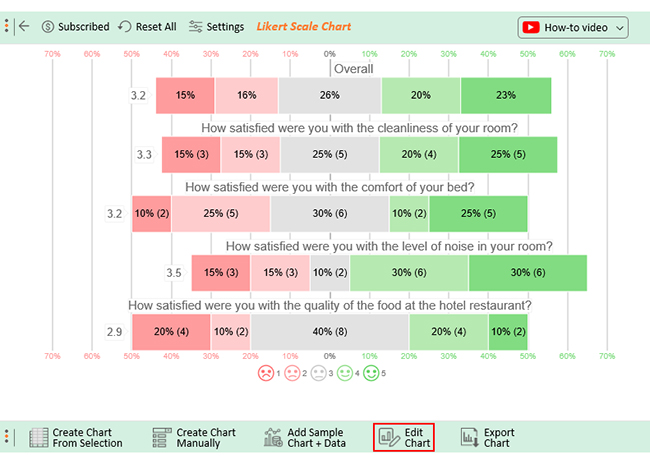
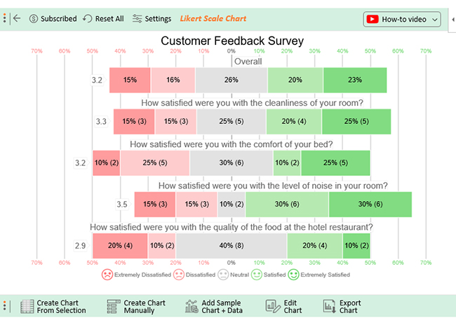
Assume your survey yields the results table below.

Timestamp How satisfied were you with the cleanliness of your room? How satisfied were you with the comfort of your bed? How satisfied were you with the level of noise in your room? How satisfied were you with the quality of the food at the hotel restaurant?
10-13-2023 17:47:33 Extremely Satisfied Dissatisfied Neutral Satisfied
10-13-2023 17:47:33 Extremely Satisfied Neutral Extremely Satisfied Neutral
10-13-2023 17:47:33 Neutral Neutral Extremely Dissatisfied Extremely Satisfied
10-13-2023 17:47:33 Satisfied Extremely Dissatisfied Dissatisfied Neutral
10-13-2023 17:47:33 Extremely Satisfied Dissatisfied Satisfied Extremely Dissatisfied
10-13-2023 17:47:33 Satisfied Dissatisfied Satisfied Neutral
10-13-2023 17:47:33 Extremely Dissatisfied Neutral Extremely Satisfied Satisfied
10-13-2023 17:47:33 Neutral Satisfied Neutral Neutral
10-13-2023 17:47:33 Extremely Dissatisfied Extremely Satisfied Extremely Satisfied Satisfied
10-13-2023 17:47:33 Extremely Satisfied Extremely Dissatisfied Satisfied Neutral
10-13-2023 17:47:33 Dissatisfied Neutral Extremely Satisfied Extremely Dissatisfied
10-13-2023 17:47:34 Neutral Neutral Extremely Dissatisfied Neutral
10-13-2023 17:47:35 Dissatisfied Neutral Extremely Satisfied Dissatisfied
10-13-2023 17:47:36 Neutral Extremely Satisfied Satisfied Extremely Dissatisfied
10-13-2023 17:47:37 Neutral Extremely Satisfied Dissatisfied Extremely Satisfied
10-13-2023 17:47:38 Extremely Dissatisfied Extremely Satisfied Dissatisfied Neutral
10-13-2023 17:47:39 Extremely Satisfied Satisfied Extremely Dissatisfied Extremely Dissatisfied
10-13-2023 17:47:40 Dissatisfied Dissatisfied Satisfied Neutral
10-13-2023 17:47:41 Satisfied Dissatisfied Extremely Satisfied Dissatisfied
10-13-2023 17:47:42 Satisfied Extremely Satisfied Satisfied Satisfied

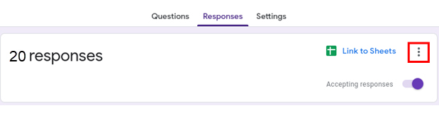
This table contains example data. Expect many responses and questions in real life.

  • To get started with ChartExpo, install ChartExpo in Excel.
  • Now Click on My Apps from the INSERT menu.
insert chartexpo in excel
  • Choose ChartExpo from My Apps, then click Insert.
open chartexpo in excel
  • Once it loads, choose the “Likert Scale Chart” from the charts list.
search likert scale chart in excel
  • Click “Create Chart From Selection” button after selecting the data from the sheet, as shown.
create likert scale chart in excel
  • When you click the “Create Chart From Selection” button, you have to map responses with numbers manually. The Likert scale has this arrangement:
    • Extremely Dissatisfied = 1
    • Dissatisfied = 2
    • Neutral = 3
    • Satisfied = 4
    • Extremely Satisfied = 5

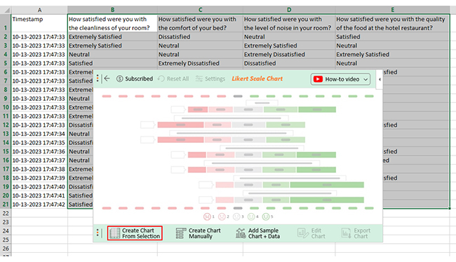
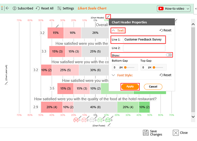
Once all is set, click the “Create Chart” button.

make likert scale chart in excel
  • ChartExpo will generate the visualization below for you.
edit likert scale chart in excel
  • If you want to have the title of chart, click on Edit Chart, as shown in the above image.
  • To change the title of the chart, click on the pencil icon that is available very next to Chart Header.
  • It will open the properties dialog. Under the Text section, you can add a heading in Line 1 and enable the Show Give the appropriate title of your chart and click on Apply button.
set likert scale chart in excel
  • Let’s say you want to add text responses instead of numbers against every emoji.
  • Click the pencil icon next to the respective emoji. Expand the “Label” properties and write the required text. Then click the “Apply All” button.
  • Click the “Save Changes” button to persist the changes.
save likert scale chart in excel
  • Your final chart will appear as below.
survey design best practices

Insights

  • 45% of customers were satisfied with the cleanliness of hotel rooms. 30% expressed dissatisfaction, and 25% remained neutral.
  • Regarding bed comfort, 35% were content, while another 35% expressed dissatisfaction.
  • Regarding noise levels in the rooms, 60% were satisfied, while 30% expressed dissatisfaction.
  • Regarding food quality, 30% expressed satisfaction, and 30% expressed dissatisfaction.
  • Overall, the hotel’s services were satisfactory for 43% of customers, with 23% extremely satisfied. 31% were dissatisfied, 15% were extremely dissatisfied, and 26% remained neutral.

FAQs

What are survey best practices?

Survey best practices include the following;

  1. Clearly define the survey objectives.
  2. Target the right audience.
  3. Use concise and unbiased language.
  4. Ensure question clarity.
  5. Keep the survey short.
  6. Use a mix of question types.
  7. Conduct a pilot test before the final implementation.

What is the ideal sample size for a survey?

The ideal sample size for a survey depends on various factors. Such factors include the population size, desired level of confidence, margin of error, and survey methodology. Generally, larger sample sizes tend to provide more reliable and accurate results.

How do I ensure that my survey is unbiased?

To ensure your survey is unbiased;

  1. Strive for neutrality in question-wording.
  2. Avoid leading or loaded questions.
  3. Use randomized question order.
  4. Provide balanced response options.
  5. Include a diverse sample.
  6. Employ proper survey administration techniques to minimize response bias.

Can I use Google Forms to create surveys for commercial purposes?

Yes, you can use Google Forms for commercial purposes. However, reviewing and complying with Google’s terms of service is essential. Also, look out for any applicable legal requirements for commercial data collection and usage.

Wrap Up

In conclusion, implementing survey best practices is crucial for effectively interpreting survey data and extracting meaningful insights. By following these top six practices, you can enhance the accuracy and reliability of your survey results.

First and foremost, clearly define your objectives to ensure you gather the necessary information. Targeting the right audience is equally important. It ensures that the collected data is relevant and representative.

Keeping the survey concise maintains respondent engagement and reduces the likelihood of incomplete or rushed responses. Furthermore, using clear and unbiased language in your questions promotes objectivity and prevents any unintended bias.

Additionally, employing a mix of question types allows for a comprehensive understanding of respondents’ perspectives. Lastly, pilot testing your survey helps identify potential issues or improvements before the final implementation.

The complexities of data management and analysis can overwhelm even experienced data analysts. Visualizing your survey data is important to ensure accurate and meaningful insights.

Creating charts can be daunting. But you don’t need to do it manually. With ChartExpo, you can effortlessly create graphs and charts with a few clicks.

How much did you enjoy this article?

ExcelAd1
Start Free Trial!
126956

Related articles

next previous
Microsoft Excel8 min read

Excel Task Tracker Template for Smarter Task Insights

Task tracker template in Excel organizes tasks, tracks deadlines, and boosts efficiency. Learn its benefits, and explore expert tips to simplify task management.

Microsoft Excel10 min read

Invoice Tracker Template in Excel for Better Insights

An invoice tracker Excel template helps track invoices, due dates, and payments. Learn how to use this template for better financial management.

Microsoft Excel12 min read

Key Performance Indicators in Healthcare for Better Insights

Key Performance Indicators in healthcare track patient care and efficiency. Learn about these KPIs, top examples, and how to use them to improve outcomes.

Microsoft Excel10 min read

BMI Calculation Formula in Excel for Better Fitness Insights

The BMI calculation formula in Excel helps track and analyze body mass index. Explore step-by-step instructions and tips to simplify BMI tracking in Excel.

Microsoft Excel29 min read

How to Create a Tornado Chart in Excel? A Complete Guide

Click to learn how to plot a Tornado Chart in Excel using easy-to-follow steps. Also, we’ll address the following question: what is a Tornado Diagram?

ChartExpo logo

Turn Data into Visual
Stories

CHARTEXPO

  • Home
  • Gallery
  • Videos
  • Services
  • Pricing
  • Contact us
  • FAQs
  • Privacy policy
  • Terms of Service
  • Sitemap

TOOLS

  • ChartExpo for Google Sheets
  • ChartExpo for Microsoft Excel
  • Power BI Custom Visuals by ChartExpo
  • Word Cloud

CATEGORIES

  • Bar Charts
  • Circle Graphs
  • Column Charts
  • Combo Charts
  • Comparison Charts
  • Line Graphs
  • PPC Charts
  • Sentiment Analysis Charts
  • Survey Charts

TOP CHARTS

  • Sankey Diagram
  • Likert Scale Chart
  • Comparison Bar Chart
  • Pareto Chart
  • Funnel Chart
  • Gauge Chart
  • Radar Chart
  • Radial Bar Chart
  • Sunburst Chart
  • see more
  • Scatter Plot Chart
  • CSAT Survey Bar Chart
  • CSAT Survey Chart
  • Dot Plot Chart
  • Double Bar Graph
  • Matrix Chart
  • Multi Axis Line Chart
  • Overlapping Bar Chart
  • Control Chart
  • Slope Chart
  • Clustered Bar Chart
  • Clustered Column Chart
  • Box and Whisker Plot
  • Tornado Chart
  • Waterfall Chart
  • Word Cloud
  • see less

RESOURCES

  • Blog
  • Resources
  • YouTube
SIGN UP FOR UPDATES

We wouldn't dream of spamming you or selling your info.

© 2025 ChartExpo, all rights reserved.