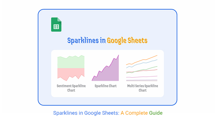
Categories
Numbers alone don’t tell the full story. You can scan a spreadsheet for hours and still miss what’s right in front of you. That’s where sparklines in Google Sheets come in.
These tiny, cell-based charts turn long columns of figures into visual patterns you can read in seconds. They work in the same grid you already use, so nothing feels out of place.


Think about monthly sales reports, expense tracking, or stock price comparisons. Instead of jumping between data tables and bulky charts, you can glance at a single cell and see the movement instantly.
This speed matters when you need to react fast, whether to seize an opportunity or fix a problem. Sparklines give you that edge.
They aren’t about replacing traditional charts. Instead, they work best as quick indicators. A sparkline can show a sudden drop in revenue, a consistent rise in customer engagement, or spikes in seasonal demand.
Because they’re formula-driven, they update automatically when the data changes. You get the freshest view without any extra steps.
The beauty of sparklines in Google Sheets is in their minimal footprint. You can place them right next to your data without disturbing your layout.
That’s why they fit well in everything from personal budgets to the most detailed Google Sheets profit and loss template. In the next sections, you’ll see what sparklines are, how they work, and how to make them serve your exact reporting needs.
Definition: A sparkline is a mini chart that lives in a single cell. It plots your data as a simple graphic so you can see patterns without scrolling through endless rows.
Unlike floating charts, sparklines are part of the cell itself, which keeps them anchored to the data representation.
You can use them to track monthly growth, highlight performance shifts, or compare multiple products without clutter.
For instance, if you’re monitoring stock prices across different companies, sparklines let you compare movements side by side without shrinking a full chart to fit the screen.
They’re perfect for spotting trends like steady increases, sudden drops, or consistent plateaus. And because they pull directly from your data range, the moment your data changes, so does the sparkline.
A Google Spreadsheet Sparkline is more than a pretty line in a cell. It’s a functional tool for quick understanding. The compact design means you can fit them into dense reports without pushing your table out of shape.
They make trend detection almost effortless. Instead of running extra formulas or scanning row by row, you can see the direction at a glance. And since they’re formula-driven, they update in real time.
This is especially helpful in reports like a Google Sheets profit and loss template, where clarity is non-negotiable.
With sparklines, you can produce cleaner, easier-to-read reports. You cut down the mental load for anyone reading them, whether it’s your manager, a client, or yourself.
That simplicity helps the real message in your numbers stand out.
The SPARKLINE function generates these small, in-cell visuals. It takes a range of values and turns them into a quick chart.
=SPARKLINE(data, [options])
=SPARKLINE(A2:A12, {“charttype”,”line”; “color”,”blue”})
This flexibility means you can keep it basic or customize heavily depending on your needs.
Google Sheets supports four main sparkline types:
Each type uses the same SPARKLINE function but changes through the options parameter.
Formula:
=SPARKLINE(A1:A5)
Formula:
=SPARKLINE(B1:B5, {“charttype”,”column”})
Formula:
=SPARKLINE(C1:C5, {“charttype”,”winloss”})
Formula:
=SPARKLINE(D1:D5, {“charttype”,”bar”; “color1″,”green”})
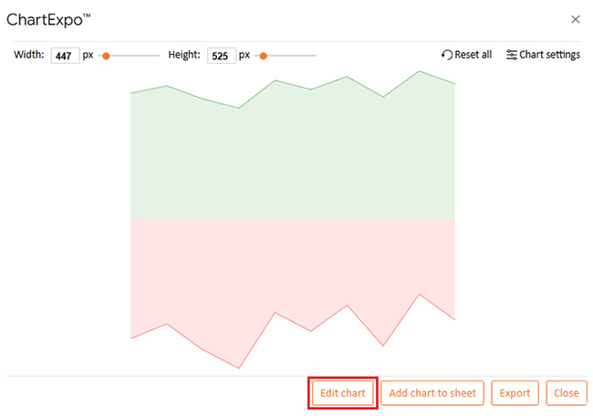
Click the cell where you want the sparkline.
Enter =SPARKLINE(range, {options}).
Press Enter.
It updates automatically as your data changes. If you need more advanced visuals, you can move into how to create a chart in Google Sheets with tools like ChartExpo.
This opens the door to visuals such as a Pareto chart in Google Sheets for distribution analysis, or more layered chart types that go beyond sparklines.
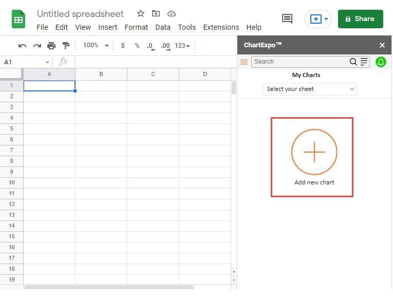
Why Use ChartExpo?
ChartExpo expands your visual options without coding, including creating a Scatter plot in Google Sheets. It lets you customize sparklines, export charts for reports, and try advanced chart types in minutes.
The tool works directly inside Google Sheets and Microsoft Excel, keeping your process simple.
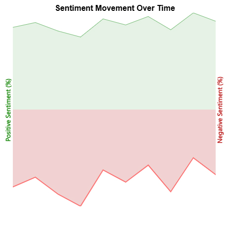
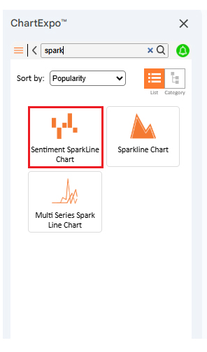
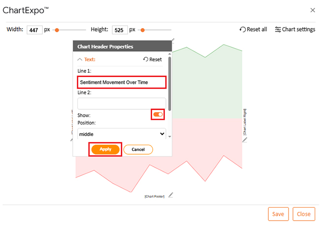
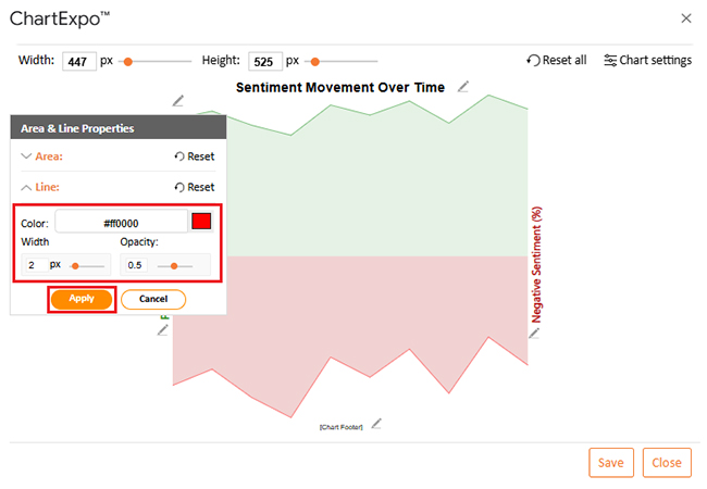
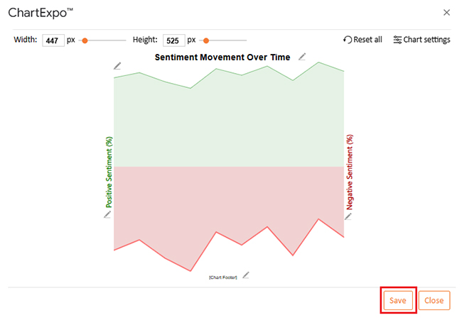
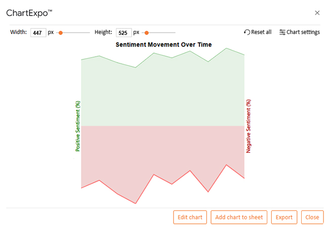
Shows shifts in positive and negative sentiment over time in minimal space.
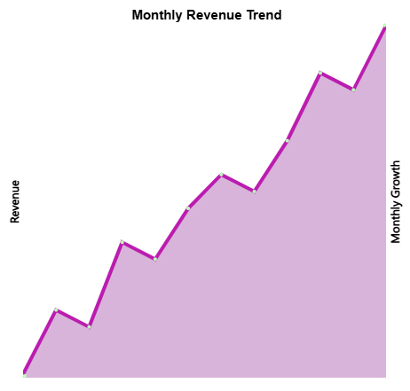
Compact cell-based chart for quick pattern spotting in large reports.
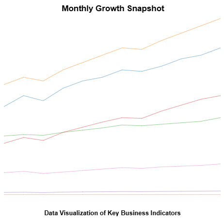
Compares multiple metrics in one small graphic without clutter.
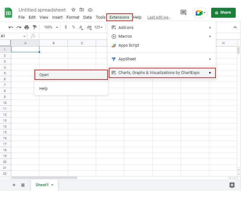
How to Install ChartExpo in Google Sheets?
Open your sheet. Go to Extensions → Add-ons → Get add-ons.
Search for “ChartExpo” in Google Workspace Marketplace.
Click “Install” and grant permissions.
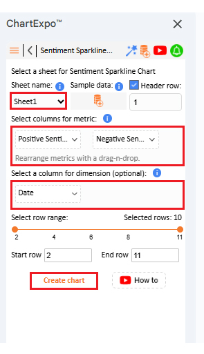
Before we create the chart, here’s the dataset we’ll use. This table contains daily sentiment data with positive and negative percentages over ten days.
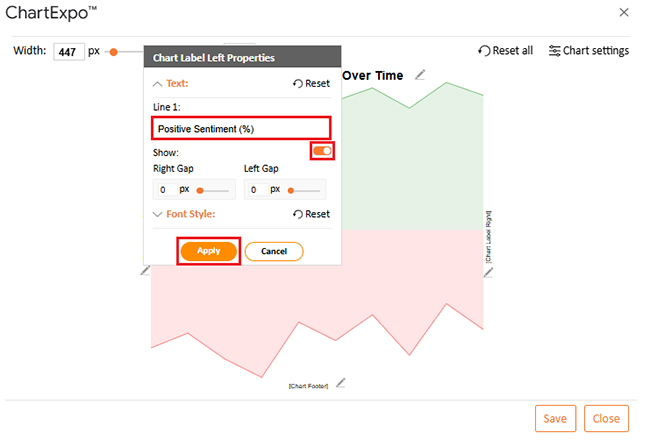
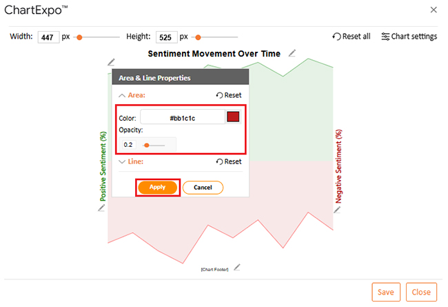
The purpose is to visualize how overall perception shifts within a set timeframe. Positive sentiment values represent favorable feedback or reactions, while negative sentiment reflects complaints, dissatisfaction, or negative feedback.
Having both values side-by-side allows you to measure overall balance in public opinion. The sparkline will compactly display these trends, highlighting peaks and drops in each sentiment.
This small format makes it ideal for placing next to the raw data for instant trend recognition without requiring a full-size chart.
| Date | Positive Sentiment | Negative Sentiment |
| 2025-07-01 | 68 | 32 |
| 2025-07-02 | 72 | 28 |
| 2025-07-03 | 65 | 35 |
| 2025-07-04 | 60 | 40 |
| 2025-07-05 | 75 | 25 |
| 2025-07-06 | 70 | 30 |
| 2025-07-07 | 77 | 23 |
| 2025-07-08 | 66 | 34 |
| 2025-07-09 | 80 | 20 |
| 2025-07-10 | 73 | 27 |


=SPARKLINE(range, {optional settings})
Select a cell.
Enter =SPARKLINE(range).
Google Sheets generates a default line sparkline.
Sparklines in Google Sheets turn raw numbers into quick, space-saving visuals. They make it easy to see trends, spot outliers, and track changes without leaving your spreadsheet.
Whether you’re managing budgets, monitoring performance, or presenting results, these small visuals carry big weight. Pair them with advanced tools like Google Charts or ChartExpo for even richer analysis.
Related Article:
Sparklines in Excel:
How much did you enjoy this article?


SUMPRODUCT in Google Sheets handles multi-condition calculations without extra columns. Master its syntax, uses, and errors. Read on!

An annual budget template in Google Sheets organizes your yearly finances, tracks every dollar, and reveals spending patterns. Read on!

Learn the best graph to show profit and loss with practical examples and use cases. Discover how to visualize your business data, track trends, and make smarter financial decisions.


