Categories
Every sales team knows that what happens after the first contact often determines whether a deal closes. Timely, relevant communication at every touchpoint is essential—miss the window, and interest fades.

Sales follow-up statistics track response speed, follow-up frequency, communication channels, and conversion outcomes. In this guide, we’ll explain these metrics, why they matter, and how to turn raw data into actionable insights that improve sales performance.
Definition: Sales follow-up statistics measure how effectively sales reps reconnect with leads after the initial outreach. They track timing, frequency of touches, communication channels, and outcomes of continued engagement.
Common metrics include:
Analyzing these statistics uncovers performance gaps, highlights successful strategies, and removes guesswork from your sales process. Essentially, it’s the difference between hoping leads convert and understanding why they do.
Follow-up sales statistics reveal what happens after a prospect enters your pipeline. They show whether your team’s outreach is timely, consistent, and effective at moving leads toward conversion. By analyzing these metrics, businesses can identify strengths, uncover weaknesses, and improve overall sales performance.
Key benefits include:
Sales follow-up performance continues to evolve as buyer expectations, communication channels, and sales technologies change. Understanding current benchmarks helps sales teams stay competitive and respond to prospects at the right time with the right approach.
Below are some important sales follow-up statistics and trends that highlight how timing, persistence, and communication methods influence conversions.
Understanding industry benchmarks helps sales teams evaluate whether their follow-up strategy is effective or needs improvement.
By comparing your metrics against common standards, you can identify gaps in response speed, follow-up frequency, and engagement levels. These sales follow-up stats provide a practical reference point for optimizing outreach and improving conversions.
Speed plays a critical role in lead conversion. Studies show that contacting a prospect quickly after their inquiry significantly increases the likelihood of engagement.
Typical benchmarks include:
Many high-performing teams aim to respond within the first 5–15 minutes to maintain prospect interest and increase the chances of starting a meaningful conversation.
Persistence is another important factor in successful outreach. Many deals are closed only after several follow-up attempts.
Common benchmarks for follow-up frequency include:
These sales follow-up statistics highlight that consistent communication often leads to better outcomes than a single outreach attempt.
Different outreach channels generate different engagement levels. Evaluating channel performance helps teams focus on the most effective communication methods.
Typical benchmarks include:
Using a combination of channels increases visibility and improves the chances of connecting with prospects.
Conversion metrics reveal how effectively follow-up efforts move prospects through the sales pipeline. Tracking these follow-up sales statistics helps teams measure the true impact of their outreach.
Common conversion benchmarks include:
While actual numbers vary by industry and sales cycle, comparing your results with these benchmarks can highlight areas where response speed, messaging, or follow-up frequency may need adjustment.
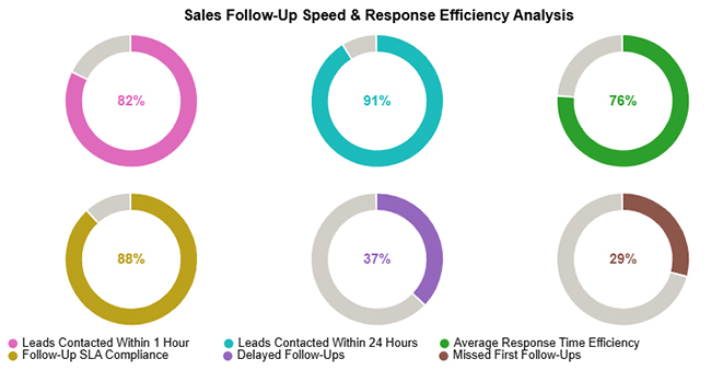
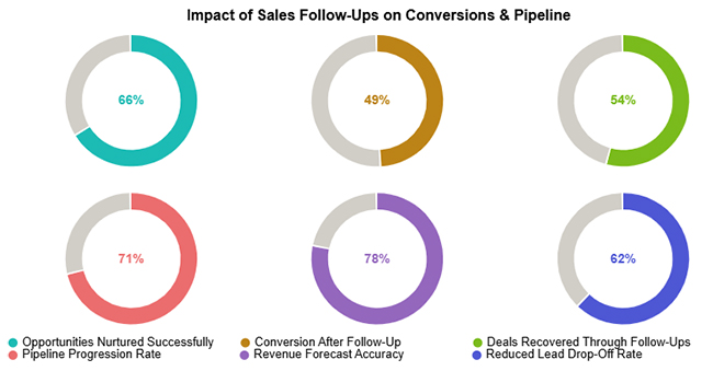
Sales follow-up metrics become clearer when viewed through real examples. Visual data helps sales teams identify patterns, evaluate performance, and uncover opportunities to improve response timing, engagement, and conversion outcomes.
This example highlights how consistent follow-up efforts influence pipeline progression and overall revenue performance. Even when immediate conversions appear modest, persistent outreach can revive stalled opportunities, strengthen pipeline momentum, and improve long-term deal closure rates.
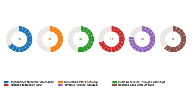
This example focuses on follow-up consistency and outreach discipline. While the team maintains regular follow-up activity, engagement indicators such as reply rates and interaction levels reveal areas where messaging, targeting, or channel selection could be optimized.
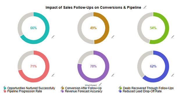
This example examines how quickly teams respond to incoming leads and inquiries. Fast response times help maintain prospect interest and improve conversion potential, while delays or missed contacts highlight gaps in response processes that may require better automation or workflow adjustments.
Choosing the right follow-up channel can significantly improve response rates and conversions. Here are the five most effective channels used in sales follow-ups:
Email remains one of the most reliable follow-up channels. It allows you to share detailed information, attach documents, and personalize your message at scale. It’s ideal for nurturing leads over time and maintaining professional communication.
Phone calls add a human touch to your follow-up. They allow real-time interaction, quick clarification of concerns, and stronger relationship building. This channel works best for high-value leads or when immediate responses are needed.
Text messages are highly effective for quick follow-ups. They have high open rates and are ideal for reminders, short updates, or time-sensitive communication. However, they should be used carefully to avoid sounding intrusive.
Platforms like LinkedIn are powerful for B2B follow-ups. Engaging with prospects through messages, comments, or shared content helps build trust and keeps your brand top-of-mind without being overly direct.
Messaging apps offer a fast and conversational way to follow up. They are especially effective in regions where apps like WhatsApp are widely used. This channel works well for informal communication, quick check-ins, and relationship-driven sales.
Accurate data collection is essential for meaningful sales follow-up analysis. Consistent tracking helps teams identify response delays, measure engagement, and refine outreach strategies based on real performance data.
Customer relationship management (CRM) platforms help record every interaction with a prospect, including calls, emails, and meeting attempts. This centralized tracking makes it easier to monitor follow-up frequency, engagement levels, and conversion outcomes.
Tracking how quickly sales representatives respond to inquiries is critical. Faster response times increase the likelihood of connecting with prospects while their interest is still high.
Each outreach attempt should be documented, whether it results in a response or not. Recording attempts provides visibility into how many touchpoints are required before prospects engage or convert.
Automation tools can schedule reminders, trigger follow-up emails, and log activities automatically. This reduces manual work and ensures no opportunities are missed during the sales cycle.
Keeping all follow-up records in a single system improves reporting accuracy and makes it easier to analyze trends across teams, campaigns, or customer segments.
Regular performance reviews help identify patterns such as slow response times, ineffective outreach channels, or missed follow-up opportunities. These insights allow teams to refine their sales process and improve conversion rates.
Google Sheets can help transform raw follow-up records into structured insights. By organizing and analyzing sales follow-up statistics, sales teams can identify response delays, measure engagement, and improve conversion performance.
Follow these steps to analyze sales follow-up statistics effectively:
Start by structuring your dataset so that every interaction with a prospect is properly recorded. A well-organized dataset makes data analysis more accurate and easier to manage.
Common columns may include:
Keeping all follow-up activities in one structured sheet ensures that sales follow-up statistics can be tracked consistently across campaigns and sales representatives.
Next, calculate how quickly sales representatives respond to leads and how many follow-up attempts occur before engagement.
For example, you can calculate response time using simple spreadsheet formulas such as:
These metrics help identify slow responses or insufficient follow-up attempts that may reduce conversion opportunities.
Segment your follow-up activity to uncover deeper insights. Data can be grouped by:
Segmentation helps teams determine which outreach strategies generate stronger engagement and which sales reps consistently achieve better results.
Analyzing the follow-up sequence helps identify where prospects stop responding. For example, some leads may disengage after the second or third follow-up attempt.
By identifying these drop-off points, sales teams can adjust:
This analysis helps prevent lost opportunities and improves overall lead nurturing.
Charts make patterns easier to interpret than raw numbers. Visualizing sales follow-up statistics helps sales teams quickly identify trends such as response speed, engagement levels, and conversion performance.
Common chart examples include:
While Google Sheets supports basic charts, advanced visualization tools such as ChartExpo can transform spreadsheet data into more interactive charts and dashboards. These visuals make it easier to interpret follow-up performance and present insights in reports or team reviews.
To use sales follow-up statistics effectively, start by collecting and organizing data on touchpoints, response rates, conversion outcomes, and timing. Focus on key metrics like response rate per follow-up, average follow-ups before closing, and channel-specific conversions.
Analyze patterns to identify the best days, times, and communication channels for outreach, and segment leads by type, industry, or stage to tailor follow-ups.
Visualizing this data with charts or dashboards, such as those created using add-ons, helps spot trends and gaps quickly.
Finally, refine your strategy based on insights, testing different messaging, timing, and channels to continuously improve engagement and conversions.
Sales follow-up statistics pinpoint which timing, frequency, and channels drive the strongest engagement. Teams can then concentrate resources on tactics that yield better conversions.
Yes. Examining follow-up performance metrics exposes delays, skipped follow-ups, and process friction that stall deal advancement.
Past follow-up performance reveals how rapidly leads progress through each stage. This knowledge improves forecast reliability and planning confidence.
Salespeople should typically send 5–7 follow-ups per lead. Most conversions happen after multiple touches, but persistence should be balanced with relevance and timing to avoid spamming.
Tracking and analyzing sales follow-up statistics enables teams to act with precision, improve response timing, and increase conversion rates.
Visualizing these metrics with tools like ChartExpo makes it easier to identify patterns, refine strategies, and scale best practices across your pipeline. A data-driven approach transforms opportunities into measurable results, stronger revenue streams, and sustainable growth.
How much did you enjoy this article?


Consulting Report Template: structure insights, drive decisions, and deliver standout results. Discover how to build better reports now!
Event budget template keeps event finances clear and controlled. Use one to track costs, compare spending, and stay on budget. Learn more!
MySQL ODBC connector bridges MySQL databases and BI tools for secure, reliable data access across platforms. Set up yours today. Read on!