• Home
  • Tools dropdown img
    • Spreadsheet Charts

      • ChartExpo for Google Sheets
      • ChartExpo for Microsoft Excel
    • Power BI Charts

      • Power BI Custom Visuals by ChartExpo
    • Word Cloud

  • Charts dropdown img
    • Chart Category

      • Bar Charts
      • Circle Graphs
      • Column Charts
      • Combo Charts
      • Comparison Charts
      • Line Graphs
      • PPC Charts
      • Sentiment Analysis Charts
      • Survey Charts
    • Chart Type

      • Box and Whisker Plot
      • Clustered Bar Chart
      • Clustered Column Chart
      • Comparison Bar Chart
      • Control Chart
      • CSAT Survey Bar Chart
      • CSAT Survey Chart
      • Dot Plot Chart
      • Double Bar Graph
      • Funnel Chart
      • Gauge Chart
      • Likert Scale Chart
      • Matrix Chart
      • Multi Axis Line Chart
      • Overlapping Bar Chart
      • Pareto Chart
      • Radar Chart
      • Radial Bar Chart
      • Sankey Diagram
      • Scatter Plot Chart
      • Slope Chart
      • Sunburst Chart
      • Tornado Chart
      • Waterfall Chart
      • Word Cloud
    • Google Sheets
      Microsoft Excel
  • Services
  • Pricing
  • Contact us
  • Blog
  • Support dropdown img
      • Gallery
      • Videos
      • Contact us
      • FAQs
      • Resources
    • Please feel free to contact us

      atsupport@chartexpo.com

Categories
All Data Visualizations Data Analytics Surveys
Add-ons/
  • Google Sheets
  • Microsoft Excel
  • Power BI
All Data Visualizations Data Analytics Surveys
Add-ons
  • Google Sheets
  • Microsoft Excel
  • Power BI

We use cookies

This website uses cookies to provide better user experience and user's session management.
By continuing visiting this website you consent the use of these cookies.

Ok

ChartExpo Survey


Home > Blog > Google Sheets

Beyond Data Points: Mastering Quantitative Research Design

Welcome to the world of quantitative research design, where we transform data into powerful insights! In this guide, we’ll unravel the art and science behind creating a solid foundation for impactful research.

quantitative research design

In research, one must navigate the treacherous seas of methodology and tools to uncover hidden truths.

The quantitative research design, a formidable approach, brings order to the chaos of numbers and statistics. Like a skilled captain, it guides researchers toward their destination. Armed with a compass of precision and a map of objectivity.

Like there are different types of ships to conquer the oceans, quantitative research designs come in various forms;

  • The descriptive vessel paints a vivid picture of a variable’s current state.
  • The correlational ship charts the intricate relationships between multiple variables.
  • The experimental flagship is where cause and effect are scrutinized under the strictest scientific scrutiny.

Each design serves a unique purpose.

But beware, dear researcher, for not all promises are fulfilled. The allure of “quantitative research with a sprinkle of ‘leave a message'” can lead to disappointment.

So, let us steer clear of the treacherous waters and chart a course toward reliable findings.

Table of Contents:

  1. What is Quantitative Research Design?
  2. Importance of Designing Quantitative Research
  3. Quantitative Research Methods
  4. Collecting Quantitative Research Data
  5. Interpreting & Reporting Quantitative Research Findings
  6. Wrap Up

What is Quantitative Research Design?

Definition: Quantitative research design is a systematic methodology to gather and analyze numerical data to answer research questions. It encompasses the measurement of variables, statistical analysis techniques, and the establishment of cause-and-effect relationships.

Importance of Designing Quantitative Research

Designing quantitative research is important for several reasons:

  • Objectivity

Quantitative research design emphasizes objectivity by relying on measurable and numerical data. This reduces the potential for bias and subjectivity, leading to more reliable and credible results.

  • Generalizability

Quantitative research design uses representative samples and employs statistical analysis techniques. Consequently, it enables you to make generalizations about a larger population. This allows for broader insights and conclusions that can be applied beyond the specific study sample.

  • Precision and Accuracy

The systematic approach of quantitative research design guarantees meticulous gathering and examination of data. Therefore, you can employ standardized measurement tools and statistical techniques to enhance the accuracy of your findings. This not only amplifies the accuracy but also fortifies the reliability and validity of your results.

Quantitative Research Methods

Quantitative research involves collecting and analyzing numerical data to investigate research questions or test hypotheses. Here are some common quantitative research methods:

  • Surveys: This involves administering questionnaires or structured interviews to a sample of participants. Surveys data collection on attitudes, opinions, behaviors, or characteristics.
  • Experiments: Experiments involve manipulating variables under controlled conditions to establish cause-and-effect relationships. Quantitative measurements are collected to analyze the effects of the manipulated variables.
  • Observational studies: This involves systematically observing and recording behaviors or phenomena in natural settings. Data collection can be through structured observations or using technological tools.
  • Secondary data analysis: You can analyze datasets from other researchers and organizations. This allows you to immerse yourself in the vast expanse of data. As a result, it opens doors to novel hypotheses and uncharted territories.
  • Longitudinal studies: Longitudinal studies, also known as longitudinal surveys, entail collecting data from a consistent sample over a prolonged duration. They facilitate the examination of evolving patterns and trends over time.
  • Content Analysis: Content analysis involves quantifying and analyzing the content of documents, texts, or media. It helps you identify patterns, themes, or trends in written or visual materials.

Collecting Quantitative Research Data

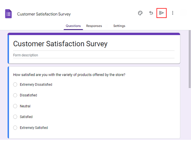
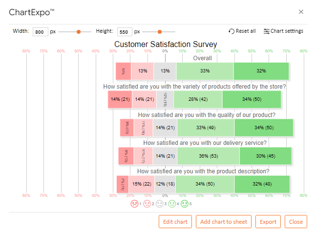
Assume you run a store and want to conduct a customer service satisfaction survey with the following questions.

  • How satisfied are you with the variety of products offered by the store?
  • How satisfied are you with the quality of our product?
  • How satisfied are you with our delivery service?
  • How satisfied are you with the product description?

You want to map the response scale below on these questions:

  1. Extremely Dissatisfied
  2. Dissatisfied
  3. Neutral
  4. Satisfied
  5. Extremely Satisfied

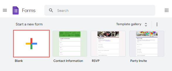
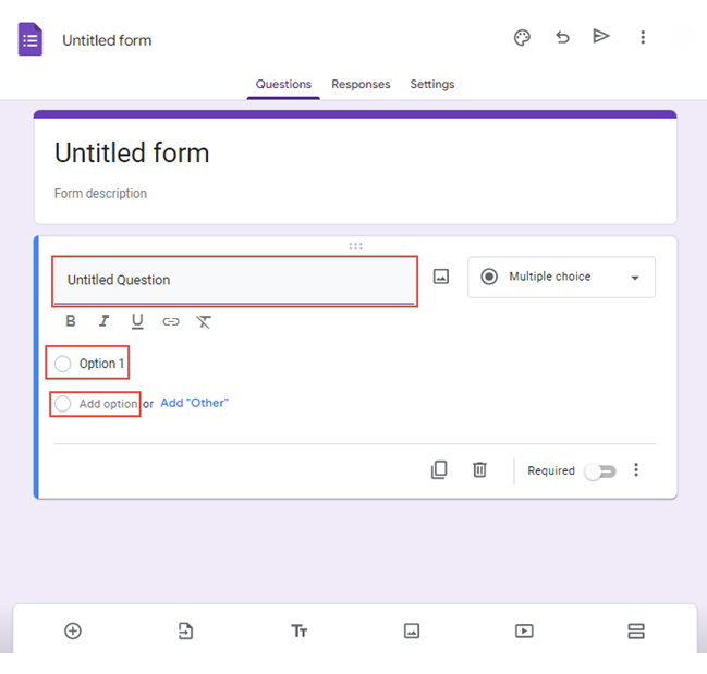
Follow the steps below to create a survey using Google Forms.

  • Open Google Forms and sign in with your Google account.
  • Click the “Blank” button to create a new form.
survey in google forms 1 ce352
  • Give your form a title and description that reflects your brand or purpose.
  • Choose the type of question you want to use, such as multiple-choice, checkbox, or short answer.
  • Type your question in the “Untitled Question” section for multiple-choice questions. Then write “Option 1” and choose “Add option” for more options.
survey in google forms 2 ce352
  • You can customize the look and feel of your survey to match your brand or theme.
  • Preview the form before sharing it with your target audience.
  • Click the share button to distribute it to your target audience.
survey in google forms 3 ce354
  • Once you collect enough responses, click the “Link to Sheets” button.
survey in google forms 4 ce352
  • The result will load in Google Sheets.
survey in google forms 5 ce354

Interpreting & Reporting Quantitative Research Findings

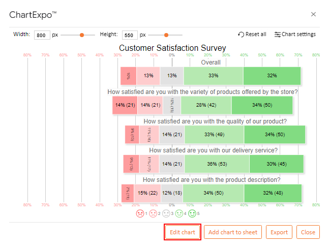
Are you looking for a simple and effective way to analyze Likert scale rating data?

Say goodbye to tedious analysis – ChartExpo is here to simplify the process.

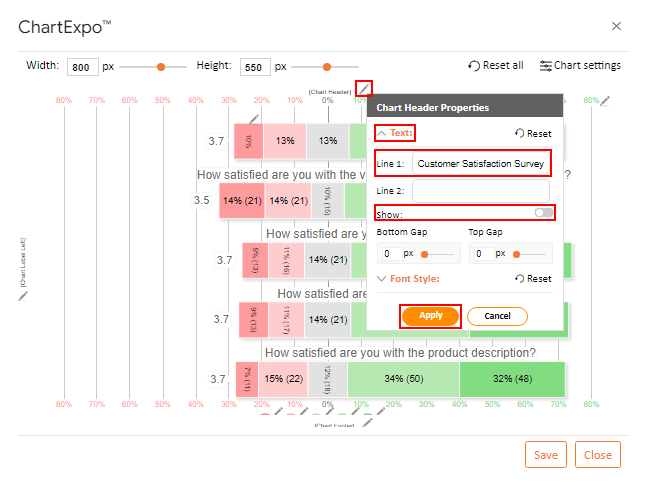
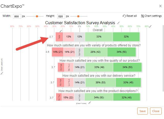
ChartExpo is the ultimate Google Sheets add-on for insightful visualizations and information design. With its intuitive interface, you can effortlessly create insightful charts and graphs in a snap. From dynamic bar charts to elegant stacked column charts, ChartExpo has got you covered.

Benefits of Using ChartExpo

  • ChartExpo visualizations are as diverse as the spice rack in a master chef’s kitchen. This allows you to handpick the perfect flavor for your data.
  • With ChartExpo’s user-friendly interface, even a tech-phobic individual can whip up appealing charts rivaling the works of Picasso. No complicated coding is involved.
  • ChartExpo’s customization options give you the power to dress up your visuals in any style you desire. From bold and vibrant to sleek and minimalist, your charts will be the talk of the town.
  • Don’t break the bank; choose ChartExpo and save those extra dollars for a fancy dinner. It has a free 7-day trial and a $10 monthly plan. You get more value than a bargain shopper on Black Friday.

How to Install ChartExpo in Google Sheets?

  1. To start using ChartExpo, download it directly from the Google Sheets program. To do this, select Extensions from the top toolbar.
  2. A menu will appear. Click the Get add-ons option.
  3. Search for ChartExpo, and click on Charts, Graphs & Visualizations by ChartExpo when it appears in the results.
  4. Click the Install button. You will have to confirm your Google account and accept some permissions.

ChartExpo charts are available both in Google Sheets and Microsoft Excel. Please use the following CTAs to install the tool of your choice and create amazing visualizations with a few clicks in your favorite tool.

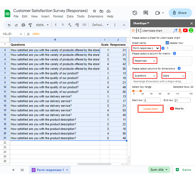
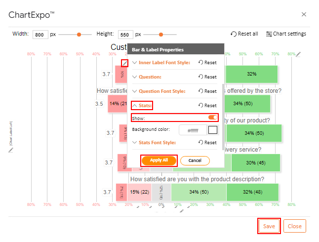
Map your textual scale with a numeric scale, as shown below.

    • Extremely Dissatisfied = 1
    • Dissatisfied = 2
    • Neutral = 3
    • Satisfied = 4
    • Extremely Satisfied = 5

This will transform your data into a format that will produce an insightful visual. The “Scale” column contains numeric scale data.

Questions Scale Responses
How satisfied are you with the variety of products offered by the store? 1 21
How satisfied are you with the variety of products offered by the store? 2 21
How satisfied are you with the variety of products offered by the store? 3 15
How satisfied are you with the variety of products offered by the store? 4 42
How satisfied are you with the variety of products offered by the store? 5 50
How satisfied are you with the quality of our product? 1 13
How satisfied are you with the quality of our product? 2 16
How satisfied are you with the quality of our product? 3 21
How satisfied are you with the quality of our product? 4 49
How satisfied are you with the quality of our product? 5 50
How satisfied are you with our delivery service? 1 13
How satisfied are you with our delivery service? 2 17
How satisfied are you with our delivery service? 3 21
How satisfied are you with our delivery service? 4 53
How satisfied are you with our delivery service? 5 45
How satisfied are you with the product description? 1 11
How satisfied are you with the product description? 2 22
How satisfied are you with the product description? 3 18
How satisfied are you with the product description? 4 50
How satisfied are you with the product description? 5 48

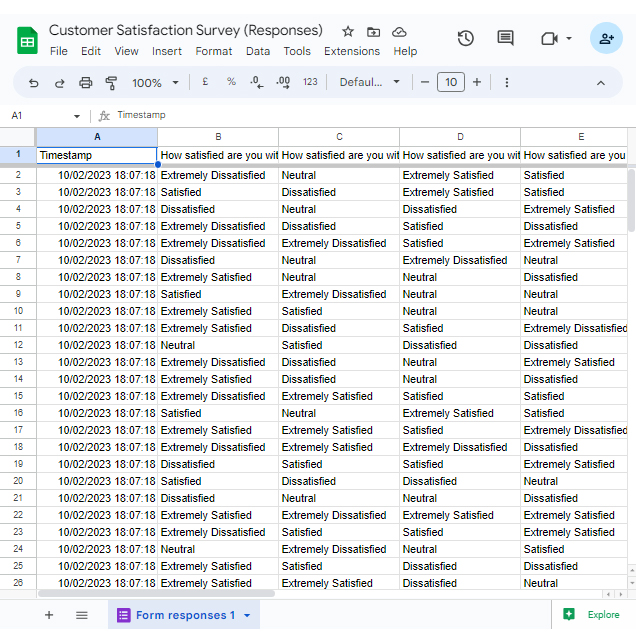
This table contains example data. Expect many responses and questions in real life.

  • To get started with ChartExpo, install ChartExpo in Google Sheets.
  • Go to Extensions > Charts, Graphs & Visualizations by ChartExpo > Open.
open chartexpo in google sheets
  • Click the “Add new chart” button to access the charts library.
add new chart in google sheets
  • Once ChartExpo is loaded, click on “Likert Scale Chart”.
Map Likert Responses to Numbers ce354
  • First of all, put your data table in the sheet. Select your Sheet name from the drop-down in the ChartExpo section.
  • Select the metrics column; metrics is the numeric column in your data sheet (in our example, we will add the Responses).
  • Select the dimension columns; dimension is the categorical column in your datasheet that contains text information (in our example, we will add the Questions & Scale).
  • Click the Create Chart button to complete the process.
select matrics for chart ce354
  • The Likert Scale Chart will look as below.
likert scale chart look ce354
  • If you want to have the title of the chart, click on Edit Chart, as shown in the above image.
  • To change the chart’s title, click on the pencil icon that is available next to Chart Header.
  • It will open the properties dialog. Under the Text section, you can add a heading in Line 1 and enable Show. Give the appropriate title of your chart and click on the Apply button.
Apply title on Chart ce354
  • Let’s hide the stats on each bar’s left corner.
Let hide stats on chart ce354
  • Click the highlighted pencil icon located at the top of the overall bars.
  • Expand the “Stats” properties and disable the “Show” option.
  • Click on the “Apply All” button.
  • Click the “Save” button to persist the changes.
Apply label on Chart ce354
  • The final chart will look as below.
final quantitative research design

Insights

  • 62% of customers are content with the store’s range of products. 28% expressed dissatisfaction, and 10% remained neutral.
  • 67% are satisfied with the quality of products, but 20% are dissatisfied.
  • Regarding delivery service, 66% are happy, but 20% expressed dissatisfaction.
  • 66% find the product descriptions satisfactory, while 21% disagree.
  • Overall:
    • 65% of respondents are satisfied with the store and its product, with 32% having a positive experience.
    • 23% expressed dissatisfaction.
    • 13% of customers neither feel satisfied nor dissatisfied with the store and its products.

FAQs

What are the 4 types of quantitative research design?

The four quantitative research designs are experimental, correlational, descriptive, and quasi-experimental. Experimental design involves manipulating variables, and correlational design examines relationships between variables. Moreover, descriptive design focuses on describing characteristics and quasi-experimental design functions without random assignment to groups.

What is quantitative research design with an example?

Quantitative research design involves collecting and analyzing numerical data to answer research questions. An example is surveying to measure customer satisfaction using a rating scale. Then, analyzing the data to determine overall satisfaction levels and identify trends or patterns.

How can I ensure the reliability and validity of quantitative research design?

To ensure reliability, use techniques like test-retest reliability or inter-rater reliability. Carefully define variables, use appropriate measurement scales, and employ established instruments or develop valid ones for validity.

Wrap Up

The art of quantitative research design unveils a systematic roadmap for collecting and deciphering numerical data. Its primary goal is to unlock the answers to research questions and put hypotheses to the ultimate test.

The meticulous selection of the most fitting methodology and tools allows you to unearth profound insights. Consequently, paves the way for decision-making grounded in solid evidence.

The four main quantitative research designs are experimental, correlational, descriptive, and quasi-experimental. They provide different approaches to address specific research objectives.

Each design has strengths and limitations, requiring careful consideration of the research goals and constraints.

The art of quantitative research design lies in its careful approach to gathering, analyzing, and interpreting data. It entails skillfully choosing the most appropriate data collection methods, be it surveys or experiments. Then, employing statistical techniques to unlock the hidden treasures and draw profound conclusions from the gathered information.

Integration of ChartExpo with quantitative research methodologies facilitates effective data analysis, interpretation, and communication of findings. ChartExpo enables you to effortlessly present complex numerical data in an accessible and visually appealing manner. No technicalities are involved.

How much did you enjoy this article?

GSAd2
Start Free Trial!
127591

Related articles

next previous
Google Sheets10 min read

Google Sheets Amortization Schedule with Clear Visuals

A Google Sheets Amortization Schedule tracks loan payments, interest, and balances. Learn how to create your schedule for better loan management.

Google Sheets11 min read

Google Sheet Profit and Loss Template for Financial Success

Google Sheet profit and loss template simplifies tracking income and expenses. Learn tips and steps for using this template for better financial management.

Google Sheets11 min read

Sales Tracking Spreadsheet for Better Insights

A Spreadsheet for Sales Tracking organizes data, tracks performance, and analyzes trends. This guide covers its benefits, templates, and visualization tips.

Google Sheets11 min read

How to Create a Chart in Google Sheets in Few Steps?

Learn step-by-step how to create a chart in Google Sheets to visualize your data clearly and effectively, even if you're a beginner.

Google Sheets14 min read

How to Use Google Spreadsheet for Insightful Results

Learn how to use Google Sheets for data management. You’ll discover tips on adding data, using formulas, creating charts, and more to streamline your work.

ChartExpo logo

Turn Data into Visual
Stories

CHARTEXPO

  • Home
  • Gallery
  • Videos
  • Services
  • Pricing
  • Contact us
  • FAQs
  • Privacy policy
  • Terms of Service
  • Sitemap

TOOLS

  • ChartExpo for Google Sheets
  • ChartExpo for Microsoft Excel
  • Power BI Custom Visuals by ChartExpo
  • Word Cloud

CATEGORIES

  • Bar Charts
  • Circle Graphs
  • Column Charts
  • Combo Charts
  • Comparison Charts
  • Line Graphs
  • PPC Charts
  • Sentiment Analysis Charts
  • Survey Charts

TOP CHARTS

  • Sankey Diagram
  • Likert Scale Chart
  • Comparison Bar Chart
  • Pareto Chart
  • Funnel Chart
  • Gauge Chart
  • Radar Chart
  • Radial Bar Chart
  • Sunburst Chart
  • see more
  • Scatter Plot Chart
  • CSAT Survey Bar Chart
  • CSAT Survey Chart
  • Dot Plot Chart
  • Double Bar Graph
  • Matrix Chart
  • Multi Axis Line Chart
  • Overlapping Bar Chart
  • Control Chart
  • Slope Chart
  • Clustered Bar Chart
  • Clustered Column Chart
  • Box and Whisker Plot
  • Tornado Chart
  • Waterfall Chart
  • Word Cloud
  • see less

RESOURCES

  • Blog
  • Resources
  • YouTube
SIGN UP FOR UPDATES

We wouldn't dream of spamming you or selling your info.

© 2025 ChartExpo, all rights reserved.