Categories
By ChartExpo Content Team
Prescriptive analytics is more than just a tool—it’s a game plan for success. It doesn’t stop at telling you what might happen; it gives you clear directions on what to do next. Whether you’re looking to cut costs, improve efficiency, or drive customer satisfaction, prescriptive analytics offers a roadmap. It’s about turning complex data into simple, actionable steps.
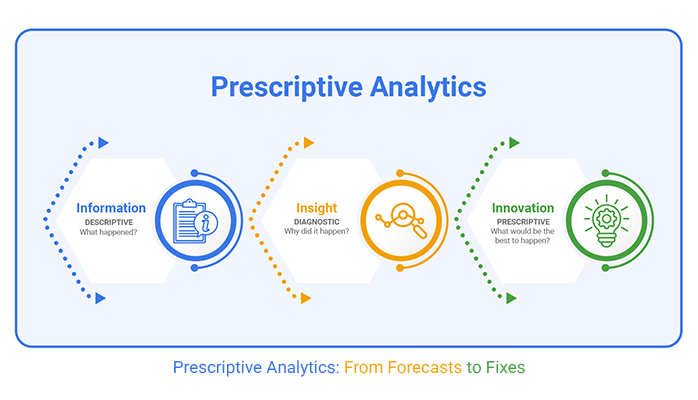
But it’s not all about predictions. Prescriptive analytics bridges the gap between knowing and acting. It empowers teams to make confident decisions, reduce risks, and drive results. In today’s fast-paced business world, those who can act on data fast and efficiently have the competitive edge.
The key to making prescriptive analytics work for you? Start by aligning it with your business goals. When done right, it becomes a powerful tool to not only forecast the future but also control it.
Let’s explore how it’s shaping the future of business strategy.
Predictive models are like weather forecasts—they tell you what might happen. But wouldn’t it be better if you also knew what to do about it? This is where prescriptive analytics steps in. It doesn’t stop at forecasts; it provides actionable steps. You’re not left wondering how to react to predictions. Instead, you get a clear plan of action.
Think of it as having both a crystal ball and a map. While predictive analytics shows potential futures, prescriptive analytics helps chart the course. It fills the gap, ensuring that you’re not just aware of possible outcomes but equipped to handle them. This combination turns uncertainty into opportunity.
| Actionable Frameworks for Solving Business Problems | ||
| Scenario/Goal | Prescriptive Analytics Model | Key Actionable Steps |
| Inventory Optimization | Inventory Management Model | Use demand forecasting, optimize stock levels |
| Fraud Detection | Risk Mitigation Model | Flag anomalies, enhance loan approval process |
| Resource Allocation | Resource Planning Model | Predict demand, allocate resources efficiently |
| Marketing Strategy | Marketing Attribution Model | Segment customers, optimize marketing spend |
| Customer Retention | Churn Prediction Model | Identify at-risk customers, develop retention strategies |
| Supply Chain Management | Logistics Optimization Model | Optimize routing, reduce delivery costs |
| Product Launch | Market Segmentation Model | Analyze market trends, tailor marketing messages |
| Operational Efficiency | Process Improvement Model | Identify bottlenecks, streamline operations |
| Pricing Strategy | Dynamic Pricing Model | Adjust prices based on demand and competitor prices |
| Financial Planning | Budget Forecasting Model | Predict financial outcomes, allocate resources effectively |
Ever felt paralyzed by choices? Prescriptive analytics cuts through the noise, spotlighting the best options. It’s like having a trusted advisor who’s always ready with data-backed insights. With this tool, decisions aren’t just guesses—they’re confident steps forward.
This confidence comes from a deep understanding of data and its implications. Prescriptive analytics sifts through mountains of information to find what truly matters. This clarity provides the assurance needed to make bold moves. Businesses can proceed with certainty, knowing their choices are grounded in solid evidence.
| The Role of Human Judgment and Data in Decision-Making | ||
| Decision Scenario | Role of Data-Driven Insights | Role of Human Judgment |
| Financial Risk Management | Predicts financial trends and offers risk mitigation options | Interprets context, understanding external factors |
| Operational Efficiency | Identifies inefficiencies and suggests process improvements | Assesses resource constraints and team dynamics |
| Marketing Campaign Optimization | Recommends target segments and campaign budget allocation | Evaluates brand tone and market nuances |
| Supply Chain Optimization | Uses data to identify bottlenecks and optimize flow | Judges unforeseen circumstances, like market shifts |
| Customer Retention | Identifies at-risk customers through churn prediction models | Balances emotional connection and customer loyalty factors |
| Product Pricing | Suggests pricing adjustments based on competitor analysis and demand | Considers brand positioning, market perception, and customer behavior |
| Healthcare | Provides predictive models for patient outcomes | Accounts for individual patient needs and external health conditions |
Let’s talk about results. Prescriptive analytics doesn’t just theorize; it delivers tangible outcomes. Imagine a company improving its supply chain, not because of luck, but because of precise insights. That’s the power of prescriptive analytics at work.
Real-world applications abound. From reducing costs to enhancing customer satisfaction, the impacts are clear. Businesses that harness this technology see measurable improvements. It’s like having a secret ingredient that consistently elevates performance. The difference is not in the tools themselves but in the results they produce.
| Stages in Implementing Data-Driven Solutions | ||
| Stage | Description | Key Actionable Steps |
| Data Collection | Gathering relevant data from various sources | Cleanse, validate, and aggregate data |
| Data Analysis | Analyzing data to identify trends and patterns | Use statistical models, machine learning |
| Solution Generation | Generating potential solutions based on analysis | Develop optimization models, scenario simulations |
| Decision-Making Support | Providing actionable insights to decision-makers | Visualize recommendations, prioritize actions |
| Monitoring and Evaluation | Tracking the effectiveness of decisions over time | Continuous feedback, refine models |
| Model Testing | Testing models under different scenarios | Simulate real-world conditions, validate assumptions |
| Stakeholder Buy-In | Engaging decision-makers to adopt the model | Present clear business benefits, build trust |
| Implementation | Putting the model into practice | Deploy model, integrate with business processes |
| Continuous Improvement | Ongoing monitoring and enhancement | Track performance, refine the model based on new data |
Many analytics models look great on paper but fall flat in real life. Why? They often lack a connection to real-world applications. Models can be too complex or not aligned with business goals. This disconnect makes them less useful for decision-making. It’s like having a detailed map but no idea where you want to go. Without clear direction, even the best models can miss the mark.
Another reason models fail is a lack of trust. Stakeholders might not buy into the model’s recommendations. If the insights don’t align with their understanding, they might ignore them. This lack of faith can stall progress. Getting everyone on the same page is key. It’s like a team sport. Everyone needs to work together for the win.
| Common Pitfalls and How to Overcome Them | ||
| Pitfall | Description | Solution/Preventive Measure |
| Poor Data Quality | Models may fail due to inaccurate or incomplete data | Regular data cleansing, accurate data collection |
| Overcomplexity | Too many variables complicating the model’s usability | Focus on key variables, simplify models where possible |
| Lack of Stakeholder Buy-In | Resistance from decision-makers can hinder model implementation | Involve stakeholders early, demonstrate benefits |
| Misaligned Objectives | Prescriptive models may not align with business goals | Align model goals with business strategy, set clear objectives |
| Inadequate Data Integration | Data from various sources may not be properly integrated | Ensure proper data integration and standardization across systems |
| Ignoring External Factors | External variables may not be considered in the model | Incorporate external factors and scenarios for more accurate predictions |
| Over-Reliance on Automation | Too much reliance on automated recommendations without human oversight | Include human judgment and expertise to validate automated recommendations |
| Lack of Flexibility | Models may not adapt well to changing conditions | Ensure models are flexible and can be updated based on new data or changing conditions |
| Insufficient Testing | Inadequate testing may lead to unforeseen issues | Thoroughly test models in different scenarios before deployment |
| Failure to Monitor and Update | Models may become outdated over time | Regularly monitor model performance and update with new data and insights |
Getting everyone on board is crucial before rolling out a new model. Start by showing how the model aligns with the company’s goals. This step builds confidence and ensures everyone understands the value. It’s like having a shared vision that everyone can rally around. Clear communication is vital. Explain the model’s purpose and how it benefits the business.
Involve stakeholders early in the process. This involvement fosters ownership and trust. When people feel included, they’re more likely to support the project. Think of it as building a house. Everyone needs to agree on the blueprint. When stakeholders see their input reflected in the model, they’re more invested in its success.
The magic of prescriptive analytics lies in its ability to turn raw data into clear actions. It’s not enough to have mountains of data. The real value comes from translating that data into decisions. A Scatter plot can help reveal key patterns that guide those decisions. Think of prescriptive analytics as a GPS for your business. It tells you not just where you are but where to go next, with clear, actionable outputs that make the path to success easy to follow.
Designing these outputs requires a clear understanding of business needs. The outputs should be simple and direct. They should provide clear guidance on the next steps. Like a well-written recipe, they should leave no room for confusion. When done right, these outputs empower decision-makers to act confidently and effectively.
Target faced a challenge with stocking its shelves. They needed a way to predict what products to stock and when. Enter prescriptive analytics. By analyzing sales data and customer trends, Target found the sweet spot for inventory levels. This approach helped reduce waste and keep shelves stocked with what customers wanted. It’s like having a crystal ball for retail.
The results were impressive. Target not only improved efficiency but also boosted customer satisfaction. When customers find what they want, they’re more likely to return. This example shows the power of turning insights into action. It’s about making data work for you, not the other way around.
| Real-World Applications Across Industries | ||
| Industry | Example of Application | Outcome/Benefit |
| Retail | Optimizing inventory and pricing strategies | Reduced waste, improved customer satisfaction |
| Healthcare | Resource allocation in hospitals and clinics | Improved patient outcomes, reduced wait times |
| Finance | Fraud detection in financial transactions | Reduced fraud, faster loan processing |
| Manufacturing | Production scheduling and equipment maintenance | Reduced downtime, improved throughput |
| Logistics & Supply Chain | Optimizing delivery routes and fleet management | Reduced fuel costs, improved delivery efficiency |
| Marketing | Customer segmentation for targeted campaigns | Increased conversion rates, improved ROI |
| Energy | Predictive maintenance for power plants | Reduced equipment failures, lowered maintenance costs |
| Transportation | Optimizing fleet routes and maintenance schedules | Reduced operational costs, enhanced efficiency |
| Hospitality | Dynamic pricing for hotel rooms | Maximized revenue, improved occupancy rates |
| Telecommunications | Churn prediction and customer retention strategies | Increased customer retention, reduced churn |
A gauge chart is a powerful tool for visualizing decision confidence. It’s like a speedometer for your data, showing how sure you are about a decision. This visual cue helps decision-makers understand the level of confidence in the recommendations. It’s a quick, at-a-glance way to gauge certainty.
These charts can make complex data more digestible. They offer a clear picture of where things stand. By providing a visual reference, they help bridge the gap between raw data and actionable insights. It’s like having a dashboard for your business, guiding you to make informed decisions with ease.
The following video will help you create the Guage Chart in Microsoft Excel.
The following video will help you to create the Guage Chart in Google Sheets.
Starting with the right problem is like picking the best seed for your garden. It sets the stage for everything that follows. Misidentify the problem, and any solution is bound to miss the mark. Imagine you’re planning a road trip but enter the wrong destination in your GPS. You won’t end up where you want to be. That’s why it’s vital to pinpoint the exact challenge you’re facing.
Once you’ve nailed down the problem, the next step is to get everyone on the same page. This involves talking to stakeholders and understanding their viewpoints. Each perspective adds a piece to the puzzle. This collective insight helps in crafting a solution that addresses everyone’s concerns. It’s like assembling a jigsaw—every piece matters, and together, they form a clear picture.
| Key Elements of Models | ||
| Model/Use Case | Key Inputs | Key Outputs |
| Resource Allocation | Demand forecasts, resource availability | Optimized staff scheduling, inventory levels |
| Fraud Detection | Transaction data, customer behavior patterns | Fraud risk score, alert triggers |
| Marketing Campaign Optimization | Customer demographics, campaign data | Optimal spend, customer segment targeting |
| Supply Chain Optimization | Logistics data, inventory levels | Optimized delivery routes, reduced costs |
| Product Pricing | Market trends, competitor prices | Dynamic pricing adjustments, pricing strategy recommendations |
| Operational Efficiency | Process data, performance metrics | Streamlined operations, reduced bottlenecks |
| Customer Retention | Customer history, engagement data | Customer retention strategies, loyalty program recommendations |
| Financial Planning | Historical financial data, market conditions | Budget forecasts, financial resource allocation |
| Churn Prediction | Customer behavior data, transaction history | Churn probability score, retention campaign targeting |
| Risk Management | Historical data, market trends, risk factors | Risk mitigation strategies, contingency plans |
Constraints and assumptions in a model are like the rules of a board game. They guide how you play and what you can achieve. Ignoring them might lead to unexpected outcomes. Recognizing these limitations helps you adjust your strategy and avoid pitfalls.
Assumptions are the lenses through which you view your problem. They can color your perception, so it’s crucial to question them. Ask yourself if they hold true in every scenario. This critical thinking ensures your model remains flexible and reliable. Adjusting these assumptions helps in crafting a more resilient solution, ready to tackle real-world challenges.
Change can feel like a stormy sea. Resistance often arises from fear or misunderstanding. To weather this storm, focus on communication and education. Explain the benefits and address concerns head-on. This transparency helps build trust and eases the transition.
Maintaining model integrity is equally important. Don’t bend the model to fit everyone’s whims. Instead, stand firm on the core principles. Think of it as building a sturdy bridge. It must bear weight without crumbling. By balancing flexibility with steadfastness, you create a solution that’s both adaptable and reliable.
Kaiser Permanente faced the challenge of resource allocation. They needed to ensure patients received timely care without overwhelming staff. By using prescriptive analytics, they found a way to balance these needs. It was like juggling—keeping many balls in the air without dropping any.
Their approach involved analyzing data to predict patient flow. This allowed them to allocate resources efficiently, ensuring patients got the care they needed. The result? Improved patient outcomes and happier staff. It’s a testament to the power of data-driven decision-making. When done right, it can transform complex challenges into manageable tasks.
Even the most advanced models can stumble when faced with real-world challenges. One reason is the unpredictable nature of human behavior. Models can be based on historical data, but they may not account for sudden shifts or unique scenarios. This gap between theory and practice can lead to decisions that miss the mark.
Additionally, data quality and biases can hamper model effectiveness. Incomplete or skewed data can lead to incorrect predictions, causing models to fail in providing accurate recommendations. This emphasizes the need for continuous monitoring and updating of models to better align with real-world conditions, ensuring they remain relevant and effective.
Trust is the cornerstone of successful analytics implementation. Without buy-in from stakeholders, even the most sophisticated models can gather dust. Engaging teams early in the process helps demystify the model’s purpose and potential benefits. By involving them from the start, you create a sense of ownership and understanding.
To secure trust, transparency is key. Explain how the model works and highlight its track record of success. Provide clear examples of how it can improve outcomes and streamline processes. When teams see the tangible benefits, they’re more likely to embrace the model and integrate its insights into their daily routines.
Transforming data into actionable steps is like turning a roadmap into a journey. Raw data, while valuable, often needs translation into practical advice. This step is where analytics shine, providing clear recommendations that guide decision-makers toward the best course of action.
Actionable outputs must be clear and concise, leaving no room for ambiguity. They should align with business goals and be easily understood by all stakeholders. When outputs are tailored to meet specific needs, they not only guide decisions but empower teams to act swiftly and confidently.
Capital One faced a challenge: reducing fraud risk without slowing down loan approvals. They turned to analytics for a solution. By analyzing patterns and identifying anomalies, they crafted a model that flagged potential fraud cases with high accuracy. This allowed them to act quickly, reducing losses while maintaining customer trust.
At the same time, the model streamlined loan approvals. By automating parts of the process, Capital One could handle applications more efficiently. This dual benefit—faster approvals and reduced fraud—highlighted the power of analytics to solve complex business problems.
Decision bottlenecks can slow down progress and frustrate teams. A funnel chart is a visual tool that helps identify where these bottlenecks occur. By mapping out each step in a process, you can see where delays happen and why. This insight allows teams to address issues and streamline workflows.
Once bottlenecks are identified, solutions can be implemented. Whether it’s reallocating resources or simplifying steps, the goal is to keep the process flowing smoothly. With a clear view of the decision path, teams can act more efficiently, reducing delays and increasing overall productivity.
Data is a powerful ally, but it shouldn’t replace human wisdom. People have instincts and insights that no machine can replicate. Analytics should enhance decision-making, not take it over. It provides evidence and suggestions, but the final call rests with people. This ensures that decisions are balanced and consider both numbers and human nuances.
Think of it as a collaboration. Machines crunch numbers and humans interpret them, adding context and understanding. This teamwork leads to decisions that are more grounded and realistic. People can question, challenge, and refine machine suggestions, ensuring choices align with broader goals and ethical considerations.
Sometimes, data can see what the human eye cannot. In scenarios where patterns are complex, analytics can offer insights that might be missed. It’s valuable in environments with clear rules and outcomes, where emotions or biases might cloud judgment. In these cases, trusting data-driven advice can lead to better results.
However, this doesn’t mean humans step back. Instead, they use data as a strong reference point. When analytics consistently align with the desired outcomes, it builds trust. Over time, this trust grows, making it easier to rely on data when necessary, without sidelining human intuition.
Override logic allows humans to step in when machines go astray. It’s like having a manual control for an automatic car. This ensures that analytics remain a tool, not a dictator. People can correct or adjust recommendations based on real-world knowledge or unexpected changes.
Incorporating this feature keeps systems flexible. It acknowledges that while algorithms can predict much, they can’t foresee everything. By allowing for human intervention, businesses can maintain control and adaptability, ensuring decisions remain relevant and effective.
Lufthansa faced a challenge. How to use data-driven systems without losing the human touch? They solved it by implementing override protocols. This meant that while automation helped in scheduling and planning, humans could override when needed.
This balance ensured efficiency without compromising on passenger experience. When unusual situations arose, human judgment took precedence. This approach not only improved operations but also maintained trust in both technology and human expertise.
Visualizing the balance between machine logic and human judgment can be enlightening. A multi-axis spider chart can show how each aspect contributes to the decision-making process. It highlights areas where machines excel, like data processing, and where humans shine, like empathy and creativity.
This chart serves as a reminder of the importance of balance. It ensures that neither side dominates, creating a harmonious decision-making ecosystem. By seeing how each part plays a role, businesses can adjust their strategies to maintain this equilibrium, optimizing both machine and human contributions.
Modeling for the entire system is like planning for a whole city, not just a single building. It involves creating scenarios that consider all aspects. This helps in predicting outcomes that benefit everyone involved. The goal is to look beyond immediate gains.
Local wins can be tempting. However, they might lead to issues elsewhere. By focusing on the whole system, one can create models that deliver consistent results. This ensures that the benefits are widespread, not confined to a single area.
Small wins can sometimes hide bigger problems. It’s like patching a leaky roof without checking the foundation. These quick fixes might seem helpful but can lead to failure. They often neglect long-term stability for short-term success.
Avoiding systemic risks requires a comprehensive view. It involves recognizing when small victories could lead to bigger challenges. By understanding potential risks, one can plan better strategies. This approach helps in building a robust and reliable system.
Building resilience is about preparing for the unexpected. It’s like having a backup plan for your backup plan. This means using data to predict and respond to changes. Being ready helps in maintaining stability and performance during disruptions.
Prescriptive analytics offers insights that strengthen systems. By analyzing data, one can identify weaknesses and opportunities. This proactive approach equips organizations to handle challenges. It ensures they remain agile and responsive in a fast-paced environment.
Verizon faced challenges in reducing build times. They used prescriptive analytics to find solutions. This approach helped them identify bottlenecks that slowed progress. By addressing these areas, they improved efficiency significantly.
The result was a 30% reduction in build times. This achievement wasn’t by chance. It was through detailed analysis and strategic planning. Verizon’s example shows the power of data-driven decision-making. It highlights how targeted efforts can lead to substantial improvements.
A tree map is a tool that shows how decisions affect the whole system. It’s like a map that reveals hidden paths and connections. This visualization helps in understanding where changes occur and what they influence.
Using a tree map, one can see the ripple effects of decisions. It provides clarity on how elements interconnect. This insight aids in making informed choices. It ensures that actions taken will support overall objectives, not just isolated parts.
Return on Investment (ROI) is a classic metric, but it can be a bit short-sighted. Imagine you’re tracking the performance of a new marketing campaign. ROI might tell you about immediate returns, but what about brand loyalty or customer satisfaction? These are long-term impacts that can be game-changers.
To measure real impact, look beyond immediate gains. Consider metrics that reflect customer experience and engagement. These metrics offer a deeper understanding of how your business resonates with its audience. It’s like watching a movie and appreciating the story, not just the box office numbers.
Imagine a rowing team where each member rows at their own pace. Chaos, right? The same happens when teams in a business don’t align their metrics. Everyone needs to pull in the same direction. This is where prescriptive analytics helps. It aligns team goals with company objectives, ensuring everyone rows in sync.
Having unified metrics fosters collaboration. Team members understand how their efforts contribute to the bigger picture. It’s like being part of an orchestra where each instrument plays a role in creating beautiful music. When metrics align, harmony follows, and goals are achieved more efficiently.
It’s tempting to chase after short-term wins. They’re like candies—sweet but fleeting. But businesses also need to think long-term. Prescriptive analytics helps maintain this balance by highlighting immediate opportunities without losing sight of future goals.
Consider short-term wins as stepping stones towards a larger journey. They’re important, but they shouldn’t overshadow long-term objectives. It’s like building a house; each brick is significant, but it’s the entire structure you’re aiming for. Balancing these aspects ensures sustainable growth and a clear path forward.
Nestlé, the giant in the food industry, faced challenges in production scheduling. Guesswork led to inefficiencies. Enter prescriptive analytics. It offered precise insights, allowing Nestlé to optimize its processes. They could better predict demand and adjust their production schedules accordingly.
This approach reduced waste and improved efficiency. Imagine a chef knowing exactly how much of each ingredient to prepare, minimizing leftovers while maximizing deliciousness. Nestlé’s story shows how this tool can transform operations, making processes smoother and more effective.
(Risk-Proofing Your Model)
Picture a crash test dummy in a car. It undergoes stress tests to ensure safety in real-world conditions. Similarly, testing models against various scenarios helps verify their reliability. By simulating different situations, you can see how the model reacts under pressure. This approach reveals weaknesses and provides insights into areas for improvement.
Stress testing exposes a model’s limits. It’s like finding out how your new smartphone holds up when dropped. By knowing its breaking point, you can take steps to protect it. This process can save time and money by highlighting issues before they become significant problems. It’s a proactive approach to model management, ensuring that the model can withstand whatever comes its way.
In decision-making, timing is everything. Imagine a captain deciding whether to change course in a storm. Sometimes sticking to the plan makes sense; other times, a change is necessary. Prescriptive analytics helps in determining the best path forward by analyzing data and predicting outcomes. It offers insights into when a change might lead to better results.
Consider a tightrope walker. Balancing requires knowing when to shift weight and when to hold steady. In business, the same principle applies. Knowing when to pivot can mean the difference between success and failure. With data-driven insights, decisions become less about gut feeling and more about informed choices, offering a clearer path to achieving goals.
Being too cautious can be as risky as taking bold steps. Think of a turtle staying in its shell too long; it misses opportunities outside. Risk-averse models tend to limit potential by focusing too much on avoiding loss. This approach might seem safe, but it can prevent growth and innovation.
Balance is essential. Like a bird learning to fly, taking calculated risks can lead to new heights. By using data to assess risks and rewards, you can find a middle ground. This balance allows for progress without unnecessary exposure to risk. Models should enable exploration of new opportunities while maintaining a safety net.
Shell, the energy giant, faced challenges in managing risk while responding quickly to market changes. They used prescriptive analytics to analyze vast amounts of data. This approach allowed them to identify trends and predict future market conditions. By doing so, Shell could make informed decisions quickly and efficiently.
This method helped Shell reduce risk exposure without slowing down. Picture a race car driver who knows when to speed up and when to brake. Shell’s data-driven strategy allowed them to maintain momentum while staying safe. The result was a balanced approach that increased their ability to respond to market demands while minimizing potential pitfalls.
A waterfall chart is a visual tool that helps break down data into understandable sections. Imagine a cascading waterfall breaking down into smaller streams. This chart shows how various factors contribute to the overall risk. It’s a way to see the big picture while focusing on individual elements.
By using a Waterfall chart, you can pinpoint areas where mistakes are likely to occur. It’s like having a map that highlights dangerous curves on a road. With this insight, you can plan to avoid these pitfalls. This tool helps make data more accessible and actionable, leading to better decision-making and fewer costly errors.
CEOs live in a world of results. They care about the bottom line, not the calculations that get them there. So when discussing analytics, highlight tangible successes. Show how it boosts revenue or cuts costs. These clear outcomes resonate with decision-makers.
Keep the complex math in the background. Use plain language to explain how analytics addresses business challenges. When CEOs see direct benefits, they’ll become advocates. Their focus is on what works, not how it works.
Attention spans are short. You’ve got two slides to make your case. Start with a compelling problem that your audience faces. Then, on the next slide, present the solution. Show the before and after using analytics.
Keep visuals clean and data concise. Use graphics to highlight key points. Don’t clutter slides with too much info. Simplicity wins. If your audience can grasp the value quickly, they’re more likely to be interested.
Prescriptive analytics isn’t an academic exercise. It’s a tool to solve real issues. Highlight specific business problems it addresses. Demonstrate how it improves decision-making and boosts profits.
Share case studies. These stories show the practical benefits and the return on investment. Use numbers to back up claims, but keep them simple. When stakeholders see clear, quantifiable results, they’re more likely to support the initiative.
Walmart faced a challenge: balancing volume and margin across thousands of products. They used analytics to find the sweet spot. This approach led to smarter pricing and increased profitability.
Walmart’s story is a testament to the power of analytics. It’s not about having data; it’s about using it effectively to drive results. This example shows how analytics can tackle complex business challenges and deliver measurable outcomes.
Prescriptive analytics is not just about predictions; it’s about action. By providing clear recommendations based on data, it helps businesses make smarter, more confident decisions. This isn’t about guessing—it’s about understanding what to do next and why.
Incorporating prescriptive analytics into your decision-making process can reduce risks, optimize operations, and drive tangible results. From supply chain improvements to marketing strategies, the applications are vast and varied. The real power lies in turning data into a guide that can navigate complex challenges and simplify decision-making.
So, what’s stopping you? The next time you face a tough decision, ask yourself how prescriptive analytics can help you take control and make the best choice. Make data work for you.
How much did you enjoy this article?


Calculate accounts receivable turnover ratio to measure credit collection speed, improve cash flow, and strengthen your financial strategy. Read on!

Change Management KPIs are the key to tracking adoption, performance, and ROI during transitions. Find out which metrics matter. Read on!

Data collection methods and techniques determine the quality of every insight you act on. Explore key approaches for gathering reliable data. Read on!


