Categories
Evaluating employee performance accurately is essential for improving both individual and organizational success. However, traditional performance reviews often rely on subjective judgments, which can lead to inconsistent and biased evaluations.
This is where a 5-point performance rating scale becomes valuable. It provides a structured and standardized way to assess performance, ensuring fair, consistent, and measurable results across teams.
With increasing organizational complexity, businesses need reliable methods to evaluate employees based on clear criteria rather than personal opinion. A well-defined rating scale helps simplify this process and improves decision-making in areas like promotions, compensation, and performance management.
In this guide, you’ll learn what a five-point performance rating scale example is, see practical examples, and understand how to use it effectively to create a fair and data-driven evaluation system.
Definition: A 5-point performance rating scale is a structured method used to evaluate employee performance on a scale of 1 to 5, where 1 represents the lowest level of performance, and 5 represents the highest.
It provides a consistent framework for assessing performance based on clearly defined criteria.
This approach helps organizations measure employee contributions, deliver fair feedback, and support performance improvement in a standardized way.
Here’s a more detailed breakdown:
The 5-point performance rating scale plays a key role in performance management by providing a simple and structured way to evaluate employees. Here’s why it is widely used:
When using the 5-point performance rating scale examples, it’s important to apply them thoughtfully to ensure fair and accurate evaluations. Here are the key factors to consider:
The 5-point performance rating scale is widely used for evaluating individual and team performance. Its structured approach, simplicity, and clarity make it a preferred choice for organizations. Key advantages include:
The standard 5-point performance rating scale examples typically look like this:
Here are some real-life examples from organizations and institutions:
Although Google now uses a more complex feedback system, its earlier performance scale resembled:
Before moving to continuous feedback, Adobe used:
Many academic institutions apply a similar framework for faculty performance:
The 5-point performance rating scale is versatile and can be applied in various scenarios to ensure fair and consistent evaluations. Here are the top situations to use it:
| Feature / Aspect | 5 Point Performance Rating Scale | 3 Point Performance Rating Scale |
| Number of Levels | Five levels: 1 (Lowest) to 5 (Highest) | Three levels: 1 (Low), 2 (Medium), 3 (High) |
| Granularity | High – Allows finer distinctions between performance levels | Low – Broad categories; less precise differentiation |
| Accuracy in Evaluation | More accurate; highlights subtle differences between employees | Less accurate; many employees may fall into the middle category |
| Feedback Potential | Enables specific, actionable feedback for improvement and development | Limited feedback; harder to identify areas for growth |
| Ease of Use | Slightly more complex, requires clear definitions for each level | Very simple and quick to use; easy for small teams |
| Best Suited For | Medium to large organizations with complex roles | Small teams or simple roles needing quick assessments |
| Differentiation of Performance | Strong – can separate average, above-average, and exceptional performers | Moderate – only basic differentiation is possible |
Creating a 5-point performance rating scale ensures fair, consistent, and actionable evaluations. Follow these steps:
Assign a specific meaning to every rating to avoid confusion:
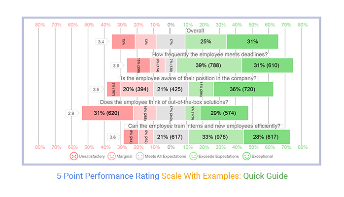
Analyzing a 5-point performance rating scale helps uncover trends, strengths, and areas for improvement. Follow these steps:

Ensure every score has a precise meaning to avoid confusion. For example:
Clear definitions help managers rate objectively, and employees understand expectations.
While the five-point performance scale is widely used, some organizations prefer other methods for performance evaluation:
Consistency in evaluations is a cornerstone of any effective performance management system. When managers apply the same criteria, like the 5-point performance rating scale, ratings become fair, objective, and comparable across teams.
Consistent evaluations build trust, improve employee buy-in, and drive better results. In contrast, inconsistent ratings can be perceived as unfair, lowering motivation and overall performance.
The five-point performance rating scale is a reliable tool for assessing employee contributions and aligning performance with organizational goals. Conducting evaluations transparently further strengthens credibility and engagement.
For organizations looking to analyze performance data quickly and effectively, the survey chart tools available in ChartExpo provide clear, actionable insights at a glance.
Related Article
How much did you enjoy this article?


Google Forms to Google Sheets keeps your data organized and current with every submission. Learn the steps, methods, and tips now!

Product survey questions reveal what customers truly think. Learn how to ask the right ones and act on the survey results. Read on!

Fun Survey Questions can raise response rates, reveal patterns, and guide survey planning across teams, classrooms, and customer research. Read on!