• Home
  • Tools dropdown img
    • Spreadsheet Charts

      • ChartExpo for Google Sheets
      • ChartExpo for Microsoft Excel
    • Power BI Charts

      • Power BI Custom Visuals by ChartExpo
    • Word Cloud

  • Charts dropdown img
    • Chart Category

      • Bar Charts
      • Circle Graphs
      • Column Charts
      • Combo Charts
      • Comparison Charts
      • Line Graphs
      • PPC Charts
      • Sentiment Analysis Charts
      • Survey Charts
    • Chart Type

      • Box and Whisker Plot
      • Clustered Bar Chart
      • Clustered Column Chart
      • Comparison Bar Chart
      • Control Chart
      • CSAT Survey Bar Chart
      • CSAT Survey Chart
      • Dot Plot Chart
      • Double Bar Graph
      • Funnel Chart
      • Gauge Chart
      • Likert Scale Chart
      • Matrix Chart
      • Multi Axis Line Chart
      • Overlapping Bar Chart
      • Pareto Chart
      • Radar Chart
      • Radial Bar Chart
      • Sankey Diagram
      • Scatter Plot Chart
      • Slope Chart
      • Sunburst Chart
      • Tornado Chart
      • Waterfall Chart
      • Word Cloud
    • Google Sheets
      Microsoft Excel
  • Services
  • Pricing
  • Contact us
  • Blog
  • Support dropdown img
      • Gallery
      • Videos
      • Contact us
      • FAQs
      • Resources
    • Please feel free to contact us

      atsupport@chartexpo.com

Categories
All Data Visualizations Data Analytics Surveys
Add-ons/
  • Google Sheets
  • Microsoft Excel
  • Power BI
All Data Visualizations Data Analytics Surveys
Add-ons
  • Google Sheets
  • Microsoft Excel
  • Power BI

We use cookies

This website uses cookies to provide better user experience and user's session management.
By continuing visiting this website you consent the use of these cookies.

Ok

ChartExpo Survey


Home > Blog > Microsoft Excel

Microsoft Survey Tools Unleashed: Revolutionize Insights

Step into the world of survey empowerment with the versatile suite of “Microsoft Survey Tools”. In the realm of data collection, these tools stand as confident allies, providing a seamless and efficient platform for crafting surveys that go beyond questions to unveil meaningful insights.

Microsoft Survey Tools

This article is your guide to harnessing the capabilities of Microsoft Survey Tools, where confidence meets convenience in the quest for valuable information.

Bid farewell to survey creation complexities and embrace a world where Microsoft’s toolkit becomes your trusted companion, ensuring that every survey is not just a task but a confident stride toward understanding and engaging your audience effectively.

Table of Contents:

  1. Define Microsoft Survey Tools
  2. Best Microsoft Survey Tools
  3. How to Use Microsoft Survey Tools?
  4. Examining Microsoft Survey Results
  5. Benefits of Using Microsoft Survey Tool
  6. Wrap Up

Define Microsoft Survey Tools

Microsoft provides several survey and form-creation tools that users can leverage to gather information, feedback, and responses.

Microsoft Survey is a flexible internet-based instrument for making and directing reviews to assemble significant data from members. It has an easy-to-understand point of interaction and offers different inquiry types and customization choices to make review creation a breeze.

From customer feedback to market research, Microsoft Survey is a go-to for data collection. Once responses are in, the tool assists in data analysis, enabling insights for better decision-making. Therefore, it simplifies survey data collection and supports business growth through informed decisions based on the gathered insights.

Best Microsoft Survey Tools

Here are some of the Microsoft survey tools:

  1. Microsoft Forms:

Microsoft Forms is a user-friendly survey tool that allows users to create surveys, quizzes, and polls. It is available as part of the Microsoft 365 suite, and users can access it through their Microsoft accounts.

Key Features:

  • Easy-to-use interface for creating surveys and forms.
  • Various question types, including multiple-choice, text, and rating scales.
  • Integration with Microsoft Excel for data analysis and visualization.
  • Real-time response tracking and analytics.
  1. Microsoft SharePoint Survey:

SharePoint, a collaboration platform by Microsoft, includes a survey feature that enables users to create surveys within SharePoint sites. Users can design surveys, collect responses, and analyze results directly within the SharePoint environment.

Key Features:

  • Survey creation and management within SharePoint sites.
  • Customizable survey design and layout.
  • Integration with SharePoint lists and libraries.
  • Basic reporting and analytics.
  1. Microsoft Power Automate (formerly Flow):

Microsoft Power Automate allows users to automate workflows and processes, including the creation and distribution of surveys. While it’s not a survey tool per se, it can be integrated with other survey platforms for workflow automation.

Key Features:

  • Automation of survey-related processes.
  • Integration with various apps and services.
  • Conditional logic and triggers based on survey responses.
  1. Microsoft Dynamics 365 Customer Voice:

Microsoft Dynamics 365 Customer Voice is an enterprise-grade feedback management solution that enables organizations to create and distribute surveys to gather customer feedback. It is part of the broader Dynamics 365 suite.

Key Features:

  • Advanced survey customization.
  • Integration with other Dynamics 365 applications.
  • In-depth analytics and reporting.
  • Customer journey mapping.

How to Use Microsoft Survey Tools?

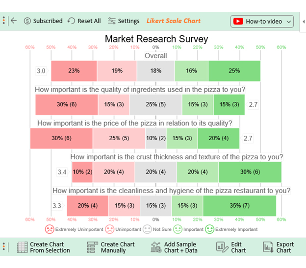
Let’s say you want to launch a pizza shop in the market. This requires you to direct a study to comprehend what clients need. Assume your survey consists of the following questions:

  • How important is the quality of ingredients used in the pizza to you?
  • How important is the price of the pizza to its quality?
  • How important is the crust thickness and texture of the pizza to you?
  • How important is the cleanliness of the pizza restaurant to you?

You want your respondents to provide an answer to each question using the response scale below:

  • Extremely Unimportant
  • Unimportant
  • Not Sure
  • Important
  • Extremely Important

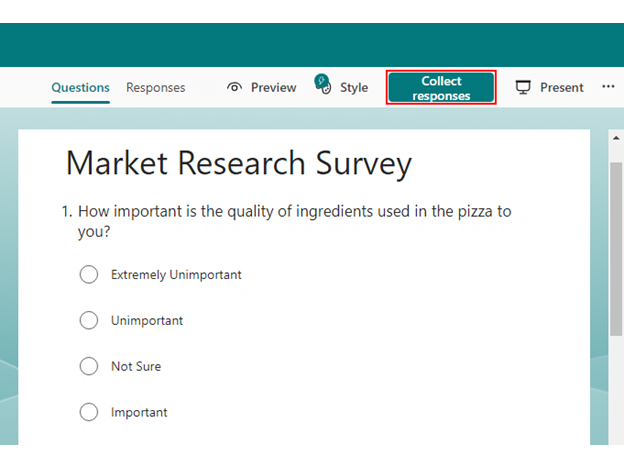
Follow the steps below to create a survey using Microsoft Forms.

  • Log in to Microsoft Forms using your Microsoft account.
  • Open Microsoft Forms and click the “New Form” button to load the survey form template.
survey in microsoft forms 1 ce423
  • Click on “Add question now” and “Collect responses”.
survey in microsoft survey tools
  • Click the Send button to share your form with the intended audience.
survey in microsoft survey tools
  • Once you collect enough responses, click the “Open in Excel” button.
survey in microsoft survey tools

Examining Microsoft Survey Results

Excel, oh Excel, is the mighty spreadsheet tool that has saved us from countless data disasters. But alas, even Excel can stumble and fumble regarding data visualization. It sometimes feels like a one-trick pony desperately trying to pull off a magic show.

Fear not, for ChartExpo is here to save the day! Its magic touch lets you transform your Microsoft survey forms data into appealing, insightful charts. Bid farewell to Excel’s charting limitations and say hello to charts practically dancing off the screen.

Benefits of Using ChartExpo

  • ChartExpo offers various visualization options, giving you the power to handpick the perfect one for your data. This turbocharges your data analysis and presentation, ensuring maximum impact.
  • ChartExpo flaunts a user-friendly interface that effortlessly conjures up insightful visualizations. You don’t need to be a coding wizard to whip up appealing, insightful charts.
  • ChartExpo’s customization options allow you to unleash creativity and create visual masterpieces. You can customize your visuals to your heart’s content with colors, fonts, and styles, making them uniquely yours.
  • ChartExpo is a bang for your buck. It offers value through a free 7-day trial and a wallet-friendly $10 monthly plan.

How to Install ChartExpo in Excel?

  1. Open your Excel application.
  2. Open the worksheet and click the “Insert” menu.
  3. You’ll see the “My Apps” option.
  4. In the office Add-ins window, click “Store” and search for ChartExpo on my Apps Store.
  5. Click the “Add” button to install ChartExpo in your Excel.

ChartExpo charts are available both in Google Sheets and Microsoft Excel. Please use the following CTA’s to install the tool of your choice and create beautiful visualizations in a few clicks in your favorite tool.

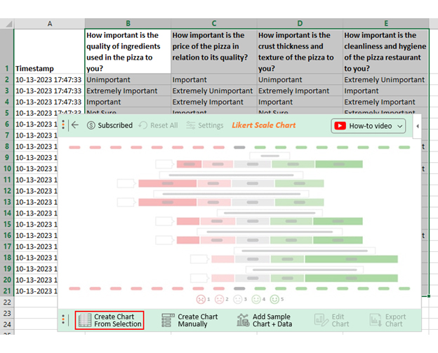
Let’s say your survey yields the data table below.

Timestamp How important is the quality of ingredients used in the pizza to you? How important is the price of the pizza in relation to its quality? How important is the crust thickness and texture of the pizza to you? How important is the cleanliness of the pizza restaurant to you?
10-13-2023 17:47:33 Unimportant Important Unimportant Extremely Unimportant
10-13-2023 17:47:33 Extremely Important Extremely Unimportant Extremely Important Important
10-13-2023 17:47:33 Important Extremely Important Important Extremely Important
10-13-2023 17:47:33 Not Sure Important Not Sure Extremely Important
10-13-2023 17:47:33 Unimportant Extremely Unimportant Extremely Important Not Sure
10-13-2023 17:47:33 Not Sure Unimportant Unimportant Not Sure
10-13-2023 17:47:33 Extremely Important Extremely Important Extremely Important Extremely Unimportant
10-13-2023 17:47:33 Not Sure Important Not Sure Unimportant
10-13-2023 17:47:33 Not Sure Unimportant Unimportant Extremely Unimportant
10-13-2023 17:47:33 Extremely Unimportant Unimportant Important Unimportant
10-13-2023 17:47:33 Important Unimportant Unimportant Important
10-13-2023 17:47:34 Extremely Unimportant Extremely Important Not Sure Not Sure
10-13-2023 17:47:35 Extremely Unimportant Extremely Unimportant Not Sure Unimportant
10-13-2023 17:47:36 Extremely Unimportant Not Sure Extremely Important Important
10-13-2023 17:47:37 Extremely Unimportant Unimportant Important Extremely Unimportant
10-13-2023 17:47:38 Important Extremely Important Extremely Important Extremely Important
10-13-2023 17:47:39 Extremely Important Extremely Unimportant Extremely Important Extremely Important
10-13-2023 17:47:40 Extremely Unimportant Not Sure Extremely Unimportant Extremely Important
10-13-2023 17:47:41 Unimportant Extremely Unimportant Extremely Unimportant Extremely Important
10-13-2023 17:47:42 Not Sure Extremely Unimportant Important Extremely Important

This table contains example data. Expect many responses and questions in real life.

  • To get started with ChartExpo, install ChartExpo in Excel.
  • Now Click on My Apps from the INSERT menu.
insert chartexpo
  • Choose ChartExpo from My Apps, then click Insert.
open chartexpo
  • Once it loads, choose the “Likert Scale Chart” from the charts list.
search likert scale chart
  • Click the “Create Chart From Selection” button after selecting the data from the sheet, as shown.
Create Chart From Selection for microsoft survey tools
  • When you click the “Create Chart From Selection” button, you have to map responses with numbers manually. The Likert scale has this arrangement:
    • Extremely Unimportant = 1
    • Unimportant = 2
    • Not Sure = 3
    • Important = 4
    • Extremely Important = 5
  • Once all is set, click the “Create Chart” button.
Map Likert Responses to Numbers for microsoft survey tools
  • ChartExpo will generate the visualization below for you.
Microsoft Survey Tools Design Template for microsoft survey tools
  • If you want to have the chart’s title, click Edit Chart, as shown in the above image.
  • Click the pencil icon next to the Chart Header to change the title.
  • It will open the properties dialog. Under the Text section, you can add a heading in Line 1 and enable Show.
  • Give the appropriate title of your chart and click the Apply button.
Apply Title on Chart for microsoft survey tools
  • Let’s say you want to add text responses instead of numbers against every emoji.
  • Click the pencil icon next to the respective emoji. Expand the “Label” properties and write the required text. Then click the “Apply All” button.
  • Click the “Save Changes” button to persist the changes.
Apply Label on Chart for microsoft survey tools
  • Your final chart will appear below.
Final Microsoft Survey Tools

Insights

  • 30% of respondents consider the quality of ingredients used in the pizza significant, while 45% find it unimportant. 25% are unsure about its importance.
  • Regarding the price of the pizza in relation to its quality, 35% find it important, while 55% consider it unimportant.
  • 50% value the crust thickness and texture, whereas 30% consider it unimportant.
  • When it comes to the hygiene of the pizza restaurant, 50% find it important, while 35% find it unimportant.
  • Overall, 41% of respondents prioritize the mentioned factors in their decision-making process, whereas 42% find them unimportant.

Benefits of Using Microsoft Survey Tool

The Microsoft Survey tool stands out as the best choice due to a multitude of compelling reasons:

  • Ease of use: Microsoft Survey offers a user-friendly interface, making it accessible even to those with limited technical expertise. Its intuitive design ensures that creating surveys, designing questions, and analyzing survey results become a seamless process.
  • Integration:  This apparatus flawlessly coordinates with other Microsoft items like Microsoft 365 and Microsoft Groups. As a result, this streamlines workflow and enhances productivity.
  • Basic vs. advanced features: It caters to both novice users and experienced researchers. Beginners can leverage its straightforward features while advanced users explore more intricate options for complex surveys.
  • Cost: With different subscription plans available, Microsoft Survey offers a range of pricing options suitable for various budgets. This flexibility makes it an economical solution for businesses and individuals.
  • Collaboration: The Microsoft Survey tool enables real-time collaboration among team members. Multiple users can collaborate on survey creation, data analysis, and reporting, fostering teamwork and efficient project completion.
  • Security and data privacy:  Microsoft focuses on security, sticking to rigid information assurance guidelines. Features like data encryption and secure user authentication ensure user data remains well-guarded.
  • Reporting and analysis: The Microsoft Survey tool offers robust reporting capabilities, allowing you to generate insightful reports and visualizations. This aids in better understanding survey results and drawing meaningful conclusions.
  • Customization: Microsoft Survey provides a range of customization options. For instance, you can brand surveys with your organization’s logo or tailor questions based on respondent behavior. Consequently, this ensures that surveys align perfectly with specific needs.

FAQs

Which Microsoft tool is best for Surveys?

Microsoft Forms is the best tool for surveys. It is user-friendly, offers various question types, integrates with Microsoft apps, and provides real-time responses. Whether for education, business, or personal use, Forms simplifies survey creation, response collection, and data analysis.

Is the Microsoft survey free?

Microsoft Forms offers a free version with basic features suitable for creating surveys and collecting responses. However, there are also paid plans with additional advanced capabilities and integration options available through Microsoft 365 subscriptions.

How do I create a survey in Microsoft?

Creating a survey in Microsoft is a breeze. Log in, select “New Form,” add questions using various formats, customize the design, and adjust settings. Then, share the link or embed it. Responses are collected automatically and can be analyzed within Forms or exported for further insights.

Wrap Up

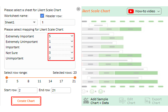
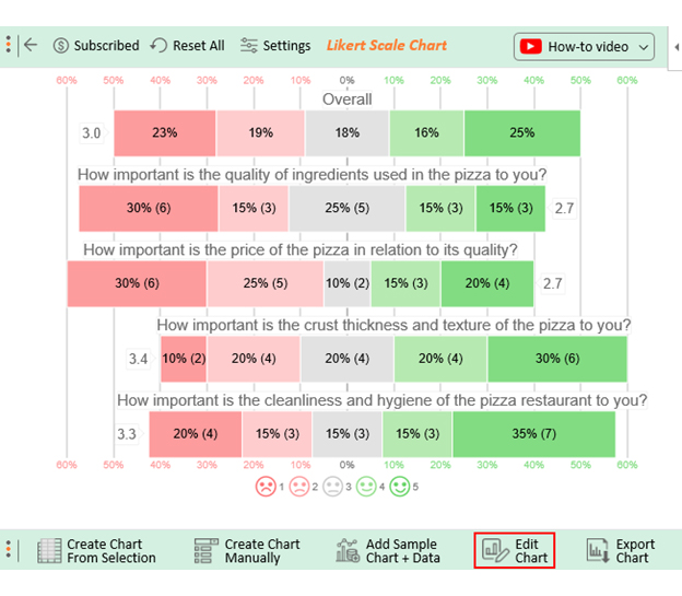
Microsoft survey tools offer a convenient and efficient way to collect valuable data. However, the real power lies in the ability to analyze this data and gain meaningful insights. Creating charts lets you visualize the survey responses and identify trends, patterns, and correlations.

With Microsoft survey tools, you can create chart types like bar charts, pie charts, and line graphs. These charts allow for easy comparison of survey responses and highlight the most significant findings.

From novice to seasoned analyst, these tools offer a stage for everyone. This isn’t just about graphs and grids. It’s about uncovering revelations, igniting aha moments, and making decisions backed by more than just gut feelings.

And when Excel’s charting limitations knock on the door, ChartExpo sweeps in. It infuses life into numbers and transforms them into visual narratives that captivate even the skeptics.

Don’t let your data be a wallflower – let ChartExpo turn it into the life of the visualization party! Try ChartExpo now.

How much did you enjoy this article?

ExcelAd2
Start Free Trial!
129117

Related articles

next previous
Microsoft Excel8 min read

Excel Task Tracker Template for Smarter Task Insights

Task tracker template in Excel organizes tasks, tracks deadlines, and boosts efficiency. Learn its benefits, and explore expert tips to simplify task management.

Microsoft Excel10 min read

Invoice Tracker Template in Excel for Better Insights

An invoice tracker Excel template helps track invoices, due dates, and payments. Learn how to use this template for better financial management.

Microsoft Excel12 min read

Key Performance Indicators in Healthcare for Better Insights

Key Performance Indicators in healthcare track patient care and efficiency. Learn about these KPIs, top examples, and how to use them to improve outcomes.

Microsoft Excel10 min read

BMI Calculation Formula in Excel for Better Fitness Insights

The BMI calculation formula in Excel helps track and analyze body mass index. Explore step-by-step instructions and tips to simplify BMI tracking in Excel.

Microsoft Excel29 min read

How to Create a Tornado Chart in Excel? A Complete Guide

Click to learn how to plot a Tornado Chart in Excel using easy-to-follow steps. Also, we’ll address the following question: what is a Tornado Diagram?

ChartExpo logo

Turn Data into Visual
Stories

CHARTEXPO

  • Home
  • Gallery
  • Videos
  • Services
  • Pricing
  • Contact us
  • FAQs
  • Privacy policy
  • Terms of Service
  • Sitemap

TOOLS

  • ChartExpo for Google Sheets
  • ChartExpo for Microsoft Excel
  • Power BI Custom Visuals by ChartExpo
  • Word Cloud

CATEGORIES

  • Bar Charts
  • Circle Graphs
  • Column Charts
  • Combo Charts
  • Comparison Charts
  • Line Graphs
  • PPC Charts
  • Sentiment Analysis Charts
  • Survey Charts

TOP CHARTS

  • Sankey Diagram
  • Likert Scale Chart
  • Comparison Bar Chart
  • Pareto Chart
  • Funnel Chart
  • Gauge Chart
  • Radar Chart
  • Radial Bar Chart
  • Sunburst Chart
  • see more
  • Scatter Plot Chart
  • CSAT Survey Bar Chart
  • CSAT Survey Chart
  • Dot Plot Chart
  • Double Bar Graph
  • Matrix Chart
  • Multi Axis Line Chart
  • Overlapping Bar Chart
  • Control Chart
  • Slope Chart
  • Clustered Bar Chart
  • Clustered Column Chart
  • Box and Whisker Plot
  • Tornado Chart
  • Waterfall Chart
  • Word Cloud
  • see less

RESOURCES

  • Blog
  • Resources
  • YouTube
SIGN UP FOR UPDATES

We wouldn't dream of spamming you or selling your info.

© 2025 ChartExpo, all rights reserved.