Categories
This world is full of choices, opinions, and the eternal quest for significance. Thus, we often face the quintessential dilemma: what truly matters?
This is where the Likert scale for importance comes into play.


This ingenious tool lets us harmonize our thoughts and opinions into a neat numerical scale. From “Not Important at All” to “Absolutely Vital,” it’s a journey of contemplation that even philosophers would envy.
Likert importnce scales help to obtain quantitative data that you can statistically analyze to draw meaningful conclusions. Consequently, it enables you to make informed decisions and recommendations based on data.
The Likert scale for importance analysis is applicable in a wide range of contexts. Examples include market research, social sciences, psychology, and organizational studies. It is particularly useful when subjective opinions and perceptions must be quantified and compared.
Why settle for mere yes or no answers when you can dive deeper into the nuances of importance?
Let’s unravel the mysteries of the this scale, one importance rating at a time.
Definition: The Likert Scale for Importance is a survey tool used to measure how strongly people value or prioritize specific items, issues, or features. It typically presents a series of statements or items alongside a multi-point scale, often 5 or 7 levels, ranging from responses like “Not at all important” to “Extremely important.”
This scale helps researchers and organizations capture nuanced opinions about what matters most to respondents. It’s especially useful in customer feedback, employee engagement surveys, and product development, where understanding the relative importance of different factors guides better decisions.
The level of importance Likert scale:
The Likert Scale of Importance is a powerful tool for turning subjective opinions into structured, actionable insights. Here’s why it stands out in research and decision-making:
By assigning numeric values to qualitative responses, the Likert scale allows researchers to transform perceptions of importance into quantifiable data. This makes it possible to track trends, compare results, and conduct meaningful statistical analysis.
The scale is easy to understand and quick to complete. Respondents can choose how important they feel something is without confusion, and researchers benefit from reduced survey fatigue and higher response accuracy.
Every respondent sees the same statements and response options, making the data consistent and reliable. This standardization enables fair comparisons across groups or over time.
Importance scale data supports a range of statistical methods. From basic distribution summaries to deeper analyses like correlations and significance testing, the scale helps reveal patterns and validate findings.
Whether you’re measuring customer satisfaction, employee engagement, or product preferences, the Importance scale adjusts easily. You can modify the number of response points or customize the language to fit your goals.
Importance scale data can be represented through clear visuals such as bar charts or heatmaps. These visuals help make complex insights easier to communicate and understand.
Thanks to its consistent structure, the scale allows for direct comparison between items, helping you identify what matters most to your audience or respondents.
The Importance Likert Scale is ideal when you need to measure how strongly people value or prioritize specific items, features, or issues. You should consider using it in the following scenarios:
5-Point Likert Scale For Importance Example:
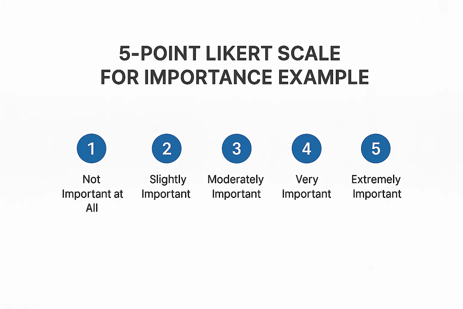
A 5-Point Likert scale provides a simple yet effective way to capture the relative importance of various factors in decision-making or feedback.
7-Point Likert Scale For Importance Example:
Here are some examples of the Likert scale for importance questions.
Excel is the go-to choice for many data analysis tasks. However, it often falls short when handling the intricacies of importance scale data and metrics like Net Promoter Score (NPS). Its limited capabilities and lack of specialized tools make extracting valuable insights difficult.
Thankfully, there’s a solution that simplifies analysis and enhances data visualization for better comprehension.
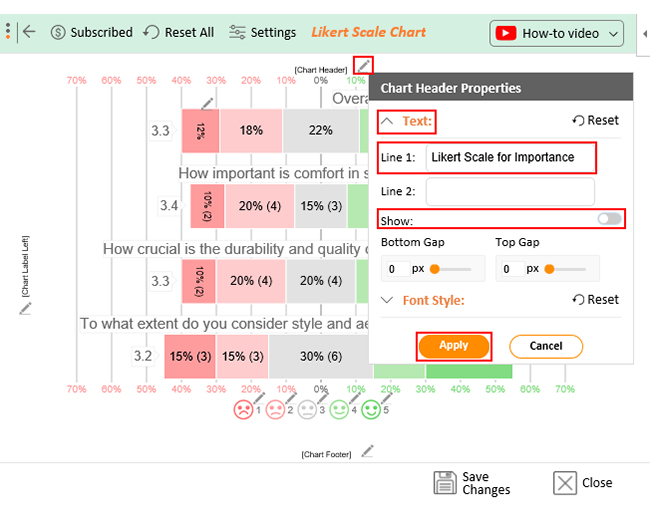
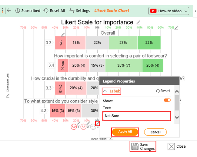
Enter ChartExpo – a powerful Excel add-in that revolutionizes importance scale data analysis and presentation. ChartExpo transforms raw data into appealing, insightful visualizations that effectively communicate the importance of each response option.
Benefits of Using ChartExpo
How to Install ChartExpo in Excel?
ChartExpo charts are available both in Google Sheets and Microsoft Excel. Please use the following CTA’s to install the tool of your choice and create beautiful visualizations in a few clicks in your favorite tool.
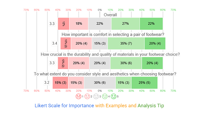
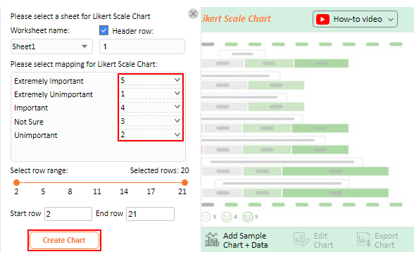
Assume you want to launch a footwear brand. You want to understand customer preferences, prompting you to conduct an important survey with the following questions.
Below is the survey importance scale associated with each question.
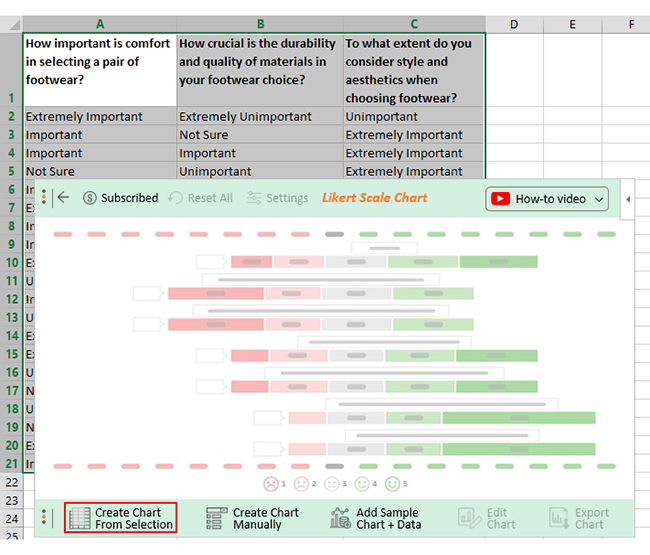
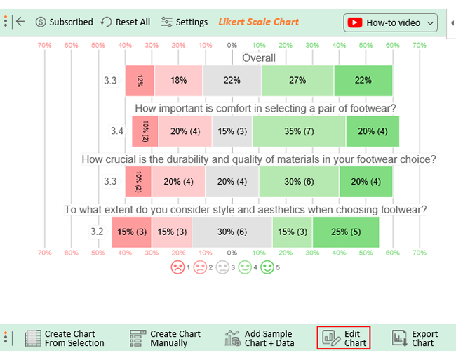
Let’s say your Likert scale for importance survey yields the data table below.
| How important is comfort in selecting a pair of footwear? | How crucial is the quality of materials in your footwear choice? | To what extent do you consider aesthetics when choosing footwear? |
| Extremely Important | Extremely Unimportant | Unimportant |
| Important | Not Sure | Extremely Important |
| Important | Important | Extremely Important |
| Not Sure | Unimportant | Extremely Important |
| Important | Important | Unimportant |
| Extremely Important | Extremely Important | Not Sure |
| Important | Unimportant | Not Sure |
| Important | Extremely Important | Extremely Unimportant |
| Extremely Unimportant | Not Sure | Not Sure |
| Unimportant | Important | Extremely Unimportant |
| Important | Not Sure | Important |
| Unimportant | Extremely Unimportant | Important |
| Extremely Important | Unimportant | Important |
| Extremely Unimportant | Important | Extremely Important |
| Unimportant | Extremely Important | Extremely Important |
| Not Sure | Extremely Important | Extremely Unimportant |
| Unimportant | Unimportant | Not Sure |
| Not Sure | Important | Unimportant |
| Extremely Important | Not Sure | Not Sure |
| Important | Important | Not Sure |
This table contains example data. Expect many responses and questions in real life.


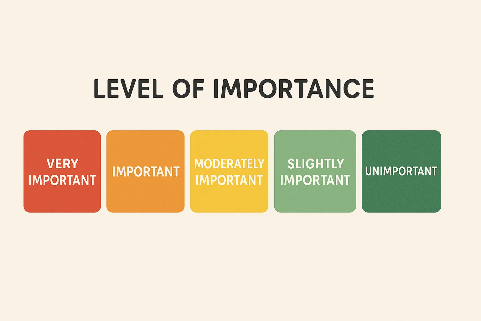
The levels of importance typically range from Not Important to Extremely Important on a 5- or 7-point Likert scale. Common levels include:
You can measure levels of importance using an importance scale in a survey. Respondents rate each item based on how important it is to them, allowing you to quantify and compare perceived priorities.
The 5-point Likert scale of importance measures degrees of importance using five response options: “Extremely Unimportant,” “Unimportant,” “Not Sure,” “Important,” and “Extremely Important.” Respondents select the option that best reflects their assessment of the item’s significance.
The “Strongly Agree” to “Strongly Disagree” scale is commonly used in importance surveys. It allows respondents to express varying levels of agreement or disagreement regarding the significance of items. Consequently, it provides a straightforward way to assess the importance they attribute to different factors.
The Likert scale for importance emerges as a versatile beacon of insight in decision-making and research. Its nuanced spectrum, from “Not Important at All” to “Extremely Important,” unveils the tapestry of preferences and priorities.
The beauty of this scale lies in its ability to convert qualitative sentiments into quantitative data. Consequently, enabling rigorous analysis and comparisons. Its adaptability transcends disciplines, welcoming inquiries into diverse facets of life.
Moreover, this scale’s prowess is evident in its user-friendly nature, empowering researchers and participants to engage seamlessly.
The importance scale transforms the abstract into the tangible, making the complex understandable and the subjective measurable. Whatever intricacies you navigate, this tool lends itself to rigorous analysis and informed decision-making.
When we add a sprinkle of ChartExpo to this concoction, the concoction becomes a masterpiece. ChartExpo joins hands with the importance scale, enabling you to explore and present data like never before.
Say goodbye to complex coding. ChartExpo simplifies data visualization for everyone.
How much did you enjoy this article?


Google Forms to Google Sheets keeps your data organized and current with every submission. Learn the steps, methods, and tips now!

Product survey questions reveal what customers truly think. Learn how to ask the right ones and act on the survey results. Read on!

Learn how the 5-Point Performance Rating Scale improves employee evaluations with clear, consistent, and fair performance reviews across teams.


