Categories
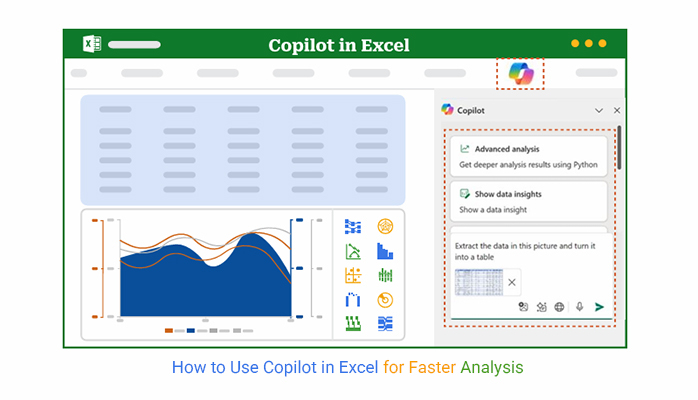
How to use Copilot in Excel without feeling overwhelmed? That’s the question many professionals are now asking. With over a billion users worldwide, Excel remains the go-to tool for data management and analysis. However, now Microsoft Copilot is changing how we work within it.


How do you use Copilot in Excel to save hours of manual work? Start by thinking of it as your assistant. Ask it questions, give it commands, and tell it what you want from your data. Instead of building formulas from scratch, you describe the task, and Copilot handles the logic behind the scenes.
This doesn’t mean the fundamentals are gone. If you want to do trend analysis in Excel, you still need to know what trends matter. The only difference is that identifying those patterns now takes seconds, not hours.
Want to transform Excel data to graph formats quickly? Copilot can suggest visuals based on the data it sees—no need to search how-to guides or click through a dozen menus.
How to use Copilot in Excel is more than a new feature—it’s a shift. Professionals in finance, marketing, and operations are already reporting a 30% faster turnaround on reports.
The future of data analysis in Excel isn’t coming. It’s already here. Ready to see how?
Let’s get started…
Definition: Copilot in Excel is an AI-powered assistant built into Microsoft Excel that helps users work faster with data. You can ask it to analyze, summarize, or visualize your spreadsheets. It understands plain English commands.
Whether you’re doing financial charts or exploring patterns, Copilot responds instantly. It utilizes machine learning to aid in data analysis in Excel, eliminating the need to write complex formulas. Copilot simplifies the process, saving time and effort for professionals at all levels.
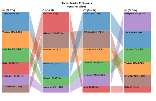
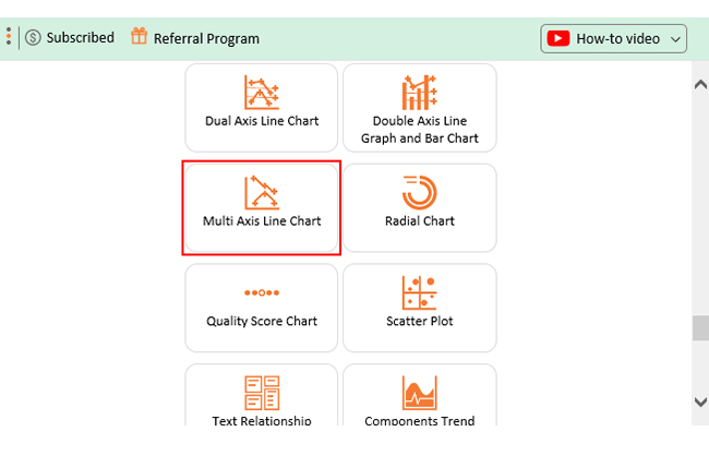
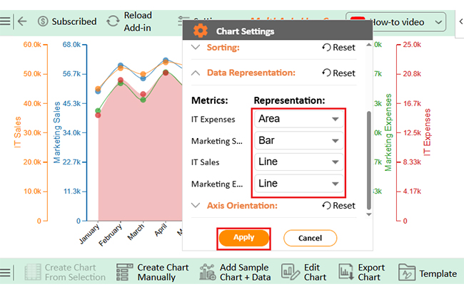
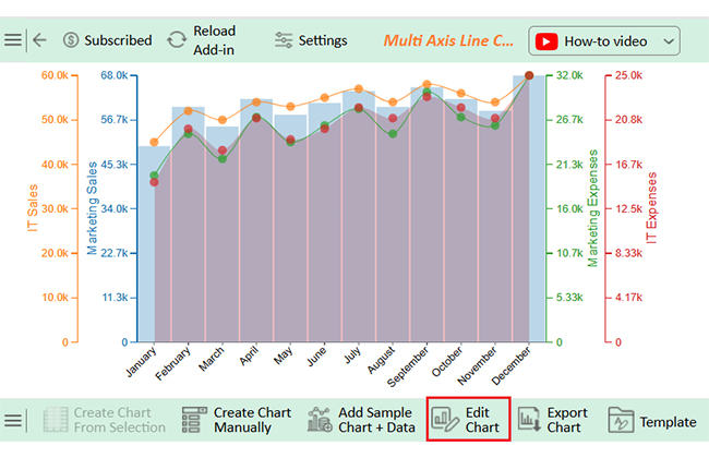
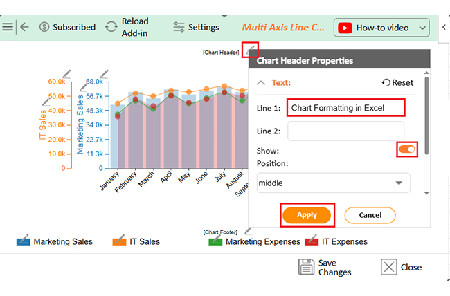
Here are some of the charts you can use to visualize data with Copilot in Excel. These charts were created using ChartExpo for Excel, a powerful data visualization tool that helps insights stand out and makes it easy to create visuals like a tornado chart in Excel.
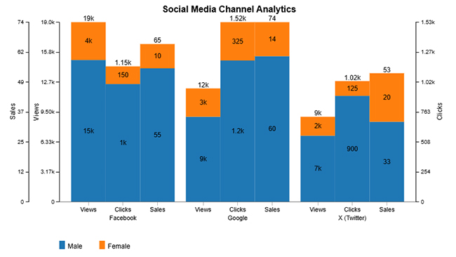
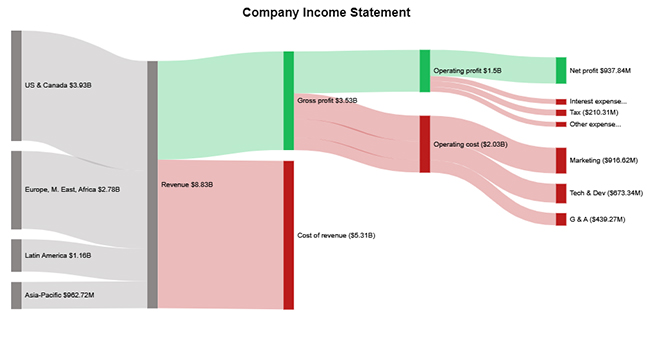
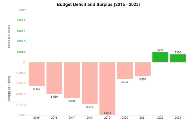
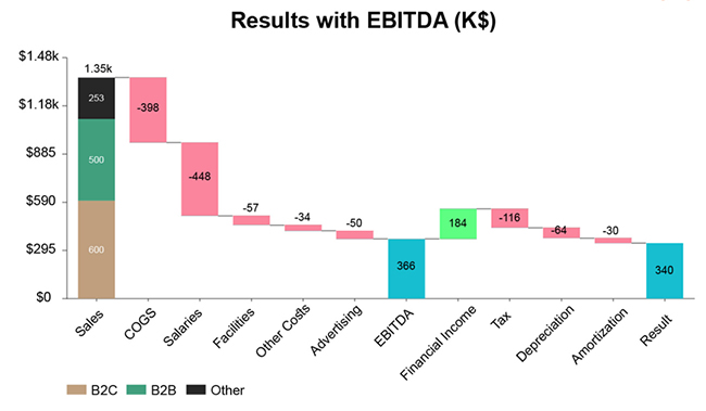


Working smarter with data isn’t a dream anymore—it’s a reality with Excel Copilot. Whether you’re creating charts, analyzing trends, or building visuals like a Waterfall chart to simplify messy data, Copilot brings instant results. Here’s why it’s quickly becoming a must-have tool for professionals everywhere.
Getting started with Copilot in Excel is easier. You don’t need to install anything extra or dig through settings. If you’ve got Excel, OneDrive, or SharePoint and the correct file type, you’re ready.
Here’s how to get Copilot working for you.
Important: Your data must be clean and structured. Copilot reads data more accurately when it’s well-formatted. Check Microsoft’s “Format data for Copilot in Excel” guidelines for help.
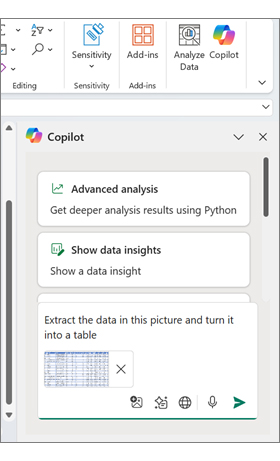
Have you ever wished Excel could read your mind? With Copilot, it almost can. This AI assistant takes your instructions and turns them into action. No more digging through menus or Googling formulas. Copilot handles the heavy lifting so you can focus on the results.
Here’s what it can do:
Excel has always been a trusted tool—but with Microsoft 365 Copilot, it becomes a thinking partner. Tasks that once took hours now take minutes. Whether you’re crunching numbers or building visuals, Copilot makes it easier. Here’s a closer look at the powerful features that make this tool a game-changer:
Copilot isn’t theory—it’s practical. The true magic of Excel Copilot is how it handles common chores. Whether deep in data or cleaning up a messy spreadsheet, it comes to your aid. Here are some real-world examples of what Copilot can do:
Have you ever wondered how to use Copilot in Excel to make sense of your data without drowning in endless rows? Data visualization is key to good analysis. But Excel’s built-in charts? They often fall short—either too basic or too complex to customize.
That’s where ChartExpo steps in. It’s a powerful chart add-in for Excel that takes your visuals from “meh” to memorable. Say goodbye to boring graphs and hello to clear, impactful insights. Install ChartExpo!
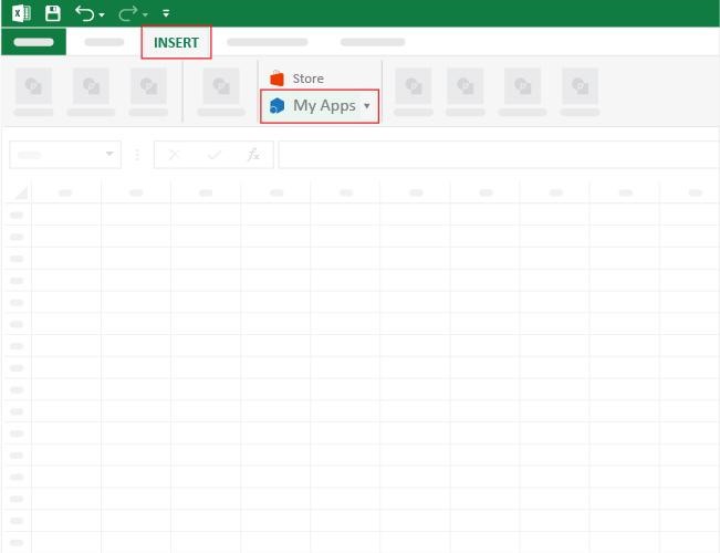
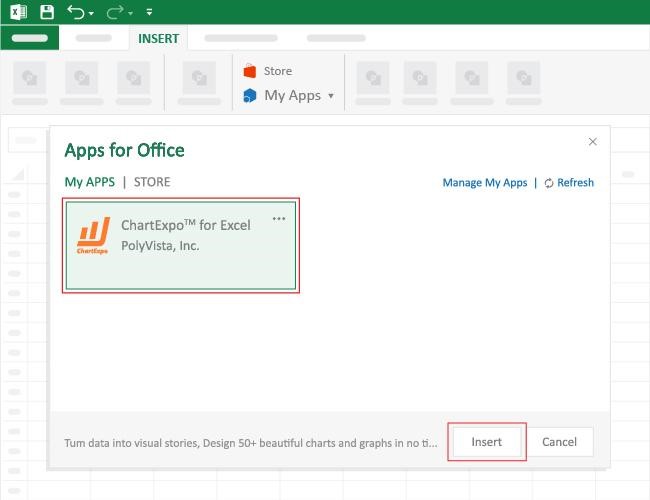
How to Install ChartExpo in Excel?
ChartExpo charts are available both in Google Sheets and Microsoft Excel. Please use the following CTAs to install the tool of your choice and create beautiful visualizations with a few clicks in your favorite tool.
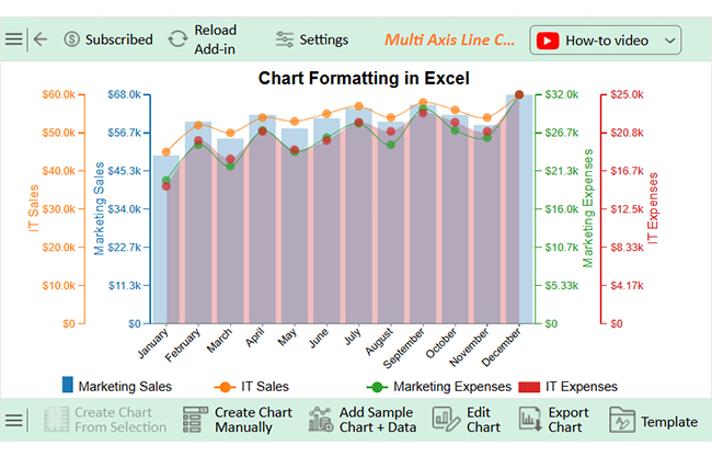
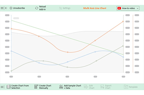
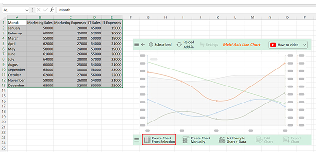
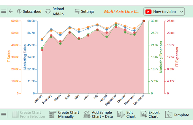
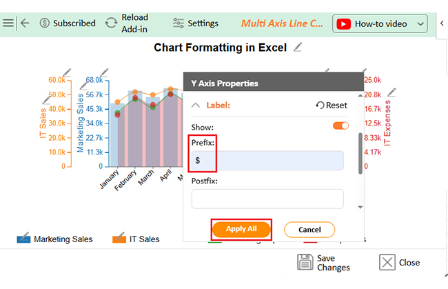
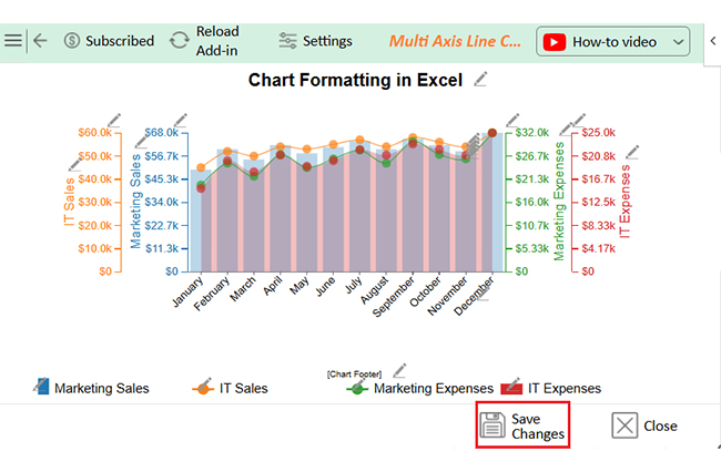
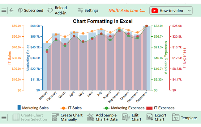
Let’s visualize this sample data in Excel using ChartExpo and glean valuable insights from it.
| Month | Marketing Sales | Marketing Expenses | IT Sales | IT Expenses |
| January | 50000 | 20000 | 45000 | 15000 |
| February | 60000 | 25000 | 52000 | 20000 |
| March | 55000 | 22000 | 50000 | 18000 |
| April | 62000 | 27000 | 54000 | 21000 |
| May | 58000 | 24000 | 53000 | 19000 |
| June | 61000 | 26000 | 55000 | 20000 |
| July | 64000 | 28000 | 57000 | 22000 |
| August | 60000 | 25000 | 54000 | 21000 |
| September | 65000 | 30000 | 58000 | 23000 |
| October | 62000 | 27000 | 56000 | 22000 |
| November | 59000 | 26000 | 54000 | 21000 |
| December | 68000 | 32000 | 60000 | 25000 |
Copilot in Excel is impressive, but let’s not kid ourselves: This is not magic. It can be a time saver, but it’s still a tool. Like any tool, it has limits. What it can’t do is just as important as what it can. Here is where Copilot still needs assistance from a human brain:
Yes, if you have Microsoft 365 with Copilot access. Your workbook must be saved on OneDrive or SharePoint. You’ll also need an internet connection. Once set up, you can interact with Copilot using simple prompts.
Yes, Copilot can create charts using your data. Ask it to make a bar graph, pie chart, or other visualizations. It simplifies the process of creating a graph in Excel, and you can also use it to edit or explain existing charts.
Do you want to master how to use Copilot in Excel? Start small; open your workbook, type a prompt, and let Copilot guide you through the process. It’s that simple.
Artificial Intelligence in Excel is transforming the way we work. You no longer need to memorize formulas. AI reads your request and does the work for you.
Need better visuals? Copilot can help. However, if you want advanced, professional visuals, consider using a chart add-in for Excel, such as ChartExpo. It fills in what Excel’s basic charts miss.
Copilot also helps you learn how to add charts in Excel. It can insert, label, and format charts based on your data. You have to ask.
It doesn’t stop there. Copilot cleans your data, explains trends, and highlights what matters. It facilitates faster and easier data analysis.
In conclusion, Excel Copilot is your competent spreadsheet partner. Use it well, and Excel becomes less of a task and more of a tool. Install ChartExpo to unlock powerful, easy-to-use visualizations.
How much did you enjoy this article?


Learn how to use sparklines in Excel to quickly visualize trends inside cells. Discover types, creation steps, customization, use cases, benefits, and best practices.

Learn what a confidence interval graph is, how to create it in Excel, and how to interpret results to make more reliable, data-driven decisions.

A correlation matrix in Excel helps identify relationships between variables. Learn how to create, read, and use it for effective data analysis.


