• Home
  • Tools dropdown img
    • Spreadsheet Charts

      • ChartExpo for Google Sheets
      • ChartExpo for Microsoft Excel
    • Power BI Charts

      • Power BI Custom Visuals by ChartExpo
    • Word Cloud

  • Charts dropdown img
    • Chart Category

      • Bar Charts
      • Circle Graphs
      • Column Charts
      • Combo Charts
      • Comparison Charts
      • Line Graphs
      • PPC Charts
      • Sentiment Analysis Charts
      • Survey Charts
    • Chart Type

      • Box and Whisker Plot
      • Clustered Bar Chart
      • Clustered Column Chart
      • Comparison Bar Chart
      • Control Chart
      • CSAT Survey Bar Chart
      • CSAT Survey Chart
      • Dot Plot Chart
      • Double Bar Graph
      • Funnel Chart
      • Gauge Chart
      • Likert Scale Chart
      • Matrix Chart
      • Multi Axis Line Chart
      • Overlapping Bar Chart
      • Pareto Chart
      • Radar Chart
      • Radial Bar Chart
      • Sankey Diagram
      • Scatter Plot Chart
      • Slope Chart
      • Sunburst Chart
      • Tornado Chart
      • Waterfall Chart
      • Word Cloud
    • Google Sheets
      Microsoft Excel
  • Services
  • Pricing
  • Contact us
  • Blog
  • Support dropdown img
      • Gallery
      • Videos
      • Contact us
      • FAQs
      • Resources
    • Please feel free to contact us

      atsupport@chartexpo.com

Categories
All Data Visualizations Data Analytics Surveys
Add-ons/
  • Google Sheets
  • Microsoft Excel
  • Power BI
All Data Visualizations Data Analytics Surveys
Add-ons
  • Google Sheets
  • Microsoft Excel
  • Power BI

We use cookies

This website uses cookies to provide better user experience and user's session management.
By continuing visiting this website you consent the use of these cookies.

Ok

ChartExpo Survey


Home > Blog > Microsoft Excel

How to Extrapolate in Excel with Step-by-Step Guide

Are you looking to learn how to extrapolate in Excel?

Picture this: you have sales data for the past five years and need to forecast next year’s sales. This task can feel overwhelming. Yet, Excel provides tools to simplify it.

Extrapolation is a method that uses existing data to predict future trends. According to the National Bureau of Economic Research, businesses that use data-driven forecasting can improve accuracy by up to 30%. This can lead to better inventory management and increased profits.

How to Extrapolate in Excel

In Excel, you can create forecasts quickly. The software’s built-in functions, like TREND and FORECAST, make this process straightforward. Knowing how to extrapolate in Excel allows you to visualize potential outcomes and make informed decisions.

Imagine being able to confidently tell your team the projected sales for the next quarter. This skill can set you apart in your organization. Many professionals miss out on the power of extrapolation. They rely on gut feelings rather than data.

By learning how to extrapolate in Excel, you gain a valuable tool for strategic planning. Whether in marketing, finance, or operations, these insights can drive your success. You don’t need to be a statistician to grasp this concept. With a little practice, you can master it.

Ready to dive in? Let’s explore the steps to extrapolate in Excel effectively – your future forecasts await.

Table of Contents:

  1. What is Data Extrapolation in Excel?
  2. What is Extrapolation vs. Interpolation in Excel?
  3. What is Extrapolate in Excel Used For?
  4. What is Data Extrapolation Formula in Excel?
  5. How to Use the Formula for Data Extrapolation in Excel?
  6. What are the Best Extrapolation Methods in Excel?
  7. What is the Data Extrapolation by the Forecast Function?
  8. How to Analyze Data Extrapolation in Excel?
  9. What are the Tips for Using the Extrapolate Function?
  10. Wrap Up

First…

What is Data Extrapolation in Excel?

Definition: Data extrapolation in Excel involves using existing data to predict future values. It helps identify trends and make forecasts.

Excel offers functions like TREND and FORECAST to assist with this process. By analyzing and interpreting past data points, you can estimate future outcomes.

This technique is valuable for businesses in planning and decision-making. It allows teams to anticipate changes and adjust strategies accordingly. With simple steps, anyone can leverage Excel for effective data extrapolation and gain insights for better planning.

What is Extrapolation vs. Interpolation in Excel?

Imagine you’re looking at some data in Excel. It’s kind of like reading a story with a few missing pages. To figure out what’s on those missing pages, you’ve got two main techniques: extrapolation and interpolation.

These methods are your tools for filling in gaps in your data story! Here’s how they work differently and why you’d choose one over the other.

Aspect Interpolation Extrapolation
Definition Estimating values within the range of known data points Estimating values beyond the range of known data points
When to Use When you need to fill in missing values between existing data When you want to predict data points outside the existing range
Example You have data for January and March; you use interpolation to estimate February’s data You have data up to June, but you want to predict July’s values
Common Formula =FORECAST.LINEAR(target, known_y’s, known_x’s) =FORECAST.LINEAR(target, known_y’s, known_x’s)
Accuracy Generally more accurate since it stays within a known range Less accurate; predictions can deviate more from actual values
Applications Sales trends, temperature data, or any consistent data Financial forecasting, future sales, or anything projecting ahead

What is Extrapolate in Excel Used For?

I know you’re trying to stay ahead of the game in your business. Knowing how to use extrapolation can give you a competitive edge. Let’s break down some key uses:

  • Future projections: Businesses often need to predict future sales or growth. Extrapolation helps create reliable forecasts based on past data.
  • Budgeting and financial planning: Accurate budgets rely on data trends. By extrapolating previous expenses, you can better plan for future costs.
  • Demand forecasting: Anticipating customer demand is crucial. Extrapolation allows you to estimate future demand based on historical sales data.
  • Performance analysis: Tracking performance over time is essential. Extrapolating past performance data helps identify trends and areas for improvement.
  • Market research: Understanding market trends is vital. Extrapolation can help analyze consumer behavior and project future market conditions.

What is Data Extrapolation Formula in Excel?

Imagine working with a dataset, and you need to look into the future. How do you go about it? Enter data extrapolation! Using a formula in Excel, you can extend your data beyond its current range. This will help you make educated guesses based on the trend you see.

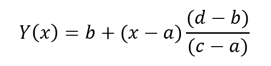
To do this, all you need are two known data points, A and B, on your chart:

  • Point A: (a, b)
  • Point B: (c, d)

Using these points, here’s the formula for linear extrapolation:

Formula for Learning How to Extrapolate in Excel

How to Use the Formula for Data Extrapolation in Excel?

Extrapolation involves predicting future values based on historical data. One of the easiest ways to do this in Excel is by using the TREND function. Here’s how to get started.

The syntax for the TREND function is as follows:

TREND(known_y’s, [known_x’s], [new_x’s], [const])

  • known_y’s: This is your range of known y-values.
  • known_x’s: This is your range of known x-values.
  • new_x’s: These are the new x-values for which you want to predict y-values.
  • const: This determines whether to force the constant in the trendline equation to zero.

Let’s go through a practical example step by step.

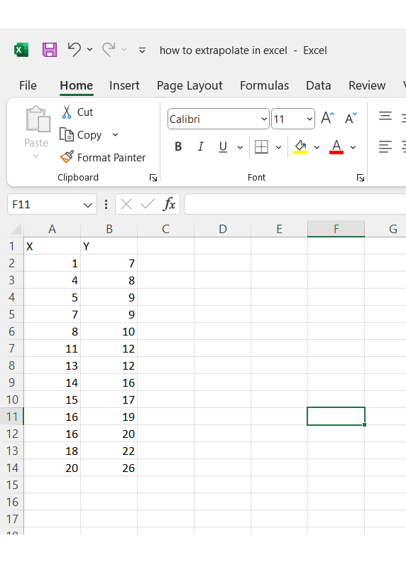
Step 1: Create the dataset: Enter your dataset into Excel. Make sure you have your known x and y values ready.

Enter Dataset for Learning How to Extrapolate in Excel

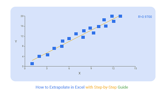
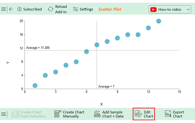
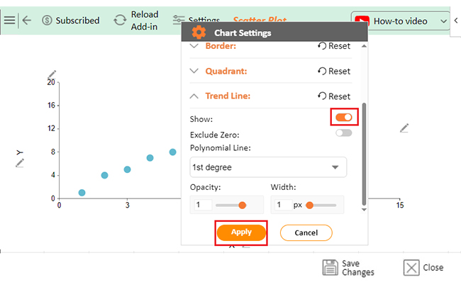
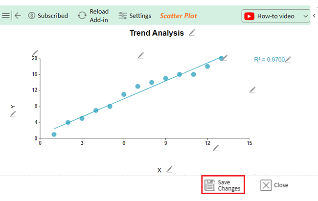
Step 2: Check for a linear trend: Create a scatter plot to see if your data exhibits a linear trend. Highlight your data range, go to the Insert tab, and select the Scatter icon in the Charts group.

Once you create the plot, look for a pattern. You can proceed with the TREND function if the points align closely along a straight line.

Create Plot look for Pattern for Learning How to Extrapolate in Excel

Step 3: Use the TREND function for extrapolation: Now, let’s extrapolate future y-values for new x-values, say 20, 25, and 30. Enter these new x-values into your worksheet. In cell B17, type the following formula:

=TREND($B$2:$B$14, $A$2:$A$14, A17)

You can then drag this formula down to apply it to your new values.

Drag This Formula Down to Apply for Learning How to Extrapolate in Excel

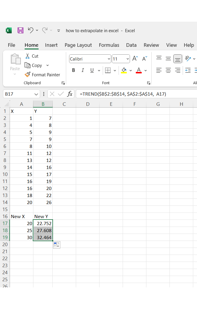
Interpreting the results:

  • For x = 20, the predicted y is 22.725.
  • For x = 25, the predicted y is 27.608.
  • For x = 30, the predicted y is 32.464.

If you want to see the underlying formula used to calculate these values, you can use the LINEST function:

=LINEST(A2:A14, B2:B14)

Use LINEST Function for Learning How to Extrapolate in Excel

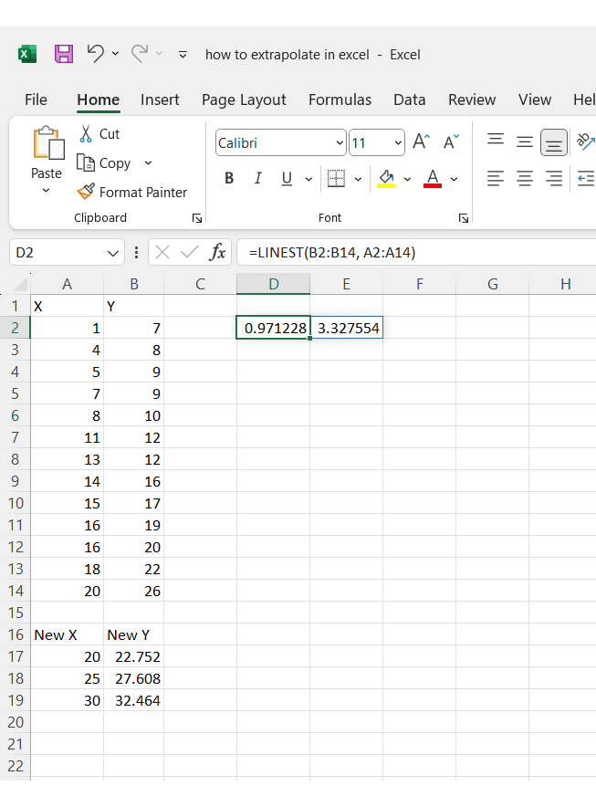
This will give you the linear trendline equation, which, in our case, is:

y=0.971228x+3.327554y

The TREND function utilizes this equation for extrapolation. For instance, for x = 25:

y = 0.971228*(25) + 3.327554 = 27.608254

What are the Best Extrapolation Methods in Excel?

When it comes to extrapolating data in Excel, choosing the right method is key. Each technique has its strengths, depending on your dataset and goals. Let’s explore three of the best extrapolation methods: linear extrapolation, polynomial extrapolation, and moving averages.

  1. Linear Extrapolation: This is the most straightforward approach. Linear extrapolation draws a straight line through your data points and extends it. You can use Excel’s FORECAST.LINEAR function for this. It is excellent for data with a steady trend.
  2. Polynomial Extrapolation: Need to capture curves? Polynomial extrapolation uses a curved line that fits more complex data patterns. With Excel’s trendline options, you can choose polynomials and set the order based on your data’s shape. It is ideal for data that fluctuates or accelerates.
  3. Moving Average: Perfect for smoothing out short-term variations. Moving averages use past data points to predict the next, offering a stable forecast. Apply it using Excel’s AVERAGE function over selected ranges, or try the built-in Data Analysis tools for more customization.

What is the Data Extrapolation by the Forecast Function?

Excel’s FORECAST function is a powerful tool for linear extrapolation. It enables you to predict future values by analyzing historical data. The syntax is straightforward:

FORECAST(x, known_y’s, known_x’s)

  • x: The specific value you want to estimate a corresponding y-value.
  • known_y’s: The range of your historical y-values.
  • known_x’s: The range of your historical x-values.

Imagine you have sales data for the first seven months of the year. Let’s say you want to forecast sales for August. You would enter 8 as your x value and the appropriate ranges for your known y’s and x’s.

By effectively utilizing the FORECAST function, you can make data-driven decisions and develop strategic plans grounded in data trends. It’s an invaluable resource for anyone looking to gain insights from their data.

How to Analyze Data Extrapolation in Excel?

Have you ever tried to predict what’s next for your data in Excel? Data extrapolation can help you forecast trends and fill in missing values.

But here’s the catch: Excel’s visualization tools can make it feel like you’re driving in the dark. Sure, Excel gives you the basics, but it can fall short when it comes to insightful, clear visuals.

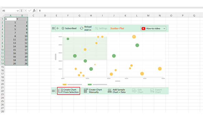
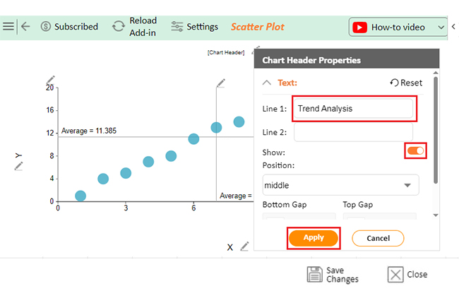
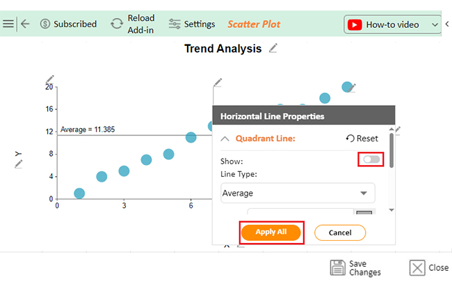
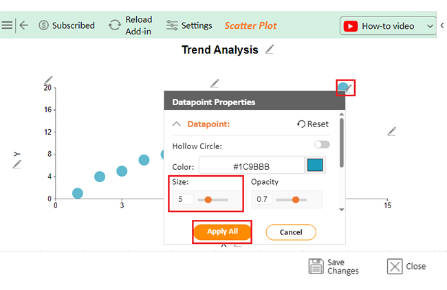
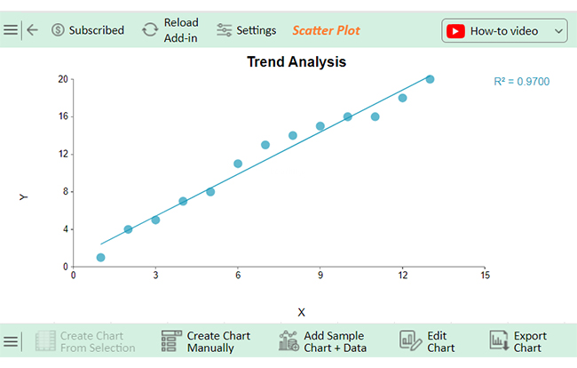
That’s where ChartExpo steps in. With its advanced charting capabilities, ChartExpo turns your data into powerful visuals that make data analysis a breeze.

Let’s learn how to install ChartExpo in Excel.

  1. Open your Excel application.
  2. Open the worksheet and click the “Insert” menu.
  3. You’ll see the “My Apps” option.
  4. In the Office Add-ins window, click “Store” and search for ChartExpo on my Apps Store.
  5. Click the “Add” button to install ChartExpo in your Excel.

ChartExpo charts are available both in Google Sheets and Microsoft Excel. Please use the following CTAs to install the tool of your choice and create beautiful visualizations with a few clicks in your favorite tool.

Example

Let’s analyze the data below in Excel using ChartExpo.

X Y
1 7
4 8
5 9
7 9
8 10
11 12
13 12
14 16
15 17
16 19
16 20
18 22
20 26
  • To get started with ChartExpo, install ChartExpo in Excel.
  • Now Click on My Apps from the INSERT menu.
insert chartexpo in excel
  • Choose ChartExpo from My Apps, then click Insert.
open chartexpo in excel
  • Once it loads, scroll through the charts list to locate and choose the “Scatter Plot”.
search scatter plot chart in excel
  • Click the “Create Chart From Selection” button after selecting the data from the sheet, as shown.
Click Create Chart From Selection After Learning How to Extrapolate in Excel
  • ChartExpo will generate the visualization below for you.
Initial Visual After Learning How to Extrapolate in Excel
  • If you want to add anything to the chart, click the Edit Chart button:
  • Click the pencil icon next to the Chart Header to change the title.
  • It will open the properties dialog. Under the Text section, you can add a heading in Line 1 and enable Show.
  • Give the appropriate title of your chart and click the Apply button.
Add Chart Header After Learning How to Extrapolate in Excel
  • You can hide the Quadrant Line and values as follows:
Hide Quadrant Line and Values After Learning How to Extrapolate in Excel
  • You can change the size of the Circle by clicking on the Small pencil icon as follows:
Change Size of Circle by Clicking Small Pencil After Learning How to Extrapolate in Excel
  • You can add the Trend Line by clicking on Settings as follows:
Add Trend Line by Clicking Settings After Learning How to Extrapolate in Excel
  • Click the “Save Changes” button to persist the changes made to the chart.
Click Save Changes After Learning How to Extrapolate in Excel
  • Your final Scatter Plot will look like the one below.
Final How to Extrapolate in Excel

Insights

  • The data reveals a positive correlation between X and Y values.
  • As X increases, Y generally rises as well.
  • This upward trend becomes stronger with larger X values, indicating acceleration.

Drive Strategic Decisions Using Extrapolate Tools in Excel:

  1. Open your Excel Application.
  2. Install ChartExpo Add-in for Excel from Microsoft AppSource to create interactive visualizations.
  3. Select the Scatter Plot from the list of charts.
  4. Select your data
  5. Click on the “Create Chart from Selection” button.
  6. Customize your chart properties to add header, axis, legends, and other required information.

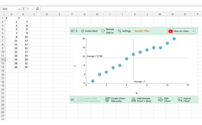
The following video will help you create a Scatter Plot in Microsoft Excel.

What are the Tips for Using the Extrapolate Function?

A few key tips can enhance your accuracy and effectiveness when using the extrapolate function in Excel. Let’s explore these tips to ensure you’re maximizing your data.

  1. Select the right data range: Choose a relevant and representative range to ensure reliable predictions.
  2. Check for linearity: Use a scatter plot to see if your data follows a linear trend; this confirms that linear extrapolation is appropriate.
  3. Use historical data: Base your forecasts on solid past data to identify trends and patterns.
  4. Consider seasonal trends: Adjust your extrapolation for any seasonal fluctuations in your data.
  5. Validate results: Compare your predictions with known data or alternate methods to ensure accuracy in predictive analytics.

FAQs

How do you extrapolate data in Excel?

To extrapolate data in Excel, use the TREND or FORECAST functions. Input your historical data for known x and y values. Then, specify new x values to predict corresponding y values. This allows you to forecast future trends effectively.

How do you extrapolate points on an Excel graph?

To extrapolate points on an Excel graph:

  • Create a scatter plot of your data.
  • Use the TREND or FORECAST functions to calculate future y-values based on new x-values.
  • Add these points to the graph to visualize projections.

Can you extrapolate a trendline in Excel?

Yes, you can extrapolate a trendline in Excel:

  • Create a scatter plot of your data.
  • Add a trendline by selecting “Add Trendline” from the chart options.
  • Extend the trendline into the future to predict upcoming values.

Wrap Up

Mastering extrapolation in Excel is a valuable skill. It allows you to make informed predictions based on historical data. Understanding the various functions, such as TREND and FORECAST, helps you analyze trends effectively.

Always begin by selecting the right data range. Ensure your data is relevant and representative. Next, check for linearity. A scatter plot can reveal if your data follows a straight trend. This step is crucial for accurate extrapolation.

Consider using historical data as your foundation. The more reliable your past data, the better your forecasts will be. Also, keep an eye on seasonal trends. These patterns can significantly affect your predictions.

Don’t forget to validate your results. Comparing your predictions with known data can highlight discrepancies. If results don’t align, revisit your methods or data range.

Lastly, enhance your data visualization. While Excel offers basic charts, tools like ChartExpo can elevate your visuals. This helps communicate your findings more effectively.

With these steps, you can confidently extrapolate data in Excel. Embrace the power of data to drive your decision-making.

How much did you enjoy this article?

ExcelAd1
Start Free Trial!
143941

Related articles

next previous
Microsoft Excel9 min read

KPI Dashboard in Excel: A Complete Guide

A KPI dashboard in Excel helps track key metrics and streamline data visualization. Discover how to create, analyze, and use it with clear guides and examples.

Microsoft Excel11 min read

How to Plot a Speedometer Chart in Excel?

Create a Speedometer Chart in Excel to track KPIs, goals, and performance metrics visually. Explore templates, examples, and step-by-step instructions for better dashboards.

Microsoft Excel13 min read

Excel for Teachers for Insightful Preparation

Excel for teachers simplifies grading, tracks attendance, and organizes data. Find its key features, expert tips, and how ChartExpo enhances data visualization.

Microsoft Excel14 min read

How to Make a Cash Flow Diagram in Excel?

Learn how to make a Cash Flow Diagram in Excel. It will help you learn to visualize and analyze inflows and outflows of your business cash flow.

Microsoft Excel11 min read

Succession Planning Template for Long-Term Success

Succession Planning Templates help businesses prepare for leadership changes. Learn to create, analyze, and use them for seamless transitions and growth.

ChartExpo logo

Turn Data into Visual
Stories

CHARTEXPO

  • Home
  • Gallery
  • Videos
  • Services
  • Pricing
  • Contact us
  • FAQs
  • Privacy policy
  • Terms of Service
  • Sitemap

TOOLS

  • ChartExpo for Google Sheets
  • ChartExpo for Microsoft Excel
  • Power BI Custom Visuals by ChartExpo
  • Word Cloud

CATEGORIES

  • Bar Charts
  • Circle Graphs
  • Column Charts
  • Combo Charts
  • Comparison Charts
  • Line Graphs
  • PPC Charts
  • Sentiment Analysis Charts
  • Survey Charts

TOP CHARTS

  • Sankey Diagram
  • Likert Scale Chart
  • Comparison Bar Chart
  • Pareto Chart
  • Funnel Chart
  • Gauge Chart
  • Radar Chart
  • Radial Bar Chart
  • Sunburst Chart
  • see more
  • Scatter Plot Chart
  • CSAT Survey Bar Chart
  • CSAT Survey Chart
  • Dot Plot Chart
  • Double Bar Graph
  • Matrix Chart
  • Multi Axis Line Chart
  • Overlapping Bar Chart
  • Control Chart
  • Slope Chart
  • Clustered Bar Chart
  • Clustered Column Chart
  • Box and Whisker Plot
  • Tornado Chart
  • Waterfall Chart
  • Word Cloud
  • see less

RESOURCES

  • Blog
  • Resources
  • YouTube
SIGN UP FOR UPDATES

We wouldn't dream of spamming you or selling your info.

© 2025 ChartExpo, all rights reserved.