Categories
By ChartExpo Content Team
Ever wondered why some visuals grab your attention while others leave you confused? The answer often lies in the power of Gestalt principles. These principles aren’t just theories; they change how we see and understand everything, from charts to dashboards.
If you’re working with data visualizations, knowing Gestalt principles can make all the difference in creating visuals that speak to your audience.


Gestalt principles help our brains make sense of complex images. Imagine trying to find insights hidden in a messy chart. Without a clear design, patterns and trends can easily get lost. But by using Gestalt principles, you guide the viewer’s eye naturally, letting them grasp the information without any struggle. It’s like giving your audience a mental shortcut to understanding the data.
At their core, Gestalt principles help group, highlight, and organize data elements in ways our minds find intuitive. So, how can you apply these principles to make your data visualizations not just informative, but unforgettable?
Read on to find out how to transform your visuals using the science of perception.
First…
Gestalt principles help us understand how humans visually perceive and interpret complex images. These principles are vital in data visualization because they dictate how elements are grouped, making data easier to digest and insights more apparent.
Gestalt psychology began in the early 20th century, mainly through the work of Max Wertheimer. He, along with colleagues Wolfgang Köhler and Kurt Koffka, focused on how people interpret the world. Their main idea was that our minds tend to perceive objects as part of a greater whole and not just as a collection of separate parts.
In data visualization, gestalt principles guide the design process. They ensure that information is presented in a way that the human brain can easily group and process it. By applying these principles, designers can create visuals that communicate data clearly and efficiently, making it easier for viewers to draw conclusions and make data-driven decisions.
This famous phrase encapsulates the essence of gestalt psychology. It suggests that an organized whole, perceived by the human mind, is not merely the sum of its component parts. Instead, the whole forms its own identity, influencing how the parts are seen.
When you use gestalt principles in visualization, you enhance the viewer’s ability to understand complex data sets.
These principles help in grouping related data, distinguishing between different data sets, and presenting them in a way that aligns with natural human perception. As a result, viewers can recognize trends, patterns, and anomalies more quickly, leading to faster and more accurate data interpretation.
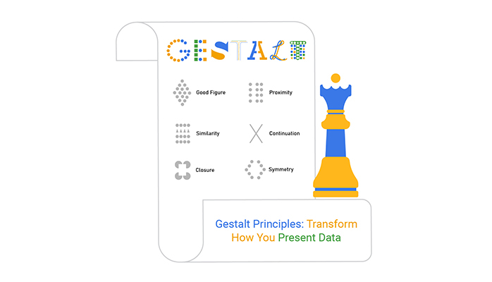
Proximity isn’t just about space; it’s about making sense of data.
When elements are close together, we see them as a group, simplifying complex information. This principle helps us quickly organize and process data visually, making it an essential tool in data presentation.
In practice, proximity can be useful for data visualization. By grouping related data points closely, you create a visual link. This method not only tidies up your presentation but also guides the viewer’s understanding and recall, making the data more accessible and actionable.
Similarity in design uses colors, shapes, or sizes to categorize data visually. This principle allows viewers to differentiate data categories effortlessly, enhancing the overall clarity and effectiveness of data interpretation.
Applying similarity effectively involves using consistent visual elements for related data. This consistency helps in creating a cleaner, more intuitive data visualization that communicates information at a glance.
Continuity leads the eye along a path, creating a smooth visual journey through the data. This principle is crucial in guiding the viewer’s attention systematically, making complex information easier to navigate and understand, and plays a key role in visual storytelling by presenting data in a way that unfolds naturally.
By implementing Gestalt laws, designers can direct attention strategically within data visualization. This focus enhances the viewer’s ability to connect and interpret data points within the larger context, leading to better insights and understanding.
Closure works by tapping into our natural desire to see things as complete.
In visualizations, applying this principle means viewers can understand complex data through partial images or incomplete information, engaging them more deeply as they mentally fill in the gaps.
In minimalistic designs, closure helps in reducing visual clutter while still conveying the full message. This approach not only cleans up the presentation but also engages viewers, challenging them to interpret the data actively.
Figure-ground organization allows for immediate differentiation between data layers, highlighting what needs attention. This separation is vital in emphasizing key data points, making them stand out amidst a sea of information.
Effective use of figure-ground in design ensures that important data doesn’t get lost. By manipulating backgrounds and foregrounds, key insights are brought to the forefront, making them more noticeable and memorable.
Common fate ties movement of elements together, suggesting they share a common action. This principle is particularly powerful in dynamic or interactive visualizations, where it can illustrate complex relationships and changes over time more clearly.
In interactive charts, elements that move or change together according to common fate make the data’s behavior easier to predict and understand. This synchronization can dramatically improve the user’s interaction with the data, making the experience both informative and engaging.
Symmetry isn’t just pleasing to the eye; it promotes balance and harmony in data visualization. This stability makes complex data sets appear simpler and more organized, enhancing the viewer’s ability to process and retain information.
Applying symmetry involves aligning elements to create a mirror image or balanced proportions. In data visualization, this can mean arranging data points so they are visually coordinated, promoting a smoother flow of information and a better overall aesthetic.
The following video will help you to create a Tornado Chart in Microsoft Excel.


The following video will help you to create a Tornado Chart in Google Sheets.
Using Gestalt grouping principles to structure data helps users quickly understand and organize information presented in visual formats.
For example, the Law of Proximity states that objects close to each other are perceived as a group. So, when designing different types of charts and graphs, keeping related data points close together allows viewers to see patterns and correlations effortlessly.
In a bar chart, applying the Law of Similarity—where similar items are grouped together through color, shape, or size—can highlight relationships or differences within the data. For instance, using different colors for different categories within the same bar chart can help viewers distinguish between data sets without confusion.
The Gestalt principle of organization to guide attention is crucial in creating effective visual hierarchies. This principle ensures that the most important information catches the viewer’s eye first. By manipulating sizes, colors, or spatial positioning, designers can control the visual flow and make it easy for viewers to prioritize information.
Start by defining the focal point; what should viewers notice first? Use contrast or the Law of Figure/Ground, where the important data stands out against a simpler background. Consistency in fonts and alignment also maintains a clean and organized layout, guiding the viewer naturally through the content.
Gestalt principles of perception to support pattern identification play a pivotal role. Patterns help in making sense of complex data by breaking it down into recognizable and familiar shapes. This recognition is automatic and allows for quicker data processing and data analysis.
The Law of Pragnanz, or simplicity, states that we tend to interpret complex images in the simplest form possible. In data visualization, this means designing charts or graphs that are not only straightforward but also intuitively convey the message. Simplifying designs by reducing clutter and focusing on essential elements makes the data more accessible and understandable.
To make your designs pop, keep your colors and shapes consistent. This taps into the gestalt principle of similarity, making your content not just pleasing to the eye but also easy to understand. Think about it: when everything matches, it’s a breeze for viewers to see what’s what.
Similarity is your friend in design. Use elements that echo each other in shape, size, and color to create harmony and balance. This doesn’t just make your design look good; it makes it more digestible. When elements are similar, people can group them mentally with zero hassle.
Symmetry isn’t just about beauty; it’s about balance. Align elements in your design to mirror each other, and watch your content come to life. This symmetry helps create a sense of order and unity, making your design not only attractive but also clear and organized.
White space isn’t empty space; it’s a powerful design tool. Use it wisely to enhance the figure-ground relationship, making your main elements jump off the page while the background stays just that—background. This clarity ensures viewers focus right where you want them.
Boost the clarity of your designs by clearly defining the figure and the ground. Make your key data stand out by setting it against a contrasting background. This separation helps viewers instantly recognize what’s important, avoiding any confusion.
Keep it clean, keep it simple. Clutter can overwhelm and confuse, so organize your design elements logically. Embrace space, maintain alignment, and remember: if it doesn’t serve a purpose, it probably doesn’t belong on the page.
Group related elements together using proximity and similarity. This not only looks good but makes your content easier to process. Label these groups clearly to guide your viewer through your design, ensuring they get the message without getting lost.
It’s all about balance. Group related items to show their connection but avoid going overboard. Too many grouped elements can be as confusing as none at all. Space them out, keep them aligned, and watch your design breathe and flow.
Labels are signposts; make them count. Use clear, concise labeling to direct viewers through your design, ensuring a smooth flow of information. Position labels strategically to maintain balance and legibility, helping viewers navigate your content with ease.
Too much of a good thing can be bad. Over-clustering can muddy your design, making it hard to tell where one group ends and another begins. Stick to clear, distinct groupings to keep your visuals sharp and your message clear.
Simplicity is the soul of good design. Use it to keep your visuals clean and your message clear. Strip away excess, focus on essentials, and let simplicity shine. This not only makes your design more appealing but also enhances viewer comprehension and retention.
When you’re dealing with the Gestalt principle of proximity, things can get a bit tricky.
Picture this: you’re trying to create a visual that groups similar items close together to show they’re connected. But oh no! Everything’s too close, and now it looks like a big blob of chaos. It’s like trying to read a book where all the words are squished together—no fun, right?
Here’s a tip: think about balance. It’s like making a smoothie. You don’t throw all the fruits in at once, right?
Start with the basics, add in your elements thoughtfully, and adjust as you go. Give each group of visuals some breathing room. This way, viewers won’t have to squint and guess what they’re looking at. Clear, spaced-out visuals? Yes, please!
Ever tried to complete a puzzle but found pieces missing? That’s what happens when the Gestalt law of closure doesn’t quite work out. This law helps our brains fill in gaps in information, but sometimes, if there’s too much missing, the image just feels incomplete.
Keep it simple, but not too simple. You want to give just enough detail to guide the viewer but not overwhelm them. Think of it as giving someone directions. You wouldn’t just say, “Go that way.” You’d give landmarks, turns, and signs to watch for. Apply the same concept to your visuals—enough clues to let the brain piece things together smoothly.
Here’s a head-scratcher: when you can’t tell the foreground from the background in a visual. It’s like trying to read a sign that’s the same color as the wall it’s mounted on. Not very helpful, right?
Make it pop! Use colors, contrasts, and clear boundaries. Imagine you’re highlighting a book—make the important stuff stand out, so it catches the eye. This way, no one will miss the key points you’re trying to show. It’s all about making it as easy as pie for anyone looking at your design to spot the main elements.
Look at how Gestalt principles transform visuals. A website might initially confuse users with scattered content. After applying Gestalt’s proximity principle, similar elements are grouped, guiding the user’s eye smoothly from one item to the next. The result? A cleaner layout that improves user experience significantly.
In logo design, the use of the figure-ground principle is a game-changer. Consider a logo that at first glance seems plain. Apply this principle, and suddenly, a negative space reveals a hidden message or symbol, adding depth and intrigue that captures attention.
Real-life applications shine when explaining abstract concepts. In traffic systems, the similarity principle helps drivers quickly identify road signs of the same shape and color as important cues, enhancing safety through clarity and quick recognition.
Tech interfaces use the closure principle to create user-friendly experiences. Even when parts of an icon are missing, our minds fill in the gaps, making for a smoother interaction.
In finance, clear, cohesive report designs allow for quick data assessment.
Marketing campaigns use the unity principle to create harmonious ads that resonate well with targeted audiences.
In retail, the principle of continuity is used in shelf arrangement and signage to lead customers on a natural shopping path. Educational materials use alignment to organize information, aiding in better comprehension and retention of complicated subjects.
A common error is overusing elements, leading to clutter rather than clarity. The solution lies in simplification; reducing the number of competing elements helps emphasize the important parts, making the overall design more effective.
Educational websites often demonstrate successes by showing how text grouping can aid memory recall. Mistakes are equally educational, like when an ad fails to convey its message due to poor use of the figure-ground principle, teaching designers the importance of contrast in visual elements.
Gestalt principles help simplify complex data. By organizing information visually, these principles reduce the effort needed to process data. Viewers can easily grasp trends and patterns, making interpretation quicker and less stressful.
Gestalt psychology suggests that our brains prefer to interpret complex images as simple, organized structures. When applied to data visualization, these principles guide the viewer to understand the data without overwhelming mental effort. Information presented this way is absorbed more efficiently.
To make data accessible, focus on alignment and proximity. Align related data points to form a coherent visual flow. Group related items closely. This setup helps the mind to recognize relationships quickly and interpret data accurately.
Designs based on Gestalt principles naturally draw the viewer’s attention. For example, using contrasting colors can highlight key data points, sparking interest and encouraging deeper interaction with the information presented.
Interactive elements like hover effects or clickable options allow users to engage with data actively. These features invite viewers to explore details and discover insights on their own, making the experience both engaging and educational.
The Law of Continuity suggests that elements arranged in a line or curve are perceived as more related than elements not on the line or curve. In data visualization, using smooth, continuous lines helps direct the viewer’s attention along a path of relevant information, highlighting connections and trends.
This principle deals with perceiving objects (figure) as distinct from their background (ground). Applying this in data visualization can help emphasize critical data points by making them stand out against a contrasting backdrop. This focus makes key insights pop, capturing viewer attention effectively.
Gestalt is a concept that focuses on how humans perceive whole forms rather than just a collection of parts. Instead of viewing every individual element separately, our brains naturally group them together to see a unified shape or concept. This holistic perception is central to how we interpret visuals, sounds, and even complex ideas. It’s about recognizing patterns and making sense of the world in a way that feels complete and cohesive.
Gestalt principles are a set of rules that explain how our brains group elements in visual designs. These principles include proximity, similarity, continuity, closure, figure-ground, and common fate. They help us understand why we see objects as related or separate, depending on how they are arranged. In data visualization, these principles are key to making charts and graphs easier to interpret, as they guide the viewer’s eye and simplify complex information. By applying these principles, you can create visuals that communicate your message clearly and effectively.
Gestalt psychology is a theory that emerged in the early 20th century, focusing on how people naturally organize sensory information into meaningful patterns. The founders believed that the mind understands objects as part of a greater whole, not just isolated parts. This approach contrasts with the idea of analyzing each element separately. Gestalt psychology is foundational in fields like design, where understanding how people perceive patterns and structures can greatly enhance communication and comprehension.
Gestalt theory centers on the idea that “the whole is other than the sum of its parts.” It suggests that our minds are wired to see complete forms rather than fragmented pieces. This theory is used to explain why we recognize patterns, group similar objects, and complete unfinished images without needing to see every detail. In practice, Gestalt theory guides designers and data analysts in structuring content in a way that aligns with how people naturally perceive and process information. This can lead to more intuitive and impactful designs.
The law of Pragnanz is one of the key principles in Gestalt theory. It states that when we encounter complex visual stimuli, our brains will simplify them into the most straightforward, stable form possible. This means that we tend to see shapes and patterns in their simplest form, even when presented with ambiguous or incomplete visuals. The law of Pragnanz is a powerful tool for reducing visual clutter and ensuring that key information stands out clearly. It helps create visuals that are not only aesthetically pleasing but also easy for viewers to understand at a glance.
Understanding Gestalt principles can change how you approach visual design. By using these principles, you can make your data visualizations more intuitive, leading to quicker insights and better decisions. It’s not about adding more elements but using what you have in smarter ways.
Think about how grouping, continuity, and closure can guide the viewer’s eyes where you want them to go. These principles help you cut through the noise, highlighting the story your data tells. Whether it’s in a chart, infographic, or report, Gestalt principles bring clarity and impact.
So, next time you design a visual, ask yourself: are you letting your data do the talking? Use Gestalt principles to give your audience that “aha!” moment they’re looking for.
Your visuals shouldn’t just show data—they should make it easy to understand.
How much did you enjoy this article?


Calculate accounts receivable turnover ratio to measure credit collection speed, improve cash flow, and strengthen your financial strategy. Read on!

Change Management KPIs are the key to tracking adoption, performance, and ROI during transitions. Find out which metrics matter. Read on!

Data collection methods and techniques determine the quality of every insight you act on. Explore key approaches for gathering reliable data. Read on!


