Categories
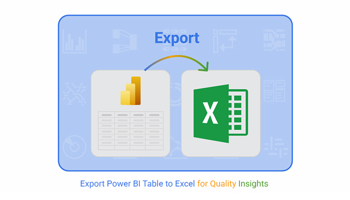
Exporting Power BI tables to Excel is a daily necessity for analysts, project managers, and business professionals who want more control over their data. Power BI gives you impressive dashboards, but Excel gives you the flexibility to dig deeper.
Combining them bridges the gap between quick visuals and detailed spreadsheet analysis.


When you export a Power BI Table to Excel, you gain freedom. You can apply formulas, pivot tables, and conditional formatting that aren’t as flexible in Power BI. This makes it easier to compare data, merge with other sources, and prepare it for deeper statistical review.
The best part is that you don’t lose your work in Power BI. You still have your interactive dashboards. But now, you also have an Excel copy for offline access and further manipulation.
That balance between dynamic visuals and spreadsheet detail is why Export Power BI Table to Excel remains one of the most practical workflows in analytics.
Power BI export to Excel bridges the gap between BI visuals and spreadsheet workflows. You can pull either summarized data or the full details, depending on your needs.
Comparing table vs chart views in Power BI helps decide which format to send to Excel. Using GETPIVOTDATA in Excel makes referencing exported metrics easier.
You can also learn how to link sheets in Excel to connect multiple exports into a single, dynamic workbook.
Power BI export table to Excel gives you flexibility and control. You can share with colleagues who prefer Excel, or combine with other data for advanced reporting.
Knowing what Excel software is used for clarifies why exports remain popular. Exporting makes it easy to apply how to sort a table in Excel techniques.
You can apply grouping data in Excel to organize exported Power BI information into categories that make sense for your analysis.
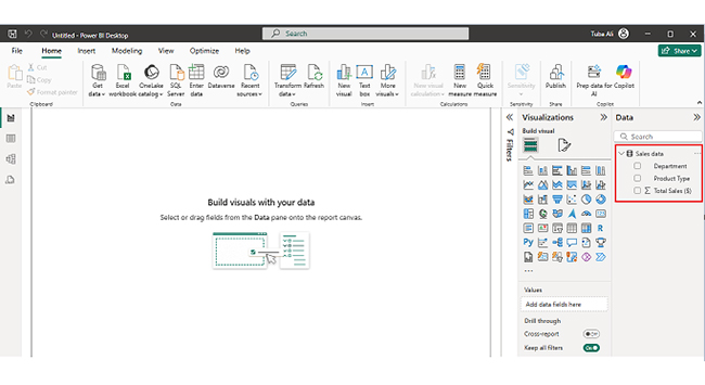
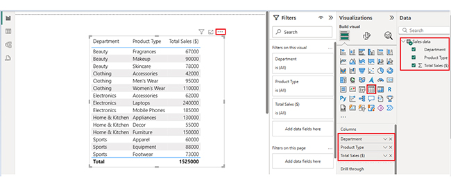
You can export a Power BI Table to Excel using three main approaches:
Once you complete Export Power BI Table to Excel, the real value comes from analysis. Excel’s native charts can work, but building advanced visuals takes time. That’s where ChartExpo helps, offering ready-to-use advanced chart types.
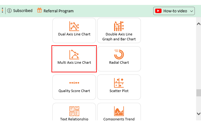
Why Use ChartExpo?
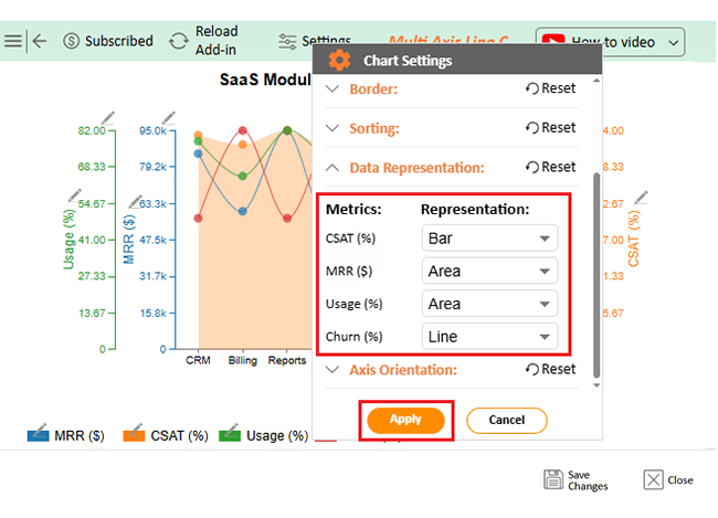
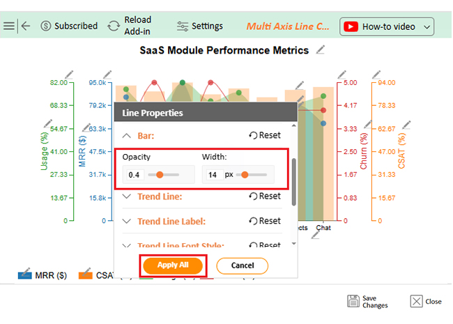
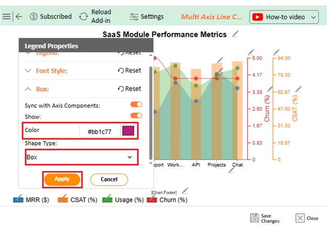
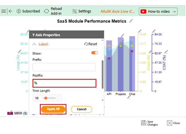
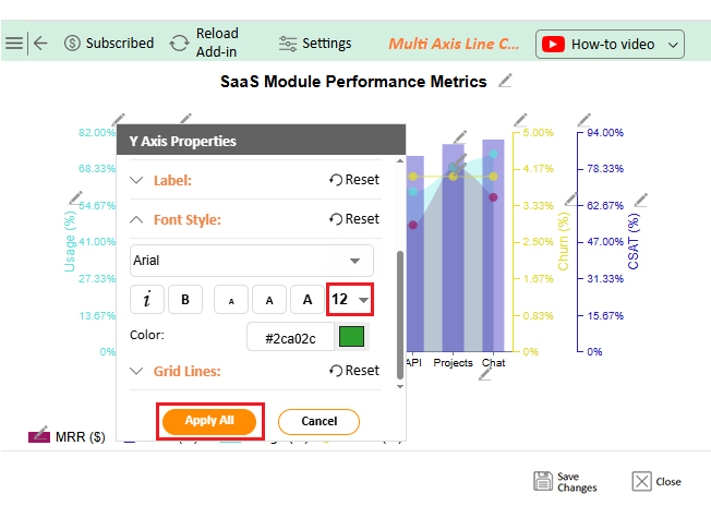
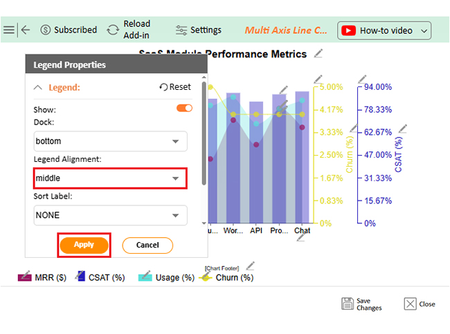
ChartExpo creates visuals from exported Power BI data without coding. You can build advanced charts like Sankey diagrams, Comparison bars, and Multi-Axis Line charts directly in Excel.
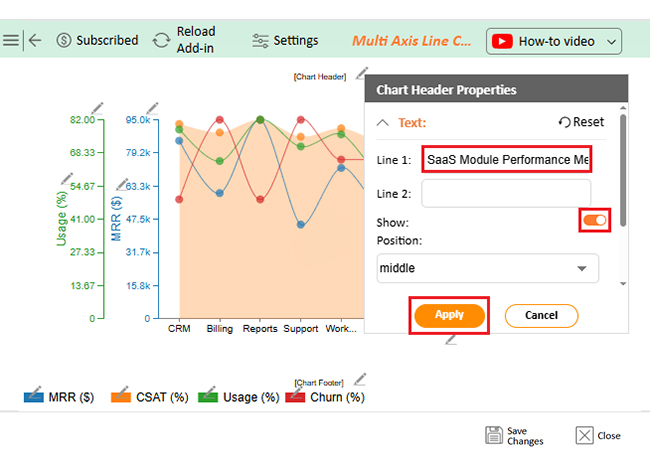
It integrates smoothly and keeps your workflow simple. The tool turns rows and columns into visuals that decision-makers can understand quickly. This means your Export Power BI Table to Excel process ends with professional-grade visuals that enhance reporting.
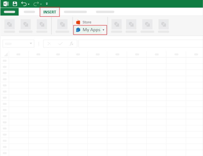
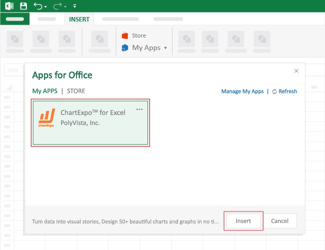
How to Install ChartExpo in Excel?
Open Microsoft Excel and start a workbook. In the ribbon, go to Insert and click My Apps to open Office Add-ins. Search for ChartExpo and click Add to install it.
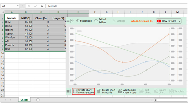
Consider we have the following data for a Multi Axis Line Chart from Export Power BI Table to Excel. This dataset contains metrics like revenue (MRR), churn, usage, and satisfaction for various modules.
It’s perfect for visualizing performance trends and spotting problem areas quickly. With ChartExpo, we can transform this raw export into a polished visual without writing formulas or complex macros.
|
Module
|
MRR ($)
|
Churn (%)
|
Usage (%)
|
|
CRM
|
85,000
|
3
|
78
|
|
Billing
|
60,000
|
5
|
65
|
|
Reports
|
95,000
|
3
|
82
|
|
Support
|
45,000
|
5
|
71
|
|
Workflow
|
72,000
|
4
|
76
|
|
API
|
55,000
|
4
|
60
|
|
Projects
|
80,000
|
4
|
69
|
|
Chat
|
67,000
|
4
|
74
|
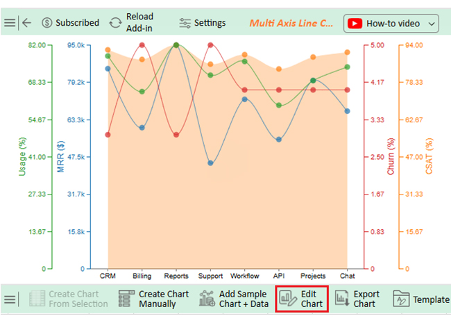
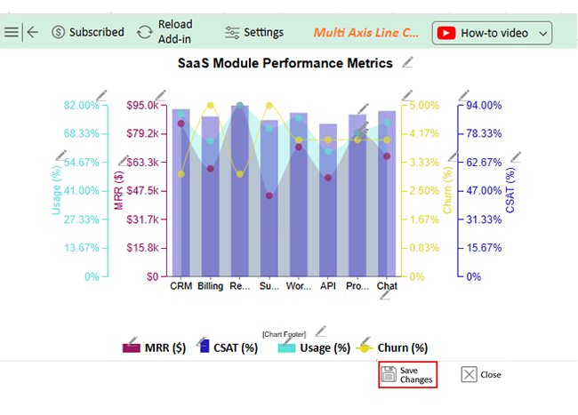
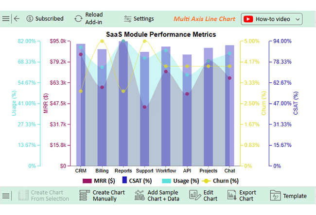
The Reports module shows the highest revenue and satisfaction. Support has the highest churn. API usage is lowest, suggesting adoption challenges. Workflow and Chat perform strongly with low churn. CRM earns high revenue but has weaker usage and satisfaction scores.
The ability to export a table from Power BI to Excel supports offline reporting and broader sharing.
You can interpolate in Excel to fill in gaps. Adding artificial intelligence to Excel helps with predictive modeling and automated insights.
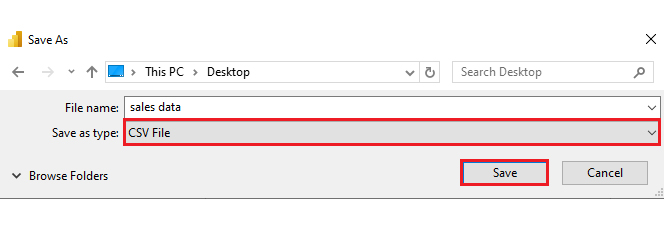
Exporting Power BI Table to Excel can be limited by file size caps, often around 150,000 rows for XLSX.
Understanding how to parse data in Excel helps clean and prepare large exports. Some features, like drill-through, won’t carry over. Access to raw data may also depend on your Power BI permissions.
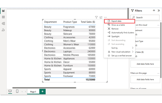
Use Export Data from the visual menu in Power BI Service, or Analyze in Excel for a live connection.
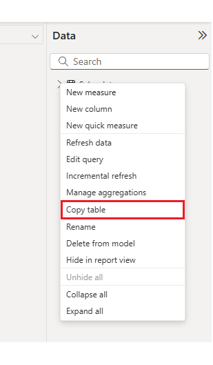
In Power BI Desktop, right-click the table visual, choose Copy Table, and paste it into Excel.
Select the visual, choose More Options (…), click Export Data, pick Excel format, then Export.
Exporting a Power BI Table to Excel is more than a data transfer; it’s a way to open new analysis possibilities. You can build a contingency table in Excel to test relationships, or create frequency tables in Excel to see distribution patterns.
With this workflow, you can keep Power BI for interactive exploration while Excel handles in-depth analysis. Combined with visualization tools, the exported data tells a story that raw numbers alone can’t match.
How much did you enjoy this article?


Learn how to use sparklines in Excel to quickly visualize trends inside cells. Discover types, creation steps, customization, use cases, benefits, and best practices.

Learn what a confidence interval graph is, how to create it in Excel, and how to interpret results to make more reliable, data-driven decisions.

A correlation matrix in Excel helps identify relationships between variables. Learn how to create, read, and use it for effective data analysis.


