• Home
  • Tools dropdown img
    • Spreadsheet Charts

      • ChartExpo for Google Sheets
      • ChartExpo for Microsoft Excel
    • Power BI Charts

      • Power BI Custom Visuals by ChartExpo
    • Word Cloud

  • Charts dropdown img
    • Chart Category

      • Bar Charts
      • Circle Graphs
      • Column Charts
      • Combo Charts
      • Comparison Charts
      • Line Graphs
      • PPC Charts
      • Sentiment Analysis Charts
      • Survey Charts
    • Chart Type

      • Box and Whisker Plot
      • Clustered Bar Chart
      • Clustered Column Chart
      • Comparison Bar Chart
      • Control Chart
      • CSAT Survey Bar Chart
      • CSAT Survey Chart
      • Dot Plot Chart
      • Double Bar Graph
      • Funnel Chart
      • Gauge Chart
      • Likert Scale Chart
      • Matrix Chart
      • Multi Axis Line Chart
      • Overlapping Bar Chart
      • Pareto Chart
      • Radar Chart
      • Radial Bar Chart
      • Sankey Diagram
      • Scatter Plot Chart
      • Slope Chart
      • Sunburst Chart
      • Tornado Chart
      • Waterfall Chart
      • Word Cloud
    • Google Sheets
      Microsoft Excel
  • Services
  • Pricing
  • Contact us
  • Blog
  • Support dropdown img
      • Gallery
      • Videos
      • Contact us
      • FAQs
      • Resources
    • Please feel free to contact us

      atsupport@chartexpo.com

Categories
All Data Visualizations Data Analytics Surveys
Add-ons/
  • Google Sheets
  • Microsoft Excel
  • Power BI
All Data Visualizations Data Analytics Surveys
Add-ons
  • Google Sheets
  • Microsoft Excel
  • Power BI

We use cookies

This website uses cookies to provide better user experience and user's session management.
By continuing visiting this website you consent the use of these cookies.

Ok

ChartExpo Survey


Home > Blog > Microsoft Excel

Cost Volume Profit (CVP) Chart: Analysis & Example

With its simple yet powerful visual representation, a cost volume profit chart provides valuable insights into a company’s financial performance. It allows you to analyze the relationship between costs, volume, and profit. This enables you to optimize your business’s operations and plan for the future.

Cost Volume Profit (CVP) Chart

Did you know that poor financial planning is one of the leading causes of business failure? In fact, according to the Bureau of Labor Statistics, approximately 20% of new businesses fail within their first year. But there’s a tool that can help you avoid this fate: the Cost Volume Profit (CVP) chart.

In this blog post, we’ll explore the fascinating world of cost volume profit charts and their essential components.

At its core, a cost volume profit chart consists of three main components: costs, volume, and profit. Costs include fixed and variable expenses a company incurs in producing and selling its products/services.

Volume refers to the number of units sold or the activity level within a given period. Profit, on the other hand, represents the difference between revenue and total costs.

This knowledge is crucial for managing your company’s finances and ensuring profitability. So, let’s dive in and unlock the power of the Cost Volume Profit chart.

Table of Content:

  1. What is Cost Volume Profit (CVP) Analysis?
  2. What is a Cost Volume Profit Chart?
  3. What are the Components of a Cost Volume Profit Chart?
  4. How to Create A Cost-Volume Profit Chart?
  5. What are the Advantages and Limitations of Cost Volume Profit Charts?
  6. Wrap Up

What is Cost Volume Profit (CVP) Analysis?

Cost-volume-profit (CVP) analysis is a method that helps managers understand how changes in costs and sales volume affect a company’s profit. This analysis is crucial for decision-making in areas such as pricing, production levels, and product line management.

What is a Cost Volume Profit Chart?

Definition: A Cost-Volume-Profit (CVP) chart illustrates the relationship between a company’s costs, volume of production/sales, and resulting profits. It depicts the total costs, revenues, and profits as functions of the volume of units produced/sold.

Therefore, it helps businesses analyze the impact of varying production levels on their financial performance.

The cost volume profit graph typically consists of the following;

  • Fixed costs.
  • Variable costs per unit.
  • Total costs.
  • Sales revenue.
  • Profit lines.

Break-even points, where total costs equal total revenue, are also identified. Beyond this point, it illustrates profit zones, where revenue surpasses costs, and loss zones, where costs exceed revenue.

Among the various types of charts, cost-volume-profit charts are instrumental in making informed decisions about pricing, production levels, and overall financial strategy.

Visualizing cost and revenue dynamics through these types of charts helps organizations assess profitability, plan production, and optimize pricing for success.

What are the Components of a Cost Volume Profit Chart?

The CVP graph is like a runway where revenue, costs, and profit flaunt their financial flair. Let’s explore the components that make this financial fashion show a standout.

  • Total Revenue Line

The total revenue line represents the cumulative income an organization generates at various sales volume levels. It typically slopes upward linearly, reflecting the direct relationship between sales and revenue.

  • Total Cost Line

Picture this as the backstage pass. It illustrates the sum of fixed and variable costs corresponding to different sales volume levels. This line may vary in slope chart and shape based on the business’s cost structure.

  • Total Cost Curve

This is where the magic happens a curve that combines the total revenue and total cost lines. Additionally, when considering factors like cost of living comparison by city, it provides a comprehensive view of the relationship between revenue and costs. As a result, it is crucial to identify profit and loss zones.

  • Profit or Loss Area

The profit or loss area is the region between the total revenue and total cost lines. Above the break-even point, it represents profit zones where revenue exceeds total costs. Below the break-even point, it represents loss zones where costs surpass revenue.

  • Break-even Point

The showstopper moment! This is where total revenue and costs are equal, marking the point of neither profit nor loss. The break-even point is the ultimate fashion statement in financial equilibrium.

How to Create A Cost-Volume Profit Chart?

Cost volume profit analysis requires you to create an insightful cost volume profit chart. Creating a Cost-Volume-Profit (CVP) chart involves plotting total revenue, variable costs, and profit at various activity levels. Here are the steps to guide you:

  1. Gather data: Collect information on total revenue and variable costs corresponding to different activity levels. Ensure you have enough data points to represent various scenarios.
  2. Open Excel and input data: Open a new Excel sheet and input your gathered data. Organize it with one column for activity levels, another for total revenue, and a third for total variable costs. Use additional columns if needed for calculations.
  3. Create Multi Series Line Chart with ChartExpo: While Excel offers default chart options, it often falls short of specialized options. To unlock more versatile visualizations like a Multi Series Line Chart, use the ChartExpo add-in.
  4. Analyze and identify the break-even point: Analyze the visual representation once your chart is ready. Identify the point where the total profit line intersects with the total revenue and total variable cost lines. This is your break-even point. Then, analyze how changes in activity levels impact profitability by observing the trends in the chart.

Let’s learn how to Install ChartExpo in Excel.

  1. Open your Excel application.
  2. Open the worksheet and click the “Insert” menu.
  3. You’ll see the “My Apps” option.
  4. In the office Add-ins window, click “Store” and search for ChartExpo on my Apps Store.
  5. Click the “Add” button to install ChartExpo in your Excel.

ChartExpo charts are available both in Google Sheets and Microsoft Excel. Please use the following CTA’s to install the tool of your choice and create beautiful visualizations in a few clicks in your favorite tool.

Cost Volume Profit Analysis Example

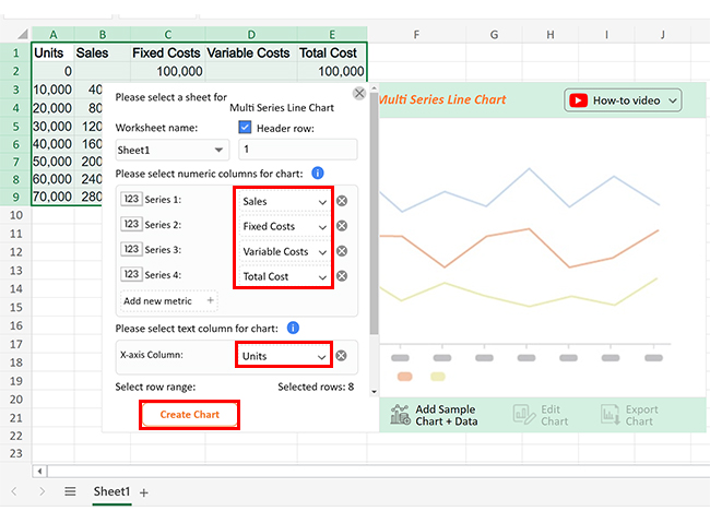
The sample data below is on sales for various units. It includes associated fixed and variable costs, illustrating total costs at different production levels.

Units Sales Fixed Costs Variable Costs Total Cost
0                       –           100,000                          –           100,000
10,000             40,000           100,000                22,000           122,000
20,000             80,000           100,000                44,000           144,000
30,000           120,000           100,000                66,000           166,000
40,000           160,000           100,000                88,000           188,000
50,000           200,000           100,000              110,000           210,000
60,000           240,000           100,000              132,000           232,000
70,000           280,000           100,000              154,000           254,000

Let’s visualize this data in Excel using ChartExpo to simplify the cost volume profit CVP analysis.

  • To get started with ChartExpo, install ChartExpo in Excel.
  • Now Click on My Apps from the INSERT menu.
insert chartexpo in excel
  • Choose ChartExpo from My Apps, then click Insert.
open chartexpo in excel
  • Once it loads, scroll through the charts list to locate and choose the “Multi Series Line Chart”.
search multi series line chart ce512
  • Put your data in Excel and select all the columns on which data need to be drawn. Then click on the “Create Chart Manually” Button as follows:
Create Chart Manually ce512
  • Add the (Sales, Fixed Costs, Variable Costs, and Total Costs) as numeric columns and Units as text columns.
  • Click the “Create Chart” button after selecting the data from the sheet, as shown.
Create Chart From Selection ce512
  • ChartExpo will generate the visualization below for you.
Cost Volume Profit (CVP) Chart Design Template
  • If you want to add anything to the chart, click the Edit Chart button:
  • Click the pencil icon next to the Chart Header to change the title.
  • It will open the properties dialog. Under the Text section, you can add a heading in Line 1 and enable Show.
  • Give the appropriate title of your chart and click the Apply button.
Apply Tittle on Chart ce512
  • Add the dollar sign with Costs and sales values as follows:
Add the dollar sign ce512
  • Change the Legend shape of All numeric text fields to Line and Circle and click the “Apply” button.
Change the Legend shape ce512
  • Click the “Save Changes” button to persist the changes made to the chart.
Save Changes ce512
  • Your final Multi Series Line Chart will look like the one below.
Final Cost Volume Profit (CVP) Chart

Insights

  • Unit sales increased to 280,000 at 70,000 units.
  • Fixed costs persist at a constant 100,000.
  • Variable costs escalate proportionally, contributing to the overall cost.
  • Total cost steadily increases, reaching 254,000 at 70,000 units.
  • The data illustrates a distinct correlation among units, sales, and costs.

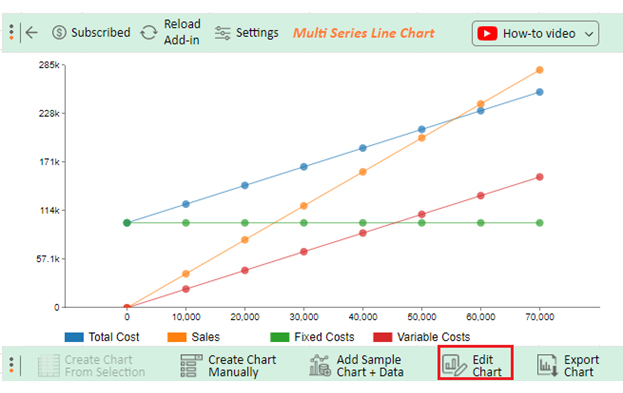
The following video will help you to create the Multi Series Line Chart in Microsoft Excel.

What are the Advantages and Limitations of Cost Volume Profit Charts?

Advantages

Here are the reasons why cost volume profit charts are the chic staple in the wardrobe of financial analysis.

  • Simplicity and clarity: Cost volume profit charts keep it simple. They distill complex financial data into a clear, concise visual narrative, ensuring everyone can be a financial guru.
  • Strategic decision support: Cost volume profit charts don’t just look good; they guide strategic decision-making. You can leverage it for insights into pricing, production, and overall strategy.
  • Identification of break-even point: Cost volume profit charts unveil the break-even point, where revenue and costs harmonize. It’s the financial dance floor where your business finds equilibrium gracefully and precisely.
  • Scenario analysis: Cost volume profit charts are the forecasters of financial climates. They enable you to play out scenarios, preparing for economic twists and turns like a seasoned trendsetter.
  • Focus on profitable products/services: Cost volume profit charts are the paparazzi for profitable products and services. They spotlight the financial stars, aiding in streamlining focus and resources for maximum impact.

Limitations

Now, let’s unveil the not-so-glamorous side of Cost volume profit charts.

  • Assumption of linearity: Cost volume profit charts assume that costs and revenue change linearly with production volume. In reality, businesses often face nonlinear dynamics, challenging the chart’s predictive accuracy.
  • Simplistic cost classifications: The profit volume chart often oversimplifies cost classifications, grouping them into fixed and variable categories. This oversimplification might neglect nuances and lead to inaccurate financial portrayals.
  • Static analysis: CVP charts operate on the assumption of static conditions, ignoring the dynamic nature of business. They freeze the financial frame, potentially missing crucial insights into changing market dynamics. Unlike a 3-statement financial analysis, which provides a comprehensive view by integrating the income statement, balance sheet, and cash flow statement, CVP charts do not account for the interconnected changes in financial statements over time.
  • Overemphasis on volume: CVP charts heavily emphasize production or sales volume. While vital, this focus may overshadow other critical factors like product mix changes or market dynamics shifts.
  • Limited application to multiproduct scenarios: CVP charts shine brightest when dealing with single products or services. However, their effectiveness diminishes in multiproduct scenarios where the wardrobe is diverse. They may struggle to accommodate the nuances of varied product lines.

FAQs

What are the three elements of CVP analysis?

The three elements of CVP analysis are:

  1. Costs: Identifying fixed and variable costs.
  2. Volume: Examining the level of activity or production.
  3. Profit: Analyzing the impact of costs and volume on the overall profitability of a business.

Is CVP analysis easy to calculate?

Yes, CVP analysis is relatively straightforward to calculate. It involves identifying fixed and variable costs, determining the break-even point, and analyzing how changes in volume impact profits. It provides valuable insights into the financial dynamics of a business.

What are the weaknesses of CVP analysis?

  1. Assumes linearity: CVP assumes a linear relationship, which may not hold in complex business scenarios.
  2. Simplistic cost classifications: Broad cost classifications oversimplify intricate cost structures.
  3. Static analysis: Fails to capture dynamic changes in the business environment.
  4. Limited multiproduct applicability: Particularly challenging in scenarios with diverse product lines.

Wrap Up

The Cost-Volume-Profit (CVP) chart is fundamental for analyzing your business’s financial performance and making informed decisions. The chart comprises three essential components: costs, volume, and profit.

Costs, the first component, represent the expenditures incurred by a business in its operations. These can be classified into fixed and variable costs. Fixed costs remain constant regardless of production levels, whereas variable costs fluctuate with the production volume.

Volume, the second component, reflects the business’s level of activity or output. It is a pivotal factor influencing costs and, consequently, profits. Understanding the relationship between volume and costs is crucial for effective financial planning and resource allocation.

Profit, the third component, is the ultimate goal of any business. CVP charts help visualize how changes in volume impact profit margins. Identifying the break-even point’ the level at which revenue equals total costs’ helps you strategize to enhance profitability.

ChartExpo enhances the CVP chart by incorporating dynamic features like real-time data updates. This, as a result, facilitates adaptability to changing market conditions. Additionally, the user-friendly interface ensures accessibility for professionals across diverse sectors, fostering informed decision-making.

Do not hesitate.

Embrace the CVP chart with ChartExpo today and revolutionize your decision-making in today’s ever-evolving economic landscape.

How much did you enjoy this article?

ExcelAd2
Start Free Trial!
133261

Related articles

next previous
Microsoft Excel8 min read

Excel Task Tracker Template for Smarter Task Insights

Task tracker template in Excel organizes tasks, tracks deadlines, and boosts efficiency. Learn its benefits, and explore expert tips to simplify task management.

Microsoft Excel10 min read

Invoice Tracker Template in Excel for Better Insights

An invoice tracker Excel template helps track invoices, due dates, and payments. Learn how to use this template for better financial management.

Microsoft Excel12 min read

Key Performance Indicators in Healthcare for Better Insights

Key Performance Indicators in healthcare track patient care and efficiency. Learn about these KPIs, top examples, and how to use them to improve outcomes.

Microsoft Excel10 min read

BMI Calculation Formula in Excel for Better Fitness Insights

The BMI calculation formula in Excel helps track and analyze body mass index. Explore step-by-step instructions and tips to simplify BMI tracking in Excel.

Microsoft Excel29 min read

How to Create a Tornado Chart in Excel? A Complete Guide

Click to learn how to plot a Tornado Chart in Excel using easy-to-follow steps. Also, we’ll address the following question: what is a Tornado Diagram?

ChartExpo logo

Turn Data into Visual
Stories

CHARTEXPO

  • Home
  • Gallery
  • Videos
  • Services
  • Pricing
  • Contact us
  • FAQs
  • Privacy policy
  • Terms of Service
  • Sitemap

TOOLS

  • ChartExpo for Google Sheets
  • ChartExpo for Microsoft Excel
  • Power BI Custom Visuals by ChartExpo
  • Word Cloud

CATEGORIES

  • Bar Charts
  • Circle Graphs
  • Column Charts
  • Combo Charts
  • Comparison Charts
  • Line Graphs
  • PPC Charts
  • Sentiment Analysis Charts
  • Survey Charts

TOP CHARTS

  • Sankey Diagram
  • Likert Scale Chart
  • Comparison Bar Chart
  • Pareto Chart
  • Funnel Chart
  • Gauge Chart
  • Radar Chart
  • Radial Bar Chart
  • Sunburst Chart
  • see more
  • Scatter Plot Chart
  • CSAT Survey Bar Chart
  • CSAT Survey Chart
  • Dot Plot Chart
  • Double Bar Graph
  • Matrix Chart
  • Multi Axis Line Chart
  • Overlapping Bar Chart
  • Control Chart
  • Slope Chart
  • Clustered Bar Chart
  • Clustered Column Chart
  • Box and Whisker Plot
  • Tornado Chart
  • Waterfall Chart
  • Word Cloud
  • see less

RESOURCES

  • Blog
  • Resources
  • YouTube
SIGN UP FOR UPDATES

We wouldn't dream of spamming you or selling your info.

© 2025 ChartExpo, all rights reserved.