• Home
  • Tools dropdown img
    • Spreadsheet Charts

      • ChartExpo for Google Sheets
      • ChartExpo for Microsoft Excel
    • Power BI Charts

      • Power BI Custom Visuals by ChartExpo
    • Word Cloud

  • Charts dropdown img
    • Chart Category

      • Bar Charts
      • Circle Graphs
      • Column Charts
      • Combo Charts
      • Comparison Charts
      • Line Graphs
      • PPC Charts
      • Sentiment Analysis Charts
      • Survey Charts
    • Chart Type

      • Box and Whisker Plot
      • Clustered Bar Chart
      • Clustered Column Chart
      • Comparison Bar Chart
      • Control Chart
      • CSAT Survey Bar Chart
      • CSAT Survey Chart
      • Dot Plot Chart
      • Double Bar Graph
      • Funnel Chart
      • Gauge Chart
      • Likert Scale Chart
      • Matrix Chart
      • Multi Axis Line Chart
      • Overlapping Bar Chart
      • Pareto Chart
      • Radar Chart
      • Radial Bar Chart
      • Sankey Diagram
      • Scatter Plot Chart
      • Slope Chart
      • Sunburst Chart
      • Tornado Chart
      • Waterfall Chart
      • Word Cloud
    • Google Sheets
      Microsoft Excel
  • Services
  • Pricing
  • Contact us
  • Blog
  • Support dropdown img
      • Gallery
      • Videos
      • Contact us
      • FAQs
      • Resources
    • Please feel free to contact us

      atsupport@chartexpo.com

Categories
All Data Visualizations Data Analytics Surveys
Add-ons/
  • Google Sheets
  • Microsoft Excel
  • Power BI
All Data Visualizations Data Analytics Surveys
Add-ons
  • Google Sheets
  • Microsoft Excel
  • Power BI

We use cookies

This website uses cookies to provide better user experience and user's session management.
By continuing visiting this website you consent the use of these cookies.

Ok

ChartExpo Survey


Home > Blog > Microsoft Excel

Cost Versus Value Report: Visualize the Difference

What is a cost versus value report, and why does it matter? This report provides data-driven insights into how home improvement projects impact resale value. For homeowners and real estate investors, it’s a tool to gauge returns on renovation investments.

Cost Versus Value Report

Imagine updating a kitchen or adding a deck. Do these projects pay off when it’s time to sell? A cost versus value report helps answer that question. This report highlights which upgrades bring the highest returns by comparing project costs with resale value. Choosing the right colors for graphs in the report can make the insights more engaging and interpretable.

Homebuyers’ preferences also influence value. Many prioritize curb appeal. Exterior upgrades, such as new siding or windows, consistently rank high in cost versus value reports. These updates are functional and boost the home’s aesthetic appeal.

Location plays a role, too. However, some projects perform better in urban settings, while others excel in suburban or rural areas. Analyzing trends using tools like multiple regressions in Excel helps identify these patterns with precision.

Whether planning to sell soon or years later, this report is a valuable guide. It allows you to align your renovation goals with market demands and financial expectations.

Table of Contents:

  1. What is Cost vs. Value Report?
  2. Why to Use a Cost Valuation Report?
  3. When Should You Use Cost Versus Value Report?
  4. How to Create a Cost vs. Value Report?
  5. How to Analyze a Cost vs. Value Report in Excel?
  6. Advantages and Disadvantages of Cost vs. Value Reporting
  7. Best Practices of Cost vs. Value Report
  8. FAQs
  9. Wrap Up

What is Cost vs. Value Report?

Definition: A cost vs. value report compares the cost of home improvement projects to their impact on resale value. It helps homeowners decide which renovations offer the best return on investment. For instance, a new garage door may yield higher returns than a luxury kitchen remodel.

This report uses actual data to show trends and regional differences. A monthly financial report template in Excel simplifies tracking costs and returns over time. It’s a practical tool for making informed renovation decisions.

Therefore, homeowners can prioritize projects that maximize their investment by understanding costs and potential value.

How to Present Cost Versus Value Data in Microsoft Excel with a Multi-Axis Line Chart for Better Financial Understanding

How to Present Cost Versus Value Data in Google Sheets with a Multi-Axis Line Chart for Better Financial Understanding

Why to Use a Cost Valuation Report?

Understanding the value of every dollar spent is crucial. A cost valuation report bridges the gap between investment and return. It’s more than numbers; it’s a roadmap to smarter decisions and better results.

  • Assessing return on investment (ROI): A cost valuation report highlights which projects or expenses yield the highest ROI. This ensures your efforts and money deliver measurable benefits.
  • Improved budgeting and resource allocation: Knowing where to allocate resources makes the difference. The report identifies areas requiring more attention and where costs can be trimmed.
  • Informed decision-making: This report transforms data into actionable insights. It helps you prioritize actions that align with your financial goals.
  • Improving operational efficiency: A cost valuation report identifies inefficiencies, streamlining operations and boosting productivity.
  • Transparency and accountability: Every decision has consequences. This report provides a clear view of costs and results, fostering trust and ensuring accountability within teams or organizations.

When Should You Use Cost Versus Value Report?

Timing is everything. A cost versus value report isn’t just a document; it’s a guide to smarter planning and better decisions. Knowing when to use it can maximize impact and minimize risks.

  • Project planning and initiation: Before starting a project, knowing what’s worth pursuing is essential. A cost versus value report identifies projects that align with your goals and offer the best returns on investment.
  • Investment decisions: Every investment has risks and rewards. The report provides data-driven insights to evaluate potential returns and choose the highest-value options.
  • Budgeting and financial forecasting: Planning a budget requires accuracy. A cost versus value report predicts costs and outcomes, enabling efficient resource allocation.
  • Performance review: Looking back at completed projects is critical to improvement. This report measures how projects performed compared to expectations, revealing successes and areas for growth.
  • Cost optimization: Maximizing value means eliminating unnecessary expenses. This report pinpoints areas where costs can be reduced without sacrificing quality or results.

How to Create a Cost vs. Value Report?

A cost vs. value report turns raw data into actionable insights. It’s a step-by-step process that helps you understand the balance between spending and benefits. Here’s how to create one effectively.

  1. Define the scope and objective: Determine the report’s purpose. Outline clearly what you want to measure and the questions you aim to answer.
  2. Identify costs: Gather detailed information about all project costs. You can use an expense report template in Excel to gather this information. Include direct expenses, like materials, and indirect ones, such as labor or overhead.
  3. Estimate value or benefits: Evaluate potential returns with measurable metrics such as revenue growth or cost reductions. Business analytics can refine projections for better decisions.
  4. Analyze the data: Examine the relationship between costs and benefits. Identify patterns, strengths, and weaknesses to inform your decisions.
  5. Visualize the data: Present the information using graphs, charts, or tables. Visual tools help you spot trends and communicate findings effectively.
  6. Conclude: Summarize the data about the project’s cost compared to the expected value. Highlight key insights and actionable recommendations based on your analysis.
  7. Prepare a report: Organize your findings into a structured, easy-to-read document. Include visuals, summaries, and clear recommendations for stakeholders.

How to Analyze a Cost vs. Value Report in Excel?

Understanding the cost versus value report is key to making smarter investments. It helps weigh project costs against potential returns, offering insights into profitability.

However, raw data alone can be overwhelming. That’s where data visualization shines—it transforms numbers into clear, actionable insights.

Unfortunately, Excel’s limited visualization tools often fail to deliver the clarity needed. So, install ChartExpo. ChartExpo is a game-changing solution that enhances data visualization, making complex analysis simple and visually compelling.

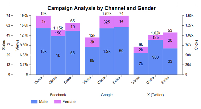
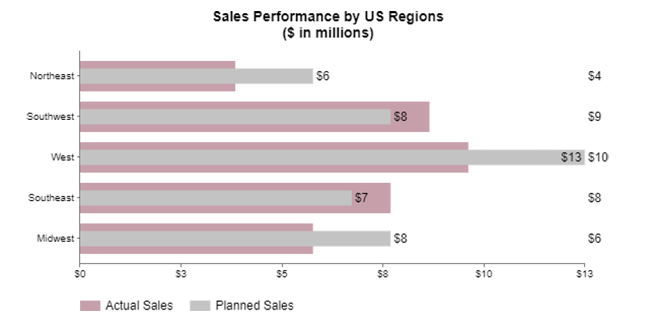
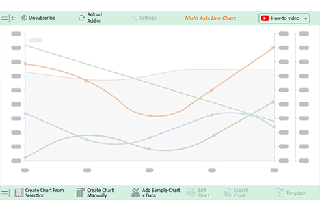
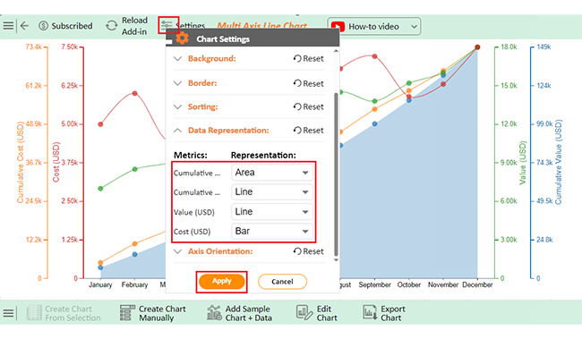
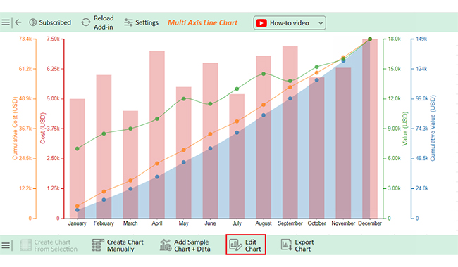
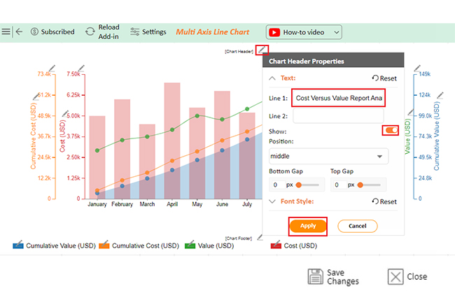
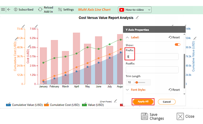
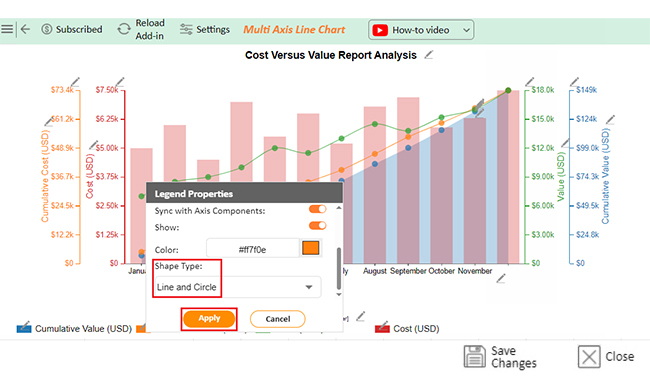
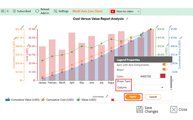
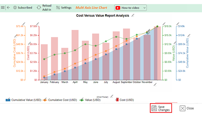
The charts below were created in Excel using ChartExpo:

Multi-Axis Line Chart:

Cost Versus Value Report

Sankey Chart:

Cost Versus Value Report

Progress Chart:

Cost Versus Value Report

Clustered Stacked Bar Chart:

Cost Versus Value Report

Overlapping Bar Chart:

Cost Versus Value Report

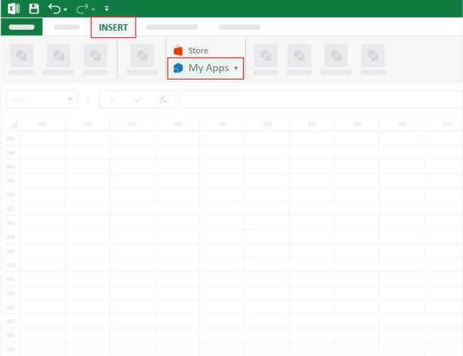
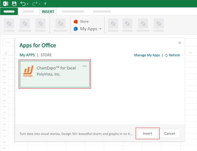
How to Install ChartExpo in Excel?

  1. Open your Excel application.
  2. Open the worksheet and click the “Insert” menu.
  3. You’ll see the “My Apps” option.
  4. In the Office Add-ins window, click “Store” and search for ChartExpo on my Apps Store.
  5. Click the “Add” button to install ChartExpo in your Excel.

ChartExpo charts are available both in Google Sheets and Microsoft Excel. Please use the following CTAs to install the tool of your choice and create beautiful visualizations with a few clicks in your favorite tool.

Example

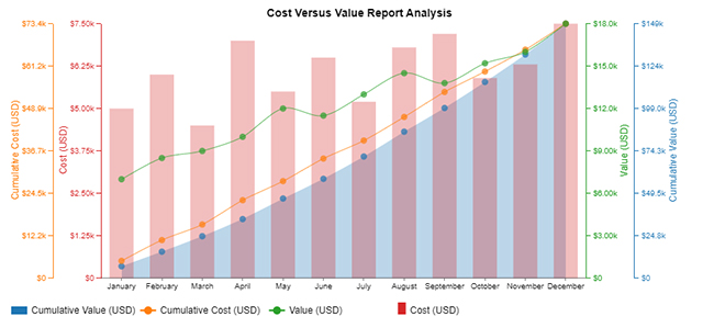
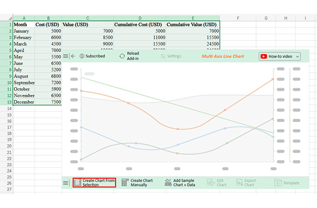
Let’s analyze this sample data in Excel using ChartExpo. To ensure the accuracy of your data, start by learning how to clean data in Excel.
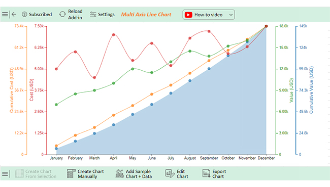
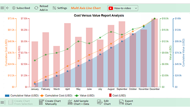
Month Cost (USD) Value (USD) Cumulative Cost (USD) Cumulative Value (USD)
January 5000 7000 5000 7000
February 6000 8500 11000 15500
March 4500 9000 15500 24500
April 7000 10000 22500 34500
May 5500 12000 28000 46500
June 6500 11500 34500 58000
July 5200 13000 39700 71000
August 6800 14500 46500 85500
September 7200 13800 53700 99300
October 5900 15200 59600 114500
November 6300 16000 65900 130500
December 7500 18000 73400 148500


  • To get started with ChartExpo, install ChartExpo in Excel.
  • Now Click on My Apps from the INSERT menu.
Cost Versus Value Report
  • Choose ChartExpo from My Apps, then click Insert.
Cost Versus Value Report
  • Once it loads, scroll through the charts list to locate and choose the “Multi Axis Line Chart”.
Cost Versus Value Report
  • You will see a Multi Axis Line Chart on the screen.
Cost Versus Value Report
  • Click the “Create Chart From Selection” button after selecting the data from the sheet, as shown.
Cost Versus Value Report
  • ChartExpo will generate the visualization below for you.
Cost Versus Value Report
  • Click on Settings and change the “Data Representation” as follows.
Cost Versus Value Report
  • If you want to add anything to the chart, click the Edit Chart button:
Cost Versus Value Report
  • Click the pencil icon next to the Chart Header to change the title.
  • It will open the properties dialog. Under the Text section, you can add a heading in Line 1 and enable Show.
  • Give the appropriate title of your chart and click the Apply button.
Cost Versus Value Report
  • You can add the dollar sign with discounted cash flow value as follows:
Cost Versus Value Report
  • Change the legend shape of “Discount Rate” into a Line and Circle and click the “Apply” button.
Cost Versus Value Report
  • Change the Legend shape of Cost into a Column as follows:
Cost Versus Value Report
  • Click the “Save Changes” button to persist the changes made to the chart.
Cost Versus Value Report
  • Your final Multi Axis Line Chart will look like the one below.
Cost Versus Value Report

Insights

  • The chart highlights steady growth in costs and value throughout the year.
  • Value grows at a faster rate than costs.
  • Cumulative metrics indicate robust overall growth.
  • December shows the largest spike in value, signaling a strong year-end performance.

Advantages and Disadvantages of Cost vs. Value Reporting

Understanding how costs compare to the value generated is crucial when managing projects. Cost vs. value reporting offers resource insights but has challenges. Let’s examine the advantages and disadvantages of this reporting method.

Advantages of Cost vs. Value Reporting:

  • Informed decision-making: Cost vs. value reporting gives leaders the information to make data-driven decisions. It helps avoid guesswork by clearly showing the relationship between costs and outcomes.
  • Improved resource allocation: By comparing costs and value, you can identify areas where resources are wasted or underutilized. This ensures investments are directed where they will generate the most benefit.
  • ROI evaluation: This reporting method allows you to assess whether the money spent yields a good return. Therefore, it helps you determine whether the project is meeting financial expectations.
  • Increased accountability: Clear reporting holds teams and managers responsible for costs and the value they produce. It fosters transparency and ensures everyone is aligned on project goals.

Disadvantages of Cost vs. Value Reporting:

  • Complexity in estimating value: Estimating value is often subjective, especially when dealing with non-financial outcomes like customer satisfaction. However, it can lead to inconsistent or inaccurate assessments of value.
  • Time-consuming: Collecting, analyzing, and interpreting data for cost vs. value reporting can be resource-intensive. The time spent on these activities can delay decision-making and progress.
  • Risk of oversimplification: Focusing only on cost and value may overlook other important factors, like quality or long-term impact. It could lead to skewed conclusions and missed opportunities.

Best Practices of Cost vs. Value Report

Creating a cost vs. value report is not just about collecting data; it’s about making it meaningful and actionable. Let’s explore some best practices to help you create a more effective and insightful report.

  • Clear objective definition: Define the report’s purpose from the start. Knowing what you want to measure helps keep the report focused and relevant.
  • Accurate cost tracking: Track all costs, direct and indirect. A dynamic graph Excel can help visualize expenses accurately.
  • Quantifying intangible benefits: Some benefits, like improved customer satisfaction, are hard to measure. So, develop a method to quantify these intangible factors for a complete picture.
  • Use of visuals: Incorporate charts, graphs, and tables to make data easier to digest. Visuals highlight trends and insights, making your report more engaging and actionable.
  • Regular updates: Update your report regularly to track progress and changes. Remodeling your cost vs. value report helps you adjust strategies and always use current data.
  • Stakeholder involvement: Involve key stakeholders to ensure the report reflects different perspectives. Their input ensures that all relevant factors are considered.

FAQs

Is a cost vs. value report accurate?

A cost vs. value report is generally accurate but not flawless. It uses average data, which may not reflect unique scenarios. Local market conditions and project specifics can affect its accuracy. So, use this report as a guide, not a guarantee.

What does cost vs. value mean?

Cost vs. value compares a project’s expense to its potential return. It shows how much value a project adds compared to its cost. This helps prioritize investments, ensuring resources are spent on higher-return projects.

What is the difference between cost price and value in real estate?

In real estate, the cost price is the amount spent to build or buy a property. Value represents the property’s worth in the market. Cost reflects expenses, while value depends on location, demand, and market conditions.

Wrap Up

A cost versus value report is more than just numbers. It bridges the gap between project expenses and potential returns, making it a vital tool for smarter decision-making. The best-designed dashboards can enhance this report, making complex data easier to understand and act upon.

The report provides clarity. It compares costs with resale or functional value, helping homeowners and businesses prioritize improvements effectively. Learning how to create a report in Excel can streamline this process, offering flexibility and precision.

Real data drives the insights. Trends, regional differences, and buyer preferences shape the findings, ensuring decisions are grounded in facts, not guesswork. Visualizing these trends with KPI graphs can highlight key areas for improvement or growth.

This report highlights where the value lies. Some projects, like exterior upgrades, often bring higher returns. Others may serve specific needs but offer less resale impact.

Using the report saves time and money. It prevents overspending on low-value projects and ensures investments align with market demands.

Informed decisions lead to better outcomes. The cost versus value report helps people make informed choices and is a trusted tool for maximizing returns.

Install ChartExpo for better cost vs. value data presentation and analysis. It will make gleaning insights a breeze.

How much did you enjoy this article?

ExcelAd1
Start Free Trial!
148726

Related articles

next previous
Microsoft Excel8 min read

Excel Task Tracker Template for Smarter Task Insights

Task tracker template in Excel organizes tasks, tracks deadlines, and boosts efficiency. Learn its benefits, and explore expert tips to simplify task management.

Microsoft Excel10 min read

Invoice Tracker Template in Excel for Better Insights

An invoice tracker Excel template helps track invoices, due dates, and payments. Learn how to use this template for better financial management.

Microsoft Excel12 min read

Key Performance Indicators in Healthcare for Better Insights

Key Performance Indicators in healthcare track patient care and efficiency. Learn about these KPIs, top examples, and how to use them to improve outcomes.

Microsoft Excel10 min read

BMI Calculation Formula in Excel for Better Fitness Insights

The BMI calculation formula in Excel helps track and analyze body mass index. Explore step-by-step instructions and tips to simplify BMI tracking in Excel.

Microsoft Excel29 min read

How to Create a Tornado Chart in Excel? A Complete Guide

Click to learn how to plot a Tornado Chart in Excel using easy-to-follow steps. Also, we’ll address the following question: what is a Tornado Diagram?

ChartExpo logo

Turn Data into Visual
Stories

CHARTEXPO

  • Home
  • Gallery
  • Videos
  • Services
  • Pricing
  • Contact us
  • FAQs
  • Privacy policy
  • Terms of Service
  • Sitemap

TOOLS

  • ChartExpo for Google Sheets
  • ChartExpo for Microsoft Excel
  • Power BI Custom Visuals by ChartExpo
  • Word Cloud

CATEGORIES

  • Bar Charts
  • Circle Graphs
  • Column Charts
  • Combo Charts
  • Comparison Charts
  • Line Graphs
  • PPC Charts
  • Sentiment Analysis Charts
  • Survey Charts

TOP CHARTS

  • Sankey Diagram
  • Likert Scale Chart
  • Comparison Bar Chart
  • Pareto Chart
  • Funnel Chart
  • Gauge Chart
  • Radar Chart
  • Radial Bar Chart
  • Sunburst Chart
  • see more
  • Scatter Plot Chart
  • CSAT Survey Bar Chart
  • CSAT Survey Chart
  • Dot Plot Chart
  • Double Bar Graph
  • Matrix Chart
  • Multi Axis Line Chart
  • Overlapping Bar Chart
  • Control Chart
  • Slope Chart
  • Clustered Bar Chart
  • Clustered Column Chart
  • Box and Whisker Plot
  • Tornado Chart
  • Waterfall Chart
  • Word Cloud
  • see less

RESOURCES

  • Blog
  • Resources
  • YouTube
SIGN UP FOR UPDATES

We wouldn't dream of spamming you or selling your info.

© 2025 ChartExpo, all rights reserved.