• Home
  • Tools dropdown img
    • Spreadsheet Charts

      • ChartExpo for Google Sheets
      • ChartExpo for Microsoft Excel
    • Power BI Charts

      • Power BI Custom Visuals by ChartExpo
    • Word Cloud

  • Charts dropdown img
    • Chart Category

      • Bar Charts
      • Circle Graphs
      • Column Charts
      • Combo Charts
      • Comparison Charts
      • Line Graphs
      • PPC Charts
      • Sentiment Analysis Charts
      • Survey Charts
    • Chart Type

      • Box and Whisker Plot
      • Clustered Bar Chart
      • Clustered Column Chart
      • Comparison Bar Chart
      • Control Chart
      • CSAT Survey Bar Chart
      • CSAT Survey Chart
      • Dot Plot Chart
      • Double Bar Graph
      • Funnel Chart
      • Gauge Chart
      • Likert Scale Chart
      • Matrix Chart
      • Multi Axis Line Chart
      • Overlapping Bar Chart
      • Pareto Chart
      • Radar Chart
      • Radial Bar Chart
      • Sankey Diagram
      • Scatter Plot Chart
      • Slope Chart
      • Sunburst Chart
      • Tornado Chart
      • Waterfall Chart
      • Word Cloud
    • Google Sheets
      Microsoft Excel
  • Services
  • Pricing
  • Contact us
  • Blog
  • Support dropdown img
      • Gallery
      • Videos
      • Contact us
      • FAQs
      • Resources
    • Please feel free to contact us

      atsupport@chartexpo.com

Categories
All Data Visualizations Data Analytics Surveys
Add-ons/
  • Google Sheets
  • Microsoft Excel
  • Power BI
All Data Visualizations Data Analytics Surveys
Add-ons
  • Google Sheets
  • Microsoft Excel
  • Power BI

We use cookies

This website uses cookies to provide better user experience and user's session management.
By continuing visiting this website you consent the use of these cookies.

Ok

ChartExpo Survey


Home > Blog > Data Analytics

Analytics in Insurance Industry: From Data to Clear Insights

Margins can flip when claim frequency rises a fraction. Analytics in the insurance industry helps insurers spot those shifts early, before loss ratio reports arrive. It connects policy, claims, and service activity into shared measures.

Analytics in Insurance Industry

When underwriting and claims teams trust the same numbers, pricing, and triage decisions move faster.

This guide breaks down definitions, benefits, limits, and common use cases. You will also follow a Power BI walkthrough that keeps the list structure intact.

Along the way, you will see how visuals can present risk, fraud, and renewal patterns without forcing readers into spreadsheets. Use it to plan data work that supports decisions, not slides.

Table of Contents:

  1. What are Analytics in Insurance Industry?
  2. Why is Analytics Important in Insurance Industry?
  3. Key Applications of Analytics in Insurance Industry
  4. Trends in Insurance Data Analytics
  5. Types of Analytics Used in Insurance Industry
  6. Examples of Analytics in Insurance Industry
  7. How to Conduct Insurance Analytics in Power BI?
  8. Benefits of Analytics in Insurance Industry
  9. Challenges of Analytics in Insurance Industry
  10. Use Cases of Analytics in Insurance Industry
  11. FAQs
  12. Wrap up

What are Analytics in Insurance Industry?

Definition: Analytics in insurance industry is the practice of turning policy, claims, and customer records into repeatable decisions. Teams clean data, define measures, and apply statistical models to score risk and flag anomalies.

Outputs guide underwriting, pricing, reserving, fraud review, and service, so actions follow evidence rather than gut feel. It also standardizes definitions across departments, which makes performance comparisons consistent.

With aligned definitions, analysts can compare results by product, region, and channel without arguing about sources. They can test whether a rule change reduces leakage, measure adjuster workload, and monitor renewal signals. Leaders get dashboards and alerts that surface exceptions early, not after losses compound over time.

Why is Analytics Important in Insurance Industry?

It matters because business analytics turns scattered operations data into consistent signals that support defensible decisions across teams.

Key reasons insurers rely on it:

  • Risk-scoring accuracy: Models blend historical and behavioral data to group applicants and reduce mispriced exposure at intake.
  • Underwriting consistency: Data-backed terms speed approvals, limit adverse selection, and keep portfolios within appetite over time.
  • Fraud control earlier: Pattern checks flag odd claim behavior, so investigators focus on high-leakage cases first.
  • Pricing alignment: Forecasts tie premiums to expected frequency and severity by segment.
  • Service improvement: Insights support faster resolutions, better coverage fit, and higher renewals overall.
  • Planning readiness: Predictive models anticipate churn, claim volume, and emerging hazards, guiding staffing and reserves.
  • Compliance strength: Standard metrics improve reporting accuracy, audit trails, and regulatory governance.

Key Applications of Analytics in Insurance Industry

Analytics in insurance industry supports underwriting, claims, fraud, pricing, and retention with shared measures.

Common uses include:

  • Claims Automation: Routes cases, validates documents, and shortens settlement cycles without increasing adjuster headcount.
  • Fraud Detection: Scores anomalies and prioritizes investigations where payout risk is highest.
  • Segmentation: Uses customer analytics to group policyholders so outreach aligns with their needs and value.
  • Rate Modeling: Leverages key drivers to set premiums that accurately reflect risk exposure by segment.
  • Portfolio Risk: Aggregates exposures and limits to inform capital allocation decisions.
  • Growth Tracking: Compares channel performance, optimizes spend, and improves efficiency across products.
  • Renewal Defense: Predicts churn and triggers proactive retention actions before customers lapse.

Trends in Insurance Data Analytics

Data analytics in insurance industry is shifting toward cloud pipelines, self-serve dashboards, and model monitoring that shortens decision cycles today.

  • AI-led risk scoring: Machine learning refines risk tiers by combining historical data, behavioral patterns, and external signals for underwriting.
  • Fraud forecasting: Predictive analytics in Power BI ranks suspicious claims, enabling investigators to review the highest-risk cases first each day.
  • Faster decisions: Streaming data feeds refresh dashboards in near real time, improving claim routing when documents or payments arrive.
  • Retention signals: Interaction data reveals renewal intent, cross-sell opportunities, and service pain points across segments.
  • Cloud platforms: Cloud-based analytics tools scale storage and compute, ensuring metrics are accessible across teams.
  • Stronger governance: Privacy controls, access logs, and model transparency help meet regulatory and audit requirements.

Types of Analytics Used in Insurance Industry

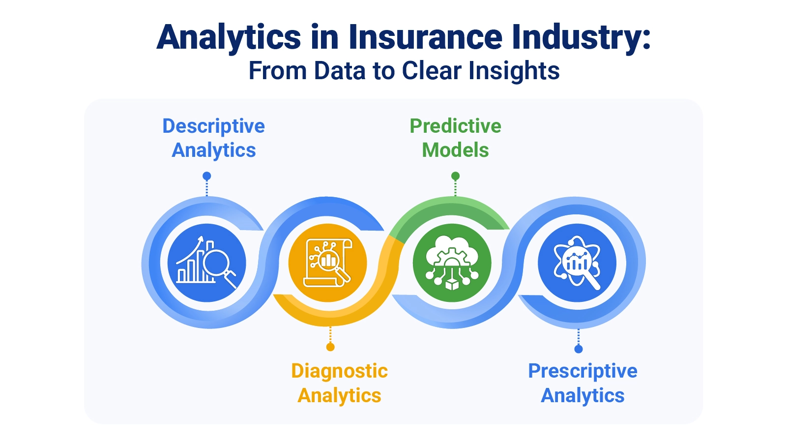
Analytics in insurance industry uses descriptive, diagnostic, predictive, and prescriptive approaches. Each method answers a question, and data analysis stays consistent across underwriting, claims, and retention workstreams.

  • Descriptive analytics: Summarizes results to show volumes, loss ratios, and cycle times by line.
  • Diagnostic analytics: Identifies the drivers behind shifts, such as spikes in loss ratios or growing claim backlogs.
  • Predictive analytics: Estimates claim frequency, lapse risk, and fraud propensity using early signals.
  • Prescriptive analytics: Recommends actions by balancing constraints, cost, and impact across scenarios to support better decision-making.

Examples of Analytics in Insurance Industry

Examples show how analytics in insurance industry turns raw operations data into dashboards that highlight risk, fraud, and renewal movement.

  1. Claims workflow dashboard

It tracks intake, routing, approvals, and investigations, letting managers spot bottlenecks and match adjuster capacity to weekly demand across teams.

Analytics in Insurance Industry
  1. Risk tier profiling

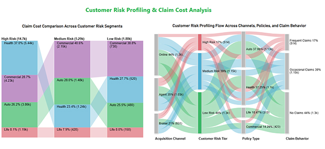
This view compares segments by expected loss and claim cost, helping teams adjust terms and focus outreach on safer cohorts.

Analytics in Insurance Industry
  1. Renewal and premium retention dashboard

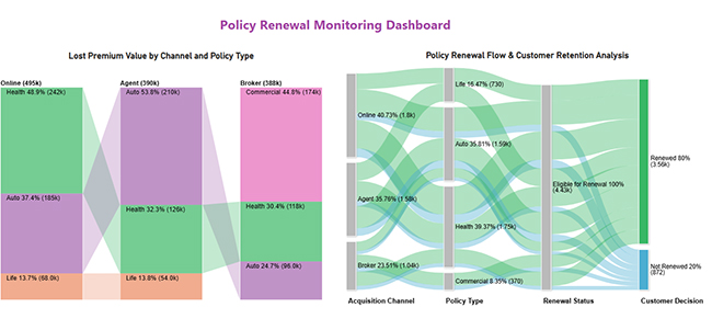
It monitors renewals by channel and product, isolates where premium drops concentrate, and flags cohorts likely to lapse before billing closes, enabling targeted retention outreach early.

Analytics in Insurance Industry

How to Conduct Insurance Analytics in Power BI?

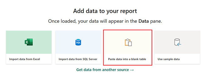
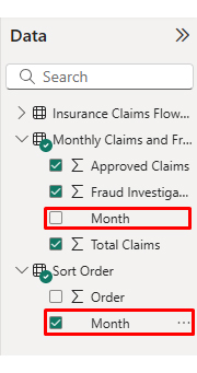
A Power BI workflow starts with inputs, measures, and visuals. Analytics in insurance industry stays usable when refreshed, and definitions remain stable.

  • Connect core data

First, confirm each data source in Power BI points to claims, policies, and payments, then refresh and validate totals today.

  • Clean and shape data

Standardize fields, fix blanks, and align dates so measures calculate correctly everywhere.

  • Define key measures

Choose KPIs such as loss ratio, severity, frequency, and cycle time, and document formulas to reuse.

  • Design dashboard views

Pick visuals that show bottlenecks, segment shifts, and hotspots at a glance.

  • Assess portfolio mix

Use the percentage of total in Power BI to show the product’s share of premium and claims.

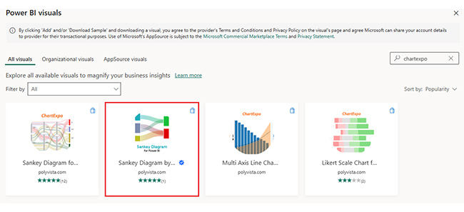
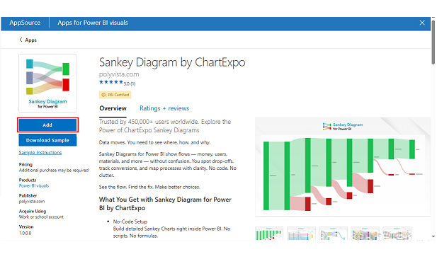
ChartExpo adds Power BI charts that clarify flows, comparisons, and sentiment for stakeholders fast.

Why use ChartExpo?

  • Turns complex tables into readable visuals fast.
  • Makes insights easier to share across teams.
  • Speeds data-led decisions today.
  • Includes a 7-day trial, then costs $10 per month only.

Example:

  • Log in to Power BI.
  • Enter your email. Click the “submit” button.
Analytics in Insurance Industry
  • You are redirected to your Microsoft account.
  • Enter your password and click “sign in”.
Analytics in Insurance Industry
  • Choose whether to stay signed in.
Analytics in Insurance Industry
  • Once done, the home screen will open.

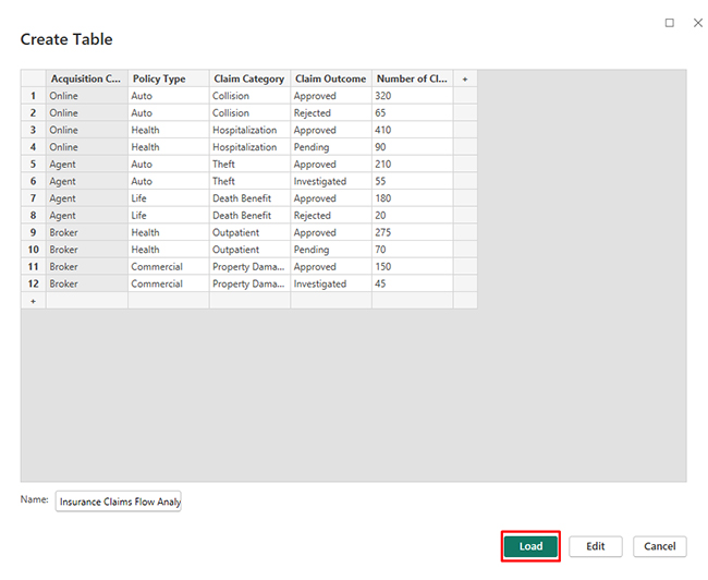
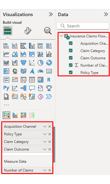
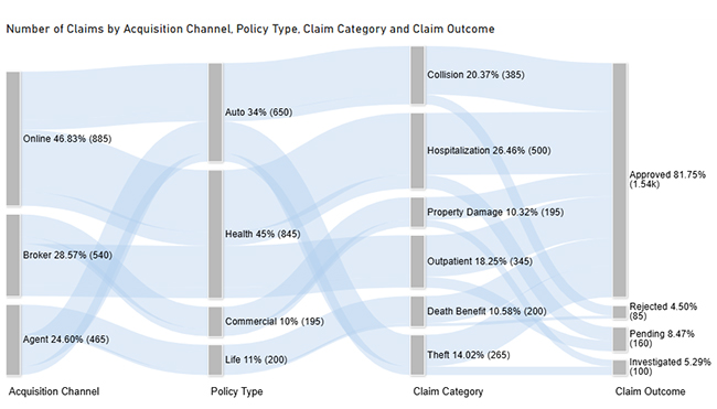
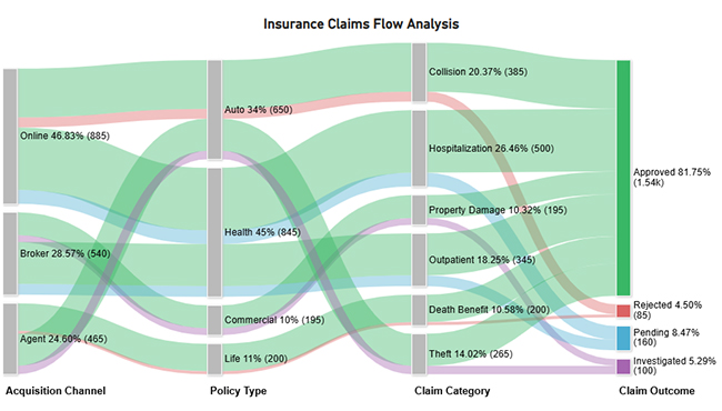
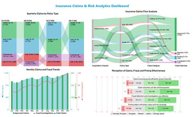
Use this data to build a Sankey Chart now.

Acquisition channel

Policy type Claim category Claim outcome

Number of claims

Online Auto Collision Approved 320
Online Auto Collision Rejected 65
Online Health Hospitalization Approved 410
Online Health Hospitalization Pending 90
Agent Auto Theft Approved 210
Agent Auto Theft Investigated 55
Agent Life Death benefit Approved 180
Agent Life Death benefit Rejected 20
Broker Health Outpatient Approved 275
Broker Health Outpatient Pending 70
Broker Commercial Property damage Approved 150
Broker Commercial Property damage Investigated 45
  • First, you need to add data to your report and click on the “paste data into a blank report”.
Analytics in Insurance Industry
  • Paste the data table above into a blank table, name it, and click on the “load” button.
Analytics in Insurance Industry
  • To build a Sankey Chart, import the visual from the app source by opening the visualizations panel.
  • Select “get more visuals”.
Analytics in Insurance Industry
  • Search ChartExpo and select the Sankey diagram. It’s also recommended to add the Multi Axis Line Chart, Comparison Bar Chart, and Likert Chart to support different insights.
Analytics in Insurance Industry
  • Click on the “ADD” button.
Analytics in Insurance Industry
  • Once you have added all four charts to your visuals, you’ll see the chart icons in your visuals list.
Analytics in Insurance Industry
  • To add a Sankey Chart visual, click on the chart icon and choose the dimension and measures.
Analytics in Insurance Industry
  • In the visualization’s properties, click on license settings and add the key. So that you’ll see the Sankey Chart without a watermark.
Analytics in Insurance Industry
  • Now, after applying the key, the watermark is removed from the chart.
Analytics in Insurance Industry
  • Now, we will enhance the chart’s appearance and modify the title to better align with the visualized data.
Analytics in Insurance Industry
  • You can set bar colors from “visual”.
Analytics in Insurance Industry
  • The final look of the Sankey Chart is given below.
Analytics in Insurance Industry

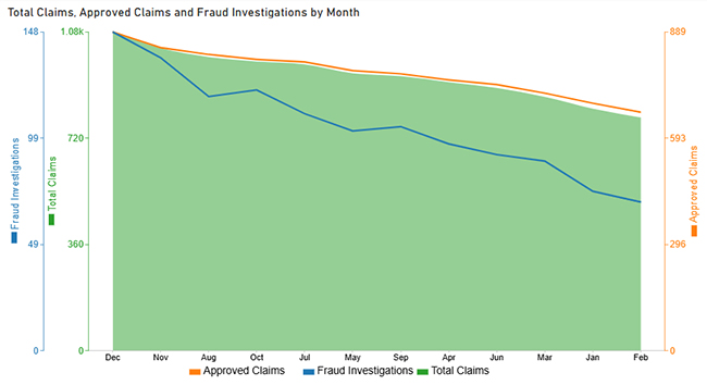
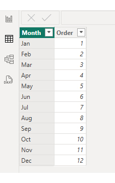
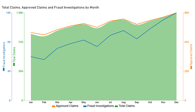
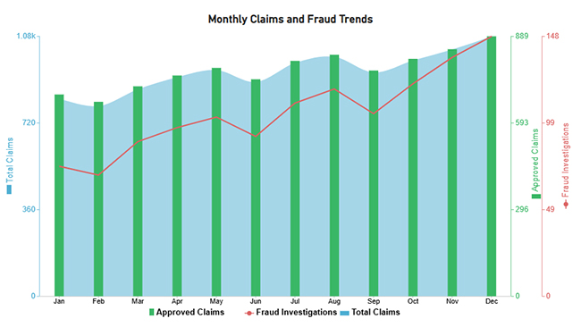
Next, use this table to create a Multi Axis Line Chart for claim trends.

Month

Total claims Approved claims

Fraud investigations

Jan 820 690 74
Feb 790 665 69
Mar 860 718 88
Apr 910 755 96
May 940 781 102
Jun 890 742 91
Jul 970 805 110
Aug 995 826 118
Sep 930 772 104
Oct 980 812 121
Nov 1,025 845 136
Dec 1,080 889 148
  • Once the data is manually pasted or exported from Excel, choose the dimension and measures.
Analytics in Insurance Industry
  • Before creating the chart, enter the key to remove the watermark. Once applied, the chart will appear without the watermark.
Analytics in Insurance Industry
  • If you notice in the chart, the months on the x-axis are not ordered correctly. Create a new table to sort the data from Jan to Dec.
  • Enter data manually, name it, and click on the “load” button.
Analytics in Insurance Industry
  • Open “table view”, select the “sort order” table, select the “month column”, and set the sorting order column.
Analytics in Insurance Industry
  • Choose sort by order.
Analytics in Insurance Industry
  • With the custom sorting set, use the month column from the sort order table instead of the original table’s month column.
Analytics in Insurance Industry
  • The chart should now display with the custom sorting order applied on the X-axis.
Analytics in Insurance Industry
  • First, we will change the title of the chart, then we will change the data representation.
Analytics in Insurance Industry
  • Next, we will change legend properties to set the shape type.
Analytics in Insurance Industry
  • The final look of the Multi Axis Line Chart is given below.
Analytics in Insurance Industry

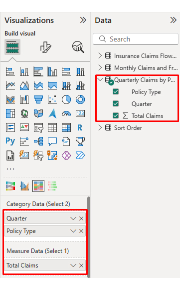
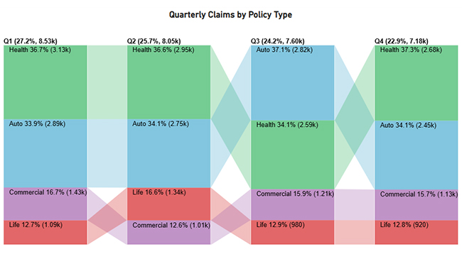
Then, use a table to create a Comparison Bar Chart that contrasts policy types.

Quarter

Policy type

Total claims

Q1 Auto 2890
Q1 Health 3,125
Q1 Life 1,085
Q1 Commercial 1,425
Q2 Auto 2745
Q2 Health 2950
Q2 Life 1340
Q2 Commercial 1015
Q3 Auto 2815
Q3 Health 2590
Q3 Life 980
Q3 Commercial 1210
Q4 Auto 2450
Q4 Health 2680
Q4 Life 920
Q4 Commercial 1130
  • Once the data is manually pasted or exported from Excel, choose the dimension and measures.
Analytics in Insurance Industry
  • Enter the key to remove the watermark, then update the chart title and change the bar color.
Analytics in Insurance Industry
  • The final look of the Comparison Bar Chart is given below.
Analytics in Insurance Industry

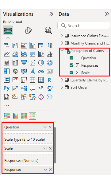
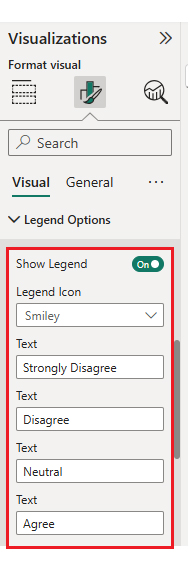
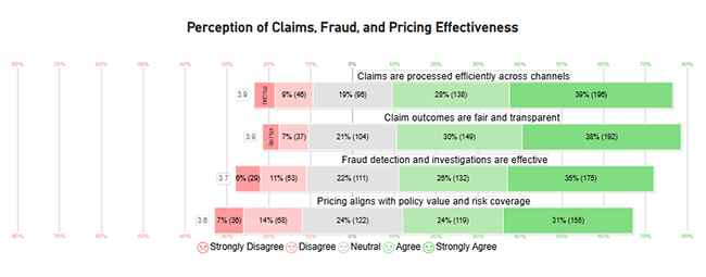
Finally, use this table to create a Likert Chart for survey ratings.

Question

Scale

Responses

Claims are processed efficiently across channels 1 24
Claims are processed efficiently across channels 2 46
Claims are processed efficiently across channels 3 96
Claims are processed efficiently across channels 4 138
Claims are processed efficiently across channels 5 196
Claim outcomes are fair and transparent 1 18
Claim outcomes are fair and transparent 2 37
Claim outcomes are fair and transparent 3 104
Claim outcomes are fair and transparent 4 149
Claim outcomes are fair and transparent 5 192
Fraud detection and investigations are effective 1 29
Fraud detection and investigations are effective 2 53
Fraud detection and investigations are effective 3 111
Fraud detection and investigations are effective 4 132
Fraud detection and investigations are effective 5 175
Pricing aligns with policy value and risk coverage 1 36
Pricing aligns with policy value and risk coverage 2 68
Pricing aligns with policy value and risk coverage 3 122
Pricing aligns with policy value and risk coverage 4 119
Pricing aligns with policy value and risk coverage 5 155
  • Once the data is manually pasted or exported from Excel, choose the dimension and measures.
Analytics in Insurance Industry
  • Enter the key to remove the watermark, update the title and adjust rating colors and labels.
Analytics in Insurance Industry
  • You can legend text as well.
Analytics in Insurance Industry
  • The final look of the Likert Chart is shown below.
Analytics in Insurance Industry

Place visuals in a clean grid, add slicers for policy and time, and confirm tooltips work before sharing internally with core teams.

Analytics in Insurance Industry

Key insights

  • Health and Auto lines drive most volume, with approvals leading outcomes and investigations clustering around higher-risk claims across segments today.
  • Monthly claims rise throughout the year, and fraud reviews increase late, suggesting exposure grows as case counts build.
  • Across quarters, Health policies generate the most claims, and the totals trend upward from Q1 through Q4 again.
  • Survey responses skew positive, yet agreement on pricing fairness lags behind views on speed and fraud controls.

Benefits of Analytics in Insurance Industry

Analytics in insurance industry benefits from insurance data analytics, making underwriting, claims, and service measurable and repeatable.

  • Underwriting Precision: Improved scoring narrows uncertainty, supports consistent pricing, and reduces surprises in new business portfolios.
  • Lower Expenses: Automation reduces manual reviews, shortens cycle times, and minimizes rework across teams.
  • Fraud Controls: Rules and models help identify suspicious claims before payments are issued.
  • Customer Insights: Segmentation enhances service, ensures promises are kept, and supports offers that align with customer needs.
  • Faster Action: KPI visuals in Power BI highlight missed targets, prompting timely improvements across claims, underwriting, and service.
  • Scalable Capability: Standardized measures and reusable models can be expanded across new products, regions, and higher volumes.

Challenges of Analytics in Insurance Industry

Insurance data analytics can stall when controls and skills do not align.

  • Data Quality Gaps: Missing fields, duplicates, and inconsistent codes undermine models and dashboards, weakening trust in results.
  • Legacy Integration: Older policy systems resist extraction, slowing consolidation and limiting refresh cycles for reporting.
  • Privacy Risk: Personal data requires strong controls, encryption, and regular access reviews to meet legal and ethical standards.
  • Cost Pressure: Tooling, computing, and hiring costs can exceed budgets without a well-planned, phased rollout.
  • Talent Shortage: Few teams have the combined actuarial, engineering, and modeling expertise required to deliver effectively.
  • Regulatory Change: New rules demand traceability, documented assumptions, and consistent reporting across jurisdictions.

Use Cases of Analytics in Insurance Industry

Data analytics in the insurance industry helps when models guide pricing, triage, retention, and fraud.

  • Fraud Scoring: Assigns risk scores to claims and parties, enabling investigators to quickly prioritize suspicious cases.
  • Claims Throughput: Identifies bottlenecks, flags missing documents, and routes work efficiently to the appropriate adjuster.
  • Behavior Insights: Tracks customer touchpoints to predict renewal intent and service needs across segments.
  • Pricing Decisions: Forecasting models estimate loss costs, supporting improved risk selection and overall rate adequacy.
  • Sales Performance: Compares channels and products to identify opportunities for growth and margin improvement.
  • Loyalty Modeling: Detects early lapse risk and triggers targeted campaigns to protect long-term, profitable relationships.

FAQs

Where do insurers use analytics most today?

It supports underwriting, claims triage, fraud review, pricing, and service, using shared definitions so teams measure performance consistently across lines of business.

What is the main goal of insurance analytics?

The goal is to reduce uncertainty, select profitable risk, and act faster, while keeping assumptions traceable for audits and regulators.

Can smaller carriers benefit with limited budgets?

Yes. Start with one use case, automate refreshes, and standardize metrics, then expand as results fund the next step without large teams.

Wrap up

Analytics in insurance industry delivers value when definitions are governed, and teams act on metrics, not screenshots. Start with a short list of measures for pricing, claims cycle time, and renewal risk. Automate refreshes, add alerts for exceptions, and keep assumptions documented. That foundation makes models safer to scale across products.

Use the earlier sections to pick the next upgrade: cleaner capture, stronger integration, or clearer visuals. Power BI can handle the core workflow, and add-ins help when the default charts limit communication. Tie each dashboard to an owner, a decision, and a follow-up step. That is how analytics becomes operations.

How much did you enjoy this article?

GSAd1
Start Free Trial!
160111

Related articles

next previous
Data Analytics9 min read

Cost Per Hire: Analyzing Hiring Costs Easily

Cost Per Hire shows what each hire costs and where the money goes. Use the formula, examples, and Excel steps to track spend. Read on!

Data Analytics12 min read

Need Analysis Template: A Complete Guide

A need analysis template transforms scattered observations into structured, evidence-based decisions. Discover how to close performance gaps. Read on!

Data Analytics10 min read

Performance-Based Budgeting: Examples & Analysis

Performance-based budgeting links spending to measurable outcomes. Learn how it works, explore examples, benefits, challenges, and analyze PBB effectively in Excel.

Data Analytics9 min read

Remote Work Statistics: A Complete Visual Guide

Remote work statistics transform workforce activity into measurable insights that guide planning and policy. Discover how to analyze this data. Read on!

Data Analytics13 min read

Total Cost of Ownership Analysis for TCO Insights

Total cost of ownership analysis reveals every lifecycle cost behind any major decision. Stop guessing what investments truly cost. Read on!

ChartExpo logo

Turn Data into Visual
Stories

CHARTEXPO

  • Home
  • Gallery
  • Videos
  • Services
  • Pricing
  • Contact us
  • FAQs
  • Privacy policy
  • Terms of Service
  • Sitemap

TOOLS

  • ChartExpo for Google Sheets
  • ChartExpo for Microsoft Excel
  • Power BI Custom Visuals by ChartExpo
  • Word Cloud

CATEGORIES

  • Bar Charts
  • Circle Graphs
  • Column Charts
  • Combo Charts
  • Comparison Charts
  • Line Graphs
  • PPC Charts
  • Sentiment Analysis Charts
  • Survey Charts

TOP CHARTS

  • Sankey Diagram
  • Likert Scale Chart
  • Comparison Bar Chart
  • Pareto Chart
  • Funnel Chart
  • Gauge Chart
  • Radar Chart
  • Radial Bar Chart
  • Sunburst Chart
  • see more
  • Scatter Plot Chart
  • CSAT Survey Bar Chart
  • CSAT Survey Chart
  • Dot Plot Chart
  • Double Bar Graph
  • Matrix Chart
  • Multi Axis Line Chart
  • Overlapping Bar Chart
  • Control Chart
  • Slope Chart
  • Clustered Bar Chart
  • Clustered Column Chart
  • Box and Whisker Plot
  • Tornado Chart
  • Waterfall Chart
  • Word Cloud
  • see less

RESOURCES

  • Blog
  • Resources
  • YouTube
SIGN UP FOR UPDATES

We wouldn't dream of spamming you or selling your info.

© 2026 ChartExpo, all rights reserved.