Categories
Online retail runs on thin margins and fast mood swings. A week of bad inventory calls can pile up holding costs or empty shelves.
The fix isn’t a bigger spreadsheet; it’s tighter business analytics that ties demand signals to pricing moves. When seasons flip and ads land, the numbers change before the team finishes coffee.
This guide breaks down how modern retailers forecast demand, tune prices, and sanity-check results with simple models and clear charts.
It also shows how to set up the workflow in Google Sheets without turning analysis into a full-time job. Expect practical checks, not theory dumps. The goal is fewer surprises and cleaner decisions.
Definition: Analytics for an Online Retailer Demand Forecasting and Price Optimization is a disciplined way to turn click, cart, and order history into decisions.
It uses data analytics to estimate near-term demand and to set prices that protect margin without choking volume. The result is a repeatable loop for inventory, promos, and pricing.
Forecasting answers the quantity and timing question; optimization answers the price question. Put together, Analytics for an Online Retailer Demand Forecasting and Price Optimization lets a team test scenarios before money is spent.
Most analytics tools for business can run the math, but the value comes from consistent inputs and tight feedback.
On a live storefront, Analytics for an Online Retailer Demand Forecasting and Price Optimization decides whether shoppers see the item they want and whether the margin survives the week.
Online shops can’t pick one model and hope. A demand forecasting methodology stacks baselines and driver-based models, then tunes them as new data arrives. Analytics for an Online Retailer Demand Forecasting and Price Optimization works best when the process is repeatable and measured.
A retail demand forecast starts with yesterday’s orders and the calendar. It reads seasonality and trend, then turns them into next period expectations. For Analytics for an Online Retailer Demand Forecasting and Price Optimization, clean history beats fancy math.
Time series models like moving averages, exponential smoothing, and ARIMA project trends forward. They give Analytics for an Online Retailer Demand Forecasting and Price Optimization a baseline.
Driver-based models add context such as holidays, discounts, shipping delays, and launches. With those signals, Analytics for an Online Retailer Demand Forecasting and Price Optimization explains changes instead of reacting late.
Modern models update from fresh clicks and orders. That keeps business forecasting stable when promos or supply shifts occur. In Analytics for an Online Retailer Demand Forecasting and Price Optimization, that flexibility matters.
Mixing methods shrinks blind spots. It gives Analytics for an Online Retailer Demand Forecasting and Price Optimization a steadier view across products, regions, and channels.
Pricing isn’t just ‘add a markup’. Analytics for an Online Retailer Demand Forecasting and Price Optimization sets a price that matches willingness to pay, competitor pressure, and inventory reality. The sweet spot shifts by day, not by season.
Pair the forecast with pricing, and the forecast gets sharper. Analytics for an Online Retailer Demand Forecasting and Price Optimization can estimate how a price change shifts volume and margin. Many teams rely on data and analytics services to keep feeds fresh.
Winter jackets are a classic trap. Analytics for an Online Retailer Demand Forecasting and Price Optimization spots the ramp early, supports higher prices when selection is full, then flags the cutoff date when markdowns clear the last sizes.
Electronics swing with holidays and competitor promos. With Analytics for an Online Retailer Demand Forecasting and Price Optimization, pricing can react to competitor drops while the forecast checks whether demand is real or just bargain hunters.
Subscriptions behave like inventory with a heartbeat. Analytics for an Online Retailer Demand Forecasting and Price Optimization uses renewal and churn patterns to project volume, then tests tiers and bundles on a marketing analytics platform to protect lifetime value.
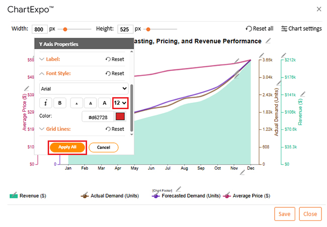
Spreadsheets still run plenty of commerce teams. Google Sheets can hold the inputs for Analytics for an Online Retailer Demand Forecasting and Price Optimization, but raw tables hide patterns. ChartExpo adds visual analytics so trends and gaps are read fast.
Example # 1:
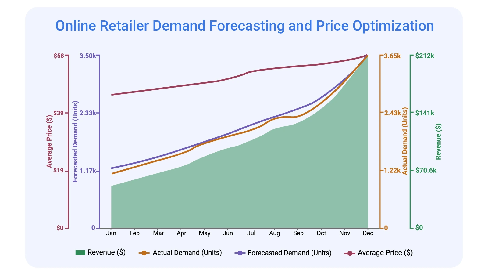
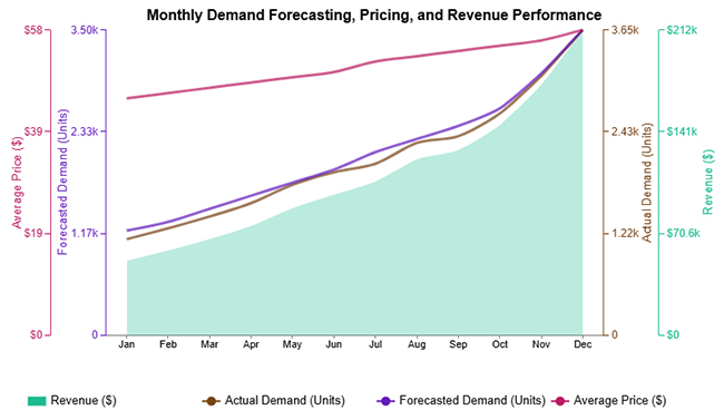
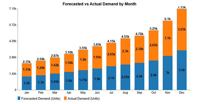
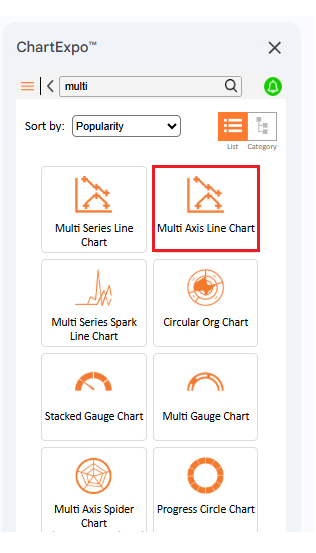
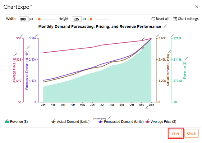
Multi Axis Line Chart puts two or more metrics on separate scales, so a percent and a dollar value can share one view. Use it to see whether price moves track demand moves. Great for spotting lag, not for exact totals.
Example # 2:
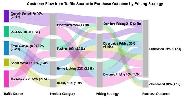
Sankey Chart maps flow from one stage to the next, like traffic source to product view to checkout. It’s useful for showing where demand leaks after a pricing change. Big drops jump out fast.
Example # 3:
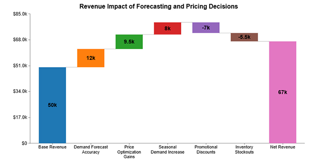
Waterfall Chart breaks a revenue change into the drivers behind it. It can show how volume, price, discounts, and returns stack into the final number. Perfect for explaining ‘what changed’ to leadership.
Example # 4:
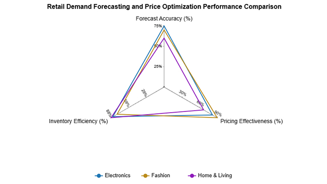
Multi Axis Spider Chart compares several metrics around one center point. It works well when a category has many KPIs, and the question is about balance, not rank. One weird spike usually means one KPI is out of line.
Example # 5:
A stacked column chart shows how parts add up to a total across categories or time. Use it to split revenue by channel or demand by region while still seeing the overall trend. It answers ‘what is driving the total’.
Example # 6:
Clustered Bar Chart lines up bars side by side, making comparisons straightforward. It’s handy for comparing forecast error across products or margin across price tiers. If the chart looks crowded, pick fewer categories.
Example # 7:
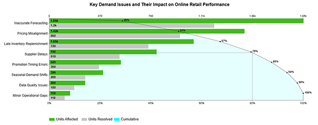
Pareto Bar Chart ranks contributors from largest to smallest, then shows the cumulative share. It’s the go-to view for finding the handful of SKUs or issues causing most of the pain. Fix the left side first.
Example # 8:
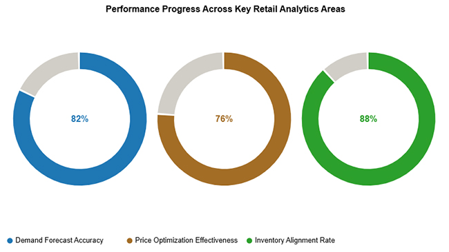
Progress Circle Chart turns a target into a simple percent complete view. It works for headline tracking like sell-through, revenue to goal, or forecast coverage. The visual is blunt, which is the point.
Example # 9:
Overlapping Bar Chart is built for planned versus actual comparisons. When bars sit on top of each other, gaps are obvious without extra math. Use it to spot where pricing or inventory decisions were missed.
Example # 10:
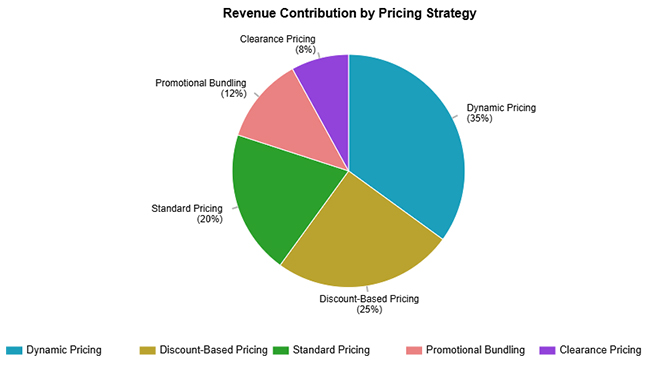
A pie chart is fine for a few categories and a single snapshot. Use it to show the share of demand or share of revenue by a small set of groups. If there are more than five slices, pick a different chart.
Teams that live in spreadsheets can still run a clean workflow. Forecasting in Google Sheets keeps the setup light, and the data can come from exports, APIs, or a warehouse dump. The key is keeping inputs consistent and charting results so errors are obvious.
Why use ChartExpo?
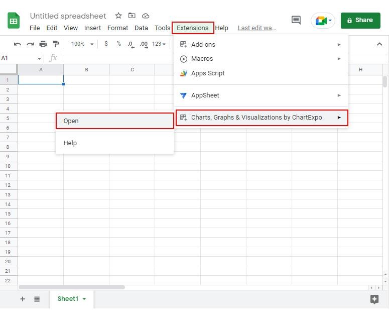
How to install ChartExpo in Google Sheets?
ChartExpo runs in both Google Sheets and Microsoft Excel. Pick the tool already in the workflow, install the add-on, then build charts in minutes. No extra exports.
Example:
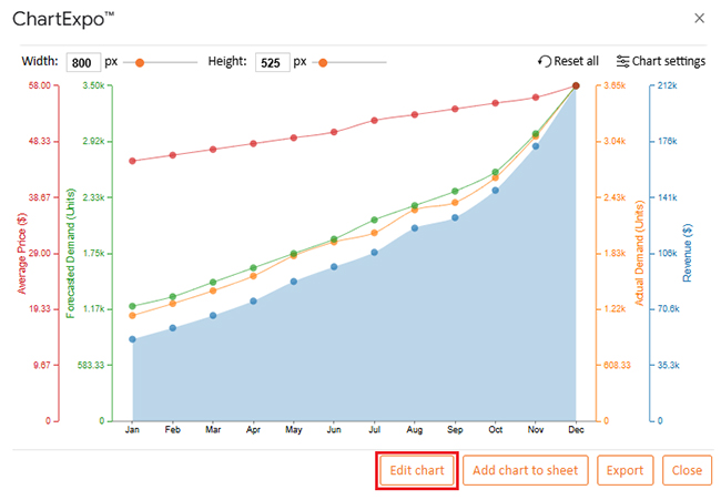
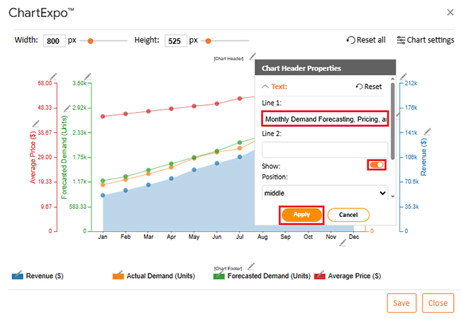
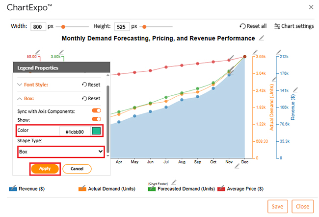
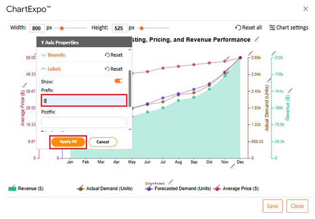
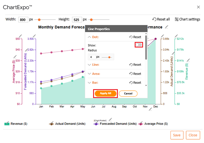
Consider we have the following data for a Multi Axis Line Chart.
|
Month |
Forecasted Demand (Units) | Actual Demand (Units) | Average Price ($) |
Revenue ($) |
| Jan | 1,200 | 1,150 | 45 | 51,750 |
| Feb | 1,300 | 1,280 | 46 | 58,880 |
| Mar | 1,450 | 1,420 | 47 | 66,740 |
| Apr | 1,600 | 1,580 | 48 | 75,840 |
| May | 1,750 | 1,800 | 49 | 88,200 |
| Jun | 1,900 | 1,950 | 50 | 97,500 |
| Jul | 2,100 | 2,050 | 52 | 106,600 |
| Aug | 2,250 | 2,300 | 53 | 121,900 |
| Sep | 2,400 | 2,380 | 54 | 128,520 |
| Oct | 2,600 | 2,650 | 55 | 145,750 |
| Nov | 3,000 | 3,100 | 56 | 173,600 |
| Dec | 3,500 | 3,650 | 58 | 211,700 |

Once the loop is running, the wins show up quickly, not just on dashboards:
Handled with discipline, the approach becomes a real edge, because the business reacts before the market forces it.
Retail product demand forecasting usually starts with historical patterns, then adds time-series models, driver-based regression, and machine learning where it fits. The strongest setups blend methods and validate results against real sales so the forecast doesn’t drift.
Forecasting estimates future demand. Demand planning takes that estimate and turns it into actions: buy quantities, production, allocation, and shipping. Forecasting informs; planning executes.
Analytics for an Online Retailer Demand Forecasting and Price Optimization ties inventory and pricing to the same facts, so teams stop fighting the spreadsheet. Forecasts guide buys and replenishment, while pricing rules protect margin when demand surges or stalls. Run it weekly, not quarterly. That’s when bad assumptions get caught.
Google Sheets is enough to start, as long as inputs stay clean and results get charted. Use visuals to spot misses, fix drivers, then repeat. A small team can run the loop, but the rules must be written and tracked. The work shouldn’t feel fancy. It should feel dependable, because profit depends on it.
How much did you enjoy this article?


Calculate accounts receivable turnover ratio to measure credit collection speed, improve cash flow, and strengthen your financial strategy. Read on!

Change Management KPIs are the key to tracking adoption, performance, and ROI during transitions. Find out which metrics matter. Read on!

Data collection methods and techniques determine the quality of every insight you act on. Explore key approaches for gathering reliable data. Read on!


