• Home
  • Tools dropdown img
    • Spreadsheet Charts

      • ChartExpo for Google Sheets
      • ChartExpo for Microsoft Excel
    • Power BI Charts

      • Power BI Custom Visuals by ChartExpo
    • Word Cloud

  • Charts dropdown img
    • Chart Category

      • Bar Charts
      • Circle Graphs
      • Column Charts
      • Combo Charts
      • Comparison Charts
      • Line Graphs
      • PPC Charts
      • Sentiment Analysis Charts
      • Survey Charts
    • Chart Type

      • Box and Whisker Plot
      • Clustered Bar Chart
      • Clustered Column Chart
      • Comparison Bar Chart
      • Control Chart
      • CSAT Survey Bar Chart
      • CSAT Survey Chart
      • Dot Plot Chart
      • Double Bar Graph
      • Funnel Chart
      • Gauge Chart
      • Likert Scale Chart
      • Matrix Chart
      • Multi Axis Line Chart
      • Overlapping Bar Chart
      • Pareto Chart
      • Radar Chart
      • Radial Bar Chart
      • Sankey Diagram
      • Scatter Plot Chart
      • Slope Chart
      • Sunburst Chart
      • Tornado Chart
      • Waterfall Chart
      • Word Cloud
    • Google Sheets
      Microsoft Excel
  • Services
  • Pricing
  • Contact us
  • Blog
  • Support dropdown img
      • Gallery
      • Videos
      • Contact us
      • FAQs
      • Resources
    • Please feel free to contact us

      atsupport@chartexpo.com

Categories
All Data Visualizations Data Analytics Surveys
Add-ons/
  • Google Sheets
  • Microsoft Excel
  • Power BI
All Data Visualizations Data Analytics Surveys
Add-ons
  • Google Sheets
  • Microsoft Excel
  • Power BI

We use cookies

This website uses cookies to provide better user experience and user's session management.
By continuing visiting this website you consent the use of these cookies.

Ok

ChartExpo Survey


Home > Blog > Data Analytics

Charts Templates for PowerPoint for Improved Presentations

Slides live or die on the chart. A messy graphic turns a meeting into a debate about colors, not numbers. Template-driven charts fix that.

They lock in spacing, fonts, and labeling so every deck looks like it came from one shop. Swap the data, keep the structure, move on.

Charts Templates for PowerPoint

It also keeps teams from reinventing the same chart every Monday. Leaders get the story, analysts keep their sanity, and the brand stops drifting slide to slide.

Clean visuals win trust, even when the numbers sting. When reports repeat, the design work shouldn’t. Build once, reuse often, and spend time on the message that matters.

Table of Contents:

  1. What are Charts Templates for PowerPoint?
  2. Why Use Charts Templates for PowerPoint?
  3. Key Concepts of PowerPoint Charts Templates
  4. Top 10 Examples of Charts Templates for PowerPoint
  5. How to Create Charts Templates for PowerPoint?
  6. How to Create PowerPoint Chart Templates Using ChartExpo in Google Sheets?
  7. Benefits of Charts Templates for PowerPoint
  8. Tips for Creating Charts Templates for PowerPoint
  9. FAQs
  10. Wrap Up

What are Charts Templates for PowerPoint?

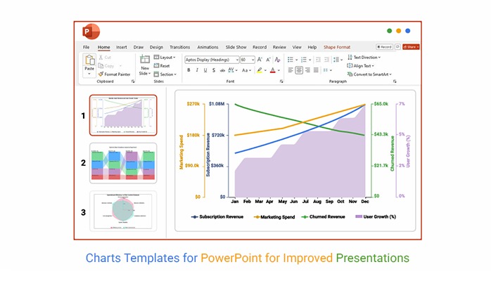
Definition: Charts Templates for PowerPoint are preset chart builds that control layout, fonts, colors, and where data labels land on the slide. Instead of rebuilding a chart from scratch, the template keeps the structure and swaps in new numbers.

That means fewer alignment fights and fewer off-brand charts. When the same report shows up every week, the format stays stable. Some teams refer to these as ppt charts templates, but the job is the same: reuse the design and focus on the insight.

Why Use Charts Templates for PowerPoint?

Charts Templates for PowerPoint cut the busywork because the chart shell is already set. The payoff shows up fast in recurring updates and review meetings. Don’t waste time nudging labels and legends. Spend it on the story.

  • Charts pop in minutes, not in a formatting marathon.
  • One look and the deck feels like one brand, not a collage.
  • Data stories move faster because the layout’s already decided.
  • Leaders get the point without squinting at messy labels.
  • Axes, legends, and colors stop changing from slide to slide.
  • Reusing a template keeps errors from sneaking into late edits.
  • Recurring dashboards stay consistent, even as the numbers shift.

Key Concepts of PowerPoint Charts Templates

Charts Templates for PowerPoint rest on a few building blocks. Layout rules define where titles, axes, and labels sit, so every slide reads the same. Results from Google Sheets linear regression can drop into the same structure without breaking the story. Keep these parts stable, and the template earns its keep.

  • Lock the chart frame: size, margins, and grid.
  • Use data placeholders that are easy to swap.
  • Set a clear reading order, so eyes know where to land.
  • Apply a brand palette with named colors.
  • Pick chart types that render well in PowerPoint.
  • Plan for growth when the dataset expands.
  • Connect to Excel or Sheets for quick refreshes.

Top 10 Examples of Charts Templates for PowerPoint

Example # 1:

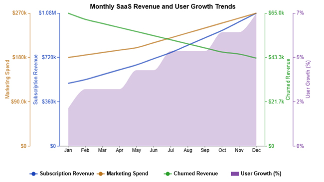
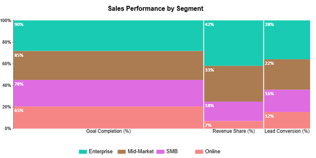
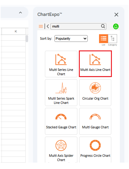
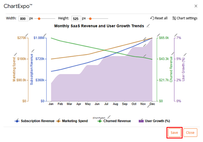
Multi-axis line charts compare two metrics that don’t share a scale. One axis can track revenue, while the other tracks churn or users. As a template, it keeps axis labels and legends consistent across slides.

Charts Templates for PowerPoint

Example # 2:

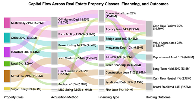
A Sankey chart shows how volume moves from one stage to the next. It’s useful for funnels, budget flows, or product journeys. In a template, the node spacing and color mapping stay fixed, so changes in flow stand out.

Charts Templates for PowerPoint

Example # 3:

Comparison bars put two groups head-to-head across the same categories. It’s a blunt chart, and that’s the point. When it’s templated, category order and label spacing stay stable, so the difference reads fast.

Charts Templates for PowerPoint

Example # 4:

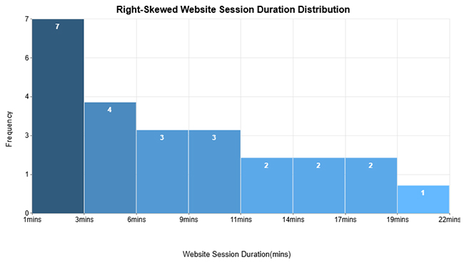
A histogram bins values so the distribution is obvious. It’s the quickest way to spot skew, gaps, or outliers in a dataset. When a Google Sheets histogram is pulled into a slide template, bin labels and axis ticks stay consistent across updates.

Charts Templates for PowerPoint

Example # 5:

Dual-axis radar charts compare several measures across the same set of attributes. They’re handy for product scorecards when a table feels flat. A template keeps spokes and label placement consistent, so small shifts don’t get lost.

Charts Templates for PowerPoint

Example # 6:

Overlapping bars show two series on the same baseline, making gaps easy to see. This works for year-over-year or plan-versus-actual views. A template locks the overlap style and transparency choices, so the comparison stays honest.

Charts Templates for PowerPoint

Example # 7:

Stacked columns show totals and parts in one view. They’re common in revenue breakdowns and survey responses. With a template, the stack order and legend mapping stay the same, which helps readers compare slides.

Charts Templates for PowerPoint

Example # 8:

A mosaic plot (aka Mekko chart) compares both share and volume at once. Width shows one dimension, height shows the other, so each block carries two signals. A template keeps axes and label rules predictable, making the chart easier to scan.

Charts Templates for PowerPoint

Example # 9:

Progress charts show how far each item is from its target. They’re perfect for project status and KPI tracking. As a template, target markers and color rules don’t change, so progress cannot be hidden.

Charts Templates for PowerPoint

Example # 10:

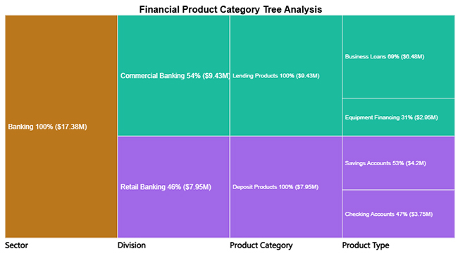
Tree diagrams break a hierarchy into branches and levels. They’re useful for org structure, product taxonomy, or root-cause analysis. Templating keeps spacing and connector styling consistent, so the hierarchy reads clean.

Charts Templates for PowerPoint

How to Create Charts Templates for PowerPoint?

Charts Templates for PowerPoint don’t happen by accident. A solid template starts with a clear goal, then locks in the rules that shouldn’t change. Build the structure first, then let data do the talking.

  • Define the slide’s job and audience

Start with the decision the slide must support. A template built for executives won’t match one built for analysts. Lock the layout around that reality.

  • Choose chart types that fit the message

Pick visuals that match the question, not the tool. Lines show change, bars compare categories, and combos explain tradeoffs. Keep the set small so the library stays usable.

  • Design for readability, not decoration

Set font sizes, grid spacing, and label rules up front. Use color to separate series, not to show off. If the text needs zooming, the template failed.

  • Apply brand rules and reuse them

Bake in fonts and approved colors, then stop debating them. That consistency earns trust with each deck. It also speeds up reviews.

  • Link to data sources when updates are frequent

If charts update often, connect them to Sheets or Excel and refresh instead of pasting new screenshots. Keep a clean data range and avoid hidden filters. The template should survive updates.

  • Save and version the template

Store templates in a shared folder and name versions clearly. Document what changed, so teams don’t guess. Old versions can be retired without chaos.

How to Create PowerPoint Chart Templates Using ChartExpo in Google Sheets?

ChartExpo can build charts inside Google Sheets, then those visuals can be dropped into Charts Templates for PowerPoint. The add-on covers specialty chart types and keeps formatting controls close to the data. Create in Sheets, export the chart, and reuse it in slides.

  1. Prepare your dataset and install the ChartExpo add-on.
  2. Select your data and choose an appropriate chart from ChartExpo’s visualization library.
  3. Customize labels, axes, colors, and formatting to align with your presentation theme.
  4. Review insights and refine clarity directly within Sheets.
  5. Export the finalized chart and insert it into PowerPoint as a reusable template.

Why use ChartExpo?

  • Turns raw tables into charts that read fast.
  • Gives control over labels, axes, and styling without manual hacks.
  • Includes a 7-day free trial to test the library.

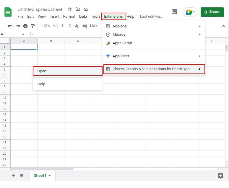
How to install ChartExpo in Google Sheets?

  • Go to Google Sheets and open the file you are interested in. Then click on the Extensions tab in the upper menu.
  • Click on the Add-ons and enter “Get add-ons.”
  • Go to the Google Workspace Marketplace and search for ChartExpo.
  • Explore “Charts, Graphs & Visualizations by ChartExpo, and click the “Install” button.
  • Allow the necessary access and confirm your Google account when asked.

Example:

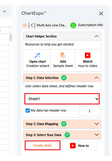
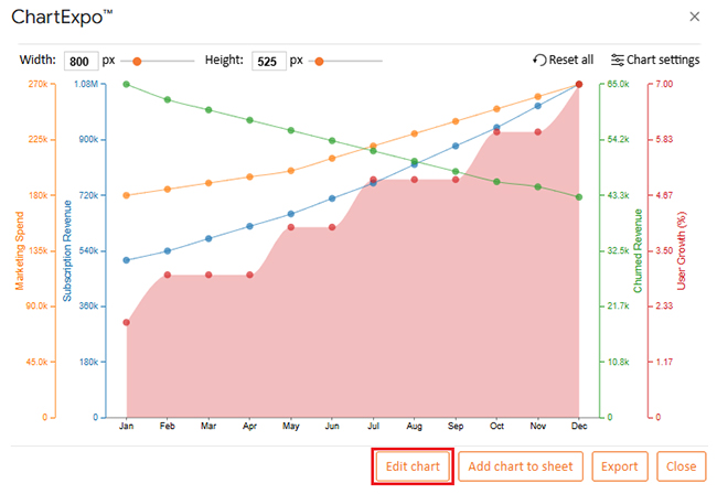
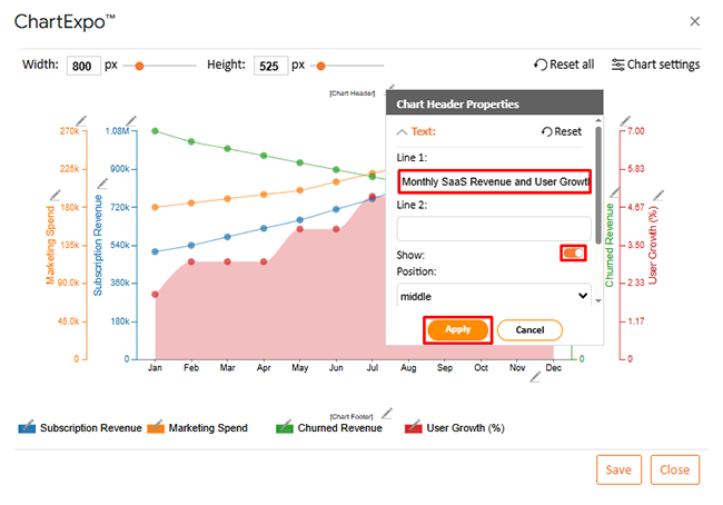
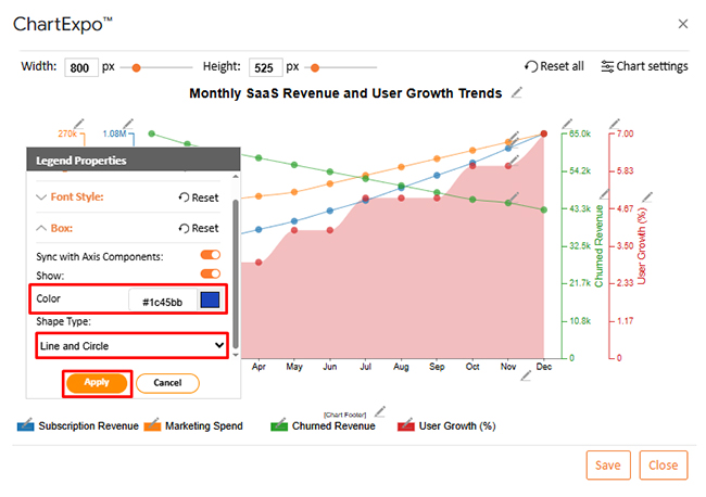
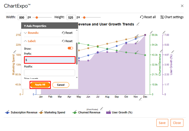
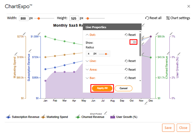
Use the dataset below to build a Multi-Axis Line Chart.

Month

Subscription Revenue Churned Revenue Marketing Spend

User Growth (%)

Jan 510,000 65,000 180,000 2
Feb 540,000 62,000 185,000 3
Mar 580,000 60,000 190,000 3
Apr 620,000 58,000 195,000 3
May 660,000 56,000 200,000 4
Jun 710,000 54,000 210,000 4
Jul 760,000 52,000 220,000 5
Aug 820,000 50,000 230,000 5
Sep 880,000 48,000 240,000 5
Oct 940,000 46,000 250,000 6
Nov 1,010,000 45,000 260,000 6
Dec 1,080,000 43,000 270,000 7
  • To get started with ChartExpo, first install ChartExpo.
  • Go to Extensions > Charts, Graphs & Visualizations by ChartExpo > Open.
Charts Templates for PowerPoint
  • Once ChartExpo is installed, click on the “Add new chart” button.
Charts Templates for PowerPoint
  • Once ChartExpo is loaded into your sheet, you need to search or select the “Multi Axis Line Chart” in the chart options, and you are off to a good start to render your data.
Charts Templates for PowerPoint
  • Then, select your worksheet and confirm the data range; your data is automatically mapped, and with a click on the Create button, your chart is generated in seconds.
Charts Templates for PowerPoint
  • If you want to customize your chart, select the ‘Edit Chart’ option and design it to your specifications.
Charts Templates for PowerPoint
  • To change the chart’s title, select the pencil icon on the header. Then, enter the text you want and select “Apply”.
Charts Templates for PowerPoint
  • You can also change the legend shape type and color.
Charts Templates for PowerPoint
  • You can add a prefix sign as well.
Charts Templates for PowerPoint
  • You can hide dots from “Line Properties”.
Charts Templates for PowerPoint
  • When you are done with all the changes, click the “Save” button to save them.
Charts Templates for PowerPoint
  • The final look of the Multi Axis Line Chart is shown below.
Charts Templates for PowerPoint

Key Insights

  • Subscription revenue rises month by month.
  • Churned revenue trends down, pointing to stronger retention.
  • Users grow through the year, even as spend stays active.

Benefits of Charts Templates for PowerPoint

Charts Templates for PowerPoint keep chart formatting consistent across decks and teams.

When a group standardizes ppt chart templates, the time spent on alignment drops, and the review cycle becomes calmer. The audience sees the trend, not the tool.

  • Cut formatting cycles when repeat datasets show up, such as a Google Spreadsheet timesheet template used in monthly reviews.
  • Keep decks consistent, which supports credibility in internal and external reporting.
  • Make complex metrics easier to read, including a performance chart for employees in review meetings.
  • Hold attention because charts stay clean and structured.
  • Boost recall because the same visual rules repeat from slide to slide.
  • Support a narrative flow, guiding the audience through the data in a logical sequence.

Tips for Creating Charts Templates for PowerPoint

Charts Templates for PowerPoint work best when the rules are written down, and the template is treated as shared gear.

PowerPoint charts templates should be tested with real data and real deadlines, not a polished demo set. A few habits keep the template stable while the numbers change.

  • Pick the chart type that matches the message.
  • Keep the slide lean; drop anything that doesn’t earn space.
  • Lock axes and labels so comparisons stay honest.
  • Use a brand palette, but don’t overload the chart.
  • Test with messy datasets, including edge cases.
  • Save versions and note changes so the team can track updates.

FAQs

What are Charts Templates for PowerPoint used for?

They set a repeatable chart layout so reports look consistent across slides. The template lets new data drop into the same structure.

How do Charts Templates for PowerPoint improve presentations?

A fixed style reduces clutter and makes trends easier to spot. It also speeds up edits because formatting doesn’t need to be rebuilt.

Can Charts Templates for PowerPoint be customized?

Yes. Colors, fonts, labels, and chart types can be adjusted, then saved for reuse. Set guardrails so changes don’t break consistency.

Are Charts Templates for PowerPoint suitable for business reports?

Yes. Reports benefit from stable visuals because readers compare periods and categories fast. Templates also help meet brand and compliance needs.

Wrap Up

Charts Templates for PowerPoint turn recurring reporting into a repeatable workflow. They standardize how charts look, even when data sources change.

When the template is set, layout, labels, and color rules stay fixed from slide to slide, so teams can drop in new numbers and keep moving.

That consistency helps readers scan faster, trust the message, and stop arguing about formatting; it also cuts the hidden tax of rechecking every visual before a meeting.

As decks scale across teams and quarters, Charts Templates for PowerPoint keep the work sane and the story sharp, so maintain a library and reuse it.

How much did you enjoy this article?

GSAd1
Start Free Trial!
159398

Related articles

next previous
Data Analytics7 min read

How to Measure Energy Use: Simple Visual Guide

Track energy consumption with precision. Learn practical methods to measure energy use, calculate costs, and optimize efficiency. Read on!

Data Analytics9 min read

Insert Chart in PowerPoint: Easy Steps

Master how to insert a chart in PowerPoint and turn spreadsheet numbers into persuasive slides. From built-in graphs to Excel imports, learn it all. Read on!

Data Analytics10 min read

Reporting vs Analytics: Everything You Need to Know

Reporting tracks past performance, while analytics uncovers why results happened and what comes next. Learn how each method strengthens decisions.

Data Analytics10 min read

Booking Dashboard: Charts for Booking Insights

Learn how a Booking Dashboard centralizes reservations, tracks KPIs, and improves forecasting. How to create and analyze booking dashboards in Power BI.

Data Analytics11 min read

Growth Metrics: Growth Insights Made Visual

Growth metrics measure performance and growth. This blog shows key KPIs and tools to help you track progress and make smarter decisions.

ChartExpo logo

Turn Data into Visual
Stories

CHARTEXPO

  • Home
  • Gallery
  • Videos
  • Services
  • Pricing
  • Contact us
  • FAQs
  • Privacy policy
  • Terms of Service
  • Sitemap

TOOLS

  • ChartExpo for Google Sheets
  • ChartExpo for Microsoft Excel
  • Power BI Custom Visuals by ChartExpo
  • Word Cloud

CATEGORIES

  • Bar Charts
  • Circle Graphs
  • Column Charts
  • Combo Charts
  • Comparison Charts
  • Line Graphs
  • PPC Charts
  • Sentiment Analysis Charts
  • Survey Charts

TOP CHARTS

  • Sankey Diagram
  • Likert Scale Chart
  • Comparison Bar Chart
  • Pareto Chart
  • Funnel Chart
  • Gauge Chart
  • Radar Chart
  • Radial Bar Chart
  • Sunburst Chart
  • see more
  • Scatter Plot Chart
  • CSAT Survey Bar Chart
  • CSAT Survey Chart
  • Dot Plot Chart
  • Double Bar Graph
  • Matrix Chart
  • Multi Axis Line Chart
  • Overlapping Bar Chart
  • Control Chart
  • Slope Chart
  • Clustered Bar Chart
  • Clustered Column Chart
  • Box and Whisker Plot
  • Tornado Chart
  • Waterfall Chart
  • Word Cloud
  • see less

RESOURCES

  • Blog
  • Resources
  • YouTube
SIGN UP FOR UPDATES

We wouldn't dream of spamming you or selling your info.

© 2026 ChartExpo, all rights reserved.