Categories
Google Sheets Histogram—have you ever needed a clear way to spot patterns in your data?
Raw numbers can be overwhelming, whether tracking sales trends, survey responses, or student grades. This is where a histogram comes in. It groups data into bins, showing how often values appear. Instead of scanning rows of numbers, you see a visual story.


A Google Sheets Histogram takes scattered numbers and turns them into clear insights. Imagine tracking customer purchases. A histogram quickly reveals spending patterns, helping businesses adjust pricing or marketing strategies. Schools use them to spot grade distributions, while researchers rely on them to study trends. Analyzing and interpreting data becomes much easier when trends are visualized effectively.
A misleading chart can lead to costly mistakes. Google Sheets Histogram charts prevent misinterpretation by structuring data logically. This ensures businesses, educators, and analysts make informed choices. If you’re dealing with financial trends, Google Finance in Google Sheets can provide real-time data, making your histograms even more insightful.
An Overlapping Bar Chart in Google Sheets effectively highlights relationships when analyzing multiple datasets. Whether managing a business, studying trends, or analyzing performance, a histogram helps make sense of the numbers.
Let’s explore further…
Definition: A histogram in Google Sheets is a chart that shows how data is distributed. It groups numbers into ranges, called bins, and displays the frequency of each range. Instead of individual values, you see patterns at a glance. This chart helps identify trends, outliers, or common values.
Businesses use it for sales analysis, educators for grading trends, and researchers for data insights. Google Sheets makes creating histograms easy, turning raw numbers into clear visuals for better decision-making. Create a dashboard in Google Sheets and visualize all your key data in one place.
A histogram chart in Google Sheets makes patterns stand out instantly, turning scattered numbers into clear insights. Whether looking at sales, student grades, or a survey result, this simple chart helps identify what is most important.
Here’s why you should leverage it:
A histogram chart in Google Sheets quickly highlights patterns, trends, and anomalies. Whether analyzing sales, test scores, or customer behavior, it turns complex data into clear insights.
These are some of its applicable scenarios:
Data speaks, but only if you let it. That’s where data visualization comes in—it turns raw numbers into insights.
Google Sheets is great for organizing data, but when it comes to visuals, that’s where it falls apart. Its default charts lack depth, making it hard to spot trends at a glance.
That’s where ChartExpo saves the day. It transforms dull, basic charts into dynamic, easy-to-read visuals. If you want to effortlessly make sense of your data, a Histogram in Google Sheets or a Pareto chart in Google Sheets (powered by ChartExpo) is the way to go.
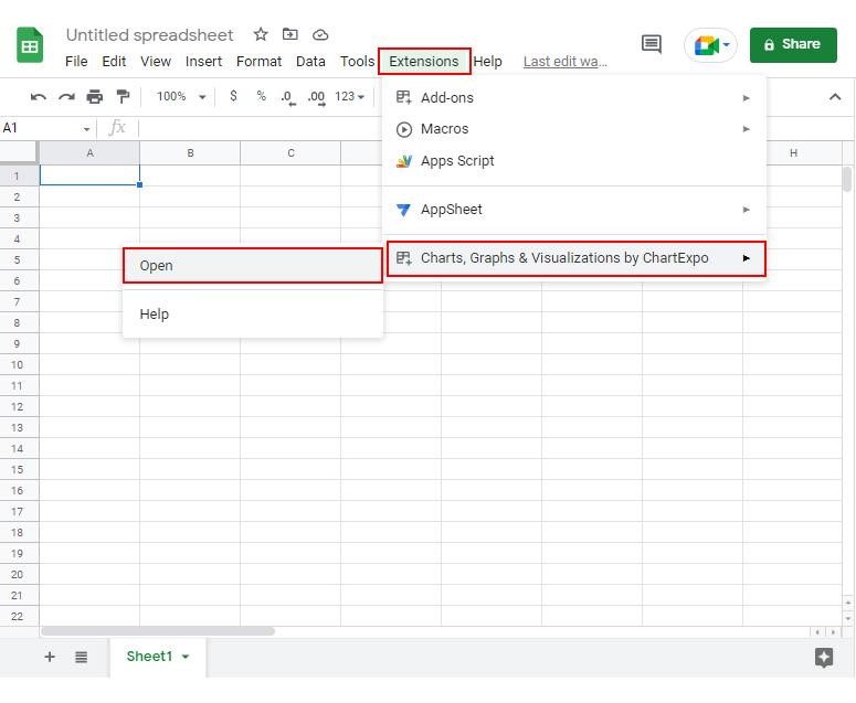
How to Install ChartExpo in Google Sheets?
ChartExpo charts are available both in Google Sheets and Microsoft Excel. Please use the following CTAs to install the tool of your choice and create beautiful visualizations in a few clicks in your favorite tool.
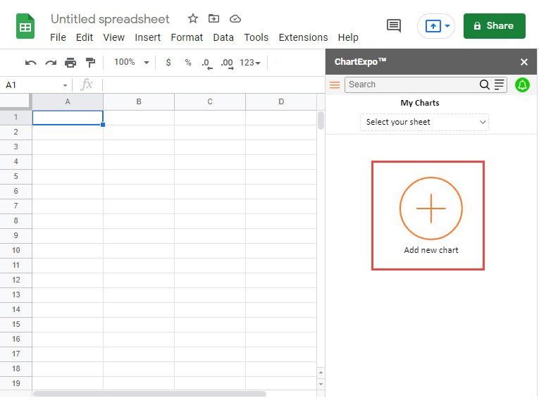
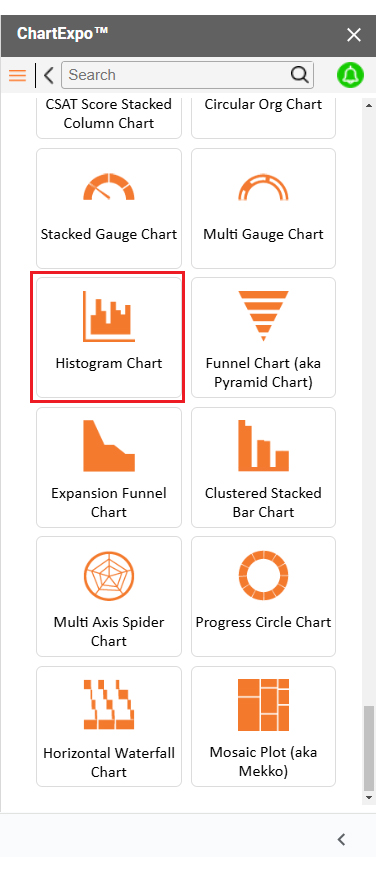
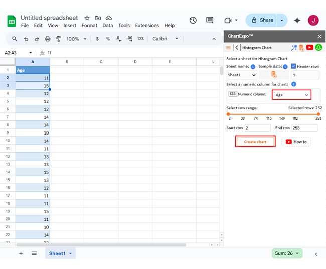
Let’s analyze this sample data and learn how to create Google Sheets charts using ChartExpo:
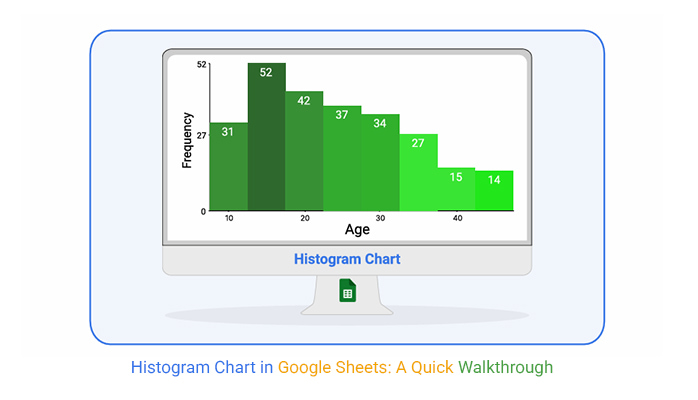
Age
11,15,12,12,12,14,14,10,14,11,13,13,15,13,12,11,11,15,11,10,14,12,14,11,11,13,14,10,10,13,12,15,14,15,12,11,15,16,18,16,20,17,18,15,19,15,17,15,17,19,18,16,15,15,20,19,20,20,19,19,20,16,15,16,18,15,15,17,20,16,16,15,17,15,20,18,20,19,19,20,17,18,17,17,20,16,15,19,15,18,18,17,15,20,25,22,22,25,25,25,24,21,21,25,24,25,21,22,21,22,24,23,24,25,25,21,24,22,24,25,24,25,21,24,22,23,25,23,23,25,22,23,22,22,23,22,21,30,27,28,28,29,27,26,28,27,27,29,30,26,26,26,27,30,28,30,28,26,28,26,27,30,27,30,27,27,30,30,28,29,34,32,31,33,32,31,33,33,34,32,34,34,33,31,32,32,31,31,33,34,34,32,34,31,33,34,38,38,38,38,37,36,37,36,40,37,38,39,40,38,38,39,36,38,37,36,38,39,36,37,36,36,39,37,39,44,44,44,43,44,44,44,45,44,44,43,43,42,42,50,45,47,46,46,49,47,46,47,47,48,47,46
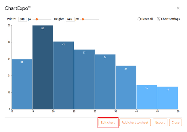
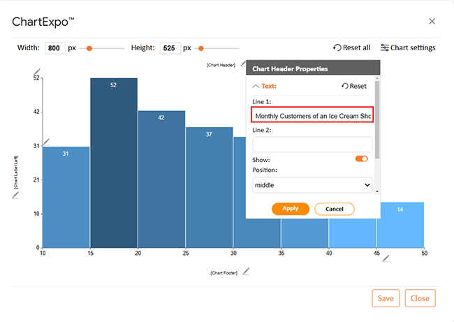
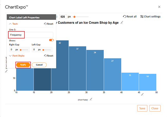
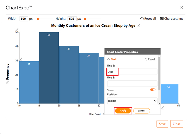
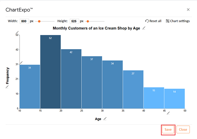
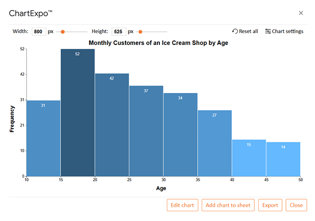


Let’s turn that basic chart into something eye-catching and easy to understand. Whether you’re showing off sales data, survey results, or anything in between, a little customization can make all the difference:
A plain histogram? That’s not your style. Let’s tweak it and make it pop!
A Google Spreadsheet Histogram turns numbers into clear patterns, making analysis faster and easier. Whether tracking sales, survey responses, or performance trends, this simple chart brings data to life. Here’s why it’s a great tool.
A histogram isn’t just a chart—it’s a visual story of your data. But if it’s cluttered or confusing, that story gets lost. Follow these simple tips to make your histogram clear, insightful, and easy to read.


A histogram chart in Google Sheets makes data easier to understand. It turns raw numbers into clear visuals, and patterns and trends become visible instantly. The histogram chart pairs well with features like the Google Sheets progress bar to monitor data changes over time.
Analyzing large datasets is simpler with histograms. They group values into ranges, making the distribution easy to see, which helps in quick decision-making. Learn how to make a comparison chart in Google Sheets for even deeper insights.
Outliers and unusual trends stand out. A histogram highlights these points, preventing errors in analysis. Businesses, educators, and researchers benefit from this clarity. It enhances Google Sheets’ functionality, making data analysis more efficient.
Customization makes histograms even more useful. You can adjust bin sizes, colors, and labels to match their needs. The chart updates automatically when data changes.
Google Sheets makes sharing and collaboration effortless. Multiple people can edit and view charts in real-time; no extra tools or add-ons are needed.
A histogram is a powerful tool for data analysis. It simplifies complex numbers, improves accuracy, and saves time. Whether for business, education, or research, it helps uncover valuable insights.
Install ChartExpo for better visualization and enhanced analysis.
How much did you enjoy this article?


SUMPRODUCT in Google Sheets handles multi-condition calculations without extra columns. Master its syntax, uses, and errors. Read on!

An annual budget template in Google Sheets organizes your yearly finances, tracks every dollar, and reveals spending patterns. Read on!

Learn the best graph to show profit and loss with practical examples and use cases. Discover how to visualize your business data, track trends, and make smarter financial decisions.


