• Home
  • Tools dropdown img
    • Spreadsheet Charts

      • ChartExpo for Google Sheets
      • ChartExpo for Microsoft Excel
    • Power BI Charts

      • Power BI Custom Visuals by ChartExpo
    • Word Cloud

  • Charts dropdown img
    • Chart Category

      • Bar Charts
      • Circle Graphs
      • Column Charts
      • Combo Charts
      • Comparison Charts
      • Line Graphs
      • PPC Charts
      • Sentiment Analysis Charts
      • Survey Charts
    • Chart Type

      • Box and Whisker Plot
      • Clustered Bar Chart
      • Clustered Column Chart
      • Comparison Bar Chart
      • Control Chart
      • CSAT Survey Bar Chart
      • CSAT Survey Chart
      • Dot Plot Chart
      • Double Bar Graph
      • Funnel Chart
      • Gauge Chart
      • Likert Scale Chart
      • Matrix Chart
      • Multi Axis Line Chart
      • Overlapping Bar Chart
      • Pareto Chart
      • Radar Chart
      • Radial Bar Chart
      • Sankey Diagram
      • Scatter Plot Chart
      • Slope Chart
      • Sunburst Chart
      • Tornado Chart
      • Waterfall Chart
      • Word Cloud
    • Google Sheets
      Microsoft Excel
  • Services
  • Pricing
  • Contact us
  • Blog
  • Support dropdown img
      • Gallery
      • Videos
      • Contact us
      • FAQs
      • Resources
    • Please feel free to contact us

      atsupport@chartexpo.com

Categories
All Data Visualizations Data Analytics Surveys
Add-ons/
  • Google Sheets
  • Microsoft Excel
  • Power BI
All Data Visualizations Data Analytics Surveys
Add-ons
  • Google Sheets
  • Microsoft Excel
  • Power BI

We use cookies

This website uses cookies to provide better user experience and user's session management.
By continuing visiting this website you consent the use of these cookies.

Ok

ChartExpo Survey


Home > Blog > Microsoft Excel

How to Create a Heatmap in Excel: A Practical Guide

Spreadsheet overwhelm is real. Rows and columns blur together when you’re staring at hundreds of values trying to spot what matters. Color solves this problem instantly.

How to Create a Heatmap in Excel

A Heatmap in Excel converts raw numbers into an intuitive gradient where darker shades signal higher values and lighter tones show lower ones. Pattern recognition becomes automatic instead of tedious.

This guide shows what a Heatmap chart in Excel does, why data analysts rely on it, when to use it over other visuals, and two ways to build one. You’ll see examples across different scenarios and learn which approach fits your needs.

Table of Contents:

  1. What is a Heatmap in Excel?
  2. Why is Heatmap in Excel Important?
  3. When to Create a Heatmap in Excel?
  4. Key Features of Heatmap Chart in Excel
  5. Examples of Heatmap Chart in Excel
  6. How to Create a Heatmap in Excel (Step by Step)?
  7. How to Create a Heatmap Chart in Excel Using ChartExpo?
  8. Benefits of a Heatmap in Excel
  9. Tips for Creating a Heatmap in Excel
  10. Excel Heatmap Chart vs ChartExpo (Comparison)
  11. Why is ChartExpo Better for Creating Heatmap Charts in Excel?
  12. FAQs
  13. Wrap Up

What is a Heatmap in Excel?

Definition: Think of a Heatmap in Excel as your data’s temperature reading. Each cell gets a color based on its value—hot colors for high numbers, cool colors for low ones. This transforms a grid of digits into a visual story where patterns jump out without squinting at individual entries.

The magic lies in comparison, instead of reading “127” versus “134” versus “98,” your brain processes “darker red” versus “lighter red” versus “pale yellow” in milliseconds. A Heatmap chart in Excel turns scanning into seeing. Clusters, outliers, and trends become obvious through color gradients rather than mental math.

Why is Heatmap in Excel Important?

Large datasets turn into cognitive puzzles without a visual hierarchy. You can’t just “see” the problem areas when everything looks identical. Color coding changes that dynamic entirely.

Here’s why this visualization matters:

  • Patterns emerge without effort.
  • Scanning speed increases dramatically.
  • Performance gaps become visible instantly.
  • Manual analysis time drops to near zero.
  • Massive tables become manageable.
  • Decision speed accelerates.
  • Business and analytical workflows align naturally with how to create a heatmap in Excel.

When to Create a Heatmap in Excel?

Not every dataset needs color treatment. Bar charts work fine for simple comparisons. Line graphs handle time series beautifully. But when you’ve got a matrix of values where relationships matter more than individual numbers, that’s Heatmap territory.

Build one when you’re facing:

  • Multi-dimensional grids with dozens of variables.
  • Extremes that need flagging automatically.
  • KPI monitoring across weeks or months.
  • Revenue or output comparisons across regions.
  • Financial or operational dashboards.
  • Unusual values buried in normal data.
  • Structured scenarios where the Heatmap in Excel delivers clearer insights than alternatives.

Color gradients communicate magnitude better than numbers alone in these contexts.

Key Features of Heatmap Chart in Excel

A Heatmap chart in Excel isn’t just colored cells. Specific capabilities make it work for serious analysis. Core features include:

  • Value encoding through color saturation shows magnitude visually.
  • Gradient or threshold rules offer precise visual control.
  • Scales flexibly from compact grids to enterprise-level matrices.
  • Enables cross-axis numeric evaluation.
  • Handles tabular or matrix structures natively.
  • Excel Heatmap tools streamline clarity and insight extraction.

Examples of Heatmap Chart in Excel

Seeing beats explaining. These examples show how a Heatmap chart in Excel handles different data types.

Example # 1:

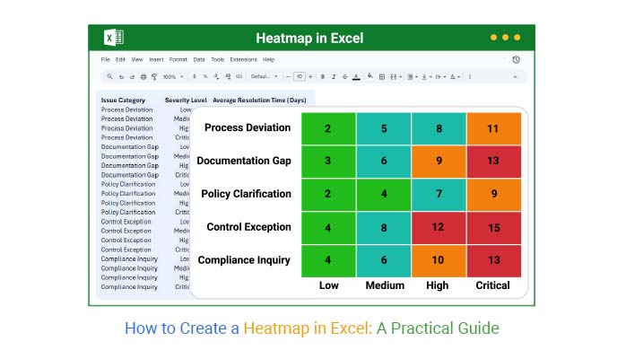
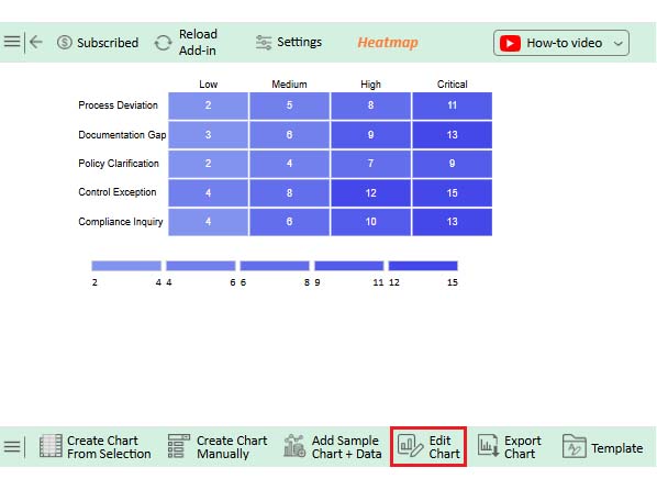
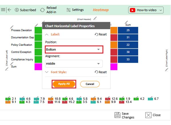
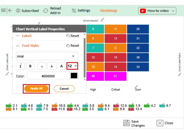
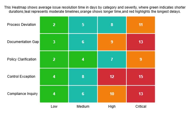
Resolution delays escalate predictably as severity climbs. This Heatmap reveals how days to close an issue expand from minor infractions through critical failures.

How to Create a Heatmap in Excel

Example # 2:

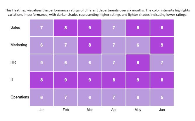
Department scores across half a year tell stories numbers can’t. Color gradients expose which teams consistently deliver and which ones struggle month after month.

How to Create a Heatmap in Excel

Example # 3:

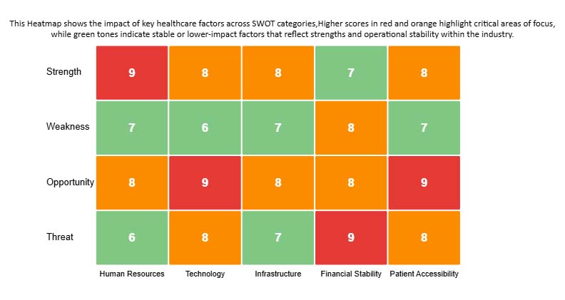
Healthcare planning demands visual priority mapping. This SWOT Heatmap uses saturation to distinguish mission-critical factors from stable baseline conditions across strategic dimensions.

How to Create a Heatmap in Excel

How to Create a Heatmap in Excel (Step by Step)?

Excel’s native tools handle basic Heatmap needs through conditional formatting. This approach works when you want quick visuals without specialized software.

Step 1: Enter the data

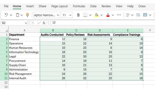
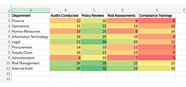
Start with organized, clean information ready for Excel chart creation.

How to Create a Heatmap in Excel

Step 2: Select the dataset

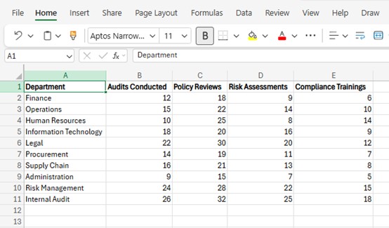
Highlight cells B2 through E11 as your Heatmap source range.

How to Create a Heatmap in Excel

Step 3: Use conditional formatting

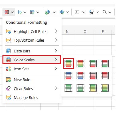
Click the Home tab, find Conditional Formatting, then choose Color Scales. Browse the gradient options to match your data visualization style. Check chart elements in Excel to verify everything displays correctly.

How to Create a Heatmap in Excel
  • Your Heatmap appears once you pick a scale. Refresh using how to update a chart in Excel when source values change.
How to Create a Heatmap in Excel

How to Create a Heatmap Chart in Excel Using ChartExpo?

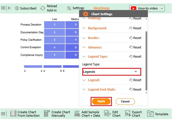
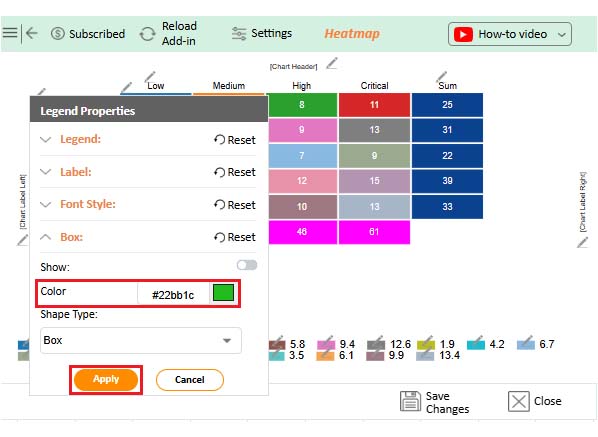
ChartExpo delivers advanced Heatmap capabilities beyond Excel’s defaults. The workflow balances power with simplicity, similar to how to create an org chart in Excel, but with deeper customization.
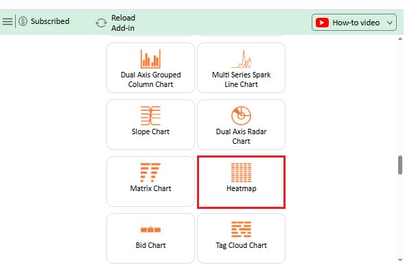
Here’s the process:

  1. Add ChartExpo through the Excel ribbon interface.
  2. Arrange your table with descriptive headers and rows.
  3. Import your range using how to Select Data for a chart in Excel.
  4. Pick Heatmap from the available chart types.
  5. Adjust titles, color schemes, and structural options.
  6. Build the visualization and confirm accuracy.
  7. Watch it refresh automatically when numbers shift.

ChartExpo bridges technical precision with visual storytelling, making Heatmap creation both intuitive and powerful.

Why use ChartExpo?

  • Removes complexity through guided workflows requiring zero code.
  • Provides richer styling and precision than native Excel options.
  • Processes substantial datasets smoothly for reliable insight delivery.
  • Costs ten dollars monthly after a week-long trial.

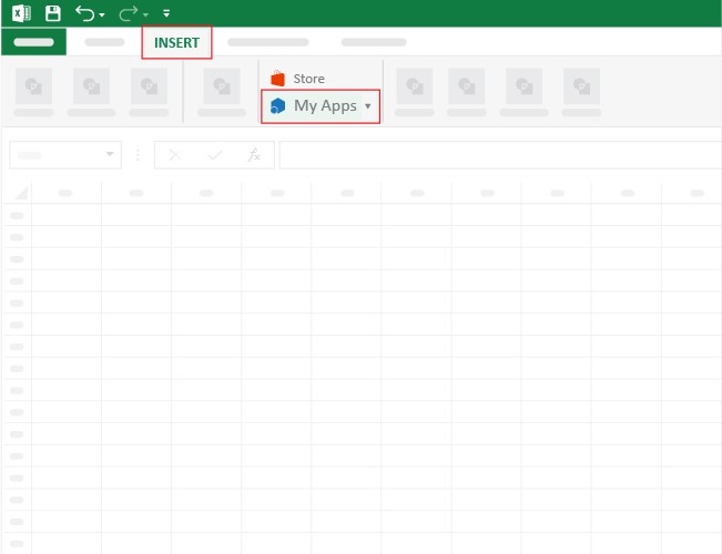
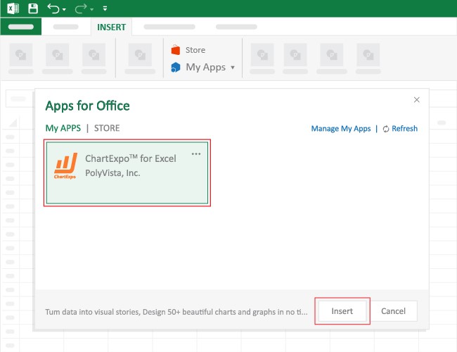
How to install ChartExpo in Excel?

  1. Open your Microsoft Excel.
  2. Start a worksheet and go to the ribbon tab named Insert.
  3. To open the window on Office Add-ins, click on My Apps.
  4. Go to the Add-ins window, and in the “/Store tab,” search ChartExpo.
  5. After finding it, click the Add button to install it.

ChartExpo can be used with both Google Sheets and Microsoft Excel. Follow the CTAs to install your favorite tool and create a beautiful visualization with just a few clicks directly on your favorite platform.

Example:

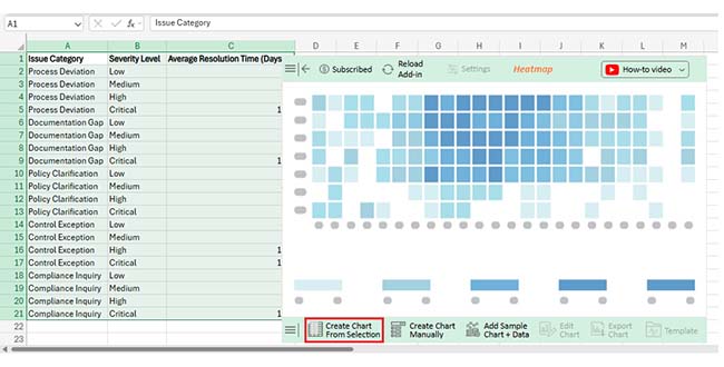
Consider we have the following data for a heatmap.

Issue Category Severity Level Average Resolution Time (Days)
Process Deviation Low 2.1
Process Deviation Medium 4.6
Process Deviation High 7.9
Process Deviation Critical 10.8
Documentation Gap Low 3
Documentation Gap Medium 5.8
Documentation Gap High 9.4
Documentation Gap Critical 12.6
Policy Clarification Low 1.9
Policy Clarification Medium 4.2
Policy Clarification High 6.7
Policy Clarification Critical 9.1
Control Exception Low 4.3
Control Exception Medium 7.5
Control Exception High 11.6
Control Exception Critical 15.2
Compliance Inquiry Low 3.5
Compliance Inquiry Medium 6.1
Compliance Inquiry High 9.9
Compliance Inquiry Critical 13.4
  • Once ChartExpo is installed, please click on the Microsoft Excel “INSERT” menu and then click on the “My Apps” submenu.
How to Create a Heatmap in Excel
  • This will open the Apps for Office window. Find ChartExpo in the list and press the Insert button to make it appear in your Excel workbook.
How to Create a Heatmap in Excel
  • Once ChartExpo is loaded into your sheet, you can search or select “Heatmap” from the list.
How to Create a Heatmap in Excel
  • Next, select your data and click the ‘Create Chart from Selection’ button.
  • This will automatically turn your data into an informative visualization.
How to Create a Heatmap in Excel
  • To customize your chart, just click on the “Edit Chart” option to make adjustments effortlessly, similar to how to change the chart style in Excel.
How to Create a Heatmap in Excel
  • You can change the legend type from “Settings” to add a legend to a chart in Excel.
How to Create a Heatmap in Excel
  • You can change legend colors from “Legend Properties”.
How to Create a Heatmap in Excel
  • You can change the label position from “Chart Horizontal Label Properties”.
How to Create a Heatmap in Excel
  • Next, you can increase the font size for better readability.
How to Create a Heatmap in Excel
  • To add the chart’s description, select the pencil icon on the header. Then, enter the text you want and press Apply.
How to Create a Heatmap in Excel
  • When you are done with all the changes, click the “Save” button to save them.
How to Create a Heatmap in Excel
  • The final look of the Heatmap is shown below.
How to Create a Heatmap in Excel

Key Insights

  • Severe problems demand maximum attention, particularly Control Exception and Documentation Gap scenarios.
  • Minor incidents close fast regardless of category.
  • Each severity jump adds a consistent delay across all issue types.

Benefits of a Heatmap in Excel

Converting numerical grids into visual gradients unlocks advantages you won’t get from raw data. A Heatmap in Excel delivers specific benefits:

  • Spots patterns instantly across dimensions.
  • Compares magnitudes through color instead of arithmetic.
  • Reduces cognitive load when working with complex tables.
  • Surfaces trends and exceptions automatically.
  • Generates presentation-ready visuals for stakeholder reports.
  • Excel Heatmap advantages strengthen interpretation for analysts and executives alike.

Tips for Creating a Heatmap in Excel

Building effective visualizations demands deliberate choices. Follow these practices:

  • Pick color palettes that distinguish values without ambiguity.
  • Skip extreme saturation differences that hurt readability.
  • Standardize scales before applying colors for fair comparisons.
  • Add explicit axis descriptions so viewers grasp what each value means.
  • Verify legibility across display sizes and resolutions.
  • Heatmap design standards maintain clarity and consistency.

Excel Heatmap Chart vs ChartExpo (Comparison)

Understanding capability differences helps pick the right visualization method.

Feature

Excel Heatmap Chart

ChartExpo

Chart flexibility Limited High
Customization options Basic Advanced
Data volume handling Moderate Large datasets
Ease of use Manual setup Guided workflow
Visual clarity Standard Enhanced
Overall Excel Heatmap comparison Functional Professional-grade

ChartExpo offers superior flexibility and scaling for demanding visualization requirements.

Why is ChartExpo Better for Creating Heatmap Charts in Excel?

Manual Heatmap building hits walls fast. ChartExpo eliminates those constraints through advanced automation and customization. It digests large datasets without performance drops and produces sharper visuals than formatting rules allow. Saved layouts and reusable Excel chart templates keep your reporting consistent across projects.

Plus, ChartExpo integrates cleanly with Excel plug-ins, expanding your native toolkit without friction. Teams running frequent, detailed analysis benefit most from this combination of power and efficiency.

FAQs

Can you customize colors in an Excel Heatmap chart?

Absolutely. A Heatmap chart in Excel lets you modify color schemes through conditional formatting or specialized tools to fit analytical requirements.

When should you use a Heatmap in Excel?

Use a Heatmap in Excel when you need to evaluate large grids, spot trends visually, or flag outliers without manual scanning.

Can you create a Heatmap in Excel without add-ins?

Yes. Excel’s built-in formatting handles basic Heatmaps, though advanced platforms deliver greater control.

Wrap Up

Mastering how to create a heatmap in Excel converts confusing grids into instant insight. Color does what numbers can’t—reveals structure at a glance. Excel’s defaults work fine for quick jobs, but ChartExpo raises the ceiling significantly.

Advanced customization, sharper clarity, and effortless scaling make pattern analysis faster, presentation preparation smoother, and data for Excel chart decisions smarter.

How much did you enjoy this article?

ExcelAd1
Start Free Trial!
159302

Related articles

next previous
Microsoft Excel8 min read

Treemap in Excel: From Data to Clear Insights

Build nested rectangle charts that expose hidden patterns in layered datasets. Discover techniques for hierarchical analysis. Learn more!

Microsoft Excel11 min read

Risk Assessment Template in Excel: A Complete Guide

Use a risk assessment template in Excel to track and manage risks. This blog will guide you through simple steps to analyze data and make informed decisions.

Microsoft Excel11 min read

Structured Reference in Excel Explained Simply

Structured reference in Excel simplifies formulas and adapts to growing data. This guide shows examples and best practices to boost accuracy and speed.

Microsoft Excel13 min read

How to Create Control Chart in Excel?

Learn how to create and use a control chart in Excel to monitor process performance, identify variations, and make data-driven decisions.

Microsoft Excel12 min read

Forecasting Using Excel: Visual Methods That Work

Forecasting using Excel helps businesses turn past data into clear predictions. It shows trends, highlights patterns, and guides decisions with accuracy.

ChartExpo logo

Turn Data into Visual
Stories

CHARTEXPO

  • Home
  • Gallery
  • Videos
  • Services
  • Pricing
  • Contact us
  • FAQs
  • Privacy policy
  • Terms of Service
  • Sitemap

TOOLS

  • ChartExpo for Google Sheets
  • ChartExpo for Microsoft Excel
  • Power BI Custom Visuals by ChartExpo
  • Word Cloud

CATEGORIES

  • Bar Charts
  • Circle Graphs
  • Column Charts
  • Combo Charts
  • Comparison Charts
  • Line Graphs
  • PPC Charts
  • Sentiment Analysis Charts
  • Survey Charts

TOP CHARTS

  • Sankey Diagram
  • Likert Scale Chart
  • Comparison Bar Chart
  • Pareto Chart
  • Funnel Chart
  • Gauge Chart
  • Radar Chart
  • Radial Bar Chart
  • Sunburst Chart
  • see more
  • Scatter Plot Chart
  • CSAT Survey Bar Chart
  • CSAT Survey Chart
  • Dot Plot Chart
  • Double Bar Graph
  • Matrix Chart
  • Multi Axis Line Chart
  • Overlapping Bar Chart
  • Control Chart
  • Slope Chart
  • Clustered Bar Chart
  • Clustered Column Chart
  • Box and Whisker Plot
  • Tornado Chart
  • Waterfall Chart
  • Word Cloud
  • see less

RESOURCES

  • Blog
  • Resources
  • YouTube
SIGN UP FOR UPDATES

We wouldn't dream of spamming you or selling your info.

© 2026 ChartExpo, all rights reserved.