• Home
  • Tools dropdown img
    • Spreadsheet Charts

      • ChartExpo for Google Sheets
      • ChartExpo for Microsoft Excel
    • Power BI Charts

      • Power BI Custom Visuals by ChartExpo
    • Word Cloud

  • Charts dropdown img
    • Chart Category

      • Bar Charts
      • Circle Graphs
      • Column Charts
      • Combo Charts
      • Comparison Charts
      • Line Graphs
      • PPC Charts
      • Sentiment Analysis Charts
      • Survey Charts
    • Chart Type

      • Box and Whisker Plot
      • Clustered Bar Chart
      • Clustered Column Chart
      • Comparison Bar Chart
      • Control Chart
      • CSAT Survey Bar Chart
      • CSAT Survey Chart
      • Dot Plot Chart
      • Double Bar Graph
      • Funnel Chart
      • Gauge Chart
      • Likert Scale Chart
      • Matrix Chart
      • Multi Axis Line Chart
      • Overlapping Bar Chart
      • Pareto Chart
      • Radar Chart
      • Radial Bar Chart
      • Sankey Diagram
      • Scatter Plot Chart
      • Slope Chart
      • Sunburst Chart
      • Tornado Chart
      • Waterfall Chart
      • Word Cloud
    • Google Sheets
      Microsoft Excel
  • Services
  • Pricing
  • Contact us
  • Blog
  • Support dropdown img
      • Gallery
      • Videos
      • Contact us
      • FAQs
      • Resources
    • Please feel free to contact us

      atsupport@chartexpo.com

Categories
All Data Visualizations Data Analytics Surveys
Add-ons/
  • Google Sheets
  • Microsoft Excel
  • Power BI
All Data Visualizations Data Analytics Surveys
Add-ons
  • Google Sheets
  • Microsoft Excel
  • Power BI

We use cookies

This website uses cookies to provide better user experience and user's session management.
By continuing visiting this website you consent the use of these cookies.

Ok

ChartExpo Survey


Home > Blog > Google Sheets

How to Group Columns in Google Sheets for Faster Insights

Are you wondering how to group columns in Google Sheets without wasting time and getting lost in endless data? Don’t worry, you’ve come to the right place. To begin with, this is a question every busy professional faces.

How to Group Columns in Google Sheets

Why? Reports, sales numbers, and budgets all pile up. From this, spreadsheets can quickly become overwhelming, rows of figures stretch on, and critical insights hide in the noise.

I have a solution for you: Learn how to group columns in Google Sheets. Learning how to group columns in Google Sheets can cut through that clutter. It helps you collapse, expand, and manage data with a few clicks.

Imagine handling an annual sales report with dozens of columns. Without grouping, you scroll endlessly. With grouping, you toggle sections on and off in seconds. The difference is not slight; it’s the difference between wasting hours and finishing early. From this convenience, teams can share clean, readable sheets. Moreover, managers can review reports without having to dig through raw data.

Whether building financial reports, using inventory tracking, or creating a comparison chart, grouping columns keeps clarity. It’s a skill that makes spreadsheets easier to read and present. Once you learn it, you’ll never go back to scrolling through endless grids.

This guide will walk you through the process step-by-step. We’ll also give you helpful tips to enable you to complete it more efficiently.

Ready? Let’s dive in…

Table of Contents:

  1. What are Grouping Columns in Google Sheets?
  2. Why Do You Need to Group Columns in Google Sheets?
  3. How to Group Columns in Google Sheets?
  4. How to Analyze Grouped Columns in Google Sheets?
  5. Benefits of Using Group Columns in Google Sheets Shortcut
  6. FAQs
  7. Wrap Up

What are Grouping Columns in Google Sheets?

Definition: Grouping columns in Google Sheets means organizing related data so you can expand or collapse sections as needed. It helps simplify large datasets and keeps reports clean and organized.

This feature is beneficial for inventory tracking in Google Sheets, especially when managing multiple categories. It also supports building a custom dashboard in Google Sheets, which can display only the data you need. Many use it to add a series in Google Sheets reports to keep data organized.

Why Do You Need to Group Columns in Google Sheets?

Have you ever opened a spreadsheet and felt lost in an endless sea of columns? That’s where grouping comes in. Learning to group columns makes everything easier to manage. It keeps sheets clear for what-if analysis in Google Sheets or creating a comparison chart.

Why?

  • Structured arrangement: Grouping allows you to organize related columns, keeping data connected. It keeps your sheet neat and makes large datasets easier to read.
  • Easy navigation: Instead of scrolling endlessly, you can collapse sections you don’t need. This helps you reach important information in seconds.
  • Improved analysis: Grouping allows you to focus on specific data without distractions. It’s ideal for testing scenarios or running detailed reports.
  • Team-friendly structure: Shared spreadsheets become easier for everyone to understand. With grouped columns, information is presented in a clear and logical order.
  • Cleaner dashboards: Dashboards look polished when grouped data is displayed in sections. It highlights key insights while hiding unnecessary details.

How to Group Columns in Google Sheets?

Have you ever stared at a massive spreadsheet and wished it looked cleaner? Grouping columns can make that happen. It turns messy grids into easy-to-read sections. Whether you handle sales data or create dashboards in Google Sheets, this feature helps save time.

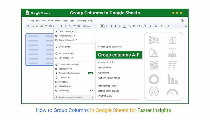
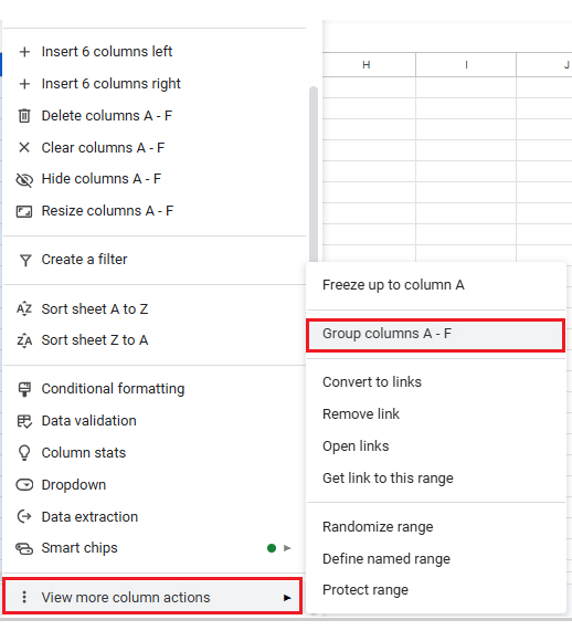
Follow these steps to achieve this level of convenience:

  • Select the columns: Highlight the columns you want to group by clicking and dragging across their headers. If the columns aren’t next to each other, hold Ctrl (Windows) or Cmd (Mac) and click each one to select them individually.
How to Group Columns in Google Sheets
  • Group the columns: Right-click on one of the selected headers and choose “Group columns” to create the group. You can also use the Data menu or quick keyboard shortcuts to speed up the process.
How to Group Columns in Google Sheets
  • Collapse or expand the group: Click the minus (–) icon above the grouped section to hide the columns. To show them again, click the plus (+) icon. Collaborators can do the same when the sheet is shared.
How to Group Columns in Google Sheets

Top 10 Visuals Using ChartExpo after Grouping Columns in Google Sheets

Charts turn raw data into stories people can understand. How? They make patterns jump out. Using ChartExpo inside Google Sheets can transform dull grids into interactive reports. These tools also pair well when you want to create a simple yet powerful dashboard in Google Sheets.

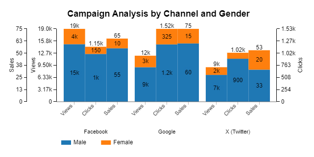
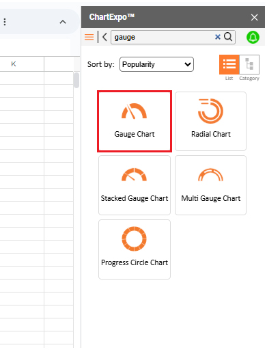
Here are the top 10 charts you can create in Google Sheets using ChartExpo.

  • Matrix Chart: Shows how two dimensions of data interact. This chart is perfect for spotting trends and comparing “Actual” vs. “Planned” columns.
How to Group Columns in Google Sheets
  • Multi-Axis Line Chart: Plots multiple data series with different values on separate axes. It is great for visualizing tasks, queries, and hours in a single, clean view.
How to Group Columns in Google Sheets
  • Comparison Bar Chart: Highlights changes between grouped categories over time. It helps track performance across quarters or departments.
How to Group Columns in Google Sheets
  • Sankey Chart: This chart visualizes the flow between categorized levels, such as transitioning from applications to interviews. It is ideal for process or funnel analysis.
How to Group Columns in Google Sheets
  • Heatmap: A Heatmap uses colors to show patterns, trends, and outliers. It is perfect for tracking performance scores or sales across periods.
How to Group Columns in Google Sheets
  • Scatter Plot Chart: Shows relationships between two numeric fields. A Scatter Plot is ideal for comparing columns like cost, effort, and outcomes.
How to Group Columns in Google Sheets
  • Progress Circle Chart: Displays completion rates of grouped tasks or project stages. It works well for dashboards and progress tracking.
How to Group Columns in Google Sheets
  • Gauge Chart: Measures performance against goals. This chart is quick to scan and ideal for KPI-focused reports.
How to Group Columns in Google Sheets
  • Multi-Axis Spider Chart: Compares multiple categories at once to reveal strengths and gaps. Use it to analyze teams or projects.
How to Group Columns in Google Sheets
  • Clustered Stacked Bar Chart: Compares grouped categories while showing sub-category contributions. This chart turns aggregated data into clear, structured insights.
How to Group Columns in Google Sheets

How to Analyze Grouped Columns in Google Sheets?

Data is everywhere. But making sense of it? That’s the real trick. Grouped columns in Google Sheets can reveal patterns, only if you know how to analyze them. This is where Data visualization comes into play. Visuals make data analysis easier by turning raw numbers into clear insights.

Sadly, Google Sheets often drops the ball here. Its charts lack depth and clarity.

We have a solution: ChartExpo. This add-on brings smart visuals to your Google Sheets, helping you spot trends and make better decisions—fast.

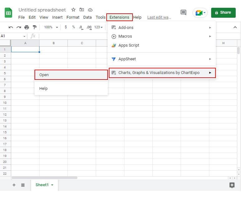
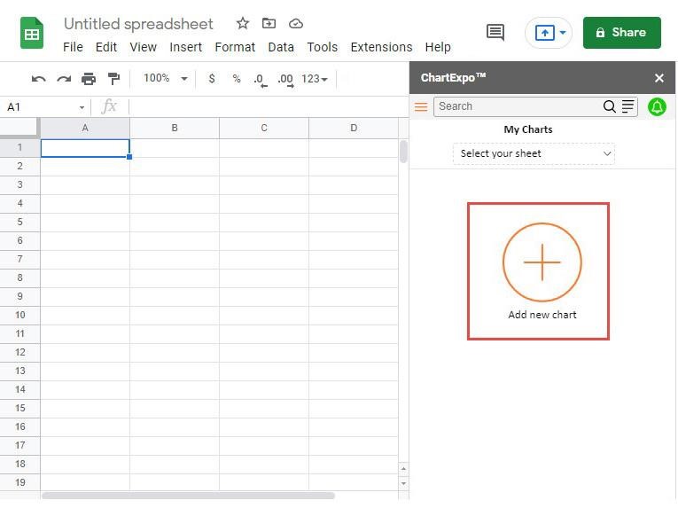
How to Install ChartExpo in Google Sheets?

  1. To start using ChartExpo, download it directly from the Google Sheets program. To do this, select Extensions from the top toolbar.
  2. A menu will appear. Click the Get add-ons option.
  3. Search for ChartExpo, and click on Charts, Graphs & Visualizations by ChartExpo when it appears in the results.
  4. Click the Install button. You will have to confirm your Google account and accept some permissions.

ChartExpo charts are available both in Google Sheets and Microsoft Excel. Please use the following CTAs to install the tool of your choice and create beautiful visualizations in a few clicks in your favorite tool.

Example

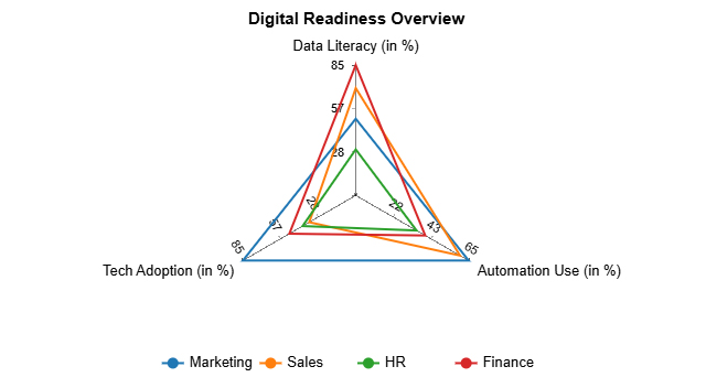
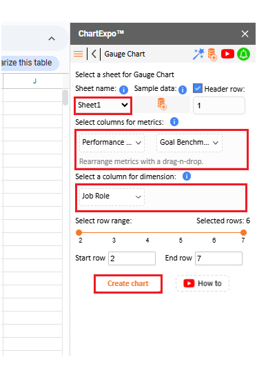
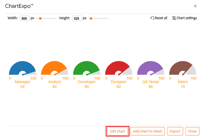
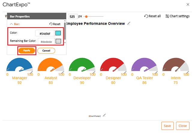
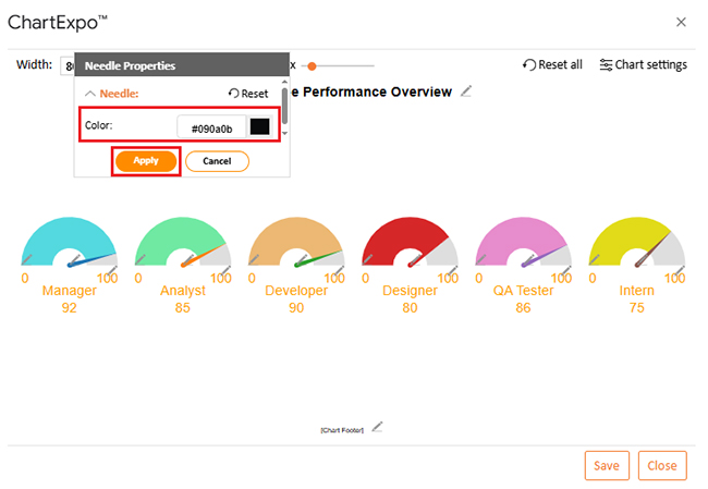
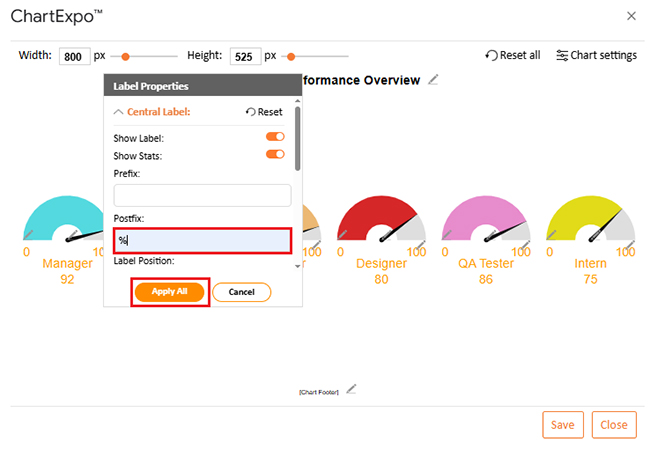
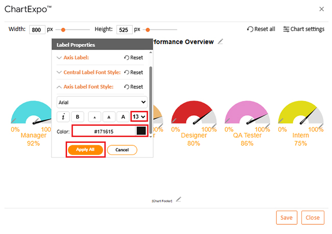
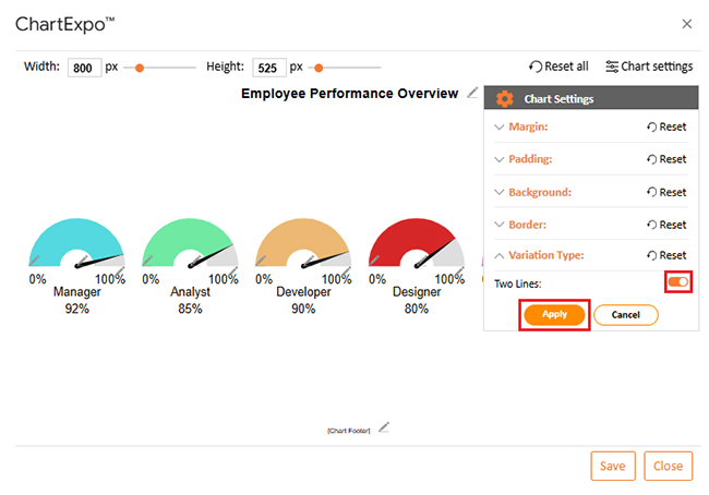
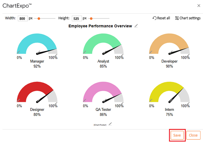
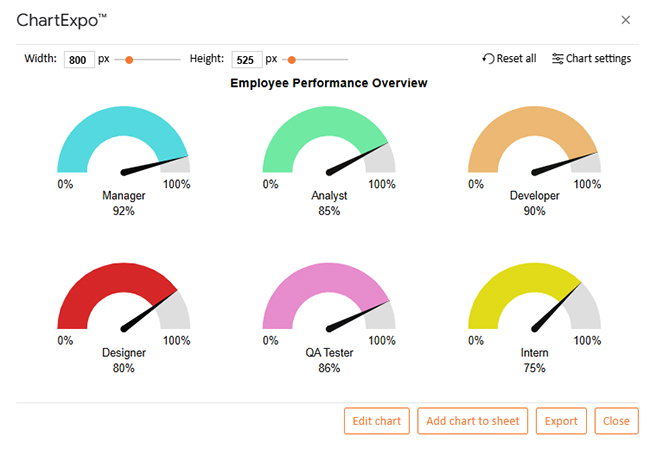
Let’s analyze this sample data in Google Sheets using ChartExpo.

Job Role Performance Score (%) Goal Benchmark (%)
Manager 92 100
Analyst 85 100
Developer 90 100
Designer 80 100
QA Tester 86 100
Intern 75 100
  • To get started with ChartExpo, install ChartExpo in Google Sheets.
  • Go to Extensions > Charts, Graphs & Visualizations by ChartExpo > Open.
How to Group Columns in Google Sheets
  • To access the charts library, click the Add new chart button.
How to Group Columns in Google Sheets
  • Once it loads, scroll through the charts list to locate and choose the “Gauge Chart”.
How to Group Columns in Google Sheets
  • Put the data table in the sheet first. Then, choose the Sheet name from the drop-down in the ChartExpo section.
  • Select the metric column; metric is the numeric column in your data sheet.
  • Select the dimensions column; the dimension is the categorical column in your datasheet that contains text information.
  • Click the Create chart button to complete the process.
How to Group Columns in Google Sheets
  • If you want to add anything to the chart, click the Edit Chart button:
How to Group Columns in Google Sheets
  • Click the pencil icon next to the Chart Header to change the title.
  • It will open the properties dialog. Under the Text section, you can add a heading in Line 1 and enable Show.
  • Give the appropriate title of your chart and click the Apply button.
How to Group Columns in Google Sheets
  • You can change the Legend Color and Shape type as follows:
How to Group Columns in Google Sheets
  • You can set the needle color to black by clicking the pencil icon on the needle.
How to Group Columns in Google Sheets
  • You can add the percentage sign with all values as follows:
How to Group Columns in Google Sheets
  • You can change font size and color for better readability as follows:
How to Group Columns in Google Sheets
  • Change the Variation type by clicking on Settings as follows:
How to Group Columns in Google Sheets
  • After making all changes, click on the “Save” button:
How to Group Columns in Google Sheets
  • Your final chart will look like the one below.
How to Group Columns in Google Sheets

Insights

  • The manager leads with a top performance score of 92%, meeting key KPIs.
  • The developer and QA Tester follow closely, with strong scores of 90% and 86%, respectively.
  • Analysts and Designers perform at expected levels, scoring 85% and 80%.
  • The Intern scores 75%, showing potential but needing guidance and coaching.
  • All roles are measured against a standard 100% performance goal for comparison.

Benefits of Using Group Columns in Google Sheets Shortcut

I know you love convenience. From this, you’ve likely asked yourself how to organize your spreadsheet in one quick move. That’s what the group columns shortcut does. It saves clicks, keeps things tidy, and makes data easy to manage.

Here are the benefits of grouping related columns in Google Sheets:

  • Saves time: The shortcut groups columns instantly, eliminating the need for extra steps. This reduces repetitive clicks and speeds up your workflow.
  • Keeps data organized: Grouped sections create a more organized spreadsheet layout. It helps you manage large datasets with less scrolling.
  • Improves focus: You can collapse irrelevant sections and view only essential data. This makes analysis quicker and more accurate.
  • Team-friendly: Shared sheets become easier to read and navigate for everyone. Grouped columns present information in a structured way for better collaboration.
  • Perfect for dashboards: Grouping organizes data for professional reports and visuals. It gives dashboards a clear and polished structure.

FAQs

How to categorize columns in Google Sheets?

  • Label headers with clear titles.
  • Use color codes for categories.
  • Apply filters to sort data.
  • Group related columns together.
  • Combine with formulas for better organization.

What is the shortcut for grouping columns in Google Sheets?

On Windows, press Alt + Shift + →. On Mac, press Shift + Option + →. Select the columns first, then the shortcut groups them instantly. Use it to organize data and save time quickly.

Wrap Up

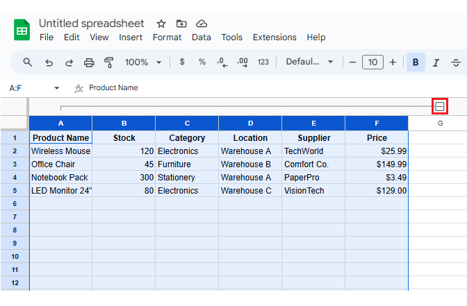
Grouping columns in Google Sheets makes large datasets easier to manage and organize. It organizes information into sections you can collapse or expand. This keeps your spreadsheet clean and easy to read.

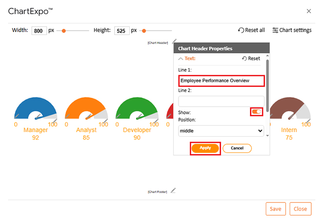
When data is well-organized, building visuals becomes effortless. You can quickly learn how to create a chart in Google Sheets using grouped data. This turns raw numbers into clear, readable insights.

Grouped columns also make testing scenarios smoother. Running a what-if analysis in Google Sheets is faster when data is separated into logical sections. It reduces errors and improves decision-making.

If you work across multiple spreadsheets, grouping pairs well with IMPORTRANGE in Google Sheets. It keeps imported data organized and ready for analysis. This is especially helpful when combining information from different teams.

You can also create a comparison chart in Google Sheets using grouped columns. It makes performance tracking or side-by-side analysis more accurate. Cleanly arranged data always leads to better visuals.

Conclusively, grouping, charts, and analysis tools work together to create smarter spreadsheets. With the proper structure, Google Sheets becomes a powerful tool for data-driven decisions. So, don’t hesitate. Install ChartExpo to simplify grouped charts and unlock visual insights.

How much did you enjoy this article?

GSAd2
Start Free Trial!
156977

Related articles

next previous
Google Sheets10 min read

Import XML to Google Sheets: Smarter Ways to Use XML

Importing XML to Google Sheets helps you pull structured web data into spreadsheets. This guide will show you how to use it, analyze results, and avert issues.

Google Sheets11 min read

Wedding Budget Template in Google Sheets: Clear Insights

The wedding budget template in Google Sheets tracks and organizes wedding costs. This guide shows you how to set it up and stay on budget with ease.

Google Sheets11 min read

Google Sheets HLOOKUP: A Simple Walkthrough

Google Sheets HLOOKUP finds data fast by scanning rows. Click here to learn how to use it to save time, reduce errors, work smarter, and more.

Google Sheets11 min read

Compare Two Columns in Google Sheets: A Quick Guide

Learn how to compare two columns in Google Sheets with ease. This guide helps you spot differences, clean data, visualize results quickly, and more.

Google Sheets11 min read

Gemini in Google Sheets: Simplifying Data for Insights

Gemini in Google Sheets lets you automate tasks with simple prompts. Click here to learn how to use it, create charts, and boost productivity with expert tips.

ChartExpo logo

Turn Data into Visual
Stories

CHARTEXPO

  • Home
  • Gallery
  • Videos
  • Services
  • Pricing
  • Contact us
  • FAQs
  • Privacy policy
  • Terms of Service
  • Sitemap

TOOLS

  • ChartExpo for Google Sheets
  • ChartExpo for Microsoft Excel
  • Power BI Custom Visuals by ChartExpo
  • Word Cloud

CATEGORIES

  • Bar Charts
  • Circle Graphs
  • Column Charts
  • Combo Charts
  • Comparison Charts
  • Line Graphs
  • PPC Charts
  • Sentiment Analysis Charts
  • Survey Charts

TOP CHARTS

  • Sankey Diagram
  • Likert Scale Chart
  • Comparison Bar Chart
  • Pareto Chart
  • Funnel Chart
  • Gauge Chart
  • Radar Chart
  • Radial Bar Chart
  • Sunburst Chart
  • see more
  • Scatter Plot Chart
  • CSAT Survey Bar Chart
  • CSAT Survey Chart
  • Dot Plot Chart
  • Double Bar Graph
  • Matrix Chart
  • Multi Axis Line Chart
  • Overlapping Bar Chart
  • Control Chart
  • Slope Chart
  • Clustered Bar Chart
  • Clustered Column Chart
  • Box and Whisker Plot
  • Tornado Chart
  • Waterfall Chart
  • Word Cloud
  • see less

RESOURCES

  • Blog
  • Resources
  • YouTube
SIGN UP FOR UPDATES

We wouldn't dream of spamming you or selling your info.

© 2025 ChartExpo, all rights reserved.