• Home
  • Tools dropdown img
    • Spreadsheet Charts

      • ChartExpo for Google Sheets
      • ChartExpo for Microsoft Excel
    • Power BI Charts

      • Power BI Custom Visuals by ChartExpo
    • Word Cloud

  • Charts dropdown img
    • Chart Category

      • Bar Charts
      • Circle Graphs
      • Column Charts
      • Combo Charts
      • Comparison Charts
      • Line Graphs
      • PPC Charts
      • Sentiment Analysis Charts
      • Survey Charts
    • Chart Type

      • Box and Whisker Plot
      • Clustered Bar Chart
      • Clustered Column Chart
      • Comparison Bar Chart
      • Control Chart
      • CSAT Survey Bar Chart
      • CSAT Survey Chart
      • Dot Plot Chart
      • Double Bar Graph
      • Funnel Chart
      • Gauge Chart
      • Likert Scale Chart
      • Matrix Chart
      • Multi Axis Line Chart
      • Overlapping Bar Chart
      • Pareto Chart
      • Radar Chart
      • Radial Bar Chart
      • Sankey Diagram
      • Scatter Plot Chart
      • Slope Chart
      • Sunburst Chart
      • Tornado Chart
      • Waterfall Chart
      • Word Cloud
    • Google Sheets
      Microsoft Excel
  • Services
  • Pricing
  • Contact us
  • Blog
  • Support dropdown img
      • Gallery
      • Videos
      • Contact us
      • FAQs
      • Resources
    • Please feel free to contact us

      atsupport@chartexpo.com

Categories
All Data Visualizations Data Analytics Surveys
Add-ons/
  • Google Sheets
  • Microsoft Excel
  • Power BI
All Data Visualizations Data Analytics Surveys
Add-ons
  • Google Sheets
  • Microsoft Excel
  • Power BI

We use cookies

This website uses cookies to provide better user experience and user's session management.
By continuing visiting this website you consent the use of these cookies.

Ok

ChartExpo Survey


Home > Blog > Data Visualization

Risk Assessment Matrix for Insights That Drive Action

Risk assessment matrix—what makes it a go-to tool for many organizations? In high-stakes industries, one misjudged risk can lead to millions in losses.

Risk Assessment Matrix

In healthcare alone, over 250,000 deaths in the U.S. are linked to medical errors, many tied to poor risk analysis.

A risk assessment matrix helps teams rank potential issues by severity and likelihood. No guesswork. This tool is used in construction, finance, manufacturing, and cybersecurity. Even NASA uses variations of it during mission planning.

A well-built risk assessment matrix doesn’t stand alone. Tools like the impact vs. effort matrix often support it. While one weighs threats, the other helps decide where to act first. Together, they steer resources where they’re needed most. To understand this better, learn what a confusion matrix is and how it is tied to efficiency.

In this post, we’ll dig deeper into how the risk assessment matrix works, why it matters, and where it fits. If you’re leading a team or reviewing risk policies, this tool can reshape how you plan your next move. So, without further ado, let’s get into it…

Table of Contents:

  1. What is a Risk Assessment Matrix?
  2. Why is a Risk Identification Matrix Important?
  3. Key Features and Purpose of a Risk Matrix
  4. How Does a Risk Matrix Work?
  5. How Many Types of Risk Matrix?
  6. How to Visualize a Risk Assessment Matrix in Excel?
  7. How to Use a Risk Control Matrix?
  8. FAQs
  9. Wrap Up

What is a Risk Assessment Matrix?

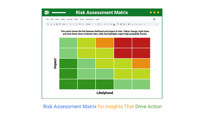
Definition: A risk assessment matrix is a simple tool for evaluating risks. It compares a risk’s likelihood with its potential impact, helping teams decide what to handle first. Each risk is plotted in a grid with colors showing severity—green for low and red for high.

A risk assessment matrix supports decisions by making risks easy to see. Tools like the prioritization matrix and skills matrix templates often work alongside it for better planning.

Why is a Risk Identification Matrix Important?

Risk can catch any project off guard. Without a clear way to spot it, small problems quickly grow. That’s where a risk identification matrix comes in. It puts risk front and center, so teams don’t miss a beat.

Here’s why it matters:

  • Structured risk analysis: It organizes risks in a clear format so nothing slips through the cracks. Using tools like the decision matrix makes this process even sharper.
  • Better decision-making: By laying out risks visually, teams can prioritize faster and act smarter. This reduces guesswork and boosts confidence.
  • Improved communication: A visual matrix turns complex risk data into a clear, simple language. This makes discussions easier for everyone, from engineers to executives.
  • Enhanced compliance and documentation: It provides a reliable record of managing risks. This supports audits and keeps teams accountable.
  • Cost and time efficiency: Spotting risks early saves money and avoids delays. A well-used matrix streamlines the whole risk management process.

Key Features and Purpose of a Risk Matrix

A missed risk can delay a launch, derail a project, or cost millions. Funny enough, risk hides in plain sight. So, how do you get to recognize it? Smart teams rely on the risk assessment matrix. It doesn’t just organize threats—it turns risk into action.

Let’s break down its key strengths into six simple points.

  • Clear visuals: The matrix uses a color-coded grid to show risk levels at a glance. This helps teams quickly spot high-risk issues without reading through dense reports.
  • Organized categories: Risks are grouped by how likely they are to happen and how serious they could be. This structure helps prevent small risks from distracting attention from major ones.
  • Sharp prioritization: The matrix highlights which risks demand action first. Much like an impact vs. effort matrix, it helps teams focus on what matters most.
  • Scalable and customizable: Whether managing a small project or a global operation, the matrix scales with your needs. You can adjust labels, scoring systems, and color schemes to fit any industry.
  • Better decision-making: The matrix guides faster and more informed choices. When paired with a covariance matrix, it reveals patterns and relationships among risks that may not be obvious.
  • Stronger communication and compliance: Its visual layout helps managers explain risk clearly to stakeholders. It also serves as evidence that your organization follows structured, proactive risk practices.

How Does a Risk Matrix Work?

Understanding how a risk matrix works can change how you handle challenges. It breaks down risk into simple, manageable parts. There is no jargon—just clear steps:

  1. Two-dimensional assessment: The matrix looks at two things: how likely a risk is and how severe its impact could be. This gives a full picture of potential problems.
  2. Risk plotting: Each risk is placed on the grid based on those two factors. This shows where it fits between low and high danger.
  3. Prioritization and action planning: Risks in the high-impact, high-likelihood zone get immediate attention. Teams use this to decide what to fix first and how.
  4. Clear visualization: Colors make it easy to spot urgent risks right away. The whole team can understand the situation without digging through reports.

How Many Types of Risk Matrix?

Not all risks are equal. And not all risk matrices are either. Choosing the right one depends on how deep you need to go.

Let’s look at two common types and how they stack up.

1.    3×3 Risk Matrix

This format includes three levels of likelihood and three levels of impact. It’s commonly used for small projects or early-stage planning.

Pros:

  • It is fast and easy to implement, even for non-experts.
  • It is ideal for low-risk environments or smaller teams needing quick assessments.

Cons:

  • Lacks granularity, which can lead to oversights in complex situations.
  • Limited detail may result in vague or generalized action plans.

2.    5×5 Risk Matrix

With five levels for both impact and likelihood, this matrix offers greater detail and accuracy. It’s better suited for complex or high-stakes environments.

Pros:

  • Enables precise risk evaluation and prioritization across large teams.
  • Offers better differentiation between moderate and critical risks.

Cons:

  • Setting it up and interpreting it can be time-consuming.
  • It may require training or guidelines to ensure consistent use.

How to Visualize a Risk Assessment Matrix in Excel?

Spreadsheets are great—until they aren’t. You can crunch numbers all day in Excel, but when it’s time to see the story in your data, things get messy fast. That’s where most risk analysis hits a wall.

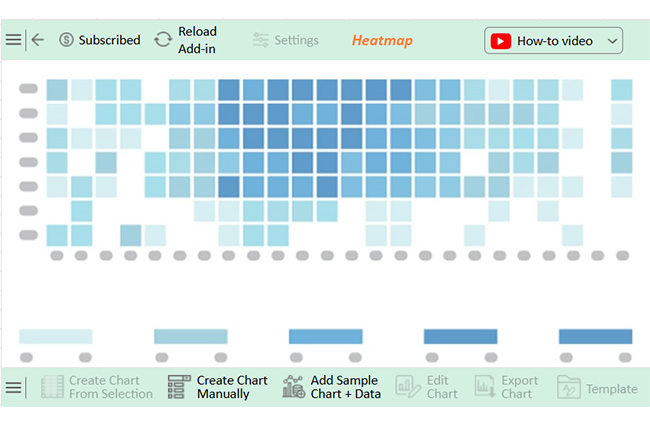
But don’t worry—the risk assessment matrix is here. It provides a visual way to spot, rank, and respond to risks before they derail your plans. But building that clarity in Excel is painful.

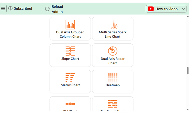
ChartExpo steps in to fix that. It transforms dull data into sharp, interactive visuals—without formulas or frustration.

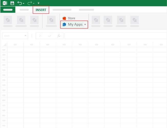
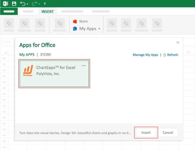
How to Install ChartExpo in Excel?

  1. Open your Excel application.
  2. Open the worksheet and click the “Insert” menu.
  3. You’ll see the “My Apps” option.
  4. In the Office Add-ins window, click “Store” and search for ChartExpo on my Apps Store.
  5. Click the “Add” button to install ChartExpo in your Excel.

ChartExpo charts are available both in Google Sheets and Microsoft Excel. Please use the following CTAs to install the tool of your choice and create beautiful visualizations with a few clicks in your favorite tool.

Example

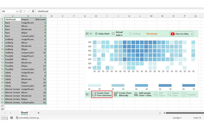
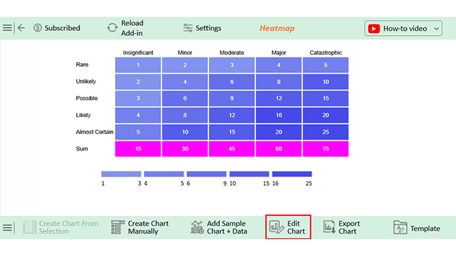
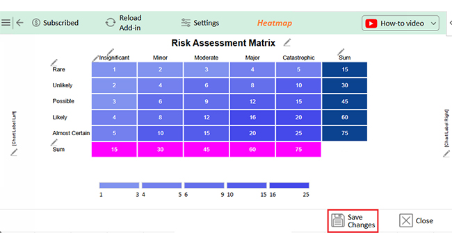
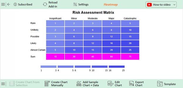
Let’s visualize and analyze this sample data in Excel using ChartExpo.

Likelihood Impact Risk Level
Rare Insignificant 1
Rare Minor 2
Rare Moderate 3
Rare Major 4
Rare Catastrophic 5
Unlikely Insignificant 2
Unlikely Minor 4
Unlikely Moderate 6
Unlikely Major 8
Unlikely Catastrophic 10
Possible Insignificant 3
Possible Minor 6
Possible Moderate 9
Possible Major 12
Possible Catastrophic 15
Likely Insignificant 4
Likely Minor 8
Likely Moderate 12
Likely Major 16
Likely Catastrophic 20
Almost Certain Insignificant 5
Almost Certain Minor 10
Almost Certain Moderate 15
Almost Certain Major 20
Almost Certain Catastrophic 25
  • To get started with ChartExpo, install ChartExpo in Excel.
  • Now, click on My Apps from the INSERT menu.
Risk Assessment Matrix
  • Choose ChartExpo from My Apps, then click Insert.
Risk Assessment Matrix
  • Once it loads, choose the “Heatmap” from the charts list.
Risk Assessment Matrix
  • After clicking on the chart, you will see the Heatmap on the screen.
Risk Assessment Matrix
  • Click the “Create Chart From Selection” button after selecting the data from the sheet, as shown.
Risk Assessment Matrix
  • ChartExpo will generate the visualization below for you:
Risk Assessment Matrix
  • If you want to have the chart’s title, click Edit Chart, as shown in the above image.
  • Click the pencil icon next to the Chart Header to change the title.
  • It will open the properties dialog. Under the Text section, you can add a heading in Line 1 and enable Show.
  • Give the appropriate title of your chart and click the Apply button.
Risk Assessment Matrix
  • Click the “Save Changes” button to persist the changes.
Risk Assessment Matrix
  • Your final chart will appear as follows.
Risk Assessment Matrix

Insights

  • Risk severity increases as both Likelihood and Impact
  • The highest risk score (up to 25) occurs when “Almost Certain” is paired with “Catastrophic”.
  • The lowest risk score (1) comes from combining “Rare” with “Insignificant”.
  • Both dimensions—Likelihood and Impact—are equally critical in determining the overall risk level.

How to Use a Risk Control Matrix?

A plan is only as strong as its ability to handle risk. That’s why the risk control matrix exists. It connects risks to real actions. There is no fluff—just clear responsibility, tracking, and follow-through.

Here’s how to use one effectively.

  1. Identify key processes and risks: Begin by mapping out the most critical processes in your operation or project. Identify risks in each process that could impact performance, cause delays, or lead to compliance issues.
  2. Assess risk severity: Evaluate each risk based on its likelihood and serious consequences. Use structured scales, similar to scoring methods in a decision matrix, to ensure consistency across your analysis.
  3. Document existing controls: List existing controls to manage each risk. This includes policies, systems, technologies, or team protocols that aim to reduce the risk impact or likelihood.
  4. Evaluate control effectiveness: Assess whether your current controls do enough to minimize risk. Use ratings or performance indicators to measure their actual impact.
  5. Define control owners and responsibilities: Assign each control to a responsible individual or team. Clear accountability ensures that actions aren’t overlooked or delayed.
  6. Monitor and update regularly: Set a schedule to revisit and revise the matrix as projects evolve or new risks emerge. Continuous updates help keep the matrix relevant and accurate.

FAQs

What is the 9×9 risk matrix?

A 9×9 risk matrix has nine levels of likelihood and nine levels of impact. It offers high detail and precision and is used for complex, high-risk projects. More categories help teams rank risks more accurately.

Is there a standard for a risk matrix?

There’s no single global standard, but many follow ISO 31000 or COSO guidelines. Organizations often customize based on their needs. The structure may vary, but the goal remains consistent: clear, visual risk evaluation.

What are the five risk factors?

The five common risk factors are likelihood, impact, exposure, detectability, and response time. These help assess and manage risks. Each factor provides a different lens. Together, they create a fuller picture of potential threats.

Wrap Up

A risk assessment matrix helps you see danger before it strikes. It shows what could go wrong and how serious it might be. You get a clear picture with two simple axes—likelihood and impact.

It’s not just about spotting risk; it’s about knowing what to do next. A good matrix turns confusion into action and keeps teams focused on what matters most.

You don’t need complex tools to start. But for more profound insight, add layers. A covariance matrix helps you understand how risks relate. It shows connections you might miss otherwise.

You can also use matrix survey questions. These collect opinions across teams. Then, you organize that feedback into patterns. It’s a smart way to bring people into the risk conversation.

A prioritization matrix helps you decide what to tackle first. When paired with a risk matrix, it gives you full control. You’re not guessing—you’re planning.

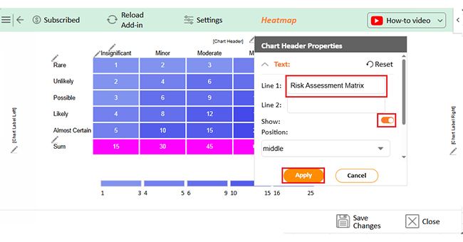
In conclusion, a risk assessment matrix is more than a chart. It’s a strategy tool that brings clarity, drives action, and strengthens every decision. Pair it with ChartExpo, and risk assessment shoots straight to cloud nine.

How much did you enjoy this article?

PBIAd1
Start Free Trial!
153849

Related articles

next previous
Data Analytics13 min read

How to Create Monthly Sales Reports Templates in Excel?

Discover the 4 best monthly sales report templates in Excel. Track sales, compare targets, and spot trends easily with ready-to-use reporting tools

Data Analytics8 min read

Business Dashboard Examples for Improved Decision Making

What is a business dashboard, and how can you create one? These answers are provided in this guide. You'll also see some business dashboard examples.

Data Analytics8 min read

Energy Demand Analysis for Better Insights

This guide dives deep into what energy demand is. You'll also discover how to calculate energy demands and ways to reduce electric energy demand.

Data Analytics13 min read

Store Performance Dashboards: Optimizing Retail Success

Discover how a store performance dashboard centralizes sales, inventory, and employee data into one view to improve retail performance and strategy.

Data Analytics9 min read

Semantic Layer for Reports Everyone Can Understand

Semantic layer connects raw data to business-friendly analytics in Power BI, enabling fast, consistent, and accurate reporting.

ChartExpo logo

Turn Data into Visual
Stories

CHARTEXPO

  • Home
  • Gallery
  • Videos
  • Services
  • Pricing
  • Contact us
  • FAQs
  • Privacy policy
  • Terms of Service
  • Sitemap

TOOLS

  • ChartExpo for Google Sheets
  • ChartExpo for Microsoft Excel
  • Power BI Custom Visuals by ChartExpo
  • Word Cloud

CATEGORIES

  • Bar Charts
  • Circle Graphs
  • Column Charts
  • Combo Charts
  • Comparison Charts
  • Line Graphs
  • PPC Charts
  • Sentiment Analysis Charts
  • Survey Charts

TOP CHARTS

  • Sankey Diagram
  • Likert Scale Chart
  • Comparison Bar Chart
  • Pareto Chart
  • Funnel Chart
  • Gauge Chart
  • Radar Chart
  • Radial Bar Chart
  • Sunburst Chart
  • see more
  • Scatter Plot Chart
  • CSAT Survey Bar Chart
  • CSAT Survey Chart
  • Dot Plot Chart
  • Double Bar Graph
  • Matrix Chart
  • Multi Axis Line Chart
  • Overlapping Bar Chart
  • Control Chart
  • Slope Chart
  • Clustered Bar Chart
  • Clustered Column Chart
  • Box and Whisker Plot
  • Tornado Chart
  • Waterfall Chart
  • Word Cloud
  • see less

RESOURCES

  • Blog
  • Resources
  • YouTube
SIGN UP FOR UPDATES

We wouldn't dream of spamming you or selling your info.

© 2025 ChartExpo, all rights reserved.