Categories
You face a simple question with a big impact: make it or buy it. The answer shapes cash flow, delivery, and control. A clear process beats gut calls every time.


Use the make versus buy analysis to compare cost, risk, and fit. Tie the choice to goals you can measure. Track volume, quality, lead time, and skills on hand. Then map how each path shifts those numbers.
You win when you quantify. That means listing fixed and variable costs. It also means setting a rule for break-even volume. With a rule, you avoid drift and slow decisions. Add checks for supplier reliability and capacity so you don’t get stuck mid-project.
People often chase a lower unit price and miss the system cost. Freight, training, and rework can flip a result. A tight make versus buy analysis puts those costs on one page. You see the full picture before money moves.
Set thresholds. For example, cap spend per unit at a stated level at 100, 500, and 1,000 units. State your recheck trigger, such as a 12 percent change in labor or a key input. When that trigger hits, you run make versus buy analysis again.
The choice also touches strategy. In-house can protect IP and speed tweaks. Outsourcing can scale faster and shift fixed costs to variable costs. Write down which edge you need for the next two quarters. That focus keeps the math honest.
Definition: Make versus buy analysis is a structured way to choose between producing in-house or sourcing from a supplier. You compare total cost, control, speed, and risk. You write the break-even point so teams act with clarity.
Use make vs buy analysis when a component matters for quality or timing. It shines when you can reuse equipment or skills across projects. It also flags vendor lock-in risk early.
Many teams start with exploratory data analysis to scan cost history and supplier performance. You plot spreads, spot outliers, and flag steps that spike cycle time. You then feed those facts into the decision steps.
A solid choice protects margins and delivery. A weak choice drifts into missed dates and quality hits. You can avoid that with clear steps and audits.
The phrase make vs buy decision should appear on your planning sheet for any new part over a set budget. State the budget and stick to it. Tie the choice to a timeline so reviews don’t stall work.
Use risk analysis to rank supplier fallbacks, single points of failure, and quality drift. Add a response plan for the top two risks. Assign owners so fixes happen.
Use competitive analysis to keep price and spec pressure honest. Compare two or three outside quotes on the same terms. Keep records so the next review starts faster.
Start with the total cost. Count labor, materials, overhead, freight, duties, storage, training, and setup. Add rework and return costs. Do not bury them. Put them on the same sheet.
Capacity matters. Check machine time, headcount, and learning curves. Use the make versus buy analysis to show where bottlenecks sit. If a line is full for eight weeks, note that and price the delay.
Run a quick SWOT analysis to frame the choice. List one strength and one weakness for each path. Add one opportunity and one threat tied to the next two quarters. Keep it lean and direct.
Watch for analysis paralysis. Set a decision date and a data cutoff. If new info arrives after the cutoff, log it for the next cycle. Protect momentum.
List the part and why it matters. Write the spend band where you will run the math. Set a decision date so you don’t stall work with open loops.
Add up in-house costs: labor, materials, overhead, training, rent, and tooling. Add up supplier cost: unit price, setup, freight, duties, and service terms. Use the make versus buy analysis to set the break-even.
Mark the break-even as units where make and buy match. For example, “at 320 units, both paths cost the same.” Then state the action when the volume is above or below that point.
Run a cost-benefit analysis when numbers are close. Include cash timing, lead times, and defect risk. Note any side value, such as the reuse of equipment across teams.
Call out ROI analysis in your memo when you pitch a change. State the payback period, the expected return, and the risk band. Tie it to the next two quarters so leaders see timing.
The phrase make vs buy decision belongs in the method sheet, not the hallway. Use it in the header so the path is traceable. It keeps decisions grounded in numbers and rules.
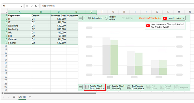
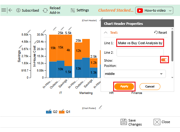
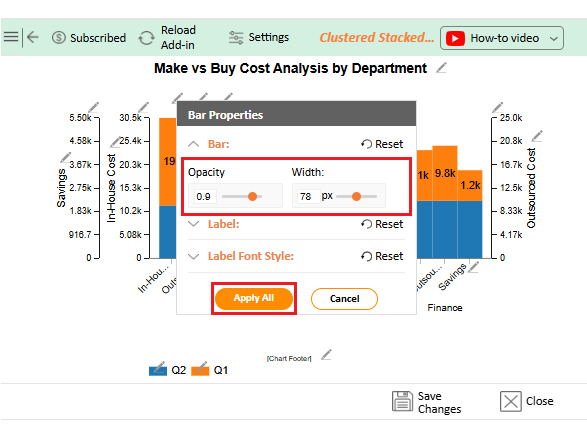
Build one tab per part or service. Put inputs at the top and a results box at the side. Use the chart below to show the cross-over point.
Enter fixed costs and variable costs in clear rows. Add quantities across common volumes. Use the make versus buy analysis to show the switch point on a line or column chart. Use a simple three-color rule for in-house win, vendor win, and tie.
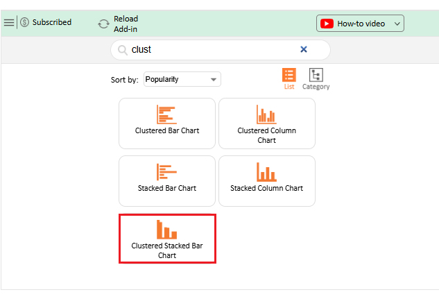
Add notes that explain why a zone wins, then snapshot the sheet as part of the review pack. You can also note the ROI analysis next to the chart, and even pair the break-even unit with payback days. A Scatter plot chart works well here because it helps people grasp both metrics quickly during reviews.
Why Use ChartExpo?
You need fast visuals that non-analysts can read. The add-in helps you build the view without macro work. That lets your team debate the decision, not formatting.
Charts help you compare many inputs at once. That is where multivariate analysis shines. You can see patterns across teams, time, and sources in one place.
Use make versus buy analysis as the spine and the chart as the face. Together, they make the break-even point clear. They also surface when you need new quotes or a staffing plan.
How to Install ChartExpo in Excel?
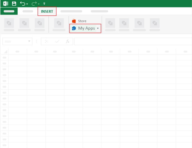
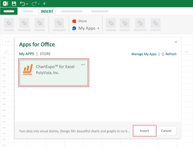
Open Excel and start a workbook. Click Insert, then My Apps. Search for the add-in and click Add. It appears in your sheet with a pane you can use right away.
Keep steps short so people can repeat them. A simple path reduces hand-holding. It also cuts the risk of rework when new staff join.
Guard your time by avoiding analysis paralysis. Set a short setup script that anyone can follow. Next time, the team gets to the chart in minutes.
Use the make versus buy analysis to guide what you chart first. Costs that swing the most get priority. That focus pays back during reviews.
Picture a launch that needs custom boxes. A vendor quotes a flat unit price. In-house needs rental, training, and materials. You plot the cost for 1, 10, 50, 100, 300, and 500 units. The curve shows where lines cross.
The example shows small runs favor buying. Larger runs favor making, since fixed costs are spread over more units. Make versus buy analysis turns that curve into a clear action. Teams then plan time on machines or place a purchase order.
You can extend the case to labels, inserts, or trays. Keep the same steps. State the break-even. Write the rule for when you switch sides. Build a short note on how the equipment serves other projects, so savings don’t sit idle.
Add competitive analysis to keep unit costs honest. Ask for two quotes with the same specs and delivery. Check penalties and service terms, not only price.
Dataset
You will chart internal cost against outsourced cost by department and quarter. This gives you a quick view of which areas swing most, and by how much. Place this data and labels in tidy columns. Then keep a single sheet for the chart. Use the make versus buy analysis to annotate your switch points and call out where the spread narrows or widens with volume.
| Department | Quarter | In-House Cost | Outsourced Cost | Savings |
| IT | Q1 | $19,000 | $15000 | $4000 |
| IT | Q2 | $11,500 | $10000 | $1500 |
| Marketing | Q1 | $12,000 | $10800 | $1200 |
| Marketing | Q2 | $13,000 | $11700 | $1300 |
| HR | Q1 | $10,000 | $9200 | $800 |
| HR | Q2 | $9,500 | $9100 | $400 |
| Finance | Q1 | $11000 | $9800 | $1200 |
| Finance | Q2 | $12500 | $10250 | $2250 |
Screenshots and Steps
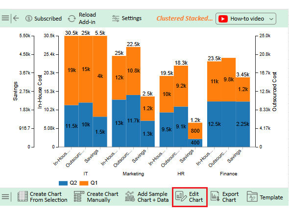
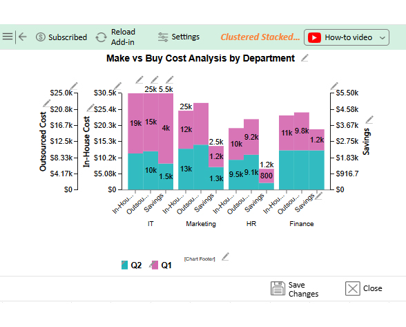


The outsourced IT line peaks at 25k in Q1 and drops to 19k in Q2. That suggests a move back to internal skill or a short-term spike that ended. Tie this swing to vendor terms and ticket volume. If the pattern holds, set a watch rule that triggers make versus buy analysis when external cost shifts by 15 percent quarter to quarter.
Marketing holds a steady 25k outsource spend across Q1 and Q2, while in-house cost rises in Q2. That pattern hints at growing internal scope without dropping supplier tasks. Ask if the team is double-paying for the same outcomes. Then write a threshold that runs a make versus buy analysis when internal spend rises while supplier invoices stay flat.
HR cuts external spend from 10k in Q1 to 800 in Q2. In-house cost rises in the same span. That looks like a planned handoff of tasks to staff. Track quality and cycle time next quarter to confirm the shift delivers. If metrics hold, publish the break-even volume so new work routes in-house by default.
Finance stays near balance across both quarters, with a small rise in outsourcing in Q2. That balance can work when demand spikes. Keep both paths ready with clear SLAs and a simple routing rule. Use the make versus buy analysis to check the split each quarter and reset targets by load.
It turns debate into a choice you can act on. The process gives you a break-even, guardrails, and a recheck rule. That keeps teams aligned.
It also exposes hidden costs before they bite. Freight, duties, and training sit in the open. You route work with fewer shocks.
Tie the steps to data analysis in one paragraph near the end of your doc. State what you tracked and why it mattered. The habit builds trust.
Use the make versus buy analysis as a standing check in quarterly planning. Reuse the template and chart. Shorten the meeting and heighten the signal.
State your decision rule at the top of your spreadsheet. People need to see it before they see the plot. Then they read the chart through that lens.
Set a review cadence. If cost inputs move by more than your trigger, run the make versus buy analysis again. That keeps choices fresh without busywork.
Use a time view when past choices teach you something. That is where cohort analysis helps. Group past projects by quarter and see how the results aged.
Keep one sentence for buy vs make analysis in your notes near the chart. State which path wins at your forecast volume and by how much. That one sentence drives alignment.
You define the part and the spend band. You gather internal costs and outside quotes. You note risks, capacity, and timing. You set a decision date and a recheck trigger.
You run a make versus buy analysis, write the break-even, and pick the path. Then you monitor results and log lessons across time, adding a short cohort analysis to see how choices hold up.
Total cost, capacity, and speed to deliver. Quality control and supplier health. IP and security were needed. The path must support your next two quarters. Use the make versus buy analysis to express the break-even point and the rule for switching when conditions change.
A clear choice beats a long debate. You get that clarity from steady steps and clean visuals. The payoff shows up in cost, speed, and fewer surprises.
Make versus buy analysis turns loose inputs into a rule you can apply. It protects margins and delivery dates. It also documents the “why”, so teams learn and act faster next time.
Write down your recheck triggers. Track supplier and internal shifts. When a trigger hits, you run the make versus buy analysis again. You move before small issues grow.
Add one paragraph on audience analysis to tune how you present the result. Stakeholders care about different points. You can lead with volume for ops or risk for finance.
Close each cycle with one lesson. Keep the template and chart in a shared folder. Next time, you start fast and decide fast with a make versus buy analysis.
How much did you enjoy this article?


Calculate accounts receivable turnover ratio to measure credit collection speed, improve cash flow, and strengthen your financial strategy. Read on!

Change Management KPIs are the key to tracking adoption, performance, and ROI during transitions. Find out which metrics matter. Read on!

Data collection methods and techniques determine the quality of every insight you act on. Explore key approaches for gathering reliable data. Read on!


