Categories
By ChartExpo Content Team
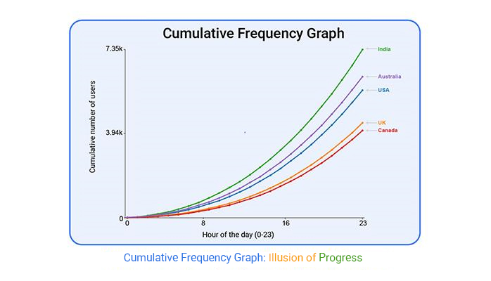
The line looks calm. Smooth. It rises slowly, suggesting progress. But that same curve can lead people in the wrong direction.
The cumulative frequency graph often hides more than it shows. It gives the impression of control when there may be none. Outliers disappear. Sudden spikes get buried. And yet, people nod at the line, thinking everything’s fine.
The danger isn’t in the data. It’s in how the cumulative frequency graph presents it. One curve tells a single story, even when multiple voices should be heard. A clean line can erase the noise, but sometimes, that noise is the warning.
Use a cumulative frequency graph in a meeting, and it might buy silence. But silence isn’t agreement. It’s hesitation. It’s someone wondering if the graph skipped over the thing they cared about. One graph. One curve. Too many blind spots.
If the cumulative frequency graph looks too perfect, ask why. Because the line’s not lying. It’s just not showing the whole truth.
You glance at it, and it seems peaceful. This curve, with its gentle rise, whispers order and clarity. But beneath that calm surface, chaos lurks. The shape might hide glaring anomalies or critical risks that are screaming for attention. Imagine looking at a report and thinking everything’s under control, only to discover later that it was just the graph’s soothing lines giving a false sense of security.
When the stakes are high, such as during forecast reviews or deal analysis, relying on these curves without understanding their tricks can delay necessary actions. It’s like having the wool pulled over your eyes just when you need clarity the most.
The graph speaks a language of its own, and sometimes, it’s telling you the wrong story. Using a frequency chart in Excel can help reduce this risk by making patterns more transparent and easier to interpret.
Choosing this graph might seem like the easy route when trying to simplify complex data. It feels like a shortcut to avoid those long conversations no one wants. However, opting for simplicity can lead to more complexity down the road. That quick choice to sidestep tension can backfire, leading to even tougher conversations later.
Think about the meeting where everyone nodded along with the curve, only to realize that the underlying issues were never addressed. Simplifying isn’t always the answer, especially if it means glossing over the details that could prevent bigger problems. Sometimes, what you think is making things easier is just putting off the inevitable.
A perfectly smooth curve looks appealing, almost too perfect. It’s a polished script promising steady progress. But here’s the catch: if it looks too good, it probably is. This so-called “Clean Curve Lie” can give a false sense of accomplishment in executive reviews. It’s like a magician’s trick, where the real story is hidden behind a flashy illusion.
Executives might look at a smooth curve and see success, but the truth hides in the details. A curve that’s too neat raises eyebrows, and rightly so. What’s missing? What’s been glossed over to make it look this way? In crucial meetings, this can backfire, leaving you scrambling to explain the gaps the curve failed to show.
A rising curve seems like a good thing. It suggests movement, advancement, and success. But looks can be deceiving. Hidden beneath that upward slope, outcomes might have stalled or even taken a turn for the worse. Just because the line goes up doesn’t mean the story it tells is positive.
Imagine presenting this curve in a meeting, and everyone takes it at face value. They see progress, but underneath, the reality is different. It’s like climbing a mountain only to find you’ve reached the wrong peak. This graph can mislead, suggesting everything’s on track when it’s not. The real challenge is seeing beyond the line to what’s happening.
Picture this: you’re in a meeting and the room’s full of skeptics. The air’s thick with doubt, and someone asks, “Why this chart?” You better have a tight script ready. This isn’t a time to wing it. You’ve gotta know why the chart fits the narrative of the data. It should show the story without you having to say much. If someone asks why you chose it, your answer should make them nod, not raise eyebrows.
But how do you get there? Start with the end in mind. What’s the takeaway you want? Pinpoint that, then reverse-engineer your defense. Show them how the chart simplifies the complex, highlights what matters, and leaves the noise behind. If your justification script is solid, it doesn’t just survive pushback; it sails right through while the skeptics sit back and listen.
Imagine you’re showing the same chart to different teams: Legal, Ops, and Product. Each sees the curve through their lens. Legal might focus on compliance, Ops on efficiency, and Product on customer impact. The same curve, three different stories. It’s a maze of interpretations that’s easy to get lost in.
How do you navigate this? Speak their language. For Legal, highlight how the curve shows risk management. For Ops, point out the efficiency gains. For Product, link it to user satisfaction. Tailor the narrative to each team, and you’ll find that what once was a tangled web of misinterpretations becomes a coherent story that everyone buys into.
You thought the chart would cut through the noise. Instead, some think you’re hiding something. They see cherry-picking, not clarity. It’s a classic misstep. What seemed straightforward to you looks like evasion to them.
Turn this around by being upfront. Acknowledge the limits of the chart. Show them what it doesn’t capture and why. Be transparent about your choices. When you own the narrative, it shifts from suspicion to understanding. Suddenly, that chart isn’t a smokescreen; it’s a tool for genuine insight that everyone values.
Ever tried to show fairness with a nice, smooth line? You know the one that looks all equal and balanced? Yeah, it’s a trap. Grouping populations into a single arc glosses over disparities. It might look neat, but it’s far from fair.
Want to avoid blowback? Break it down. Show the separate groups and their realities. Transparency wins here. When everyone can see the distinctions, you’re not just dodging equity pushback; you’re fostering trust. You’re not hiding behind a smoothed-out line. You’re laying it all out, honestly, and that’s where real progress begins.
Cumulative graphs often mask the real story. Picture this: you’re in a meeting, and the graph looks smooth, serene even. But lurking beneath that gentle curve are spikes, outliers waiting to derail the conversation. These outliers, hidden by gradual increases, can lead to misunderstandings if not addressed. It’s like sweeping dirt under a rug; it might look tidy, but the mess is still there.
Let’s talk risk. Imagine presenting data where sudden increases are crucial. If those spikes are buried, it can delay necessary actions or escalate issues. This isn’t just about aesthetics; it’s about ensuring no critical detail is overlooked. In high-stakes settings, missing these outliers can mean the difference between a quick fix and a crisis.
Graphs can be tricky, especially when viewers misinterpret them. The 50% mark often gets mistaken for the median, especially when the data’s all skewed. It’s an illusion, a trap for the unwary. When the distribution isn’t balanced, assuming that the middle line represents normalcy can lead to faulty decisions.
Consider a project review where stakeholders assume that the 50% mark means business as usual. But if the data is lopsided, that assumption might lead to wrong conclusions. It’s like thinking a coin toss always gives you heads. Understanding these nuances is key to avoiding costly mistakes and ensuring everyone sees the true picture.
Interval grouping might seem minor, but it can distort perceptions. When data gets grouped inconsistently, it shifts the slope, changing how the graph tells its story. It might not scream for attention, but it’s there, quietly altering the audience’s understanding, especially when working with a confidence interval graph where accuracy depends on proper data grouping.
Imagine preparing for a presentation with a graph that seems straightforward. But if the intervals aren’t consistent, it can skew how trends appear. It’s like reading a book with missing chapters; the story’s incomplete. Ensuring uniformity in data grouping keeps the narrative clear and prevents miscommunication.
Combining small and large groups into one curve can skew perceptions. It creates a visual weight that suggests fairness, even when it’s not there. This can lead to a false sense of equity and impact decision-making.
Think of a meeting where this visual imbalance goes unnoticed. The graph might suggest all’s well, but in truth, disparities remain hidden. It’s like painting over cracks in a wall; it looks fine until pressure is applied. Transparency in data representation ensures that everyone sees the real picture, allowing for informed, fair decisions.
Ever tried to spot a spike with a curve? It’s like reading a map without a compass. When volatility’s in the mix, slopes just won’t cut it. Enter the histogram. It doesn’t smooth out the bumps; it celebrates them. You get to see the raw, jagged edges of your data, not the polished curve that lies about the calm.
Histograms show every little tremor and quake. They’re perfect for those meetings where everyone needs to see the chaos, not the calm. Stakeholders can’t argue with bars that shout, “Look here, something’s happening!” It’s the chart you bring when you need everyone to sit up and pay attention.
Sometimes, you need to ditch the visuals. Tables don’t lie. They lay bare every digit without fluff. When everyone else is lost in the story a chart tells, a table cuts through with cold, hard facts. It’s the no-nonsense choice when clarity’s your top priority.
Visual abstraction can confuse more than it clarifies. Tables show relationships and exact numbers that graphs might gloss over. When precision matters, don’t dress up the data, let it speak for itself. In high-stakes situations, a well-constructed table might just be your best ally.
Ever looked at a spread when you needed impact? That’s where Pareto shines. It’s not about how things are spread out, but about what’s making the biggest noise. Those few elements causing the most drama? Pareto points them out with ruthless efficiency.
Cumulative graphs have their place, but impact requires a different focus. Pareto charts strip away the noise, showing you what’s really making a difference. It’s the tool you pull out when you need to cut to the chase, revealing what truly matters in the data.
Box plots aren’t flashy. But they’re brutally honest. When outliers or skew matter more than a neat line, they’re your best friend. They show the spread and the surprises, laying out the truth without smoothing over the bumps.
This isn’t about making data pretty. It’s about telling the full story, warts and all. Box plots give you the real deal, highlighting the unexpected in a way a curve never could. When you need truth, not polish, the box plot is your go-to.
The gentle upward slope of the graph can be deceiving. It suggests growth, improvement, and progress at a glance. But don’t be fooled. Without digging into the numbers beneath, that line can mislead you. What looks like a steady climb might hide flatlining or even downturns.
Placement on the page isn’t innocent either. A line starting higher up might signal success, while lower placement can feel like a loss. It’s all about the angle and direction. If you’ve ever sat in a meeting watching folks nod at that rising line, you know the risk. They see only the surface, not the storm brewing underneath.
Axes tell a story. The y-axis might seem just a list of numbers, but it’s communicating more. The range you choose sets expectations. A narrow range makes small changes look like dramatic shifts. A wide range can flatten out significant jumps.
Tick intervals and category order also play their part. Changing them can alter the emotional impact of the graph. Ever watched a budget meeting go off the rails because someone thought a 5% increase was massive? That’s the axis talking. It’s a subtle influence, but it shapes how people feel about the data.
An upward curve can scream confidence. It’s like telling everyone, “We’ve got this.” But what if that curve is just an illusion? Averages can mask volatility. One department might be soaring while another is tanking, but the curve won’t show that. It whispers safety even when the numbers are shouting danger.
Key decisions often hinge on these curves. Picture an exec nodding along, convinced everything’s on track. But without context, even a Scatter plot showing trends can leave them acting on only half the story. That’s the curve’s power and its peril—it’s not just a line; it’s a narrative that can influence decisions, for better or worse.
Ah, the allure of a smooth line that whispers everything is under control. But beware. Those curves can mask uncertainty beneath a façade of serenity. They might look polished, but they can hide chaos that’s ready to jump out when least expected. Picture a situation where a seemingly perfect graph lulled everyone into complacency, only for reality to hit hard later.
In high-pressure meetings, the Clean Curve Lie can be a silent culprit. Decision-makers glance, nod, and move on, convinced by the false calm. It’s the visual equivalent of sweeping dirt under the rug. You think it’s neat until someone trips over it. This pattern is a trap for those who crave simplicity but end up with a narrative that misses the mark. Spot it, name it, and save your team from the aftermath of a pretty lie.
Audits are supposed to catch the sneaky stuff, right? But these graphs can sneak past the least thorough audits. They paint a picture of compliance that isn’t always true. The surface calm can give auditors the impression everything’s in order, even when it’s not.
Imagine a compliance officer seeing a neat curve and assuming all’s well. Meanwhile, under the hood, there’s a jungle of issues waiting to cause trouble. This is more than just a visual trick; it’s a false sense of security that can lead to bigger problems down the line. Audits should be about accuracy, not just good looks. This framing needs to be flagged before it leads to bigger headaches.
Ever notice how some graphs look too good to be true? They might be hiding anomalies that should raise red flags. Smoothing is often used to tidy up data, but it can erase outliers that need attention. Those outliers might be the very signals that prevent disaster.
Consider a scenario where an outlier was smoothed out, and everyone missed the warning signs. Later, when things go wrong, the blame game starts. It’s not just about keeping the graph pretty. It’s about understanding what those outliers mean and taking action. Recognize this pattern and ensure anomalies get the attention they deserve.
One line to rule them all? Not quite. When multiple segments are crammed into a single curve, it’s easy to lose the details. Group Blur hides the unique stories each segment tells. It’s like trying to hear a whisper in a crowded room.
Think about a meeting where everyone nodded along to a neat graph, only to later realize specific segments got overlooked. Each segment has its tale, and when they’re blurred together, important nuances disappear. This isn’t just about clarity. It’s about ensuring every piece of data gets its moment. Identify this pattern, and you’ll avoid missing the important details.
When you’re in a meeting with limited time and high stakes, having only one chart can be risky. The main chart should show the story you want to tell. It’s your visual pitch to capture attention. But what if questions start flying? That’s where your backup chart steps in. It’s the safety net with the technical details, ready to handle the scrutiny.
Ever been in a meeting where a simple question threw everyone off track? Having a secondary chart means you’re not just hoping the main one holds up. It’s about being prepared. It’s like having a trusted friend ready to back you up when the discussion gets intense. This way, you’re not caught off guard, and you can steer the conversation back to where it needs to be.
In a fast-paced meeting, less is more. Your chart doesn’t need to be crammed with information. Highlight the key point, whether it’s a threshold, a percentile, or a critical data point. A single annotation can speak volumes, cutting through the noise and focusing attention exactly where you need it.
Think of it as shining a spotlight. You’re guiding the room to see what’s truly important. This approach not only simplifies your message but also gives you control over the narrative. When you direct the audience’s gaze to the crucial detail, you make your point clear and memorable, ensuring that your message isn’t lost in a sea of data.
When presenting, sometimes the fewer words, the better. Craft one powerful sentence that encapsulates your main message. Deliver it with confidence and then let the visual speak. This strategy keeps the focus on the graph and prevents unnecessary tangents.
It’s easy to get caught up in explanations, but brevity can be your best ally. A well-placed sentence acts like a headline, concise and impactful. Once you’ve made your point, step back. Let the visual reinforce the message. This approach respects your audience’s time and keeps the meeting on track, showing that you’re prepared and in control.
Combining data into a single curve might look neat, but it hides important differences. When you lump groups together, the unique traits of each group disappear. This can lead to misleading conclusions, like assuming everyone is doing just fine when some groups are struggling.
When data is mashed into one line, it’s easy to miss inequality. Each group might have its own story to tell, but a single curve silences these voices. Recognizing this can prevent decisions that overlook real disparities. It’s like trying to hear a symphony through a single note, something crucial gets lost.
Grouping segments for a cleaner look can backfire. The idea is to simplify, but the reality is that it often confuses more than it clarifies. When details are hidden, it invites questions and skepticism. It’s like trying to cover a mess with a pretty blanket, eventually, someone’s going to look underneath.
Without segment visibility, you risk accusations of cherry-picking or bias. Stakeholders might think you’re hiding something, even if you’re not. To avoid this, show the data as it is, with all its messy details. Honesty builds trust, and trust is your best ally when presenting data.
Changing the order of categories on a graph seems harmless, but it’s not just about looks. The order can influence how the data is perceived, especially in terms of fairness and compliance. It’s not just a shuffle; it’s a shift in narrative.
This reordering can skew the audience’s understanding. It might unintentionally highlight or hide particular aspects of the data. If fairness is your goal, be careful with category order. It’s a subtle tweak that can have big implications on how your data story is received.
Trying to prove fairness with a single graph setup is a shaky strategy. To truly reflect equity, consider breaking down the data by segments or presenting them side-by-side. This way, each group gets its spotlight, showing where resources or attention might be needed.
Rebuilding the graph to reflect true fairness means showing each segment clearly. It’s not about complicating things; it’s about being transparent. When stakeholders see the full picture, their trust in your data and you grows. It’s all about presenting honesty without inviting conflict.
Graphs can be a scapegoat. In high-pressure reviews, they’re often blamed when things go sideways. It’s not that the data was wrong, but the way it was shown. The curve looks calm and composed, misleading everyone into thinking that everything is under control. But when the storm hit and outcomes weren’t as rosy, the graph took the fall.
Consider a meeting where all eyes are on the graph. It was smooth, unassuming. Yet, it hid spikes that mattered. The blame game starts. “Why didn’t we see this coming?” The reality? The graph was right, but it wasn’t clear enough. It’s a lesson in how clarity trumps accuracy when the stakes are high.
Sometimes, the graph has all the answers. You just didn’t see them. Trends and spikes, buried in the smooth flow, were there all along. It happens. You’re caught up in the meeting, and those crucial details slip by. Later, they’re glaringly obvious.
Picture the aftermath. Reviewing the data, you notice what you couldn’t see before. It’s like missing a signpost on a familiar road. The graph held the clues, but they went unnoticed. It’s a reminder that even the best data needs a sharp eye to catch the nuances.
A simple overlay can change everything. A line here, a marker there. Suddenly, the graph speaks louder. It’s not just about seeing; it’s about showing what matters. A timestamp or a threshold can anchor the story.
Think of it as highlighting a book. The words don’t change, but the message stands out. This overlay becomes a focal point, making accountability clear. It’s a small addition, but it turns passive viewing into active interpretation.
Questions shape understanding. And sometimes, they’re asked too late. In the heat of reviewing graphs, it’s easy to miss the right queries. What are we not seeing? What should this data tell us? These are the questions that matter.
Imagine a postmortem review. Someone points out that a simple question could have changed the outcome. It’s a wake-up call. The graph was there, and the answers were there. Asking better questions next time could be the difference between insight and oversight.
Framing is everything. The same graph can tell a different story with a shift in perspective. What seemed like a failure can become a lesson. It’s about reframing the narrative from “we missed it” to “we learned and adjusted.”
Think of it like a plot twist. The data hasn’t changed, but the interpretation has. It’s a powerful shift that turns a negative into a positive. By framing the story differently, the graph becomes a tool for growth, not a relic of past mistakes.
If your chart hides the spike, it hides the story. That’s the risk with a cumulative frequency graph.
A clean slope may look safe. But behind that curve, problems can pile up. One wrong bin and a sharp rise vanishes. One group merged into another, and real gaps disappeared. The curve stays smooth while the trouble gets missed.
A cumulative frequency graph should bring clarity. If it doesn’t show change, it slows decisions. If it skips outliers, it skips action. Smooth isn’t always honest. Simple doesn’t always help.
So don’t let your graph nod for you. Don’t let the curve say, “Everything’s fine” when it isn’t. Make it clear. Make it readable. Make it honest.
A good cumulative frequency graph doesn’t speak loudly. It speaks true.
How much did you enjoy this article?


Calculate accounts receivable turnover ratio to measure credit collection speed, improve cash flow, and strengthen your financial strategy. Read on!

Change Management KPIs are the key to tracking adoption, performance, and ROI during transitions. Find out which metrics matter. Read on!

Data collection methods and techniques determine the quality of every insight you act on. Explore key approaches for gathering reliable data. Read on!


