Categories
Key Performance Indicators in Healthcare—what do they mean? Hospitals, clinics, and medical teams rely on them to measure success. Without these indicators, tracking progress would be impossible. They shape decisions, improve patient care, and boost efficiency.


Healthcare is under constant pressure. Rising costs, staff shortages, and growing patient needs create daily challenges. Key Performance Indicators in Healthcare help identify risks before they become critical problems. Using trend analysis in Excel, you can track shifts in patient outcomes, resource use, and financial performance.
Numbers tell a story. Healthcare analytics provides deeper insights, helping with trend prediction and proactive decision-making. You can spot bottlenecks and improve service. These metrics drive change, and without them, problems remain hidden.
Efficiency matters. Healthcare KPIs highlight where improvements are needed. Better resource management, faster response times, and more substantial patient outcomes all start with data. A Circular Org Chart can help visualize team structures and streamline hospital communication.
Financial health is just as important. Wasted resources and billing errors cost billions every year. Hospitals tracking revenue cycles can reduce losses and stay financially stable. Strong performance metrics help ensure long-term success. Let’s explore how they shape the future of healthcare.
Definition: Key Performance Indicators (KPIs) in healthcare measure success by measuring patient care, efficiency, and financial stability. They track patient care, efficiency, and financial stability. Hospitals and clinics use them to improve outcomes and reduce risks. Common KPIs include patient wait times, readmission rates, and infection rates. These metrics highlight areas needing improvement.
Healthcare analytics helps turn data into actionable insights. Moreover, an exponential growth chart can show rapid patient demand or resource usage increases. With the right KPIs, healthcare providers make informed decisions, enhance care quality, and ensure long-term success.
Key Performance Indicators in healthcare reveal what works and highlight areas for improvement. They turn challenges into measurable goals that benefit patients, providers, and administrators.
These Key Performance Indicators in Healthcare help measure quality, efficiency, and financial stability. Each provides valuable insights into patient care and hospital performance.
Healthcare businesses need more than generic performance metrics. They need healthcare-specific KPIs to measure quality, safety, and efficiency. Tracking the correct data leads to better decisions, more substantial operations, and improved patient care.
How?
Tracking healthcare performance without the right tools is like diagnosing a patient in the dark. Key Performance Indicators (KPIs) highlight critical areas like patient care, efficiency, and costs.
But raw data alone isn’t enough—you must see it. While Excel handles basic charts, it struggles with advanced healthcare data visualization.
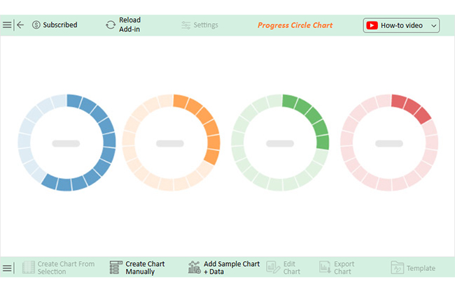
That’s where ChartExpo steps in. This chart add-in for Excel transforms complex healthcare data into clear, actionable visuals, making analysis faster and wiser.
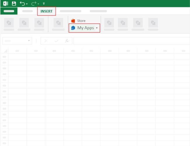
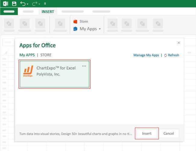
How to Install ChartExpo in Excel?
ChartExpo charts are available both in Google Sheets and Microsoft Excel. Please use the following CTAs to install the tool of your choice and create beautiful visualizations with a few clicks in your favorite tool.
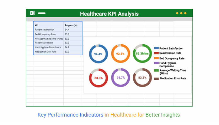
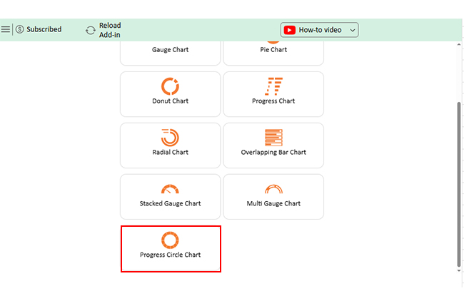
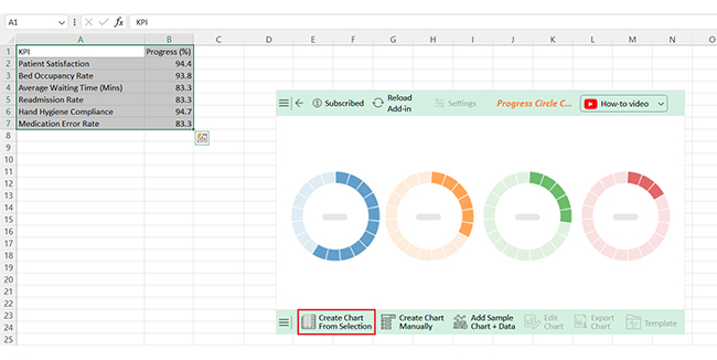
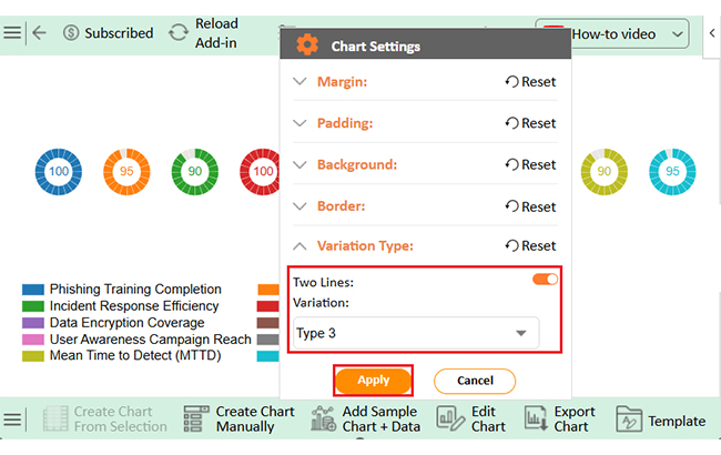
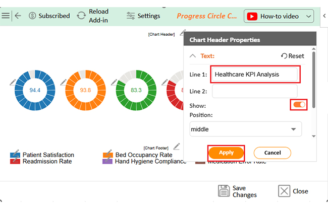
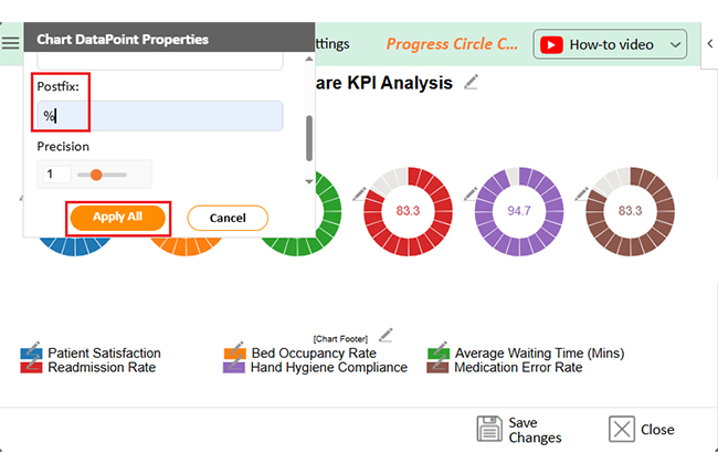
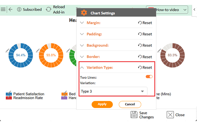
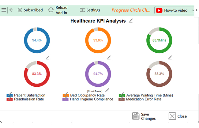
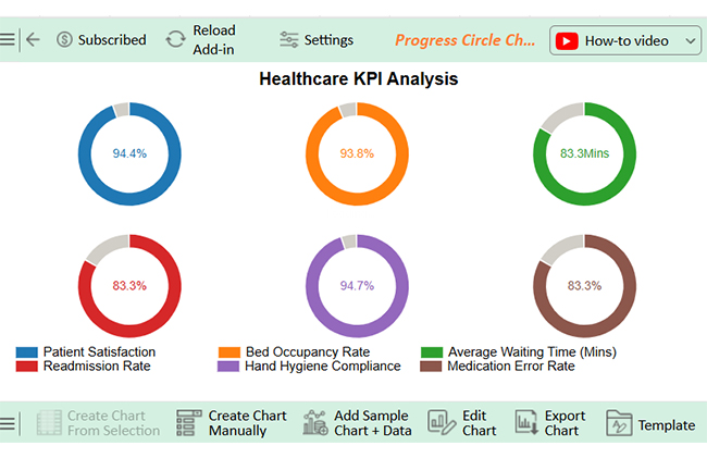
Let’s create a chart from the data below in Excel using ChartExpo and analyze it:
| KPI | Progress (%) |
| Patient Satisfaction | 94.4 |
| Bed Occupancy Rate | 93.8 |
| Average Waiting Time (Mins) | 83.3 |
| Readmission Rate | 83.3 |
| Hand Hygiene Compliance | 94.7 |
| Medication Error Rate | 83.3 |
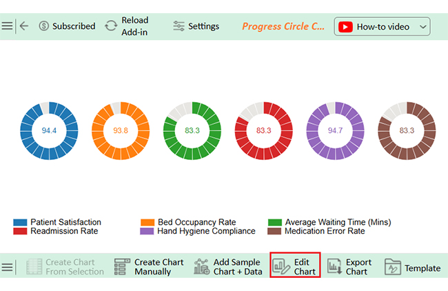


Strong Performance:
Areas for Improvement:
Using healthcare metrics the right way leads to real results. Here’s how to go about it:
Metrics reveal strengths and weaknesses and drive better outcomes. Without accurate data, inefficiencies and poor care follow. Tracking key metrics improves outcomes, optimizes resources, and strengthens financial stability. Here are the benefits of having effective healthcare metrics data:
Healthcare runs on data, but even the best Key Performance Indicators (KPIs) are limited. While they provide valuable insights, relying too much on numbers can create blind spots. Here’s where KPIs in healthcare can fall short:
Using KPIs and metrics in healthcare can be a game-changer—but only if done right. Data analysis is key to understanding these metrics and turning raw numbers into actionable insights. Here are some tips to help you make the most of your data and drive real improvements:


KPI formulas in healthcare vary by metric. Common examples include:
Key Performance Indicators in Healthcare are essential for measuring success. They provide precise data on patient care, efficiency, and financial stability. Without them, healthcare facilities struggle to track progress and improve outcomes.
Quality of care measures in healthcare focus on patient safety, treatment effectiveness, and overall care standards. Tracking infection rates, readmission rates, and treatment outcomes helps reduce risks. Hospitals that use KPIs improve safety and quality.
Efficiency matters in healthcare. Long wait times, staffing shortages, and resource mismanagement create serious problems. Understanding healthcare metrics vs. KPIs is important—metrics track general data, while KPIs focus on critical performance goals. Measuring operational performance helps identify issues and implement solutions.
Financial health is critical for sustainability. Rising costs and budget constraints put pressure on hospitals and clinics. Monitoring revenue, expenses, and resource allocation supports better financial planning. Moreover, analyzing box plot outliers in financial data helps identify unusual costs and areas for improvement.
Healthcare laws and standards ensure patient safety and organizational integrity. KPIs help track compliance and avoid legal risks.
Data-driven decisions improve healthcare. Key Performance Indicators in Healthcare guide better strategies, reduce errors, and enhance patient satisfaction. Tracking the correct numbers leads to better care, more substantial operations, and long-term success.
How much did you enjoy this article?


Calculate accounts receivable turnover ratio to measure credit collection speed, improve cash flow, and strengthen your financial strategy. Read on!

Change Management KPIs are the key to tracking adoption, performance, and ROI during transitions. Find out which metrics matter. Read on!

Data collection methods and techniques determine the quality of every insight you act on. Explore key approaches for gathering reliable data. Read on!


