• Home
  • Tools dropdown img
    • Spreadsheet Charts

      • ChartExpo for Google Sheets
      • ChartExpo for Microsoft Excel
    • Power BI Charts

      • Power BI Custom Visuals by ChartExpo
    • Word Cloud

  • Charts dropdown img
    • Chart Category

      • Bar Charts
      • Circle Graphs
      • Column Charts
      • Combo Charts
      • Comparison Charts
      • Line Graphs
      • PPC Charts
      • Sentiment Analysis Charts
      • Survey Charts
    • Chart Type

      • Box and Whisker Plot
      • Clustered Bar Chart
      • Clustered Column Chart
      • Comparison Bar Chart
      • Control Chart
      • CSAT Survey Bar Chart
      • CSAT Survey Chart
      • Dot Plot Chart
      • Double Bar Graph
      • Funnel Chart
      • Gauge Chart
      • Likert Scale Chart
      • Matrix Chart
      • Multi Axis Line Chart
      • Overlapping Bar Chart
      • Pareto Chart
      • Radar Chart
      • Radial Bar Chart
      • Sankey Diagram
      • Scatter Plot Chart
      • Slope Chart
      • Sunburst Chart
      • Tornado Chart
      • Waterfall Chart
      • Word Cloud
    • Google Sheets
      Microsoft Excel
  • Services
  • Pricing
  • Contact us
  • Blog
  • Support dropdown img
      • Gallery
      • Videos
      • Contact us
      • FAQs
      • Resources
    • Please feel free to contact us

      atsupport@chartexpo.com

Categories
All Data Visualizations Data Analytics Surveys
Add-ons/
  • Google Sheets
  • Microsoft Excel
  • Power BI
All Data Visualizations Data Analytics Surveys
Add-ons
  • Google Sheets
  • Microsoft Excel
  • Power BI

We use cookies

This website uses cookies to provide better user experience and user's session management.
By continuing visiting this website you consent the use of these cookies.

Ok

ChartExpo Survey


Home > Blog > Microsoft Excel

GETPIVOTDATA in Excel: Extracting Right Data for Insights

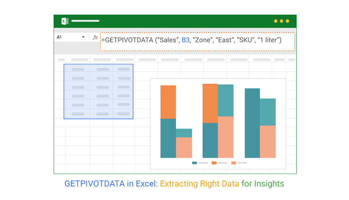
GETPIVOTDATA in Excel—why should you use it? If you work with PivotTables, pulling specific data can be frustrating. Scrolling, filtering, and manually selecting cells slow you down. This function eliminates the hassle, giving you precise results instantly. It also improves data consolidation in Excel, making it easier to manage large datasets.

GETPIVOTDATA in Excel

Spreadsheets drive decisions in finance, marketing, and operations, and large businesses rely on Excel for data analysis. Yet, many people still copy and paste values manually, increasing errors. GETPIVOTDATA in Excel helps by retrieving data directly from a PivotTable, reducing mistakes and improving efficiency. It ensures accurate numbers, which is crucial when creating advanced Excel charts for better data visualization.

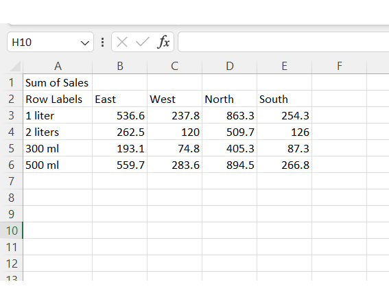
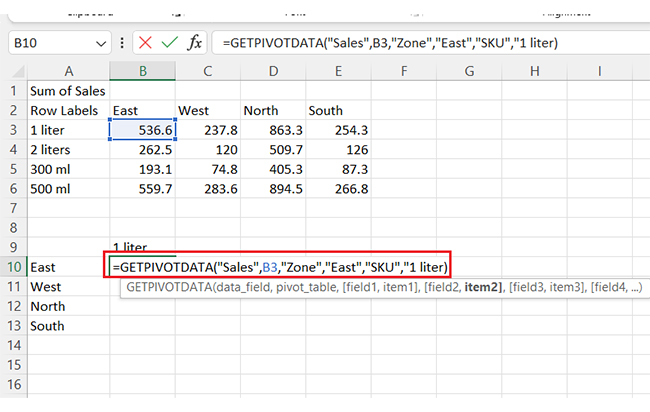
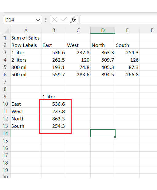
Imagine tracking monthly sales for multiple products. Instead of manually clicking through PivotTables, you can extract totals with a simple formula. There is no risk of referencing the wrong cell and no wasted time searching for numbers.

Professionals spend their time correcting spreadsheet errors. Using GETPIVOTDATA in Excel cuts that risk. Your reports stay accurate, even when PivotTables update. This is especially helpful when preparing an expense report template in Excel, ensuring all figures remain correct.

Many avoid this function because it looks complicated. The truth? It’s easy to learn. Once you see how it works, you’ll wonder why you didn’t use it sooner.

Table of Contents:

  1. What is GETPIVOTDATA in Excel?
  2. Why Use GETPIVOTDATA in Excel?
  3. How to Use the GETPIVOTDATA Function in Excel?
  4. How to Use GETPIVOTDATA for Analysis in Excel?
  5. When to Use Get Pivot Data in Excel?
  6. Use Cases of Excel GETPIVOTDATA
  7. Pros and Cons of Getpivotdata in Excel
  8. FAQs
  9. Wrap Up

What is GETPIVOTDATA in Excel?

Definition: GETPIVOTDATA in Excel is a function that extracts data from a Pivot Table. It retrieves specific values based on field names, not cell references, ensuring accuracy. It also saves time by eliminating manual lookups.

Moreover, businesses use it for sales reports, financial analysis, and performance tracking. It reduces errors and improves efficiency. Accurate data is essential for deeper analysis.

In multiple regressions in Excel, precise values enhance predictions and insights. Learning GETPIVOTDATA in Excel helps you work smarter and make better data-driven decisions.

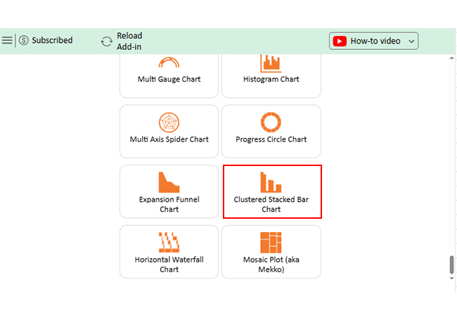
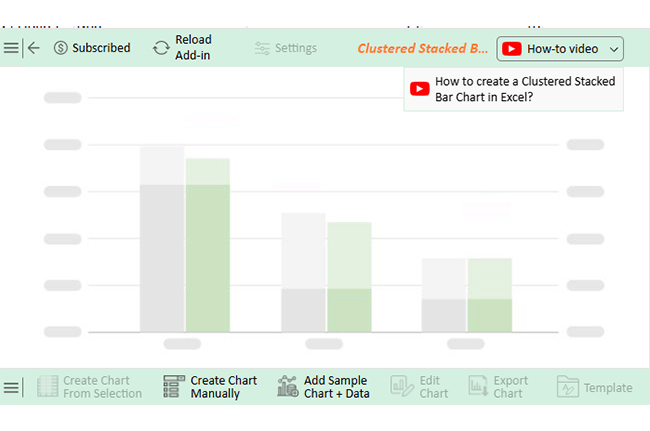
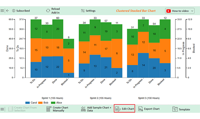
Creating the Clustered Stacked Bar Chart in Excel Using GETPIVOTDATA 


Creating the Clustered Stacked Bar Chart in Google Sheets Using GETPIVOTDATA

Why Use GETPIVOTDATA in Excel?

Have you ever clicked the wrong cell in a Pivot Table? This happens too often. Manual lookups slow you down and lead to mistakes. That’s where GETPIVOTDATA in Excel changes the game. With data modeling in Excel, you can structure data efficiently for better analysis. It pulls what you need—fast, accurate, and hassle-free.

Here’s why you should use it:

  • Precision in data retrieval: No more guessing which cell holds the correct value. GETPIVOTDATA in Excel fetches data based on field names, ensuring accuracy even if the PivotTable layout changes.
  • Reduces manual errors: Accidentally dragging the wrong cell can ruin reports. Fortunately, this function eliminates that risk by always locking in the correct data.
  • Improved flexibility: Need to extract specific figures without affecting the PivotTable layout? This function lets you do that effortlessly, even when filtering or rearranging data.
  • Dynamic updates: PivotTables change as data grows. However, GETPIVOTDATA ensures your formulas stay intact, automatically adjusting to updates without breaking calculations.
  • Consistency in reporting: Reports should always be reliable. This function keeps them accurate, structured, and free from human error across different datasets.

How to Use the GETPIVOTDATA Function in Excel?

I know – you’ve wasted time searching through a Pivot Table for the correct number. Scrolling, clicking, and copying data isn’t efficient. GETPIVOTDATA in Excel gives you a faster, more accurate way to extract your needs. It also makes converting Excel data to graphs for better visualization seamless, making analyzing trends more straightforward.

Here’s how to use GETPIVOTDATA in Excel:

  • Set up your Pivot Table: Ensure your Pivot Table contains summarized data, such as sales by product and region. Standard fields might include “East,” “West,” “North,” and “South”.
GETPIVOTDATA in Excel
  • Use GETPIVOTDATA to extract data: Click any cell outside the Pivot Table where you want the extracted value to appear. Then, type =GETPIVOTDATA(…), or let Excel generate it by selecting a cell inside the PivotTable.
GETPIVOTDATA in Excel
  • Dynamic adjustments: PivotTables update as new data comes in. Thankfully, GETPIVOTDATA automatically adjusts, ensuring your reports stay accurate without extra work.
GETPIVOTDATA in Excel

How to Use GETPIVOTDATA for Analysis in Excel?

Data visualization makes numbers more straightforward to understand. Charts and graphs turn raw data into insights. Yet, Excel struggles with advanced visuals. Its standard charts lack depth, and customization is limited.

That’s where ChartExpo steps in. It enhances Excel with insightful, interactive visuals. For deeper analysis, tools like Analysis Toolpak in Excel help perform complex calculations.

Before visualizing data, you need accurate numbers. GETPIVOTDATA in Excel ensures precision by extracting the correct values from PivotTables. No more errors, no more guesswork. Clean data plus great visuals? Better decisions every time.

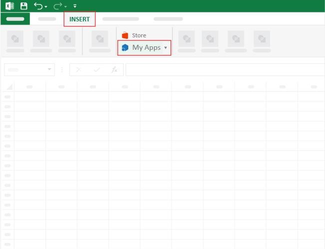
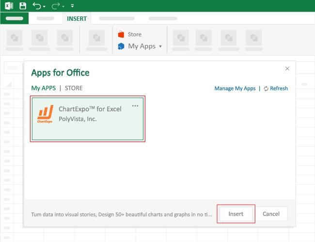
How to Install ChartExpo in Excel?

  1. Open your Excel application.
  2. Open the worksheet and click the “Insert” menu.
  3. You’ll see the “My Apps” option.
  4. In the Office Add-ins window, click “Store” and search for ChartExpo on my Apps Store.
  5. Click the “Add” button to install ChartExpo in your Excel.

ChartExpo charts are available both in Google Sheets and Microsoft Excel. Please use the following CTAs to install the tool of your choice and create beautiful visualizations with a few clicks in your favorite tool.

Example

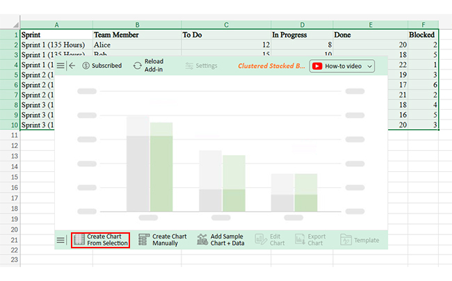
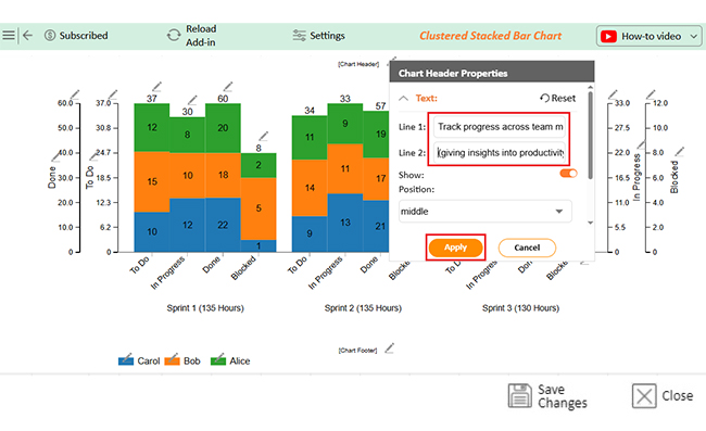
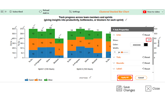
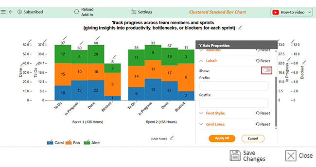
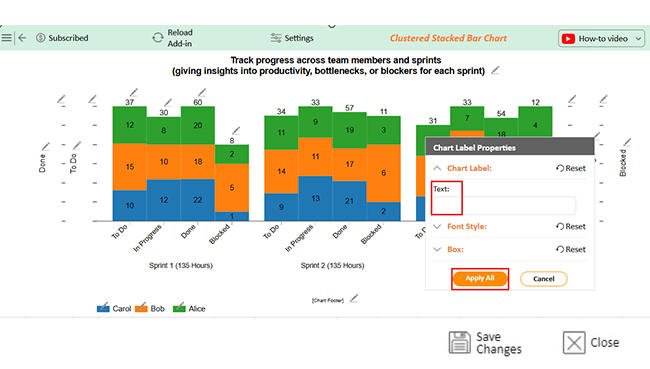
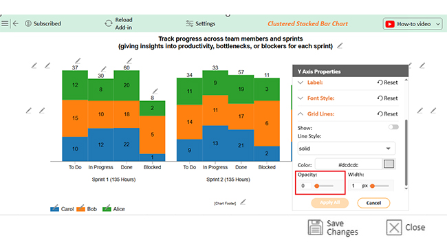
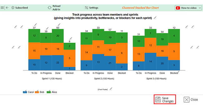
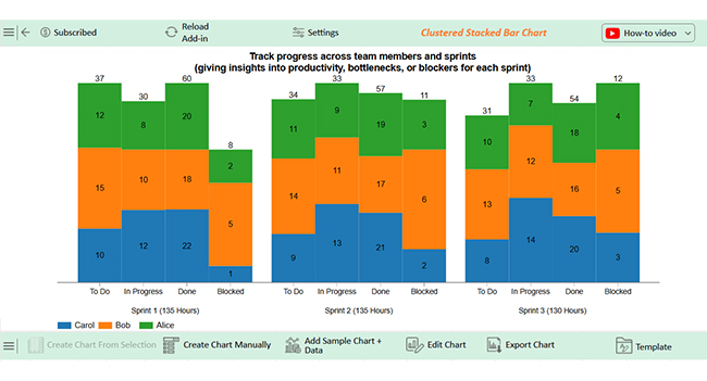
Let’s analyze this sample data and learn how to update a chart in Excel using ChartExpo. And that’s not all. We’ll also learn how to add data labels to Excel charts and customize them.

Sprint Team Member To Do In Progress Done Blocked
Sprint 1 (135 Hours) Alice 12 8 20 2
Sprint 1 (135 Hours) Bob 15 10 18 5
Sprint 1 (135 Hours) Carol 10 12 22 1
Sprint 2 (135 Hours) Alice 11 9 19 3
Sprint 2 (135 Hours) Bob 14 11 17 6
Sprint 2 (135 Hours) Carol 9 13 21 2
Sprint 3 (130 Hours) Alice 10 7 18 4
Sprint 3 (130 Hours) Bob 13 12 16 5
Sprint 3 (130 Hours) Carol 8 14 20 3
  • To get started with ChartExpo, install ChartExpo in Excel.
  • Now Click on My Apps from the INSERT menu.
GETPIVOTDATA in Excel
  • Choose ChartExpo from My Apps, then click Insert.
GETPIVOTDATA in Excel
  • Once it loads, scroll through the charts list to locate and choose the “Clustered Stacked Bar Chart”. This chart is best suited to this scenario.
GETPIVOTDATA in Excel
  • You will see a Clustered Stacked Bar Chart on the screen.
GETPIVOTDATA in Excel
  • Click the “Create Chart From Selection” button after selecting the data from the sheet, as shown.
GETPIVOTDATA in Excel
  • ChartExpo will generate the visualization below for you.
GETPIVOTDATA in Excel
  • If you want to have the chart’s title, click Edit Chart, as shown in the above image.
  • Click the pencil icon next to the Chart Header to change the title.
  • It will open the properties dialog. Under the Text section, you can add a heading in Line 1 and enable Show.
  • Give the appropriate title of your chart and click the Apply button.
GETPIVOTDATA in Excel
  • You can disable the Y-axis Lines by clicking on the small pencil icon:
GETPIVOTDATA in Excel
  • You can disable the Label by clicking on the small pencil icon:
GETPIVOTDATA in Excel
  • You can remove each text by clicking on the small pencil icon:
GETPIVOTDATA in Excel
  • You can change the opacity value to zero by clicking on the small pencil icon:
GETPIVOTDATA in Excel
  • Click the “Save Changes” button to persist the changes.
GETPIVOTDATA in Excel
  • Your Clustered Stacked Bar Chart will appear as below.
GETPIVOTDATA in Excel

Insights

  • Total effort: 400 hours across three sprints.
  • Carol: Highest task completion.
  • Alice: Steady progress.
  • Bob: Most task blockages.
  • Task distribution: Varies across categories for each sprint.

When to Use Get Pivot Data in Excel?

Spreadsheets can get messy quickly. If you use one wrong formula, your report will fall apart. Knowing when to use GETPIVOTDATA in Excel can save time and frustration. It keeps reports accurate, even when data updates. To ensure clean data, it also helps eliminate duplicates in Excel, preventing errors in analysis.

Here’s when it makes the most sense.

  • Extracting data from large PivotTables: PivotTables can hold thousands of rows, making it difficult to find specific values. GETPIVOTDATA extracts precise data instantly, eliminating the need to scroll or manually search.
  • Ensuring consistency in reports: Dragging formulas across PivotTables often leads to errors when structures change. By referencing field names instead of fixed cell positions, reports remain accurate.
  • Handling dynamic and updated PivotTables: PivotTables update as data changes, which can shift cell locations and break formulas. GETPIVOTDATA adapts automatically, ensuring extracted values remain correct even when the table updates.
  • Avoiding cell reference errors: Standard cell references can become unreliable if the PivotTable layout changes. It pulls data based on labels, reducing the risk of incorrect or broken references.
  • Customizing data extraction: Sometimes, reports require specific details that standard PivotTables don’t display. GETPIVOTDATA lets you extract your needs, making reports more flexible and insightful.

Use Cases of Excel GETPIVOTDATA

Excel’s GETPIVOTDATA function is a game-changer. It helps you pull specific data from PivotTables without breaking a sweat—no more manual lookups or errors. You can add data labels to Excel charts to clarify insights, ensuring key figures stand out. Let’s explore some practical ways to use it.

  1. Sales Analysis: Need precise sales data? GETPIVOTDATA effortlessly extracts figures by region, product, or salesperson. So, instead of scrolling through a massive table, you get the exact numbers instantly.
  2. Financial reporting: This function ensures your reports stay dynamic. If your PivotTable updates, your formulas adjust automatically—keeping your financial summaries error-free.
  3. Employee data management: GETPIVOTDATA helps HR teams quickly retrieve salary figures, leave balances, or departmental stats. It simplifies workforce analysis like never before.
  4. Budget tracking: This function simplifies expense tracking and improves data discovery, making insights easier to find.
  5. Market research: GETPIVOTDATA extracts insights without you manually filtering PivotTables. This allows you to focus on making data-driven decisions quickly.

Pros and Cons of Getpivotdata in Excel

Excel’s GETPIVOTDATA is a powerhouse. It pulls data from Pivot Tables with pinpoint accuracy, making analysis faster and easier. Data storytelling becomes effortless as you extract meaningful insights with precision. But like any tool, it has its strengths and weaknesses. Let’s break them down.

Pros of GETPIVOTDATA

  • Accurate data extraction: It retrieves precise values directly from a Pivot Table, reducing human error. Instead of manually searching for data, you get exact numbers instantly.
  • Dynamic updates: If the PivotTable updates, the function adjusts automatically to reflect changes. This ensures your reports remain accurate without constant manual edits.
  • Consistency in reporting: The extracted data stays structured since it references field names rather than cell positions. This keeps your reports uniform, even when the PivotTable expands or shifts.
  • Handling complex PivotTables: Large datasets with multiple categories can be overwhelming, but this function pulls out what you need. It simplifies data retrieval, even from intricate PivotTable structures.
  • Flexibility: You can customize GETPIVOTDATA to extract specific metrics without unnecessary details. It allows for tailored reports without manually filtering the Pivot Table.

Cons of GETPIVOTDATA

  • Learning curve: The function’s syntax can be tricky at first. However, it becomes powerful with practice, especially when combined with circular charts to visualize trends.
  • Requires PivotTable setup: Unlike simple cell references, it only works when a PivotTable exists. Therefore, if your data isn’t in one, you must create and structure a Pivot Table first.
  • Overcomplicating simple tasks: A direct cell reference is often faster and easier for quick calculations. Therefore, using GETPIVOTDATA in such cases may add unnecessary complexity.

FAQs

What is the GETPIVOTDATA function in Excel?

The GETPIVOTDATA function in Excel extracts specific data from a Pivot Table. It ensures accuracy by referencing field names instead of cell positions. This function updates dynamically when the PivotTable changes. It’s useful for precise reporting and automated data analysis.

What is the alternative to GETPIVOTDATA in Excel?

An alternative to GETPIVOTDATA is using direct cell references. You can manually select PivotTable cells for quick data retrieval. Additionally, functions like INDEX-MATCH, XLOOKUP, or SUMIFS work well for extracting specific data. These methods offer flexibility without PivotTable dependency.

Wrap Up

GETPIVOTDATA in Excel saves time and reduces errors. It extracts precise values from PivotTables, ensuring accuracy. No more manual lookups or broken references. When paired with an Excel charts add-in, it improves visualization, making reports clearer and more insightful.

Report errors can be costly. Copying and pasting data increases the risk of mistakes. This function eliminates that risk by pulling data directly from the source. Accurate numbers are crucial for tracking performance metrics, especially in KPI graphs, where small errors mislead decision-making.

PivotTables change as data updates and standard cell references may break. However, GETPIVOTDATA adjusts automatically, keeping reports accurate. This is especially useful in cohort analysis, where shifting periods require precise and dynamic data extraction.

Flexibility is key in data analysis. This function allows you to extract specific values without disturbing the Pivot Table. It ensures your data remains organized and easy to manage.

Consistency matters in reporting. Using GETPIVOTDATA ensures reliable, structured, and repeatable results. Your reports stay error-free, no matter how often data updates.

Mastering GETPIVOTDATA improves efficiency. With clean, accurate data, you make better decisions. Smart use of Excel leads to smarter business choices; start using it today with ChartExpo for improved results.

How much did you enjoy this article?

ExcelAd2
Start Free Trial!
149174

Related articles

next previous
Microsoft Excel13 min read

Excel for Teachers for Insightful Preparation

Excel for teachers simplifies grading, tracks attendance, and organizes data. Find its key features, expert tips, and how ChartExpo enhances data visualization.

Microsoft Excel14 min read

How to Make a Cash Flow Diagram in Excel?

Learn how to make a Cash Flow Diagram in Excel. It will help you learn to visualize and analyze inflows and outflows of your business cash flow.

Microsoft Excel11 min read

Succession Planning Template for Long-Term Success

Succession Planning Templates help businesses prepare for leadership changes. Learn to create, analyze, and use them for seamless transitions and growth.

Microsoft Excel10 min read

Grant Tracking Spreadsheet: Insights Made Easy

A Grant Tracker Spreadsheet helps track funding, deadlines, and expenses in Excel. Learn to use grant tracking templates, analyze data, and stay organized.

Microsoft Excel10 min read

What is Excel Software Used for: A Complete Guide

What is Excel software used for? It organizes, analyzes, and manages data. Explore its workplace applications, benefits, and top tips for efficiency and more.

ChartExpo logo

Turn Data into Visual
Stories

CHARTEXPO

  • Home
  • Gallery
  • Videos
  • Services
  • Pricing
  • Contact us
  • FAQs
  • Privacy policy
  • Terms of Service
  • Sitemap

TOOLS

  • ChartExpo for Google Sheets
  • ChartExpo for Microsoft Excel
  • Power BI Custom Visuals by ChartExpo
  • Word Cloud

CATEGORIES

  • Bar Charts
  • Circle Graphs
  • Column Charts
  • Combo Charts
  • Comparison Charts
  • Line Graphs
  • PPC Charts
  • Sentiment Analysis Charts
  • Survey Charts

TOP CHARTS

  • Sankey Diagram
  • Likert Scale Chart
  • Comparison Bar Chart
  • Pareto Chart
  • Funnel Chart
  • Gauge Chart
  • Radar Chart
  • Radial Bar Chart
  • Sunburst Chart
  • see more
  • Scatter Plot Chart
  • CSAT Survey Bar Chart
  • CSAT Survey Chart
  • Dot Plot Chart
  • Double Bar Graph
  • Matrix Chart
  • Multi Axis Line Chart
  • Overlapping Bar Chart
  • Control Chart
  • Slope Chart
  • Clustered Bar Chart
  • Clustered Column Chart
  • Box and Whisker Plot
  • Tornado Chart
  • Waterfall Chart
  • Word Cloud
  • see less

RESOURCES

  • Blog
  • Resources
  • YouTube
SIGN UP FOR UPDATES

We wouldn't dream of spamming you or selling your info.

© 2025 ChartExpo, all rights reserved.