• Home
  • Tools dropdown img
    • Spreadsheet Charts

      • ChartExpo for Google Sheets
      • ChartExpo for Microsoft Excel
    • Power BI Charts

      • Power BI Custom Visuals by ChartExpo
    • Word Cloud

  • Charts dropdown img
    • Chart Category

      • Bar Charts
      • Circle Graphs
      • Column Charts
      • Combo Charts
      • Comparison Charts
      • Line Graphs
      • PPC Charts
      • Sentiment Analysis Charts
      • Survey Charts
    • Chart Type

      • Box and Whisker Plot
      • Clustered Bar Chart
      • Clustered Column Chart
      • Comparison Bar Chart
      • Control Chart
      • CSAT Survey Bar Chart
      • CSAT Survey Chart
      • Dot Plot Chart
      • Double Bar Graph
      • Funnel Chart
      • Gauge Chart
      • Likert Scale Chart
      • Matrix Chart
      • Multi Axis Line Chart
      • Overlapping Bar Chart
      • Pareto Chart
      • Radar Chart
      • Radial Bar Chart
      • Sankey Diagram
      • Scatter Plot Chart
      • Slope Chart
      • Sunburst Chart
      • Tornado Chart
      • Waterfall Chart
      • Word Cloud
    • Google Sheets
      Microsoft Excel
  • Services
  • Pricing
  • Contact us
  • Blog
  • Support dropdown img
      • Gallery
      • Videos
      • Contact us
      • FAQs
      • Resources
    • Please feel free to contact us

      atsupport@chartexpo.com

Categories
All Data Visualizations Data Analytics Surveys
Add-ons/
  • Google Sheets
  • Microsoft Excel
  • Power BI
All Data Visualizations Data Analytics Surveys
Add-ons
  • Google Sheets
  • Microsoft Excel
  • Power BI

We use cookies

This website uses cookies to provide better user experience and user's session management.
By continuing visiting this website you consent the use of these cookies.

Ok

ChartExpo Survey


Home > Blog > Microsoft Excel

Multiple Regressions in Excel: A Complete Guide

Why run multiple regressions in Excel?

Imagine you’re managing sales data for a retail business. You’re analyzing how factors like advertising spend, seasonality, and product price impact revenue. Single-variable analysis won’t give you a full picture. This is where multiple regressions in Excel can be a game-changer.

Businesses rely on data-driven decisions. According to a recent survey, 91% of companies believe data-driven strategies improve business outcomes. But making sense of complex data isn’t easy. Multiple regressions in Excel allow you to explore the relationship between more than one independent variable and a dependent variable. Running these analyses gives you insights that help make better predictions and improve performance.

Multiple Regressions in Excel

Think about predicting next quarter’s sales. You could consider the influence of advertising alone. Or, with multiple regressions in Excel, include additional factors like competitor activity or weather patterns. This multi-dimensional approach gives deeper insights. No wonder companies that use data effectively are 23 times more likely to outperform their competitors.

Excel’s regression tool makes this analysis more accessible. Excel’s built-in functions provide a straightforward way to analyze data – even if you’re not a statistician. You don’t need advanced software to uncover valuable trends and relationships that impact your business strategy.

So, why settle for less when you can use multiple regressions in Excel to maximize your data’s potential?

Let’s explore further.

Table of Contents:

  1. What is Multiple Regression in Excel?
  2. What is the Formula for Multiple Regression?
  3. Why Run Multiple Regression in Excel?
  4. How to Run Multiple Regressions in Excel?
  5. How to Do Multiple Regression Analysis in Excel?
  6. Wrap Up

First…

What is Multiple Regression in Excel?

Definition: Multiple regression in Excel is a statistical method. It analyzes the relationship between one dependent variable and two or more independent variables.

Multiple regression in Excel helps identify how different factors impact a specific outcome. For example, you can examine how advertising spending, price, and customer feedback influence sales.

Excel’s Data Analysis Toolpak allows you to run multiple regression easily. This technique is useful for making predictions, identifying trends, and improving decision-making based on your data.

What is the Formula for Multiple Regression?

The formula for multiple regression is as follows:

Y = ß0 + ß1×1 + ß2×2 + … + ßpxp.

  • Where:
  • Y: This figure represents the dependent variable.
  • x1, x2, and xp: These elements represent the independent variables.
  • ß0: This represents the Y value when every independent variable equals zero.
  • ß1, ß2, and ßp: These represent the estimated regression coefficients, which describe the change in the dependent variable relative to the one-unit change of the independent variable.

Why Run Multiple Regression in Excel?

When handling large data sets, one question often arises: How do you make sense of it all? Multiple regression in Excel offers a powerful solution. It doesn’t just crunch numbers—it turns data into actionable insights.

So, why run multiple regressions in Excel?

  • Better predictive insights: Multiple regression helps you forecast future outcomes by analyzing several factors at once. It’s more accurate than single-variable analysis.
  • Improved problem-solving: By considering multiple variables, you can identify hidden relationships and solve complex issues.
  • Improved decision-making: With more precise data, your data-driven decisions become more informed, reducing the risk of costly mistakes.
  • Creation of visualization models: Excel lets you create clear graphs and charts to visualize the results, making your analysis easier to understand.
  • Simplified calculation process: Excel’s built-in regression tools automate complex calculations, saving you time and effort.
  • Identification of anomalies or outliers: Multiple regression can highlight unusual data points, helping you spot and address potential problems early.
  • Determination of relative influences: You can measure how much each variable impacts the outcome to get deeper insights into what drives success.
  • Diverse scenario application: Whether in marketing, finance, or operations, this method can be applied to various scenarios for better insights and strategies.

How to Run Multiple Regressions in Excel?

Running multiple regression in Excel may sound complicated, but it’s surprisingly straightforward.

Ready to get started?

  1. Activate the Data Analysis ToolPak: First, enable this feature under the “Add-Ins” section in Excel’s options. It provides the tools you need for running regression.
    1. Click the “Data” tab.
    2. If you don’t see the “Data” tab, enable it by going to the “File” menu.
    3. Click “Options.”
    4. Click “Add-ins” on the left pane of the populated window.
    5. Click “Go” beside the “Manage: Add-ins” option at the bottom of the window.
    6. When the new window populates, check the “AnalysisToolPak” box and click “OK” to enable the add-in.
  1. Enter your basic data:
    • Organize your data in columns.
    • Place the dependent variable (e.g., sales) in one column.
    • Place the independent variables (e.g., advertising spend, price, etc.) in separate columns.
  1. Input your dependent data: Select the range of cells containing your dependent variable in the regression setup.
  2. Input your independent data: Highlight the cells that hold your independent variables.
  3. Execute your analysis: Click “OK” and let Excel run the regression. You’ll get detailed results, including coefficients showing each variable’s impact.

How to Do Multiple Regression Analysis in Excel?

Data analysis can feel like piecing together a giant puzzle. Numbers are everywhere, and relationships are unclear.

You run your multiple regression analysis in Excel, but the results are often a sea of text and numbers. It’s tough to make sense of it all.

That’s where data visualization comes in. Visuals help you see trends and patterns instantly. Yet, Excel’s basic chart options don’t always cut it.

Enter ChartExpo. This tool turns your regression results into clear, powerful visuals. It is perfect for overcoming Excel’s limitations and unlocking insights faster.

Let’s learn how to install ChartExpo in Excel.

  1. Open your Excel application.
  2. Open the worksheet and click the “Insert” menu.
  3. You’ll see the “My Apps” option.
  4. In the Office Add-ins window, click “Store” and search for ChartExpo on my Apps Store.
  5. Click the “Add” button to install ChartExpo in your Excel.

ChartExpo charts are available both in Google Sheets and Microsoft Excel. Please use the following CTAs to install the tool of your choice and create beautiful visualizations with a few clicks in your favorite tool.

Multiple Regression with Example

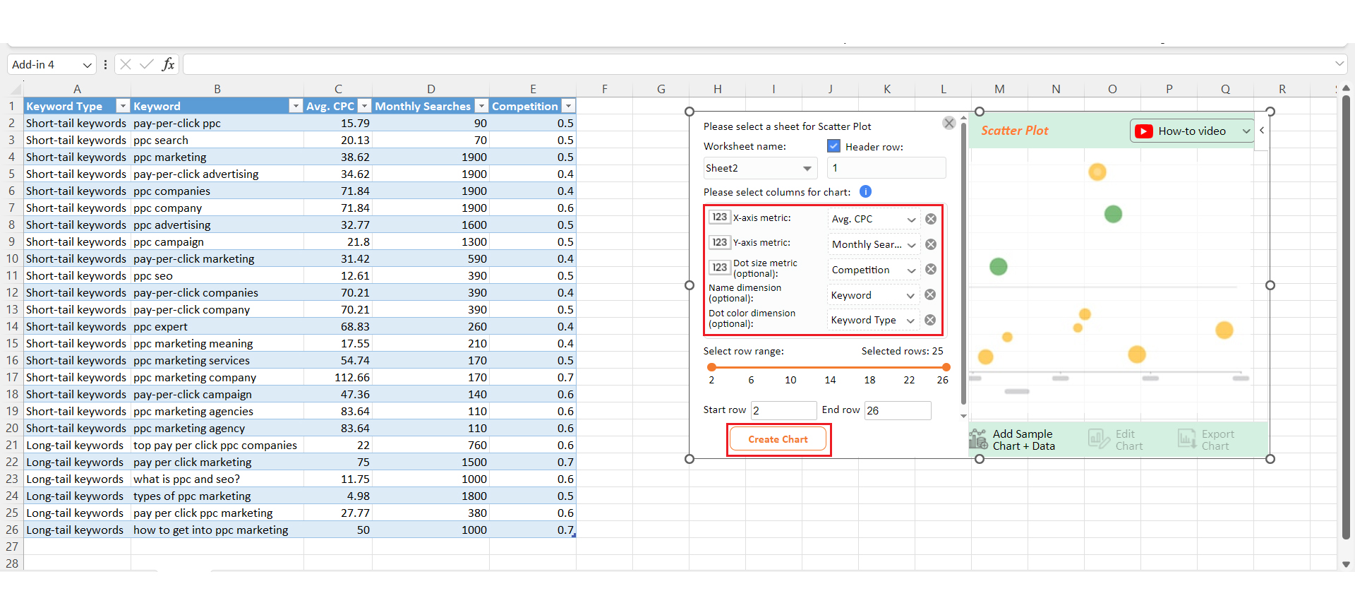
Let’s run the multiple regression data below in Excel and visualize the results using ChartExpo.

Keyword Type Keyword Avg. CPC Monthly Searches Competition
Short-tail keywords pay-per-click ppc 15.79 90 0.5
Short-tail keywords PPC search 20.13 70 0.5
Short-tail keywords PPC marketing 38.62 1900 0.5
Short-tail keywords pay-per-click advertising 34.62 1900 0.4
Short-tail keywords PPC companies 71.84 1900 0.4
Short-tail keywords PPC company 71.84 1900 0.6
Short-tail keywords PPC advertising 32.77 1600 0.5
Short-tail keywords PPC campaign 21.8 1300 0.5
Short-tail keywords pay-per-click marketing 31.42 590 0.4
Short-tail keywords ppc seo 12.61 390 0.5
Short-tail keywords pay-per-click companies 70.21 390 0.4
Short-tail keywords pay-per-click company 70.21 390 0.5
Short-tail keywords PPC expert 68.83 260 0.4
Short-tail keywords PPC marketing meaning 17.55 210 0.4
Short-tail keywords PPC marketing services 54.74 170 0.5
Short-tail keywords PPC marketing company 112.66 170 0.7
Short-tail keywords pay-per-click campaign 47.36 140 0.6
Short-tail keywords PPC marketing agencies 83.64 110 0.6
Short-tail keywords PPC marketing agency 83.64 110 0.6
Long-tail keywords top pay per click PPC companies 22 760 0.6
Long-tail keywords pay per click marketing 75 1500 0.7
Long-tail keywords what is ppc and seo? 11.75 1000 0.6
Long-tail keywords types of PPC marketing 4.98 1800 0.5
Long-tail keywords pay per click PPC marketing 27.77 380 0.6
Long-tail keywords how to get into PPC marketing 50 1000 0.7
  • To get started with ChartExpo, install ChartExpo in Excel.
  • Now Click on My Apps from the INSERT menu.
insert chartexpo in excel
  • Choose ChartExpo from My Apps, then click Insert.
open chartexpo in excel
  • Once it loads, scroll through the charts list to locate and choose the “Scatter Plot”.
search scatter plot chart in excel
  • Click the “Create Chart From Selection” button after selecting the data from the sheet, as shown.
Click Create Chart From Selection After Doing Multiple Regressions in Excel
  • ChartExpo will generate the visualization below for you.
Initial Visual After Doing Multiple Regressions in Excel
  • If you want to add anything to the chart, click the Edit Chart button:
  • Click the pencil icon next to the Chart Header to change the title.
  • It will open the properties dialog. Under the Text section, you can add a heading in Line 1 and enable Show.
  • Give the appropriate title of your chart and click the Apply button.
Add Chart Header After Doing Multiple Regressions in Excel
  • You can add the dollar sign with “Avg. CPC” values as follows:
Add Dollar Sign with Avg CPC After Doing Multiple Regressions in Excel
  • You can enable the button of legend show as follows:
Enable Buton of Legend After Doing Multiple Regressions in Excel
  • You can change the color of short-tail keywords as follows:
Change Color of Short-tail Keywords After Doing Multiple Regressions in Excel\
  • You can change the color of long-tail keywords as follows:
Change Color of Long-tail Keywords After Doing Multiple Regressions in Excel\
  • You can enable the trend line by clicking on Settings as follows:
Enable Trend Line by Clicking on Settings After Doing Multiple Regressions in Excel
  • Click the “Save Changes” button to persist the changes made to the chart.
Click Save Changes After Doing Multiple Regressions in Excel
  • Your final Scatter Plot will look like the one below.
Final Multiple Regressions in Excel

Insights

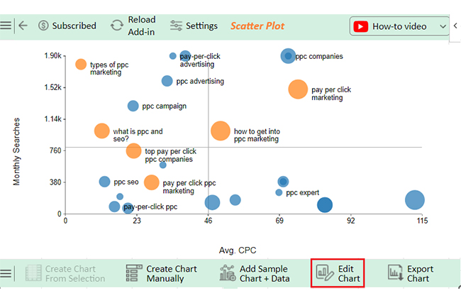
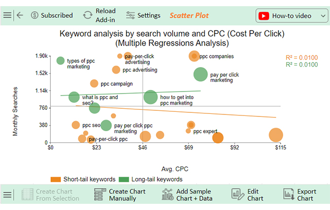
The data reveals that the long-tail keyword “types of PPC marketing” has a high search volume and a low average CPC. The first quadrant highlights keywords with strong potential.

FAQs

When do I use multiple regression?

Use multiple regression when analyzing one dependent variable with two or more independent variables. It helps predict outcomes based on multiple factors. This method is ideal for understanding how different variables affect the results of complex data sets.

What is the difference between single regression and multiple regression?

Single regression analyzes the relationship between one dependent variable and one independent variable. Multiple regression examines one dependent variable and two or more independent variables. Multiple regression provides a more detailed analysis, capturing the influence of several factors at once.

Wrap Up

Running multiple regressions in Excel offers real value. It goes beyond basic analysis by examining multiple variables at once, giving you deeper insights into your data.

With better predictive insights, you can make more informed decisions. You’ll see how different factors impact your outcomes. This is crucial for improving strategies.

Excel’s built-in tools make the process simple. You don’t need advanced software to run complex analyses. It’s a time-saver for those handling large data sets.

Multiple regression also helps identify outliers. These are data points that don’t fit the usual pattern. Spotting them early can save you from costly mistakes.

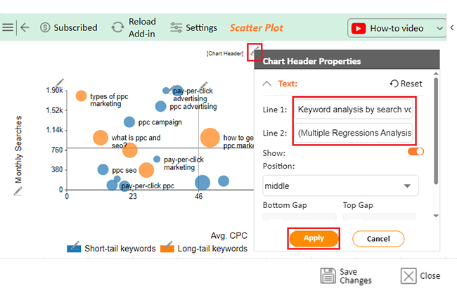
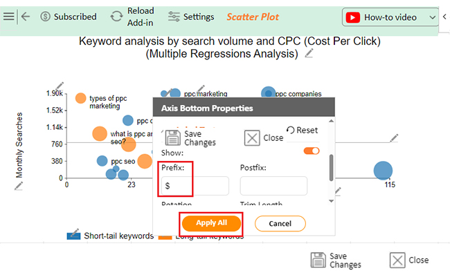
Visualization plays a key role in understanding regression results. Excel’s graphs help, but more advanced tools like ChartExpo take it further. You’ll get clearer, more detailed visuals.

In the end, running multiple regressions in Excel allows you to uncover valuable insights. It’s a practical way to turn data into smarter decisions. And with tools like ChartExpo, the process becomes even easier.

How much did you enjoy this article?

ExcelAd2
Start Free Trial!
143457

Related articles

next previous
Microsoft Excel13 min read

Excel for Teachers for Insightful Preparation

Excel for teachers simplifies grading, tracks attendance, and organizes data. Find its key features, expert tips, and how ChartExpo enhances data visualization.

Microsoft Excel14 min read

How to Make a Cash Flow Diagram in Excel?

Learn how to make a Cash Flow Diagram in Excel. It will help you learn to visualize and analyze inflows and outflows of your business cash flow.

Microsoft Excel11 min read

Succession Planning Template for Long-Term Success

Succession Planning Templates help businesses prepare for leadership changes. Learn to create, analyze, and use them for seamless transitions and growth.

Microsoft Excel10 min read

Grant Tracking Spreadsheet: Insights Made Easy

A Grant Tracker Spreadsheet helps track funding, deadlines, and expenses in Excel. Learn to use grant tracking templates, analyze data, and stay organized.

Microsoft Excel10 min read

What is Excel Software Used for: A Complete Guide

What is Excel software used for? It organizes, analyzes, and manages data. Explore its workplace applications, benefits, and top tips for efficiency and more.

ChartExpo logo

Turn Data into Visual
Stories

CHARTEXPO

  • Home
  • Gallery
  • Videos
  • Services
  • Pricing
  • Contact us
  • FAQs
  • Privacy policy
  • Terms of Service
  • Sitemap

TOOLS

  • ChartExpo for Google Sheets
  • ChartExpo for Microsoft Excel
  • Power BI Custom Visuals by ChartExpo
  • Word Cloud

CATEGORIES

  • Bar Charts
  • Circle Graphs
  • Column Charts
  • Combo Charts
  • Comparison Charts
  • Line Graphs
  • PPC Charts
  • Sentiment Analysis Charts
  • Survey Charts

TOP CHARTS

  • Sankey Diagram
  • Likert Scale Chart
  • Comparison Bar Chart
  • Pareto Chart
  • Funnel Chart
  • Gauge Chart
  • Radar Chart
  • Radial Bar Chart
  • Sunburst Chart
  • see more
  • Scatter Plot Chart
  • CSAT Survey Bar Chart
  • CSAT Survey Chart
  • Dot Plot Chart
  • Double Bar Graph
  • Matrix Chart
  • Multi Axis Line Chart
  • Overlapping Bar Chart
  • Control Chart
  • Slope Chart
  • Clustered Bar Chart
  • Clustered Column Chart
  • Box and Whisker Plot
  • Tornado Chart
  • Waterfall Chart
  • Word Cloud
  • see less

RESOURCES

  • Blog
  • Resources
  • YouTube
SIGN UP FOR UPDATES

We wouldn't dream of spamming you or selling your info.

© 2025 ChartExpo, all rights reserved.